| Author |
Message |
 |
|
|
|
|
Advert
|
Forum adverts like this one are shown to any user who is not logged in. Join us by filling out a tiny 3 field form and you will get your own, free, dakka user account which gives a good range of benefits to you:
- No adverts like this in the forums anymore.
- Times and dates in your local timezone.
- Full tracking of what you have read so you can skip to your first unread post, easily see what has changed since you last logged in, and easily see what is new at a glance.
- Email notifications for threads you want to watch closely.
- Being a part of the oldest wargaming community on the net.
If you are already a member then feel free to login now. |
|
 |
2020/07/23 13:17:46
Subject: Are there trends in painting styles?
|
|

Thane of Dol Guldur
|
I agree that people needing their hands holding for paint colours is very prevelent these days. Obviously asking for the odd colour here and there that you like, or for a new starting colour for a certain faction, but otherwise, experiment with your own colours, learn how to mix and work with different tones.
|
  Heresy World Eaters/Emperors Children Heresy World Eaters/Emperors Children 
Instagram: nagrakali_love_songs |
|
|
 |
|
2020/07/23 14:50:30
Subject: Are there trends in painting styles?
|
|

Insect-Infested Nurgle Chaos Lord
|
 queen_annes_revenge wrote: queen_annes_revenge wrote:I agree that people needing their hands holding for paint colours is very prevelent these days. Obviously asking for the odd colour here and there that you like, or for a new starting colour for a certain faction, but otherwise, experiment with your own colours, learn how to mix and work with different tones.
Agreed.
Too many people don't want to deviate these days, I even experimented from an early time in this hobby (though I was just rediscovering things as you'll see). I remember the first Christmas I got 40k stuff and it was a bunch of Eldar. I spent all morning assembling them and spraying them white outside, then I went on to paint them and I chose Midnight Blue, cos I was doing Alaitoc. Turns out young Grimtuff had never really watered down his paints before, despite being scolded by the local GW manager a few months prior when brush undercoating a conversion he'd just helped me with (he ran it under a tap and threatened to tell Jes Goodwin what I'd done to one of his sculpts!  ) and I was like amazed by the fact I'd just "made an ink" out of this paint in front of me. It was beautiful how it highlighted and shaded at the same time (hey I did contrast before it was cool, apparently...).
I was so ecstatic in having made this discovery by myself and I feel a lot of people are getting robbed of that today. Too many people taking the mantra of "water down your paints" (oh, irony...) to heart and applying it to everything. Another anecdote here is I had to learn to work with very little red in some of my models as when I started out I spilled the pot of blood red on the rug in the kitchen. Yes, my mum was furious. I prioritised minis with my paper route money over paints so adapted my style as such.
I know it sounds a bit jerky to say, but I don't mean it that way; but I really really hope with Duncan being gone from GW that his cult will die off a bit and I'll see much less of "But Duncan sez...!" type comments when advising people that no, you do not need to water down those metallics or Nurgle's rot for example (both of those actually happened.) and we'll get more experimentation going on. Like, use technical paints over white. Nihilakh Oxide looks fething great over white if I do say so myself 
|

Games Workshop Delenda Est.
Users on ignore- 53.
If you break apart my or anyone else's posts line by line I will not read them. |
|
|
|
|
2020/07/23 15:50:16
Subject: Are there trends in painting styles?
|
|
Longtime Dakkanaut
|
I wanted to do dark angles and emperors children. When I did 40k 2ed as a kid these were my favourites and I had some old minis in a cupboard. I’d stopped playing before 3rd and there was no you tube or anything then so my painting was aweful.
Now YouTube etc has really helped learn a variety of ways to do things and I experiment to find my way. I’m still not great at layering and dry brushing for example but I have colour schemes that I like and that’s important because when it returned to the hobby I did not like the way DA and EC were represented as a colour scheme. DA were edge highlighted using warp stone glow and for me that doesn’t not look like DA and I couldn’t understand why I couldn’t find an example of DA power armour that was basically bold dark angles green with some shading and lighter tones on raised areas.
I’ve actually come to the opinion that GW used the generic acceptance that minis should be faded and highlighted to expand their colour range and bad highlights are added to their DA colour scheme, as and example, to add 1 more suggested paint to buy of you play that army
Here’s a couple of photos of a mini I am working on. To date it’s turning into one of my best and the reason is that I have stopped trying to make the edges bright pink. I really like the range of tone from darker purple to pinky purple. For some reasons the base colour for this is a heavy purple wash On top of a white primer. I don’t know why I tried that but I like the result and stick with it for the unit. I don’t know why I tried that. There might be a better way but I have enjoyed it more than trying to copy a video on YouTube.
![[Thumb - 9047B633-E419-4625-A1DA-418BB4319D57.jpeg]](/s/i/at/2020/7/23/e124a4537eddae2965861b2ab649c5fc_125105.jpeg__thumb)
|
![[Thumb - 2F8068C4-5F63-4400-A178-EED26F78E3BD.jpeg]](/s/i/at/2020/7/23/af1db1ec93cdb9f648b617a6878d7e20_125105.jpeg__thumb)
|
|
|
This message was edited 1 time. Last update was at 2020/07/23 16:00:08
|
|
|
|
|
2020/07/23 15:50:50
Subject: Are there trends in painting styles?
|
|
Thane of Dol Guldur
|
Thinning paints is a good painting maxim. A good principle to base your painting journey from. The key is learning how much, or how little to thin different paints, and when to use paints straight from the pot. There is no universal standard to thinning, and this is something that's learnt with practice and experience.
|
Heresy World Eaters/Emperors Children
Instagram: nagrakali_love_songs |
|
|
|
|
2020/07/23 16:04:20
Subject: Are there trends in painting styles?
|
|
Longtime Dakkanaut
|
queen_annes_revenge wrote:Thinning paints is a good painting maxim. A good principle to base your painting journey from. The key is learning how much, or how little to thin different paints, and when to use paints straight from the pot. There is no universal standard to thinning, and this is something that's learnt with practice and experience.
Absolutely and I have done a lot of experimenting but what I can’t get to grips with the examples I’ve seen of people making really thin layers and applying ten or more to build up the colour. As I am using more paint from Vallejo and GSW I and finding I only really need a few drops of flow enhancer most of the time. Citadel bases need more thinning I think. And then I have just some random acrylic paints that are different colour and I add medium etc to them to make the the right consistency for mini painting.
But most you tubers, that I have seen, would say I don’t thin enough
|
|
|
|
|
2020/07/23 16:12:47
Subject: Are there trends in painting styles?
|
|
Insect-Infested Nurgle Chaos Lord
|
queen_annes_revenge wrote:Thinning paints is a good painting maxim. A good principle to base your painting journey from. The key is learning how much, or how little to thin different paints, and when to use paints straight from the pot. There is no universal standard to thinning, and this is something that's learnt with practice and experience.
Yes, forgot to mention that. "Consistency of milk" is such a useless phrase.
|
Games Workshop Delenda Est.
Users on ignore- 53.
If you break apart my or anyone else's posts line by line I will not read them. |
|
|
|
|
2020/07/23 16:16:46
Subject: Re:Are there trends in painting styles?
|
|
Fixture of Dakka
|
Are you saying I wasted all that time sourcing different coloured milks so that I could compare them with my paints 
|
|
|
|
|
|
2020/07/23 16:31:11
Subject: Re:Are there trends in painting styles?
|
|

Master Tormentor
|
What, you don't like strawberry milk on its own merits?
|
|
|
|
|
2020/07/23 17:03:05
Subject: Are there trends in painting styles?
|
|
Longtime Dakkanaut
|
What flavour milk is leadbelcher colour???
|
|
|
|
|
2020/07/23 17:40:02
Subject: Are there trends in painting styles?
|
|
Thane of Dol Guldur
|
mrFickle wrote: queen_annes_revenge wrote:Thinning paints is a good painting maxim. A good principle to base your painting journey from. The key is learning how much, or how little to thin different paints, and when to use paints straight from the pot. There is no universal standard to thinning, and this is something that's learnt with practice and experience.
Absolutely and I have done a lot of experimenting but what I can’t get to grips with the examples I’ve seen of people making really thin layers and applying ten or more to build up the colour. As I am using more paint from Vallejo and GSW I and finding I only really need a few drops of flow enhancer most of the time. Citadel bases need more thinning I think. And then I have just some random acrylic paints that are different colour and I add medium etc to them to make the the right consistency for mini painting.
But most you tubers, that I have seen, would say I don’t thin enough
Umm, yeah... haha nah, I'm a layer builder. 20 plus sometimes. I prefer it to wet blending. Although I often wet blend a rough base layer, then build up layers and glazes to get the tones and transitions I like.
|
Heresy World Eaters/Emperors Children
Instagram: nagrakali_love_songs |
|
|
|
|
2020/07/23 20:41:06
Subject: Are there trends in painting styles?
|
|
Ultramarine Chaplain with Hate to Spare
|
Jackal90 wrote:As above but I believe one person I’ve seen is still black lining models.
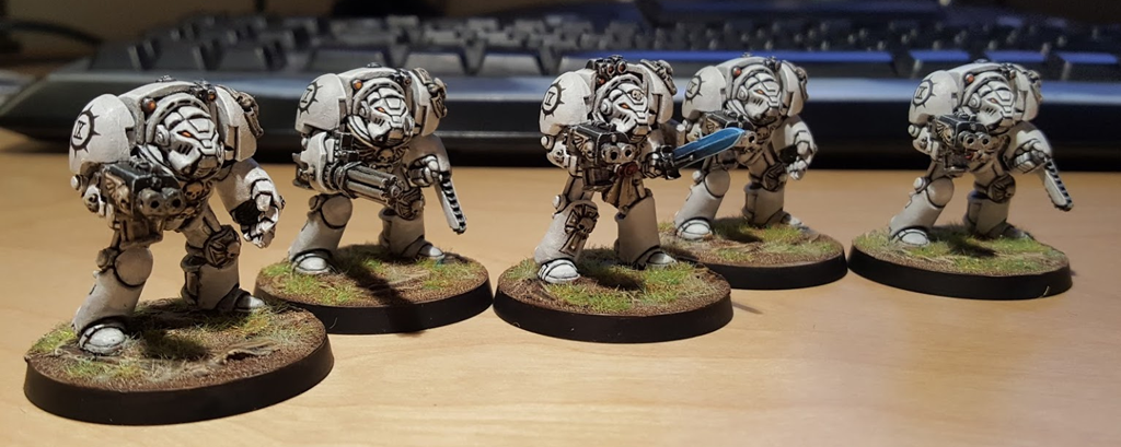
I hate doing the black lining but I love the effect. I do my marines this way. That plus the white takes foooorrreeeeevvvveeerrr.
|
|
This message was edited 1 time. Last update was at 2020/07/23 20:41:35
|
|
|
|
|
2020/07/23 21:33:02
Subject: Are there trends in painting styles?
|
|
Longtime Dakkanaut
|
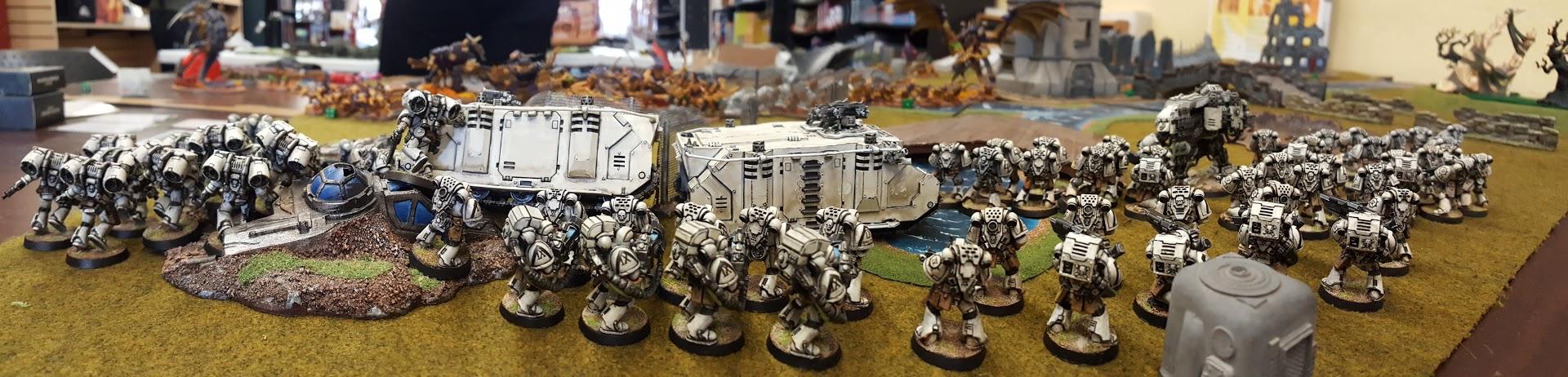
I love those jump packs
|
|
|
|
|
2020/07/23 21:35:44
Subject: Re:Are there trends in painting styles?
|
|
Dipping With Wood Stain
|
 skchsan wrote: skchsan wrote:There are certainly different painting styles, but I wouldn't go as far as to say there are trends per se in miniature painting.
After being in the painting game for 35 years, I can most assuredly say that there are.
They tend to shift every 4 or 5 years or so, and will often surge in popularity if it’s an undiscovered technique, or new product that changes the game. But to say there are not trends is flat out wrong.
You can tell a mini from the 1990’s from today’s quite easily. That’s proof of a change in trends right there.
|
|
|
|
|
2020/07/23 22:13:39
Subject: Are there trends in painting styles?
|
|
Ultramarine Chaplain with Hate to Spare
|
Thanks! I have more to do but I'm laaaazzzyy. 
|
|
|
|
|
|
2020/07/23 22:27:06
Subject: Are there trends in painting styles?
|
|
Thane of Dol Guldur
|
mrFickle wrote:I DA were edge highlighted using warp stone glow and for me that doesn’t not look like DA and I couldn’t understand why I couldn’t find an example of DA power armour that was basically bold dark angles green with some shading and lighter tones on raised areas.
I’ve actually come to the opinion that GW used the generic acceptance that minis should be faded and highlighted to expand their colour range and bad highlights are added to their DA colour scheme, as and example, to add 1 more suggested paint to buy of you play that army.
I think your conclusions are misguided somewhat. Gw don't do high(ish) contrast paint jobs to flog more paint. They do it because its the most efficient way to make good looking models to out on their product boxes.
Miniature painting wise, the consensus is that more contrast leads to more realistic looking paint jobs, and thus better paint jobs. This means that highlighted models are always going to look better than ones painted with flat, dark base tones.
This doesn't mean that you need to do that bright, high contrast though. There are other methods. You could highlight with more neutral tones. Greys for example. I've been experimenting with using deck tan to highlight blacks and blues. You could do subtle highlights, but add spot colours to draw focus or you could tone down the look with weathering and such.
|
|
This message was edited 1 time. Last update was at 2020/07/23 22:28:01
Heresy World Eaters/Emperors Children
Instagram: nagrakali_love_songs |
|
|
|
|
2020/07/24 09:55:54
Subject: Are there trends in painting styles?
|
|
Longtime Dakkanaut
|
Hmmm I might just be exorcising my noob frustrations.
|
|
|
|
|
|
|