| Author |
Message |
 |
|
|
 |
|
Advert
|
Forum adverts like this one are shown to any user who is not logged in. Join us by filling out a tiny 3 field form and you will get your own, free, dakka user account which gives a good range of benefits to you:
- No adverts like this in the forums anymore.
- Times and dates in your local timezone.
- Full tracking of what you have read so you can skip to your first unread post, easily see what has changed since you last logged in, and easily see what is new at a glance.
- Email notifications for threads you want to watch closely.
- Being a part of the oldest wargaming community on the net.
If you are already a member then feel free to login now. |
|
 |
![[Post New]](/s/i/i.gif) 2020/09/20 21:48:26
Subject: Elf Cow Warrior?
|
 |

Grumpy Longbeard
|
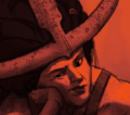 Inquisitor Gideon wrote: Inquisitor Gideon wrote:As much as you talk about good and bad design, this does come off more as a whine/troll thread. You haven't posted anything worth discussing as of yet.
I did.
Lets discuss Difference in scale, the proportion ratios.
Example image - Stronger design will exaggerate one part and minimize the other to crate a stronger character and avoid half ratios.
Lets discuss Rhythm and the balance of busy vs calm in the design. Why is a design with good balance is stronger than the design without it?
Lets discuss readability of the silhouette. A good design will communicate to viewer in a split second at a quick glance if the "character" is good or bad strong or weak, fast or slow, ets. And lets discuss what the silhouette communicates. and why it is importnat. Because I already wrote why it is important, I hope we can discuss that.
![[Thumb - tool_test_8.jpg]](/s/i/at/2020/9/20/f104072313e352f470a686144aefc6a5_79426.jpg__thumb)
|
![[Thumb - tool_test_9.jpg]](/s/i/at/2020/9/20/e1c384f547e3f4ae6a7fcc6597dfa924_79426.jpg__thumb)
|
![[Thumb - tool_test_10.jpg]](/s/i/at/2020/9/20/be20f1c1722f7ced6e07d181e083033a_79426.jpg__thumb)
|
![[Thumb - tool_test_11.jpg]](/s/i/at/2020/9/20/7063a2dc50f7afec3ee5eb6c0266f6a9_79426.jpg__thumb)
|
|
|
This message was edited 2 times. Last update was at 2020/09/20 21:52:48
|
|
|
 |
 |
![[Post New]](/s/i/i.gif) 2020/09/20 21:52:15
Subject: Elf Cow Warrior?
|
 |

Walking Dead Wraithlord
|
Yeah they are a solid nope from me.
I think its an interesting design direction but personally think they look stupid... Like I appreciate the technical design stuff and it looks like a nice kit but the overall effect just doesn't mesh...
Maybe im just to set in my ways.. When I think about high elves, I dont picture cows.. Each to their own of course.
|
|
|
|
 |
 |
![[Post New]](/s/i/i.gif) 2020/09/20 22:05:14
Subject: Elf Cow Warrior?
|
 |

Longtime Dakkanaut
|
 Mothsniper wrote: Mothsniper wrote: Inquisitor Gideon wrote: Inquisitor Gideon wrote:As much as you talk about good and bad design, this does come off more as a whine/troll thread. You haven't posted anything worth discussing as of yet.
I did.
Lets discuss Difference in scale, the proportion ratios.
Example image - Stronger design will exaggerate one part and minimize the other to crate a stronger character and avoid half ratios.
Lets discuss Rhythm and the balance of busy vs calm in the design. Why is a design with good balance is stronger than the design without it?
Lets discuss readability of the silhouette. A good design will communicate to viewer in a split second at a quick glance if the "character" is good or bad strong or weak, fast or slow, ets. And lets discuss what the silhouette communicates. and why it is importnat. Because I already wrote why it is important, I hope we can discuss that.
Shame you didn't post some of this instead of the 4chan tier trash opening post.
I don't have time to address each of these points right now, but i'll try and get some time tomorrow.
Automatically Appended Next Post:
 Argive wrote: Argive wrote:Yeah they are a solid nope from me.
I think its an interesting design direction but personally think they look stupid... Like I appreciate the technical design stuff and it looks like a nice kit but the overall effect just doesn't mesh...
Maybe im just to set in my ways.. When I think about high elves, I dont picture cows.. Each to their own of course.
Your problem is thinking of them as high elves, they're not. People need to get out of this stereotyping mindset of elves=flouncy, lanky and blonde hair, dwarves=scottish, beard and hard drinker etc. It's tiresome. Even Tolkien had hammer wielding elves in his works.
"The House of the Hammer of Wrath was a House of the Elven city of Gondolin. Their lord was Rog. They were great smiths and craftsmen, and revered Aulë. In battle they carried great maces like hammers, and heavy shields, for they had strong arms."
|
|
This message was edited 2 times. Last update was at 2020/09/20 22:10:23
|
|
|
 |
 |
![[Post New]](/s/i/i.gif) 2020/09/20 22:48:00
Subject: Re:Elf Cow Warrior?
|
 |

Grumpy Longbeard
|
"Shame you didn't post some of this instead of the 4chan tier trash opening post"
How silly of me, wish you jumped in sooner to steer me in right direction!
4chan tier trash  hahahaa,  brilliant! I like you.
Looking forward to deep insightful addressing of the points made.
|
|
This message was edited 1 time. Last update was at 2020/09/20 23:11:27
|
|
|
 |
 |
![[Post New]](/s/i/i.gif) 2020/09/21 00:24:53
Subject: Elf Cow Warrior?
|
 |

Decrepit Dakkanaut
UK
|
 Inquisitor Gideon wrote: Inquisitor Gideon wrote:
Your problem is thinking of them as high elves, they're not. People need to get out of this stereotyping mindset of elves=flouncy, lanky and blonde hair, dwarves=scottish, beard and hard drinker etc. It's tiresome. Even Tolkien had hammer wielding elves in his works.
"The House of the Hammer of Wrath was a House of the Elven city of Gondolin. Their lord was Rog. They were great smiths and craftsmen, and revered Aulë. In battle they carried great maces like hammers, and heavy shields, for they had strong arms."
What's interesting is that in real warfare swords aren't always the best weapon. Once you had plate armours a mace or hammer could be far more effective. Your sword couldn't slice through plate and chain mail and padding; but a hammer or mace blow might dent it and bruise or break the softer body underneath. It's only in fantasy where the sword is always king and the spear is only against horses and the mace against undead.
Also in the lore behind Old World the elves, even the High Elves, were not as poncy as many make out. Indeed they were quite savage. If anything, in the Old World at least, the Dwarves were almost more noble than the Elves. Though Dwarves had other vices like their strict social codes and way of life and also their tendency to carry a grudge.
|
|
|
|
 |
 |
![[Post New]](/s/i/i.gif) 2020/09/21 00:52:09
Subject: Elf Cow Warrior?
|
 |

Lieutenant General
|
 Overread wrote: Overread wrote:What's interesting is that in real warfare swords aren't always the best weapon. Once you had plate armours a mace or hammer could be far more effective. Your sword couldn't slice through plate and chain mail and padding; but a hammer or mace blow might dent it and bruise or break the softer body underneath.
In real life, I believe that the pollax was as popular as the two handed sword for the knight when fighting on foot against enemy in plate armor.
|
'It is a source of constant consternation that my opponents
cannot correlate their innate inferiority with their inevitable defeat. It would seem that stupidity is as eternal as war.'
- Nemesor Zahndrekh of the Sautekh Dynasty
Overlord of the Crownworld of Gidrim |
|
|
 |
 |
![[Post New]](/s/i/i.gif) 2020/09/21 00:53:53
Subject: Elf Cow Warrior?
|
 |

Walking Dead Wraithlord
|
 Inquisitor Gideon wrote: Inquisitor Gideon wrote: Mothsniper wrote: Mothsniper wrote: Inquisitor Gideon wrote: Inquisitor Gideon wrote:As much as you talk about good and bad design, this does come off more as a whine/troll thread. You haven't posted anything worth discussing as of yet.
I did.
Lets discuss Difference in scale, the proportion ratios.
Example image - Stronger design will exaggerate one part and minimize the other to crate a stronger character and avoid half ratios.
Lets discuss Rhythm and the balance of busy vs calm in the design. Why is a design with good balance is stronger than the design without it?
Lets discuss readability of the silhouette. A good design will communicate to viewer in a split second at a quick glance if the "character" is good or bad strong or weak, fast or slow, ets. And lets discuss what the silhouette communicates. and why it is importnat. Because I already wrote why it is important, I hope we can discuss that.
Shame you didn't post some of this instead of the 4chan tier trash opening post.
I don't have time to address each of these points right now, but i'll try and get some time tomorrow.
Automatically Appended Next Post:
 Argive wrote: Argive wrote:Yeah they are a solid nope from me.
I think its an interesting design direction but personally think they look stupid... Like I appreciate the technical design stuff and it looks like a nice kit but the overall effect just doesn't mesh...
Maybe im just to set in my ways.. When I think about high elves, I dont picture cows.. Each to their own of course.
Your problem is thinking of them as high elves, they're not. People need to get out of this stereotyping mindset of elves=flouncy, lanky and blonde hair, dwarves=scottish, beard and hard drinker etc. It's tiresome. Even Tolkien had hammer wielding elves in his works.
"The House of the Hammer of Wrath was a House of the Elven city of Gondolin. Their lord was Rog. They were great smiths and craftsmen, and revered Aulë. In battle they carried great maces like hammers, and heavy shields, for they had strong arms."
I dont agree people need to change their image of an elf to suit/explain a new GW minature range lol..
Some tolkien elves using maces coz they really into their smithing is not going to convince me that any kind of elf fits a huge circle-cow-horn-helmet-thats-comicaly-too-large-for-head is going to make me change my mind. Mind you the WHFB HE sculpts were very silly too. The plastic Phoenix guard are even worse than the cow head elfs..
You can like the models, I have no issues with people liking these. You do you. But I certainly wouldn't say you have a problem because you like them for wrong reasons. if you dig them thats cool..
|
|
|
|
 |
 |
![[Post New]](/s/i/i.gif) 2020/09/21 01:39:12
Subject: Elf Cow Warrior?
|
 |

Road-Raging Blood Angel Biker
|
To each their own, I suppose.
Personally, as a long time 40k player, Lumineth Realm Lords are the first AoS army that has appealed to me, and I have decided to jump in and start the army.
I chose the Ymetrica faction just so I could run a whole army of Cow Mountains and Cow Elves.
Beauty, as they say, is in the eye of the beholder.
|
|
|
 |
 |
![[Post New]](/s/i/i.gif) 2020/09/21 02:07:48
Subject: Re:Elf Cow Warrior?
|
 |

Committed Chaos Cult Marine
|
@Mothsniper
You say you want to discuss stronger vs. weaker designs, yet the images are far from apparent to what you arguing in your original post to me.
Take the Spirit of the Mountain vs. the two-headed ogre. You place red blocks I am guessing to highlight portion. Which I think strengthen the argument for the Spirit of the Mountain as it is well portion. Especially when compared to something that would fit right in with Mantic Games' aesthetic of tiny little legs (which is a fine aesthetic if that's what one likes). The ogre has old dreadnought legs complete with an almost lack of upper leg. Where as the the Spirit of the Mountain's long legs give it a kind of grace. The avoiding half-ratios guideline (it isn't a rule by any means) typically applies more to two-dimensional art in framing composition. Less so in 3D sculpture.
Next, comparing the Spirit of the Mountain to the sorceress, I suppose you are attempting to demonstrate balance and motion. Certainly not avoiding half-ratios since the sorceress could very easy also be guilty of it. The Spirit of the Mountain doesn't have a lot of motion. Which is to be expected from a tranquil mountain spirit given an artificial avatar to inhabit. Furthermore, the balance and subsequent formations of a lot of triangles particularly with negative space gives the viewer the impression of quiet, tempered power and strength. Which very much works to merge with more bovine aspect of the model. Cows aren't quick to anger but they are very strong and not something to mess with despite their usual placid demeanor. There's a reason why comparing a bull's strength to something is common knowledge way to say something is very strong.
As for the silhouette, I think this where the Spirit of the Mountain very much shines. Again the model form many triangular shapes in silhouette subtlety reveal the idea of balance and power as well as the basic shape of mountains. It probably wouldn't to a surprise that Great Nation of Ymetrica (the mountain aspect nation) is said to incorporate triangle patterns into their art and craftsmanship according to the limited lore given in the Battletome.
Next look at the silhouette's shoulders. Broad and powerful but also showing some refinement with the graceful curve of the shoulder pad reinforcing the grace along with the model's long legs. I disagree with the idea that a silhouette should reveal whether something is good or evil. I mean try applying that criteria to just about anything in 40k model line where everything ranges from evil to very evil. The iconic space marine would fail to demonstrate pretty much anything with your silhouette test I think.
I mean look at a number of the silhouettes you included. Each to recognizable enough that someone familiar with model line know what they are in silhouette. Which I honestly think is about as much a silhouette should strive to accomplish for three-dimensional models. Perhaps also showing dome interesting use of negative space. I would hardly have it hold much weight of criteria for good/bad design. I mean look at the Maw Crusha and perennial favorite model of most AoS fans I that I have encountered. Yet in silhouette, it looks like crap barely readable to want it is. Heck, go back to the not Citadel images you used for demonstration purposes and look at their silhouette. You get round shape-y thing with spikes (I guess spikes=evil, right? Stupid, evil Chun-Li) and stubby-legs and curtain with a stick and ribbons.
***
It is totally fine not liking the designs of the Lumineth even the Alarith. You are probably in the majority. They are most certainly a bold, new direction for what can best be described as AoS High Elves. Which if that is what someone was wanting, I can't see how they would be anything but disappointed if they just wanted modern updates to a classical line. However, just because they aren't to your liking doesn't mean that they are aesthetically bad in any objective manner save maybe creating bad faith criteria or Texas sharp-shoot them into being bad. Which I think you are doing. Particularly when you seem to be applying a lot of 2d criteria to a 3d sculpture that doesn't always work the same between the mediums.
So you can keep not liking them. Just don't pretend that your expert art critique holds as much water as you think it does.
|
|
|
 |
 |
![[Post New]](/s/i/i.gif) 2020/09/21 02:25:00
Subject: Elf Cow Warrior?
|
 |

Hissing Hybrid Metamorph
|
Mothsniper, you seem like a fun dude haha.
Let’s discuss my dude:
You haven’t placed the (I assume) weight of the head in the right spot. If you had, the weight would be good. If you’re talking about proportions with this, it’s heroic proportions, as opposed to more cartoony monster proportions. The balance of busy vs calm as well, it has plenty of white plates between other details. While these have little etchings in them, they’re subtle enough not to detract. The mountains themselves are pretty subtle, the handle of the hammer is plain. Not to mention the space between his elements and limbs to give points of rest between the actual model itself.
The rhythm of the model too, (I presume your second image) you’ve taken too literally. Look at the lovely lines that go across him, using the horns, shoulders and hammer. Then, look at the pyramidal lines using his legs, his arms, then the mountains themselves, to give a real solid and grounded vibe.
The difference between this model, and the lovely painting by Wayne Reynolds, is 1 has to be easily readable in 2D, the other is a 3D model that must look good from all angles. Try doing your rhythm outline on Drycha, or most of those other silhouettes, none will be as simplistic as the 2D painting.
Finally, your silhouettes, his silhouette is easily more readable than a lot of those. And the way he’s so planted, the clear mountainous shape on him, the big hammer, the stoic stance, all would suggest he’s a defensive beef cake, regardless of being skinny.
Ontop of this, the designer has even managed to get dynamics into such a typically motionless pose using dangling cloth that’s flowing in the wind.
EDIT: Also, just to add, your point about it having no character because there’s too many themes. This is a very flawed way to look at design, and also very basic. If every design was structured around a single thing, life would be very boring. The designer on this model clearly knew what they wanted, and mixed several things together to make it interesting and to drive home the point. His is tall, slender and elegant, to show that he is part of an elf force. He stands stern and grounded, with obvious mountains on his back to show that he is strong and defensive. And the cow design, imo, drives home that immovable brick theme.
It’s not about how many themes you add, it’s about how they they mix together.
EDIT 2: (because I’ve thought about this way too much lol) here’s the portrayal of the lines I mention above. As a secondary to the already established satisfaction you get from the balance and symmetry, when taking into account the curve of the shoulders and horns, it looks somewhat like an Elvish/Japanese/Chinese letter or rune, which is really awesome.
![[Thumb - 305A8336-BD1A-443C-A955-CD603EDE0EDC.jpeg]](/s/i/at/2020/9/21/522ec80ecf34c5de93e2cda856ae6119_84851.jpeg__thumb)
|
|
|
This message was edited 9 times. Last update was at 2020/09/21 04:59:38
|
|
|
 |
 |
![[Post New]](/s/i/i.gif) 2020/09/21 06:54:46
Subject: Re:Elf Cow Warrior?
|
 |

Grumpy Longbeard
|
 Saturmorn Carvilli wrote: Saturmorn Carvilli wrote: @Mothsniper
You say you want to discuss stronger vs. weaker designs, yet the images are far from apparent to what you arguing in your original post to me.
Take the Spirit of the Mountain vs. the two-headed ogre. You place red blocks I am guessing to highlight portion. Which I think strengthen the argument for the Spirit of the Mountain as it is well portion. Especially when compared to something that would fit right in with Mantic Games' aesthetic of tiny little legs (which is a fine aesthetic if that's what one likes). The ogre has old dreadnought legs complete with an almost lack of upper leg. Where as the the Spirit of the Mountain's long legs give it a kind of grace. The avoiding half-ratios guideline (it isn't a rule by any means) typically applies more to two-dimensional art in framing composition. Less so in 3D sculpture.
 I though adding a picture would communicate what I was trying to communicate better, nevermind. One thing I will point out is (it isn't a rule by any means) I am sorry lolz there are rules in art, design, and music. Those rules are there for a good reason, those rules are there to make sure the image clicks with human psychology and clicks with the way brain processes visual input with better designs create a stronger impact and payoff, the entire art, game, advertisement industry is only build on those rules. I know art field seems like a free for all do what you want, but it is not, and that is not an opinion that is a fact. Lolz what, hahaha "typically applies more to two-dimensional art in framing composition" What the heck is a framing composition? Like a composition that frames the .. painting composition? Only to 2Dimentioanl art? Oh well, I must go tell that to all 3D game devs who are into character design, guess they must stop using half-ratios because it is for 2D only.
 Saturmorn Carvilli wrote: Saturmorn Carvilli wrote:
Next, comparing the Spirit of the Mountain to the sorceress, I suppose you are attempting to demonstrate balance and motion. Certainly not avoiding half-ratios since the sorceress could very easy also be guilty of it. The Spirit of the Mountain doesn't have a lot of motion. Which is to be expected from a tranquil mountain spirit given an artificial avatar to inhabit. Furthermore, the balance and subsequent formations of a lot of triangles particularly with negative space gives the viewer the impression of quiet, tempered power and strength. Which very much works to merge with more bovine aspect of the model. Cows aren't quick to anger but they are very strong and not something to mess with despite their usual placid demeanor. There's a reason why comparing a bull's strength to something is common knowledge way to say something is very strong.
Not balance or motion, why are you making up your own things to argue against? What I wrote was not clear enough?
I said Rhythm and the balance of busy vs calm Not balance or motion... busy vs calm busy vs calm busy vs calm not balance or motion. There is a picture that shows one side busy and one side calm...
"Certainly not avoiding half-ratios since the sorceress could very easy also be guilty of it." Wrong, image bellow, leg to waist, torso and head ratios are not all equal or half of the other. And even if it was we are talking about what makes a good design, Wayne has good designs and bad designs too, that is why I find strongest design by an artist to make a point.
"Mountain doesn't have a lot of motion" So far only you are arguing against motion, I have not mentioned it before, and have no idea how you got motion out of busy vs calm example...
 Saturmorn Carvilli wrote: Saturmorn Carvilli wrote:
As for the silhouette, I think this where the Spirit of the Mountain very much shines. Again the model form many triangular shapes in silhouette subtlety reveal the idea of balance and power as well as the basic shape of mountains. It probably wouldn't to a surprise that Great Nation of Ymetrica (the mountain aspect nation) is said to incorporate triangle patterns into their art and craftsmanship according to the limited lore given in the Battletome.
Silhouette is triangle shaped, really. It is more of an X shaped. So if you to hold the image of that silhouette in front of your friend and asked them to keep they eyes closed, and then told them to open their eyes and say the first shape that will pop into their mind when they see it for the first time, and they will look at that and yell-out triangle? Care to put that to a test 
 Saturmorn Carvilli wrote: Saturmorn Carvilli wrote:
Next look at the silhouette's shoulders. Broad and powerful but also showing some refinement with the graceful curve of the shoulder pad reinforcing the grace along with the model's long legs. I disagree with the idea that a silhouette should reveal whether something is good or evil. I mean try applying that criteria to just about anything in 40k model line where everything ranges from evil to very evil. The iconic space marine would fail to demonstrate pretty much anything with your silhouette test I think.
In order for your point of "a silhouette shouldn't reveal whether something is good or evil" not to stand idle, be good to show an example of that where an "evil" silhouette was used with a good character. Like hunched brooding silhouette was used for a strong noble hero or a crooked and barbed dagger was a weapon choose for the good keepers of the law. So Jafar could of looked just as evil if he was short round?
"I mean try applying that criteria to just about anything in 40k " I am sorry we are talking about what goes into a good design, not comparing 40K silhouettes to 40K, and even if we did that space marines suppose to be good? Not according to the books or space marines them selves. They are a feared overpowered weapon, and their silhouette does communicate that well.
 Saturmorn Carvilli wrote: Saturmorn Carvilli wrote:
I mean look at a number of the silhouettes you included. Each to recognizable enough that someone familiar with model line know what they are in silhouette. Which I honestly think is about as much a silhouette should strive to accomplish for three-dimensional models. Perhaps also showing dome interesting use of negative space. I would hardly have it hold much weight of criteria for good/bad design. I mean look at the Maw Crusha and perennial favorite model of most AoS fans I that I have encountered. Yet in silhouette, it looks like crap barely readable to want it is. Heck, go back to the not Citadel images you used for demonstration purposes and look at their silhouette. You get round shape-y thing with spikes (I guess spikes=evil, right? Stupid, evil Chun-Li) and stubby-legs and curtain with a stick and ribbons.
The silhouettes I included for (And lets discuss what the silhouette communicates) Not if it is hard for people to id the models, Not if silhouettes look cool or like crap, Seriously mate, its like you are arguing against points that you are coming up with as you go. I brought up (And lets discuss what the silhouette communicates.) (what the silhouette communicates) (communicates) (communicates) (communicates) (communicates)
(You get round shape-y thing with spikes) That is a very good silhouette, it communicates something huge brooding and spiky, Oh it is a brute, well done artist!
Maw Crusha silhouette communicates a huge brooding mass, and hey that is exactly what it is. Elf silhouette communicates, well you can tell it is a bird.
What does the Mountain Spirit communicate to you my friend? With hoof legs and horns hmm, Oh yes, a noble friendly spirit for good, obviously!
 Saturmorn Carvilli wrote: Saturmorn Carvilli wrote:
It is totally fine not liking the designs of the Lumineth even the Alarith. You are probably in the majority. They are most certainly a bold, new direction for what can best be described as AoS High Elves. Which if that is what someone was wanting, I can't see how they would be anything but disappointed if they just wanted modern updates to a classical line. However, just because they aren't to your liking doesn't mean that they are aesthetically bad in any objective manner save maybe creating bad faith criteria or Texas sharp-shoot them into being bad. Which I think you are doing. Particularly when you seem to be applying a lot of 2d criteria to a 3d sculpture that doesn't always work the same between the mediums.
Again you are arguing against the position that I never took. Yes because the design rules I listed are my subjective manners. Learning something new about my self every day!
"2d criteria to a 3d sculpture that doesn't always work the same between the mediums" Unfortunately the criteria we are discussing is "design" and that applies to both. Everything I say about 2D is not only directly applied to 3D as well but before it was a 3D model it was all drawn out in 2D rotoscoped and aprooved...waita minute... I think I know what happened, lolz, .... I wonder... I would bet 50 good ol USofA deniros that newer models now go from 3D sketch to model without much of art direction.
 Saturmorn Carvilli wrote: Saturmorn Carvilli wrote:
So you can keep not liking them. Just don't pretend that your expert art critique holds as much water as you think it does.
You can keep on liking them! Just next time stay on topic please and don't invent your own arguments to destroy in our future discussion.
Wish we had this talk over a cup of tea. 
![[Thumb - tool_test_9a.jpg]](/s/i/at/2020/9/21/480bcd150a160c5dcfbe3b90e12bc958_79426.jpg__thumb)
|
![[Thumb - tool_test_9ab.jpg]](/s/i/at/2020/9/21/f86da42866c2c40cc329710d05289f4a_79426.jpg__thumb)
|
|
|
|
|
 |
 |
![[Post New]](/s/i/i.gif) 2020/09/21 06:56:59
Subject: Re:Elf Cow Warrior?
|
 |

Keeper of the Flame
|
Mothsniper wrote:Yeah, mountains are an obviously cheezy one.
-"Stone themed units, what shall we do"
-"Dont know sir, this is a hard one"
-"Hmmm lets put... rocks and mountains in the design!"
-"Brilliant sir! what school did you go to to learn such depths of character design?!"
For me bigger problem is that I just do not understand a thematic connection of a Beatmen upright cow with the "High-Elfs" I know they are not HighElfs, yet they LOOK like they are kin.
This one is easy to explain. GW lost their ass in a lawsuit trying to crush smaller mini companies, mainly ones making alternative models to their models. What they found out was that generic fantasy tropes couldn't be copyrighted, so they needed to make their product as far away from common tropes as possible. Thus we have Cow Elves. Sorry, Aelves.
|
www.classichammer.com
For 4-6th WFB, 2-5th 40k, and similar timeframe gaming
Looking for dice from the new AOS boxed set and Dark Imperium on the cheap. Let me know if you can help.
|
|
|
 |
 |
![[Post New]](/s/i/i.gif) 2020/09/21 06:57:48
Subject: Re:Elf Cow Warrior?
|
 |

Fixture of Dakka
|
And the cow design, imo, drives home that immovable brick theme.
I spent a good chunk of my life living on a farm, and cows are on the stupidest animals there are. Dog elfs or wolf elfs, heck even pig elfs would have been better. They are also not immovable, I was as old as 8 when I was herding them and had zero problems with moving them around from the pastures to home, and from home to the pastures.
|
If you have to kill, then kill in the best manner. If you slaughter, then slaughter in the best manner. Let one of you sharpen his knife so his animal feels no pain. |
|
|
 |
 |
![[Post New]](/s/i/i.gif) 2020/09/21 07:49:50
Subject: Elf Cow Warrior?
|
 |

Grumpy Longbeard
|
you dont know me! lolz
 Tiberius501 wrote: Tiberius501 wrote:
Let’s discuss my dude:
You haven’t placed the (I assume) weight of the head in the right spot. If you had, the weight would be good. If you’re talking about proportions with this, it’s heroic proportions, as opposed to more cartoony monster proportions. The balance of busy vs calm as well, it has plenty of white plates between other details. While these have little etchings in them, they’re subtle enough not to detract. The mountains themselves are pretty subtle, the handle of the hammer is plain. Not to mention the space between his elements and limbs to give points of rest between the actual model itself.
Perhaps, but then take mountains and proportion ratio is even worse.
I understand the heroic proportions, what I mean by proportions is a CONCEPT, a ratio of something big to something small, like a big purple fussy thing to small round green shiny thing a contrast of sizes if you will. try to ignore the actual images or styles they are painted in or colors used or the details, I think a lot of miscommunication here because of that, also in my inability to type well.
Yes there are plenty of clean smooth areas, but that is when you look at the details, I am looking at the sculpt in shapes. Yes in 3D too, the concept is the same. In the Spirit design there is no balance of calmn vs busy, but in the details there are.
 Tiberius501 wrote: Tiberius501 wrote:
The rhythm of the model too, (I presume your second image) you’ve taken too literally. Look at the lovely lines that go across him, using the horns, shoulders and hammer. Then, look at the pyramidal lines using his legs, his arms, then the mountains themselves, to give a real solid and grounded vibe.
The difference between this model, and the lovely painting by Wayne Reynolds, is 1 has to be easily readable in 2D, the other is a 3D model that must look good from all angles. Try doing your rhythm outline on Drycha, or most of those other silhouettes, none will be as simplistic as the 2D painting.
Yes there is grounded vibe is there. And the design is not very strong because it is equality detailed all over with very well executed grounded vibe.
There is no difference between 2D and 3D when it comes to a design, Because a 3D artist is using same basic art rules he learned from basic still life drawing class and color theory. It is very silly to assume that 3D models gets away with design flaws just because it can be viewed at different angles.
 Tiberius501 wrote: Tiberius501 wrote:
Finally, your silhouettes, his silhouette is easily more readable than a lot of those. And the way he’s so planted, the clear mountainous shape on him, the big hammer, the stoic stance, all would suggest he’s a defensive beef cake, regardless of being skinny.
More readable? Remember, I am talking about what the silhouette communicates, not if you can tell what the models is or not from the silhouette. So if a person that never seen the models before sees the silhouettes, could they reliably clearly point to what alliance each model belongs to? For the ones that are clear are then with strong design, ones that will get misplaced is bad design.
On those toothpick legs? immovable object? move aside Maw Crusha, Mountain Spirit will show you the meaning of word defensive!
 Tiberius501 wrote: Tiberius501 wrote:
Ontop of this, the designer has even managed to get dynamics into such a typically motionless pose using dangling cloth that’s flowing in the wind.
When I say dynamics, I mean the dynamic shapes, not the dynamic pose or dynamic sense of movement in the pose.
And this is personal opinion, dangling cloth is awesome on anything, also with tassels.
 Tiberius501 wrote: Tiberius501 wrote:
EDIT: Also, just to add, your point about it having no character because there’s too many themes. This is a very flawed way to look at design, and also very basic. If every design was structured around a single thing, life would be very boring. The designer on this model clearly knew what they wanted, and mixed several things together to make it interesting and to drive home the point. His is tall, slender and elegant, to show that he is part of an elf force. He stands stern and grounded, with obvious mountains on his back to show that he is strong and defensive. And the cow design, imo, drives home that immovable brick theme.
It’s not about how many themes you add, it’s about how they they mix together.
It is extremely flawed way to look at design! By my beard! Who is looking at the design that way?
You must of missed it, but I said earlier
(There are 2 types of artist who use multitude of colors on their palette! The ones who know exactly what they are doing and the ones who don't have a clue.
Same for designers, There are 2 types of designers who mix many many themes and styles and concepts into one character, the ones who know exactly what they are doing, and the ones who aint. )
I am all for mixing themes and ideas together, if they are mixed well. They are not here and that is my position and things that I already listed support that position.
 Tiberius501 wrote: Tiberius501 wrote:
EDIT 2: (because I’ve thought about this way too much lol) here’s the portrayal of the lines I mention above. As a secondary to the already established satisfaction you get from the balance and symmetry, when taking into account the curve of the shoulders and horns, it looks somewhat like an Elvish/Japanese/Chinese letter or rune, which is really awesome.
It does look like Japanese character and that is awesome!
That is the thing, perfectly balanced design or composition is boring and is always avoided as much as possible. Because I do that in my work everyday, avoid boring design and composition. Because human eye is always always drawn to contrast and not to symmetry.
What I can tell from your lines is that the model is very top heavy, and those toothpick legs look very lonely. And that if I drew or sculpted that, my art director would of told me to redo it.
|
|
This message was edited 4 times. Last update was at 2020/09/21 07:55:34
|
|
|
 |
 |
![[Post New]](/s/i/i.gif) 2020/09/21 08:29:58
Subject: Elf Cow Warrior?
|
 |

Hissing Hybrid Metamorph
|
@Mothsniper
1. His ratio seems good to me. Head small, torso bigger, legs the longest part. Like Drycha, who’s also a swish design. It’s practically doubling the sizes each time, which is good.
2. The fundamental principles are the same, for sure, but that doesn’t stop 3D from having an additional layer of necessary things to consider. A 2D image is a 2D image and that’s that. You must have it as good as possible from that angle or it has flaws. A 3D object needs to be veiwed from all angles, therefore inherently requires different dynamics. You can’t always reproduce a 2D illustration in 3D for that very reason. The image you provided and the cow are also completely different designs entirely, and need to fulfill different criteria.
3. It is not the thickness but the stance. His wide stance, suggests that he is planted and will be staying there. The Mawcrusher is great too, because he’s a boulder. But there’s more ways to suggest that something is immovable than being fat.
4. That’s fair.
5. I disagree. He is slender and elegant, to suggest that he is elvish. But he is also wide and planted, with the flowing parts to help fill him out as a grounded object. He has animalistic traits that are done subtlety to not override the elf. And to support the grounded ideal, he has a small mountain on his back to show clearly what he represents. Not to mention the fact that he stoically stands to represent his patience and defensiveness. It all seems to fit together very nicely to me, they’ve managed to get an elf, mountain cow brief all into a well executed model.
6. I’m not saying that it is perfectly symmetrical, and perfectly symmetrical designs CAN be very boring, you’re right. However it depends on what the design is trying to portray. Here, we have a spirit aspect from the realm of symmatry, knowledge and enlightenment. So symmetry seems like a pretty big part of its design phelosify. The designer has then offset that with the flowing material and the pose, shifting its gaze to the side where the wind is blowing its cloth parts, cutting through the symmetry.
Symmetry in design can also be very satisfying to the eye, all the same as non-symmetry. In a way, similar to how analogous schemes work as well as complimentary. It gives a feeling of serenity and calm.
He is also not top heavy, he has the banner between his legs and other parts of flowing ribbon on his legs to weigh it down more, and the longest line being through his middle also provides stability, as well as his wide stance.
Automatically Appended Next Post:
Karol wrote: And the cow design, imo, drives home that immovable brick theme.
I spent a good chunk of my life living on a farm, and cows are on the stupidest animals there are. Dog elfs or wolf elfs, heck even pig elfs would have been better. They are also not immovable, I was as old as 8 when I was herding them and had zero problems with moving them around from the pastures to home, and from home to the pastures.
Sorry, I don’t mean to claim how cows work in real life, I wouldn’t have a clue haha. I mean more in mythology. Looking at Celtic mythology, cows were a big part of their culture, and often viewed as strong and necessary creatures.
|
|
This message was edited 5 times. Last update was at 2020/09/21 08:42:31
|
|
|
 |
 |
![[Post New]](/s/i/i.gif) 2020/09/21 09:02:53
Subject: Re:Elf Cow Warrior?
|
 |

Decrepit Dakkanaut
UK
|
Karol wrote: And the cow design, imo, drives home that immovable brick theme.
I spent a good chunk of my life living on a farm, and cows are on the stupidest animals there are. Dog elfs or wolf elfs, heck even pig elfs would have been better. They are also not immovable, I was as old as 8 when I was herding them and had zero problems with moving them around from the pastures to home, and from home to the pastures.
There is a vast world of difference between a bovine bred through generations of selective breeding for farming and one from the wild.
Domestic animals have been selectively bred for generations and breeders would select the more docile and easily led/herded animals to breed from over and over to reinforce those traits (often by accident to start with and later by intent). So sure today we've cattle that can be easily handled, led, trained and used for work on the farms (traditionally most farms used cattle for work, it was only in more comparatively recent times that the horse rose to replace the cow - at least in western European farming). You can see the same in dogs, compare some domestic breeds with a wolf; or even compare your standard companion breed with a dog from a working background of breeding and you will see differences in intelligence, wilfulness (which can be mistaken for intelligence) etc...
Mothsniper - I think you're having issues because you keep presenting a handful of words without defining what you mean by them. So the rest of the thread has to come up with trying to work out what you mean; you then hit a wall because people did not interpret what you summarised the same way as you meant it. You have to learn to put forward a detailed argument if you want people to both make a detailed reply and to make a reply to the point you are making rather than to one similar, but not quite what you mean.
That said some of your arguments are not factual but based on opinion and are thus subjective. Eg you state that the silhouette must define if the unit is good or bad which is honestly impossible unless the good and bad designs in the game diverge greatly. Thing is you've got the sylvaneth up there who looks like a walking tentacle monster in silhouette I'd also note that you're looking at the silhouette from only one angle on a 3D object which has multiple different angles to view it from and each one might present a totally different impression.
Asides for which the silhouette is unlikely to ever come up in a game. We have colour, we have a 3D view.
Also your design concepts on scale are going to hit a barrier because wargame models are, in gameplay, viewed from a 45 degree angle looking down at them from around half a foot to a foot away from them. That's the angle you view most models at during a game. You have to potentially factor that into your calculations when viewing a model not just the front on view.
|
|
|
|
 |
 |
![[Post New]](/s/i/i.gif) 2020/09/21 17:34:53
Subject: Elf Cow Warrior?
|
 |

Grumpy Longbeard
|
 Tiberius501 wrote: Tiberius501 wrote:@Mothsniper
1. His ratio seems good to me. Head small, torso bigger, legs the longest part. Like Drycha, who’s also a swish design. It’s practically doubling the sizes each time, which is good.
2. The fundamental principles are the same, for sure, but that doesn’t stop 3D from having an additional layer of necessary things to consider. A 2D image is a 2D image and that’s that. You must have it as good as possible from that angle or it has flaws. A 3D object needs to be veiwed from all angles, therefore inherently requires different dynamics. You can’t always reproduce a 2D illustration in 3D for that very reason. The image you provided and the cow are also completely different designs entirely, and need to fulfill different criteria.
3. It is not the thickness but the stance. His wide stance, suggests that he is planted and will be staying there. The Mawcrusher is great too, because he’s a boulder. But there’s more ways to suggest that something is immovable than being fat.
4. That’s fair.
5. I disagree. He is slender and elegant, to suggest that he is elvish. But he is also wide and planted, with the flowing parts to help fill him out as a grounded object. He has animalistic traits that are done subtlety to not override the elf. And to support the grounded ideal, he has a small mountain on his back to show clearly what he represents. Not to mention the fact that he stoically stands to represent his patience and defensiveness. It all seems to fit together very nicely to me, they’ve managed to get an elf, mountain cow brief all into a well executed model.
6. I’m not saying that it is perfectly symmetrical, and perfectly symmetrical designs CAN be very boring, you’re right. However it depends on what the design is trying to portray. Here, we have a spirit aspect from the realm of symmatry, knowledge and enlightenment. So symmetry seems like a pretty big part of its design phelosify. The designer has then offset that with the flowing material and the pose, shifting its gaze to the side where the wind is blowing its cloth parts, cutting through the symmetry.
Symmetry in design can also be very satisfying to the eye, all the same as non-symmetry. In a way, similar to how analogous schemes work as well as complimentary. It gives a feeling of serenity and calm.
He is also not top heavy, he has the banner between his legs and other parts of flowing ribbon on his legs to weigh it down more, and the longest line being through his middle also provides stability, as well as his wide stance.
Automatically Appended Next Post:
Karol wrote: And the cow design, imo, drives home that immovable brick theme.
I spent a good chunk of my life living on a farm, and cows are on the stupidest animals there are. Dog elfs or wolf elfs, heck even pig elfs would have been better. They are also not immovable, I was as old as 8 when I was herding them and had zero problems with moving them around from the pastures to home, and from home to the pastures.
Sorry, I don’t mean to claim how cows work in real life, I wouldn’t have a clue haha. I mean more in mythology. Looking at Celtic mythology, cows were a big part of their culture, and often viewed as strong and necessary creatures.
1 - " His ratio seems good to me" Sure. And good design avoids such ratios. Honestly don't know what is so hard about admiring that yes, the design could of been better. No you must insist that design is perfect and no matter what I say your standard by what you will measure what I say is accurate or not, is your own perception. Are there any examples you can give me of a strong design that uses doubling in size ratios or symmetrical designs you mentioned earlier? in architecture perhaps? in sculpture perhaps? maybe in design of packaging? Perhaps in a well designed logo? "Doubling the sizes each time, which is good" That is the definition of a boring design, because there is no impact. (earlier I explain what I mean by impact and payoff)
2 - "fundamental principles are the same,but that doesn’t stop 3D from having an additional layer of necessary things to consider." ... Have you ever sculpted a character or a portrait before? I have. Have you ever translated a drawing into a 3D sculpture? I have. You can’t always reproduce a 2D illustration in 3D If you do not know what you are doing! "The image you provided and the cow are also completely different designs entirely" No what you are talking about is Style, yes different in style but design is like notes in music you can play in Jazz style or Classical style but the notes are the same. The criteria is always the same, Impact and Payoff, in 2D or 3D, movie poster or Movie it self, it does not matter, the criteria is always the same, if you do not see that then I do not know how else to explain it 
3 - "But there’s more ways to suggest that something is immovable than being fat" Yes, and a jumping jacks pose is not it! ! !
5 - Slender and elegance with plantedness all of that could of been executed in a much stronger way!
6 - "He is also not top heavy" He is lolz, based on your own line drawing! Seriously man, are you an act curator? Because damn you can present a candy wrapper as a high form of art that should be in museums!
lolz vat? "Symmetry in design can also be very satisfying to the eye, all the same as non-symmetry. " So ... it doesn't matter really, Anything symmetrical or none can be pleasing to an eye! If only people knew that before they got into student debt going to a art university! "In a way, similar to how analogous schemes work as well as complimentary" Unfortunately not, they do not work in a similar way... That is color theory 101.
Automatically Appended Next Post:
 Overread wrote: Overread wrote:Karol wrote: And the cow design, imo, drives home that immovable brick theme.
I spent a good chunk of my life living on a farm, and cows are on the stupidest animals there are. Dog elfs or wolf elfs, heck even pig elfs would have been better. They are also not immovable, I was as old as 8 when I was herding them and had zero problems with moving them around from the pastures to home, and from home to the pastures.
Mothsniper - I think you're having issues because you keep presenting a handful of words without defining what you mean by them. So the rest of the thread has to come up with trying to work out what you mean; you then hit a wall because people did not interpret what you summarised the same way as you meant it. You have to learn to put forward a detailed argument if you want people to both make a detailed reply and to make a reply to the point you are making rather than to one similar, but not quite what you mean.
That said some of your arguments are not factual but based on opinion and are thus subjective. Eg you state that the silhouette must define if the unit is good or bad which is honestly impossible unless the good and bad designs in the game diverge greatly. Thing is you've got the sylvaneth up there who looks like a walking tentacle monster in silhouette I'd also note that you're looking at the silhouette from only one angle on a 3D object which has multiple different angles to view it from and each one might present a totally different impression.
Asides for which the silhouette is unlikely to ever come up in a game. We have colour, we have a 3D view.
Also your design concepts on scale are going to hit a barrier because wargame models are, in gameplay, viewed from a 45 degree angle looking down at them from around half a foot to a foot away from them. That's the angle you view most models at during a game. You have to potentially factor that into your calculations when viewing a model not just the front on view.
"handful of words without defining what you mean by them"
Interesting... I though I did
"You have to learn to put forward a detailed argument if you want people to both make a detailed reply and to make a reply to the point you are making rather than to one similar,"
I agree that my communication skills are not very good, working on it. However I am still confused how my example of Busy vs Calm got misinterpreted as motion. I think that is beyon my ability to communicate.
"That said some of your arguments are not factual but based on opinion and are thus subjective."
Some are yes, but not all.
"Eg you state that the silhouette must define if the unit is good or bad which is honestly impossible unless the good and bad designs in the game diverge greatly."
And that is the whole point of this thread, there are are no longer any great divergence! ! ! and I am sorry if that point was missed in miscommunication.
Now... "impossible unless the good and bad designs in the game diverge greatly" Is that a factual statement? Or can I dismiss it because it is subjective? lolz
" Thing is you've got the sylvaneth up there who looks like a walking tentacle monster"
EXACTLY! and do you think that is a good design for sylvaneth? I think it is a very poor design based on the silhouette
"in silhouette I'd also note that you're looking at the silhouette from only one angle on a 3D object which has multiple different angles to view it from and each one might present a totally different impression. "
I am so sorry for being so brain-dead dumb not to realize that 3D models can be viewed from a different angle! How stupid am I, to base my entire argument on something that can be so easily refuted... Don't i feel put back in my place now, shunts...
For the Thousandth time, the silhouett good/evil and reability applies to both 2D and 3D regardless! It was not coined by me! It was though to me by Jeremy Bennet when they designed Left4Dead, Not only a 3D sculpture but in a game but where the models are not static but MOVE and animated!
AND FOR 3D THE SILHOUETTE IS EVEN MORE IMPORTANT THAN FOR A 2D IMAGE! And for a 3D model that is moving the SILHOUETTE is even more important than for a static sculpture. HAhaha, oh boy, this is fun.
"Also your design concepts on scale are going to hit a barrier because wargame models are, in gameplay, viewed from a 45 degree angle looking down at them from around half a foot to a foot away from them. That's the angle you view most models at during a game. You have to potentially factor that into your calculations when viewing a model not just the front on view. "
You spoke of my inability to communicate. I though we are talking about character design goodvsbad. I do not recall arguing about models viewed on the table top for wargaming... Good job crushing a point that I never made!
But yes, if wargaming is to be considered than you right, ultimately silhouette does not matter on the table.
Who cares if model is well designed or just good enough? If it is pro painted or good enough? on the table top, with normal kitchen lighting, at a distance none of it matters anyways 
|
|
This message was edited 7 times. Last update was at 2020/09/21 18:08:25
|
|
|
 |
 |
![[Post New]](/s/i/i.gif) 2020/09/21 22:54:34
Subject: Re:Elf Cow Warrior?
|
 |

Cackling Chaos Conscript
|
I would have thought that surely an expert in design would be able to explain their point clearly from basic principles, considering their audience would mostly be laypeople, as yet unburdened by the crushing weight of genius.
Maybe consider how better to articulate your points before calling everyone else stupid and disingenuous? Or perhaps just try being a bit polite? The things you're trying to say may well have merit (I don't know, I didn't STUDY DESIGN!!) but your condescending attitude, incoherent explanations and blind appeals to authority (either your own or to some guy who worked on Left4Dead) rather than explaining the principles you say back up your point are not very convincing.
Perhaps next you could study rhetoric, teaching, or basic social skills?
|
|
|
 |
 |
![[Post New]](/s/i/i.gif) 2020/09/21 23:53:10
Subject: Elf Cow Warrior?
|
 |

Decrepit Dakkanaut
UK
|
Silhouettes are important in a 3D computergame like Left 4 Dead because the game involves dark regions and fast action. Ergo many times where the viewer is looking directly at the silhouette of things or an outline or just a quick glance. So within that context yes making them easy to tell apart makes the game fairer/easier/more accessible in being able to tell a human from a zombie.
Things like that don't really come into Warhammer games. Silhouette design isn't as important because its not a common thing you're going to encounter when interacting with the models.
Design is very rarely a case of ultimate concepts. Any creative design situation is comprised of multiple theories and concepts that vary in importance depending on the creative project. Often as not what you might identify as a weakness in one area of design could be a strength for another design theory.
As for silhouettes in general and the lack of a unified "good - bad" design structure - I don't see that as a negative at all. Multiple races in the setting are neither good nor bad in a general sense or understanding. Sylvaneth are neither good nor evil - in fact depending on your point of view they are both at once. If you're being attacked by chaos and the woods come alive to save you, they are good. If you're chopping away to harvest wood to build a home to protect your family and the woods come alive and want to have revenge on you, then they are bad.
Furthermore why limit design choices for a specific design in silhouette? Why can't the sylvaneth have writhing vines on their bodies? A vine is not a tentacle but in a silhouette the might be mistaken for each other; yet in colour and in the full 3D view you can see clearly that they are different.
That's just one example, another might be spikes - why should chaos only be allowed spikes when armies like, for example, Daughters of Khaine would also benefit from a spiky or bladed design choice.
|
|
|
|
 |
 |
![[Post New]](/s/i/i.gif) 2020/09/22 02:04:54
Subject: Re:Elf Cow Warrior?
|
 |

Grumpy Longbeard
|
 Wasteland wrote: Wasteland wrote:I would have thought that surely an expert in design would be able to explain their point clearly from basic principles, considering their audience would mostly be laypeople, as yet unburdened by the crushing weight of genius.
Maybe consider how better to articulate your points before calling everyone else stupid and disingenuous? Or perhaps just try being a bit polite? The things you're trying to say may well have merit (I don't know, I didn't STUDY DESIGN!!) but your condescending attitude, incoherent explanations and blind appeals to authority (either your own or to some guy who worked on Left4Dead) rather than explaining the principles you say back up your point are not very convincing.
Perhaps next you could study rhetoric, teaching, or basic social skills?
Calmn ur tits, When did I call anyone here stupid but MY self? Soryr, was that too mean?
Ah yes, the insults begin 
"I would have thought that surely an expert in design would be able to explain their point clearly from basic principle" What are you calling me here? don't be shy I am not faint of heart be honest  !
Can you please copy paste what I wrote that was condescending? Otherwise your point is not very convincing.
Want to be consistent and also put condescending comments from others too or is it just my attitude that is an issue lolz
You know that the best way to put this condescending A-hole with no social skills, this prick with incoherent explanations who is calling everyone else stupid and disingenuous, this vile nobody with an attitude back into his place would be just to show design principals that prove my claims wrong.
Nah, personal insults is the way to go.
Lets try again, with respect!
There is a concept of Busy vs calmn in a design, in art, sculpture, and music. It is important to have areas that are busy and areas that are calm in a design because that creates interest and attracts the eye and keep eye engaged longer.
Images, sculptures with good busy vs calm balance have stronger design than images, sculptures that do not have good busy vs calm balance.
I included a picture to illustrate the concept. If you are still of mind set that "rather than explaining the principles you say back up your point are not very convincing."
Then you are right, perhaps I need to study rhetoric, teaching, or basic social skills before I engage in a discussion with random people on a forum on ultimately a useless topic.
Automatically Appended Next Post:
 Overread wrote: Overread wrote:Silhouettes are important in a 3D computergame like Left 4 Dead because the game involves dark regions and fast action. Ergo many times where the viewer is looking directly at the silhouette of things or an outline or just a quick glance. So within that context yes making them easy to tell apart makes the game fairer/easier/more accessible in being able to tell a human from a zombie.
Things like that don't really come into Warhammer games. Silhouette design isn't as important because its not a common thing you're going to encounter when interacting with the models.
Design is very rarely a case of ultimate concepts. Any creative design situation is comprised of multiple theories and concepts that vary in importance depending on the creative project. Often as not what you might identify as a weakness in one area of design could be a strength for another design theory.
Yes exactly. agree 100% That is what I was talking about the character design. It would of been silly of me to make same point and demand silhouettes that would translate to the tabletop.
And if we talk about the design for war gaming then my position on design here is absolutely irrelevant.
Though we discussed character design. Perhaps talking pass each other then.
 Overread wrote: Overread wrote:
As for silhouettes in general and the lack of a unified "good - bad" design structure - I don't see that as a negative at all. Multiple races in the setting are neither good nor bad in a general sense or understanding. Sylvaneth are neither good nor evil - in fact depending on your point of view they are both at once. If you're being attacked by chaos and the woods come alive to save you, they are good. If you're chopping away to harvest wood to build a home to protect your family and the woods come alive and want to have revenge on you, then they are bad.
I know that, but you must agree that there should be at least some sort of grouping. If everything is relative, then the orders have no purpose at all. Why then have Lumenith in Alliance or Order? I am not familiar with the lore but aren't the new aelfs like wielding crazy magical powers and destroying each other with crazy weapons? Why not put them in Alliance or Destruction with orks? Lets not get stuck on old tropes and concepts. Get rid of Grand Alliances all together and let players make up their own origins and pick their own traits for death, chaos, order, destruction. You could have evil Sigmar stormcasts, and noble goblins fighting for true faith! Seriously why not?
Because if there is no issue with that then there is no issue with silhouettes.
 Overread wrote: Overread wrote:
Furthermore why limit design choices for a specific design in silhouette? Why can't the sylvaneth have writhing vines on their bodies? A vine is not a tentacle but in a silhouette the might be mistaken for each other; yet in colour and in the full 3D view you can see clearly that they are different.
That's just one example, another might be spikes - why should chaos only be allowed spikes when armies like, for example, Daughters of Khaine would also benefit from a spiky or bladed design choice.
I think the answer to that question is human psychology and how people view and and process shapes and colors. That is a good question, why Jafar instinctively, just based on the shape and color of his robe look like a cunning bad guy and the Sultan based on his color and shape look like a gullible good guy?
It might be best to look at top dogs now - Disney, Starwars, Wow, ets and see what are they doing or done right with the design, and learn from.
All in all, hope someone here will get so inspired in proving me wrong and go out and study design 
|
|
This message was edited 7 times. Last update was at 2020/09/22 02:51:41
|
|
|
 |
 |
![[Post New]](/s/i/i.gif) 2020/09/22 03:09:20
Subject: Re:Elf Cow Warrior?
|
 |

Cackling Chaos Conscript
|
 Mothsniper wrote: Mothsniper wrote:
Can you please copy paste what I wrote that was condescending? Otherwise your point is not very convincing.
Sure. Here are some of my favorites:
I get it, you like it no matter how many times good design is broken down for you. And that is fine
But what do I know about good design, its not like studied it or anything.
4chan tier trash hahahaa, brilliant! I like you.
Looking forward to deep insightful addressing of the points made.
Oh well, I must go tell that to all 3D game devs who are into character design, guess they must stop using half-ratios because it is for 2D only.
Not balance or motion, why are you making up your own things to argue against? What I wrote was not clear enough?
Yes because the design rules I listed are my subjective manners. Learning something new about my self every day!
waita minute... I think I know what happened, lolz, .... I wonder... I would bet 50 good ol USofA deniros that newer models now go from 3D sketch to model without much of art direction.
Not balance or motion, why are you making up your own things to argue against? What I wrote was not clear enough?
No you must insist that design is perfect and no matter what I say your standard by what you will measure what I say is accurate or not, is your own perception
Is that a factual statement? Or can I dismiss it because it is subjective? lolz
I am so sorry for being so brain-dead dumb not to realize that 3D models can be viewed from a different angle! How stupid am I, to base my entire argument on something that can be so easily refuted... Don't i feel put back in my place now, shunts...
 Mothsniper wrote: Mothsniper wrote:
You know that the best way to put this condescending A-hole with no social skills, this prick with incoherent explanations who is calling everyone else stupid and disingenuous, this vile nobody with an attitude back into his place would be just to show design principals that prove my claims wrong.
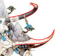
I told you, I don't know any. You've posted examples with no explanation - I see one image of the model where you've drawn rough pointed lines over the edges (including the curved parts of the outline) and a piece of Pathfinder art where instead you've followed the some of the curves. No explanation of the point you're trying to make, or why you drew the lines differently. Same with the silhouettes - what are we meant to conclude from them?
 Mothsniper wrote: Mothsniper wrote:
" Thing is you've got the sylvaneth up there who looks like a walking tentacle monster"
EXACTLY! and do you think that is a good design for sylvaneth? I think it is a very poor design based on the silhouette
So some of your examples are of good design, and others bad? Which ones are which? What makes them one or the other? You say "let's discuss" and then don't say anything.
(Here's where you can call me stupid, or just sarcastically imply it)
 Mothsniper wrote: Mothsniper wrote:
There is a concept of Busy vs calmn in a design, in art, sculpture, and music. It is important to have areas that are busy and areas that are calm in a design because that creates interest and attracts the eye and keep eye engaged longer.
Images, sculptures with good busy vs calm balance have stronger design than images, sculptures that do not have good busy vs calm balance.
I included a picture to illustrate the concept. If you are still of mind set that "rather than explaining the principles you say back up your point are not very convincing."
So explain your examples! Why did you draw those lines the way you did? What do they tell us about one design vs the other? Which of the silhouettes you posted are good examples and which are bad? Why? Surely you can provide a better explanation for why these things matter than "Left4Dead guy said so!"
You follow this curved line like this:
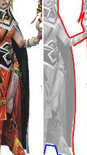
(I assume this is supposed to be an example of "calm"? You don't say)
But follow these lines like this:
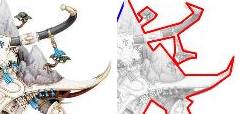
Why did you draw them like that, and not like this?
I don't already know myself, I went to school for other things. You come across like a 1st year Psychology student who takes one class and then thinks they can tell anyone in earshot about how they can analyze their every action and know exactly what they're thinking and why.
 Mothsniper wrote: Mothsniper wrote:
Then you are right, perhaps I need to study rhetoric, teaching, or basic social skills before I engage in a discussion with random people on a forum on ultimately a useless topic.
Politeness exists regardless of how important the subject of the conversation is. You can be an  discussing matters of philosophy just the same as you can be an  talking about what color of jellybeans you like the best. Doesn't matter how long you spent studying jellybean color.
 Mothsniper wrote: Mothsniper wrote:
It might be best to look at top dogs now - Disney, Starwars, Wow, ets and see what are they doing or done right with the design, and learn from.
So do that! Let's see it! If you want me to agree that you're correct about something, show me why I should. Your whole thread has just been "I'm right, anyone who disagrees is a fool, and figuring out what I'm talking about or how it applies is left as an exercise for the reader".
Now that you mention WoW, it actually brings up an interesting point of comparison:
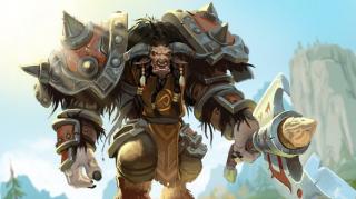
Is this better design? Why or why not?
EDIT: Added image examples
|
|
This message was edited 6 times. Last update was at 2020/09/22 04:02:01
|
|
|
 |
 |
![[Post New]](/s/i/i.gif) 2020/09/22 06:54:50
Subject: Elf Cow Warrior?
|
 |

Locked in the Tower of Amareo
|
 Mothsniper wrote: Mothsniper wrote:
Lets discuss readability of the silhouette. A good design will communicate to viewer in a split second at a quick glance if the "character" is good or bad strong or weak, fast or slow, ets. And lets discuss what the silhouette communicates. and why it is importnat. Because I already wrote why it is important, I hope we can discuss that.
So what in avalorn silhuette doesn't say "slow immobile bulwark" that the model is supposed to be?
|
2024 painted/bought: 109/109 |
|
|
 |
 |
![[Post New]](/s/i/i.gif) 2020/09/22 10:41:25
Subject: Re:Elf Cow Warrior?
|
 |

Decrepit Dakkanaut
UK
|
 Mothsniper wrote: Mothsniper wrote:
 Overread wrote: Overread wrote:Silhouettes are important in a 3D computergame like Left 4 Dead because the game involves dark regions and fast action. Ergo many times where the viewer is looking directly at the silhouette of things or an outline or just a quick glance. So within that context yes making them easy to tell apart makes the game fairer/easier/more accessible in being able to tell a human from a zombie.
Things like that don't really come into Warhammer games. Silhouette design isn't as important because its not a common thing you're going to encounter when interacting with the models.
Design is very rarely a case of ultimate concepts. Any creative design situation is comprised of multiple theories and concepts that vary in importance depending on the creative project. Often as not what you might identify as a weakness in one area of design could be a strength for another design theory.
Yes exactly. agree 100% That is what I was talking about the character design. It would of been silly of me to make same point and demand silhouettes that would translate to the tabletop.
And if we talk about the design for war gaming then my position on design here is absolutely irrelevant.
Though we discussed character design. Perhaps talking pass each other then.
I'm not really sure what you're talking about now. You seem to be discussing character design based on a photograph of the physical model. You seem to agree with me that in the tabletop world the silhouette isn't important, but that it is for the characters design. Yet the design you're holding up is the physical model viewed from one angle. So I'm not really sure what you're getting at at all. You seem to be jointly saying that it is and is not important. Or that its only important when we are looking at a photograph, which I'd argue is of a minor importance considering that most of us would be seeing a model and interacting with it (either our own or our opponents) on the tabletop.
 Mothsniper wrote: Mothsniper wrote:
 Overread wrote: Overread wrote:
As for silhouettes in general and the lack of a unified "good - bad" design structure - I don't see that as a negative at all. Multiple races in the setting are neither good nor bad in a general sense or understanding. Sylvaneth are neither good nor evil - in fact depending on your point of view they are both at once. If you're being attacked by chaos and the woods come alive to save you, they are good. If you're chopping away to harvest wood to build a home to protect your family and the woods come alive and want to have revenge on you, then they are bad.
I know that, but you must agree that there should be at least some sort of grouping. If everything is relative, then the orders have no purpose at all. Why then have Lumenith in Alliance or Order? I am not familiar with the lore but aren't the new aelfs like wielding crazy magical powers and destroying each other with crazy weapons? Why not put them in Alliance or Destruction with orks? Lets not get stuck on old tropes and concepts. Get rid of Grand Alliances all together and let players make up their own origins and pick their own traits for death, chaos, order, destruction. You could have evil Sigmar stormcasts, and noble goblins fighting for true faith! Seriously why not?
Because if there is no issue with that then there is no issue with silhouettes.
The problem here is you don't understand the lore so you're making connections which are not there. The "Grand Alliances" are not grouped on concepts of good - bad - evil - chaos. They are instead political alliances formed around ways of life. Grand Alliance Order is a collection of factions who all approach a sedentary way of life. The idea that they settle in a specific area, build up that area; improve that area and invest themselves in the betterment and extension of their territory. They build civilisations of a kind we, in the western developed world, would consider civilised.
Even the Sylvaneth are quite (if not very) sedentary; though their approach to land management is different to that of a Cities of Sigmar faction or a Khadoran. As such the armies within are formed of factions we'd consider good, neutral even evil. They will fight each other; plot against each other; you have death cults in Daughters of Khaine; Sylvaneth who will tear up anyone who harms their woods; Idoneth who actively prey on other factions for souls.
Yet those factions will also set aside their differences and stand united against Chaos.
DEATH meanwhile is a faction united by the insane control of Nagash. Each army (even the mad, uncontrollable Flesheaters) are controlled by Nagash. They represent the undead forces of the realms. There are many undead armies and factions who are not part of Nagash's domain and control and they are not apparent. Granted part of that is because he's conquering them left right and centre as much as he can (interestingly Skaven appear to be one of the few who are able to resist him). Each of the Death factions are united by the fact that they are ruled by Nagash; influenced by Nagash.
Destruction are those races who are not civilisation builders. They are more tribal and less likely to settle in one particular spot and make their home. They are more apt to roam the lands, settling in temporary camps and settlements before moving on. Every so often they'll form up into huge gatherings and form fortresses and the like. Their approach to life is different; they aren't ordered or civilised as a race. They aren't building and improving the land; they aren't drawing lines on maps (though they'll have territories). They have a different view on life. They will ally and stand with those factions in Order, just as Death will - when Chaos comes knocking; but they are far more likely to stand against the others. To drive forward their own agenda.
Chaos - is Chaos its the force of madness, magic chaos and ruination that wants to sweep over and corrupt all the lands to their will.
As you can see there is no simple good and evil. There isn't a unified aesthetic that each block should aspire too. Heck several models have stormcast helms on them including some Daughters of Khaine models (and they are in order; they have temples within the Cities of Sigmar).
 Mothsniper wrote: Mothsniper wrote:
 Overread wrote: Overread wrote:
Furthermore why limit design choices for a specific design in silhouette? Why can't the sylvaneth have writhing vines on their bodies? A vine is not a tentacle but in a silhouette the might be mistaken for each other; yet in colour and in the full 3D view you can see clearly that they are different.
That's just one example, another might be spikes - why should chaos only be allowed spikes when armies like, for example, Daughters of Khaine would also benefit from a spiky or bladed design choice.
I think the answer to that question is human psychology and how people view and and process shapes and colors. That is a good question, why Jafar instinctively, just based on the shape and color of his robe look like a cunning bad guy and the Sultan based on his color and shape look like a gullible good guy?
It might be best to look at top dogs now - Disney, Starwars, Wow, ets and see what are they doing or done right with the design, and learn from.
All in all, hope someone here will get so inspired in proving me wrong and go out and study design 
You're also overlooking that the appearance of those character is only one part of them. Jafar isn't evil just because he wears black and has angular edges to his form. His voice actor, his mannerisms, his actions create his evil nature. You could just as easily take him and change the voice, change the actions and have him as a good character. Disney creates concepts (like angular looks are evil) but they are purely fabrications of design ideas within their own construct. A theme that works for Disney but is not inherently "evil". It's just evil/bad in a Disney film.
Even that isn't unified, one of the bad characters in Toy Story is a fluffy pink bear.
|
|
|
|
 |
 |
![[Post New]](/s/i/i.gif) 2020/09/22 12:11:11
Subject: Elf Cow Warrior?
|
 |

Longtime Dakkanaut
|
why Jafar instinctively, just based on the shape and color of his robe look like a cunning bad guy
because of cultural expectations, there is nothing universal about the design being "evil". He was designed purely to fit what western culture trained you to think an "evil oriental" is supposed to look like, largely based on victorian stereotypes (because you can pretty much trace 90% of harmful western stereotypes to that blighted period)
|
|
|
 |
 |
![[Post New]](/s/i/i.gif) 2020/09/22 14:08:27
Subject: Elf Cow Warrior?
|
 |

Decrepit Dakkanaut
UK
|
He shares very similar designs to Scar, Rasputin, Maleficent, that witch out of the film where there's a llama and many other "evil" cartoon Disney characters.
Thin, angular character design, darker colour pallet, haughty and selfish mannerisms
It's an identity structure that Disney has built up over the years and repeated so you are partly trained to see the "evil". It's like how when the evil person appears in a pantomime the music changes and you're encouraged to boo and hiss. It's like how they might speak slightly differently etc... Plus all the actions they perform are "evil" very quickly.
There's nothing which culturally says thin people who wear darker clothes are evil, its just in Disney films.
|
|
|
|
 |
 |
![[Post New]](/s/i/i.gif) 2020/09/22 16:52:22
Subject: Elf Cow Warrior?
|
 |

Fixture of Dakka
|
 Tiberius501 wrote: Tiberius501 wrote:
Sorry, I don’t mean to claim how cows work in real life, I wouldn’t have a clue haha. I mean more in mythology. Looking at Celtic mythology, cows were a big part of their culture, and often viewed as strong and necessary creatures.
Maybe I am in the wrong here. But really there are so many noble animals or scary animals to pick from. Why not wolf elfs, tiger elfs, eagle elfs, boars are god damn scary up close and celtic too same with elks. Everything, but cows. I mean the only worse option would be mormots or hamster elfs.
Mountain lion elfs could be cool. Saber tooth mounted cavalery would be awesome. Automatically Appended Next Post: Cronch wrote:why Jafar instinctively, just based on the shape and color of his robe look like a cunning bad guy
because of cultural expectations, there is nothing universal about the design being "evil". He was designed purely to fit what western culture trained you to think an "evil oriental" is supposed to look like, largely based on victorian stereotypes (because you can pretty much trace 90% of harmful western stereotypes to that blighted period)
Sharp facial features are considered evil in every culture and holding the seat of a kings right hand always brings in the idea of a sneaky backstabber. If Jaffar liked to play the violoin he would be, minus the magic powers, a clone of Iskander Celebi
|
|
This message was edited 1 time. Last update was at 2020/09/22 16:57:06
If you have to kill, then kill in the best manner. If you slaughter, then slaughter in the best manner. Let one of you sharpen his knife so his animal feels no pain. |
|
|
 |
 |
![[Post New]](/s/i/i.gif) 2020/09/22 17:19:01
Subject: Elf Cow Warrior?
|
 |

Ollanius Pius - Savior of the Emperor
Gathering the Informations.
|
Because the Lumineth chose an animal that dwells on the mountainsides in the form of a buffalo called the 'Ymetrican Longhorn'. It's a beast said to be immortal, thus they felt it embodied the mountains best.
Seriously. This stuff is in the damn battletome. Phil Kelly talked about it in the livestream where they revealed the Alarith.
The Aelementari Temples? They're not about power for power's sake. It's Aelves who have given themselves over to Hysh's various genius loci to repair the damage that the Lumineth did during a time of war between the various Great Nations. Teclis' founding of the Temples is explained in great detail.
Go read it. Then come back to discuss it, Karol.
|
|
|
 |
 |
![[Post New]](/s/i/i.gif) 2020/09/22 17:32:55
Subject: Elf Cow Warrior?
|
 |

Perfect Shot Ultramarine Predator Pilot
|
I love the big cows, I'm a little iffy on the hammerers, but I'm going to be having the models in person soon. Perhaps my tune will chance with them in hand, like it did once I actually got to see Teclis, and could give him a less... cringing face like he just smelled something absolutely foul.
My biggest gripe of the Alarith release, was that it was, quite obviously, a very divisive portion of the army to release at first. The army already had hard lines drawn just off of it's Vanari troops, but such an odd/ unique design choice, both lore and model wise behind Alarith temple units, I feel it turned people away from Lumineth even more so.
Consider, had they released or designed an Aelementari temple that had more traditionally "Elven" sterotype designs FIRST instead of the cows, I feel the initial reception to Lumineth would have been brighter. Then, they can release the weird Cow army. While I do like them, one should recognize that they are pretty weird.
|
|
This message was edited 1 time. Last update was at 2020/09/22 17:34:08
 Skaven - 4500 Skaven - 4500
 OBR - 4250 OBR - 4250
 - 6800 - 6800
 - 4250 - 4250
 - 2750 - 2750 |
|
|
 |
 |
![[Post New]](/s/i/i.gif) 2020/09/22 17:35:52
Subject: Re:Elf Cow Warrior?
|
 |

Grumpy Longbeard
|
 Wasteland wrote: Wasteland wrote: Mothsniper wrote: Mothsniper wrote:
Can you please copy paste what I wrote that was condescending? Otherwise your point is not very convincing.
Sure. Here are some of my favorites:
I get it, you like it no matter how many times good design is broken down for you. And that is fine
But what do I know about good design, its not like studied it or anything.
4chan tier trash hahahaa, brilliant! I like you.
Looking forward to deep insightful addressing of the points made.
Oh well, I must go tell that to all 3D game devs who are into character design, guess they must stop using half-ratios because it is for 2D only.
Not balance or motion, why are you making up your own things to argue against? What I wrote was not clear enough?
Yes because the design rules I listed are my subjective manners. Learning something new about my self every day!
waita minute... I think I know what happened, lolz, .... I wonder... I would bet 50 good ol USofA deniros that newer models now go from 3D sketch to model without much of art direction.
Not balance or motion, why are you making up your own things to argue against? What I wrote was not clear enough?
No you must insist that design is perfect and no matter what I say your standard by what you will measure what I say is accurate or not, is your own perception
Is that a factual statement? Or can I dismiss it because it is subjective? lolz
I am so sorry for being so brain-dead dumb not to realize that 3D models can be viewed from a different angle! How stupid am I, to base my entire argument on something that can be so easily refuted... Don't i feel put back in my place now, shunts...
 Mothsniper wrote: Mothsniper wrote:
You know that the best way to put this condescending A-hole with no social skills, this prick with incoherent explanations who is calling everyone else stupid and disingenuous, this vile nobody with an attitude back into his place would be just to show design principals that prove my claims wrong.
I told you, I don't know any. You've posted examples with no explanation - I see one image of the model where you've drawn rough pointed lines over the edges (including the curved parts of the outline) and a piece of Pathfinder art where instead you've followed the some of the curves. No explanation of the point you're trying to make, or why you drew the lines differently. Same with the silhouettes - what are we meant to conclude from them?
 Mothsniper wrote: Mothsniper wrote:
" Thing is you've got the sylvaneth up there who looks like a walking tentacle monster"
EXACTLY! and do you think that is a good design for sylvaneth? I think it is a very poor design based on the silhouette
So some of your examples are of good design, and others bad? Which ones are which? What makes them one or the other? You say "let's discuss" and then don't say anything.
(Here's where you can call me stupid, or just sarcastically imply it)
 Mothsniper wrote: Mothsniper wrote:
There is a concept of Busy vs calmn in a design, in art, sculpture, and music. It is important to have areas that are busy and areas that are calm in a design because that creates interest and attracts the eye and keep eye engaged longer.
Images, sculptures with good busy vs calm balance have stronger design than images, sculptures that do not have good busy vs calm balance.
I included a picture to illustrate the concept. If you are still of mind set that "rather than explaining the principles you say back up your point are not very convincing."
So explain your examples! Why did you draw those lines the way you did? What do they tell us about one design vs the other? Which of the silhouettes you posted are good examples and which are bad? Why? Surely you can provide a better explanation for why these things matter than "Left4Dead guy said so!"
You follow this curved line like this:

(I assume this is supposed to be an example of "calm"? You don't say)
But follow these lines like this:

Why did you draw them like that, and not like this?

I don't already know myself, I went to school for other things. You come across like a 1st year Psychology student who takes one class and then thinks they can tell anyone in earshot about how they can analyze their every action and know exactly what they're thinking and why.
 Mothsniper wrote: Mothsniper wrote:
Then you are right, perhaps I need to study rhetoric, teaching, or basic social skills before I engage in a discussion with random people on a forum on ultimately a useless topic.
Politeness exists regardless of how important the subject of the conversation is. You can be an  discussing matters of philosophy just the same as you can be an  talking about what color of jellybeans you like the best. Doesn't matter how long you spent studying jellybean color.
 Mothsniper wrote: Mothsniper wrote:
It might be best to look at top dogs now - Disney, Starwars, Wow, ets and see what are they doing or done right with the design, and learn from.
So do that! Let's see it! If you want me to agree that you're correct about something, show me why I should. Your whole thread has just been "I'm right, anyone who disagrees is a fool, and figuring out what I'm talking about or how it applies is left as an exercise for the reader".
Now that you mention WoW, it actually brings up an interesting point of comparison:

Is this better design? Why or why not?
EDIT: Added image examples
NIce! Wow , Sorry I am still not convinced. Those seem to you condescending?! That is your personal issue mate, with perhaps childhood undressed guilt and adult established inadequacies lead you to take simple replies as insults.
Learning something about people everyday  Care to share more of who you are?
"I told you, I don't know any. You've posted examples with no explanation - I see one image of the model where you've drawn rough pointed lines over the edges (including the curved parts of the outline) and a piece of Pathfinder art where instead you've followed the some of the curves. No explanation of the point you're trying to make, or why you drew the lines differently. Same with the silhouettes - what are we meant to conclude from them? "
With no explanation? That post is a specific reply to a specific comment, it was an invitation to a discussion. I did not need to do detailed explanation in that picture example post as if I am talking to 5 year olds! That would be condescending.
"So some of your examples are of good design, and others bad? Which ones are which? What makes them one or the other? You say "let's discuss" and then don't say anything.
(Here's where you can call me stupid, or just sarcastically imply it) "
Yes lets discuss, and we are discussing what are stronger and what are weaker.
I don't say anything? LOLZ Are you kidding me man So if I just list them here ( Here ya go lads, these are good and these here are bad) I already know a reply that I will get, it will be something akin to - (Well to YOU those are good and bad, but not to me, and that is your personal opinion and don't act like you are king of design that holds authority to tell what is good and what is bad) That is not the discussion I want to have, because then I spend all the time establishing my credibility. And even if I do that will come off wrong and will achieve nothing. INSTEAD! the discussion is open and flowing, and organically we will come to some sort of conclusions in the end! Hopefully staying on topic and talk about points and not about people who are making the points. I will most defensively not engage a discussion how you think I should.
"(Here's where you can call me stupid, or just sarcastically imply it) "
I really hope you stop perceiving comments as personal insults, because that tells more about who you are than about what you think I am.
AND DON'T take this the wrong way again, I say it because that was my issue a while back. take it or leave, I don't really care
"So explain your examples! Why did you draw those lines the way you did? What do they tell us about one design vs the other? Which of the silhouettes you posted are good examples and which are bad? Why? Surely you can provide a better explanation for why these things matter than "Left4Dead guy said so!"
Left4Dead example is an outside reference out side of just saying things.
"(I assume this is supposed to be an example of "calm"? You don't say) "
You assume correctly
"Why did you draw them like that, and not like this? "
Why did I draw those lines very jagged? For same exact reason I drew lines jagged on the sorceress as well.
Lets have a discussion, Why do you think I drew jagged lines on both Spirit and Sorceress?
"I don't already know myself, I went to school for other things. You come across like a 1st year Psychology student who takes one class and then thinks they can tell anyone in earshot about how they can analyze their every action and know exactly what they're thinking and why. "
Am I being categorized now and demeaned? Let me take notes quick on this behavior for my second year of my Psychology degree!
"Politeness exists regardless of how important the subject of the conversation is. You can be an discussing matters of philosophy just the same as you can be an talking about what color of jellybeans you like the best. Doesn't matter how long you spent studying jellybean color. "
Get off your high horse! lolz are you a politeness police here to put me back into my place? Nothing I said was offensive, that does not mean that some people might still take offense to it, and that is not my problem but theirs.
/// Ima try to explain this - You see I am just sitting here and typing, YOU HAVE NO IDEA with what intent I am typing things, Infact, I can put an emoji  but you don't know if that is my honest intent or sarcastic! And when you read it (even though you have no idea my intent) you interpret what I wrote how you want it. Accurately or not.
Check your self before schooling me on politeness (dont take it the wrong way) ... dont take the ( dont take it the wrong way) the wrong way... 
"Now that you mention WoW, it actually brings up an interesting point of comparison: "
Yes it is much better design. Why? Many reasons and lets start with one.
It is not using same or half ratios, Want to overlay the rulers from the legs vs tors vs head and compare that the the Spirit?
Automatically Appended Next Post: tneva82 wrote: Mothsniper wrote: Mothsniper wrote:
Lets discuss readability of the silhouette. A good design will communicate to viewer in a split second at a quick glance if the "character" is good or bad strong or weak, fast or slow, ets. And lets discuss what the silhouette communicates. and why it is importnat. Because I already wrote why it is important, I hope we can discuss that.
So what in avalorn silhuette doesn't say "slow immobile bulwark" that the model is supposed to be?
I am sorry, what is avalorn?
|
|
This message was edited 1 time. Last update was at 2020/09/22 17:36:49
|
|
|
 |
 |
![[Post New]](/s/i/i.gif) 2020/09/22 17:38:36
Subject: Elf Cow Warrior?
|
 |

Decrepit Dakkanaut
UK
|
Thing is cows/bovines are noble. They just aren't "Western European" popular modern noble animals. As I've noted before cattle used to be the primary work animal for many farms for generations; most farmers could never afford a horse and until they were bred for it; many weren't suited to hard labour. We had cattle for that work.
Head to India and the cow is a revered animal.
Also the whole concept of animals having nobility etc... is purely human constructs. Wolves are no more loyal, noble, righteous or such; just like hyenas are no more low, filthy and scavengers (heck lions scavenge from hyena kills all the time)
|
|
|
|
 |
 |
|
|
|