| Author |
Message |
 |
|
|
|
|
Advert
|
Forum adverts like this one are shown to any user who is not logged in. Join us by filling out a tiny 3 field form and you will get your own, free, dakka user account which gives a good range of benefits to you:
- No adverts like this in the forums anymore.
- Times and dates in your local timezone.
- Full tracking of what you have read so you can skip to your first unread post, easily see what has changed since you last logged in, and easily see what is new at a glance.
- Email notifications for threads you want to watch closely.
- Being a part of the oldest wargaming community on the net.
If you are already a member then feel free to login now. |
|
 |
2020/09/22 17:48:48
Subject: Elf Cow Warrior?
|
|

Ollanius Pius - Savior of the Emperor
Gathering the Informations.
|
 Thadin wrote: Thadin wrote:I love the big cows, I'm a little iffy on the hammerers, but I'm going to be having the models in person soon. Perhaps my tune will chance with them in hand, like it did once I actually got to see Teclis, and could give him a less... cringing face like he just smelled something absolutely foul.
My biggest gripe of the Alarith release, was that it was, quite obviously, a very divisive portion of the army to release at first. The army already had hard lines drawn just off of it's Vanari troops, but such an odd/ unique design choice, both lore and model wise behind Alarith temple units, I feel it turned people away from Lumineth even more so.
Consider, had they released or designed an Aelementari temple that had more traditionally "Elven" sterotype designs FIRST instead of the cows, I feel the initial reception to Lumineth would have been brighter. Then, they can release the weird Cow army. While I do like them, one should recognize that they are pretty weird.
If they had done River(which seem to be swordsmen) or Wind(which seem to be mounted archers)? I don't expect things would have necessarily sold as well as something all new would. Plus, River's Aelementari 'Avatar' is supposed to be formed from water and would have felt too Idoneth-y. Wind has a 'fox-faced spirit' with a massive bow and 'streamers of cloth' that would have possibly felt too Wood Elf-y.
If it's truly the Aelementari Temple bit throwing people off, it wouldn't matter which Temple got released because they'd be consistent in their criticisms...but let's be real here, it's the memey nonsense from people like the OP. "cOw eLvEs?! loooooooool" doesn't help matters any. I've linked the relevant stuff in the past, not doing it again. There's two good videos with Phil Kelly discussing the lore of the Lumineth. It's easy enough for people to find and it's on the Warhammer Community page plus their Twitch stream("From Aelves to Zoats"-- LVO show) free to watch.
The Vanari are cross-faction, effectively, since they are both Tyrionic and Teclian. They're across all of the Great Nations. The Aelementari Temples? They're a Teclian thing. The Tyrionic nations are said to have some more 'traditional' stuff in the form of scouts, chariots, and warmachines while the Teclian ones have Aelementari Temples.
Ymetrica(Teclis' 'homebase', so to speak) is the Great Nation where Teclis basically founded the Aelementari Temples and is closely associated with the Alarith.
|
|
|
 |
|
2020/09/22 18:02:24
Subject: Re:Elf Cow Warrior?
|
|
Grumpy Longbeard
|
 Overread wrote: Overread wrote:Silhouettes are important in a 3D computergame like Left 4 Dead because the game involves dark regions and fast action. Ergo many times where the viewer is looking directly at the silhouette of things or an outline or just a quick glance. So within that context yes making them easy to tell apart makes the game fairer/easier/more accessible in being able to tell a human from a zombie.
"I'm not really sure what you're talking about now."
I feel like I need to define character design, otherwise ARE talking pass each other
"The problem here is you don't understand the lore so you're making connections which are not there. The "Grand Alliances" are not grouped on concepts of good - bad - evil - chaos. They are instead political alliances formed around ways of life. Grand Alliance Order is a collection of factions who all approach a sedentary way of life. The idea that they settle in a specific area, build up that area; improve that area and invest themselves in the betterment and extension of their territory. They build civilisations of a kind we, in the western developed world, would consider civilised.
Even the Sylvaneth are quite (if not very) sedentary; though their approach to land management is different to that of a Cities of Sigmar faction or a Khadoran. As such the armies within are formed of factions we'd consider good, neutral even evil. They will fight each other; plot against each other; you have death cults in Daughters of Khaine; Sylvaneth who will tear up anyone who harms their woods; Idoneth who actively prey on other factions for souls. "
Then that is even worse than I though lolz. That is then extremely misleading to new folk or to anyone who did not dive into the lore! So there is a bad design at the root, interesting. Everything makes sense now!
"As you can see there is no simple good and evil. There isn't a unified aesthetic that each block should aspire too. Heck several models have stormcast helms on them including some Daughters of Khaine models (and they are in order; they have temples within the Cities of Sigmar)"
Yes I see now. I did not know that AoS as a whole Sucked this much - Now this is a personal opinion, feel free to disregard it as insignificant!
That is some poor story and character development - Now this is not a personal opinion, feel free to explain to how a fantasy with no clear good/evil is more engaging than a fantasy with good/evil, lets say lord of the rings.
Now this kidna makes me want to leave the hobby. If all is so relative then I can't really get exited for anyone, everyone equally suck 
"You're also overlooking that the appearance of those character is only one part of them. Jafar isn't evil just because he wears black and has angular edges to his form. His voice actor, his mannerisms, his actions create his evil nature. You could just as easily take him and change the voice, change the actions and have him as a good character. Disney creates concepts (like angular looks are evil) but they are purely fabrications of design ideas within their own construct. A theme that works for Disney but is not inherently "evil". It's just evil/bad in a Disney film.
Even that isn't unified, one of the bad characters in Toy Story is a fluffy pink bear. "
Wait, you truly believe that if Jafar looked like Sultan it would of been just the same, and it does not matter how the character looks at all because the voice actor is all that matters in a character?
Now that is purely subjective opinion. And is absolutely wrong based on the fact how brain processes shapes and colors.
You will deny that "shape and color of his robe look like a cunning bad guy"
At this point we are talking pass eachother.
Automatically Appended Next Post:
Cronch wrote:why Jafar instinctively, just based on the shape and color of his robe look like a cunning bad guy
because of cultural expectations, there is nothing universal about the design being "evil". He was designed purely to fit what western culture trained you to think an "evil oriental" is supposed to look like, largely based on victorian stereotypes (because you can pretty much trace 90% of harmful western stereotypes to that blighted period)
Yes, and that proves my point even more.
wait, (because you can pretty much trace 90% of harmful western stereotypes to that blighted period)
Victorian? really? Like mid 1800, like Napoleon time? trained western culture to think what evil looks like?
|
|
This message was edited 2 times. Last update was at 2020/09/22 20:13:53
|
|
|
|
|
2020/09/22 18:09:09
Subject: Elf Cow Warrior?
|
|

Perfect Shot Ultramarine Predator Pilot
|
I think it's more a matter of familiarity, as opposed to it being 'too similar' to other armies, in my mind.
Wood Elves are... just about entirely gone, I don't think their identity, what little remains, would be infringed upon by a High Elf classic, redesigned brilliantly, in the Horseback archers. Fox spirit, with the armor design motifs of Lumineth, wouldn't look too similar to what Wood Elves have, which tend to be more natural appearances.
They could have started with Water too. The only thing connecting them to Idoneth would be... being wet, and being elves. Idoneth use sea creatures, for the most part. I think there's enough design space to release a water elemental style monster, that would be suitably different from an Eidolon. Lean more to the monsterous side of an elemental, and I think that'd be good.
Though, this is just my opinion on how I feel GW could have done better on drawing people in to playing Lumineth to start off with. Release things that are comfortable to players, not too terribly offensive. There are plenty of people who just don't like the Alarith designs, beyond the meme-reasons. I was almost one of them, before I took time to warm up to it's design.
Ultimately, it doesn't matter to either of us. We both like the designs, and (myself atleast) are buying in to the army. I'm trying to consider the perspectives of others who didn't like the Alarith release.
|
 Skaven - 4500 Skaven - 4500
 OBR - 4250 OBR - 4250
 - 6800 - 6800
 - 4250 - 4250
 - 2750 - 2750 |
|
|
|
|
2020/09/22 18:16:17
Subject: Re:Elf Cow Warrior?
|
|

Decrepit Dakkanaut
UK
|
 Mothsniper wrote: Mothsniper wrote:
Yes I see now. I did not know that AoS as a whole Sucked this much - Now this is a personal opinion, feel free to disregard it as insignificant!
That is some poor story and character development - Now this is not a personal opinion, feel free to explain to how a fantasy with no clear good/evil is more engaging than a fantasy with good/evil, lets say lord of the rings.
Now this kidna makes me want to leave the hobby. If all is so relative then I can't really get exited for anyone, everyone equally suck
There's nothing wrong with heroic style fantasy with good VS evil just as there is nothing wrong with "grey" where it might not be good vs evil. Game of Thrones, Malazan Book of the Fallen - there are loads of stories where its not your classic "Good VS Evil" setup. Even the Old World wasn't that. Bretonnia wasn't "good" it just wasn't orks or dark elves or chaos. Good in warhammer games has always been variable depending on your chosen army and point of view.
Mothsniper wrote:
Wait, you truly believe that if Jafar looked like Sultan it would of been just the same, and it does not matter how the character looks at all because the voice actor is all that matters in a character?
Now that is purely subjective opinion. And is absolutely wrong based on the fact how brain processes shapes and colors.
You will deny that "shape and color of his robe look like a cunning bad guy"
At this point we are talking pass eachother.
More or less the actions a character makes defines a character and establishes visual tropes. If all the angular characters with dark robes do evil things then dark robes and angular characters appear evil. If all the evil characters were jolly and fat with beards then - yep - that would become how "evil" looks. As I noted Disney establishes style within itself. There's no reason that those styles have to carry over into other genres and IPs. There's no reason that black and dark red are "evil" colours more evil than blue or white.
Mothsniper wrote:
Cronch wrote:why Jafar instinctively, just based on the shape and color of his robe look like a cunning bad guy
because of cultural expectations, there is nothing universal about the design being "evil". He was designed purely to fit what western culture trained you to think an "evil oriental" is supposed to look like, largely based on victorian stereotypes (because you can pretty much trace 90% of harmful western stereotypes to that blighted period)
Yes, and that proves my point even more.
wait, (because you can pretty much trace 90% of harmful western stereotypes to that blighted period)
Victorian? really? Like mid 1800, like Napoleon time? trained western culture to think what evil looks like?
Cronch is more referring to the western stylised impressions (visual and behavioural) of foreigners. So its not "good and evil" more a case of how one might perceive other cultures in a negative way. And that topic is far more complex and in depth than we can likely go here.
|
|
|
|
|
|
2020/09/22 18:17:59
Subject: Elf Cow Warrior?
|
|
Ollanius Pius - Savior of the Emperor
Gathering the Informations.
|
That's fair, but at this point? I don't think GW should do things that are 'comfortable' for AoS when first dropping an army. We had that with the initial AoS launch and it just seemed like it wasn't that great. It wasn't until we started seeing stuff like the Idoneth, Kharadron, etc that I feel that we really saw the setting start to feel different than just WHFB 2.0. Even Stormcast alone weren't really that different. I have a hard time, personally, with anyone saying "I just don't like the Alarith designs"--because it inevitably comes down to "Elfs shouldn't have hammers!" or "Cows aren't scary!" kind of nonsense.  That Aelf in the front with the greatsword? That's our 'first look', seemingly, at a River Temple Aelementari. I genuinely do not feel like that model would have stirred up anything near this level of discussion or interest for me.
|
|
This message was edited 1 time. Last update was at 2020/09/22 18:21:31
|
|
|
|
|
2020/09/22 18:23:25
Subject: Elf Cow Warrior?
|
|
Decrepit Dakkanaut
UK
|
I think the Cow Aelves are also seeing GW not so much tipping the boat of fantasy, but more reaching out to other cultural backgrounds and not just the western fantasy approach.
So we are seeing units that are perhaps inspired by Indian folk lore and stories not just King Arthur and Lord of the Rings. Which is honestly a great thing. We could do with more such influences and I hope AoS continues to explore them.
|
|
|
|
|
|
2020/09/22 18:26:05
Subject: Elf Cow Warrior?
|
|
Grumpy Longbeard
|
Overread wrote:He shares very similar designs to Scar, Rasputin, Maleficent, that witch out of the film where there's a llama and many other "evil" cartoon Disney characters.
Thin, angular character design, darker colour pallet, haughty and selfish mannerisms
It's an identity structure that Disney has built up over the years and repeated so you are partly trained to see the "evil". It's like how when the evil person appears in a pantomime the music changes and you're encouraged to boo and hiss. It's like how they might speak slightly differently etc... Plus all the actions they perform are "evil" very quickly.
There's nothing which culturally says thin people who wear darker clothes are evil, its just in Disney films.
I disagree, because the artist that was drawing it was not thinking - "Oh, we are so confused and no one knows what evil should look like, let me invent a new way of how evil shall be viewed, Yeah, this guy looks evil enough"
No, the artist came up with a design that works from his own pre-disney identity structure that was already there, that is the way brain processes shapes and colors before disney identity structure, before medieval times identity structure, back in mythology identity structure there are color and shapes that are assigned to good and evil.
"There's nothing which culturally says thin people who wear darker clothes are evil, its just in Disney films. "
So when I say lets look at the big dogs and see what they did right you make a case that Disney is wrong in their design of Jafar? Because you claim that it doesn't not matter what the bad guy looks like, because it is all relative.
They could of made him short fat and fluffy with light clothes and achieved same response from the audience? That is provably untrue because humans do react to different colors and shapes psychologically beyond "cultural biases" Because if they didn't then there would be no advertising industry.
Colors and shapes do work, and it does matter what color and what shape goes on a character that suppose to be good, bad, sneaky, tweaky, weak, strong, ets.
You are mistaking reinforcing existing identity structure with partly trained to see new identity structure Disney invented. They did not invent it, they use it because it works. Automatically Appended Next Post: Thadin wrote:I love the big cows, I'm a little iffy on the hammerers, but I'm going to be having the models in person soon. Perhaps my tune will chance with them in hand, like it did once I actually got to see Teclis, and could give him a less... cringing face like he just smelled something absolutely foul.
My biggest gripe of the Alarith release, was that it was, quite obviously, a very divisive portion of the army to release at first. The army already had hard lines drawn just off of it's Vanari troops, but such an odd/ unique design choice, both lore and model wise behind Alarith temple units, I feel it turned people away from Lumineth even more so.
Consider, had they released or designed an Aelementari temple that had more traditionally "Elven" sterotype designs FIRST instead of the cows, I feel the initial reception to Lumineth would have been brighter. Then, they can release the weird Cow army. While I do like them, one should recognize that they are pretty weird.
Man, honestly they could of made something cool with cow theme troops. Like my first image with Hindu holly cows, that would of been an awesome Urumi style Elf cow warriors or Charkum throwers style Elf cow warriors.
|
|
This message was edited 1 time. Last update was at 2020/09/22 18:32:53
|
|
|
|
|
2020/09/22 18:33:10
Subject: Elf Cow Warrior?
|
|
Decrepit Dakkanaut
UK
|
You're overlooking how often marketing has changed over the generations and even country to country. For example, its currently seen as less attractive to be overweight in the UK. Yet if you go to many African nations being overweight is seen as an attractive quality.
Marketing takes it to the extreme, but at the same time it doesn't just follow trends, it aims to define them. Look at how they've steadily shifted advertising to women especially with lots of "nip and tuck" in photoshop to the point where the women shown are near impossible in proportions.
Marketing creates constructs; those constructs might be based on a period in time and impressions of a generation or two; however after a time they stop following and start leading and defining. Until things change and new generations come along with a new and different perspective.
Being angular isn't inherently making one evil, if that were the case thin, angular shaped people would be hated and driven out of communities. Meanwhile we'd be marrying and nurturing and raising our children to be bearded and somewhat overweight.
Again how a character acts defines them greatly in a series. The fat jolly sultan is fat and jolly because of his looks and his actions. You can equally have fat and horrible characters (the Baron from Dune). Colour and shape works, but it requires contextual information and situational information and often as not it might be a simply supporting part not a defining part.
|
|
|
|
|
|
2020/09/22 18:38:08
Subject: Elf Cow Warrior?
|
|
Grumpy Longbeard
|
Overread wrote:Thing is cows/bovines are noble. They just aren't "Western European" popular modern noble animals. As I've noted before cattle used to be the primary work animal for many farms for generations; most farmers could never afford a horse and until they were bred for it; many weren't suited to hard labour. We had cattle for that work.
Head to India and the cow is a revered animal.
Also the whole concept of animals having nobility etc... is purely human constructs. Wolves are no more loyal, noble, righteous or such; just like hyenas are no more low, filthy and scavengers (heck lions scavenge from hyena kills all the time)
"Also the whole concept of animals having nobility etc... is purely human constructs."
OMG lolz is everything relative to you?
This is a FANTASY! yes in a fantasy I want this warrior to be good and this one to be bad, this animal to be noble and this one to be low.
I see your argument, and it is absolutely boring! Even in good ol boring real life not everything is relative and subjective.
|
|
|
|
|
|
2020/09/22 18:41:00
Subject: Elf Cow Warrior?
|
|
Decrepit Dakkanaut
UK
|
Mothsniper wrote: Overread wrote:Thing is cows/bovines are noble. They just aren't "Western European" popular modern noble animals. As I've noted before cattle used to be the primary work animal for many farms for generations; most farmers could never afford a horse and until they were bred for it; many weren't suited to hard labour. We had cattle for that work.
Head to India and the cow is a revered animal.
Also the whole concept of animals having nobility etc... is purely human constructs. Wolves are no more loyal, noble, righteous or such; just like hyenas are no more low, filthy and scavengers (heck lions scavenge from hyena kills all the time)
"Also the whole concept of animals having nobility etc... is purely human constructs."
OMG lolz is everything relative to you?
This is a FANTASY! yes in a fantasy I want this warrior to be good and this one to be bad, this animal to be noble and this one to be low.
I see your argument, and it is absolutely boring! Even in good ol boring real life not everything is relative and subjective.
Think of it like this -
why is a wolf loyal
Why is a lion nobel
Why is a hyena disloyal
Why is an owl wise
Fun fact see I put wolf in there; go back 100 years and the wolf was far from loyal, it was big and bad. It wasn't noble, loyal, wild and free. It was vicious and monstrous and horrible and evil. It's eyes the colour of the devil so much so it features in dozens of folk tales and stories. Go back far enough and the wolf was so hated and feared in the UK that we wiped them out.
Today we see the wolf as a symbol of nature, of restoration and balance; back then it was a monster.
Second fun fact - owls are generally regarded to be not as high up the wisdom nor intelligence scale as quite a few other birds. Parrots and corvids have them beaten quite soundly and quite a few other raptors are generally considered smarter/easier to train*
So yes its relative.
*though one must be careful since being easy to train does not always correspond to being "smarter".
|
|
This message was edited 1 time. Last update was at 2020/09/22 18:44:35
|
|
|
|
|
2020/09/22 18:41:23
Subject: Elf Cow Warrior?
|
|
Perfect Shot Ultramarine Predator Pilot
|
There are plenty of reasons why someone may not like a design, and you boiling it down to 'nonsense' why they don't like it is reductive, and needlessly confrontational. Just because you like it doesn't mean it should be liked by everyone else. Personal preference and all that.
However, the people who feel passionately enough about them do seem to come on to forums quite loudly about how it's a bad design or something or another... I Don't Like it =/= Bad Design
I blame forum/internet culture about it. The people I talk to in person who don't like it, merely say that it's not for them, or something along those lines.
|
Skaven - 4500
OBR - 4250
- 6800
- 4250
- 2750 |
|
|
|
|
2020/09/22 18:56:29
Subject: Elf Cow Warrior?
|
|
Ollanius Pius - Savior of the Emperor
Gathering the Informations.
|
Thadin wrote:There are plenty of reasons why someone may not like a design, and you boiling it down to 'nonsense' why they don't like it is reductive, and needlessly confrontational. Just because you like it doesn't mean it should be liked by everyone else. Personal preference and all that.
However, the people who feel passionately enough about them do seem to come on to forums quite loudly about how it's a bad design or something or another... I Don't Like it =/= Bad Design
I blame forum/internet culture about it. The people I talk to in person who don't like it, merely say that it's not for them, or something along those lines.
It's not even 'forum/internet culture'. It's fandom culture at this point. You're right that I might be a bit reductive or confrontational about it...but I have yet to ever hear anyone say "I read the fluff/watched Phil Kelly explain the lore. I don't like the models, but the concept is interesting" or anything of that nature. It just keeps being the same constant refrain of "LOLZ COWELFS?" or folks like the OP, who just seem to want to bandwagon onto the hate-train while adding nothing of substance to the discussion.
|
|
|
|
|
2020/09/22 18:56:51
Subject: Elf Cow Warrior?
|
|
Grumpy Longbeard
|
Overread wrote:You're overlooking how often marketing has changed over the generations and even country to country. For example, its currently seen as less attractive to be overweight in the UK. Yet if you go to many African nations being overweight is seen as an attractive quality.
Marketing takes it to the extreme, but at the same time it doesn't just follow trends, it aims to define them. Look at how they've steadily shifted advertising to women especially with lots of "nip and tuck" in photoshop to the point where the women shown are near impossible in proportions.
Marketing creates constructs; those constructs might be based on a period in time and impressions of a generation or two; however after a time they stop following and start leading and defining. Until things change and new generations come along with a new and different perspective.
Being angular isn't inherently making one evil, if that were the case thin, angular shaped people would be hated and driven out of communities. Meanwhile we'd be marrying and nurturing and raising our children to be bearded and somewhat overweight.
Again how a character acts defines them greatly in a series. The fat jolly sultan is fat and jolly because of his looks and his actions. You can equally have fat and horrible characters (the Baron from Dune). Colour and shape works, but it requires contextual information and situational information and often as not it might be a simply supporting part not a defining part.
"Yet if you go to many African nations being overweight is seen as an attractive quality. "
First of all I was taking about VISUAL DESIGN for the advertisement, like colors and shapes, because are talking about visual design here and not about marketing. You are arguing against your own points again that I did not make.
And wait- "Yet if you go to many African nations being overweight is seen as an attractive quality. "
Is that a fact? I think you are wrong in this.
Are you sure about that? Now I have a friend from Nigeria, and if I ask him about that what do you think he will tell me?
"Marketing takes it to the extreme, but at the same time it doesn't just follow trends, it aims to define them. Look at how they've steadily shifted advertising to women especially with lots of "nip and tuck" in photoshop to the point where the women shown are near impossible in proportions. "
Marketing towards women? what are you talking about? Who has ever made a point that TRENDS stay the same, I am talking about colors and shapes? I am talking about VISUAL advertisements not marketing tactics or trends.
"
Marketing creates constructs; those constructs might be based on a period in time and impressions of a generation or two; however after a time they stop following and start leading and defining. Until things change and new generations come along with a new and different perspective.
Being angular isn't inherently making one evil, if that were the case thin, angular shaped people would be hated and driven out of communities. Meanwhile we'd be marrying and nurturing and raising our children to be bearded and somewhat overweight.
Again how a character acts defines them greatly in a series. The fat jolly sultan is fat and jolly because of his looks and his actions. You can equally have fat and horrible characters (the Baron from Dune). Colour and shape works, but it requires contextual information and situational information and often as not it might be a simply supporting part not a defining part. "
Why are you talking about acting? we are on a topic of visual design of shapes and colors.
"The fat jolly sultan is fat and jolly because of his looks and his actions."
So his looks are important?
"You can equally have fat and horrible characters (the Baron from Dune)."
Vat are ya talking about? Baron does not look like Sultan! He looks like fat Jafar with back and red, thank you for proving my point!
"Colour and shape works, but it requires contextual information and situational information"
Wrong, A Bag of chips does not contextual information or situational information to attract a customer with shape and color
" often as not it might be a simply supporting part not a defining part"
I would love to see you actually prove that
|
|
|
|
|
|
2020/09/22 19:00:29
Subject: Elf Cow Warrior?
|
|
Perfect Shot Ultramarine Predator Pilot
|
You should take a break. At this point you're maliciously misconstruing points just to keep an argument going.
|
Skaven - 4500
OBR - 4250
- 6800
- 4250
- 2750 |
|
|
|
|
2020/09/22 19:01:22
Subject: Elf Cow Warrior?
|
|
Ollanius Pius - Savior of the Emperor
Gathering the Informations.
|
Overread wrote:I think the Cow Aelves are also seeing GW not so much tipping the boat of fantasy, but more reaching out to other cultural backgrounds and not just the western fantasy approach.
So we are seeing units that are perhaps inspired by Indian folk lore and stories not just King Arthur and Lord of the Rings. Which is honestly a great thing. We could do with more such influences and I hope AoS continues to explore them.
Kelly talked about it being more an extension of the 'genius loci' concept. Where a place is given an identity. The Ymetrican Longhorn is a cow, the Alarith temple was founded on a mountainside. The Longhorn is considered effectively immortal(some comment was made about the horns needing to be removed for the beast to actually perish? something of that nature) and only dwells in the mountains of Hysh. It would make sense then that they start styling themselves after a beast tied to it.
|
|
|
|
|
2020/09/22 19:05:07
Subject: Elf Cow Warrior?
|
|
Grumpy Longbeard
|
 Kanluwen wrote: Kanluwen wrote: Thadin wrote:There are plenty of reasons why someone may not like a design, and you boiling it down to 'nonsense' why they don't like it is reductive, and needlessly confrontational. Just because you like it doesn't mean it should be liked by everyone else. Personal preference and all that.
However, the people who feel passionately enough about them do seem to come on to forums quite loudly about how it's a bad design or something or another... I Don't Like it =/= Bad Design
I blame forum/internet culture about it. The people I talk to in person who don't like it, merely say that it's not for them, or something along those lines.
It's not even 'forum/internet culture'. It's fandom culture at this point. You're right that I might be a bit reductive or confrontational about it...but I have yet to ever hear anyone say "I read the fluff/watched Phil Kelly explain the lore. I don't like the models, but the concept is interesting" or anything of that nature. It just keeps being the same constant refrain of "LOLZ COWELFS?" or folks like the OP, who just seem to want to bandwagon onto the hate-train while adding nothing of substance to the discussion.
Not the original response get in line!
Inquisitor Gideon
(As much as you talk about good and bad design, this does come off more as a whine/troll thread. You haven't posted anything worth discussing as of yet.)
"bandwagon onto the hate-train while adding nothing of substance to the discussion"
It is fascinating to read your crit of the OP.
Would love to hear your crit of the design problems brought up in the discussion about Cygor in Elven armor.
Otherwise it is It's fandom culture around the lore.
|
|
|
|
|
|
2020/09/22 19:09:20
Subject: Elf Cow Warrior?
|
|
Decrepit Dakkanaut
UK
|
Mothsniper you keep jumping around like mad whenever someone makes a point. You openly start talking about marketing and advertising then shoot someone down for talking about marketing and advertising.
Besides you're also not clear if your issue is with the concept of the sculpt; the design of the sculpt or GWs chosen angle of the photograph to market the sculpt (which in turn is talking about the sculpt itself). You need to settle and make your points clearer and then slow down as you read the counter arguments and points being made
|
|
|
|
|
|
2020/09/22 19:41:48
Subject: Re:Elf Cow Warrior?
|
|
Ollanius Pius - Savior of the Emperor
Gathering the Informations.
|
Cygor:

Alarith, Spirit of the Mountain:

These things do not look similar beyond broadstrokes.
They both have hoofed feet, are bipedal, have arms, and have horns.
The Cygor:
Grotesquely muscular, unkempt(cracked horns and the 'fur' on the back is matted with blood per the fluff so that it stands straight up like that), crude coverings and improvised weapons. Even the pose itself is more 'feral', with its positioning being more aggressive than intelligent.
Spirit of the Mountain:
Lithe rather than muscular. Well-constructed armor and weapons with banners and streamers coming from the armor and decoration on the armor and weapons. Even its fur is well-'groomed' despite the whole thing being a construct built for a spirit to inhabit rather than an actual flesh and blood creature. The horns have been decorated as well.
In no way, shape, or form are these two things comparable beyond 'they have horns, stand up on two hoofed feet, and have arms that clutch things'.
|
|
|
|
|
2020/09/22 19:54:45
Subject: Elf Cow Warrior?
|
|
Grumpy Longbeard
|
Overread wrote:Mothsniper you keep jumping around like mad whenever someone makes a point. You openly start talking about marketing and advertising then shoot someone down for talking about marketing and advertising.
Besides you're also not clear if your issue is with the concept of the sculpt; the design of the sculpt or GWs chosen angle of the photograph to market the sculpt (which in turn is talking about the sculpt itself). You need to settle and make your points clearer and then slow down as you read the counter arguments and points being made
Calling me mad? I was hoping to get called something bit more creative 
"You openly start talking about marketing and advertising"
I openly talked about Advertising, visual advertising, in context of color and shapes and design that we are discussing.
You go off tangent into marketing and what trends target each group then you are going off topic!
I know ti is hard to stay on topic of advertising, and tempting to go off into all kinds of related subjects like marketing and trends.
"Besides you're also not clear if your issue is with the concept of the sculpt; the design of the sculpt or GWs chosen angle of the photograph to market the sculpt (which in turn is talking about the sculpt itself). You need to settle and make your points clearer and then slow down as you read the counter arguments and points being made "
Then let me repeat my self. Bad design is my issue wit the concept and the sculpt.
"You need to settle and make your points clearer and then slow down as you read the counter arguments and points being made "
I will try, hope you can try to stay on topic next time  Automatically Appended Next Post:
 Kanluwen wrote:Cygor:
Alarith, Spirit of the Mountain:
These things do not look similar beyond broadstrokes.
They both have hoofed feet, are bipedal, have arms, and have horns.
The Cygor:
Grotesquely muscular, unkempt(cracked horns and the 'fur' on the back is matted with blood per the fluff so that it stands straight up like that), crude coverings and improvised weapons. Even the pose itself is more 'feral', with its positioning being more aggressive than intelligent.
Spirit of the Mountain:
Lithe rather than muscular. Well-constructed armor and weapons with banners and streamers coming from the armor and decoration on the armor and weapons. Even its fur is well-'groomed' despite the whole thing being a construct built for a spirit to inhabit rather than an actual flesh and blood creature. The horns have been decorated as well.
In no way, shape, or form are these two things comparable beyond 'they have horns, stand up on two hoofed feet, and have arms that clutch things'.
Yes, and that is the problem! the broadstrokes! Because broadstrokes is the most important in the design.
"In no way, shape, or form are these two things comparable beyond 'they have horns, stand up on two hoofed feet, and have arms that clutch things'."
Yes, They have horns, stand up on two hoofed feet, Did I not outline that from beginning?
"For me bigger problem is that I just do not understand a thematic connection of a Beatmen upright cow with the "High-Elfs" I know they are not HighElfs, yet they LOOK like they are kin. "
"I was talking about Thematic connection of a Cygor draped in Elven armor. "
"I saw the unit and was like,,, Are Elfs and beast men are now allies on this new unit? "
|
|
This message was edited 1 time. Last update was at 2020/09/22 20:09:26
|
|
|
|
|
2020/09/22 20:09:43
Subject: Re:Elf Cow Warrior?
|
|
Cackling Chaos Conscript
|
Mothsniper wrote:
NIce! Wow , Sorry I am still not convinced. Those seem to you condescending?! That is your personal issue mate, with perhaps childhood undressed guilt and adult established inadequacies lead you to take simple replies as insults.
Learning something about people everyday Care to share more of who you are?
Cmon mate, this is DakkaDakka. We all know smartass insulting comments when we see them. Don't play dumb.
Mothsniper wrote:
"Why did you draw them like that, and not like this? "
Why did I draw those lines very jagged? For same exact reason I drew lines jagged on the sorceress as well.
Lets have a discussion, Why do you think I drew jagged lines on both Spirit and Sorceress?
Look, I'm not doing your homework for you. I'm not just gonna guess at what point you're trying to make. If you want someone to agree with you, you have to tell them why. You bounce back and forth between "these concepts are so simple that explaining them would be condescending to a five-year-old" and "You obviously can't understand such advanced concepts without all the schooling I've had!".
Mothsniper wrote:
Get off your high horse! lolz are you a politeness police here to put me back into my place? Nothing I said was offensive, that does not mean that some people might still take offense to it, and that is not my problem but theirs.
If something's offensive, it's because it's "something that offends". As you say below, we can't know what you're actually thinking, we just have your words to go on. If you say something that causes offense, what else are we to assume other than that you're trying to be offensive? Especially when you do it over and over, after multiple people leave comments to the effect of "dude, you're being offensive". Don't pretend to be so naive that you don't know how your comments come across. Everyone here (you included) knows exactly what you're doing.
Mothsniper wrote:
Ima try to explain this - You see I am just sitting here and typing, YOU HAVE NO IDEA with what intent I am typing things, Infact, I can put an emoji  but you don't know if that is my honest intent or sarcastic! And when you read it (even though you have no idea my intent) you interpret what I wrote how you want it. Accurately or not.
Check your self before schooling me on politeness (dont take it the wrong way) ... dont take the ( dont take it the wrong way) the wrong way...
See, this is the whole crux of the issue people have with your posts. If you want someone to understand what you're saying, and convince them you're correct, the onus is on you to make yourself understood. If you come across as a sarcastic  , you can be 100% right and still no one will want to listen to you. All communication is imperfect - we could be talking face to face and I can still have no idea what you're thinking or trying to say to me. As you said, we only have what you type here to judge you on. Don't get upset when we judge you by what you say, and not by whatever unknowable intentions are in your head. If the words of your argument aren't convincing anyone, find better words. We're not being deliberately obtuse or stupid; you're making a bad argument for why you're right.
Mothsniper wrote:
"Now that you mention WoW, it actually brings up an interesting point of comparison: "
Yes it is much better design. Why? Many reasons and lets start with one.
It is not using same or half ratios, Want to overlay the rulers from the legs vs tors vs head and compare that the the Spirit?
Yes, please do. Lay out the reasons. Draw your lines and explain why. Convince me. You've spilled far more (digital) ink picking fights with other posters than it would take to clearly explain your ideas, I think.
What are same or half ratios? I don't know, I didn't go to school for that. Why are they important? So far you've only offered up "because my school said so" and "because Left4Dead guy said so". If Disney or whoever offers better examples, show me! I've gone and looked at images of Mickey Mouse and Star Wars characters, and I still don't have any idea what you're talking about.
I'll ask you for an example you've cited more directly:
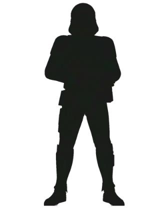
Is this a silhouette of a good guy or a bad guy? How can you tell?
To me, these legs/torso/head boxes look more like the ones you drew on our Elf Cow Man here, than on the other (WoW?) character. What should I take away from that? Does this mean that this is bad design? It occurs to me that these seem like pretty human proportions - like, a person's torso is about twice the height of their head, and their legs twice as long as their torso? Why is it bad for a humanoid character to have body dimensions similar to that of a real person?
|
|
This message was edited 1 time. Last update was at 2020/09/22 20:18:35
|
|
|
|
|
2020/09/22 20:24:09
Subject: Elf Cow Warrior?
|
|
Perfect Shot Ultramarine Predator Pilot
|
To that point, it's folly to try and assume the 'goodness' of a character just by it's appearance or silhouette.
A conniving bandit in a sharp coat and wide-brimmed hat wielding a wicked rapier could be a bad guy. Or, that same silhouette could be a valiant, daring-do musketeer-type. It's about context, actions, expression.
The only thing that makes the silhouette you're using as an example, recognizable as a bad guy, is because it looks roughly like a Stormtrooper or Clone Trooper (Revenge of the sith, where they are baddies). That falls in to the realm of context and expression.
|
|
This message was edited 1 time. Last update was at 2020/09/22 20:26:07
Skaven - 4500
OBR - 4250
- 6800
- 4250
- 2750 |
|
|
|
|
2020/09/22 20:40:33
Subject: Elf Cow Warrior?
|
|
Decrepit Dakkanaut
UK
|
That silhouette could be a stormtrooper or a rebel fighter. Both wear helmets of a roughly similar outer shape.
|
|
|
|
|
|
2020/09/22 20:42:34
Subject: Elf Cow Warrior?
|
|
Cackling Chaos Conscript
|
I'd agree - if you recognize the specific character than you know if they're good or bad, but what if you hadn't seen Star Wars already? I don't think there's anything about the silhouette that specifically communicates "this character is a good guy/is a bad guy".
|
|
|
|
|
2020/09/22 20:42:49
Subject: Elf Cow Warrior?
|
|
Perfect Shot Ultramarine Predator Pilot
|
I thought the same briefly, but the rounded shoulder guards and the shin... things and hip protection made me think that it had to be a clone/storm trooper.
Even in a video game, silhouette detection only matters if you know what that thing is, and what it can do. Some brand-new player to TF2, a game with probably the best silhouette work out of any game might recognize that the enemy they see at a glance is different from another, but until they play and know from context and experience what it's capable of, it doesn't matter.
|
|
This message was edited 1 time. Last update was at 2020/09/22 20:45:03
Skaven - 4500
OBR - 4250
- 6800
- 4250
- 2750 |
|
|
|
|
2020/09/22 21:14:03
Subject: Re:Elf Cow Warrior?
|
|
Grumpy Longbeard
|
 Wasteland wrote: Wasteland wrote: Mothsniper wrote:
NIce! Wow , Sorry I am still not convinced. Those seem to you condescending?! That is your personal issue mate, with perhaps childhood undressed guilt and adult established inadequacies lead you to take simple replies as insults.
Learning something about people everyday Care to share more of who you are?
Cmon mate, this is DakkaDakka. We all know smartass insulting comments when we see them. Don't play dumb.
"Cmon mate, this is DakkaDakka. We all know smartass insulting comments when we see them. Don't play dumb"
Like condescendingly telling some one to stop playing dumb?
We all know indeed, perhaps not in your case if you can't tell the difference between an insulting and calling someone out for going off topic.
"Look, I'm not doing your homework for you. I'm not just gonna guess at what point you're trying to make. If you want someone to agree with you, you have to tell them why. You bounce back and forth between "these concepts are so simple that explaining them would be condescending to a five-year-old" and "You obviously can't understand such advanced concepts without all the schooling I've had!". "
I did answer your question
"For same exact reason I drew lines jagged on the sorceress as well."
Why can't you answer mine?
"Why do you think I drew jagged lines on both Spirit and Sorceress? "
"If something's offensive, it's because it's "something that offends". As you say below, we can't know what you're actually thinking, we just have your words to go on. If you say something that causes offense, what else are we to assume other than that you're trying to be offensive? Especially when you do it over and over, after multiple people leave comments to the effect of "dude, you're being offensive". Don't pretend to be so naive that you don't know how your comments come across. Everyone here (you included) knows exactly what you're doing. "
Not pretending to be naive lolz, just telling you that you are wrong in your assesment.
"See, this is the whole crux of the issue people have with your posts. If you want someone to understand what you're saying, and convince them you're correct, the onus is on you to make yourself understood. If you come across as a sarcastic , you can be 100% right and still no one will want to listen to you. All communication is imperfect - we could be talking face to face and I can still have no idea what you're thinking or trying to say to me. As you said, we only have what you type here to judge you on. Don't get upset when we judge you by what you say, and not by whatever unknowable intentions are in your head. If the words of your argument aren't convincing anyone, find better words. We're not being deliberately obtuse or stupid; you're making a bad argument for why you're right. "
... So far there is one person here getting upset. Convincing anyone of anything is not my goal at all! I already said that earlier. did you miss it?
"
Yes, please do. Lay out the reasons. Draw your lines and explain why. Convince me. You've spilled far more (digital) ink picking fights with other posters than it would take to clearly explain your ideas, I think.
What are same or half ratios? I don't know, I didn't go to school for that. Why are they important? So far you've only offered up "because my school said so" and "because Left4Dead guy said so". If Disney or whoever offers better examples, show me! I've gone and looked at images of Mickey Mouse and Star Wars characters, and I still don't have any idea what you're talking about. "
Picking fights with other posters, so far only you have done that
Why are they important?
- I already said it.. will just be copy and pasting then if you are too triggered to read (because that creates interest and attracts the eye and keep eye engaged longer.) (Impact and Payoff)
"Impact" (impact is a term referring to the strong composition design, color, and tone that immediately catches the eye)
"Payoff" (Payoff is a term referring to the richness of information and details present when the image is examined closer)
So Impact is what catches the eye and payoff is what keeps the eye. Does that make senes?
"I'll ask you for an example you've cited more directly: "
"Is this a silhouette of a good guy or a bad guy? How can you tell? "
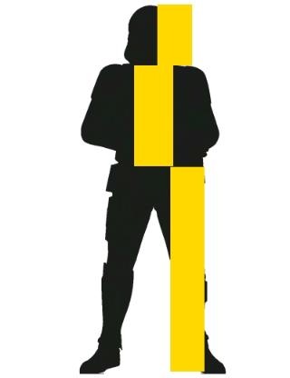
"To me, these legs/torso/head boxes look more like the ones you drew on our Elf Cow Man here, than on the other (WoW?) character. What should I take away from that? Does this mean that this is bad design? It occurs to me that these seem like pretty human proportions - like, a person's torso is about twice the height of their head, and their legs twice as long as their torso? Why is it bad for a humanoid character to have body dimensions similar to that of a real person? "
EXACTLY! human proportions, those are exactly normal human proportions. And there is nothing wrong with normal human proportions.
Your Tauren image has those normal, standard ,default, human proportions skewed into tiny legs, huge torso, and offset small head.
The BAD part comes in if your Tauren character had normal, standard ,default, human proportions. It would of been a boring Fantasy character with normal, standard ,default, proportions.
I hope this is making sense, because I do not know how else to explain it other jumping on discord with screenshare.
That is why a good design plays with exaggerating proportions and avoids default standard boring normal proportions! that is why the Spirit unit is not as strong as it could of been.
I also hope that is making sense.
Automatically Appended Next Post:
Thadin wrote:To that point, it's folly to try and assume the 'goodness' of a character just by it's appearance or silhouette.
A conniving bandit in a sharp coat and wide-brimmed hat wielding a wicked rapier could be a bad guy. Or, that same silhouette could be a valiant, daring-do musketeer-type. It's about context, actions, expression.
The only thing that makes the silhouette you're using as an example, recognizable as a bad guy, is because it looks roughly like a Stormtrooper or Clone Trooper (Revenge of the sith, where they are baddies). That falls in to the realm of context and expression.
Silhouette is primarily there for readability and recognition.
silhouette does play bit role into the good vs bad character design.
I was saying that silhouette plays into the characterization of the character. And having an obvious "evil spiky" silhouette for a good character is not a good design.
The storm trooper is a default human silhouette, and that silhouette perfectly characterize the character! Because the character is a default normal duplication, insignificant and numerous. and the design and color and silhouette underlines that characteristic. If would be bad design if storm trooper silhouette was opposite of the "normal" look
I hope this makes sense.
|
|
This message was edited 4 times. Last update was at 2020/09/22 21:27:41
|
|
|
|
|
2020/09/22 21:34:42
Subject: Elf Cow Warrior?
|
|
Perfect Shot Ultramarine Predator Pilot
|
A solid point on the stormtrooper.
While spikes and sharp angles are typically the realm of the baddies, I don't believe that the points and angles of the Alarith spirit are the sort that give off an evil vibe. Graceful curves leading in to sharp points give me a sense of lethal grace, that are often associated with elven motifs. It can be found in the traditionally 'good' elven styles of Warhammer, extending even in to 40k with it's Craftworlders.
|
Skaven - 4500
OBR - 4250
- 6800
- 4250
- 2750 |
|
|
|
|
2020/09/22 22:39:04
Subject: Re:Elf Cow Warrior?
|
|
Cackling Chaos Conscript
|
Mothsniper wrote:
"Cmon mate, this is DakkaDakka. We all know smartass insulting comments when we see them. Don't play dumb"
Like condescendingly telling some one to stop playing dumb?
We all know indeed, perhaps not in your case if you can't tell the difference between an insulting and calling someone out for going off topic.
No no, it's much too late to claim ignorance now. If you didn't know you're coming across as an , and you didn't want to come across as an , you would have changed your approach after it was pointed out to you way back on page one, and many times since.
Mothsniper wrote:
I did answer your question
"For same exact reason I drew lines jagged on the sorceress as well."
Why can't you answer mine?
"Why do you think I drew jagged lines on both Spirit and Sorceress? "
Because they both have some jagged parts? Those aren't the parts I'm talking about. Go back and look at the images I posted. On the sorceress, you followed the curve of her robe with a nice, gentle line of your own. On similarly curved lines on the spirit, you've followed the outline with rough, straight lines like a bad vector image. Why are the curved lines on one treated differently that the curved lines on the other?
Mothsniper wrote:
Convincing anyone of anything is not my goal at all! I already said that earlier. did you miss it?
So why are you still talking? Leave us in our happy ignorance, then.
Mothsniper wrote:
- I already said it.. will just be copy and pasting then if you are too triggered to read (because that creates interest and attracts the eye and keep eye engaged longer.) (Impact and Payoff)
"Impact" (impact is a term referring to the strong composition design, color, and tone that immediately catches the eye)
"Payoff" (Payoff is a term referring to the richness of information and details present when the image is examined closer)
So Impact is what catches the eye and payoff is what keeps the eye. Does that make senes?
Yes, but you've failed to explain how something has good impact vs bad impact, good payoff vs bad payoff. You've defined the terms, but haven't explained how they apply or lead you to your conclusions. When I look closely at the spirit, I see the details of the little tassels, the elements that appear to be moving with the wind, all the little lines in the armor that I don't see at first glance. Are these not examples of payoff? Why not?
Mothsniper wrote:
"I'll ask you for an example you've cited more directly: "
"Is this a silhouette of a good guy or a bad guy? How can you tell? "
"To me, these legs/torso/head boxes look more like the ones you drew on our Elf Cow Man here, than on the other (WoW?) character. What should I take away from that? Does this mean that this is bad design? It occurs to me that these seem like pretty human proportions - like, a person's torso is about twice the height of their head, and their legs twice as long as their torso? Why is it bad for a humanoid character to have body dimensions similar to that of a real person? "
EXACTLY! human proportions, those are exactly normal human proportions. And there is nothing wrong with normal human proportions.
Your Tauren image has those normal, standard ,default, human proportions skewed into tiny legs, huge torso, and offset small head.
The BAD part comes in if your Tauren character had normal, standard ,default, human proportions. It would of been a boring Fantasy character with normal, standard ,default, proportions.
And there is nothing wrong with normal human proportions.
The BAD part comes in if your Tauren character had normal, standard ,default, human proportions
Honestly not sure what to make of that.
Rather than just saying that the humanlike proportions are bad, don't you think it could be communicating other things? Like, couldn't the familiar proportions make the character more familiar or relatable to us despite being a giant mountain-backed cow man?
That's not to say that the WoW Tauren is bad, but it seems to be following different rules to create a specific style. The things you're saying don't seem to be wrong per se, but you're treating them like ironclad, inviolate rules when they don't apply equally to everything.
Like, the concepts of "stretch and squish" are important concepts and vital parts of traditional western-style animation, and can be used to communicate movement very effectively. But the fact that something like Ghost in the Shell doesn't use them does not make Ghost in the Shell poorly animated.
Mothsniper wrote:
I was saying that silhouette plays into the characterization of the character. And having an obvious "evil spiky" silhouette for a good character is not a good design.
The storm trooper is a default human silhouette, and that silhouette perfectly characterize the character! Because the character is a default normal duplication, insignificant and numerous. and the design and color and silhouette underlines that characteristic. If would be bad design if storm trooper silhouette was opposite of the "normal" look
I hope this makes sense.
Yes, that does make sense. Is it fair to say then that a well-designed bad guy character may have a smooth, innocuous silhouette? Like, that particular part of their design communicates something other than "good/evil"? Couldn't you have, say, a good character or design with big spiky dragon wings? Or a unique, one-of-a-kind good guy character with a bulky, smooth silhouette like the stormtrooper, showing how he's set apart from normal humanity (for example Robocop?)
|
|
This message was edited 2 times. Last update was at 2020/09/22 23:12:03
|
|
|
|
|
2020/09/23 02:02:44
Subject: Re:Elf Cow Warrior?
|
|
Grumpy Longbeard
|
Wasteland wrote: Mothsniper wrote:
"Cmon mate, this is DakkaDakka. We all know smartass insulting comments when we see them. Don't play dumb"
Like condescendingly telling some one to stop playing dumb?
We all know indeed, perhaps not in your case if you can't tell the difference between an insulting and calling someone out for going off topic.
No no, it's much too late to claim ignorance now. If you didn't know you're coming across as an , and you didn't want to come across as an , you would have changed your approach after it was pointed out to you way back on page one, and many times since.
Mothsniper wrote:
I did answer your question
"For same exact reason I drew lines jagged on the sorceress as well."
Why can't you answer mine?
"Why do you think I drew jagged lines on both Spirit and Sorceress? "
Because they both have some jagged parts? Those aren't the parts I'm talking about. Go back and look at the images I posted. On the sorceress, you followed the curve of her robe with a nice, gentle line of your own. On similarly curved lines on the spirit, you've followed the outline with rough, straight lines like a bad vector image. Why are the curved lines on one treated differently that the curved lines on the other?
Mothsniper wrote:
Convincing anyone of anything is not my goal at all! I already said that earlier. did you miss it?
So why are you still talking? Leave us in our happy ignorance, then.
Mothsniper wrote:
- I already said it.. will just be copy and pasting then if you are too triggered to read (because that creates interest and attracts the eye and keep eye engaged longer.) (Impact and Payoff)
"Impact" (impact is a term referring to the strong composition design, color, and tone that immediately catches the eye)
"Payoff" (Payoff is a term referring to the richness of information and details present when the image is examined closer)
So Impact is what catches the eye and payoff is what keeps the eye. Does that make senes?
Yes, but you've failed to explain how something has good impact vs bad impact, good payoff vs bad payoff. You've defined the terms, but haven't explained how they apply or lead you to your conclusions. When I look closely at the spirit, I see the details of the little tassels, the elements that appear to be moving with the wind, all the little lines in the armor that I don't see at first glance. Are these not examples of payoff? Why not?
Mothsniper wrote:
"I'll ask you for an example you've cited more directly: "
"Is this a silhouette of a good guy or a bad guy? How can you tell? "
"To me, these legs/torso/head boxes look more like the ones you drew on our Elf Cow Man here, than on the other (WoW?) character. What should I take away from that? Does this mean that this is bad design? It occurs to me that these seem like pretty human proportions - like, a person's torso is about twice the height of their head, and their legs twice as long as their torso? Why is it bad for a humanoid character to have body dimensions similar to that of a real person? "
EXACTLY! human proportions, those are exactly normal human proportions. And there is nothing wrong with normal human proportions.
Your Tauren image has those normal, standard ,default, human proportions skewed into tiny legs, huge torso, and offset small head.
The BAD part comes in if your Tauren character had normal, standard ,default, human proportions. It would of been a boring Fantasy character with normal, standard ,default, proportions.
And there is nothing wrong with normal human proportions.
The BAD part comes in if your Tauren character had normal, standard ,default, human proportions
Honestly not sure what to make of that.
Rather than just saying that the humanlike proportions are bad, don't you think it could be communicating other things? Like, couldn't the familiar proportions make the character more familiar or relatable to us despite being a giant mountain-backed cow man?
That's not to say that the WoW Tauren is bad, but it seems to be following different rules to create a specific style. The things you're saying don't seem to be wrong per se, but you're treating them like ironclad, inviolate rules when they don't apply equally to everything.
Like, the concepts of "stretch and squish" are important concepts and vital parts of traditional western-style animation, and can be used to communicate movement very effectively. But the fact that something like Ghost in the Shell doesn't use them does not make Ghost in the Shell poorly animated.
Mothsniper wrote:
I was saying that silhouette plays into the characterization of the character. And having an obvious "evil spiky" silhouette for a good character is not a good design.
The storm trooper is a default human silhouette, and that silhouette perfectly characterize the character! Because the character is a default normal duplication, insignificant and numerous. and the design and color and silhouette underlines that characteristic. If would be bad design if storm trooper silhouette was opposite of the "normal" look
I hope this makes sense.
Yes, that does make sense. Is it fair to say then that a well-designed bad guy character may have a smooth, innocuous silhouette? Like, that particular part of their design communicates something other than "good/evil"? Couldn't you have, say, a good character or design with big spiky dragon wings? Or a unique, one-of-a-kind good guy character with a bulky, smooth silhouette like the stormtrooper, showing how he's set apart from normal humanity (for example Robocop?)
"No no, it's much too late to claim ignorance now. If you didn't know you're coming across as an , and you didn't want to come across as an , you would have changed your approach after it was pointed out to you way back on page one, and many times since. "
Lolz, what are those ? Come on say it. What are you calling me? Can't just type it out? pathetic.
I see nothing wrong with my approach, and will not change it because I am good with it.
"Because they both have some jagged parts? Those aren't the parts I'm talking about. Go back and look at the images I posted. On the sorceress, you followed the curve of her robe with a nice, gentle line of your own. On similarly curved lines on the spirit, you've followed the outline with rough, straight lines like a bad vector image. Why are the curved lines on one treated differently that the curved lines on the other? "
Yes because they both do have jagged lines! so I am not favoring one design over the other just to make a point. I put jaded lines to indicate areas that are busy, because it is an illustration of a BUSY vs CALM concept. The Jagged lines I A REPRESENTATION OF AN AREA THAT IS BUSY, JAGGED LINE IS NOT AN ACTUAL LINE THAT OUTLINES A SHAPE OF THE DESIGN, IT IS A REPRESENTATION OF AN AREA THAT IS BUSY TO ILLUSTRATE THE CONCEPT OF BUSY vs CALM.
Sorry for camps, I am not yelling, just trying to be as clear as my person will allow.
Curved lines are traded differently because jagged lines are representing an area that is BUSY with details, not actually outlining the shape...
You know what, my bad, I though that was self explanatory, if we I talk about busy vs calm and put an example image of busy vs calm, it never even crossed my mind that someone will ignore the actual busy vs calm concept that we are talking about and starts picking at the way I drew the busy example line.  My communication skills are seriously lacking, no surprise though, because what do you expect from a total am I right
"So why are you still talking? Leave us in our happy ignorance, then."
Is that why you jumped in, to shut up this !
Why am I here, Because I already said why I am still here, lolz right after I talked about not trying to convince anyone, guess you missed that too.
"Yes, but you've failed to explain how something has good impact vs bad impact, good payoff vs bad payoff. You've defined the terms, but haven't explained how they apply or lead you to your conclusions. When I look closely at the spirit, I see the details of the little tassels, the elements that appear to be moving with the wind, all the little lines in the armor that I don't see at first glance. Are these not examples of payoff? Why not? "
This should be self evident, but if it is not then away we go:
Good Impact grabs the attention, Bad impact doesn't grab jack. Good Payoff keeps attention, bad payoff doesn't keep jack.
Example: If you are fillping through google images of Elfs and scrolling through them quickly and Boom! one catches you eye, and you stop, go back, and open it so you get a closer look at it. But when you open it you realize that the image is more of a sketch and there is not much else to look at. ( That would be strong impact and weak payoff)
Example: You are still scrolling through google images of Elfs, and you scroll pass one of the images that is actually a well crafted and detailed battle scene with alots of details and characters and epic story ets. (That is an example of weak Impact but strong payoff)
Concepts of Impact and Payoff are terms coined by Craig Nelson, amazing illustrator (One of the guys who painted those photo real old school movie posters) and amazing Fine artist who's class I had an honor of attneding.
Yes, you are right that is a perfect example of payoff. And that is why the design is not strong. Because good design, in advertisement adds, needs strong Impact alone to grab attention quickly, In art you need both in equal measure to not only grab attention, but keep the attention on you piece of art long enough for the audience to get the story or a point that the artist was trying to communicate. In a sculpture you need both as well, in 3D model you need both, in a moving picture you need both, in a computer game you need both, otherwise you will lose the attention of the audience! But in all of those mediums, Impact is always more important than payoff.
That is another way Spirit is bad in design and could of been designed, posed, in a much much stronger way!
I hope this makes sense.
"Rather than just saying that the humanlike proportions are bad, don't you think it could be communicating other things? Like, couldn't the familiar proportions make the character more familiar or relatable to us despite being a giant mountain-backed cow man? "
Human proportions are bad for a fantasy creature because it renders creature "boring", imagine orks elfs goblins ets all being of same proportion despite difference in height and scale, that would be weird.
Yes, If I wanted audience to relate to the fantasy creature more I would most defiantly stick to "human" proportions more!
"That's not to say that the WoW Tauren is bad, but it seems to be following different rules to create a specific style. The things you're saying don't seem to be wrong per se, but you're treating them like ironclad, inviolate rules when they don't apply equally to everything."
Well, there are rules, and they are not iron clad but they are in a way. Same for music, some rules you can break but some rules will just break the tune. There are rules that can be bent or bypassed sure, but there are also defiantly ironclad rules in creating impactful image.
For example: To paint a miniature that will read well and look cool you could use contrast (ie opposte) colors, yes it is a rule, because contrast colors just automatically work very well in anything. But that rule can be broken by painting miniatures with Analogous colors, or limited palette, or black and white, or monochrome, or solid flat, rainbow, or all colors together, ets. So by breaking color rule you can still end up with a cool mini that reads well!
But if you break tonal rule (Tone - a range from dark to light) or value rule (Value - also, range from light to dark) then you will lose the contrast and miniature will not read. And stronger the tone - then higher the contrast and better mini will read, weaker the tone - less contrast - mini will read less.
And Silhouette is one of those rules in a design that is hard to dismiss because it is the rudimentary shape that sets the direction for rest of the model down to the finest detail. Rhythm of busy vs calm however can be avoided, it will not make or break the design.
I hope this makes sense.
"Like, the concepts of "stretch and squish" are important concepts and vital parts of traditional western-style animation, and can be used to communicate movement very effectively. But the fact that something like Ghost in the Shell doesn't use them does not make Ghost in the Shell poorly animated."
Yep I agree, that is why Spirited Away is better ! ----------runs for cover - Oh boy If I though I was getting some heat before, I will get it now.
"Yes, that does make sense. Is it fair to say then that a well-designed bad guy character may have a smooth, innocuous silhouette? Like, that particular part of their design communicates something other than "good/evil"? Couldn't you have, say, a good character or design with big spiky dragon wings? Or a unique, one-of-a-kind good guy character with a bulky, smooth silhouette like the stormtrooper, showing how he's set apart from normal humanity (for example Robocop?)"
You could have good character or design with big spiky dragon wings yes, if it is done right.
Yes you could, that is not the rule, however let me attempt to explain the concept!
The whole point is this:
Think of a nike LOGO
1-The Most optimally minimum amount of design without any unnecessary details or information
2-That Maximally communicates the entire mission statement and direction and about-ness of a company
Silhouette is that.
Example: If you took a marker and scribbled scribbles on a page and showed it you your friend, and you friend said "Oh cool evil wizard"
That is a strong design! With most minimal amount of information you where able to communicate exactly what you wanted and it read clearly enough for the audience to ID it at a quick glance!
Audience did not have to make up excuses or dig deep to explain the design!
Pulling obsquer mythos to explain the connection of a cow and a mountain, dig deep into the lore or history to explain why they holding hammers ets, why there are mountains of shoulders, why there are horned and hoofed creature in an elf army, ets.
The deeper you have to dig to explain things in the design the weaker the design is. Folk here do not get that digging deeper into the lore and cultures, The VISUAL design should be self evident if it is not, it is not strong design.
Now do you think that a design with big spiky dragon wings will read at a quick glance as a "good" character?
I say yes, but only if it is done correctly.
Sorry dudes, Spirit is a bad character design, both in theme and execution.
|
|
This message was edited 4 times. Last update was at 2020/09/23 02:15:07
|
|
|
|
|
2020/09/23 02:11:21
Subject: Elf Cow Warrior?
|
|
Ollanius Pius - Savior of the Emperor
Gathering the Informations.
|
You still haven't actually 'proven' anything. You've just drawn squiggly lines and spouted off your opinion.
Phil Kelly, the guy who helped write the fricking lore for the army, says these things are constructs. Phil Kelly says that the design is based off a Ymetrican Longhorn buffalo, a mountain dwelling creature of Hysh(that's the Realm of Light, aka where the Lumineth Realmlords are from).
The 'mountain' on their backs? It's a literal representation of the Alarith('mountain') rune and mountains.
Nobody has 'made up' anything beyond you here. You've chosen not to understand why these things look the way they do. That's cool. But stop pretending that it doesn't make sense.
|
|
|
|
|
2020/09/23 02:13:58
Subject: Re:Elf Cow Warrior?
|
|
[MOD]
Villanous Scum
|
Mothsniper wrote:
"No no, it's much too late to claim ignorance now. If you didn't know you're coming across as an , and you didn't want to come across as an , you would have changed your approach after it was pointed out to you way back on page one, and many times since. "
Lolz, what are those ? Come on say it. What are you calling me? Can't just type it out? pathetic.
I see nothing wrong with my approach, and will not change it because I am good with it.
No, you have absolutely come across as rude, condescending and demeaning in many of your posts and you really need to change that. Read back through what you have written and see how you come across to other people who read it and think how you can change the words you use to no longer do so. You may not have an issue with it but the primary rule of this site is "Be polite" and you need to to start obeying it. That goes for everyone else in this thread as well.
|
On parle toujours mal quand on n'a rien à dire. |
|
|
|
|
|
|
|
