Forum adverts like this one are shown to any user who is not logged in. Join us by filling out a tiny 3 field form and you will get your own, free, dakka user account which gives a good range of benefits to you:
No adverts like this in the forums anymore.
Times and dates in your local timezone.
Full tracking of what you have read so you can skip to your first unread post, easily see what has changed since you last logged in, and easily see what is new at a glance.
Email notifications for threads you want to watch closely.
Being a part of the oldest wargaming community on the net.
If you are already a member then feel free to login now.
2023/07/03 09:17:54
Subject: Adversion to "pure" black and white in modelling?
As some of you might know, I've been researching military modelling techniques and workflows in the hope of applying some of that knowledge to my miniature painting. I recently ran into an interesting concept in some video, where the builder stated he never uses pure black or white in their models, because it "makes things look more toylike and less realistic". This kind of stuck with me, and it also has some basis in art theories, where pure black and white are kind of not considered as colours, but as the two extremes of light (total absence of it / total saturation of it).
For a while now, I've been a big fan of "not-black" colour shades such as Rubber Black and Uniform Black, and have tried to use those instead of pure blacks, and conversely, have shiffted to using only off whites. I need much more experience with them, but so far, I have liked the results. Now, I'm at a point where I'm starting to think I don't even want to use pure black primer anymore.. There are things such as Amsterdam Oxide Black Acrylic spray, which is sold in art stores and looks like it could be one solution, I'll need to buy a can and do some tests..
Anyways, today I learned new tricks when it comes to black, so wanted to share this video
Do you mix your own blacks from blue and brown? If so, name the brands and colours you use
This all is in the series of my "back to basics" ethos for miniature building and painting, an idea that many of us who started our miniature hobby with GW products, are painfully oblivious to best practices and foundational knowledge of arts and crafts, and (re)learning all the stuff we never had to learn (cuz GW made it all a turnkey solution for us, all preplanned out, just buy and do) will make us better at our hobby
"The larger point though, is that as players, we have more control over what the game looks and feels like than most of us are willing to use in order to solve our own problems"
2023/07/03 09:36:28
Subject: Adversion to "pure" black and white in modelling?
I know my High School art teacher warned us against going pure white black, because there was nowhere to go from there. No more high points, no more shadow. Their use should be restricted to just a handful of extreme spots. Wisdom I try to head to this day in all my artistic endeavors.
In regard to white, there is also the technical issue of pigments. Most pure white are chalky garbage. So you are better off using an off white for most work, as they have pigments that don’t suck and can make better paints.
This message was edited 1 time. Last update was at 2023/07/03 09:37:03
I always use amsterdam oxyde black for the basecoat because it never lumps in the detail as citadel black does.
I use a lot of Amsterdam paints actually, but also have loads of Citadel paints and sometimes even blend them together.
My experience with white is the same as Nevelon, its horrendously chalky.. I prefer to mix my white with grey, to a very light grey which has better consistency and allows for some highlights.
This message was edited 1 time. Last update was at 2023/07/04 08:47:50
"Why would i be lying for Wechhudrs sake man.., i do not write fiction!"
2023/07/04 12:42:43
Subject: Re:Adversion to "pure" black and white in modelling?
Leopold Helveine wrote: I always use amsterdam oxyde black for the basecoat because it never lumps in the detail as citadel black does.
I use a lot of Amsterdam paints actually, but also have loads of Citadel paints and sometimes even blend them together.
My experience with white is the same as Nevelon, its horrendously chalky.. I prefer to mix my white with grey, to a very light grey which has better consistency and allows for some highlights.
Oh, I have a can of Mr Surfacer Black 1500 which goes on like silk.. but its a regular black colour, not an "off black"
Since you own and have used Amsterdam Oxide Black, can you confirm it is an off black colour? I mean, that's what the swatch looks like to me eye, anyway..
"The larger point though, is that as players, we have more control over what the game looks and feels like than most of us are willing to use in order to solve our own problems"
2023/07/06 08:23:29
Subject: Adversion to "pure" black and white in modelling?
Personally I've never bought this line. I use black as a base tone virtually 100% of the time, especially for non metallic metals. I've even gotten nice grey non metallic using just black and white.
For black surfaces also I start with black and mix in different hues with whites to highlight, so I guess maybe you're getting a similar result in a different way.
Basically what I'm saying is that like most things it's down to personal taste, but people shouldn't get tied up trying to avoid pure black and white.
Heresy World Eaters/Emperors Children
Instagram: nagrakali_love_songs
2023/07/06 15:51:43
Subject: Adversion to "pure" black and white in modelling?
I think you can probably avoid using black paint very much, since black ink and very dark browns and greys will be more useful, but I don't see any problem with black primer. Or using black as an undercoat for metallics.
there's no reason not to use black primer, if for nothing else so the very deep recesses stay pure black, which makese sense.
2023/07/06 19:53:45
Subject: Adversion to "pure" black and white in modelling?
Polonius wrote: I think you can probably avoid using black paint very much, since black ink and very dark browns and greys will be more useful, but I don't see any problem with black primer. Or using black as an undercoat for metallics.
there's no reason not to use black primer, if for nothing else so the very deep recesses stay pure black, which makese sense.
If I use an off black / anthracite primer, the very deep recesses stay almost black, which could look less toylike and more realistic. I will be experimenting with this, no doubt about it. For metallics, many special metallic paints need a super glossy black base anyway for maximum shine (same thing with real mirrors IIUC), so that's a lil different
Many famous artists restrict their colour pallettes on purpose, I see only new possibilites with such approaches
"The larger point though, is that as players, we have more control over what the game looks and feels like than most of us are willing to use in order to solve our own problems"
2023/07/06 21:25:06
Subject: Re:Adversion to "pure" black and white in modelling?
I hear ya, and it is true, however it almost does not matter! because the eye does the blending for you and the mini is so small.
Because the model is so small, you eye will naturally do the blending of everything, and any "wild" tones or colors will only read in the contrast!
So it is much more important what is the tonal relationship of the neighboring colors around your black or white then the actual use of black or white.
Traditionally in Classical Painting Art pure black is never used because in reality dark areas are always colored and in a relationship of other colors, and the shadows are always painted transparently because that creates an illusion of depth! The white is only used for the highlights where the surface of the object alights at a perfect 90% angle with the light source, and the lights are always painted opaquely.
However, In miniature painting, UI UX design, advertising, ets, pretty much in any visual art outside of traditional Fine Art (even more so if it is for something very very very small) - the Contrast is KING! Because READABILITY is the most important goal a designer or illustrator can achieve. Best example is Wayne Reynolds who uses extreme high contrast of black and whites and his stuff is killing it because his work is designed for very small scale viewing like a mtg-card.
Your mini might look more realistic, but who cares if does not read.
This message was edited 3 times. Last update was at 2023/07/06 21:28:10
2023/07/07 00:50:53
Subject: Re:Adversion to "pure" black and white in modelling?
Re: pure black/white as primer I wouldn't worry about it. Even with translucent paints and airbrushing you should be covering all of your primer layer with least a slight tint even if some pre-shading is visible through the color layer and you won't have pure black/white as the final result. And if there are any deep recesses that the paint can't reach you aren't going to see them clearly enough to notice a color difference. With primer you should be concerned far more about getting a good surface for the paint and not obscuring detail. Color is helpful for mitigating opacity issues but I'd 100% of the time take a less-optimal color over a less-optimal surface texture.
Re: pure black/white as a final color, 100% correct. Neither color exists in reality and when you have a model painted with them it immediately stands out as unnatural. It's bad for realism and it's really bad when a random shadow becomes the eye-catching feature on a model.
Automatically Appended Next Post:
Mothsniper wrote: However, In miniature painting, UI UX design, advertising, ets, pretty much in any visual art outside of traditional Fine Art (even more so if it is for something very very very small) - the Contrast is KING! Because READABILITY is the most important goal a designer or illustrator can achieve. Best example is Wayne Reynolds who uses extreme high contrast of black and whites and his stuff is killing it because his work is designed for very small scale viewing like a mtg-card.
Your mini might look more realistic, but who cares if does not read.
Got to disagree here. You can use an off-white or off-black that avoids the unnatural look of a pure color without sacrificing any meaningful contrast. A dark color next to ivory or a bright color next to a very dark gray/brown will still have a lot of contrast, plenty to be read correctly at miniature scale and tabletop distances. OTOH having pure black/white can really mess with the read of a miniature, drawing the eye to very wrong places.
This message was edited 1 time. Last update was at 2023/07/07 00:53:52
(<-- B.A: Drawing, Currently getting BFA in Painting) I treat Black paint like cayenne pepper: used preferably in Parts per Million. If I need a very dark color, I'll use Payne's grey- it's like pen ink, where it's really a very dark and unsaturated blue. Black's key element is that is sucks in light and energy (put a white and black sheet of paper in the sun, and see which one is cooler). So, mixing it into colors will dull them down- yes, this is good for browns or unsaturated colors, but horrid for some. Yellow always makes an icky khaki or olive when mixed with black, so green or orange-brown is better.
White doesn't have the color sucking powers of black, but both suffer from the problem that you can't make a darker black/ lighter white. So- you have to figure out where that color will go. If there's an Ipad that has a white gloss highlight, that's the only pure white place, the rest is a very light grey. Contriwise, any black object will only have pure black in it's deepest shadow.
When it gets down to it, in the hobby we go for contrast and that's really hard with 2 colors everyone knows by heart.
"Cold is the Emperor's way of telling us to burn more heretics."
2023/07/07 04:45:42
Subject: Re:Adversion to "pure" black and white in modelling?
ThePaintingOwl wrote: Re: pure black/white as primer I wouldn't worry about it. Even with translucent paints and airbrushing you should be covering all of your primer layer with least a slight tint even if some pre-shading is visible through the color layer and you won't have pure black/white as the final result. And if there are any deep recesses that the paint can't reach you aren't going to see them clearly enough to notice a color difference. With primer you should be concerned far more about getting a good surface for the paint and not obscuring detail. Color is helpful for mitigating opacity issues but I'd 100% of the time take a less-optimal color over a less-optimal surface texture.
Re: pure black/white as a final color, 100% correct. Neither color exists in reality and when you have a model painted with them it immediately stands out as unnatural. It's bad for realism and it's really bad when a random shadow becomes the eye-catching feature on a model.
Automatically Appended Next Post:
Mothsniper wrote: However, In miniature painting, UI UX design, advertising, ets, pretty much in any visual art outside of traditional Fine Art (even more so if it is for something very very very small) - the Contrast is KING! Because READABILITY is the most important goal a designer or illustrator can achieve. Best example is Wayne Reynolds who uses extreme high contrast of black and whites and his stuff is killing it because his work is designed for very small scale viewing like a mtg-card.
Your mini might look more realistic, but who cares if does not read.
Got to disagree here. You can use an off-white or off-black that avoids the unnatural look of a pure color without sacrificing any meaningful contrast. OTOH having pure black/white can really mess with the read of a miniature, drawing the eye to very wrong places.
I do not understand what you are disagreeing with...
With my point that Readability is king? Or that contrast is the most important thing when painting something small? Or that the use of black/white is an effective way to create contrast?
Because I was only making those points... I did mention, in the part that you cropped out of the quotations, that the point is in the relationship of colors and not just black and white - "So it is much more important what is the tonal relationship of the neighboring colors around your black or white"
so you are pretty much rephrasing what I said but somehow disagreeing?
A dark color next to ivory or a bright color next to a very dark gray/brown will still have a lot of contrast, plenty to be read correctly at miniature scale and tabletop distances.
Here you are giving an example and a refutation to the point that I never made... I never stated that closer tonal range loses the contrast or that it is impossible to maintain contrast without the use of pure white and black.
And I never would of made that point in my right mind, because I have been doing art professionally for over 10 years
I very much understand how to work with in close tonal range in oil acrylic digital and mini painting. that is why I spoke of the importance of the relationship of the colors and tones to each other.
OTOH having pure black/white can really mess with the read of a miniature, drawing the eye to very wrong places
Right, also A dark color next to ivory or a bright color next to a very dark gray/brown will still have a lot of contrast can also mess with the read of a miniature, drawing the eye to very wrong places.
Anything can drawing the eye to very wrong places. I would like to see an example picture of a mini someone painted that is drawing an eye to a wrong place by using pure black/white and see how much that is really messing with the readability.
If Anything CAN do anything, therefor I am wrong, I see your point.
2023/07/07 05:35:02
Subject: Re:Adversion to "pure" black and white in modelling?
Mothsniper wrote: I do not understand what you are disagreeing with...
Then maybe I am misunderstanding what you were trying to say. You described the use of off-black and off-white in traditional painting and then started off the part about miniatures with "however", framing it as something in contrast to the use of off-black and off-white. IOW, that contrary to traditional painting you should use pure black and pure white to maximize contrast. Was the "however" not meant to have that meaning and set the two styles and goals in opposition?
I would like to see an example picture of a mini someone painted that is drawing an eye to a wrong place by using pure black/white and see how much that is really messing with the readability.
It's hard to show in a forum discussion, especially without pulling a random image of google and risking being rude to someone by using their work as an example of poor technique without their consent. The subtle differences in color don't always photograph well and a thing that stands out in person may be obscured in photo form by the same things that make pure black and pure white colors that don't exist in the real world. It's a very, very subtle thing. Even a very slight tint to make a pure color into an off-color is enough to make it read properly and not stand out.
(And that's why I was questioning the idea of setting miniature painting in opposition to traditional painting for the sake of contrast. The level of off-color tinting/fading required to avoid the unrealistic pure color is very subtle and has a negligible impact on contrast. If you're comparing, say, dark red/pure white vs. dark red/ivory the level of contrast will be pretty much the same between the two pairs.)
Then maybe I am misunderstanding what you were trying to say. You described the use of off-black and off-white in traditional painting and then started off the part about miniatures with "however", framing it as something in contrast to the use of off-black and off-white. IOW, that contrary to traditional painting you should use pure black and pure white to maximize contrast. Was the "however" not meant to have that meaning and set the two styles and goals in opposition?
... Perhaps some misunderstanding on your part, or my inability to communicate. The "however" part is not divorced from the context of (it almost does not matter) and (eye does the blending ) and (importance of the tonal relationship) that I talked about right before the "however" example.
Yes the use of pure black/white will maximize the contrast. And yes, contrary to traditional painting the miniature relies more so on contrast than anything else, and No because I never said that pure white and black (Should) be used. Instead of the (should) I said : (it almost does not matter) and (eye does the blending ) and (importance of the tonal relationship)
I though it was obvious from what I tried to communicate that the use of pure black/white in a mini is much much more ok than in a traditional painting because of (it almost does not matter) and (eye does the blending ) and (importance of the tonal relationship)
It's hard to show in a forum discussion, especially without pulling a random image of google and risking being rude to someone by using their work as an example of poor technique without their consent. The subtle differences in color don't always photograph well and a thing that stands out in person may be obscured in photo form by the same things that make pure black and pure white colors that don't exist in the real world. It's a very, very subtle thing. Even a very slight tint to make a pure color into an off-color is enough to make it read properly and not stand out.
Nope, it is quite easy actually, go to your gallery (you sound like you speak from experience, so I assume you have your own work to point too) or go to my gallery and pick anything you like, I always use pure white/black should be easy to point where my work lead the eye to wrong place and really messed with the read of a miniature.
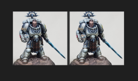
Infact here is an example of my ssu. I used pure white. If I would of used ivory on his beard instead, I would of lost tiny bit of contrast and it wouldn't look any more "realistic" Another words: I would of lost negligible lvl of contrast and gained negligible lvl of realism, result = it does not matter
(And that's why I was questioning the idea of setting miniature painting in opposition to traditional painting for the sake of contrast.
They are very very different, almost opposite in approach and the goal. Staying away from pure white and black applies infinitely more to traditional painting than to a miniature.
And when it does apply to a miniature, because it is so small and the differences are so tiny it is almost unnoticeable and therefor does not really matter.
The level of off-color tinting/fading required to avoid the unrealistic pure color is very subtle and has a negligible impact on contrast. If you're comparing, say, dark red/pure white vs. dark red/ivory the level of contrast will be pretty much the same between the two pairs.)
If pretty much the same then it does not really matter right? I mean, what you are saying is that you have strong evidence for how very subtle difference between pure white and ivory white will change the tiny miniature so much where one will appear noticeably realistic and the other noticeably cartoony. And I am saying that because the model is so small it does not really matter, another words using ivory over pure white will not add realism as much as you think it will, and avoiding pure while will not make it less cartoony enough where it will actually matter.
I began with - I hear ya, and it is true, however it almost does not matter!
and will end it with - I hear ya, and it is true, however it almost does not matter!
This message was edited 5 times. Last update was at 2023/07/07 09:07:32
2023/07/07 07:40:42
Subject: Re:Adversion to "pure" black and white in modelling?
Mothsniper wrote: Nope, it is quite easy actually, go to your gallery (you sound like you speak from experience, so I assume you have your own work to point too) or go to my gallery and pick anything you like, I always use pure white/black should be easy to point where my work lead the eye to wrong place and really messed with the read of a miniature.
It's not just that it's hard to find an example without being rude to someone, it's that subtle things like pure vs. off colors are very hard to photograph accurately. Pure white on a model won't necessarily end up looking the same in a photograph. Ambient lighting can tint or dull the color away from pure white, your camera's software will shift the color slightly based on how it interprets the white balance, etc. Same thing for pure black. Set your shutter speed a tiny fraction of a second too slow and suddenly pure black becomes dark gray in the photograph. It looks fine in the photo but then when you hold
So yes, in your example image I can say that I think the white beard stands out too much (and probably should be even darker than off-white for better realism while still maintaining enough contrast to be visible) but am I giving accurate feedback on the painting or has your camera's image processing software exaggerated the white beyond what is visible when you hold the actual model in your hand?
If pretty much the same then it does not really matter right?
The level of contrast will be pretty much the same. The realism will not. If you look at pure white next to dark red and ivory next to the same dark red both of them will have very similar levels of contrast (and that level of contrast will be very high). But from a realism point the unnatural color of the pure white will stand out awkwardly and look fake, while the ivory is tinted just enough to look more natural while still reading as white.
It sounds like you think I'm advocating using a significant step away from pure black/white, like using a dark gray or bone color which would meaningfully reduce contrast?
Nevelon wrote: I know my High School art teacher warned us against going pure white black, because there was nowhere to go from there. No more high points, no more shadow. Their use should be restricted to just a handful of extreme spots. Wisdom I try to head to this day in all my artistic endeavors.
In regard to white, there is also the technical issue of pigments. Most pure white are chalky garbage. So you are better off using an off white for most work, as they have pigments that don’t suck and can make better paints.
That and pure black/white is pretty darn rare in nature. Always bit off. Deepest black still not pure black.
Which is why pure black cloth would be very bad camoflage at night. You would stand out being too black
This message was edited 1 time. Last update was at 2023/07/07 08:55:17
2024 painted/bought: 109/109
2023/07/07 09:00:08
Subject: Re:Adversion to "pure" black and white in modelling?
It's not just that it's hard to find an example without being rude to someone, it's that subtle things like pure vs. off colors are very hard to photograph accurately. Pure white on a model won't necessarily end up looking the same in a photograph. Ambient lighting can tint or dull the color away from pure white, your camera's software will shift the color slightly based on how it interprets the white balance, etc. Same thing for pure black. Set your shutter speed a tiny fraction of a second too slow and suddenly pure black becomes dark gray in the photograph. It looks fine in the photo but then when you hold
Sounds like it does not matter. Great, good chat.
Bad excuses however, you know that you can take two pictures of the two examples (pure white and ivory) under same conditions to prove your point right? I am just waiting for that same lvl contrast and amazing lvl of realism picture.
So yes, in your example image I can say that I think the white beard stands out too much (and probably should be even darker than off-white for better realism while still maintaining enough contrast to be visible) but am I giving accurate feedback on the painting or has your camera's image processing software exaggerated the white beyond what is visible when you hold the actual model in your hand?
Firstly accurate or not, who cares, as far as the world is concerned the mini is just as it is in the picture. It is ok to think that the beard stands out too much, however objectively it needs to be like that to read better in a lightbox, at an arm length distance, and on a table with the kitchen lighting. I don't see better levels of realism that you speak off it, the beard wont look more "real" it will just look grayer in color. So If I told you that I was highlighting the beard to show it being hit by the bright sun light like it happens in reality with real white beards in the sunlight you would of been ok with the beard painted brightness because it be aligning with the reality of white beards in the sunlight? Also, the black beard next to him, I used pure black on that one, you didn't find anything wrong with that?
The level of contrast will be pretty much the same. The realism will not. If you look at pure white next to dark red and ivory next to the same dark red both of them will have very similar levels of contrast (and that level of contrast will be very high). But from a realism point the unnatural color of the pure white will stand out awkwardly and look fake, while the ivory is tinted just enough to look more natural while still reading as white.
It sounds like you think I'm advocating using a significant step away from pure black/white, like using a dark gray or bone color which would meaningfully reduce contrast?
You do realize that "stand out awkwardly" is the whole point of contrast I spoke of the tone and tonal relationships ie values ie levels of darkness and lightness, here you speak of Tinting by changing the hue. At this point there is misunderstanding going on and we are talking past each other. Even with tinting you are wrong, because your ivory will look very different, even fake, depending on light, tonal and color relationship.
Have to say that I got inspired, my next project will be done with pure black and white for that extra realism.
This message was edited 3 times. Last update was at 2023/07/07 09:07:09
2023/07/07 09:11:57
Subject: Re:Adversion to "pure" black and white in modelling?
It does matter, but we're just going to have to agree to disagree on this. I can see the difference between the two colors and therefore I think it matters, you can't see the difference and don't think it matters. I can't help your eyes see color nuances better and I've tried explaining it without any success.
However, this is simply not accurate:
You do realize that "stand out awkwardly" is the WHOLE POINT OF CONTRAST
Contrast is about standing out, not standing out awkwardly. Consider a case of printing a photo on paper with a person in black clothes standing in front of a snow background.
Using off-black and off-white makes the person stand out. There's tons of contrast and the dark figure is very prominent against the light background.
A printer glitch that sprays pure black ink where the person is certainly stands out but it stands out awkwardly. It's obviously wrong and a misprint and you throw it in the trash and try again.
If you bring the image into photoshop and spike the contrast slighter before printing, washing out the snow to 0,0,0 white, the person will again stand out awkwardly. It will be very obvious that you're looking at an image processing error and like the printer error the result will be terrible.
Using pure black and pure white in painting miniatures is the equivalent of those glitches. Even if you personally can't see the difference between the two it stands out as an error, not a real and intended color.
It does matter, but we're just going to have to agree to disagree on this. I can see the difference between the two colors and therefore I think it matters, you can't see the difference and don't think it matters. I can't help your eyes see color nuances better and I've tried explaining it without any success.
You don't even read what I am saying. "you can't see the difference and don't think it matters" I think it does not matter NOT because I don't see the difference, but because of, those other things that I wrote about that you did not get, or addressed. Lolz, how can you misunderstand and misrepresent what I was trying to communicate in just few posts. You can agree to disagree if it makes you feel better, I speak from experience and trying my best not to misrepresent your position.
Contrast is about standing out, not standing out awkwardly. Consider a case of printing a photo on paper with a person in black clothes standing in front of a snow background.
Using off-black and off-white makes the person stand out. There's tons of contrast and the dark figure is very prominent against the light background.
A printer glitch that sprays pure black ink where the person is certainly stands out but it stands out awkwardly. It's obviously wrong and a misprint and you throw it in the trash and try again.
If you bring the image into photoshop and spike the contrast slighter before printing, washing out the snow to 0,0,0 white, the person will again stand out awkwardly. It will be very obvious that you're looking at an image processing error and like the printer error the result will be terrible.
Using pure black and pure white in painting miniatures is the equivalent of those glitches. Even if you personally can't see the difference between the two it stands out as an error, not a real and intended color.
Glad you settled this! My eyes are seeing wrongly
That is a weak example with so many variables and problems. The FACT that when you pull that print from the printer and your eye will jump to that pure black ink stain is the proof that the awkward contrast is much more stronger than the "nice none awkward contrast" of the man on snow. The FACT that when you pull that print from the printer and your eye will jump to that pure black ink stain is the proof that the pure black is stronger in contrast than the off-black of your man on snow.
Hey, you know what, get some models, post your progress and finished minis, and show me how to properly balance contrast and realism! I would love to see your work, seriously, no sarcasm.
2023/07/07 11:02:26
Subject: Re:Adversion to "pure" black and white in modelling?
So yes, in your example image I can say that I think the white beard stands out too much (and probably should be even darker than off-white for better realism while still maintaining enough contrast to be visible) but am I giving accurate feedback on the painting or has your camera's image processing software exaggerated the white beyond what is visible when you hold the actual model in your hand?
Firstly accurate or not, who cares, as far as the world is concerned the mini is just as it is in the picture. It is ok to think that the beard stands out too much, however objectively it needs to be like that to read better in a lightbox, at an arm length distance, and on a table with the kitchen lighting. I don't see better levels of realism that you speak off it, the beard wont look more "real" it will just look grayer in color. So If I told you that I was highlighting the beard to show it being hit by the bright sun light like it happens in reality with real white beards in the sunlight you would of been ok with the beard painted brightness because it be aligning with the reality of white beards in the sunlight? Also, the black beard next to him, I used pure black on that one, you didn't find anything wrong with that?
Not to lump on here Moth, but ThePaintingOwl is correct here. I think saying "who cares" invalidates your argument a little bit as well. "Who cares" is subjective, and this isn't a subjective thing. Using your beards as an example, both look blown out by the photo, and if that's how they are in real life, they are too stark and do not read well. The beard does not objectively need to be like that to read in your lightbox. Someone does not need to be goaded to post their own work to complete an argument about a well understood facet of painting. Just because it is in miniature, doesn't mean you eschew that aspect.
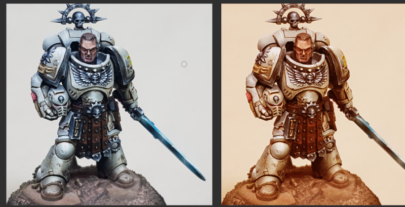
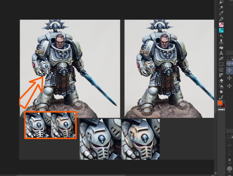
BUT to prove the point, let's look at my own work (I am not saying this is the bees knees or whatever, but they're not badly painted).
I paint my space marines in black and white. I feel I am pretty good now at painting black and white having done so for the guts of three years. It absolutely does matter whether you're using pure white vs off-white, and pure black vs off-black or chromatic black. The final result of my white armour isn't pure white, it's a ultimately a very light grey. I have made the mistake of going too white which blows out the mini and stops me adding any edge highlight in pure white (pure white is fine for sparing use as specular points), because I use the tone underneath to pull the edge highlight back from pure white.
If you look at the marines I first painted, you'll see that the white edge highlight was too opaque and to be honest, I think they look garbage sitting beside my more recent marines because they are stark and lack depth. The same can be said for my blacks. If you look at my assault intercessors, some have black faceplates. I slapped on pure black and gave them an edge highlight. They look awful both in photos and the flesh.
Since then I have been using blue-blacks, brown-blacks etc. or tinting my blacks after the fact to add some visual interest. In addition, there's a reason you should never do pure black oil or enamel washes, at minimum they should be mixed with a payne's grey or other tinted grey to offset how stark it will look. Sure it will give you contrast, but not good contrast.
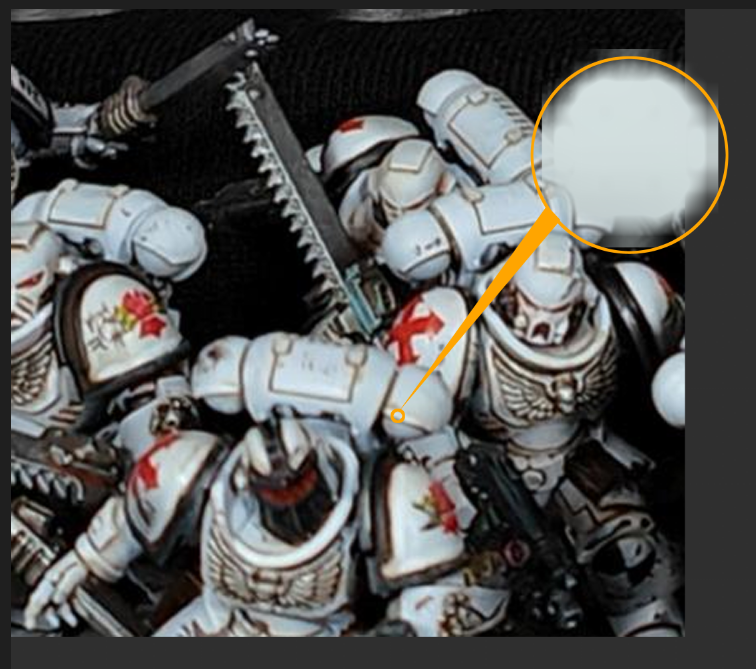
This display piece I did is from two years ago, and there are stark, pure white highlights which I loath. I think they ruin the NMM effect as a result, which requires specular white highlights:
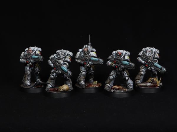
I am much happier with these Hellblasters. Not display level by any means, but they use the principles I've learned the hard way. They have titanium white oil dot filtering, but work with the underlying tone to become a very light grey so I can still benefit from white edge highlights (themselves not really being white anymore). Their shadows are glazed with oils to prevent the shadows being pure black.
For QAR's NMM black to white, that works quite nicely because there's a gradient and the transition of grey helps visually.
At the end of the day, you are right in that no one cares, but wrong saying it doesn't matter.
Not to lump on here Moth, but ThePaintingOwl is correct here. I think saying "who cares" invalidates your argument a little bit as well. "Who cares" is subjective, and this isn't a subjective thing. Using your beards as an example, both look blown out by the photo, and if that's how they are in real life, they are too stark and do not read well. The beard does not objectively need to be like that to read in your lightbox. Someone does not need to be goaded to post their own work to complete an argument about a well understood facet of painting. Just because it is in miniature, doesn't mean you eschew that aspect.
People just don't read these days and take things out of context:
1 - Saying "who cares" was a response the point Owl made about difficulties in taking pictures, meaning that, if it is that hard to take a picture and the changes are so subtle even the shutter speed with make it look different, then it does not really matter. I did say in the beginning (I hear ya, and it is true, however it almost does not matter!) Note that I DO ACKNOWLEDGE THAT YOU GUYS ARE RIGHT! by stating (I hear ya, and it is true) Then I make a case that the difference is so small that i does not REALLY (important word here) matter. It boggles the mind how to something so mild could be misinterpreted that extremely.
2 - (they are too stark and do not read well) They do read well, because the meaning of the term "read" implies that it is something that you can "read" at a quick glance at great distance. The yellow hair guy does not read because it takes a second to see that he even has a beard. The higher the contrast the higher the "read" I hope I don't have to explain that basic concept, or how eyes work, or how human brain processes contrast and takes note of things that standout awkwardly.
3 - You say It does not need to stand out objectively in my lightbox. But I Never talked about it objectively standing out in my lightbox I said box/arm/table, why rip out box from the point about box/arm/table
4 - (Someone does not need to be goaded to post their own work to complete an argument about a well understood facet of painting.) I agree 100% and that is NOT what I intended. If you read what I wrote you would of seen that that I said ("go to my gallery and pick anything you like")
So, you think that I was goading Owl to post their work, but then I was goading Owl to use my work as an example? You are not being fair to me, but that does not really matter ether I suppose.
At the end of the day, you are right in that no one cares, but wrong saying it doesn't matter.
5 - You do realize that the "who cares" was in context of me describing specifically the picture of minis vs real minis and that (no one cares) only applies to something specific and does not apply to the over all points. Unless you are making a general point that no one cares in general about anything, and to that I agree 100% this discussion illustrated that.
You do realize that I never stated that "it doesn't matter" but , (it ALMOST does not matter) or (it does not REALLY matter)
Because "it doesn't matter" and "it almost doesn't matter" are not the same! I hope I don't have to defend that those have different implications...
Feel like you are twisting what I meant, and the my attempts of trying to be understood correctly by copy pasting things I previous stated is a good flashback to the old days of wasting crazy amounts of time discussing pointless things with random people. It is 5 hrs I could of been painting that I wasted in attempts to help and be understood correctly.
THANK YOU POSTING EXAMPLES! But it does not prove the point discussed here. Let me show you:
What you need to demonstrate with your examples is how the contrast is the same but the realism is increased ENOUGH that it MATTERS. Because that was the WHOLE fulcrum and a RAISON DETRE of my argument. (if you are not trying to misrepresent it)
So what if your armor is off white? You still used pure white to edge highlight. Great.
Let me make your argument stronger for you. I took the edge highlights and tinted them ivory-ish to simulate an example by comparison. You SEE! how much realism there is now!!!
So this rough example shows that the contrast is the same, great, and realism is the same, great. One had slightly cooler highlight and other slightly warmer highlight. (they could be on a planet with warmer sun light or on a planet with cooler sunlight, or on a same planet but at different sunny or rainy light) Meaning that it objectively does not REALLY matter, and only up to personal preference that I 100% agree and implied by placing (almost and really into my -does not matter-) If looking at this comparison you see amazing depths of realism then good for you
But those are zoomed in, the contrast and readability comes into play in small size.
Here is what you have to prove here using small image! that from those two side by side, the one is cartoony and other is realistic enough that it matters. You can have a preference, and opinions of what you think looks better, and that is fine, but we are not talking about preferences here, the discussion is cartoony vs realistic.
Let me make your point even stronger
I pushed the lights into extreme IVORY here, you can see how much
And took out your evil pure white edge highlights to show good and holy and amazingly realistic ivory off-white
Look at that realism!
So here is what you have to prove using this small zoomed out picture!
That the helmet on the right is more realistic than the one on the left. I think the only thing this example demonstrates is that left helmet has cooler highlights and the one on the right has warmer highlights.
This message was edited 2 times. Last update was at 2023/07/07 19:21:23
2023/07/07 22:05:12
Subject: Re:Adversion to "pure" black and white in modelling?
Mothsniper wrote: 1 - Saying "who cares" was a response the point Owl made about difficulties in taking pictures, meaning that, if it is that hard to take a picture and the changes are so subtle even the shutter speed with make it look different, then it does not really matter.
I don't think you really appreciate just how much the camera can change how something looks. Shutter speed is not necessarily subtle, I can make a color look anywhere from pure white to pure black depending on what I set the shutter speed to. I can make a white miniature look anywhere from pink to sky blue depending on what I set the white balance to. I can exaggerate or minimize shading depending on whether I use a harsh point light or a diffuse indirect light. If "the shutter speed can make it look different" makes something too subtle to matter then literally every painting technique ever invented in the entire history of painting is too subtle to matter.
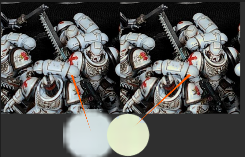
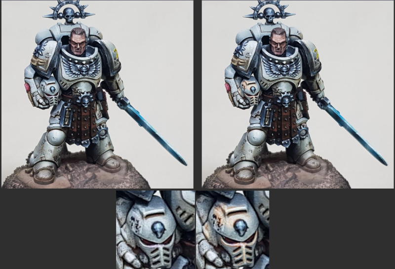
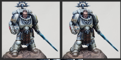
helmet examples
And here you're missing the point. You aren't comparing pure white to off-white, you're comparing different off-whites. The camera and lighting environment have already tinted the "pure" whites and removed some of that unnatural color. Here's an actual example of pure white being used for highlights and you can see that the edit with pure white looks like complete garbage compared to the actual model. And it would only get worse if the pure white was used for the entire surface instead of just a narrow edge highlight.
This message was edited 1 time. Last update was at 2023/07/07 22:06:23
Mothsniper wrote: 1 - Saying "who cares" was a response the point Owl made about difficulties in taking pictures, meaning that, if it is that hard to take a picture and the changes are so subtle even the shutter speed with make it look different, then it does not really matter.
I don't think you really appreciate just how much the camera can change how something looks. Shutter speed is not necessarily subtle, I can make a color look anywhere from pure white to pure black depending on what I set the shutter speed to. I can make a white miniature look anywhere from pink to sky blue depending on what I set the white balance to. I can exaggerate or minimize shading depending on whether I use a harsh point light or a diffuse indirect light. If "the shutter speed can make it look different" makes something too subtle to matter then literally every painting technique ever invented in the entire history of painting is too subtle to matter.
helmet examples
And here you're missing the point. You aren't comparing pure white to off-white, you're comparing different off-whites. The camera and lighting environment have already tinted the "pure" whites and removed some of that unnatural color. Here's an actual example of pure white being used for highlights and you can see that the edit with pure white looks like complete garbage compared to the actual model. And it would only get worse if the pure white was used for the entire surface instead of just a narrow edge highlight.
Missing the point. oh the irony...
I am comparing pure white:
1 - Because for that model in that image that is the pure white. Because no matter camera settings any picture is always in relationship.
2 - And because, you would of understood this if you read carefully, Just like Tyranid Horde said:
"This display piece I did is from two years ago, and there are stark, pure white highlights which I loath. I think they ruin the NMM effect as a result, which requires specular white highlights:"
That helmet was painted with stark pure white loathsome highlights! So yes I am comparing pure white.
Here's an actual example of pure white being used for highlights and you can see that the edit with pure white looks like complete garbage compared to the actual model. And it would only get worse if the pure white was used for the entire surface instead of just a narrow edge highlight.
When I was color tinting I was careful not to mess with the native values of the picture to maintain most accurate representation.
The fact that you have to paint a computer white into a photograph to prove a point is dumb , I am sorry (people don't read carefully and read their own meanings, so to avoid another misunderstanding when I say dumb I don't mean that you are dumb or any person, but it was a dumb thing to say or do, so I call dumb the action or ideas or perceptions not the persons! in case that was not clear, and someone would to jump in and pull that out of context as well) I wont event bother explain the issues using computer white on to a photograph. And the harsh sharp lines you drew in that extend into the shadow are not helping.
By the way, it looking like complete garbage has to do more with how you drew in the white harsh lines than with the tone hue or value of the white highlight, just saying.
But for argument sake Lets take the helmet that you made!!! No matter how Unrealistic it is, and we will ignore that fact, of painting in a computer white into a photograph.
I took your harsh computer white helmet and put it in his hands, zoomed out to the small size that the model would be at, Use that new small image to prove that the right helmet is more realistic and left is more cartoony.
This message was edited 3 times. Last update was at 2023/07/07 23:13:47
2023/07/07 23:06:24
Subject: Re:Adversion to "pure" black and white in modelling?
Mothsniper wrote: 1 - Because for that model in that image that is the pure white. Because no matter camera settings any picture is always in relationship.
That's not how it works. You're misunderstanding why pure white stands out as wrong. It isn't because it has maximum contrast relative to other colors, it's because the color 255,255,255 is unnatural. If you take a camera image of a model and tint it so the pixels in the image are no longer that unnatural 255,255,255 color then you no longer have pure white even if it still has the same contrast level relative to the rest of the model.
I took your harsh computer white helmet and put it in his hands, zoomed out to the small size that the model would be at, Use that to prove that the right is more realistic and left is more cartoony.
"I resized your image so much that there are literally zero pixels of pure white remaining, use that to prove that pure white is unrealistic" is a spectacularly dishonest argument.
Right, awesome. You do realize that the human eye, does same blending for the things that are very are small or far away. So what you are saying is, lolz, Nature because things that are far and I can't tell the difference is very dishonest because I should be able to see the difference even if things are far.
The reason it is almost unnoticeable is because of something I said at the very beginning ("Because the model is so small, you eye will naturally do the blending of everything, and any "wild" tones or colors will only read in the contrast!")
It is a natural process, therefore it does not really matter, unless you paint computer white into zoomed in closeup photographs Super unrealistic
Also, why are you zooming in? the whole point of zooming out is to see how well it reads when things are small.
The dishonest thing here was you using computer white, and using harsh pencil brush in ms-paint
This message was edited 7 times. Last update was at 2023/07/07 23:30:19
2023/07/08 01:00:51
Subject: Adversion to "pure" black and white in modelling?
I'll reply more thoroughly in the morning but I am rather unimpressed to see has gone awry.
To put that helmet argument to bed, those aren't the stark white highlights I was on about. Go slightly north and look at the pauldron. I achieved the effect I wanted with the helmet thanks. I was able to maintain a degree of opacity to knock back the pure white I used, therefore it is no longer pure white. I didn't manage that with the pauldron. Not ALL of my highlights for that piece are stark.
If that last statement wasn't clear: just because I use pure white, doesn't mean it remains pure white due to thinning and the underlying layer showing through. You didn't read that part did you? You disregarded the rest of post I made to suit yourself. You've latched onto "pure white" and ran with it.
Don't know what you're on about with this ivory thing, I am well aware what temperature is and I deliberately chose cold tones. I'll return to this at another time.
If you genuinely want to engage in a meaningful discussion Moth, nip the attitude in the bud. You are being unnecessarily hostile and for someone who screams about meaning of words, check yourself and your syntax because you're claiming two people don't understand you.
Mothsniper wrote: Right, awesome. You do realize that the human eye, does same blending for the things that are very are small or far away. So what you are saying is, lolz, Nature because things that are far and I can't tell the difference is very dishonest because I should be able to see the difference even if things are far.
Yes, the eye does that but to a much lesser degree. The human eye has higher resolution than (most) phones and screens which means detail is lost. You can't use the re-sizing algorithm to average out pixel colors and remove all trace of the original pure white and then say "pure white looks fine". Yes, at some distance the eye is going to lose detail to that level but at a significant distance. And TBH if the only standard that matters for miniature painting is how the model looks on the opposite end of a 6' table then none of this discussion of technique refinement matters, a single coat of contrast paint over white primer will be more than adequate.
Also, why are you zooming in?
To confirm your dishonesty in removing literally every single pixel of pure white and then saying "prove that pure white is an issue in this image". Of course pure white is not a problem in an image that contains no pure white whatsoever.
The dishonest thing here was you using computer white
This is one of the most surreal arguments I have ever been involved in. You're objecting to my claim that pure white is a bad color and shouldn't be used by calling it dishonest to use pure white in an image demonstrating how bad pure white looks. If "computer white" is such a bad thing then thanks for conceding the point to me and agreeing that you shouldn't use it.
I seriously didn't intend to start a flame war with this topic, so apologies for bringing this stuff up. Big ups to Tyranid Horde for his reference picts and experiences, they sound like something I will definitely want to be paying heed to in my own modelling going forward.
When it comes to these things, everything is subjective. I don't care too much about how a miniature "reads" from a distance - that's the "theatrical makeup" narrative all Eavy Metal style miniature painting leans on, and I'm personally bored with it. I am more interested in military modelling and fine art aesthetics now than how something reads from across the tabletop. Dont care about how muddy it looks from a distance, I care how it looks like up close and personal. I'm going for that Lucasfilm aesthetic (see analogue practical fx Star Wars), not for thearte makeup. Everyone is free to pursue the styles they want.
This message was edited 2 times. Last update was at 2023/07/08 09:40:34
"The larger point though, is that as players, we have more control over what the game looks and feels like than most of us are willing to use in order to solve our own problems"


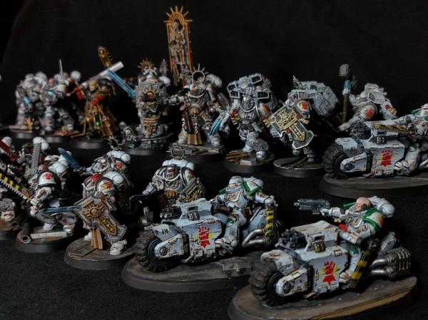
 Ultramarines, 3rd Co. and friends, 16k+
  4k
4k  4k Points
 Competition Index

 Heresy World Eaters/Emperors Children


 it will just look grayer in color. So If I told you that I was highlighting the beard to show it being hit by the bright sun light like it happens in reality with real white beards in the sunlight you would of been ok with the beard painted brightness because it be aligning with the reality of white beards in the sunlight?