| Author |
Message |
 |
|
|
|
|
Advert
|
Forum adverts like this one are shown to any user who is not logged in. Join us by filling out a tiny 3 field form and you will get your own, free, dakka user account which gives a good range of benefits to you:
- No adverts like this in the forums anymore.
- Times and dates in your local timezone.
- Full tracking of what you have read so you can skip to your first unread post, easily see what has changed since you last logged in, and easily see what is new at a glance.
- Email notifications for threads you want to watch closely.
- Being a part of the oldest wargaming community on the net.
If you are already a member then feel free to login now. |
|
 |
2011/04/27 20:42:48
Subject: Help with highlighting - I'm doing it wrong
|
|

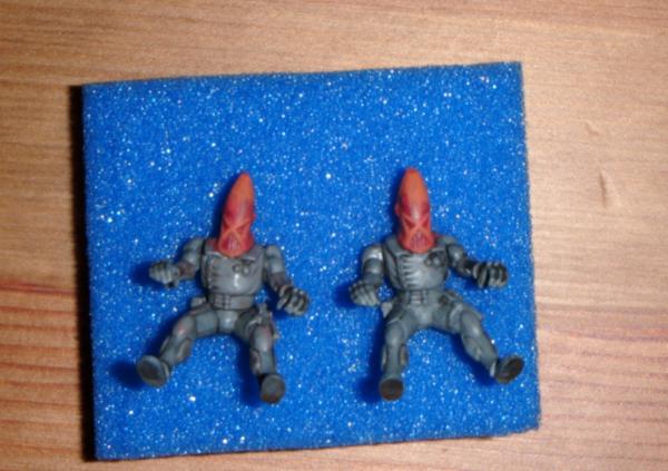
Painting Within the Lines
|
I seem to be going backwards with my painting at the moment, possibly i'm overthinking too much, either way I really need help!
I'm just doing the helmets at the moment - scab red basecoat - firt highlight 50:50 scab red : blazing orange, then added more and more orange, but i'm really not happy with how obvious the highlight is. Actually it doesn't look like a highlight, more like an orange cross on a red background.
I promise I am watering my paint down, but am I watering it down enough or was jumping to a 50:50 mix straight off too much of a colour jump?
Any advice, would be really appreciated - thank you.
|
FOW: Soviet - Tankovy
Infinity: Aleph
|
|
|
 |
|
2011/04/27 21:50:12
Subject: Help with highlighting - I'm doing it wrong
|
|

Jovial Plaguebearer of Nurgle
|
I've always had trouble with GW oranges. Maybe it's a paint issue?
|
|
|
|
|
|
2011/04/27 22:01:10
Subject: Help with highlighting - I'm doing it wrong
|
|
Longtime Dakkanaut
|
Go brighter, then glaze back is a good trick with reds / oranges. For red you want to work up to a bright peachflesh sort of colour. Then start making it redder by applying thin layers of red to knock back the orangeness / pinkness. Sounds complex, but as red's a fairly translucent colour it really is easier than it sounds.
|
|
|
|
|
|
2011/04/28 01:30:51
Subject: Re:Help with highlighting - I'm doing it wrong
|
|
Longtime Dakkanaut
|
That doesn't look bad at all. Once the eyes are painted it'll be far less noticeable. Highlighting cone heads like that is a pain though, compared to Marine armor.
It seems like what you're doing is hard highlighting, when you actually want a softer transition.
|
|
|
|
|
|
2011/04/28 04:11:54
Subject: Help with highlighting - I'm doing it wrong
|
|
Krazy Grot Kutta Driva
|
You should go this route. Scab red, Blood red, then Blazing orange. Make sure the paint is watered down enough that way it will make a natural blend.
|
 Team Zero Comp Team Zero Comp
:
 DA BULLY BOYZ DA BULLY BOYZ
Best painted/ Players choice Slaughter in Space 2011
Best painted Comikaze GT 2011
Best painted Broadside Bash 2012
Best painted Bay Area Open 2012 |
|
|
|
|
2011/04/28 04:31:41
Subject: Help with highlighting - I'm doing it wrong
|
|

Longtime Dakkanaut
|
I think it looks good, but yeah you're jumping too quickly from the red range to the oranges if you want a truly orange main-tone.
As Blasto stated, put a layer in between, alternatively you could start with Blood Red and work up into Blazing Orange.
Another idea (disclaimer totally un-tested theory) is to start with a base coat of Blazing Orange then do a wash of Baal Red and work your way back up, highlighting with a bit of yellow/white in the orange on the edges.
Remember if you're blending/layering for highlights you want the actual colour-proper to be the middle layer that takes up the most space, so to speak.
|
|
|
|
|
|
2011/04/28 06:47:53
Subject: Re:Help with highlighting - I'm doing it wrong
|
|
Painting Within the Lines
|
Remember if you're blending/layering for highlights you want the actual colour-proper to be the middle layer that takes up the most space, so to speak.
Sounds obvious but i actually didn't think of it like that. As these guys are Yme- Loc I was going for orange, not red, but I wanted a different orange to the standard "blazing orange" that most people do their Yme Loc.
Thanks for the comments. I wanted this technique down before I started on anything really good, like my wraithlords. Perhaps i'll strip them and start again - for the 5th time.
|
FOW: Soviet - Tankovy
Infinity: Aleph
|
|
|
|
|
2011/04/28 07:22:38
Subject: Help with highlighting - I'm doing it wrong
|
|

Chaplain with Hate to Spare
|
I love reds and Oranges my favorite colors to paint actually :-) I have a few example on reds in my galleries (exorcists, and my Marines exemplar blog, dreadnought pics) I believe for your models it is a case of the blazing orange being the most prominent layer of highlight to the eye, I start with red gore but any would work then blood red and blazing orange, in your case more blazing orange blends will work easily and then if you feel you need to a slight vomit brown highlight may work for you, it's a personal thing I know but there are a few ways to get the result you want, I realise this post actually sounds a bit jumbled :-/ but in my defense i work night shift and am currently very tired! If you see any good stuff in my gallery and blog i'm happy to Pm you and help out? :-)
|
 Flesh Eaters 4,500 points Flesh Eaters 4,500 points

" I will constantly have those in my head telling me how lazy and ugly and whorish I am. You sir, are a true friend " - KingCracker
"Nah, I'm just way too lazy to stand up so I keep sitting and paint" - Sigur
"I think the NMM technique with metals is just MNMM. Same sound I make while eating a good pizza" - Whalemusic360 |
|
|
|
|
2011/04/28 07:29:09
Subject: Help with highlighting - I'm doing it wrong
|
|
Painting Within the Lines
|
@nerdfest, thanks for the tips. I'm at my FLGS tonight so i'll grab some vomit brown and give it a try. I'l give your recipe a go on a spare guardian or something. THanks
BTW did you use an ink on your terminators?
|
|
This message was edited 1 time. Last update was at 2011/04/28 07:30:00
FOW: Soviet - Tankovy
Infinity: Aleph
|
|
|
|
|
2011/04/28 09:37:59
Subject: Help with highlighting - I'm doing it wrong
|
|
Screaming Shining Spear
|
I think you're being a bit hard on yourself here 'fire - these are looking okay. I do find that Blazing Orange is quite a flat, chalky colour, so that might be influencing your decision. It's also quite a dark orange, so a Baal wash doesn't actually give you very deep shadows (but I don't know if I'd do a Leviathan wash, that'd darken it down to red).
This is a two-window response! lol I'm just looking at my corsair and trying to remember what I did on that (plus I'm totally ignoring the fact that I should be doing some work at the moment).
I started off with a lightened orange - 2:1 Blazing orange to Golden Yellow, just to lighten it a little. I then did two washes of Baal red, re-highlighted back up to my base orange (using my usual thinned down paint technique), and then I went in with a highlight of Sunburst Yellow. I'm a bit wary of Sunburst as it's *so* bright, and I'd usually use Golden Yellow, but it turned out quite well. As someone else mentioned, there's actually only a little shadow, and a little highlight - it's mainly my base colour.
If you wanted to carry on working on what you have, I'd maybe do a bit of backwards highlighting with blood red , and then I'd do a highlight of yellow on the tip of the helmet.
What's also decieving about the minis at the moment is that they're pretty much all the same tone (if you squint at them, you can see that the grey and the orange are pretty much the same and the detail drops out) - once you put some deep shadows on them, it'll all even out. I guess the obvious place for this would be to give them black or dark purple lenses, then everything else will balance out. Maybe even a wash of black on the mouthplate?
The greys are lovely btw.
keep up the good work! : )
|
|
This message was edited 2 times. Last update was at 2011/04/28 09:44:03

"Pit Crew! Take this box out back, throw in a rabid Honey Badger and SET IT ON FIRE!"
If I were an Eskimo, I'd build my igloo next to a supermarket on a tropical beach. |
|
|
|
|
2011/04/28 17:50:24
Subject: Re:Help with highlighting - I'm doing it wrong
|
|
Screaming Shining Spear
|
so, Hangfire asked me to explain how I do my blending, so here we go! Like the good teacher I am, I'm even giving visual resources (always better to show than tell!). This might get pic-heavy so I might have to split it into a couple of posts...
1) basecoat - a straight 1:1 mix of Blazing Orange and Golden Yellow - no watering down because they're fairly transluscent and I didn't want to have to do several coats of it.
2) our test subject
3) basecoat (still a bit wet). I wasn't too bothered about missing bits as this is just a demo and most of him will end up grey anyway.
4) Secret Weapon - I still have some of the old Yellow Ink - I love this stuff. Just gives a nice oomph to models. You could probably achieve the same effect with a thin wash of Golden Yellow.
5) with one wash of Baal Red - it's not actually too dark, considering I'm putting red onto orange
6) scond wash of Baal - this is waht I'm after, a nice, meaty shadow in the recesses, but it's still orange rather than red.
|
"Pit Crew! Take this box out back, throw in a rabid Honey Badger and SET IT ON FIRE!"
If I were an Eskimo, I'd build my igloo next to a supermarket on a tropical beach. |
|
|
|
|
2011/04/28 18:01:08
Subject: Re:Help with highlighting - I'm doing it wrong
|
|
Screaming Shining Spear
|
7) here's what I use for most of my painting - the top brush, a 000 watercolour brush. Underneath a GW fine detail brush for comparison. Not too much difference in size, but where the GW brushes are sable, I prefer synthetic brushes - they're stiffer (oo-er missus!), and I find I can control them better
8) Blazing Orange - this is how much I put on my pallette
9) and then what it's like with water.
Okay, that sounds really stupid, but I always say to people that I thin my paints down, and this is how much I thin them - a minimum of 1:1 water, and this was 1:2 water, so still fairly thick for me. If I want to be careful, I'll go 1:4 - because it's so thing, the actual pigment is so displaced, if you go wrong, it generally doesn't show up, so no worries. Of course the thinner it is, the more layers you hvae to do to build up the colour...
10) I just worked on the wing for demo purposes, but the technique's the same for whatever surface. This is ONE layer. Absolutely no difference whatsoever.
11) six layers
12) 12 layers (why I counted in sixes, I have no idea, odd, even for me!)
13) 18 layers
14) 24 layers
15) 30 layers - 30 layers, just to get a flat orange! I didn't quite realise that's how many layers it took, but there you go. It's not all THAT time consuming as a) the paint is so thin, it doesn't take long for the water to evaporate out b) I apply it in thin, controlled layers - I certainly don't flood the area.
![[Thumb - IMG_0357.JPG]](/s/i/at/2011/4/28/6c34422240a37384263bb50e48d2c754_23173.jpg__thumb)
|
![[Thumb - IMG_0358.JPG]](/s/i/at/2011/4/28/df67f6739078e1d7d3e7aa90f3160ff6_23173.jpg__thumb)
|
![[Thumb - IMG_0359.JPG]](/s/i/at/2011/4/28/aa0fd844c478778b9de4bc48b31316a9_23173.jpg__thumb)
|
![[Thumb - IMG_0360.JPG]](/s/i/at/2011/4/28/7d6659c5e14e2be1dd31d7b9f83c307f_23173.jpg__thumb)
|
![[Thumb - IMG_0361.JPG]](/s/i/at/2011/4/28/67350bc71e1e844a78e3288a9a6878f3_23173.jpg__thumb)
|
![[Thumb - IMG_0362.JPG]](/s/i/at/2011/4/28/72f68f83df139eaf0d33489b48f13a53_23173.jpg__thumb)
|
![[Thumb - IMG_0363.JPG]](/s/i/at/2011/4/28/c7f715de395d480140057040c6fad7a5_23173.jpg__thumb)
|
![[Thumb - IMG_0364.JPG]](/s/i/at/2011/4/28/6a4effa05ff4696ebb5868c1f0612f1b_23173.jpg__thumb)
|
![[Thumb - IMG_0365.JPG]](/s/i/at/2011/4/28/3365af34b8a69bf80e7a4c0e0db39fac_23173.jpg__thumb)
|
|
"Pit Crew! Take this box out back, throw in a rabid Honey Badger and SET IT ON FIRE!"
If I were an Eskimo, I'd build my igloo next to a supermarket on a tropical beach. |
|
|
|
|
2011/04/28 18:13:18
Subject: Re:Help with highlighting - I'm doing it wrong
|
|
Screaming Shining Spear
|
16) first layer of highlights - this is a mix of 1:2 Blazing orange:Golden yellow. Again, I thinned it down 1:2 paint:water
17) five layers of the highlight
18) 10 layers of the highlight
19) 15 layers of the highlight. Technically, the highlight should be less work than the basecoat - I didn't deliberately aim to do half the layers fo the highlight as the flat orange, but that's how it worked out, pretty neat!
As you can see, I also started to work on the helmet, and I only did half of it, so you can see the difference between the base+wash and the highlights
Again, it sounds stupid to say this, but I didn't apply the highlight to all the wing area, only about along a third of the end, narrowing down the nearer I got to the jetpack end.
20) final highlight - pure Sunburst Yellow, slightly scary as it's practically neon in its brightness.
I watered this down more as I know it was so bright (and thank goodness I did!)
21) five layers of the yellow - again, a smaller area than the first highlight
22) 10 layers of the yellow, and I'm done! I'm happy with the colour as it is, although I could have carried on and gotten it brighter.
You can also see there on the helmet of the difference between the base and all the combined highlights (all 55 layers of them!). I guess if I wanted to, I could do a final highlight of white on the helmet to make it a bright highlight, but I prefer the matte finish as it is.
I'm liking how this guy is turning out, and the orange is nice an bright. He's reminding me of Iron Man, so OBVIOUSLY I now want to do one on Iron Man colours 
Hope that helps : )
![[Thumb - IMG_0366.JPG]](/s/i/at/2011/4/28/ffb211e8bef2fe2159f555ca22d6f085_23173.jpg__thumb)
|
![[Thumb - IMG_0367.JPG]](/s/i/at/2011/4/28/f348ded9a4b9ee95c3ba355f81cbe84d_23173.jpg__thumb)
|
![[Thumb - IMG_0368.JPG]](/s/i/at/2011/4/28/1de5dd7fbc99a0e8b769abd4293ad13f_23173.jpg__thumb)
|
![[Thumb - IMG_0369.JPG]](/s/i/at/2011/4/28/82c8684496225b753df99ba068e628ea_23173.jpg__thumb)
|
![[Thumb - IMG_0370.JPG]](/s/i/at/2011/4/28/6fef8d6fa2db0835a969ae4c9f8e7980_23173.jpg__thumb)
|
![[Thumb - IMG_0371.JPG]](/s/i/at/2011/4/28/6144538a1316f5db7e6813d0c5e2682f_23173.jpg__thumb)
|
![[Thumb - IMG_0372.JPG]](/s/i/at/2011/4/28/3157ae521347f32a3b358272d9d6c93d_23173.jpg__thumb)
|
![[Thumb - IMG_0373.JPG]](/s/i/at/2011/4/28/c3c78c3149a6cd1c3f9049337b4c3521_23173.jpg__thumb)
|
![[Thumb - IMG_0374.JPG]](/s/i/at/2011/4/28/c20d7eea7a1b890b3edf6ec7403fcb08_23173.jpg__thumb)
|
|
"Pit Crew! Take this box out back, throw in a rabid Honey Badger and SET IT ON FIRE!"
If I were an Eskimo, I'd build my igloo next to a supermarket on a tropical beach. |
|
|
|
|
2011/04/28 18:16:19
Subject: Help with highlighting - I'm doing it wrong
|
|
Blood-Raging Khorne Berserker
|
I always find it's easiest to over-highlight and then pull it back with a good glaze
|
 Chaos Space Marines, The Skull Guard: 4500pts Chaos Space Marines, The Skull Guard: 4500pts 
 Fists of Dorn: 1500pts Fists of Dorn: 1500pts 
 Wood Elves, Awakened of Spring: 3425pts Wood Elves, Awakened of Spring: 3425pts |
|
|
|
|
2011/04/28 19:34:46
Subject: Help with highlighting - I'm doing it wrong
|
|
Stern Iron Priest with Thrall Bodyguard
|
The issue with so many layers of highlights is that it's time consuming for a standard infantryman, and takes a lot of patience and brush control. You can achieve a very similar effect by doing about 3-4 layers if highlights in thin coats and then applying a glaze to the miniature to pull everything together.
Also, I've recently acquired an airbrush, and it makes realistic highlights super easy to do using the zenethal technique. Have a look at the front page article for the Grey Knight Terminator and you will see what I mean. If you really want to get it done quickly and have a convincing effect without it being so stark, pick up one of the Air Pro Tools PS900 Dual Action brushes from amazon for $50, and a compressor from Harbor Freight for $80. Spend $130, save hours and hours of time doing thin blending.
Of course, an Airbrush does not give you the fine control that Finnan's pictures show, and you cannot do even highlights across an entire model with it, so if that's the kind of highlighting you want then you should try either the thin layers he suggests, or over-highlighting and glazing/washing. And sometimes a thin line highlight like the one in your original picture is a great way to give definition to the model and show where light would hit a hard edge. You just need to make the lined thinner and starker for the effect to be convincing, which takes a lot of time and practice.
|
|
This message was edited 1 time. Last update was at 2011/04/28 19:35:26
|
|
|
|
|
2011/04/29 07:03:15
Subject: Re:Help with highlighting - I'm doing it wrong
|
|
Painting Within the Lines
|
Jaw hits floor!
That was really really helpful, thanks so much for taking the time to do that Finnan. Now I see why I'm not achieveing the same effect with 3 layers - lol.
Just a few questions, if that's okay.
When doing the wing for example, would your brush stroke go lengthwise along the wing or sort of downwards in the direction of the highlight?
Also
When painting a mini like this would you focus on the wings, get them done, do the legs, finish them, body...etc etc, or once you've made up a colour would you apply to the whole of the mini?
I noticed your Avatar was painted in sections, but that's a big model (a Maxi????) so I wondered if you did that for all your mini's.
For those wondering, don't worry I not out to emulate Finnan and I know I need to find my own style, this is just how I process things - The devil's in the detail!
|
FOW: Soviet - Tankovy
Infinity: Aleph
|
|
|
|
|
2011/04/29 08:47:11
Subject: Help with highlighting - I'm doing it wrong
|
|
Screaming Shining Spear
|
You're more than welcome 
I started the brushstroke from the middle of the wing and went towards the edge - it kind of blends itself. Because the paint is so thin, and there's more paint at the end of the stroke than the beginning, the paint 'pools' at the end (even though I'm not flooding the area), so there's more pigment there. I did a longer stroke alonge the edge of the wing with the Sunburst, that's why it's more of a line rather than a blurred transition.
I've actually been working on it this morning! What I tend to do is focus on one colour, and do all the bits I want in that colour at once - for example, I did the other wing this morning, so I'd do one side, then the other, then the unpainted side of the wing I did last night, then any other bits. By the time I get back to the start of the bits, the paint has dried, so it's like a little production line - yeah, there are lots of layers, but it doesn't take all that long to do lots of different areas.
For the Avatar, I basecoated it all, and then concentrated on a leg at a time, then the torso, then the back etc. But I did the same technique for the areas, I did all the orange, then the red, then the grey - I didn't work on each bit individually, completed it, then move on.
It's all about finding a technique that works for what you want - I'm not in this for the gaming, so I can take as long as I want over a single mini (but that means that I HATE doing unit-painting as it takes AGES!), but I know that's an issue for gamers who need to put large armies on the table quickly. I guess that means using other techniques like drybrushing or even airbrushing.
I have a friend who's content with the minimum three colours and base, and it's all that fussed about the painting as long as he can play, and that's cool.
|
"Pit Crew! Take this box out back, throw in a rabid Honey Badger and SET IT ON FIRE!"
If I were an Eskimo, I'd build my igloo next to a supermarket on a tropical beach. |
|
|
|
|
|
|