| Author |
Message |
 |
|
|
|
|
Advert
|
Forum adverts like this one are shown to any user who is not logged in. Join us by filling out a tiny 3 field form and you will get your own, free, dakka user account which gives a good range of benefits to you:
- No adverts like this in the forums anymore.
- Times and dates in your local timezone.
- Full tracking of what you have read so you can skip to your first unread post, easily see what has changed since you last logged in, and easily see what is new at a glance.
- Email notifications for threads you want to watch closely.
- Being a part of the oldest wargaming community on the net.
If you are already a member then feel free to login now. |
|
 |
2012/01/03 03:29:43
Subject: Need honest feedback on your latest paintjob? Post here!
|
|

Powerful Orc Big'Un
Somewhere in the steamy jungles of the south...
|
In an effort to improve my painting skills, and aid the community at the same time, I am creating this thread.
My idea is simple: to provide a collective space for people to post up models that they are wanting feedback on-to be exact, honest feedback. Plogs are nice and all, but they have a downfall: the people that regularly post feedback on them tend to always be the same, so feedback tends to stagnate after awhile. Plus, with all this in one thread, we can cut down on clutter! Finally, this subforum (painting and modeling), tends to get a good bit of traffic, so this thread should be a good way of getting some speedy feedback on your models.
Of course, we need a couple of guidelines for posting models/giving feedback:
1: Be HONEST, but also constructive. Negative criticism never gets anybody anywhere.
2: Be ready to offer tips to those you give feedback to.
So, to get this ball rolling, here is one of my miniatures, needing feedback:
Have fun!
_Tim?
P.S. If a thread like this already exists, feel free to ignore this one/lock it!
|
|
|
|
 |
|
2012/01/03 03:45:18
Subject: Re:Need honest feedback on your latest paintjob? Post here!
|
|
Willing Inquisitorial Excruciator
|
Sounds fun. Not entirely sure if it is a good idea or not as many of the criticism threads go on for multiple pages for a single model, but lets experiment and see how it works!
As for this model, good show. Clean lines, good attention to detail on the hornes, and an effort at highlighting all around.
Some of the edge highlighting is a bit gauche, especially on the robe. Thinner paints or dry brushing would have served better. The teeth look like pure white specks on black. I would have liked to see the same TLC applied to the teeth as was to the horns. Finally, your metallic techniques could use some work. Looks like either a single color of gold or a single color and a wash. Metallics require just as much attention and layering as any other technique, one could argue more. Try using shining gold, devlin mud, burnished gold, mithril drybrush/edge highlight.
Guess I'll open one up for criticism.
|
|
This message was edited 1 time. Last update was at 2012/01/03 03:47:18
|
|
|
|
|
2012/01/03 03:49:39
Subject: Need honest feedback on your latest paintjob? Post here!
|
|

Avatar of the Bloody-Handed God
|
Looks like Stargate, ME LIKE the WATER
|
Paused
◙▬▬▬▬▬▬▬▬▬▬▬▬▬
◂◂ ► ▐ ▌ ◼ ▸▸
ʳʷ ᵖˡᵃʸ ᵖᵃᵘˢᵉ ˢᵗᵒᵖ ᶠᶠ |
|
|
|
|
2012/01/03 03:55:51
Subject: Re:Need honest feedback on your latest paintjob? Post here!
|
|
Willing Inquisitorial Excruciator
|
Uh oh. I was going for a blue marble effect.  Well at least it looks good. 
|
|
|
|
|
|
2012/01/03 04:03:21
Subject: Re:Need honest feedback on your latest paintjob? Post here!
|
|
Avatar of the Bloody-Handed God
|
riplikash wrote:Uh oh. I was going for a blue marble effect. Well at least it looks good.
marbles are formed when molten rocks swirled around,
water / liquid rock are the same , so you did great :'P
|
Paused
◙▬▬▬▬▬▬▬▬▬▬▬▬▬
◂◂ ► ▐ ▌ ◼ ▸▸
ʳʷ ᵖˡᵃʸ ᵖᵃᵘˢᵉ ˢᵗᵒᵖ ᶠᶠ |
|
|
|
|
2012/01/03 04:48:04
Subject: Need honest feedback on your latest paintjob? Post here!
|
|
Gargantuan Gargant
|
Don't have any pics of my recent work, but I'm all about (hopefully) constructive criticism, so I'll add my $.02.
Riplikash made some good points about the gobbo, but my biggest qualm with the highlighting of the robe isn't the starkness of the highlights (honestly, with such small, cartoonish characters, this style is frequently more attractive than more "advanced" efforts, once they're ranked up), but the colors used. I assume you merely added white to make your highlights, as the both the banner's cloth and the hood/mantle are rimmed with pink. I feel like adding yellow or orange to brighten up your mix would've done wonders for the intensity of the color, which, instead of looking brighter in some areas, looks to be a different color, entirely.
For riplikash's 'crons, the marble effect is obviously a focal point, so I'll focus on that. Generally, I love the idea and it's a pretty effect, but it doesn't scream "marble," to me - it feels unfinished. The blue and pale blue/white mottling is a great start, but without more distinct veining, I think the intent is lost to the scale. When playing with scale, as we do, you've got to suggest the desired effect, not actually replicate it. Try mocking up some relatively stark pure white or dark blue veins over the marble sections in an image editing program and ask yourself if you could still mistake it for water. My only general criticism is that the expanses of metal look a tad flat. Not a deal breaker, but a little more contrast wouldn't go amiss (wash the recesses of the "pilots," drybrush/edge-line the darkened thrusters, etc.).
I hope that was reasonably helpful to each of you, or, at the very least, marginally helpful to one of you.
|
The Dreadnote wrote:But the Emperor already has a shrine, in the form of your local Games Workshop. You honour him by sacrificing your money to the plastic effigies of his warriors. In time, your devotion will be rewarded with the gift of having even more effigies to worship.
|
|
|
|
|
2012/01/03 06:24:40
Subject: Need honest feedback on your latest paintjob? Post here!
|
|
Stealthy Warhound Titan Princeps
|
The marble effect looks good IMO, just as other posters said, maybe a few more dramatic veins. My real suggestion is for the tan(?) areas after the marble on the hull... they look a bit bland. I'm not sure what color your going for. If its metallica, a coating of flesh wash or brown ink, then go over it highlighting the edges in the original color would look pretty good.
I'll toss in a recent model I finished myself -

|
|
|
|
|
2012/01/03 14:15:26
Subject: Need honest feedback on your latest paintjob? Post here!
|
|
Willing Inquisitorial Excruciator
|
I've got to say, it looks...airbrushed. I mean, obviously it is, but it LOOKS airbrushed. Instead of highlights it looks like it has gradients. It is especially jarring because you did a proper 3 color job on the power weapon (3 color gradient) but not on the power claw (2 colors is not enough). Using black as a base color for the entire thing gives it an odd feel.
Finally, the steel and gold areas could do with additional wash/highlight steps.
On the plus side it is a fantastically clean paint job, and you have the skill of painting gradients with an airbrush down to perfection.
|
|
|
|
|
|
2012/01/03 14:17:09
Subject: Need honest feedback on your latest paintjob? Post here!
|
|
Powerful Orc Big'Un
Somewhere in the steamy jungles of the south...
|
I take it you used an airbrush on that dread? It looks nice, but the model would be vastly improved if you added some depth to the metals by utilizing some washes and highlights.
The green bits on your model could use some sharp highlights right on the edges, and the scrolls/purity seals could use them as well.
Hope that helps!
_Tim?
|
|
|
|
|
|
2012/01/03 14:31:42
Subject: Need honest feedback on your latest paintjob? Post here!
|
|

Longtime Dakkanaut
|
I am nearly finished the body and legs of a dreadnought just not the arms. Can i post that up?
That night goblin is fantastic tim. Speaking completely objectively i would say you are a slightly better painter than i am. As you have a similar love of chunky highlights and bright colours.
Riplikash the blue marble is great and i wont bring my irrational dislike of osl into things.
The metal however looks a little 'sticky', did you have problems with the paint? Also i think the gold bits need more darkness in the grooves and not the green shade you have chosen, doesnt quite work for me.
I find obviously airbrushed models difficult to judge so i am not even gonna try i'm afraid Horst. They just sort of send my brain into meltdown.
|
Mary Sue wrote: Perkustin is even more awesome than me!
|
|
|
|
|
2012/01/03 14:36:28
Subject: Re:Need honest feedback on your latest paintjob? Post here!
|
|

Lady of the Lake
|
This thread is refreshing.
I agree the sharp highlights would do it wonders. The blending itself is already superb.
Mines a mix of recent and not so recent (may need to use zoom in gallery), though still scraping mid table top at best in my opinion.
Don't want to come across as a pest, but I'm kind of looking for a way to improve the bronze though, latest for it is the flamer on the right. Another thing is how to improve adding in iris, the first attempt was the green eyes in the middle though the second was the blue to the left and I seem to not be grasping it. So I'm not too sure of it.
I'm also after tips on how I could improve the script on these as to me it's a bit thick and messy in places, though I likely already know it's just improve brush control.
Of course any tips are good, but advice on those would be nice as well.
|
|
|
|
|
|
2012/01/03 14:48:02
Subject: Need honest feedback on your latest paintjob? Post here!
|
|
Ollanius Pius - Savior of the Emperor
Gathering the Informations.
|
For the bronze, I think you should start off with a brighter metal base or add some Mithril Silver or the like to the original bronze color.
Alternatively, use Gryphonne Sepia to do the shading. It adds a more rich coloration rather than simply darkening the metal. You can also do some fun stuff with heavily watered down Dark Angels Green, Hawk Turqoise, or Blazing Orange to add some spotting and age to the mix.
I've got some examples of that in my "Children Shouldn't Play With Dead Things" gallery here on Dakka.
|
|
|
|
|
2012/01/03 15:05:39
Subject: Need honest feedback on your latest paintjob? Post here!
|
|
Powerful Orc Big'Un
Somewhere in the steamy jungles of the south...
|
Perkustin wrote:I am nearly finished the body and legs of a dreadnought just not the arms. Can i post that up?
That night goblin is fantastic tim. Speaking completely objectively i would say you are a slightly better painter than i am. As you have a similar love of chunky highlights and bright colours.
Riplikash the blue marble is great and i wont bring my irrational dislike of osl into things.
The metal however looks a little 'sticky', did you have problems with the paint? Also i think the gold bits need more darkness in the grooves and not the green shade you have chosen, doesnt quite work for me.
I find obviously airbrushed models difficult to judge so i am not even gonna try i'm afraid Horst. They just sort of send my brain into meltdown.
Sure, go ahead and pust up pictures of the Dreadnought! We would be more than glad to help you out.
Oh, and in an effort to improve my painting skills, I am ordering the Ork Boss and the Space Marine captain out of the AoB boxset. Those should be good models to practice my battle damage effects and fine edge highlighting on.
_Tim?
|
|
This message was edited 1 time. Last update was at 2012/01/03 15:07:48
|
|
|
|
|
2012/01/03 16:03:01
Subject: Re:Need honest feedback on your latest paintjob? Post here!
|
|
Willing Inquisitorial Excruciator
|
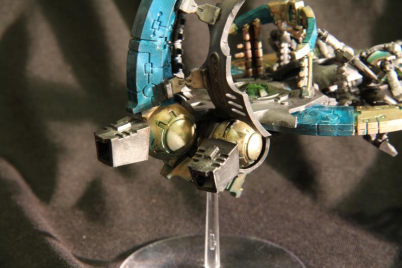
I'm a little confused at the comments on the metallics in my pic. Wondering if clarification is in order as I can't tell if the picture is just not representing things well, or I made a mistake.
The metal is actually a metal "polish", so the "tan" areas area actual brass painting. The blue wash is to simulate the blue patina brass develops.
Here is a slightly different picture.
I wanted it to look only mildly tarnished. Here's an example of a more heavily patinad experiment I did:
Does it really look that non-metallic?
|
|
This message was edited 2 times. Last update was at 2012/01/03 16:09:34
|
|
|
|
|
2012/01/03 19:16:00
Subject: Re:Need honest feedback on your latest paintjob? Post here!
|
|
Longtime Dakkanaut
|
Riplikash the test model looks pretty good. Looks fairly good here, note that's meant to be dirt not weathering. Though it was an experiment, never done it before. 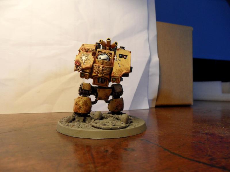 Am not entirely happy with the back but i dont want to have plain metal in my army as i dont feel its realistic, prefer heavily chipped black paint. I think it needed another wash of Badab black before i started doing the chipping, too much boltgun metal is still showing. 
|
|
This message was edited 2 times. Last update was at 2012/01/03 19:17:43
Mary Sue wrote: Perkustin is even more awesome than me!
|
|
|
|
|
2012/01/03 19:19:42
Subject: Need honest feedback on your latest paintjob? Post here!
|
|
Willing Inquisitorial Excruciator
|
I really like it. It's hard to tell without a closer shot, but from these pics the weathering looks top notch. Good job on the white too, not an easy color to pull off.
Only criticism I have, and it might be becaues it is not done yet, but some of the details don't seem finished. The mechanus sign on the back, and the aquilas.
Other than that it is a hard model to criticize, at least from these pictures.
|
|
|
|
|
|
2012/01/03 22:57:05
Subject: Re:Need honest feedback on your latest paintjob? Post here!
|
|
Gargantuan Gargant
|
riplikash wrote:I'm a little confused at the comments on the metallics in my pic. Wondering if clarification is in order as I can't tell if the picture is just not representing things well, or I made a mistake.
The metal is actually a metal "polish", so the "tan" areas area actual brass painting. The blue wash is to simulate the blue patina brass develops.
Again, I'd make the point about scale and illusion that I did with the marble - a model made of brass looks different than a large machine made of brass, viewed at a distance (the closest analog we have for scale). Natural metal finishes can work great on realistic model airplanes, for example, but they often feel out of scale or simply "off" when placed next to obviously illusory and stylized techniques, like OSL, edgelining, and color modulation. My opinion of the patina aside, the reason it looks off to my eye is because you're mixing realistic and stylized elements, just as when someone bases a painted miniature with plain, unpainted sand. People that say it could use highlights do so because the metal is reflecting light like an object its size and shape would, not like a larger object, miniaturized.
In the end, it's entirely a personal, stylistic choice, but it's not a matter of people 'not getting it' - they're just reacting to the difference between what they're seeing and what they expect to see represented.
|
The Dreadnote wrote:But the Emperor already has a shrine, in the form of your local Games Workshop. You honour him by sacrificing your money to the plastic effigies of his warriors. In time, your devotion will be rewarded with the gift of having even more effigies to worship.
|
|
|
|
|
2012/01/03 23:06:50
Subject: Re:Need honest feedback on your latest paintjob? Post here!
|
|
Willing Inquisitorial Excruciator
|
Appreciate the feedback, and the rift between the very realistic metal and more stylized other elements was a concern of mine. On my monolith I did a much more stylized metallic look, and even though the painting in general is much less advanced, it seems to get better reviews.
I would be interesting on any thoughts between the two techniques.
And I'll stop with my own stuff there, as I feel like I'm hijacking the thread. Hope some more people get involved and post some stuff.
|
|
This message was edited 1 time. Last update was at 2012/01/03 23:07:22
|
|
|
|
|
2012/01/03 23:26:52
Subject: Re:Need honest feedback on your latest paintjob? Post here!
|
|
Anointed Dark Priest of Chaos
|
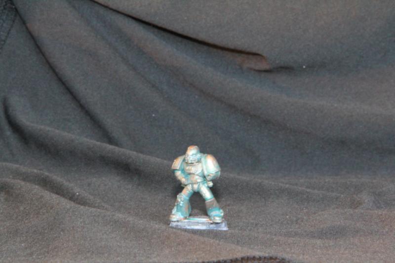
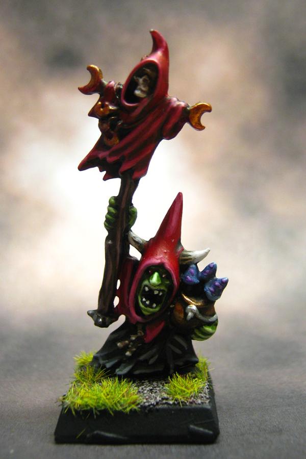
Last model I finished was this nob:

|
|
|
|
|
|
2012/01/03 23:40:50
Subject: Need honest feedback on your latest paintjob? Post here!
|
|
Powerful Orc Big'Un
Somewhere in the steamy jungles of the south...
|
@CT Gamer: If I were you, I would add one more layer of highlights, at least on the skin. Right now, the model looks a bit flat. I would also recommend some highlights on the metal bitz as well-even just an edge high of Chainmail would give it that extra "pop".
Kudos on the dag marks, though! Those are very hard to do, and require a good bit of brush control.
_Tim?
|
|
|
|
|
|
2012/01/03 23:43:57
Subject: Need honest feedback on your latest paintjob? Post here!
|
|
Anointed Dark Priest of Chaos
|
Some_Call_Me_Tim? wrote:@CT Gamer: If I were you, I would add one more layer of highlights, at least on the skin. Right now, the model looks a bit flat. I would also recommend some highlights on the metal bitz as well-even just an edge high of Chainmail would give it that extra "pop".
Kudos on the dag marks, though! Those are very hard to do, and require a good bit of brush control.
_Tim?
Yeah, the skin is usually the frst thing people mention. i sort of like a "cartoonish" look for orks, but I can't deny that everyone mentions it...
|
|
|
|
|
|
2012/01/04 03:47:02
Subject: Need honest feedback on your latest paintjob? Post here!
|
|
Willing Inquisitorial Excruciator
|
I see what you mean by 'cartoonish', and it looks really good, but if you want to go for the cell shaded look it is best to do it with purpose so it doesn't just look flat. Usually you need at least two colors for cell shading, a base and a shade.
|
|
|
|
|
|
2012/01/04 03:52:20
Subject: Need honest feedback on your latest paintjob? Post here!
|
|
Lady of the Lake
|
I think the cartoonish look suits the feel of the orks myself.
@Kan: Gave it a look and it's nice. You meant stuff like the scythe and the plate on the wight king?
|
|
|
|
|
|
2012/01/04 14:44:58
Subject: Need honest feedback on your latest paintjob? Post here!
|
|
Ollanius Pius - Savior of the Emperor
Gathering the Informations.
|
Indeed I did n0t_u.
The armor plating on the Blood Dragon was done to make a bronze without ever having to use a bronze color though. Mithril Silver washed Sepia and then given a touch-up to make it metallic.
|
|
|
|
|
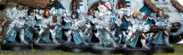
2012/01/04 18:02:06
Subject: Re:Need honest feedback on your latest paintjob? Post here!
|
|
Stormin' Stompa
|
What else could I do to make them look better?
|
Ask yourself: have you rated a gallery image today? |
|
|
|
|
2012/01/04 18:06:54
Subject: Need honest feedback on your latest paintjob? Post here!
|
|
Ollanius Pius - Savior of the Emperor
Gathering the Informations.
|
Dirty 'em up more!
They look too much like "models", if that makes sense.
|
|
|
|
|
2012/01/04 18:31:17
Subject: Re:Need honest feedback on your latest paintjob? Post here!
|
|
Willing Inquisitorial Excruciator
|
A wash would really help, and some more shading on the lower half of the pauldrens. A mud wash wold help the leather pouches. For the silver start with something darker like boltgun and then highlight with whatever color you used.
Start with a darker color of grey than you want the finished piece to be and highlight up from there, painting only the most exposed/highest portions of the model your finished color.
Remember metallics should always take 2-3 coats thin coats, never 1 thick. Some parts of your silver looks patchy, and I suspect that is because you didn't layer enough.
The shield emblem could use more detail. Instead of thinking of black as it's own color think of it as a dark grey and highlight accordingly. A gradient of grey on the shield emblem would look much better than flat black, which almost never looks good. Same goes for the white symbol on the shield. Either give it a gradient (grey or bleached bone would look good) or paint it up a bit more as a mountain (i'm guessing that is what it is supposed to be).
Finally, for these guys color scheme some dirt/dust weathering could REALLY add some visual interest. There are lots options, but many are expensive (weathering powders, airbrush, oil paints). The cheapest thing to do would be to get some brown pastels and make your own weathering powder by rubbing them on sand paper. For a dusty look you can just brush it on into the cracks and around the legs then spray it with alcohol, thinner/terpentine, or even water if nothing else is available, then seal the model with a varnish as usual. Or if you want mud mix the powder with alcohol and paint it on. Seal with varnish.
|
|
|
|
|
|
2012/01/04 19:02:29
Subject: Re:Need honest feedback on your latest paintjob? Post here!
|
|
Regular Dakkanaut
|
Oooh, I'll bite! I love trying to spread the limited knowledge I've gained on the subject so having a one stop shop is a great idea!
@Some_Call_Me_Tim?
So this is being very critical of a well painted mini but here goes...
First I'd clean the base up a little bit more. Looks like there's some rough stuff on the edge that could be cut away?
The night goblin looks really good but the blending is a little rough. I think it's been said but I'll echo it with my spin. I know this technique can be great for table top as it can create some dramatic contrasts so if that's what you were going for then well done. However, for display mini's I'd suggest wet blending those colors - keep your pallet wet and apply the colors in succession, blending them on the mini itself. You can also try layering with very thinned paint - when you apply the paint it should look like it made the spot wet for a second but it should evaporate as quickly as you applied it. Applying those highlights in very thin layers will help blend the colors a lil better.
I also like to highlight reds to warmer colors like orange / yellows instead of adding white and giving a pinkish hue... but this is my personal taste.
Lastly, the horns could use another coat of brown wash at the VERY base of the horn, where it's coming out of the hood. And maybe some Greyphone Sepia on the base of the teeth to tie them in (as was said).
@riplikash
Hey there! So I absolutely love the marble effect you accomplished on this guy! However, for whatever reason (camera / picture?) and as others have said, the metallics look very flat to me. They aren't as vibrant as the monolith you did. I agree with what's been said about adding some wash to give the metallics a little more depth (on the pilots too). You could also try highlighting with metallic medium instead of a full metallic paint. This should be applied very sparingly but really adds some pop! Personally, I like the style you achieved on your monolith. I'd suggest keeping the army coherent with this effect but that's my 2 cents.
My next suggestion would be the green from the panel / other orb areas... from the angles you posted it looks like the source of light could be a little brighter in some areas? Again, it looks a little flat so I'd add some green wash to the recesses (not disturbing any OSL on other parts) and take it a little lighter with scorpion green or SG + white.
All in all, looking good though!
@Horst
That dreadnought is an excellent start! However, it looks like you did the base coat (airbrush included) and need to finish the painting by hand a lil. Reiterating what riplikash said, try adding another layer of highlights to the claws to bring them up to the level of the force weapon. The green body could use some battle damage and highlights to break up how clean it looks with the airbrushing. The bronze could use a brown wash then some highlights using the original color to keep it simple. Same goes for the silver but with black wash & another coat of the same silver color as a basic highlight. Next one you paint I'd suggest looking into the salting technique. You basically spray the whole thing mithril silver then toss a wash or two on. After that you "salt" it and finish painting like you did on this dreadnought. After you're done you pick off the salt to expose that metal underneath for some insta paint chip / battle damage glory! Salting Youtube Tutorial This shows a military model but the same technique applies here...
Very clean paintjob, thus far, you have excellent brush control... don't be afraid to get a lil dirty! 
@n0t_u
So I tried to zoom in a best I could for the iris issue but I still can't see them very clearly (and I know how hard it'll be to actually photo them in great detail). Given what I understand I can make the following suggestions:
The iris' I see painted on the two black haired non-helmeted sisters looks white with black on the edges. When I paint eyes I typically add the iris color to the middle / off center first. Next I paint the pupil black as a spot in the middle. I then clean up / paint the edges of the eyes white and add a small white dot to the edge of the iris and pupil. Break out your 000 brush for this! Like so:

MS Paint FTW!
As for the bronze flamers try using Greyphone Seipa over most of it, then highlighting with the same bronze to add some depth. After that, add more Seipa to the flamer tips then try Leviathian Purple instead of black for the burnt effect. Someone had a tutorial on how they painted a demolisher cannon using a similar, albeit more in depth, technique and it looked fantastic... Dakka P&M Link!
@Perkustin
That looks amazing, so far!
I think the metal backing could be taken further, still... I know it'd be a lot of work but if you wanted a mostly black look without it going to an oily mess using a ton of black wash, you could try the salting technique with what you've got so far. Using the layer you have now as the foundation, seal it (varnish) then add some salt over that (spray hairspray then toss on salt to wet areas) and let it dry. Next paint it pure black with a few grey highlights for some depth. Next remove the salt with an erasure or some similar method to expose the dirty metal underneath. You could highlight the edges of the salted area like you did on the paint / battle marks on the front of the dreadnought. (See salting video I posted, above, for Horst.)
@ CT GAMER
As others have said, I agree that the skin could use a little more depth. The armor you've done looks more realistic so there's a bit of a disconnect, for me, between the skin and armor, at least on the nob up front... That mob is looking good though, great terrain and fun pic too!
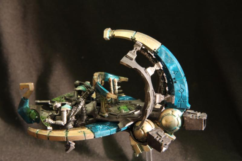
So there you have it... some suggestions based on my personal preferences, hopefully related to what some of you are trying to achieve. And hopefully some help, too! As for my most recent mini's I just finished up my Monolith's none too long ago and am working on a full royal court (5 lords & 4 crypteks) along with Obyron and Imotekh. I know where I'd improve on my monoliths but I'd love to hear any thoughts from the Dakka community. Thanks!
Monolith Image Here:
P.S. If I never have to put together another monolith it'd be too soon! Automatically Appended Next Post: @Mr Nobody
I agree with everything riplikash has suggested. I think this color scheme looks good and the subtle highlights work. These remind me of naval armor or something... Adding some chipped paint / battle damage with exposed metal would really make these pop! It takes some forethought but painting these with the salting technique would pay off. Spray using Army Painter metallic primer, toss a wash of black on and some highlights in mithril silver then seal, salt, and paint like you did! You (along with everyone else I've suggested this to) could use the sponge technique but it's a lot more work to apply chipping afterwards, imho.
Sponge tip from fellow Dakka member, grey_death: Linky
|
|
This message was edited 1 time. Last update was at 2012/01/04 19:15:05
|
|
|
|
|
2012/01/04 19:23:10
Subject: Need honest feedback on your latest paintjob? Post here!
|
|
Willing Inquisitorial Excruciator
|
Hey Nowoo, always good to get feedback from you.
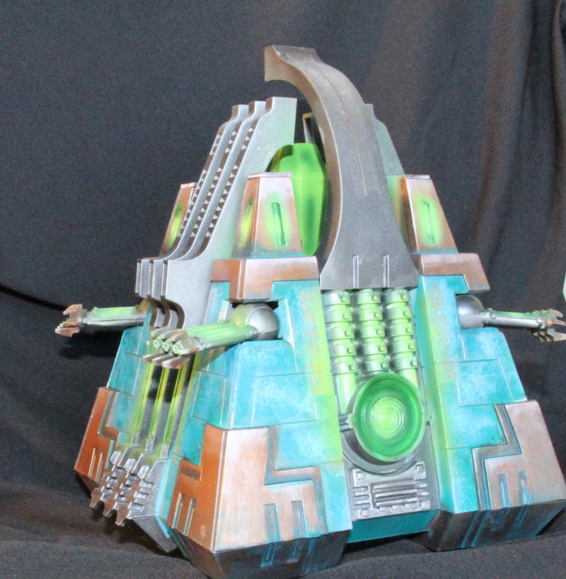
So, feedback on the monoliths:
I have no technical critisizms. You have pretty much mastered the techniques you are using. Stylistically you are top notch too, so I'm not so much going to make recommendations as think out loud about possible changes in style. They are all fairly nit-picky as you nailed these pretty well.
I have to admit, I'm a little silvered out by the scheme. SOMETHING to break it up would be nice. Mainly it is the top portion that just feels a bit flat i.e. the four pillars and crystal cage. It is all just very flat silver up there where the rest of the model has some beautiful weathering. However, weathering is obviously not appropriate for those flat silver portions.
I had very similar issues with my pillars and decided to go for a gradient, as you saw. Don't know if that would work or not on yours though.
I love all the metal, but wonder if some slightly different material would provide some contrast. I liked the WD article written by the Nihilakh army painter where he talked about how he made the fully mechanical portions of his models a different material, a dark iron color. You may have noticed I did a similar thing. I have a brass/marble theme, but the mechanical portions are a darker iron color.
I could see something like that providing some nice contrast, even if it was fairly subtle.
|
|
|
|
|
|
2012/01/04 20:51:29
Subject: Re:Need honest feedback on your latest paintjob? Post here!
|
|
Regular Dakkanaut
|
@riplikash
Thanks for the feedback! I really like your theme and the contrast two distinct colors give. I also like the subtle detail of having the joints / smaller stuff a darker metallic.
I was actually in analysis-paralysis over the pillars for sometime before I started painting. I knew they would be tough to paint beyond the glow so I went for a very smooth finish (green stuffed & sanded the creases to the point I was dreaming about it - even with a dremel). I tried to give it a very formidable look, as though it were impregnable... Less is more and all. I was actually playing with putting bronze on the lower corners instead of silver too but scratched that once I had the silver done. It's hard to photograph, and you'll have to take my word, but there's a lot more depth IRL than I've captured in this image. If you can't tell I gloss coated my army so the light box / gloss really tends to kill any depth but hey... you're giving honest feedback based on the image I posted so it's appreciated, all the same! There is a lot going on inside the crystal area - I'll try and find a better shot showing more of the OSL and gradiant shading of the silver for the side vents and back thingy that you can't see in this pic. These are already packed away though, so if I can't find a shot I already took, don't hold you breath!
I was toying with the following themes when I first started this army:
1) Bronze joints / spine w/ Silver armor plates
2) Silver joints / spine w/ Bone armor plates
3) Paint all the metallics fairly similar
So I went with number 3, obviously, but I also mix in some bronze spines here and there (immortals, wraiths, lords currently). In the end, I started this army by painting up 1 lord and 24 warriors and didn't feel like painting 2 base colors...
If I were to do this over again I'd end up doing a bone armor with metal chips. I think this would have been 10x faster and given a very clean look. However, I'll probably save that for a marine army, if I ever get there...
Thanks again!
|
|
|
|
|
|
|
 1500
1500  1500
1500