Ironklawmadgutsmek wrote:Wanting some feed back on my model,
I'd like to think that I'm getting better. be as critical as you like, thanks.
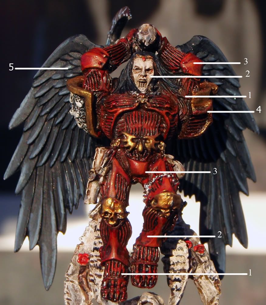
I do have some critiques for you, and I pointed out a few things on your photo:
It doesn't look like your paints are thick and chalky, so I'm guessing that you're thinning them down some, and that's definitely a good thing. I find that even paint that says it can be used straight out of the pot(the old
GW foundation paints, P3 paints, etc), I still prefer to thin them down, as multiple thin coats will always be better than a few thick ones.
Overall, the paint job is a bit sloppy and it looks like you're relying too heavily on washes to do the painting for you.
For some of the points on the photo:
1) Regarding the sloppiness, there are quite a few areas where parts of the model either went unpainted, such as his hair where it falls around his shoulders(it's red), the armor grooves around the feet, and in a lot of the areas with the metallics(see pointer 4 on his left shoulder). Even if you aren't a magnificent painter, cleaning up areas like this can really make a difference in a paint job. Clean lines are more important than fancy blending or glaze effects when you're trying to get better with painting. Personally, I think I spend more time on this aspect of painting a figure than anything else.
2) Painting with washes is more of an advanced technique, and if not done properly, it can give the splotchy, mottled look seen on your figure in the dark wash on the armor and on the face. Generally, washes should be used to either shade recessed areas, or to subtly shift the color of an area, and not used as "paint" or an entire layer in the painting structure(such as shadows). I would also suggest adding something to your washes to help them flow better. Some of the cheapest and easiest things to break the water tension are Future Floor Wax or Windex - these are American names, and I'm not sure if either is sold in the
UK under the same name. For the best results, washes should be controlled and directed with careful attention from your paintbrush, making sure it goes where you want.
For the more subtle effects with washes, again, it's best to mix it thinner than you intend and do multiple thin layers where you can easily add more layers and control the effect you want, rather than putting on a layer that's too heavy and ruin the paint job on the area.
3) Highlights.
Your highlights are on the thick side, and not always positioned correctly, like the stripe on his codpiece. I've taught some family and friends some painting techniques, and this is always one of the hardest to learn. I struggled with it myself for a while. The way I show people new to painting how to do line or edge highlights is to do the basecoat first, and then go straight to highlights, instead of the usual base-shadow-highlight format that is the norm. Why? Because if you aren't practiced with putting down fine highlights yet, it's easier to go back with the base color and paint over the edges of the thick stripe and thin the line down to the proper thickness. If you've already put down shading and/or washes, it's very hard to come back and clean that highlight up.
Something that can really help you learn where to place the highlights is to use references of the painted figure, especially if you're going with the studio paint scheme. There are good photos of Astorath on the
GW site that could help you see where to put not just highlights, but shading as well.
4) Metallics are best done over a dark base color, either a dark brown or black, and again, thin them down. In my experience, metallic colors seem to dry faster than other paints, and can start to show brushstrokes really easily if you're not careful. I thin the first coat down about 2:1 paint/water to get a good coverage, and then thin to 1:1 for subsequent layers to enrich the color and make sure I've got everything covered that I need to.
Also, unless you are a REALLY good painter, do not highlight the "gold" type of metallic colors with silver. To look good, it has to be a really light, fine line. A basecoat, then a brown wash, and a thin layer of the base coat to act as a highlight is generally enough for good "gold" colors.
5) This point in the pic is touching on both the sloppiness and edge highlight points. Some of the feathers have highlights, some don't. Some of the highlights are very thick, and some aren't even along the edges of the feathers. Remember, clean lines are THE most important thing in a good paint job. I've seen some figures that completely skipped any sort of shading but were very sharp and clean with the base coat and highlight, and looked very nice.


 14,000pts ish
 /
/  2500pts ish
 4500pts ish
 /marine 8500pts ish

 ) or some other bright sliver. Looks great tho.
 Check out my
  Check out my
  Check out my
  Check out my


 ....
....