| Author |
Message |
 |
|
|
|
|
Advert
|
Forum adverts like this one are shown to any user who is not logged in. Join us by filling out a tiny 3 field form and you will get your own, free, dakka user account which gives a good range of benefits to you:
- No adverts like this in the forums anymore.
- Times and dates in your local timezone.
- Full tracking of what you have read so you can skip to your first unread post, easily see what has changed since you last logged in, and easily see what is new at a glance.
- Email notifications for threads you want to watch closely.
- Being a part of the oldest wargaming community on the net.
If you are already a member then feel free to login now. |
|
 |
2012/05/20 09:33:59
Subject: Wanted: Feedback on My Infinity Challenge Entry and Advice on Aleph Color Schemes
|
|

Stalwart Tribune
|
*May 27th, 2012, Edit: Thanks for the feedback, I've now begun the process of repainting the model and trying to develop a scheme for it and the rest of my Aleph force. Please stop by the thread on the P&M blogs page to follow my ongoing efforts!*
Now that the Infinity Challenge is over, I'm very interested in any general feedback an constructive criticism on my entry. Thanks to everyone who took the time to comment in the contest thread itself!
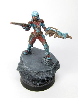
I don't think I had any chance at the Top 5, but I do feel that I hurt my entry by stuffing too many photos into the contest image. For anyone who looked through the contest thread, does seeing this larger image change your opinion of the miniature? It might not since a surprising number of people seem to have clicked into the gallery for a closer view.
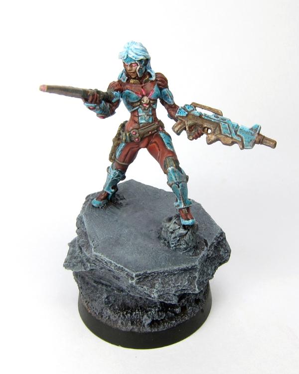
In defense of my overstuffed image, I thought the entries would be shown in full 1000*800 size in the thread (as shown below) so that more detail would be visible:

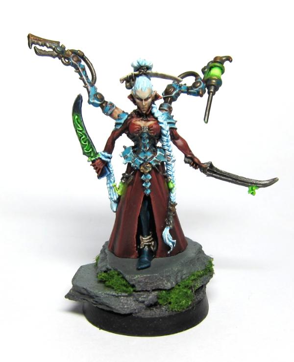
Also, more specifically to help me improve overall as a painter, I'd like any feedback on why this scheme seems to work better on my Dark Eldar than it does on the Myrmidon Officer. For me, the fact that Aleph models shouldn't be weathered doesn't bother me since I'm just starting Infinity and the fluff hasn't sunk in yet. So it's not that. What it might be is that the Myrmidon is more streamlined overall and so just doesn't take as well to random bits of weathering. Any thoughts?
For years, I've really mostly only been painting GW minis and I'd like any advice on whether some other brands of miniatures do better with certain techniques over others. I'm also generally interested in examples of alternate color schemes for Aleph. I've already spent hours on Google, Coolminiornot and the Dakka Gallery looking for examples. Since Aleph seems to be at least partially inspired by Ghost in the Shell, I'm currently thinking of a white/pale grey/blue-purple scheme based off that.
I'd be grateful for any and all comments, advice and constructive criticism  !
|
|
This message was edited 1 time. Last update was at 2012/05/27 11:55:02
|
|
|
 |
|
2012/05/20 23:20:29
Subject: Wanted: Feedback on My Infinity Challenge Entry and Advice on Aleph Color Schemes
|
|

[MOD]
Madrak Ironhide
|
The Infinity Aleph is presented as clean "NuHumans." I think you
got voted down because you went with a dirty metal idea.
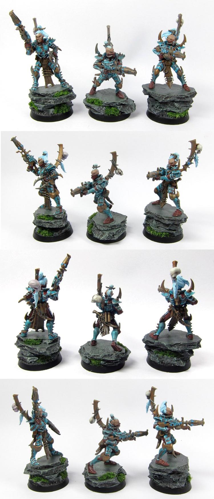
Here is the studio scheme:

Your model does not match the clean feel of the faction.
One thing you could have done instead of wash in dirty detail
would have been to go for a marbled/ornate blue look.
Also, the model's flesh tone melts into the reds you've got going
there.
The Dark Eldar are boss, though.
|
|
|
|
|
|
2012/05/21 12:23:17
Subject: Wanted: Feedback on My Infinity Challenge Entry and Advice on Aleph Color Schemes
|
|

Fixture of Dakka
|
I really love infinity and I thought your entry was really nice(and so obviously yours  ). Fluffwise, there is nothing wrong with the way you painted her but infinity attracts a lot of fluff Nazis that can't look past what's there in black and white. Similarly they wouldn't like non codex 40k armies so don't worry about that.
In the interest of giving helpful feedback, I'd say that the extent of the weathering makes the paint look dirty. Not the model, the paint. It looks a little like when you wash and re-highlight something to the point it gets messy. Those who don't know your Dark Eldar may have mistaken your skillful weathering for dirty paint which is a shame. You definitely deserved more votes!
If your going to be painting more Aleph before you read the books then pm me and we'll talk fluff. At least that way you can explain why your style makes sense if the Nazis come a'callin'!
|
|
|
|
|
|
2012/05/21 22:37:45
Subject: Re:Wanted: Feedback on My Infinity Challenge Entry and Advice on Aleph Color Schemes
|
|
Stalwart Tribune
|
@malfred: Thanks for the honest feedback . I actually really admire the studio scheme in how it gets the "NuHuman" theme across. After researching Aleph color schemes before and after the challenge I've realized that creating a bright futuristic look that also communicates a no-nonsense efficiency is unusually difficult. In particular the use of the, very lightly, purple-tinged bone instead of white is brilliant. I find that miniatures with pure white armor that isn't weathered often look a bit cartoony and the warmer bone helps contrast with the colder purples. Also, I appreciate the use of purple instead of the more conventional blue since it helps to differentiate the faction. Ultimately I might finally decide on the Studio scheme since it is so good, but I want to take the time to explore some other options first.
@Casey's Law: Before this painting competition I had never seen an Infinity miniature in person. I now think that a lot of the line suffers in photos compared with GW and PP (what I'm used to seeing) because they don't get across the fact that some of the Infinity miniatures are actually a lot smaller. Compared with my Dark Eldar, I was very restrained with my weathering on this entry. But it still overwhelmed the comparatively "petite" model. Thanks for your support and offer of fluff assistance! I'm not going to stick with a weathered scheme for Aleph. Mostly because I'd like the challenge of painting something really clean as a change from my Dark Eldar. What I'd really like to know is whether the rule books give you a good amount of fluff. I've looked around on the internet and have found it relatively difficult to find comprehensive fluff. What's available seems to be either brief faction descriptions or in-depth fan discussion on details.
|
|
|
|
|
2012/05/22 12:30:27
Subject: Re:Wanted: Feedback on My Infinity Challenge Entry and Advice on Aleph Color Schemes
|
|
Dipping With Wood Stain
|
I think part of the problem is that the blue armour merges into the hair scheme, the brown armour merges into the red glowing effects and the face a bit too much. The brown also seems a bit .."off". Especially just over the breasts, it looks like a solid coat wasn't laid down properly, or maybe that a wash pooled there. If you'd given her green or yellow (or even white, maybe) glowing sections and black (or blonde, to match the brass on the guns maybe) hair, the colours wouldn't have been so similar.
For the other problem, I'm just guessing here but from the looks of it I'd say that you needed crisper and more stark colour changes between shade, base and highlight to get the miniature to shine.
|

DR:80+S+GM++B+I++Pw40k07#-D+A+/mWD300R+T(M)DM+ |
|
|
|
|
2012/05/22 15:43:49
Subject: Wanted: Feedback on My Infinity Challenge Entry and Advice on Aleph Color Schemes
|
|
Calculating Commissar
|
Ok, for some really critical input on this (I hope it comes out in a helpful way and not mean one...)
1) As LadyCassandra mentioned, the hair merged into the other blue items, which lost you some contrast between the parts.
2) The blues on the armour and the dark red of the chest look fine in your larger image, but in the smaller 1000*800 picture it looks a bit messy and incomplete. I think there's a bit too much weathering on these areas for such small images.
3) The browns look a bit patchy as if it was thin paint layered over black and it hasn't covered properly in places
4) The rifle looks like it was washed with a brown colour and not highlighted. This, combined with the way you do your blues has made the rifle actually look messy, rather than weathered. I'm not sure why this has happened as your weathering is great on the Dark Eldar... it may be that the model doesn't suit weathering, or it might be the size of the images... I don't really know.*
5) Finally, the base is just too plain. You've got some grass on the Dark Eldar bases to break up the grey
6) The choice of colour for the eyes and glowing effect are too close, tone wise, to the surrounding areas so they aren't actually very visible and just make the area look incomplete. If the eyed had been a bright colour it would have been far easier to see that they were there.
7) The photos. I think I failed to get many votes for the same reason... lots of pictures means no-one can really see the detail. I think we'd both have been better off having one large picture with one or two cropped shots of detail you couldn't see in the main image, rather than having shots from every angle.
* looking back at the Dark Eldar, I think it's the level of detail available on the models. The DE have some detail, but nowhere near as much as an Infinity model, so it accepts weathering well as it's in scale with the detail. Having large chips and denting, like you have on the Myrmidon, sitting on top of such fine detail looks a bit jarring.
|
|
This message was edited 2 times. Last update was at 2012/05/22 15:48:04
|
|
|
|
|
2012/05/22 16:29:06
Subject: Wanted: Feedback on My Infinity Challenge Entry and Advice on Aleph Color Schemes
|
|
Ollanius Pius - Savior of the Emperor
Gathering the Informations.
|
endtransmission wrote:
* looking back at the Dark Eldar, I think it's the level of detail available on the models. The DE have some detail, but nowhere near as much as an Infinity model, so it accepts weathering well as it's in scale with the detail. Having large chips and denting, like you have on the Myrmidon, sitting on top of such fine detail looks a bit jarring.
I'd actually suggest the opposite. The Myrmidon models are very "meh" in terms of detail when compared to other ALEPH and Infinity models. Their armour/wargear is essentially that of the Nanosuit from Crysis with a bit of added silliness.
|
|
|
|
|
2012/05/22 19:01:14
Subject: Wanted: Feedback on My Infinity Challenge Entry and Advice on Aleph Color Schemes
|
|
Calculating Commissar
|
Compared to the rest of the Aleph range, I'd agree... but compared to Dark Eldar (which is what I was doing), even the worst Aleph has more delicate detail.
I'm having real trouble coming up with a colour scheme that I think works on the Myrmidons though.
|
|
|
|
|
|
2012/05/22 22:30:46
Subject: Re:Wanted: Feedback on My Infinity Challenge Entry and Advice on Aleph Color Schemes
|
|
Stalwart Tribune
|
Thanks to everyone for responding honestly and constructively. Before I painted my Dark Eldar, I used to sometimes trap myself into painting whole small armies in color schemes I wasn't completely happy with. Mostly because I'd already spent twenty or so hours painting up a squad and I didn't want to "lose" the time investment. I've now realized that it's much more sensible to think of the first few mini's as R&D efforts to develop the right look first. Your comments are a big help in that process.
One slightly off topic question that's been bugging me on the Myrmidon Officer's pose. I've looked on various forums and the most plausible interpretation I've found is that she's taunting her opponent by offering them her blade. But I still think it looks more like she's staring quizzically at her sword's hilt .
I've got to catch a plane to Jakarta for a business trip so I'll need to cut this a bit short. I generally agree with all of the comments but would like to offer a defense of the brown. The "patchy" look is mainly a result of glare in the photos. The glare being a combination of the satin varnish and using only an overhead daylight bulb for lighting.
|
|
|
|
|
2012/05/23 13:45:32
Subject: Wanted: Feedback on My Infinity Challenge Entry and Advice on Aleph Color Schemes
|
|
Calculating Commissar
|
I can understand the lighting causing odd effects with paint as my photos suffered the same thing. The comments were purely based upon what the photos show.
|
|
|
|
|
|
2012/05/25 22:45:47
Subject: Wanted: Feedback on My Infinity Challenge Entry and Advice on Aleph Color Schemes
|
|
Fixture of Dakka
|
I hope your business trip goes well. In reply to your question, yes.  Both of the rulebooks are packed with fluff and it's rather detailed too. It is more orientated towards the politics and big picture than 40k's battles and characters approach but equally enjoyable.
You may have trouble with reading the English versions, the contents are great and the translation is good but it comes across stiff an awkward sometimes because it's translated from the original Spanish. It's worth pushing on even if it bogs you down in places because it's a nice approach to fluff that really opened my mind.
|
|
|
|
|
|
|
|


