| Author |
Message |
 |
|
|
|
|
Advert
|
Forum adverts like this one are shown to any user who is not logged in. Join us by filling out a tiny 3 field form and you will get your own, free, dakka user account which gives a good range of benefits to you:
- No adverts like this in the forums anymore.
- Times and dates in your local timezone.
- Full tracking of what you have read so you can skip to your first unread post, easily see what has changed since you last logged in, and easily see what is new at a glance.
- Email notifications for threads you want to watch closely.
- Being a part of the oldest wargaming community on the net.
If you are already a member then feel free to login now. |
|
 |
2013/07/01 05:53:32
Subject: Asian themed Eldar army (Struggling painter: advice welcomed)
|
|

Been Around the Block
|
Hey. This is my first time showing off what I have done. I am not the best at modeling or painting. I have always put at least 3 colors on my mini’s, but this is the first time that I have ever decided to spend my time trying to go all out on an army. I work in China, and am surrounded by Asian art. I thought that with the release of the new Eldar codex, this would be a great time to try and make a themed army. I have tried to go with a floral/landscape theme for some freehand work. I have never done any real freehand before. This is the part where I would like the most advice on. I have mostly just used multiple layers of inks and washed to try and get a woodblock feel to the army.
I know that I wasn’t able to get all of the mold lines off, but with more time and practice, this will get better. I have read what I could from Dakka, but without being able to go to the BlogSpot sites or YouTube, the availability of tutorial as been rather limited. I have hand to spend most of my time looking up tutorials for painting landscapes, though the scale of the pictures is hard to make work for miniature purposes.
The basic way that I painted the white base was:
• Prime white
• Sepia wash
• Painted the raised areas with thinned down white
• Shading with devlin mud
• Gems were washed with turquoise ink
The second white coat looks fairly splotchy with many paint lines even though I watered down the paint to a near 50:50 ratio. Though on some of the models it looks like worn paper, which is really cool (I think).
The cherry trees on the bike came out well for a spring feel, but I don’t know what to do to try and make them really pop. Though this is something that would come with time and more practice I feel. I tried to do a mountain on the platform, though I feel like this looks very flat and lazy. I hope to go back later and either fix it or paint over it with something else.
I am sorry for the poor quality of photos. I only have an iPhone to take pictures with and my apartment has poor lighting.
My main questions are:
How can I get a consistently clean coat using citadel paints and washed? It tends to clump up or become streaky.
What can I do to improve freehand designs? I practice drawing it out before I put it on the model, but it just seems so flat.
Do you have any other advice or recommendations that could help me? I can’t get YouTube or BlogSpot, so any advice is very welcomed!
![[Thumb - Picture 001.jpg]](/s/i/at/2013/7/1/8ef1d9a4f94c9d2ad1a0c3520220dcbc_45647.jpg__thumb)
|
![[Thumb - Picture 002.jpg]](/s/i/at/2013/7/1/2bea3ca5cf3e729b3ad8e5f3626e7093_45647.jpg__thumb)
|
![[Thumb - Picture 003.jpg]](/s/i/at/2013/7/1/9d1b925c443d0ffd8d02292cc83c0335_45647.jpg__thumb)
|
![[Thumb - Picture 007.jpg]](/s/i/at/2013/7/1/18c98889f55420548f17275fe8ffc3a3_45647.jpg__thumb)
|
![[Thumb - Picture 008.jpg]](/s/i/at/2013/7/1/b0848628175b4ed65989c9378e41564e_45647.jpg__thumb)
|
![[Thumb - Picture 009.jpg]](/s/i/at/2013/7/1/02f03fc3e3d4408fa8b181669fc584ba_45647.jpg__thumb)
|
|
|
This message was edited 2 times. Last update was at 2013/07/02 06:58:15
I have not been the person I was since I stopped being him. |
|
|
 |
|
2013/07/01 09:50:46
Subject: Re:Asain themed Eldar army (Struggling painter: advice welcomed)
|
|

Longtime Dakkanaut
|
Ok, I'm pretty new to free-hand aswell so I don't have a good advice to give but I have to comment how beautiful those Eldar look. The cherry trees look great on those jetbikes, the cloak of the farseer is fantastic and that Wave Serpent is begging for some free-hand aswell 
(I thought cherry trees were more of a Japanese theme, didn't know China had plenty of those as well)
|
|
This message was edited 1 time. Last update was at 2013/07/01 09:52:16
"Fear is freedom! Subjugation is liberation! Contradiction is truth! These are the truths of this world! Surrender to these truths, you pigs in human clothing!" - Satsuki Kiryuin, Kill la Kill |
|
|
|
|
2013/07/01 13:14:00
Subject: Re:Asain themed Eldar army (Struggling painter: advice welcomed)
|
|
Been Around the Block
|
It is more of a generic Asian theme. I was going to go for more of a landscape motif for the lager models. I am slowly building up to it. I want to get my hand used to trying to move as steadily as it can. They tend to shake (a lot). I am having a hard time trying to figure out what to do for the wave serpent. My first idea was to try and paint a Chinese dragon along the sides. Another idea was to paint a yin-yang koi image along the prows.
It should be simple enough if I put down some paint/ink lines down first, then do a light wash over it.
Any ideas for what I could put on the banner for the DA exarch? I have no idea for that.....
|
I have not been the person I was since I stopped being him. |
|
|
|
|
2013/07/01 13:23:14
Subject: Asain themed Eldar army (Struggling painter: advice welcomed)
|
|

Regular Dakkanaut
|
I'd say that the freehand is the best part of it. It really looks good.
The biggest improvement you could make would be getting a smoother finish on the white. Particularly on the Wave Serpent. An airbrush would be a huge help in that regard, especially when working with white. It's a really hard one to get right on smaller areas. Big flat areas are almost impossible, especially if you wash the entire model. It an airbrush isn't an option, priming white and then only putting any color in the specific areas that you want shaded using one of the various blending techniques is the next best plan.
|
|
|
|
|
2013/07/01 14:33:27
Subject: Asain themed Eldar army (Struggling painter: advice welcomed)
|
|
Blood Angel Captain Wracked with Visions
|
As said above - try and get a smoother finish on the white. Water down your paints and use multiple thin layers for a cleaner finish.
Also when taking photographs try and use white cloth or paper as a backdrop so there is more focus on the miniature. Finally when taking pictures of your figures try to use the macro setting (usually denoted by a flower symbol) .
|
|
|
|
|
|
2013/07/02 02:21:17
Subject: Re:Asain themed Eldar army (Struggling painter: advice welcomed)
|
|
Been Around the Block
|
I took the advice on using a white background and something to steady my hand as I took the photos. They came put great. Thanks for the advice and words of encouragement. Here are some new photos that are of MUCH higher quality.
Edit: posting pictures from a phone is hard. 
|
|
This message was edited 10 times. Last update was at 2013/07/02 02:41:39
I have not been the person I was since I stopped being him. |
|
|
|
|
2013/07/02 07:35:18
Subject: Asian themed Eldar army (Struggling painter: advice welcomed)
|
|

Fresh-Faced New User
Belgium
|
Looking gooood!
|
|
|
|
|
|
2013/07/02 08:09:20
Subject: Re:Asian themed Eldar army (Struggling painter: advice welcomed)
|
|

Dipping With Wood Stain
Welwyn Garden City, Herts
|
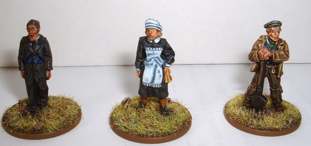
Another vote for smoothing out the white here. The freehand work itself I can't help with and it looks great - really unique look to this project.
Rather than put a sepia wash over a white basecoat, how about starting with a light brown/ khaki basecoat and layering up to white? I tend to go up to white from a blue or grey basecoat like on the maid's apron below (sorry the picture is huge).
For the more sepia look you are using (which looks really nice btw), I'd go something like:
Base: Zandri Dust or XV-88
Possible wash with Sepia, but I'm not sure I'd bother with it tbh
Layer: Ushabti Bone
Highlight: very thinned White in multiple layers
|
|
|
|
|
|
2013/07/03 04:24:23
Subject: Re:Asian themed Eldar army (Struggling painter: advice welcomed)
|
|
Been Around the Block
|
richred_uk wrote:Another vote for smoothing out the white here. The freehand work itself I can't help with and it looks great - really unique look to this project.
Rather than put a sepia wash over a white basecoat, how about starting with a light brown/ khaki basecoat and layering up to white? I tend to go up to white from a blue or grey basecoat like on the maid's apron below (sorry the picture is huge).
For the more sepia look you are using (which looks really nice btw), I'd go something like:
Base: Zandri Dust or XV-88
Possible wash with Sepia, but I'm not sure I'd bother with it tbh
Layer: Ushabti Bone
Highlight: very thinned White in multiple layers
I will take your advice when I work on my next set. Everything I have has already been washed. But for my viper, I did do a lot more lighter coats. It looks a lot better. Thank you all for the advice.
|
I have not been the person I was since I stopped being him. |
|
|
|
|
2013/07/03 05:05:32
Subject: Asian themed Eldar army (Struggling painter: advice welcomed)
|
|
[ARTICLE MOD]
Huge Hierodule
|
Another technique you could consider for the vehicles is sponging. Here's what I did with my Necron Monolith:
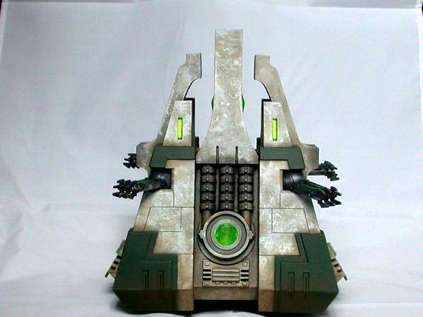
It could give you some interesting parchment like color and texture. Alternatively, you could try stippling your colors as well. For the warlock, you could break up the white by using a lavendor to do the face.
Other than that, I think your army is looking great.
|
|
|
|
|
|
2013/07/03 07:23:31
Subject: Asian themed Eldar army (Struggling painter: advice welcomed)
|
|
Been Around the Block
|
Would you start with a black undercoat and work up with the sponge, or sponge on the colors after white undercoat and wash?
|
I have not been the person I was since I stopped being him. |
|
|
|
|
2013/07/03 11:23:34
Subject: Asian themed Eldar army (Struggling painter: advice welcomed)
|
|
Stealthy Grot Snipa
|
I cant give much advice on the white and layering (as im only starting back into the hobby), but I did just want to say excellent work  Loving the look of the army.
In terms of keeping your hands steady, what I do is hold the model with my right, press the balls of my palms together and paint with the left. What this achieves is stability for your hands, it also means the movements of one mimic the other or that they move together, which means you have less chance of one hand jerking and ruining everyhthing
You can then press your two hands so the wrist of the hand holding the model is against a hard surface, giving you support all up through both hands and the model.
Or you can use a tool to hold the model, while basically pistol gripping your hand. So one hand holds the brush the other hand holds the painting wrist. But only hold the wrist lightly, you just want to remove the minor movements while keeping the painting hand free and light to move.
Hope this helps
|
Favourite Game: When your Warboss on bike wrecks 3 vehicles simply by HoW - especially when his bike is a custom monowheel.
|
|
|
|
|
2013/07/03 12:59:01
Subject: Asian themed Eldar army (Struggling painter: advice welcomed)
|
|

Hard-Wired Sentinel Pilot
Somewhere just South of nowhere
|
Models look great. Bet they look awesome on the tabletop. I definately agree on layering the white. It looks ok on the smaller models, but you can see the brush strokes easier on larger areas (ie the tank). Perhaps basing the model white first would solve this? I would also do a black wash as well as the brown you already do, just to get more definition. No need to go heavy on the black wash, but a little would really add to the model.
|
Armies
 (2000pts) (2000pts)  (2500pts) (2500pts)  (5000pts) (5000pts)  (6000pts) Adeptus Titanicus (1500pts) (6000pts) Adeptus Titanicus (1500pts)
DA:80-S+GM++B++IPW40K06-D++A+++/areWD180R+++T(M)DM+
Projects: Warhound and Stuff |
|
|
|
|
2013/07/03 13:51:17
Subject: Asian themed Eldar army (Struggling painter: advice welcomed)
|
|
Blood Angel Captain Wracked with Visions
|
Those pictures do a much better job of showing off the great work you've done 
Another tip you may also be interested in is for the writing on the Farseer's cloak. You may wish to try using micro pens with fine nibs for lettering etc. these are usually much easier to control than paint on a brush.
|
|
This message was edited 1 time. Last update was at 2013/07/03 13:52:15
|
|
|
|
|
2013/07/03 13:57:55
Subject: Asian themed Eldar army (Struggling painter: advice welcomed)
|
|
Stealthy Grot Snipa
|
 Dreadclaw69 wrote: Dreadclaw69 wrote:Those pictures do a much better job of showing off the great work you've done
Another tip you may also be interested in is for the writing on the Farseer's cloak. You may wish to try using micro pens with fine nibs for lettering etc. these are usually much easier to control than paint on a brush.
OOOOOOOOOOOOOOOOOOOOOOO!!!!!!!!!!!!!!! this is an awesome tip! Why had a never thought of that?! I have tonnes of fine nib pens. Il have to give that a try. Thats one for the brain bank.
|
Favourite Game: When your Warboss on bike wrecks 3 vehicles simply by HoW - especially when his bike is a custom monowheel.
|
|
|
|
|
2013/07/03 14:04:32
Subject: Asian themed Eldar army (Struggling painter: advice welcomed)
|
|
Been Around the Block
|
That is indeed a great idea. I will be using that on my next ones.
|
I have not been the person I was since I stopped being him. |
|
|
|
|
2013/07/03 14:32:40
Subject: Asian themed Eldar army (Struggling painter: advice welcomed)
|
|
Blood Angel Captain Wracked with Visions
|
Solar Shock wrote:OOOOOOOOOOOOOOOOOOOOOOO!!!!!!!!!!!!!!! this is an awesome tip! Why had a never thought of that?! I have tonnes of fine nib pens. Il have to give that a try. Thats one for the brain bank.
groggeron wrote:That is indeed a great idea. I will be using that on my next ones.
I wish I could lay claim to it as my own, but it's from an old White Dwarf when Paul Sawyer talked about using pens to blackline the armour of his White Scars, and some details on his Chaos Warriors.
|
|
|
|
|
|
2013/07/03 20:59:30
Subject: Asian themed Eldar army (Struggling painter: advice welcomed)
|
|

Quick-fingered Warlord Moderatus
|
What the mother of freehand art?! This is amazing!
|
Click here for my Swap Shop post - I'm buying stuff!
DR:90-S++G++M+B++I+Pw40kPbfg99#+D++A++/eWDR++T(T)DM+
 Black Legion/Iron Warriors/Night Lords Black Legion/Iron Warriors/Night Lords  Inquisitorial Friends & Co. (Inq, GK, Elysians, Assassins) Inquisitorial Friends & Co. (Inq, GK, Elysians, Assassins)  Elysian Droptroops, soon-to-add Armored Battlegroup Elysian Droptroops, soon-to-add Armored Battlegroup  Adeptus Mechanicus Forge World Lucius Adeptus Mechanicus Forge World Lucius
 |
|
|
|
|
2013/07/04 20:46:46
Subject: Asian themed Eldar army (Struggling painter: advice welcomed)
|
|
Swift Swooping Hawk
|
Your freehand is great!!
Have you ever seen the figures by Wargames Factory...the asian line could really add some flavor to your figs!!
|
 -3500+ -3500+
 -1850+ -1850+
 -2500+ -2500+
 -3500+ -3500+
 --3500+ --3500+ |
|
|
|
|
2013/07/05 01:22:15
Subject: Asian themed Eldar army (Struggling painter: advice welcomed)
|
|
Been Around the Block
|
I looked at their website and they seem very cool. I have been rather limited to what I can ourchase in China. I may give them a shot! Thanks for the advice.
|
I have not been the person I was since I stopped being him. |
|
|
|
|
2013/07/05 19:58:37
Subject: Asian themed Eldar army (Struggling painter: advice welcomed)
|
|
Stabbin' Skarboy
|
Just a quick suggestion. Finish up the basing on some of your models and paint the rim of the base black to contrast the white. The figures will come across looking much better visually. Your army is looking great. Id suggest to play with sponging and stippling. I use it to do rust for my orks and it works wonders. If you use different colors youll get some very interesting textures
|
All my work is done using StyleX, Professional Model Tools
http://www.stylexhobby.com
 My 1850 pt. Ork army: Big Boss Badonk-a-Donk and 'da Dakka Dudez My 1850 pt. Ork army: Big Boss Badonk-a-Donk and 'da Dakka Dudez
Eye of Terror San Diego Tournament: Best Painted
Game Empire Pasadena RTT : Best Painted x 4
Bay Area Open: 2nd Best Presentation
Anime Expo '14: Best Presentation/Hobbyist
Feast of Blades Qualifier: Best Presentation(Perfect Score)
|
|
|
|
|
2013/07/05 20:40:26
Subject: Asian themed Eldar army (Struggling painter: advice welcomed)
|
|
Fresh-Faced New User
|
Beautiful army! The free hand is great, you should be really proud of them.
|
|
|
|
|
|
2013/07/05 20:59:20
Subject: Asian themed Eldar army (Struggling painter: advice welcomed)
|
|
Screaming Shining Spear
|
cool idea, and great start : )
I think that what might help with the Asian-ness of the look of the army would be the composition of the freehand. I know that space is really limited on the models, but think about the positive and negative space.
I think the jetbike on the right works the best because the cherry branch is balanced out by the empty space on the rest of the canopy. It's more restrained, and a little more unusual. On the other two jetbikes, the imagery is too central, and there's too much of it.
Liking the koi very much - I wouldn't try and squeeze the red one on the same canopy, I think it'd overpower what you already have. But maybe a coupe of other, smaller koi? Water ripples?
I'm very much liking the bone/porcelain scheme, but there does need to be a contrasting colour - a deep indigo to reference Chinese and Japanese fabric dyeing?
Maybe even have one image/landscape running over several models, so that the whole is only seen when they're formed up in ranks, or as a whole army, but they have little bits of freehand on them when they're seen individually?
... perhaps research Ikebana, because it's incredibly beautiful, but some of them are also quite stark and simple?
I'll stop whittering on now...
|

"Pit Crew! Take this box out back, throw in a rabid Honey Badger and SET IT ON FIRE!"
If I were an Eskimo, I'd build my igloo next to a supermarket on a tropical beach. |
|
|
|
|
2013/07/05 21:14:15
Subject: Asian themed Eldar army (Struggling painter: advice welcomed)
|
|
Avatar of the Bloody-Handed God
Inside your mind, corrupting the pathways
|
I paint my eldar using washes (and extremely thinned paints) exclusively - if you want a smoother white with darkened recesses, use a clean wet brush when you apply the sepia wash to clean most of the wash off the flat areas. This will mean you don't really have to paint over the flat areas with white and so will get a smoother finish.
The freehanding is looking pretty good indeed - I really like the cherry tree design and I think you have done it quite well. I might be tempted to add in an extra lighter version of the colour of the petals to give it some highlights and variation - you might already have this but I can't see from the pictures.
Otherwise a very nice looking force
|
|
|
|
|
|
2013/07/06 07:33:05
Subject: Asian themed Eldar army (Struggling painter: advice welcomed)
|
|
Been Around the Block
|
SilverMK2 wrote:I paint my eldar using washes (and extremely thinned paints) exclusively - if you want a smoother white with darkened recesses, use a clean wet brush when you apply the sepia wash to clean most of the wash off the flat areas. This will mean you don't really have to paint over the flat areas with white and so will get a smoother finish.
The freehanding is looking pretty good indeed - I really like the cherry tree design and I think you have done it quite well. I might be tempted to add in an extra lighter version of the colour of the petals to give it some highlights and variation - you might already have this but I can't see from the pictures.
Otherwise a very nice looking force
I will try to do this on my next batch. I have already heavily washed most of my tanks, but I will work on this for mt rangers. That is a great idea for the petals as well. It would be good to give a little bit of definition. I am hesitant to add much though, as I dont want the quality as is to go down. But I will definately keep it in mind for my next batch of bikes,
finnan wrote:cool idea, and great start : )
I think that what might help with the Asian-ness of the look of the army would be the composition of the freehand. I know that space is really limited on the models, but think about the positive and negative space.
I think the jetbike on the right works the best because the cherry branch is balanced out by the empty space on the rest of the canopy. It's more restrained, and a little more unusual. On the other two jetbikes, the imagery is too central, and there's too much of it.
Liking the koi very much - I wouldn't try and squeeze the red one on the same canopy, I think it'd overpower what you already have. But maybe a coupe of other, smaller koi? Water ripples?
I'm very much liking the bone/porcelain scheme, but there does need to be a contrasting colour - a deep indigo to reference Chinese and Japanese fabric dyeing?
Maybe even have one image/landscape running over several models, so that the whole is only seen when they're formed up in ranks, or as a whole army, but they have little bits of freehand on them when they're seen individually?
... perhaps research Ikebana, because it's incredibly beautiful, but some of them are also quite stark and simple?
I'll stop whittering on now...
I like your whittering. Please continue. 
You had many good points. I will definately go for the nice deep indigo, that is a great idea! I'll paint some on tonight and share the results as soon as I can. Also, I definately did overdo it on the koi, Though I do like having both of them on it. For the bikes, the one on the right does look good, but I was trying do have them be like an evolution of Spring. With regard to composition, do you have any reccomendations on where I can read more about it?
Having the multi plane image landscape would be great! I'll put it on my Nightspinner along the prows.
|
I have not been the person I was since I stopped being him. |
|
|
|
|
2013/07/06 10:44:42
Subject: Asian themed Eldar army (Struggling painter: advice welcomed)
|
|
Screaming Shining Spear
|
I did a little bit of research when I was writing my original reply, but nothing obvious jumped out... the best thing is to look at Chinese or Japanese landscape paintings on Google. A lot of them are very limited in colour-range, which makes them look simple, but they can be quite complex. But notice that a lot of the 'detail' is actually formed by empty/negative space - think about it in that a doorway is made up of the emptiness, not the door itself, a vase is made of the empty space inside, not the clay of the container... I'm going a bit Zen there, but hopefully that made sense.
The strong black/grey/colour is balanced by an equal, if not stronger amount of empty space, so that the viewer is forced to look where you what them to look, rather than being overwhelmed by a lot of objects.
I understand what you were aiming for with the progression of the seasons, but rather than have more blossoms, you could have kept the same composition (and empty space) and gone from Spring blossom, to Summer foliage, to Autumn foliage, to Winter bare branch with snow.
Also on Chinese and Japanese paintings, there a often a little bit of text, or at least the chop of the artist - you could have a little bit of Eldar text plus a Craftworld icon as part of the composition as a whole.
|
"Pit Crew! Take this box out back, throw in a rabid Honey Badger and SET IT ON FIRE!"
If I were an Eskimo, I'd build my igloo next to a supermarket on a tropical beach. |
|
|
|
|
2013/07/06 11:36:10
Subject: Asian themed Eldar army (Struggling painter: advice welcomed)
|
|
Avatar of the Bloody-Handed God
Inside your mind, corrupting the pathways
|
My wife has a painting which forms her name (English characters) formed from traditional Chinese pictures (fish swimming to form a "B", etc). That can sometimes look quite good for an isolated letter on an otherwise blank vehicle to denote squad numbers and craftworld symbols etc.
|
|
|
|
|
|
2013/07/07 20:45:04
Subject: Asian themed Eldar army (Struggling painter: advice welcomed)
|
|

[MOD]
Otiose in a Niche
|
Great stuff!
Where in the PRC are you?
|
|
|
|
|
|
2013/07/08 04:09:43
Subject: Asian themed Eldar army (Struggling painter: advice welcomed)
|
|
Been Around the Block
|
Thanks Kid. I am an ESL teacher in Beijing.
Silver, my calligraphic skills at the moment are horrible, but that sounds like a good idea. I'll be sure to practice and try it out.
|
I have not been the person I was since I stopped being him. |
|
|
|
|
|
|