Converted from my blog,
link to the original with nicer formatting.
So, for my first tutorial, I'm focusing on a favorite area of mine- I consider myself pretty proficient in lighting and contrast, so
NMM techniques was a clear first option.
This tutorial will be primarily about working primarily with
glossy blacks and
NMM, though the techniques could be applied to most high-contrast techniques and I'll make a few
notes throughout on how this can be adapted.
This also covers a few of my preferences on paints and techniques.
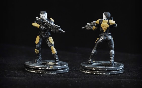
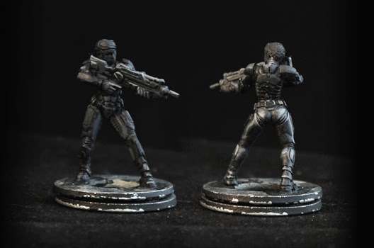
I'll be using a Studio McVey Sedition Wars mini as the basis for this demo.
1: Prime

I used
Krylon's Ultraflat series of primer for this. I've tried a few of their varieties along with other hardware companies', and this is by far the best I've found. I consider it on par with the best primers in the miniatures industry (P3's and Citadel Color's), but below 1/2 the price). It's just barely thicker than the above companies' but I wouldn't hesitate to prime a mini intended for display with it.
Option- other colors: If going with a different color, just try to start with a midtone. White will make too strong of a contrast and dark colors won't give any volume. If you've already primed the mini white and are painting a base color, thin the paint slightly so it gets a little initial volume since you're already putting down another color.
2: Wash (dark grey)

This is the darkest grey I regularly mix, and is a pretty heavy mix: Close to 50/50 of the darkest grey I have and black. I thin this mixture with water until it flows smoothly, concentrating in the cracks.
This'll be largely done by feel, but you're looking for something that stains the whole surface, and won't entirely rub off with your finger if you try to wipe it after a few seconds. Too thin, and it won't do anything; too thick, and you might as well have started with a darker shade.
Paint the whole surface you care about this color.
Note: I prefer dropper paints (like Vallejo's line) over lid tops (like P3 or Citadel), because when mixing or thinning you have more control over the color and don't need to expose the paint to the air or scoop it with the brush, meaning it's less wearing on both paint and brush.
Option - other colors: If going with cooler colors, mixing down with black works fine; if going with warm colors or trying to get a little rusty look, I'd recommend 1 black: 1 neutral brown: 2 main color, since black tends to desaturate warm colors.
3: Wash (black)
(
Note: This photo got a bit of glare on it, and the black got a little thicker than I intended.)
This is to smooth out the blending further, with a second,
dark layer, thinned pretty heavily- you're really only going for the cracks, here. This mixture should be about as thin opacity as milk.
This is still just getting the basic
recessed shading down.
Option - other colors: Again, if using warm colors, mix a bit of brown in instead of straight black.
Option - simplify: You can just start with black (or dark brown), to speed things up, though it doesn't get as smooth of a shade.
Option - lighter metal: If you're looking to go with a middle-dark metal (like the
Astral Claws featured in my blog), you skip this step entirely, and start blending lighter immediately, or selectively go for the darkest areas.
4: Soft Highlight (dark grey)
This is about the same mix as step 2, but only lightly thinned. The idea is to start to blend up to a mid-tone, here, getting
slightly lighter than the main highlights.
This is the first step where you need to consider the angle of light: For basic
NMM, you'll be looking at getting a
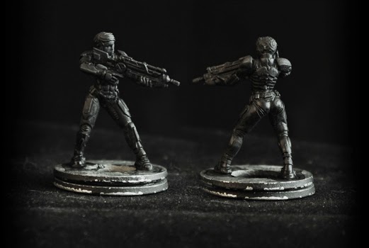
basic highlight against the upper surfaces or to contrast with shadows. Areas you should hit are any larger muscle group/round surface (thighs, shoulders, calves, knees, gun barrels, helmets, etc.; in this case also the collar) and edges (the tops of weapons and armor plates).
For much of the highlighting, I use paint that's a little thinned, with the edge rather than tip of my brush where possible. The reason for this is, it will naturally pick up the edges and I'm not needing to be that specific, so there's no need to wear on a nice brush tip.
Note: Some areas are going to be ignored in this demo, since they're getting painted with another color (such as the shoulders) - check the top image for reference if something isn't looking right.
5: Soft Highlight (mid-dark grey)
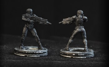
Roughly a repeat of the last step. This is refining the same areas of highlighting, with a little more precision. Where the last highlight was general, this focuses on
softer upper edges. The arms, fingers, calf, butt, and rounder parts of the gun are what's relevant here.
Notably exempt are the harder edges, such as most of the angular bits of the armor. You're looking for a stronger contrast, so the edges don't really need to be included in this step, since they'll just be painted over, later.
This is around or slightly darker than the base coat.
Option - dull shading: For some material, like neoprene, dull stone, or fabric, it might make sense to stop here, since not everything needs strong highlighting.
6: Highlight (middle grey)
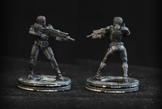
Refining further, this work starts to
need a detail brush or at least one in good condition. This is much like the last step, except
exaggerating the highlights artificially by painting rather than just following the surface.
Unlike the last step, this does include hard edges, as too sharp of a contrast will still look overly artificial.
In this case, the gun, butt, hands, toe of the boot, and calves are the focus, though the shoulder and back would be too, if they weren't getting painted over.
Option - contrast: If going for a high contrast, but not glossy/metallic, surface, this could be a good point to stop.
Option - other colors: If you don't have lighter colors prepared, mixing bone to cool colors or yellow to warm colors tends to get cleaner and more natural highlights, with grey if going for dull and white if going for pastel.
7: Highlight (light grey)

These are just picking out the extreme edges. Pick a light grey, probably lighter than you feel comfortable with. Close to white.
These are just for the strongest edges, like the top of the gun and the tip of the boot, and the top edges of the thigh armor for contrast with the under armor.
8: Highlight (white)

These are the most extreme highlights. The focus is basically the top edges of the gun and picking out the belt buckle to give the waist more definition, in this case. This is to get that glossy and or metallic extreme, and used very sparingly elsewhere.
9: Other colors
Returning to that first image, getting the bases for other colors showed a couple spots that needed some touching up.