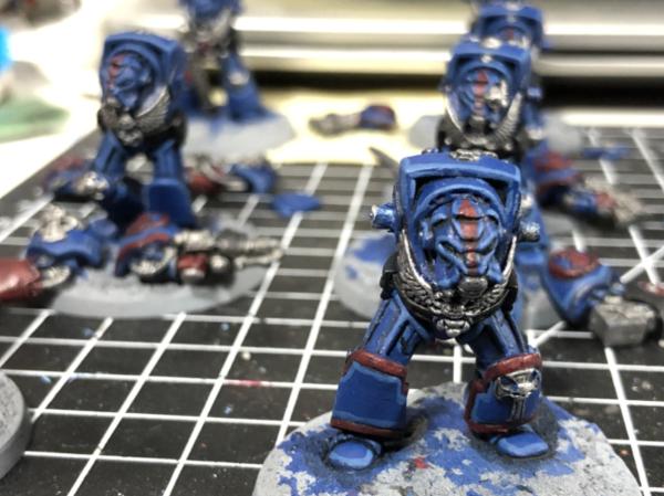
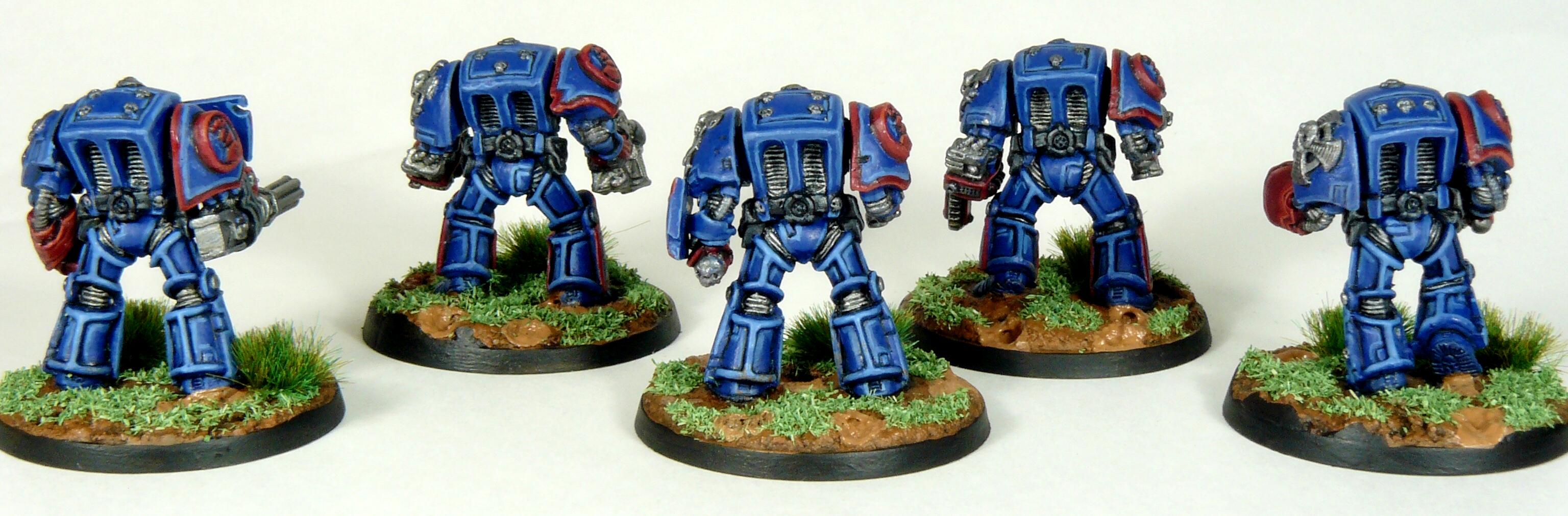
Those vintage wolves are giving me serious flashbacks.
Spoiler:
14 year old me won a school painting comp with that Iron Priest. Shudder. I trust your version won't end up looking like my old 90's paint bomb colour splurge. Go look it up if you want to see that retina searing monstrosity, I won't sully your fine thread with it.
looking forward to seeing a modern paint job on those old classics.
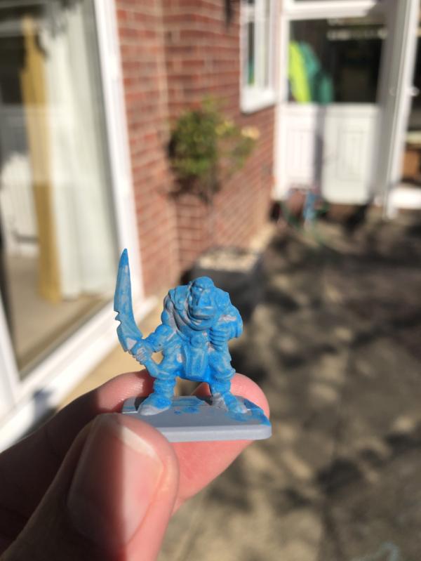
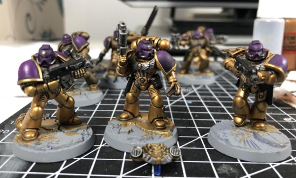
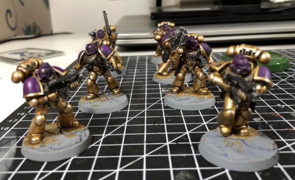
The ambull is really nice and scary. What's the plan for the base? It'd look great in the snow!
amazingturtles wrote:I think the ambull came out perfect, and yes, very gruffaloish. I love the purple and the one green eye.
I'm glad your daughter is having fun painting things up, it'll be neat to see what she's done!
Thanks turtles, the green nodule is meant to be a poisonous wart, at least in my head!
Ezki wrote:The Ambull looks very good! The purple works well with the dark tones.
I second what amazingturtles said: It would be cool to see what your daughter has painted!
It's so cool that you can share some of the hobby with her.
Thanks Ezki, I feel I need to mix it up and use something other than purple, but it’s kinda part of my Blackstone Theme. Sadly I keep forgetting to take pics of her “Little Guys.” Hopefully the weather turns soon and I can prime her EM4 dwarves (or is it dwarfs?)
Not Online!!! wrote:Dreadfully beautiful.
Well done.
I see what you did there Not Online!!! Thanks!!!
Captain Brown wrote:Ambull is well done.
Cheers,
CB
Thanks CB
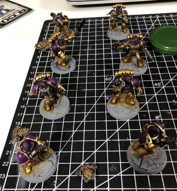
Yorkright wrote: Ambull and kids look great! Really upping your game Gobert, looking forward to these next projects
Thanks Yorkright, I think the modern minis help flatter me. Not sure how inspired I am by the current pair, but dead excited by the BSF Goodies!
theCrowe wrote:Those vintage wolves are giving me serious flashbacks.
Spoiler:
14 year old me won a school painting comp with that Iron Priest. Shudder. I trust your version won't end up looking like my old 90's paint bomb colour splurge. Go look it up if you want to see that retina searing monstrosity, I won't sully your fine thread with it.
looking forward to seeing a modern paint job on those old classics.
The ambull is really nice and scary. What's the plan for the base? It'd look great in the snow!
I stalked out your Iron Priest, not sure I’ll put that many colours so liberally on mine! Once I’ve done all of my BSF minis I’m planning to paint on the triangles like the game boards. Midwinter Minis have a tutorial that gives quick and decent looking results. I’ve also seen some of the freehand attempts of others that will take longer, but can look better. We’ll see soon (hopefully) which I choose!
Fifty wrote:That Ambull is great. I think I prefer it to the "proper" scheme GW give it.
Thanks Fifty, she’s a cool model and something dark but fun really caught my imagination!
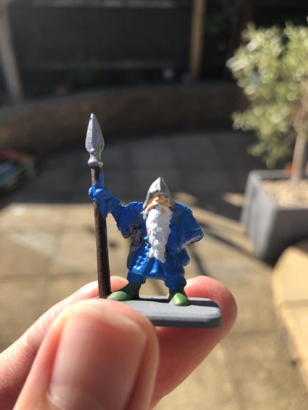
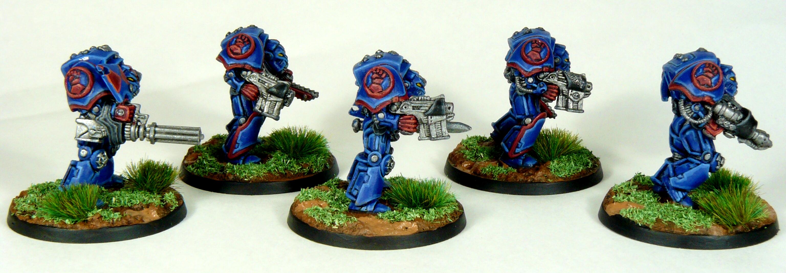
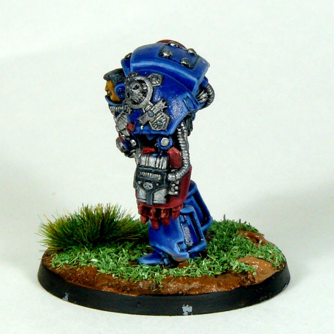
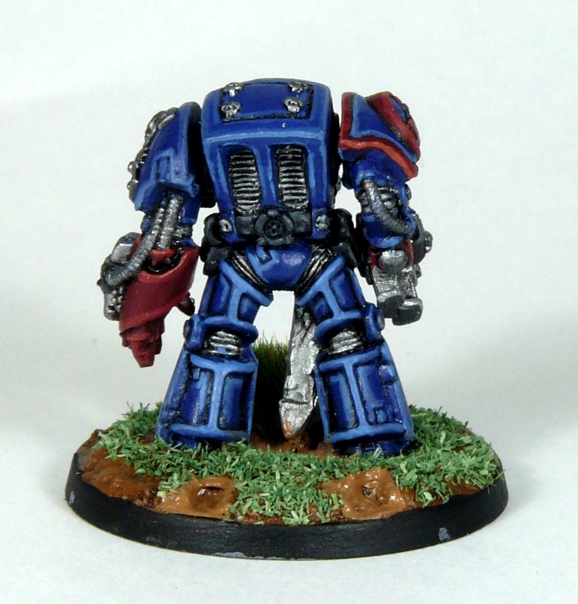
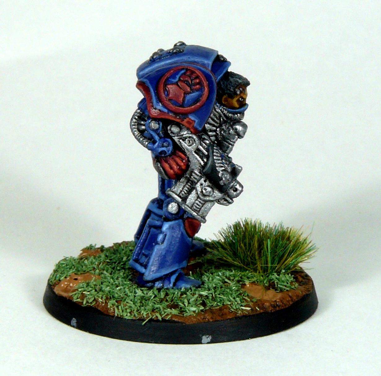
Thanks for all the kind words, it’s nice to hear that others like what I’m producing. I got a bit of progress on the Iron Priest and Njal Stormcaller, sadly was I mentioned above they’re not really inspiring me at the moment. I’d switch to something else but I’ve not got anything else ready for painting and I’m not wanting to fall in to the trap of having too many projects on the go at once (I’ve got enough to of that at work!). Anyway, I’ve decided the Iron Priest needs some Mechanicum red on him, so his armour trim has had a base coat of Khorne Red. Both also got their metals basecoated.
Next I’ll do their black and Yellow bits, Njals face and beard, ammo pouches and scrolls. Then it’ll be the fun bit of washes and highlights. Their bases will be pale stones with bits of Heresy era coloured Thousand Sons bits (random RTB01 arms I found). I’m pretending their in the ruins of Tizca which I always imagined as pale marble buildings, worn away over time to the pale stone bases
Anyways, enough ramblings from me. Thanks for looking!
I feel ya on not being inspired, but if you keep doing a little bit like you are they'll magically be finished one day. And if they're as good as your other wolves, they'll be beautiful!
Seems like a few people are slogging through the first couple of months here in 2020. I know it feels like I am, despite working steadily. Don't worry. The mojo will find its way back and you will be two wolves up.
That Ambull is awesome... really nice light touch on the highlighting, it's got great depth. As for your classic Marines, I'm stoked to see them get some pint. I'm thinking that'll be my line on this month's theme in the painting contest. I have no actual need for Marines, but I've got some fun, classic models. Love that Mechanicus dude.
MegaDave wrote:I feel ya on not being inspired, but if you keep doing a little bit like you are they'll magically be finished one day. And if they're as good as your other wolves, they'll be beautiful!
Yep, gotta keep on keeping on, tonight was more enjoyable, but I still don’t have a clear idea of what I want the finished products to look like. Thanks for the kind words on the other Wolves
Viterbi wrote:Hang in there with the models, they are going to look great and it‘ll feel all the better, when they‘re done.
Yeah, they’re coming, might be done in a couple more sittings at this rate!
youwashock wrote:Seems like a few people are slogging through the first couple of months here in 2020. I know it feels like I am, despite working steadily. Don't worry. The mojo will find its way back and you will be two wolves up.
Yeah, January was a good month smashing out those Grots. I guess I don’t feel much of a connection to the Spwce Wolves as they weren’t originally mine.
MacPhail wrote:That Ambull is awesome... really nice light touch on the highlighting, it's got great depth. As for your classic Marines, I'm stoked to see them get some pint. I'm thinking that'll be my line on this month's theme in the painting contest. I have no actual need for Marines, but I've got some fun, classic models. Love that Mechanicus dude.
Thanks Macaphail, I certainly enjoyed painting Mama Ambull, she came out pretty well for such a simple scheme. Always love some classic model, I’ll look out for yours!
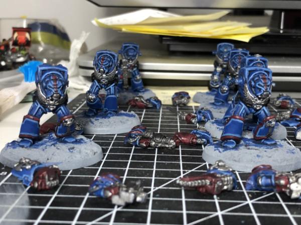
I’ve made some good progress on this pair of Wolves tonight, getting all (apart for a couple of pouches I missed) of their base colours down. Njal’s Wolf cloak was pretty fun to paint and looks to have come out pretty well. It was just a few stripes of different browns up to bleached bone. His beard got some squid orange mixed with snakebite leather after I dropped some orange too soon! I thought I’d try some dwarf flesh for his face, which came out pinker than I recall. The yellows on both are just the first coat, and will get brighter. Their armour got some Agrax in the recesses and the gold and fur got some all over
I’m still not too convinced by the red on the iron priest but I’m not too unconvinced to change it . Next I’ll wash the metals with nuln oil before tidying up the colours I’ve washed then highlighting can commence. Njal’s runes look better after the Agrax wash, but I’m not sure what colour to go for with them. A yellowy Red seems like the classic so I might copy the MegaDave inspired power weapon recipe. That or I’ll go bright green or blue? Decisions, Decisions!
Red on the iron priest looks ok to me, I think you should stick with it. Hope the inspiration strikes for you to finish these guys - I find this problem with marines more than anything else for some reason, I've never done more than a couple before starting something else.
Ambull turned out nice - the little coloured patches worked really well with the brown skin
The old wolves are coming along nicely. I like the red, too. For Njal's runes, a warm color is your best bet. Too cool and it may not pop enough off the armor color.
I am liking the progress on the Wolves. As Maharg says just keep on plodding on with them and before you know it they will be done, then you can move onto a more gratifying project. I am eager to see how your Tizcan based bases will look.
Overall I think it's a solid start on both. You can see how Njal is coming together nicely. The Iron Priest I think is a trickier mini to parse though. The sculpt is just so busy that any two colour pattern might look good in one part but clash in another part. I'm would honestly be feeling exactly the same trying to do that guy myself. It's hard to judge with just base colours on but hang in there, I can see it all coming together well in the end.
Slap some flat colour on those bases soon though. I think the white primer tends to with your appreciation of the grey.
Maharg wrote:Red on the iron priest looks ok to me, I think you should stick with it. Hope the inspiration strikes for you to finish these guys - I find this problem with marines more than anything else for some reason, I've never done more than a couple before starting something else.
Ambull turned out nice - the little coloured patches worked really well with the brown skin
Yeah, now I’ve got the shading and a bit of highlighting done it’s growing on me. Not sure I’m up for edge highlighting the notched trim though. Yep, I’m pleased with how Mrs Ambull came out, thanks Maharg
youwashock wrote:The old wolves are coming along nicely. I like the red, too. For Njal's runes, a warm color is your best bet. Too cool and it may not pop enough off the armor color.
I think your right, I’ve gone with red so far, I might add a bright orange too, I’ll see how the mood takes me at the weekend.
ListenToMeWarriors wrote:I am liking the progress on the Wolves. As Maharg says just keep on plodding on with them and before you know it they will be done, then you can move onto a more gratifying project. I am eager to see how your Tizcan based bases will look.
Now I’m off the blocking in colours I’m enjoying them more, was half tempted to plough on and finish them tonight. Tiredness has gotten the better of me though. There’s nothing too special about the bases, a few red Thousand Sons bits and pale rocky surface like the rest of my Wolves.
theCrowe wrote:Overall I think it's a solid start on both. You can see how Njal is coming together nicely. The Iron Priest I think is a trickier mini to parse though. The sculpt is just so busy that any two colour pattern might look good in one part but clash in another part. I'm would honestly be feeling exactly the same trying to do that guy myself. It's hard to judge with just base colours on but hang in there, I can see it all coming together well in the end.
Slap some flat colour on those bases soon though. I think the white primer tends to with your appreciation of the grey.
Agreed, the iron priest is overly busy, I think metallic trim would’ve been more straightforward, but it always bugged me that all other techmarines are red to apease the machine spirit but he’s usually done in Space Wolves colours. Maybe all red with only the shoulder pads in Space Wolves colours? Still he’s coming together reasonably well now.
Captain Brown wrote:Good progress gobert.
Cheers,
CB
Thanks CB!
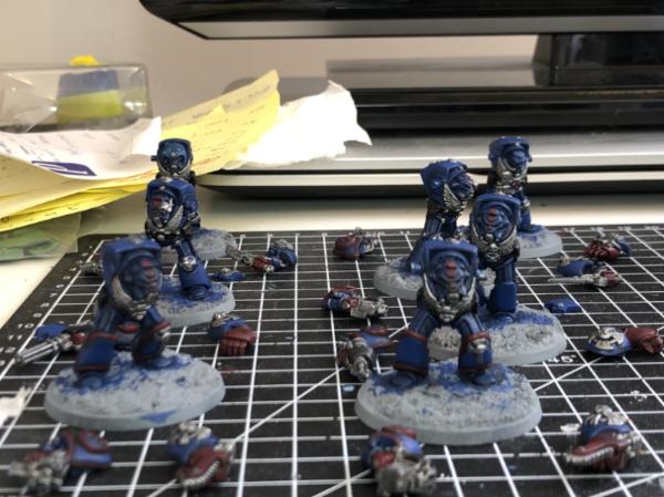
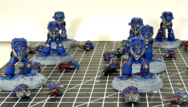
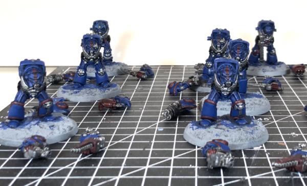
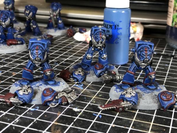
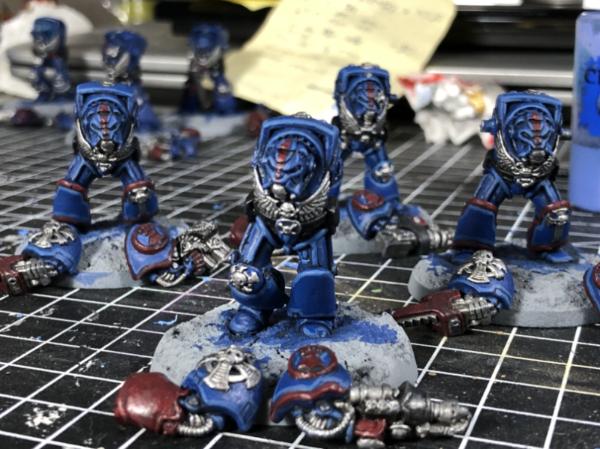
I kept the plodding going on. After a long day at work I decided to do some painting to help me “switch off”, it seems to have worked and I got quite a bit done. The most satisfy being tidying up their armour post washes and painting the techmarine’s bolter. I just love the yellow bolters, they’re very satisfyingly bright and 2nd Edition! I also spent some time on the Metallics and reds. Here’s where I got to;
I’m hopeful I’ll be able to finish them off this weekend, just a few more highlights, transfers and their bases to do. If the weather warms up I’ll spray my next batch of minis too. Just realised I forgot to snap my daughters little guys again.
Coming together nicely. Color blocking stage is always cruel, everything looks flat as until there's some washes to give depth. Really like this classic look of the models, even if I wasn't active when they first were around.
amazingturtles wrote:Woo! Got to love that crow, and the yellow really does help brighten the whole affair
I should’ve known that you’d like the crow agreed on the yellow it adds a nice tone to the minis. Somehow it brought the red and blue grey together on the Iron Priest I think.
MegaDave wrote:Dude those are looking great! The great slog continues, but you're making it fun for the rest of us
Glad you’re enjoying the ride! Hopefully they’ll be done this weekend.
Viterbi wrote:Coming together nicely. Color blocking stage is always cruel, everything looks flat as until there's some washes to give depth. Really like this classic look of the models, even if I wasn't active when they first were around.
Yep, the blocking is a pain in the . Just a few more highlights to go now and these old timers will be done!
youwashock wrote:There ya go. They'll be done in no time and be ready to howl.
Hopefully tomorrow night!
No photos tonight I’m afraid, but I got a good batch of minis primed. I’ve decided that the cheap white primer I bought from wilkos is bobbins, I’ll save it for rank and file High Elves I think. I tried a halfords primer and it’s miles better at thin and neat coverage. I’ve not painted over it yet, but it looks amazing in comparison to others. I’ll have to get the black and white versions soon! In the batch are some High Elf Spearmen and a Silver Helm, both to get to a nice round unit size. There’s all bar 2 of the Blackstone Fortress Goodies and half a dozen EM dwarfs for my daughter. My wife is away for the night tomorrow, so should get a good long session in, so I’m hopeful to start on Amalyn Shadowguide. Probably get started on her when waiting for the shading on the Wolf bases to dry.
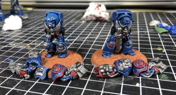
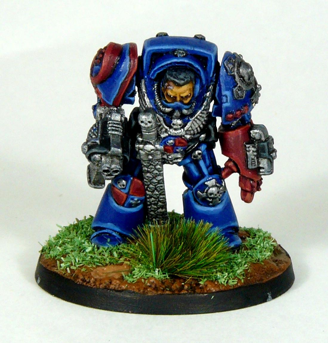
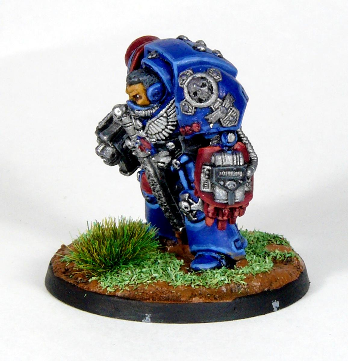
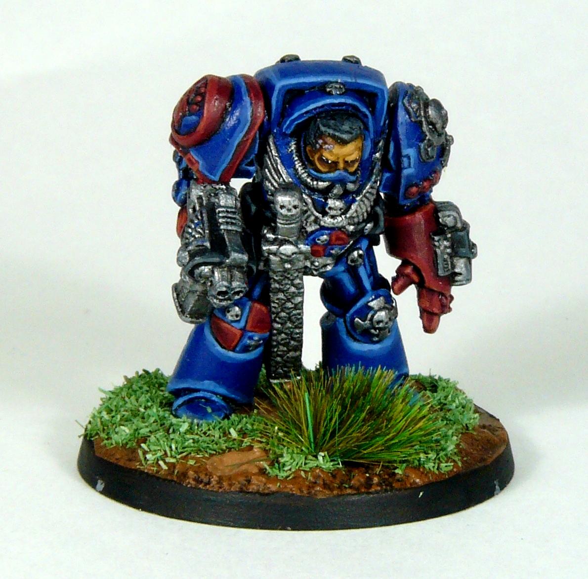
A good uninterrupted session last night got the Iron Priest and Njal Stormcaller finished. In the end I didn’t do much more than tidy up a few bits and add transfers. I’m reasonably pleased how they came out, particularly as I didn’t start with any ideas on how to paint them.
Spoiler:
Spoiler:
Having applied the wash to their bases I figured I may as well start on my BSF goodies. As with the others I’m following the YouTube guide from Midwinter Minis. Previously I changed up some of the colours, but for Amalyn and UR I’m going to pretty much follow them step by step. Amalyn is at the end of the speed painting phase and UR-025 is only a dry brush away from the same stage.
Already I think they’re looking good, and they’re the product of about an hours painting between them. Highlights are up next and quite perversely I’m looking forward to highlighting Amalyn’s armour. Midwinter dirtied up UR-025, but I might keep him/her looking in decent condition, then again it’s good to step outside of your comfort zone every now and then.
Wolves all wrapped up and nice. How many old school wolves does that make, now? Love that ranger. Both BSF models are off to a good start. Sure you don't want to go back and paint Njal's eyes a glowing blue?
Ezki wrote:The Priest and Njal Stormcaller are looking great!
The BSF models are looking great already. Bet they turn out fantastic.
And you are right, it's sometimes good to step out of the comfort zone. That way we can learn new techniques and tricks!
Cheers Ezki, they turned out pretty decent. The Blackstone models are so good it’s hard to make the look bad! I probably will have a go at the weathering on UR-025.
MegaDave wrote:Iron priest is rocking now that you got him all finished up!
Goes to show you shouldn't doubt yourself or become distraught, as you always make it look great in the end
Man of Iron looks fun, and I'm not familiar with the tutorial so it'll be a nice surprise to see what he looks like when finished.
Thanks MegaDave, he turned out pretty decent and was a bit more enjoyable once I got to the detailing and highlights.
Viterbi wrote:Congrats on finishing the wolves! BSF minis are looking very good too, the white on the eldar is really neat.
Thank you Viterbi. The whites aren’t the smoothest I’ve seen, but they’re probably the best I’ve produced so far.
youwashock wrote:Wolves all wrapped up and nice. How many old school wolves does that make, now? Love that ranger. Both BSF models are off to a good start. Sure you don't want to go back and paint Njal's eyes a glowing blue?
Thanks youwashock, I think these guys bring me to 10 Marines plus 2 actual Wolves. Hmmm, Njal needs a banner at some point, maybe I could give him glowing eyes then?
Yorkright wrote: I like how the wolves turned out glad you stuck it out. Got to agree with the rest that ranger and man of iron are looking sharp.
Thanks Yorkright, the Blackstone stuff really is something else, hopefully I do them justice.
I did a fair bit of layering tonight; neatening up the white after its wash then gradually adding yellow to the green. Sadly the photos either made the white look good or the green. I think it’s because the yellow I used (old bad moon yellow) is a bit glossy so i mainly got reflections of the light. The blue was old enchanted blue with a bit of white layered up then washed with the enchanted blue, I like how it came out.
I took all of the photos thinking I’d finished her, but I now see I missed a few gems and totally forgot to highlight them. that’ll be a job for the next session.
I got moving on UR-025 as well, his scheme is pretty simple. After the wash his armour was dry rushed white and his gun Skelton work Boltgun metal. Despite the pictures his arm and lights are orange.
A bit more detail on him and then I’ll try my hand at weathering.
I like where your going with these 2, the white is very striking. If I could make a suggestion, have you thought about bringing up the cloaks highlights? The green looks great but building up the folds and edges would really make the fig standout, just my opinion. Otherwise like I mentioned they look great.
I like the different approaches to painting white on the two. You get the smooth and the gritty. Both look good. Ranger gal is really going to sparkle once you go back and hit all those gems.
Loving the robot so far, pretty impressed with how the white turned out considering it's dry brushed, perfect for base for weathering after. Excited to see what you do to him
Love the idea of drybrushing over the metal of the robot, it's looking really good! Seeing how my robot is only primed leadbelcher, I may borrow that idea, but with another color.
Good work on those old Wolves, and the BSF minis seem to be coming along nicely. I agree with you about the yellow bolters, they look great! It can be a bit of a pain to paint at times, but definitely adds a nice spot color.
Yorkright wrote: I like where your going with these 2, the white is very striking. If I could make a suggestion, have you thought about bringing up the cloaks highlights? The green looks great but building up the folds and edges would really make the fig standout, just my opinion. Otherwise like I mentioned they look great.
You’re right Yorkright, I’ve redone the cloak as the shiny yellow didn’t look right on a fabric elements. I think the Matt yellow makes the highlights more visible.
Captain Brown wrote:Getting models painted gobert.
Salute for winning the war against unpainted miniatures.
Cheers,
CB
Slowly, slowly! 42 down for the year so far is a decent number I reckon.
youwashock wrote:I like the different approaches to painting white on the two. You get the smooth and the gritty. Both look good. Ranger gal is really going to sparkle once you go back and hit all those gems.
Yeah, they’re both pretty effective and I’m liking the finished products too. The gems could’ve gone better, but they look ok so I’m calling them done.
MegaDave wrote:Loving the robot so far, pretty impressed with how the white turned out considering it's dry brushed, perfect for base for weathering after. Excited to see what you do to him
Yeah, on the tutorial their white turned out much darker, but I’m liking the brighter finish I’ve ended up with. Hopefully the finished bot doesn’t disappoint!
Viterbi wrote:Love the idea of drybrushing over the metal of the robot, it's looking really good! Seeing how my robot is only primed leadbelcher, I may borrow that idea, but with another color.
Hit URs with a good wash and some drybrushing! What colour are you going for?
mcmattila wrote:Good work on those old Wolves, and the BSF minis seem to be coming along nicely. I agree with you about the yellow bolters, they look great! It can be a bit of a pain to paint at times, but definitely adds a nice spot color.
Yep, I’m really loving the retro Yellow Bolters, the Wolf Guard Terminators will certainly be getting the same treatment!
So, as I mentioned above I redid Amalyns cloak and I think it looks much better now. All that was then left was the gems, oh so many gems! Some were so small I could barely get any of the orange on them let alone the white dot opposite! A bit of tidying up and she was done;
Spoiler:
Next I got on with UR-025. The Man of Iron didn’t need too much work, an Agrax wash on his metal bits. A dry brush of his claw, then it was my first attempt at weathering. Some sponged on unmixed black/brown followed by some drips of Agrax. I think the blog he’s on his head and shoulder are a bit too much, but it’s too late now I guess!
Spoiler:
As he’s already primed, I got started on Thaddeus the Purifier. I got all of the base colours down and left his wash drying
Thanks for looking
Don't worry about the weathering on the bot, it looks fine. And regarding your question, I will probably use dark green for the body and pink for the claw on my bot, to tie him into my planned Adeptus Mechanicus color scheme.
Thaddeus is one of the models that I don't warm up to, but good start on your end. Looking at the model, I believe it's the head, that's bothering me, may give my model a transplant
I think that UR-025 looks great, brave to do him white as well. Totally agree on MIss Rangers redone cloak looking better and Thaddeus is off to a great start.
I love how the weathering turned out! UR-025 is probably my favorite of the heroes, probably because i can't help but imagining them as barely disguising their desire to wipe out humanity.
Thats the ticket! Ranger looks great that extra work on the cloak and gems really paid off. Robots weathering looks perfect for being ten thousand years old, wandering around the Blackstone Fortress is bound to muck things up a bit too. The priest is looking good, can't wait to see what comes next.
Amalyn's cloak is looking good. You also pulled the white really well.
And yeah, don't worry about there being too much brown on the UR-025. There is never too much weathering
Captain Brown wrote:Nice work on Amalyns there gobert. Doing gems on Eldar are always tough, but they really make the models pop when they are done.
Cheers,
CB
Cheers Captain Brown, she came out pretty well I think, sooo many gems though! Glad I put in the stint
youwashock wrote:Amalyn is lovely. Really nice work. Big fan of the weathering on UR-025. Especially the right shoulder. Dirty done right.
Thanks youwashock, definitely the right thing to do all those gems and redo the cloak. UR-025 is growing on me, he’s a cool model and probably the character I’d choose when I eventually play the game.
Viterbi wrote:Don't worry about the weathering on the bot, it looks fine. And regarding your question, I will probably use dark green for the body and pink for the claw on my bot, to tie him into my planned Adeptus Mechanicus color scheme.
Thaddeus is one of the models that I don't warm up to, but good start on your end. Looking at the model, I believe it's the head, that's bothering me, may give my model a transplant
Thank you Viterbi, it was a first go at weathering so I’m reasonably pleased, plus he looks good on the shelf. Your dark green sounds cool, keeping your imperium colour scheme across all of the Adeptus’s (Adepti?), I like it! I know what you mean about Taddeus, he’s probably my least favourite of the Explorers, the only saving grace for him is the servo skull.
ListenToMeWarriors wrote:I think that UR-025 looks great, brave to do him white as well. Totally agree on MIss Rangers redone cloak looking better and Thaddeus is off to a great start.
Tah, ListenToMeWarriors, the white scheme was curtesy of the Mid Winter Minis tutorial I’ve been following. Their Explorer recipes came out really nice so I’m following them nearly to the letter at the moment. Simple and easy!
Not Online!!! wrote:Thaddeus has potential.
The bot Looks great imo as above.
I dunno NotOnline!!!, Taddeus is a bit marmite, so it was a bit of a rush job to get him done. The bot was dead easy and still looks cool!
amazingturtles wrote:I love how the weathering turned out! UR-025 is probably my favorite of the heroes, probably because i can't help but imagining them as barely disguising their desire to wipe out humanity.
But you know, in a funny way! I'm bad at grimdark
Hehe, I know, he’s a cool sinister “hero” probably muttering “Death to all humans” under his breath.... and now I wish I’d done him as Bender!
MegaDave wrote:UR-025 looks great! I see what you mean with the weathering up top, but to me it just looks like he had a close call with a meltagun or flame.
That is a lot of gems, and I commend you for doing them by hand and not using the gem paint (like I would have )
Cheers MegaDave, maybe Pious Vorne got a bit grumpy with him one day and gave him a light flaming!?! Sadly I don’t have any of the technical paints, so I’ve got to go old school, I think they look ok, but it was a slog!
Yorkright wrote: Thats the ticket! Ranger looks great that extra work on the cloak and gems really paid off. Robots weathering looks perfect for being ten thousand years old, wandering around the Blackstone Fortress is bound to muck things up a bit too. The priest is looking good, can't wait to see what comes next.
Yeah, you’re right Yorkright, the extra work paid off on Amalyn, the gems took ages and I probably still missed a few! Given how bad old versions of Windows are, I guess UR-025 is probably prone to the odd bump, what with being thousands of years since his last update patch!
Fifty wrote:That is all looking great. Really nice whites. Nice cream robes on the priest too.
Cheers Fifty, the Army Painter white I bought is loads better than the ancient Citadel one I have, it’s almost nice painting whites! Taddeus got a bit more highlighting on his robes back to more of an off white now.
Ezki wrote:Great work there!
Amalyn's cloak is looking good. You also pulled the white really well.
And yeah, don't worry about there being too much brown on the UR-025. There is never too much weathering
Yep I’m pleased with the the white on Amalyn (&UR-025), the Army Painter Matt White ISS helping. Having seen your Orks, I’m coming round to more weathering
Snrub wrote:AH those BFG minis are looking good with some paint on them! Veeery clean white you got on the ranger there!
Good work on the space wolves too!
Thanks Snrub, they really are cool minis. I love my old skool, but some of the new stuff is pretty special!
wow! Thanks for all the comments, you’ve all kept me busy for a while with this whole “Social Distancing” thing. Thankfully my kids are oblivious, apart from being sad not to see their school friends next week. We really are living in interesting times. To that end we’ve all got to keep our spirits up, so my wife and I are getting our hobbies on. Yesterday was gardening day followed by painting evening for me (and trinket making for my wife, glittery butterfly kids key rings at the moment).
Using the Mid Winter Minis tutorials I thought I’d finish Taddeus and probably get Drahyak and Rein&Raus to the wash stage. In the end Kroot and the Ratling twins were so similar in colours I basecoated them up together, washed them and then did Taddeus. Once he was done the washes were dry and it was still early so I decided to finish the other 3.
Taddeus didn’t need much in the end, I did an Agrax wash on his gold bits, highlighted his robes with white and added a couple of bits of detail. I couldn’t get inspired with him, so called it done quite readily.
I think he looks alright for my least favourite model in the box and not much effort!
Next up was Drahyak Grehk, again I followed the tutorial and finished him in short order. Nothing too special, but I like the red cloak which is just Evil Sunz Scarlet mixed with Bestial Brown. I figured the Kroot would be quite grimy, but their guns look a bit like Tau tech, so that was brightened up a bit.
Looking at the pics now, I think I missed the wash on his feet and the vials on his leg strap. I’ll have to get those sorted next painting session.
Next up were Rein & Raus the Ratling twins. I’ve seen that some don’t like them, but I think they’re quite cool. Their palette is pretty much the same as Drahyak so they joined him in the paint queue.
Not much effort for decent results I think, though I missed a hairy bit on a foot. It also seems that I forgot to drill the barrels of any of the Explorers, so I’ll have to go back and do that.
When I put them on their shelf I couldn’t help but take a snap of my Blackstone Fortress guys so far
I’m running out of space, so need to build an intermediary shelf to cover the escalation box, plus the Nurgle and Zoat boxes when I get those. I need to basecoat Esperanto Locano and Pious Vorne and get Janus Draik done too. When I’ve done those 3 I’ll go back and tart up the bases a bit.
The Kroot is definitely my favorite of the latest batch. He looks very cool. Love the group shot, also. Can't wait to see the Zoat in all his splendor added to the group.
Great work on this latest batch and Rein & Raus are by far my favorite explorers of the game. Love them just for that mini fridge, I had such a blast painting mine last year, such nice sculpts.
Hey, a bit late to the party but really digging your Blackstone output. I agree Thaddeus isn't my favorite sculpt in the box but you've done him up very nicely. I think the Kroot is my favorite as well, love the cloak and I like the choice to keep the gun bright. I think Amalyn turned out great, nice depth of color on her cloak. Painting white is hard but you've done a great job each time!
MegaDave wrote:Group shot looks great! (I viewed them on my phone 6 ft away )
I also like the cloak for the kroot, it's a nice color. And I love kroot!
It made me chuckle every time you noticed something you didn't paint in a photo, I do the same thing all the time!
Keep trucking along, enjoying every update of yours!
Cheers MegaDave, I’m glad you’re enjoying the blog and my forgetful nature . I’ve just been too keen to get these guys done as I’m so close to finishing the main BSF boxset... I think it’ll mark the first time I’ve fully painted a boxset! Probably best to view these next lot from 6ft too...
youwashock wrote:The Kroot is definitely my favorite of the latest batch. He looks very cool. Love the group shot, also. Can't wait to see the Zoat in all his splendor added to the group.
Yeah, he’s grown on me has Dahyak, I’m liking his bionic eye in the pics. Sadly youwashock I think we’ll be waiting some time for the new Zoat as GW have shut their factory. Who knows when he/she will appear.
Ezki wrote:Not every day you see a kroot model. Liking the cloak!
They are looking real good in the group shot. Well done.
Yeah, you’re right Ezki, they don’t seem very popular the Kroot. Dahyak was prettty fun to paint, maybe when the pile is depleted around 2030 I should get some more Kroot?
Captain Brown wrote:gobert,
The Kroot and Ratlings are very nice.
Cheers,
CB
Thanks CB!
Viterbi wrote:Great work on this latest batch and Rein & Raus are by far my favorite explorers of the game. Love them just for that mini fridge, I had such a blast painting mine last year, such nice sculpts.
I know, that fridge and sack of food are great touches Viterbi. Their rules look pretty fun so they’ll probably be in my party when I finally explore the Blackstone Fortress!
Snrub wrote:The Kroot is looking shmicko! I hadn't actually realised he had leg warmers on.
Kroot are such an underrated race. They really need some love!
Not sure what schmicko means Snrub, but I’ll take it as a complement it must be pretty cold in the fortress, so leg warmers are a must have item. Every Kroot whose any Kroot is wearing them
Yorkright wrote: It’s all looking good Gobert, group shot of all the models together is my favorite.
Thank you Yorkright, hopefully the rest of the gang will be joining them shortly.
amazingturtles wrote:I like the ratlings! Always have so i was glad to see them appear in blackstone fortress. You did a great job with the pair of them.
Yep, I agree amazingturtles, the ratlings were a fun little bunch back in 2nd. I never got any for my Catachan Guard back in the day, but they add some fun to BSF
Don Qui Hotep wrote:Hey, a bit late to the party but really digging your Blackstone output. I agree Thaddeus isn't my favorite sculpt in the box but you've done him up very nicely. I think the Kroot is my favorite as well, love the cloak and I like the choice to keep the gun bright. I think Amalyn turned out great, nice depth of color on her cloak. Painting white is hard but you've done a great job each time!
Welcome Don Qui Hotep! Great username btw! The Blackstone Fortress minis have been great to paint, so detailed but somehow forgiving of fairly basic paint jobs.
So today I set up my new lamps. Inspired by mcmatilla’s double daylight lamp set up, I added some to my Covid-19 office upgrade order on amazon. Whilst I was there sorted out a new we palette too, just a sandwich box and a thin sponge. I’m hoping it will keep the paint from drying out better than my old one. Here’s the new look hobby set up;
After sorting them out and tidying the office cables and setting up a replacement printer I snuck in a bit of hobby time. I couldn’t be bothered facing the cold evening so didn’t prime Pious and Espern. Instead I based up some High Elf Archers and their champion, along with making a large scenic (ish) base for my old school Repeater Bolt thrower. I had a big stone that was a perfect fit for the thrower, but it meant I’d need to massively build up the base. Not wanting to waste all of my basing materials on a filling job I dug our my old Space Marine bases, left overs from upping their base size, and piled them up.
That means the commander and loader can stand at the same height as the thrower, and it’ll tower over the rest of the army. Then I ended up using a good portion of my basing stuff anyway.
But it looks quite good so I’m not too fussed about that.
The archers bases weren’t anything fancy, but learning from my Spearmen I’ve mounted them to the base straight away rather than battling to get a fit that doesn’t show slotta bits under their feet. Sadly that means I’ll have to be careful when dry brushing the bases.
Anyways, thanks for looking and stay safe everyone!
Bolt throwers! Love them. One of the most iconic Oldhammer models, I think. Happy to see it get some modern love. Clever to bulk up using many old bases - that opens up a lot of scenery potential. Perhaps some colonnaded halls of stacked slotta bases!
Viterbi wrote:Great work on this latest batch and Rein & Raus are by far my favorite explorers of the game. Love them just for that mini fridge, I had such a blast painting mine last year, such nice sculpts.
I know, that fridge and sack of food are great touches Viterbi. Their rules look pretty fun so they’ll probably be in my party when I finally explore the Blackstone Fortress!
I already used them several times in Kill Team and were having a blast with them. Raus has a 6" range blast mine that can be used only once, but may kill several enemies. It's suicidal, because he has to get real close, but it can turn a game.
And elves are looking good, the big base is great!
youwashock wrote:Yeah. I lament the delay for the Zoat. Maybe one day...
Good idea using those old bases as filler.
Finger crossed that this thing is brought under control and Zoat production resumes!
amazingturtles wrote:It looks like a nice and well organized set up! You do not want to see mine.
I like those old elves, and I'm looking forward to what you do with them
Cheers turtles, I can promise that it won’t last! Elves are all done, hopefully I haven’t disappointed.
Don Qui Hotep wrote:Bolt throwers! Love them. One of the most iconic Oldhammer models, I think. Happy to see it get some modern love. Clever to bulk up using many old bases - that opens up a lot of scenery potential. Perhaps some colonnaded halls of stacked slotta bases!
Thanks Don Qui Hotep, it really is a classic model, hopefully you like what I’ve done with it. I’ll have to figure out whether I’ve got enough to built anything substantial, but it certainly worked well to build a little hill
Viterbi wrote:Great work on this latest batch and Rein & Raus are by far my favorite explorers of the game. Love them just for that mini fridge, I had such a blast painting mine last year, such nice sculpts.
I know, that fridge and sack of food are great touches Viterbi. Their rules look pretty fun so they’ll probably be in my party when I finally explore the Blackstone Fortress!
I already used them several times in Kill Team and were having a blast with them. Raus has a 6" range blast mine that can be used only once, but may kill several enemies. It's suicidal, because he has to get real close, but it can turn a game.
And elves are looking good, the big base is great!
Ha! I love a good zany tactic like that!
Last night I got in a groove and finished up the Elf Archers and the Bolt Thrower. Most of the work was on their bases, then touch ups of feet and robes. The bolt thrower and the trim on the bows were gold. Whilst they looked ok, they didn’t really fit in very well with the overall colour scheme, so they got the silver paint and blue wash treatment. The red on them was looking much brighter than the Spearmen I did last year, so that got a touch up and flesh/red wash to tone them down a bit. After that I called them done;
And the Archers;
And the new additions in a firing line;
Plus a bonus pic of the Army so far;
The shelf is looking nicely filled now, with decently painted cohesive units. I’ll try to spray the last 2 unprimed BSF minis soon.
youwashock wrote:That's a sweet group pic. Brings back memories.
Gotta love a good group shot I still remember my first ever game of Warhammer on the dining room table. My mate had a unit of something like 40 goblins that ran through my stupidly sized units of 10 Spearmen! My archers did next to nothing to help either
Don Qui Hotep wrote:Agreed, a really fun project. Some real nice looking elves on the shelf.
Cheers, I hope my kids recognise the elf on a shelf’s relatives and behave all year round... unlikely!
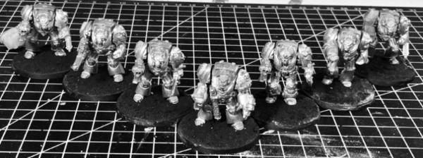
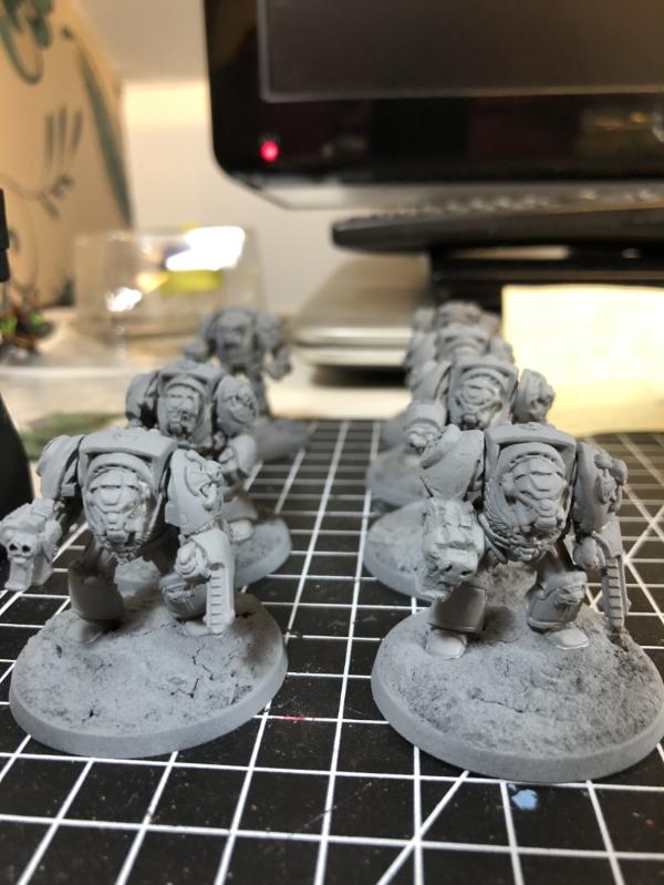
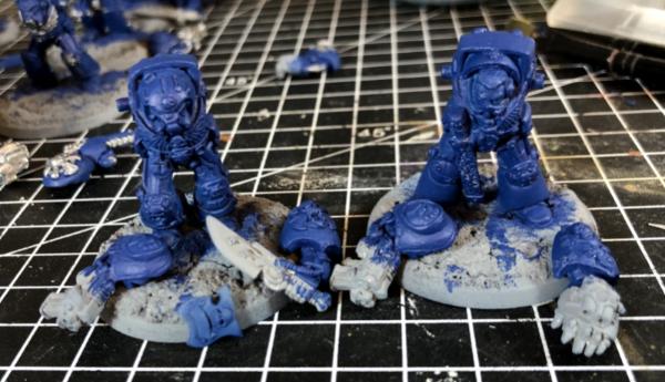
And now for something completely different, but equally old school. After I acquired the Elf half of the 4th Edition boxset from my above mentions friend, the next minis I got were the RTB9 Terminators. These guys were originally my brothers though, I’ve no idea what happened to mine! Getting my dad to drive us to Sheffield in the rain was totally worth it . Back then we had no clue on prepping the minis, so I spent most of this evening removing mould lines and vent ports. I then got them based up on their new 40mm bases;
Surprisingly they don’t look too tiny, but then again I don’t have their modern equivalents to compare them to! They’ll be based up similar to my Orks, because who else would they fight? Sadly the Librarian is missing an arm, I doubt I’ll find it as it probably fell of 20 years ago ! Not sure what I’ll do with him, I guess their arms are quite pricey! They’ll get primed soon and be ready to join the painting queue after my Blackstone Fortress trio of explorers.
Those High Elves will always have a great sense of nostalgia to them for me, that High Elf vs Goblin starter box was my first ever Warhammer boxed set and Eltharion was my first ever multi piece metal model. You have nailed the classic scheme.
Looking forward to the Terminators, that RTB9 box was one hell of a set back in the day and the cover art is iconic.
ListenToMeWarriors wrote:Those High Elves will always have a great sense of nostalgia to them for me, that High Elf vs Goblin starter box was my first ever Warhammer boxed set and Eltharion was my first ever multi piece metal model. You have nailed the classic scheme.
Looking forward to the Terminators, that RTB9 box was one hell of a set back in the day and the cover art is iconic.
Pretty similar timelines to me. Putting Stormwing together was pretty challenging as a teenager, the time I spent trying to get the wings to stay in place . I’ve been looking on stuff of legends at the RTB9 boxes, proper nostalgia trip! Seeing them on their new bases and ready for priming has got me pretty excited!
Arakasi wrote:Seems to be quite a bit of old school going around at the moment Better do those Terminators proud!
Yep, I guess it’s hard to buy new bits, so we may as well get lots of ancient stuff painted
MegaDave wrote:The elves look great, old school warms my heart! Can't wait to see the termies, I'm sure you'll do them justice.
Cheers Dave, the whole shelf is starting to look pretty good and full!
Despite teasing all of the Oldhammer, I got started on my last 3 BSF goodies. I’ve decided as they’re all Imperials that I’d tie their colours together, so they’ll all be getting some nice red. Janus and Espern will share the same blue too.
I’m not sure how Espern will look in the red and blue as most people seem to have stuck to the purple and gold of the GW style. I’m thinking gold and silver trim for the cloak and armour.
The terminators got a bit of love, I filled a few old banner pile holes. I also tried to press mould a replacement crux for the top armour plate, sadly I ended up ruining the mould as the green stuff stuck together. I used oil, but it still stuck to the mould. Any ideas where I might’ve gone wrong, or is it a taboo subject?
Anyway, thanks for looking and stay socially distant!
Looking forward to seeing those termite taking shape. Proper old metal termies are just gorgeous iconic miniatures.
Spoiler:
I too have a squad languishing in the lead pile. They used to be part of my old Space Wolves army. When I converted to Raven Guard I kept them and stripped them down always intending to add them to my Ravens but heavily armoured elites are about the least fluffy thing a Raven Guard force could use. So unsurprisingly they're still sitting primed but neglected after about 7 years. If this lockdown doesn't shift me to tackle them I should maybe we'll them on to someone who'll show them the love they deserve. I'm hoping your project might throw some inspiration my way but then if I went and painted them as a different chapter... Well that'd be starting something. Dare I even consider it?!
Anyway good luck on your termies and Good work on the hard tedious cleanup already.
Lookit those guys! Wotta medley of loadouts they have. I still have my old metal Chaos Terminators on their 25 mm bases. They were so imposing at the time, now they're quite tame-looking.
My limited experience of press-molding is that the oilier the mold, the easier it will be to pull them apart. When modeling small details, I have sometimes allowed the putty to cure about 75% dry and then gently pried it off with an exacto-knife/sculpting tool blade. This does make the stamp curve some, but it's fairly easy to flatten it out on a prepared surface. I'll clear up any imperfections or blemishes with my sculpting tool. I've only tried making shields for my Seraphon, so I had a bit of leeway with the scaly details. I also like to remove the flash at this stage rather than use the exacto-knife after it cured, because that way I could smooth out the hard edges without having to use a file, with which I am clumsy.
I'm doing some press moulds now using my wife's bee balm. Worked a treat for the plastic I was moulding. I'll let you know how the green stuff replicas work out (or don't) this evening...
Automatically Appended Next Post: Bee balm worked for me. 24hr cure for press mould and icons.
Those old metal Terminators do bring back memories. I picked up the original box and a few more when they came out to replace the original Space Hulk Terminators that were ghastly.
youwashock wrote:Absolutely love that Terminator set. Still have my own. Can't wait to see how they turn out.
Yeah, it’s a real classic, and really inspired me to take up the hobby in the first place.
theCrowe wrote:Looking forward to seeing those termite taking shape. Proper old metal termies are just gorgeous iconic miniatures.
Spoiler:
I too have a squad languishing in the lead pile. They used to be part of my old Space Wolves army. When I converted to Raven Guard I kept them and stripped them down always intending to add them to my Ravens but heavily armoured elites are about the least fluffy thing a Raven Guard force could use. So unsurprisingly they're still sitting primed but neglected after about 7 years. If this lockdown doesn't shift me to tackle them I should maybe we'll them on to someone who'll show them the love they deserve. I'm hoping your project might throw some inspiration my way but then if I went and painted them as a different chapter... Well that'd be starting something. Dare I even consider it?!
They really are icons of Warhammer, they’re getting so much love I’m going to have to get them ready sooner than I had planned!
Spoiler:
just do it!
Anyway good luck on your termies and Good work on the hard tedious cleanup already.
monkeytroll wrote:Got to love those termies. Most of mine are still unpainted, although I did use some arms on the original Space Hulk plastic termies.
Looking forward to seeing what you do with them.
Hi monkeytroll, they really are awesome! They’re getting so much hype and I’ve not even primed them yet, so hopefully I don’t get stage fright with them
Don Qui Hotep wrote:Lookit those guys! Wotta medley of loadouts they have. I still have my old metal Chaos Terminators on their 25 mm bases. They were so imposing at the time, now they're quite tame-looking.
My limited experience of press-molding is that the oilier the mold, the easier it will be to pull them apart. When modeling small details, I have sometimes allowed the putty to cure about 75% dry and then gently pried it off with an exacto-knife/sculpting tool blade. This does make the stamp curve some, but it's fairly easy to flatten it out on a prepared surface. I'll clear up any imperfections or blemishes with my sculpting tool. I've only tried making shields for my Seraphon, so I had a bit of leeway with the scaly details. I also like to remove the flash at this stage rather than use the exacto-knife after it cured, because that way I could smooth out the hard edges without having to use a file, with which I am clumsy.
I think that’s where I may have gone wrong, not letting the GS cure for long enough. It’s like it’s pulling apart as much as it’s sticking to the mould. Will maybe have another try, this time leaving it to cure over night?
Arakasi wrote:I'm doing some press moulds now using my wife's bee balm. Worked a treat for the plastic I was moulding. I'll let you know how the green stuff replicas work out (or don't) this evening...
Automatically Appended Next Post: Bee balm worked for me. 24hr cure for press mould and icons.
Spoiler:
They came out a treat! I’ve been making a 2 part press for a missing arm, hopefully that comes out ok. Though I’ve just seen one on eBay for £4.99, so I might snap that up if it doesn’t! More oil and more time to cure me thinks!
Captain Brown wrote:gobert,
Those old metal Terminators do bring back memories. I picked up the original box and a few more when they came out to replace the original Space Hulk Terminators that were ghastly.
Cheers,
CB
I don’t blame you for replacing those original Space Hulk terminators and RTB9 was so good, I’d have loved to pick up a couple, but my pocket money would never stretch that far! I do have a squad of 2nd Edition assault terminators with lightning claws and thunder hammers though
Will try making a press mould again tonight and see if I can do a better job this time... don’t hold your breath though!
Yeah, once the mold was fully cured I think I pressed the shields around 6 or 7 PM and let them cure overnight, then removing them early the next afternoon. I was using more yellow putty in the mix that time, and haven't figured out what the best ratio is for the amount of time you let it cure. I only have a stick and a half left and I'm not sure when I'll be able to pick up more, so I don't quite have enough to burn on experiments!
My own press molding experience is fairly limited. Tried it years ago and found it to be tedious. Last month I caved and bought an Instant Mold clone off Amazon. The boil n' mold stuff. Have only used it once, but it did a fair job. No mold release, just left it overnight and popped the part out. I have not finished/fully cleaned the parts I made, but the detail was there. They did come out with a slight curve I will need to account for if I finish that project.
When I first got to Warhammer Fantasy, I bought two boxes of high elves: group of spearmen and that same bolt thrower.
Ended up selling them, as a 13 year old me decided that high elves were not my thing. I should have left the painted ones for nostalgia reasons.
The light setup looks great, better than mine I've noticed that ideally the lamps should be mounted to the opposite side of the table from where you're sitting (as you've done). Sadly, my table is so large it doesn't really allow that, so I have them mounted very close to me, which makes the space a bit cramped. Anyway, hope the new lights make painting even more fun for you, and thanks for the shoutout!
Now, not to forget about your minis! Great work on the BSF collection, you're nearing a complete set and everything's looking good! The High-Elfs are also nice and neat, although I'd like to see a bit of weathering/dust at the bottom of their robes/boots. This would ground them to their bases a bit more.
I like the look of the old Terminators. Wasn't aware that they were made in metal as well. I have the same design but in newer plastic, which were pretty boring static monopose affairs. The metal ones seem to have at least a bit more interesting poses.
Don Qui Hotep wrote:Yeah, once the mold was fully cured I think I pressed the shields around 6 or 7 PM and let them cure overnight, then removing them early the next afternoon. I was using more yellow putty in the mix that time, and haven't figured out what the best ratio is for the amount of time you let it cure. I only have a stick and a half left and I'm not sure when I'll be able to pick up more, so I don't quite have enough to burn on experiments!
Cheers for the tips Don Qui Hotep, I put them to practice and I’m pretty happy with the replacement arm I’ve made.
youwashock wrote:My own press molding experience is fairly limited. Tried it years ago and found it to be tedious. Last month I caved and bought an Instant Mold clone off Amazon. The boil n' mold stuff. Have only used it once, but it did a fair job. No mold release, just left it overnight and popped the part out. I have not finished/fully cleaned the parts I made, but the detail was there. They did come out with a slight curve I will need to account for if I finish that project.
The instant mold sounds interesting, I might have to see about some of that. The clean up was a bit of a pain for the arm I made, but it makes the Yorkshireman in me feel better than forming out £4.99 for a real one!
Ezki wrote:What a collection of old school models!
When I first got to Warhammer Fantasy, I bought two boxes of high elves: group of spearmen and that same bolt thrower.
Ended up selling them, as a 13 year old me decided that high elves were not my thing. I should have left the painted ones for nostalgia reasons.
Anyway, looking good!
Shame you sold your elves Ezki, you’d be able to smash them out of the park now!
mcmattila wrote:The light setup looks great, better than mine I've noticed that ideally the lamps should be mounted to the opposite side of the table from where you're sitting (as you've done). Sadly, my table is so large it doesn't really allow that, so I have them mounted very close to me, which makes the space a bit cramped. Anyway, hope the new lights make painting even more fun for you, and thanks for the shoutout!
Now, not to forget about your minis! Great work on the BSF collection, you're nearing a complete set and everything's looking good! The High-Elfs are also nice and neat, although I'd like to see a bit of weathering/dust at the bottom of their robes/boots. This would ground them to their bases a bit more.
I like the look of the old Terminators. Wasn't aware that they were made in metal as well. I have the same design but in newer plastic, which were pretty boring static monopose affairs. The metal ones seem to have at least a bit more interesting poses.
I’ve actually had to move one of the lamps to the opposite side as it would barely reach far enough. I found it hard to see all of the details, now it’s a bit cramped on my left hand side, but I can see! The biggest difference is the colour of the light, makes the strain in the eyes much less.
I toyed with the idea of dirtying their boots and gowns, but figured they’re so light footed they’d rise above the dirt. I think they reused the terminator moulds for quite a few years.
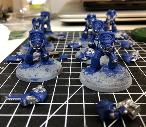
No painting for this update, but a fair bit more prep on the Terminators. I followed a few tips on the press moulding and gave my replacement arm a go last night. I left it to cure a whole 24hrs and prised the moulds apart. Most of the detail came out pretty well, but I used too much GS so I didn’t get a tight seal. The shoulder pad came out ok, but the storm bolter ended up a bit fat and the inside of the arm was a bit misaligned. A can hide the arm by lowering the weapon but I decided to rebuild the barrels. They came out pretty well for a first attempt at GS sculpting. It’s fiddly as hell when all you’ve got is a knife!
Once the clean up of the arm was out of the way I got to drilling barrels, and went a bit insane... I drilled all six barrels of the Assault Cannon!
Amazingly, it came out pretty well, only the top one looks slightly off centre. I then grabbed my BSF Explorers and did their barrels, I’ll try got get the barrels painted tomorrow... it should take long . Surprisingly the storm hooters were tricky to get right as they had raised barrels. The metal being harder than plastic meant the bit was prone to slipping. I think I got most of them done reasonably well though. We’ll see when they’re painted. Here’s the gang of minis I worked on tonight;
Thanks for looking
Man, I might give you a call when I need some barrels drilled. I can barely get mine on-center. XD
Looks like your mold came out great! I see the green arm in that last group shot, it looks ace. I feel like a lot of people have taken this opportunity to experiment with all sorts of different techniques, and in this case it came out swimmingly.
MegaDave wrote:Dude that is dedication to drill out the assault cannon barrels on a metal mini! Looks good though, I'm sure it'll be worth the effort in the end!
Well, I was doing the storm bolters (auto correct nearly got me again!) and though feth it, I’ll give the Assault Cannon a go. Fingers crossed I do the paint job well!
Arakasi wrote:Always happy to see drilled barrels
You can’t beat it, when I got back in to the hobby it was the first thing I wanted to try, and it’s totally worth the hassle!
youwashock wrote:Storm hooters? Not your usual Terminator loadout. Top modeling with the assault cannon.
Ha! Yeah, I saw your comment and was going to change the auto correct error, but it’s funny so I left it!
Viterbi wrote:Drilling those barrels on the assault cannon is great! For now I'm content with using a black dot for barrels, but drilled looks much nicer.
Give it a go, it’s well worth the effort. You don’t even need a pin vice, a 1mm bit works too. I’ve seen people use their knife, but it’s too scary for my liking!
amazingturtles wrote:Ha, i can barely get myself to drill a single large barrel much less something like that! It looks great though, i think that the effort was worth it!
Totally worth it! Nerve wracking on the last one at the top, which I think is slightly off centre. That’s the firing position on a minigun iirc, so we’ll call it barrel deformation on firing...
Don Qui Hotep wrote:Man, I might give you a call when I need some barrels drilled. I can barely get mine on-center. XD
Looks like your mold came out great! I see the green arm in that last group shot, it looks ace. I feel like a lot of people have taken this opportunity to experiment with all sorts of different techniques, and in this case it came out swimmingly.
Good though it is, I wouldn’t want to mess up anyone else’s minis! The arm came out well enough, I’m still not convinced I’ve got this moulding down though. We’ll see how the next bits come out
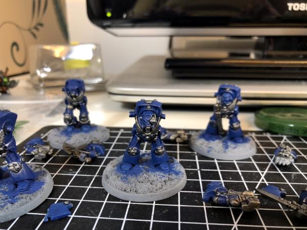
Not much terminator progress to show. I’ve set a crimson fists icon to be moulded to their shoulder pads and a terminator cross. The latter is tiny, so I expect it lol just stick to the mould. The former seems to have worked on 1 marine, we’ll see how no2 goes tomorrow.
I made decent progress on my last 3 Explorers. I’m taking my time over these 3 and so far it seems to be paying off. Continuing the theme of stealing/borrow ideas from mcmatilla I tried to follow his red robes recipe. It’s come out ok on Pious, a bit meh on Janus but I’m really liking it on Espern. I also did the blues on Janus and Espern;
I’ll probably go dark now with Pious, but go bright with Janus and Espern, mostly golds and silvers for them. Dark gun metal for Pious, but I want to spend more time on the flames. I’ll be trying to follow Darren Lathams recipe for that if I can.
But lasguns don't have an open ended barrel, at least I always imagined they had more of a lens thing going on at the end. I never drilled a lasgun in my life either. Done a few bolters though. I'll never look at my old termie assault cannon the same again now. I'll have to drill it or I'll not be able to look that little guy in the eye.
I think I generally give lasguns a miss most of the time too, citing the lens macguffin...projectile weapons need it. Having said that I can see a couple that look like they might have been drilled next to me....
But lasguns don't have an open ended barrel, at least I always imagined they had more of a lens thing going on at the end. I never drilled a lasgun in my life either. Done a few bolters though. I'll never look at my old termie assault cannon the same again now. I'll have to drill it or I'll not be able to look that little guy in the eye.
I can see the argument for lasguns, but I drilled mine on the Traitor Guard. With 300+ I think you’d go insane drilling that many in a sitting!
Arakasi wrote:
Don Qui Hotep wrote:I can barely get mine on-center. XD
I find the trick is making a centred guide impression before applying the drill.
theCrowe wrote:But lasguns don't have an open ended barrel, at least I always imagined they had more of a lens thing going on at the end.
I hope you painted all of those lens separate to the encasing!
I think drawing lenses on 300+ lasguns would be even more insane!
monkeytroll wrote:I think I generally give lasguns a miss most of the time too, citing the lens macguffin...projectile weapons need it. Having said that I can see a couple that look like they might have been drilled next to me....
Red looks good.
Thanks monkeytroll, mcmatilla gets the credit for the recipe though!
youwashock wrote:The gang is looking good in that red. You are right about Espern, too. He is turning out VERY well.
Thanks youwashock,I’ve just gotta keep it up when I switch to my least favourite colour to paint; gold!
gobert wrote: Yep, always start off lightly, check the centre and go from there. I wonder if it’d be possible to make a green stuff jig for drilling common weapons?
Not sure about green stuff, but might be a good project for someone with access to a 3d printer...
gobert wrote: Yep, always start off lightly, check the centre and go from there. I wonder if it’d be possible to make a green stuff jig for drilling common weapons?
Not sure about green stuff, but might be a good project for someone with access to a 3d printer...
Surely with a 3D printer one would just chop the barrels off and print a replacement with holes and all!? I need a 3D Printer, but the I’d probably need a PC too and that gets expensive quick!
I’ve been working most evenings recently, but have spent the odd 5-10mins doing more press moulding. So far I’ve got 2 good fist shoulder pad icons on my terminators. Tomorrow I’ll see if my High Elf shields came out ok. I trimmed the GS roughly to the right size for those and have longer alignment studs so hopefully they’ll be decently lined up. More pics next time hopefully!
We’ll work didn’t go too well this evening as my laptop decided to reboot to do some updates. So I filled the downtime with some hobbying! I inspected and tidied up my replacement shields and prepped another batch. There are some deformities, but they’ll hardly be noticeable once painted and all ranked up. They’ll end up in the middle of the unit anyway;
I’ve got a few more being readied for other units that are missing shields too, namely some undead and gobbos.
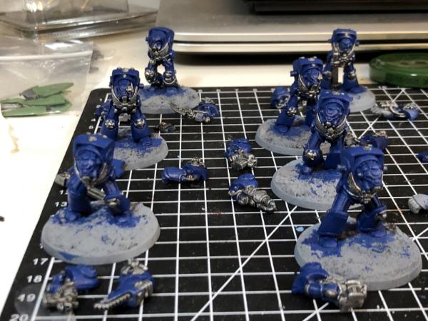
Next is set about sorting out some shoulder pad icons for my terminators. I cleaned one up and glued it on, then set about pressing the next.
This marine had his top carapace replacement terminator honours cross stuck on the other day too. The next one came out even better and will go on the Captain. Sadly I forgot pics of that and the cleaner up icon, which didn’t come out as well as the first one. The third one is in progress, so fingers crossed!
Then I didn’t feel like painting so started doing some minor kit bashing and prepping a future project. The kit bash was just putting different arms from the boyz box on the 2nd Edition boxset Orks. The scale creep is there, but it doesn’t look too bad. I swapped around the weapons on another. Still not wanting to be sensible and go to bed I drilled all of their barrels, including the original Ghaz. I’ve left the painted ones as standard load out, but there are a couple of unpainted boyz that will get box fresh arms too. One might get a marine shoulder pad as a trophy too As you can see I made quite a mess! I’ll tidy up and hopefully get back to the BSF Explorers at the weekend.
More elves are always great! Their whole aesthetic is just so powerfully nostalgic. You've done a great job with the GS moulds too. Love the beginning of the new BFS stuff - the consistent colour palette worked well with your renegades so glad to see the start of that here. The red robes come out really well!
Good use of the downtime, but not being able to work because of updates is always a pain.
The shields came out fine, it really shouldn't matter once they are painted. Worst case, it's battle damage
tzurk wrote:More elves are always great! Their whole aesthetic is just so powerfully nostalgic. You've done a great job with the GS moulds too. Love the beginning of the new BFS stuff - the consistent colour palette worked well with your renegades so glad to see the start of that here. The red robes come out really well!
Excited for more old school terms too!
Cheers Tzurk, the Elves hit me right in the nostalgia too! I’m half tempted to tweak the other Explorers to use similar colours too. Not sure I like the others enough to do so though!
Viterbi wrote:Good use of the downtime, but not being able to work because of updates is always a pain.
The shields came out fine, it really shouldn't matter once they are painted. Worst case, it's battle damage
It think they’ll be decent and few enough to hide in the middle ranks , but I suppose if could give their basss the same treatment as the chaos chaos so I can say their shields melted ?
Captain Brown wrote:gobert,
You are far more dedicated to shield detail than I was...I just used the plan faced ones and hid them in the middle ranks.
Cheers,
CB
Just forced to experiment as I don’t even have any plain shields for a few Spearmen. I really should count up how many I need up to six new ones now.
MegaDave wrote:Shields look good!
Thanks MegaDave
youwashock wrote:Those shields should work just fine. Shoulder, too. Success!
Yep, I’m happy with the shields. Not convinced about the shoulder icon yet
amazingturtles wrote:Nice work on the sheilds!
The boyz deserve some trophies!
Thanks turtles, they should work out ok. I’ll see what trophies the Bitz box might have
Ezki wrote:Nice work! The shields are looking great. I bet when they are in a unit no one will notice the difference.
Yeah they’ll be hidden by the numbers I bet!
theCrowe wrote:Looking forward to seeing your franken-orks. Kitbashing orks is just how its meant to be.
Agreed, they’re too ramshackle a force to all have the same pose. I might have to call the nob Frank!
Not much to report, a bit more fettling with the Franken-Orks. The last 2 got their new arms, one got an arm reattached after I knocked it off and 2 lost a foot when swapping bases
I forgot to drill the barrels on the new armed boyz. I’ll have to wait until the glue is set to do them now. My superglue ran out so I’m using contacta special glue, which seems to take forever to go off. Not sure whether I’m using it right or not. Has anybody got any experience using it?
I also got the rest of them set up on their bases ready for making more muddy puddles.
I think like the Gretchin I did back in January I’ll mix up their colours a bit, but will do a bit of highlighting on them unlike the Grots, to show their standing in Ork-ciety. I’ll keep progressing the building and prep of minis until I’ve finished all of the shoulder pad icons on the terminators. Then it’ll be finish the BSF painting, then Terminators, then the Orkses.
Nice to see the original Ghazkhul! That's a fun model. I'm glad to see that you decided to eschew the inexplicable swastika armband that was present on the official version of the model:
Spoiler:
Oh dear. I'm really not sure what they were thinking back then!
Excited to see what kind of frankenork conversions you've got coming up.
That's a clever use of using old bases to bulk out the base for the bolt thrower. The whole piece came out really well done and helps give the bolt thrower a nice solid look.
The whole of your high elves are excellent! The blue and white is such an iconic look for them and you've pulled it off superbly.
And you're not wrong about the arm swaps on the old orks. They really don't look as out of place as you might expect, given the age difference in the parts.
Don Qui Hotep wrote: I'm glad to see that you decided to eschew the inexplicable swastika armband that was present on the official version of the model
Oh dear. I'm really not sure what they were thinking back then!
Possibly not as inexplicable as you might think!
I would hazard a guess that maybe it was a further subtle poke at Margaret Thacher (who old Ghazy is named in honour of), who was the Prime Minister of England back when what would eventually become GW was just starting to coalesce. And depending on who ask, she was either very good for England and did great things, or was very bad and in the eyes of some, on par with Hitler himself.
Further point of interest, it's not actually a Nazi swastika, which all face clock-wise. This once is more likely a Manji, given it's thickness and the that it faces counter clock-wise.
I don't think even GW would have been that outright ballsy in calling out old Maggie as a Nazi.
Those old school orcs are coming along nicely! I remember them and their art vaguely from early teenager years and always thought "what kind of game is this, that must be cool".
youwashock wrote:Three exciting projects going. Respect for tackling another 2nd edition horde.
Thanks youwashock, I’m just in an Orkish mood of late. May as well finish these before doing my last 2 bikes and the box of boyz. Glad I decided to mix them up a little first.
Don Qui Hotep wrote:Nice to see the original Ghazkhul! That's a fun model. I'm glad to see that you decided to eschew the inexplicable swastika armband that was present on the official version of the model:
Spoiler:
Oh dear. I'm really not sure what they were thinking back then!
Excited to see what kind of frankenork conversions you've got coming up.
I hadn’t really spotted the swastika on the studio banner, but Maggie linkages to Thrakka aside I doubt there was a malicious intent. As Snrub pointed out it’s a left facing swastika, whereas the nazis used a right facing one. Sadly the franken-Orks are just the 2nd Ed boyz with later boyz’ arms.
Snrub wrote:Hey Gobert.
That's a clever use of using old bases to bulk out the base for the bolt thrower. The whole piece came out really well done and helps give the bolt thrower a nice solid look.
The whole of your high elves are excellent! The blue and white is such an iconic look for them and you've pulled it off superbly.
And you're not wrong about the arm swaps on the old orks. They really don't look as out of place as you might expect, given the age difference in the parts.
Don Qui Hotep wrote: I'm glad to see that you decided to eschew the inexplicable swastika armband that was present on the official version of the model
Oh dear. I'm really not sure what they were thinking back then!
Possibly not as inexplicable as you might think!
I would hazard a guess that maybe it was a further subtle poke at Margaret Thacher (who old Ghazy is named in honour of), who was the Prime Minister of England back when what would eventually become GW was just starting to coalesce. And depending on who ask, she was either very good for England and did great things, or was very bad and in the eyes of some, on par with Hitler himself.
Further point of interest, it's not actually a Nazi swastika, which all face clock-wise. This once is more likely a Manji, given it's thickness and the that it faces counter clock-wise.
I don't think even GW would have been that outright ballsy in calling out old Maggie as a Nazi.
Hi Snrub, glad you like the elves! I wasn’t sure how the bases would work out with the bolt thrower, but it turned out well I think.
I hadn’t realised that Ghaz was named after Maggie. I grew up near mining areas, so you can guess which side of the divide I fall on. That said she did do the odd good thing, probably!
Viterbi wrote:Those old school orcs are coming along nicely! I remember them and their art vaguely from early teenager years and always thought "what kind of game is this, that must be cool".
Young Viterbi was correct, it was(is?) a cool game
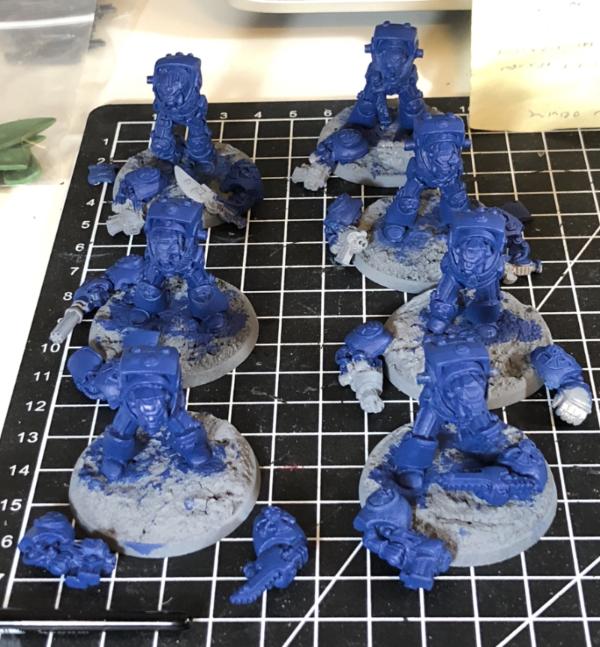
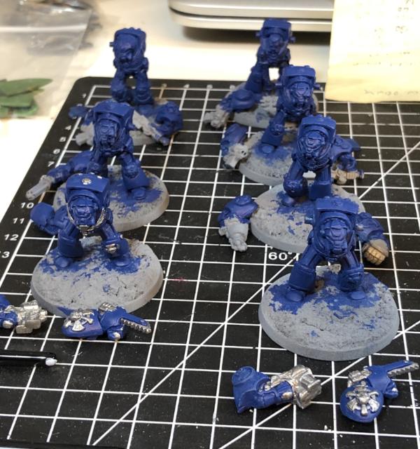
I finished up all of the Orks ready for painting. Their muddy bases got applied, the last few arms got reattached and barrels drilled. The fists gained another fist icon shoulder pad and I cleaned up the latest couple. Just one more after tonight’s casting, then probably a bit of GS to tidy the circles up a bit. Here’s the busy desk;
I also cleaned up the Chaos Knights after their dettol bath. The paint just melted off them and they seem to have come up decently;
They’ll join the painting queue once it’s cleared up a little
Don Qui Hotep wrote: I'm glad to see that you decided to eschew the inexplicable swastika armband that was present on the official version of the model
Oh dear. I'm really not sure what they were thinking back then!
Possibly not as inexplicable as you might think!
I would hazard a guess that maybe it was a further subtle poke at Margaret Thacher (who old Ghazy is named in honour of), who was the Prime Minister of England back when what would eventually become GW was just starting to coalesce. And depending on who ask, she was either very good for England and did great things, or was very bad and in the eyes of some, on par with Hitler himself.
Further point of interest, it's not actually a Nazi swastika, which all face clock-wise. This once is more likely a Manji, given it's thickness and the that it faces counter clock-wise.
I don't think even GW would have been that outright ballsy in calling out old Maggie as a Nazi.
That's me, learned! Thanks for the details. I am never sure whether or not to believe whether Thrakka was named after Thatcher, the only official word was a former exec denying it but granted that was probably a PR move. I don't think that Warhammer 40k has any particular social analysis built in, all the critique is quite explicit: here's a binary choice between anarchy and fascism, aren't they both pretty bad? I feel like in the early days everything was a little bit tongue-in-cheek, with the orks getting a lot of bandwidth for comedy in particular.
Don QuiHotep wrote:Nice to see the original Ghazkhul! That's a fun model. I'm glad to see that you decided to eschew the inexplicable swastika armband that was present on the official version of the model:
Spoiler:
Oh dear. I'm really not sure what they were thinking back then!
Excited to see what kind of frankenork conversions you've got coming up.
I hadn’t really spotted the swastika on the studio banner, but Maggie linkages to Thrakka aside I doubt there was a malicious intent. As Snrub pointed out it’s a left facing swastika, whereas the nazis used a right facing one. Sadly the franken-Orks are just the 2nd Ed boyz with later boyz’ arms.
Agreed, I hope that my original post is read in an ironic tone - I'm not accusing anyone at GW of malicious intent, I was just genuinely surprised at a choice made back in the day that feels very different in our modern context.
Back on topic, I am excited for those Chaos Knights! Your desk is looking cluttered with potential. It's nice to have a few different projects to rotate through to keep a sense of variety.
Arakasi wrote:Mmmm... Chaos Knights. I really should be more excited for the Orks though...
It’s ok to be excited by the Chaos knights, I know I am! 2nd Edition boxset Orks are pretty hard to get excited about
MegaDave wrote:Are those the old battlemasters chaos knights?!
They are indeed MegaDave. Just them and the archers to finish the Chaos element of my BattleMasters collection
mcmattila wrote:Those High Elf shields came out really nicely! I should also try out mold-making and casting at some point...
Thanks mcmatilla, they’re not too shabby a replacement. The process is a bit laborious and time consuming but the results are pretty decent once you get the hang of it... I’ll let you know when I do!
Don Qui Hotep wrote: I'm glad to see that you decided to eschew the inexplicable swastika armband that was present on the official version of the model
Oh dear. I'm really not sure what they were thinking back then!
Possibly not as inexplicable as you might think!
I would hazard a guess that maybe it was a further subtle poke at Margaret Thacher (who old Ghazy is named in honour of), who was the Prime Minister of England back when what would eventually become GW was just starting to coalesce. And depending on who ask, she was either very good for England and did great things, or was very bad and in the eyes of some, on par with Hitler himself.
Further point of interest, it's not actually a Nazi swastika, which all face clock-wise. This once is more likely a Manji, given it's thickness and the that it faces counter clock-wise.
I don't think even GW would have been that outright ballsy in calling out old Maggie as a Nazi.
That's me, learned! Thanks for the details. I am never sure whether or not to believe whether Thrakka was named after Thatcher, the only official word was a former exec denying it but granted that was probably a PR move. I don't think that Warhammer 40k has any particular social analysis built in, all the critique is quite explicit: here's a binary choice between anarchy and fascism, aren't they both pretty bad? I feel like in the early days everything was a little bit tongue-in-cheek, with the orks getting a lot of bandwidth for comedy in particular.
Don QuiHotep wrote:Nice to see the original Ghazkhul! That's a fun model. I'm glad to see that you decided to eschew the inexplicable swastika armband that was present on the official version of the model:
Spoiler:
Oh dear. I'm really not sure what they were thinking back then!
Excited to see what kind of frankenork conversions you've got coming up.
I hadn’t really spotted the swastika on the studio banner, but Maggie linkages to Thrakka aside I doubt there was a malicious intent. As Snrub pointed out it’s a left facing swastika, whereas the nazis used a right facing one. Sadly the franken-Orks are just the 2nd Ed boyz with later boyz’ arms.
Agreed, I hope that my original post is read in an ironic tone - I'm not accusing anyone at GW of malicious intent, I was just genuinely surprised at a choice made back in the day that feels very different in our modern context.
Back on topic, I am excited for those Chaos Knights! Your desk is looking cluttered with potential. It's nice to have a few different projects to rotate through to keep a sense of variety.
No worries, Don Qui Hotep. It’s been good seeing conversation pop up in my plog. I too learned a few bits from Snrub’s post. I think a lack of variety is what led to me stopping the hobby previously, so I’m keen to switch things up.
Sadly no pics to share but I’ve got the Orks ready for painting and set my last shoulder pad icon to cast last night. My next hobby evening will be to sort them out, trimming excess GS and then filling any gaps. If I’m feeling brave I’ll maybe try to fix one that’s missing a finger! I did a bit more on Pious Vorne, starting on the flames. My girls were doing some painting and crafting in the garden so I thought I’d join them. It was rather lovely enjoying hobby time with them!
Great stuff - that Ambull is a particularly sweet choice of colors and techniques - really works.
I have a soft spot for the old plastic goffs - I did all sorts of conversions with them back when I didn't have many other figures - used a lot of hot glue and cardboard. The good old days!
kestral wrote:Great stuff - that Ambull is a particularly sweet choice of colors and techniques - really works.
I have a soft spot for the old plastic goffs - I did all sorts of conversions with them back when I didn't have many other figures - used a lot of hot glue and cardboard. The good old days!
Thanks kestrel, the Ambull was a cool mini to paint and I think she came out well (for me at least!). Your Orks sound interesting, I’ve not been brave enough to get the hot glue gun out on mine... that could be because I still have a scar from one from high school!
Captain Brown wrote:gobert,
Orks are coming along. Nothing like recovering old models or parts of old models to make playable ones.
Cheers,
CB
Thanks Captain Brown, the Orks have been pretty fun as most of my stuff recently had been minimal changes from standard. Looking forward to getting some paint on them some time!
Speaking of paint, I made some decent progress on Pious Vorne tonight. Her flames are about half way through, and all of the rest of her colours are blocked in ready for washes.
Sorry for the blurry pic, it’s late and I’m tired. Plus she’s quite hard to photograph with such a busy background.
I had hoped to finally get my Terminators ready for priming, but this glue is gak! I think I’ve finally gotten all of the icons so stick to the shoulder pads, and mostly the right position. My aim to fill gaps in the circle around the fists won’t happen until next time, but I think most of the fists are pretty neat.
Flames looking good so far. Really loving the colour scheme - there's something super sci fi and grimdarky about the cool/warm contrast.
Robes still look great underneath that big toasted sandwich maker!
I'm looking forward to more orks too - 2e orks are best orks. I agree it's a bit amazing how well the new arms fit onto the old bodies - pleasant surprise!
Don Qui Hotep wrote: I'm glad to see that you decided to eschew the inexplicable swastika armband that was present on the official version of the model
Oh dear. I'm really not sure what they were thinking back then!
Possibly not as inexplicable as you might think!
I would hazard a guess that maybe it was a further subtle poke at Margaret Thacher (who old Ghazy is named in honour of), who was the Prime Minister of England back when what would eventually become GW was just starting to coalesce. And depending on who ask, she was either very good for England and did great things, or was very bad and in the eyes of some, on par with Hitler himself.
Further point of interest, it's not actually a Nazi swastika, which all face clock-wise. This once is more likely a Manji, given it's thickness and the that it faces counter clock-wise.
I don't think even GW would have been that outright ballsy in calling out old Maggie as a Nazi.
Hey wait! So my Doberman Tank commander based on Magie's PR stunt in a challenger isn't even the first Thatcher joke in the 40k world!?
Outrage! At least I didn't give him a Nazi armband I suppose.
tzurk wrote:Flames looking good so far. Really loving the colour scheme - there's something super sci fi and grimdarky about the cool/warm contrast.
Robes still look great underneath that big toasted sandwich maker!
I'm looking forward to more orks too - 2e orks are best orks. I agree it's a bit amazing how well the new arms fit onto the old bodies - pleasant surprise!
Cheers tzurk, Pious is about as grim dark as they come, so I wanted something nice and fanatical. I envisaged the only light she sees is from her flames, so will be giving her nice pale skintones. Fancied a really dark metallic look for her armour too, may do a few sharp highlights in places, not sure.
MegaDave wrote:Yah, flames are nice. That's some good progress!
Thanks MegaDave, hoping to get her finished tonight.
Viterbi wrote:Nice start on the flames! That's something where I still have to find the right recipe. Might I inquire how you do yours?
I’m afraid I can’t claim the recipe as my own, and it takes a long time compared to some of the speed painting that I’ve been doing recently. The recipe is from Darren Latham’s YouTube Flames tutorial. I’m only part way through the Darren Latham Flames tutorial, but as he’s apparently taking his videos down I’ve written up the recipe in the spoiler
Spoiler:
Base Averland Sunset thin coats
Lower portions Yriel Yellow thin coats
Upper half Fire Dragon Bright thin coats to meet the Yriel Yellow
Lowest parts get Flash Gitz/SunburstYellow
Wash (50/50 water paint) lower (hotter) parts of Sunburst Yellow with Dorn Yellow (or mix white with SunburstYellow 50/50)
Wash lowest parts pure white
Thin coats of Trollslayer/Blazing Orange on upper parts of Fire Dragon Bright
This is as far as I’ve gotten so far. The next steps will be;
Thin coats Evil Sunz Scarlet on upper parts of Fire Dragon Bright
Thin coats Mephiston Red on upper parts of Evil Sunz Scarlet
Khorne Red next
Khorne Red and Abaddon Black mixed on upper most bits
Abaddon Black at very tips
Colour blocking is now done, next is details
Lighten the recesses of each colour by one stage
Darken ridges and tips of flames by one or two stages
youwashock wrote:PV is looking good and fanatical. That weapon is awesome.
I know, nothing says grimdark fanatic better than a flamethrower with a built in Chainsword
Don Qui Hotep wrote:Flame effects are coming out really well! Excited to see how they develop. Thinking of trying some OSL? I have a video I could recommend.
I hadn’t planned on OSL, but I might now you’ve mentioned it. I’ll see how brave I’m feeling!
mould2k wrote:Pious Vorne is looking great, the fire is particularly impressive. I need to get around to painting my BSF set one day.
I’ve loved painting my BSF set mould2k. The whole kit is great, it’s a shame they seem to be bringing it to a close with Ascension (from today’s online preview).
Don Qui Hotep wrote: I'm glad to see that you decided to eschew the inexplicable swastika armband that was present on the official version of the model
Oh dear. I'm really not sure what they were thinking back then!
Possibly not as inexplicable as you might think!
I would hazard a guess that maybe it was a further subtle poke at Margaret Thacher (who old Ghazy is named in honour of), who was the Prime Minister of England back when what would eventually become GW was just starting to coalesce. And depending on who ask, she was either very good for England and did great things, or was very bad and in the eyes of some, on par with Hitler himself.
Further point of interest, it's not actually a Nazi swastika, which all face clock-wise. This once is more likely a Manji, given it's thickness and the that it faces counter clock-wise.
I don't think even GW would have been that outright ballsy in calling out old Maggie as a Nazi.
Hey wait! So my Doberman Tank commander based on Magie's PR stunt in a challenger isn't even the first Thatcher joke in the 40k world!?
Outrage! At least I didn't give him a Nazi armband I suppose.
Sorry if the guys pointed out a previous Maggie reference. Your Doberman was great though!
Maharg wrote:Press moulding looks to have worked well, should look great all painted up. Pious Vorne is coming on nicely too
Yeah, some of the shoulder pad icons were a bit ropey but should be salvageable. The shields are great though, need to paint some up to see how they look properly
The Riddle of Steel wrote:It’s so great to see those old Goffs getting some love! Looking forward to seeing what’s next.
Thanks The Riddle of Steel, the Grots were so much fun I decided to go in for more monopose action! Mixed it up a bit with the new arms tho!
No updates just yet, but will be sitting at my desk shortly to hopefully finish Pious
amazingturtles wrote: Pious vorne's looking great! Flames are always a lot of fun to paint i think
Thanks turtles, they’ve been really fun to paint, the tutorial is excellent. Amazingly I think she looks better in the pics too!
As hoped for I managed to finish Pious Vorne this evening and I’m really chuffed with how she’s turned out. The flames are definitely the focal point of the mini and I’m really glad I spent more time on them than I normally would. Darrens tutorial was great, I don’t think my flames look anywhere near as good as his, but they’re better than id have managed on my own. My main problem was getting the thinned paint to behave in the same way his does. Mine seemed to dry out as I applied it, whereas his seems to stay wet for ages. He says he uses water and I tried water and airbrush thinner. The water behaves better but still not the same, maybe Nottingham water is softer/better than Bristol’s?
Post flames I also highlighted up her parchments and armour. First bringing back the black/boltgun metal mix away from the recesses, then edge highlights of pure boltgun metal finished off with corner highlights of mithril silver. I like the effect it’s given, nice and dark as you’d expect of a flamethrower wielding soot covered fanatic. It’s much closer to a real gunmetal than standard boltgun metal too. I then highlighted the rivets on her gloves with boltgun metal, amazingly I managed to do it quite neatly too!
So here’s some pics;
I think that last pic shows the flame at its best angle. There’s a couple more in the gallery but they’re pretty similar to the head on shot. Oh and I forgot that I’d added the hazard stripes to the Chainsword part of her lovely weapon!
I also made some more progress with Janus and Espern. Blocking out all of their colours apart from the throw rug on Janus’ shoulders. Espern is usually some with lots of gold, but I figured silver would go better with the red and blue.
I can’t decide what to do with Esperns filigree on his/her armour. I’m currently torn between using a blue shade and highlighting back to silver, or using nuln to share and going gold on the filigree. What do you guys think?
Those are excellent flames, even better than before! They almost look like they're glowing in some of the shots, and I think you've got every right to be proud of them
I'm intreegued to see the blue back to silver option but I like the gold aquila on the silver... hat? A gold filigree on silver armour would work really well. Sorry that's not much help at all really. I guess I can see your problem.
Excellent work on those flames. Glad you didn't go OSL. You see some pretty ropey OSL sometimes and it's a shame. It's obviously very very hard to do well, I certainly have never had any success with it. But there's nothing worse than seeing a cracking good paint job ruined by a lot of heavy flamey highlights.
The flames look really awesome!
Don't worry too much about getting the exact same results from a tutorial. You did a great job.
I always think of them more like guidelines to figure out what works for me and to get some ideas.
Good work on the metallics and the hazard stripes too.
MegaDave wrote:Excellent flames and hazard stripes! You spent way more time than my lazy butt would on the flames, and it certainly shows.
I vote for gold on the filigree.
Thanks MegaDave, it’s probably the longest I’ve spent on a small part of a mini to date. Pretty pleased with the Hazard Stripes too.
Gold 1-0 Blue
amazingturtles wrote:Those are excellent flames, even better than before! They almost look like they're glowing in some of the shots, and I think you've got every right to be proud of them
I vote for gold too, make him look fancy!
Thank you amazingturtles, I think the auto-adjust in the gallery helped the glow effect. I’m not convinced it looks that good irl, not often photos enhance a mini, so I’ll take that win!
Gold 2-0 Blue
theCrowe wrote:I'm intreegued to see the blue back to silver option but I like the gold aquila on the silver... hat? A gold filigree on silver armour would work really well. Sorry that's not much help at all really. I guess I can see your problem.
Excellent work on those flames. Glad you didn't go OSL. You see some pretty ropey OSL sometimes and it's a shame. It's obviously very very hard to do well, I certainly have never had any success with it. But there's nothing worse than seeing a cracking good paint job ruined by a lot of heavy flamey highlights.
Thanks theCrowe, I wasn't brave enough with the OSL and was worried I’d ruin the effect. There’ll be more chances for OSL I’m sure.
Gold 3-1 Blue (can’t have half points in football!)
ListenToMeWarriors wrote:Great stuff on Vorne, I think she is sone of your best work yet. The flames and hazard stripes really help draw the eye to the miniature.
Gold on the filigree for me.
Thanks ListenToMeWarriors, I’m pretty certain she’s my best mini to date! The stark contrast to her armour and the flames gives her a nice presence I think.
Gold 4-1 Blue
Ezki wrote:The flames look really awesome!
Don't worry too much about getting the exact same results from a tutorial. You did a great job.
I always think of them more like guidelines to figure out what works for me and to get some ideas.
Good work on the metallics and the hazard stripes too.
Looking forward to see Janus and Espem finished.
Thanks Ezki, I agree the best tutorials guide you to a system that works for you. I probably wouldn’t have done so many different layers on the flames without it. That’s what really paid off and the tips on how the heat intensity affects the colour.
So at Full Time it’s a resounding victory for Gold. I think you guys are right that he needs some bling (theCrowe, check out my Elves’ helmets for a version of what I had envisioned for the blue. I got some Nuln Oil washes applied to Espern and Janus tonight. So far it’s really brought out how nicely detailed they are.
Janus also got his cloak and hair/tash blocked out too
They both need some bits of Agrax Earthshade and Janus some Seraphim Sepia too, so that’ll probably be a quick pass once the kids are asleep tomorrow and Tuesday. I’ll probably highlight Espern’s armour back up to silver before I attack the filigree with some gold. There’s quite a bit which should keep me busy for a while!
You're probbably right to go gold. I'll bow to the majority. Just one thing though. Is there a tiny bit of blue cloak showing just at Espern's neck on one side that needs to be blue? Come to think of it, moving off the metals in that whole area would be good to allow for the mask/armour/solid bits to feel like there's some potential for movement in there.
I really should get me some nuln oil. It looks the business.
This batch of minis is really letting you flex your painting muscles. PV looks awesome. Between the stripes and the flames it has great bells n' whistles. The other two are shaping up to match. Is it too late to vote for gold?
Thanks for the info on the flame, I'm afraid I wouldn't even have all the colors to attempt it And great work on Vorne, your flames really pop! Navigator and RT are coming along nicely, those two are the home stretch, aren't they?
theCrowe wrote:You're probbably right to go gold. I'll bow to the majority. Just one thing though. Is there a tiny bit of blue cloak showing just at Espern's neck on one side that needs to be blue? Come to think of it, moving off the metals in that whole area would be good to allow for the mask/armour/solid bits to feel like there's some potential for movement in there.
I really should get me some nuln oil. It looks the business.
Hmmm, I think that it might be some fabric there, it’s gonna be a to get to. Maybe you’re right to look at it being his under suit? I’ll have a think. You should definitely get some nuln oil and Agrax Earthshade, they’re the business!
youwashock wrote:This batch of minis is really letting you flex your painting muscles. PV looks awesome. Between the stripes and the flames it has great bells n' whistles. The other two are shaping up to match. Is it too late to vote for gold?
Thanks youwashock, painting modern minis helps for sure, but trying other people’s techniques has been fun.
Gold 5-1 Blue (the ref missed counting a goal)
Viterbi wrote:Thanks for the info on the flame, I'm afraid I wouldn't even have all the colors to attempt it And great work on Vorne, your flames really pop! Navigator and RT are coming along nicely, those two are the home stretch, aren't they?
I reckon you could miss the odd step or mix any intermediate colours. Give it a go, what’s the worst that could happen! These 2 are my last from the main boxset, though I do have Escalation sat waiting for building and painting
Not much to report this evening, just Sepia and Agrax washes to get them ready for layering. Now theCrowe has pointed out some missed cloth I might need to redo Esperns face mask.
Oh and I put some Agrax Earthshade on the ancient Ork Boyz whilst I had it out.
I also got some modelling putty in the post to hopefully help neaten up the shoulder pad icons on the terminators. Will give that a try one evening this week to find out.
I'm looking forward to the impending class photo for the BSF crew. Strange to hear the game is coming to a close. They produced some great models for it. Will you be picking up the larger drones?
Pious Vorne looks great. Always good to stretch yourself and learn new things - we all are - and the flames came out well. I think you did a good job of the hazard stripes too.
Espern and Janus are coming along nicely. Was the choice between doing the the filigree blue, or tinting the silver armour blue and doing the filigree silver? A silver trim on any colour tends to look good, the reverse would be unusual, but possible. But if you are keeping the silver armour, then I'd have to go with the gold filigree too...
Theophony wrote:I like the face mask on the Esper guy, creepy and otherworldly.
Yeah, he’s got a real off world look about him. Not sure about the huge wing/horn things, but I like his dignified pose too, and who doesn’t love a gold walking stick!
Captain Brown wrote:gobert,
The washes are definitely adding depth to the models.
Cheers,
CB
Yeah, it really shows off these highly detailed minis
youwashock wrote:I'm looking forward to the impending class photo for the BSF crew. Strange to hear the game is coming to a close. They produced some great models for it. Will you be picking up the larger drones?
Not long now, only Janus to finish now then I’ll get the gang together for a class photo. I was surprised too, but am hoping for another Heresy boxset. I’ll definitely be getting the final box and No Respite, I still haven’t played the game yet. If I can convince Mrs Gobert we might have a go soon, if not it can be played on your own
Arakasi wrote:It's been busy since I was last here!
Pious Vorne looks great. Always good to stretch yourself and learn new things - we all are - and the flames came out well. I think you did a good job of the hazard stripes too.
Espern and Janus are coming along nicely. Was the choice between doing the the filigree blue, or tinting the silver armour blue and doing the filigree silver? A silver trim on any colour tends to look good, the reverse would be unusual, but possible. But if you are keeping the silver armour, then I'd have to go with the gold filigree too...
Yep, it’s helping with the sanity during lockdown! It’s been especially good trying new techniques which seem to have come out well. Regarding the filigree, the armour would have had a blue shading instead of the nuln oil. I think it would’ve looked nice, but I’m liking how the gold worked out too
Gold 6-1 Blue (not sure this is how extra time works, but I’ll go with it!)
monkeytroll wrote:Great work on these guys so far, and Pious was excellent.
Thanks monkeytroll I’m very please how Miss Vorne panned out!
IGtR= wrote:All looking excellent, and the flame work was really top-notch!
Thanks =IGtR=, it was really good trying something new and having it work reasonably well for a change!
Tonight was a good night, because tonight was a hobby night! Even better I finished Espern off! The gold filigree came together quite nicely with minimal rework (just the odd bit needed another wash). As his armour and gown are quite ornate I kept the rest of him quite toned down. He’s wearing a nice black flight suit under the gown with his cable work in dark grey, so there wasn’t much to highlight. With the filigree I highlighted the armour back to mithril silver then tried liberator gold on the filigree, but it was lost against the silver. Retributor Gold however did the trick nicely, helping it stand out more. The gold symbols on his cloak got some more attention, and only now seeing the picks it looks like i forgot to redo the Retributor after giving it a show of Nuln Oil (I used Agrax last time to tie it in with the blue, but it just looked shoddy). I’ll redo that when I update the bases. His lenses and wax seal got some emerald green and bright green highlights to finish him off;
Janus got a bit of love too, having his metals highlighted. His skin was highlighted too and it doesn’t look too shoddy I think:
I trimmed his cloak too
Anyways, it’s getting on and I’m half asleep, so Thanks for looking!
Espern turned out amazing! I really like all the gold detailing, especially on the back of his cloak. And the green lenses and wax seal are great spot colors.
Great work on Espern! It's a model I really love and your more muted approach looks better than the "official" scheme. Still not in love with the Janus sculpt, but paintjob looking good so far.
Espern is fantastic. Great mask, love the gold detailing. Janus' lapels are amazingly painted. His whole chest area, with the play between the coat and the armor, is really working.
MegaDave wrote:Espern turned out amazing! I really like all the gold detailing, especially on the back of his cloak. And the green lenses and wax seal are great spot colors.
Thanks MegaDave, the filigree turned out better than I could’ve hoped. Green lenses seem to be my thing for Blackstone Fortress!
Viterbi wrote:Great work on Espern! It's a model I really love and your more muted approach looks better than the "official" scheme. Still not in love with the Janus sculpt, but paintjob looking good so far.
Thank you Viterbi, the speed painting tutorials from Mid Winter Minis set me off on not painting EVERYTHING a different colour. I’ve tried keeping that going away from the tutorials as I think most people don’t wear more than 5 or 6 colours . So why would inhabitants of the 41st Millenium! And everyone loves Black/Grey right! I know what you mean about Janus, he’s not the most exciting of minis, but I’ve enjoyed painting him.
theCrowe wrote:Very cool. Really sharp on the detail and highlights. And a very nice colour scheme all round. Great job! Janus is coming along very nicely too.
Thanks theCrowe, I’ve found the BSF minis very rewarding so I’ve happily spent extra time on these last few and I’m proud it’s noticeable!
Captain Brown wrote:Espern turned out quite well.
Cheers,
CB
Cheers CB, I like him too!
amazingturtles wrote:Esparno looks great! The metal choice worked perfectly, i think
Skin highlights are working well, and most importantly, his moustache.
Thanks Turtles, I’m really pleased you guys plumped for the gold trim, it really adds to his status I think. Not as much status as Janus’ moustache gives though!
youwashock wrote:Espern is fantastic. Great mask, love the gold detailing. Janus' lapels are amazingly painted. His whole chest area, with the play between the coat and the armor, is really working.
Thanks youwashock, I’ve enjoyed these two more than I expected. Their details have been fun to get stuck in to and I’m glad people like the scheme. Janus is probably the closest to the “official” scheme I’ve gone as he’s such a busy model I wouldn’t know where to start to change him up!
So I got some Hobby time in this evening, it’s really helping with the sanity during lockdown. Last night I got some of my new putty applied to the Terminators shoulder pad icons to remove some of the GS imperfections. It’s solvent based and boy does it stink! It also goes off quite quickly making it hard to get in to position easily. Tonight I told off the excess putty and was relieved to see how well it files down and hom much rounder the icons look. Sadly 2 fell off so I need to wait for the super glue I ordered to finally pitch up before I can finish them.
I then got on with finishing Janus. There wasn’t much left, just sorting the fur of the scarf-beastie, it’s horns and teeth too and it’s nice green eyes. His lens for the ubiquitous green lens and his face got some more washes. I used a bit of Druchi violet around his eyes and head studs to add a bit of age. I also greyed his hair and tache a bit too. A bit of black on his base and he was done;
So that’s the Blackstone Fortress boxset completed. This is a first for me to have a collection of a boxset completely painted. Ok, I admit I’ve got the Escalafoom add on waiting on their sprues but I’m still dead chuffed! Here’s a few group shots of them sat on their shelf.
Their bases all look a bit plain, I just need to decide what to do. Midwinter Minis have a cool tutorial as do GW. I thought I might do a hybrid using the colours and triangle sizes from MWM and the neatness from GW. Alternatively I might buy some 3D Printed bases as I quite fancy building a bit of a diorama using the boards and the terrain from Dragons Rest and the bundle I’m most tempted by included the bases for free. Whilst I weigh up the options, I’ll get on with something else. Orks ormTerminators next I think
MegaDave wrote:Dude, what a great set of minis. You've put a lot of love into them and it shows, you should certainly be proud of finishing your box set!
Cheers MegaDave! I’m very proud... need to play the game now!
Viterbi wrote:Congrats on finishing the box set and two of the expansions, if my eyes don't deceive me!
Yep, 2 expansions done; The Dreaded Ambull and Traitor Command. Escalation is still on the sprues with plans to buy No Respite once lockdown is over . The Zoat and Ascension will follow once they’re released. I’d like to get some 3D printed terrain too as it looks cool!
monkeytroll wrote:Good work, they all look great
Cheers monkeytroll!
amazingturtles wrote:All the congratulations on getting the box set done! That's a lot of painting and it looks very much worth it! Janus came out looking suitably gruff.
Thanks turtles, I’ve enjoyed them very much. The variety has helped but it’s been fun trying to keep them relatively cohesive.
youwashock wrote:That's awesome, man. Great pics. And a perfect finish with Janus. Looks every bit the dapper, eccentric space pirate.
Thanks youwashock, he really does look like a space pirate!
In other news I’ve sorted the RTB9 Terminators and they’re now ready for priming;
I’ve turned the pic black and white, see if you can spot the one with the Green Stuff Storm Bolter arm!
Thanks for looking!
Automatically Appended Next Post: And they’re primed! Old school mini painting here we come!
The Riddle of Steel wrote:Awesome work on that flame job. The colors look great.
The new models are also very nice. I especially like Janus.
I can’t wait to see those old Terminators get some love.
Thanks The Riddle of Steel, I’m dead pleased how well the flames came out along with the rest of the imperials.
youwashock wrote:Excitement intensifies.
Tell me about it, working alongside these will be tough tomorrow.
Inspired by Arakasi I’ve been taking step by step pics, though my level of experimentation is nowhere near as high! The regal blue went down really well and I’ll only be needing a few touch ups. I was going to do the librarian in enchanted blue, but looking at the RTB9 box librarians back the weren’t dressed in blue. So I’ve kept him in the Crimson Fists blue, maybe his helmet or shoulder pad might get a lighter blue. What do you guys think?
Halfords Grey Primer
Regal Blue Basecoat
Boltgun Metal Basecoat
About halfway through the Regal Blue I decided it’ll be much easier to paint the arms and bodies separately so pulled them all apart again. I liked some of the poses so hopefully I’ll get them back in the right spot. Boltgun Metal is a horrible paint as it just seems to dry out on the brush almost instantly, for that reason I decided to get that down before I highlight the blue. Sadly that means lots of Basecoating in one go even more so if I do the crimson too! On the plus side there’ll be lots of highlighting then
Looking at the Rogue Trader cover the Crimson Fist scheme is very straightforward, red blue and boltgun metal. I think I’ll have two shades of the latter to differentiate the casing and the mechanisms. Some of the Terminators have borders on a few armour plates so I’ll add a bit of crimson away from their fists for that. The Sergeant and the Assault Cannon marine have shields, I’m not sure what to do for those yet. 1 will probably get a freehand fist. I might try some quartered checks for the other, not sure I’m brave enough for that though. Any other ideas?
A big part Rogue Trader marines that I like is the markings to differentiate status. As such I’d like to give their helmets a stripe, but since they’re Terminators they’ll all need the red and black striped stripe . I also like the look of the yellow lenses in the RT pictures so will give them a pop, thank for Averland Sunset! I might have a stab at the equipment icons under their chapter icon. The flames one looks well tricky!
Anyways, enough ideas spewing, it’s time for sleep.
Really looking forward to seeing your vintage metal termies get done. Really great squad to pull out of the bag and looking just as cool in 2020 as ever they did.
What's happening with the bases? What have you used on there already?
I’ll add to the congrats on finishing a box set - very impressive. Appreciate the extra steps with the Terminators - looking forward to how they turn out.
Excited to see those mass of terminators painted up. Looking impressive already, like a blue wall moving towards you (while firing explosive shells)...
Those old terminators bring back great memories. I still have tons in a box somewhere. Always loved the chaos ones and the inquisitor terminator was one of the best models out there.
It is always great to see a full boxed set painted up, great stuff to see it all done and to such a great standard.
The Terminators look like great fun, shame you had to pull the arms off mid paint but I am sure they will come out fine. I think a lighter blue helmet on the libby will look great to differentiate him, a nice mix between the painting of the time and more recent lore.
Congrats on finishing the box mate, they look great all together. Espern's detail work is impressive, and the rogue trader ties with Pious for my favourite of the bunch.
Super excited for more retro marines! You are an unstoppable painting machine!
Huge congrats for finishing a whole boxed set! That's a feat that I've yet to accomplish (if you don't count Underworlds starter sets..). The reds look great on Vorne, Espern and Janus, and the blues complement them well. And the flames on Vorne's torch are gorgeous! I think I need to check out Darren's video and try it out the next time I'm painting flames..
youwashock wrote:Not fooling around with these guys, for sure. Sweet progress.
I wasn’t, but my hatred for boltgun metal put me off until tonight! Got it done now so I can get on with fun stuff
MegaDave wrote:I love the step by step pics, excited to see your progress!
I’ve already missed one step out
amazingturtles wrote:They're looking good so far! a lot of blues seem to look the same to me so i'm not sure i can give feedback on that but i like this blue.
Thanks turtles, Regal Blue is a really nice colour, but it keeps separating on my palette, hopefully it won’t be noticeable on the minis.
theCrowe wrote:Really looking forward to seeing your vintage metal termies get done. Really great squad to pull out of the bag and looking just as cool in 2020 as ever they did.
What's happening with the bases? What have you used on there already?
Yeah, I’ve been excited to do these for quite a while. Their bases have battlefield mud on them, I think it’s from warlord games. Theyll be getting a less trampled version of the muddy bases that my 2nd Ed boxset Gretchen got a couple of pages back, Assault on the Muddy Farm?
Captain Brown wrote:Congratulations on completely painting the figures of the Blackstone Fortress box.
Exalted.
Cheers,
CB
Thanks CB, It feels good to get them all done!
Maharg wrote:Well done on finishing all the BSF stuff, they look great together.
Looking forward to seeing the Terminators progress, 7 in one go is another big challenge
Thanks Maharg, I appreciate it! Now the boltgun metal is out of the way the Terminators shouldn’t be too bad. After 30 grots I’m hoping I can handle 7 terminators!
Arakasi wrote:I’ll add to the congrats on finishing a box set - very impressive. Appreciate the extra steps with the Terminators - looking forward to how they turn out.
Thanks Arakasi,I’m hoping following your model will help me remember the recipe for future Fists!
Viterbi wrote:Excited to see those mass of terminators painted up. Looking impressive already, like a blue wall moving towards you (while firing explosive shells)...
Cheers Viterbi, gotta love a blue shorty wall!
Theophony wrote:Those old terminators bring back great memories. I still have tons in a box somewhere. Always loved the chaos ones and the inquisitor terminator was one of the best models out there.
They really are classics, sadly I never got the Chaos or Inquisitor versions, they were super cool though.
ListenToMeWarriors wrote:It is always great to see a full boxed set painted up, great stuff to see it all done and to such a great standard.
The Terminators look like great fun, shame you had to pull the arms off mid paint but I am sure they will come out fine. I think a lighter blue helmet on the libby will look great to differentiate him, a nice mix between the painting of the time and more recent lore.
Thanks ListenToMeWarriors, I’d nearly forgotten about the lighter hood on the Librarian, il have to do that next painting sesh cheers for the reminder!
tzurk wrote:Congrats on finishing the box mate, they look great all together. Espern's detail work is impressive, and the rogue trader ties with Pious for my favourite of the bunch.
Super excited for more retro marines! You are an unstoppable painting machine!
Thanks tzurk, the last 3 are up there as my favourites, I think pious’ flames win out for me!
mcmattila wrote:Huge congrats for finishing a whole boxed set! That's a feat that I've yet to accomplish (if you don't count Underworlds starter sets..). The reds look great on Vorne, Espern and Janus, and the blues complement them well. And the flames on Vorne's torch are gorgeous! I think I need to check out Darren's video and try it out the next time I'm painting flames..
Cheers mcmatila, I thank you as the source of the recipe! Definitely check the video before he pulls them down.
Automatically Appended Next Post: I did a decent bit on the terminators tonight, and thought I’d throw the captain and librarian in to the painting challenge. I’m hoping they didn’t have too much paint on them for the submission
I finished off the boltgun metal, god I hate that paint!
Gave it a wash of nylon oil, god I love this paint!
Dry brush of boltgun
Then a mithril silver dry brush
Followed by tidying up the 5 man squads Regal Blue
Those last two are the same pic as I forgot the photo post silver! They’re coming along nicely now, I’m going to do their belts and casings black now, so will block them in and their first before more washing then on to the fun bit of highlighting!
Congratulations on finishing up Blackstone! They look fantastic. Really excited to see what you bring out of some classic metal marines. Congrats on your progress, Gobert.
MegaDave wrote:Starting to take shape! I also enjoy finding out what random paints you hate or love, keep the paint reviews coming.
Slowly but surely. My reviews are simple and to the point, that’ll be the Yorkshire Engineer in me!
youwashock wrote:Glad you struggled through. They are looking awesome. Just think how jazzed you will be when they are done!
Gotta love an old bit o’Pb!
Viterbi wrote:Termis are coming along nicely, Nuln Oil makes everything better!
It’s like magic paint better paint!
Theophony wrote:Man more old marines. I should pull out my box of metal marines and get painting.
Old Marines are the best marines, though having said that, I was gutted to miss out on buying a display box of Space Marine Heroes series 1 today... all whilst deciding what else to spend my vouchers on!
Don Qui Hotep wrote:Congratulations on finishing up Blackstone! They look fantastic. Really excited to see what you bring out of some classic metal marines. Congrats on your progress, Gobert.
Thanks Don Qui Hotep, there will be more soon as I’ve also got the Escalation box set awaiting building. Hopefully I’ll do the terminators justice.
Got a few minutes of painting in tonight. I finished neatening up the blue on all of them then I decided to paint the librarians Psychic hood thing Enchanted Blue.
And now I can’t decide whether I like it or not. On the RTB9 boxset the Blood Angels librarian is all in red and gold, but I quite like the idea of adding some lighter blue to him. I thought the hood would be a good nod to the new Librarian colours, but right now I’m thinking it looks a bit like a baby’s bonnet. So far that’s all I’ve gone enchanted blue on, I had thought about his left terminator cross shoulder pad and possibly his shield. Now I’m not sure, what do you guys think? Go back, stick or twist and go for more Enchanted Blue bits?
Thanks for looking and hoping you guys can give me a steer!
Edit: Looking at the pics again I wonder if post highlights it might be less obviously different?”
Now you've mentioned baby bonnet I was to to see him with a little purity bow on his head
If you're going to do add more light b!he I'd say stick to the shield and not th be shoulder pad - adding the pad might look a little too much like tell enemy armour where the techmarine has got his paint mix wrong.
At present I'd say the !lighter helm works, and post highlights that should also be highlighted so should continue to stand out. If you were to change it up what would be your choice of colour?
It actually reminds me of a cat wearing a tennis ball! Super cute!
I do think a different color than blue would be the way to go. If you do want to keep it blue, I'd probably paint it the same color as the rest of the model.
Anyhoo, no matter what you choose I'm sure it will look wonderful when it's finished, I'll be interested to see what you go with.
monkeytroll wrote:Now you've mentioned baby bonnet I was to to see him with a little purity bow on his head
If you're going to do add more light b!he I'd say stick to the shield and not th be shoulder pad - adding the pad might look a little too much like tell enemy armour where the techmarine has got his paint mix wrong.
At present I'd say the !lighter helm works, and post highlights that should also be highlighted so should continue to stand out. If you were to change it up what would be your choice of colour?
As much as I like the idea of a purity bow on his bonnet, I’m not convinced it’s grim dark enough . I think you’re right on too much baby blue will look a bit odd. Being boring I’d probably just go back to Regal Blue.
MegaDave wrote:It actually reminds me of a cat wearing a tennis ball! Super cute!
I do think a different color than blue would be the way to go. If you do want to keep it blue, I'd probably paint it the same color as the rest of the model.
Anyhoo, no matter what you choose I'm sure it will look wonderful when it's finished, I'll be interested to see what you go with.
I can see the tennis ball resemblance! I think I’m going to stick with the light blue for now. Tempted a add something to the coil type bits but might just do them like vents.
Captain Brown wrote:I would recommend lightening the helmet/bonnet/hood until the final edging is pure white. That will give the contrast to the other Terminators.
My two cents,
CB
I think that’s a cool idea, I’ll probably need to mix up some mid-tones, but that only adds to the fun!
More progress this evening, they now have Crimson Fists! First bit was to finish neatening up the blue post metal dry brushing;
Then it was going for black belts and pouches, as well as black weapon casings. I was torn on whether the chainfists counted as weapons or fists, a critical choice for Crimson Fists
As you can see I decided they were more fist than weapon, it’s in their name after all, so they went Khorne Red. As did all their fist (obviously!) and going a bit retro the trim on their shoulder pads and legs did too.
I decided to go for the Rogue Trader era stripe down their helmets, and I’m really pleased how they’ve turned out so far. One or two need a bit of a touch up, but they mostly narrow to a tip at the nose and top of the helmet. Just like they did on the old beakies. I’ll highlight them all up to be the same red as their fists and then I’ll have a decision to make. As Terminators they’re veterans, so according to pics I’ve seen on the internet, should have horizontal black stripes on the red bits. The Sergeant should then get a yellow stripe either side of the red bit. The Sgt stripes, I think, should be ok, but black is scary.
In other news I checked Amazon again today and they had more of the better priced display boxes of Space Marine Heroes Series 1. I’ve pretty much decided that only specifically Space Wolves miniatures will be painted as such. Any 2nd Editions Marines will be Blood Angels with Rogue Trader guys being Crimson Fists. Any newer Space Marines I’ve decided to go away from the traditional Chapters and find something a little different. I’m not decided on a Chapter as yet, but I’ll probably stay away from Red and Boltgun ing Metal as main colours and I want some variety, like different coloured helmets. I could be tempted to try a quartered or halved scheme too. I’ll try to get a shortlist together soon. Black and Purple are also tempting to maybe give them a route to allying with my Purplish Black Legion from Blackstone Fortress.
I also ordered an SD card reader for my iPhone, which should allow me break out my bridge camera to see if I can take better pics. That in itself is a bit worrying as I’ll then be able to see all of the flaws clearer!
These termies are going to be beautiful. I'll be tempted to crack on with my own ones (which i realistically have no time for but will want to do none the less) after seeing these done.
I like the stripes! You've got some exciting plans for the future. For me personally I'm not a huge fan of halved or quartered color schemes, especially when one of the color choices is much darker than the other. But I think from a painting point of view they must pose really exciting challenges. Regardless I think you'd crush it.
amazingturtles wrote:The stripes look good! And black and purple are always fun color choices to mess around with so i say that.
Or maybe orange and purple, just to be wild. But that is me
Cheers amazingturtles, the stripes looking neat so far, I hope I don’t mess them up during highlighting. Orange and Purple is an interesting combo, might mock it up.
Arakasi wrote:It's amazing the difference the third colour makes. Looking good, keep it up!
It sure is, the red is helping them come together.
youwashock wrote:Agreed. The red is really pulling them together.
Yep, much less boring now!
MegaDave wrote:Stripes are great, giving some nice character to them
Can’t beat a bit of old school stripes!
Viterbi wrote:Cool update, love the stripes on the helmet!
Quartered scheme in black and purple would look really cool.
Cheers. Viterbi, I’m not sure on the black and purple right now, I’ve been mocking up a few and I’m still as indecisive as ever! My daughter is a fan of Novamarines based on the pics I’ve shown her, so quartered schemes are still in the mix.
theCrowe wrote:These termies are going to be beautiful. I'll be tempted to crack on with my own ones (which i realistically have no time for but will want to do none the less) after seeing these done.
Go on, you know you want to
Don Qui Hotep wrote:I like the stripes! You've got some exciting plans for the future. For me personally I'm not a huge fan of halved or quartered color schemes, especially when one of the color choices is much darker than the other. But I think from a painting point of view they must pose really exciting challenges. Regardless I think you'd crush it.
Yeah, the challenge of a quartered scheme is what is tempting, I’ll see what wins out.
Captain Brown wrote:They are coming along gobert.
Cheers,
CB
Cheers Cap, making slow progress this week though.
My SD Card reader for my phone has arrived, now I need to get my camera battery charged to see if it works still. I probably should’ve checked that first, but fingers crossed! The rest of my Amazon order has yet to arrive but I’ve been giving thought on colour schemes for my new old
marines. As a big fan of ListenToMeWarriors’ Celestial Lions and sockwithaticket’s Crimson Tears I’m tempted by those, but also considering using some old transfers and putting my own spin on them. I’m tempted to switch the Lions’ blue for purple or change the Tears to Mortificators. As mentioned above, the quad or half scheme could be fun to try, with Nova Marines being the favourite but something more multi coloured like the Emperors Shields are quite cool. Then again something more plain like the Knights of Gryphonne is pretty cool. Quite some time to decide what way to go.
The RTB9 Crimson Fists made a bit of progress, their Khorne Red got a second coat and the Nuln Oil wash was then added to the recesses
I’ve now started the process of tidying up their regal blue, but the kids decided to camp in the backyard, so tonight’s session was short. 2 out of 7 is where I’ve gotten to, slow and steady but making a bit of progress. Compared to the Blackstone Fortress minis the cast quality is somewhat lacking, but that’s 30 years or so worth of improvements I guess! It does seem to make the close up pics look to have a much tougher surface finish than they look in person. Or maybe I’m just making excuses for doing a poor job at thinning my paints properly! Which always seems an odd thing to do, why don’t companies get that right?
youwashock wrote: I can't wait to see these guys done. Awesome stuff.
Slow and steady wins the race apparently, but right now it’s a way off.
In between fiddling with my old camera I finished cleaning up the Regal Blue on the Terminators. Then rather than start highlighting the blue I did a short experiment following the Warhammer Community photography guide. Camera aside I tweaked the lighting position which seems to have helped and then went for a back to back with my phone to see which is better
Surprisingly there’s not much in it, but the Camera has a much wider focus distance. Even the captain at the back is in focus. I think the exposure length was a bit long so the blue is a bit brighter than in real life, but not bad for a first try with a more sophisticated camera. When they’re done I’ll be sure to get some more camera pics and have a good experiment with what works.
Thanks for looking, hopefully some more interesting bits next time!
Termies are coming along nicely, painting minis is always a marathon, not a sprint (at least that's what I tell myself every time I visit Graven's plog and marvel at his output )
You know they look decent (bulky enough) on the new sized bases. Whish I could convince the three marine players in my gaming group to do that...their Librarian's are constantly tipping over.
A bit late to the party, but great job on finishing the whole box! They look really good together.
The Terminators look good already. Keep up the good work!
Playing around with camera settings can be daunting at first, but it will be very much worth it in the end.
At least for me it took a while, but I'm slowly learning with the help of fellow hobbyists and patience.
MegaDave wrote:Camera pic looks good, you really can tell the difference between the two!
Yeah, I’m pleased given it was only a quick fumble with the settings.
Viterbi wrote:Termies are coming along nicely, painting minis is always a marathon, not a sprint (at least that's what I tell myself every time I visit Graven's plog and marvel at his output )
Good luck experimenting with the camera!
Yep, I really have no idea how some people are so quick. Either that or they have more free time in a day than I get in a month!
Don Qui Hotep wrote:I like the look of the Terminators! I love the Crimson Fist color scheme and you've done it service here. New camera is looking good!
Cheers, I’ve had a craving to paint some fists since getting back in to the hobby, so figured what better set than some RT Terminators?
Fifty wrote:Seeing that lovely old set get some paint gives me a warm and happy feeling in my tummy.
Me too, hopefully they’ll be finished at some point! I’ve entered the Cap and Libby in the Dakka Painting Challenge, so I really ought to get them progressing!
Captain Brown wrote:You know they look decent (bulky enough) on the new sized bases. Whish I could convince the three marine players in my gaming group to do that...their Librarian's are constantly tipping over.
Cheers,
CB
Yeah, I was worried that they’d look a bit lost on all of that real estate, but they’re not too bad size wise and certainly much more stable!
Ezki wrote:A bit late to the party, but great job on finishing the whole box! They look really good together.
The Terminators look good already. Keep up the good work!
Playing around with camera settings can be daunting at first, but it will be very much worth it in the end.
At least for me it took a while, but I'm slowly learning with the help of fellow hobbyists and patience.
Cheers Ezki, the Blackstone Fortress stuff has been great fun, can’t wait to do more of the expansions!
amazingturtles wrote:Slow and steady is fine! it works for turtles after all...
Indeed, sadly I’ve been slow even for a turtle this past week!
No progress on the Terminators, but like a spotty teenager I was excitedly awaiting the Amazon delivery man today, for he was bringing plastic! My Space Marine Heroes box arrived!
In my head I had pictures the box being at least twice it’s size, but that was probably the spotty teenager in me!
Whilst getting dinner ready I hurriedly unboxed them all to see who it got. Unsurprisingly I got all of the regular marines including the sergeant, missile launcher dude and the plasma marine. Sadly there was no captain, so I’m left having to decide how much I want him...
I built and cleaned up a couple of them. They both went together easy enough, but they could probably do with some glue and maybe a few gaps filling. Really nice poses though and I love their bases too! Looking at them they are a little larger than my 2nd Ed Marines, though Tycho seems comparable. I even stood them next to my RTB9 lads on the desk
With base heights they’re slightly taller than the Terminators, but with their feet level, they’re comparable. A while back I bought a Blood Angels upgrade sprue, the Bolter Marine has a similar breast plate design to the one on the upgrade sprue. A quick test fit shows it might be an option for mixing him up, though he’ll look a giant amongst my 2nd Ed Marines! It might be reason to buy some more marines... maybe, but I need to pain these guys first!
I don't recall if the Barnes & Noble Space Marine games were available in your neck of the woods, but one of the expansions had the Captain in it. Could be a solution, if you can get one of those. I haven't checked the secondary market to see what he goes for.
youwashock wrote: I don't recall if the Barnes & Noble Space Marine games were available in your neck of the woods, but one of the expansions had the Captain in it. Could be a solution, if you can get one of those. I haven't checked the secondary market to see what he goes for.
Yeah, he seems to go for about £25 + p&p which is a bit steep for me. Sadly that expansion isn’t available in the UK, but the first one is so maybe the second on will be available soon. I’ll have to keep an eye out for it, GAME seem to have the necron game and series 2 on exclusive, so maybe they’ll pick it up post lockdown?
Anyway, I did some hobby time after finishing Homeschooling yesterday. That allowed me to finish building and prepping all of the unique Space Marine Heroes. I’ve gotta day they’re nice sculpts, but there are a few bits where they had to deform the cast to avoid overhangs. A little bit of filing and it looks to have improved things a bit. Here they are with their cards;
I think I’ve pretty much settled on a scheme for my New Old Marines. Borrowing heavily from ListenToMeWarriors’ Celestial Lions I’m going for mainly gold, but instead of blue I’m going to use Purple for the accent colours. If they still work I’ll use some really old Space Wolves transfers for the chapter markings and I’ve got plenty of tactical squad markings for the other pads too. In potentially trying to tie in to the Purple Black Legion Ive got and as an excuse to buy Series 2, I wonder if I could adopt the Sons of Horus black for the First Company? Maybe they’re paying lip service to a past transgression?
Whilst I was busy with the Marines, both of my daughters wanted to do some painting. So I treated them for getting their school stuff done. They both really loved painting the “little guys” and I loved watching them. My eldest finished off one of the dwarfs she started a while ago, and my youngest did one of the Orcs from the same set. They both had a great time and actually listened to the odd bit of advice really well. Learning from last time though I pretty let them get on with it, and the cuteness was HIGH!
Here’s the Orc, not bad for a 4 year old i think! At first she was just putting huge blobs of paint on, but I showed her how to spread it out and she copied really well. We’re probably a way off doing two thin coats, but not a bad start. She wasn’t using my paints as she wanted to use her own so coverage wasn’t great.
Now i don’t know about you lot, but i think this is amazing that a 6 year old painted this. She chose all of the colour herself and got the hang of it really well. I can’t get over how neat the beard is, and the chainmail pattern is still visible under the blue. I know I’m biased being her dad but it’s probably better than quite a few of the early minis that I painted at twice her age! She was very proud of her little guy, and informed me that he’s the leader because he’s different. She was very pleased to be sharing hobbies with me and my wife (she’s trying her hand at sewing too) and I was a very proud dad!
Thanks for looking, I’ll be back to the RTB9 Terminators soon I promise!
Agreed, start em young! My parents did the same. Great way to spend family time, and also just a great way to spend time. "He's the leader because he's different" is not only perceptive it is also adorable.
Fantastic work by your girls! I agree they look great for their ages. I’ve had my kids make attempts at painting with mixed results. I thought contrast would be easier for them but I actually think mine did better with regular paints, for what it’s worth. I’m also impressed the younger one went with an orc. Most kids want to do the good guys. She must be a cool kid to want to do an orc! Try to encourage them to keep it up.
Sorry you didn't get the captain in the SM Heroes box, but excited to see your color scheme, those new sculpts are really great.
And hobby time with the family looks fun. Your girls did a good job, that dwarf is still recognizable a dwarf and I know that I wouldn't have done such a neat beard at 6 years old I let my five-year-old drybrush some buildings, but he's more for building stuff out of Legos, so may have to do some more convincing
I soooooo want that SM Heroes 1 Captain, but am unwilling to hand over the moolah.
A good start by your daughters, for the 4 year old I would just be pleased that the paint is not all over the walls. And your older girl did a great job on that Dwarf.
Nice work little gobertesses. Blue orcs are really cool and I'd follow that dwarf. He looks like a wise leader.
The next step is adapting your other toys to play daddy games. Playmobile sets are great for Roleplay settings. We have a playmobile sail boat, pirate island and Egyptian pyramid that all see pretty regular gaming action with the miniatures.
Her dwarf came out amazingly! That is really great work for that age, i know i sure wouldn't have been able to do that when i was six. It's just so neat to see family involved, i played games with my nephews but i just couldn't get them interested in the painting part as much
youwashock wrote:Awesome! Great to see the next generation at work.
Yep, it truly is, hopefully their enthusiasm continues.
Don Qui Hotep wrote:Agreed, start em young! My parents did the same. Great way to spend family time, and also just a great way to spend time. "He's the leader because he's different" is not only perceptive it is also adorable.
Yeah, it’s really a pleasure to watch them concentrating so hard and enjoying the end results. She really is adorable!
MegaDave wrote:
For 4 and 6 they're not bad at all! My first minis at 12 weren't as good as the dwarf!
Don Qui Hotep wrote: "He's the leader because he's different" is not only perceptive it is also adorable.
Agreed!
Yeah, she’s bettered most of my early efforts too I reckon!
The Riddle of Steel wrote:Fantastic work by your girls! I agree they look great for their ages. I’ve had my kids make attempts at painting with mixed results. I thought contrast would be easier for them but I actually think mine did better with regular paints, for what it’s worth. I’m also impressed the younger one went with an orc. Most kids want to do the good guys. She must be a cool kid to want to do an orc! Try to encourage them to keep it up.
Thanks! I had a chat with the local GW store and he recommended staying away from contrast for the young ones. Having heard so many having to redo the Basecoat when they stray I’ve the lines I can see why. Kids just want to see results fast, last time out I tried getting the eldest to do a wash ad drybrush, but she just got bored. This time I just let her block in the colours she wanted to do.
The youngest is a very cool kid (i might be biased...), she really wanted her own little guys and wanted them to be different to her big sis. I got a mixed set of Orcs and Dwarfs from em4miniatures as they were cheap as most of my minis are nearly antiques! They’ve been great for them to learn with so far.
Viterbi wrote:Sorry you didn't get the captain in the SM Heroes box, but excited to see your color scheme, those new sculpts are really great.
And hobby time with the family looks fun. Your girls did a good job, that dwarf is still recognizable a dwarf and I know that I wouldn't have done such a neat beard at 6 years old I let my five-year-old drybrush some buildings, but he's more for building stuff out of Legos, so may have to do some more convincing
Yeah, me too, but not £25 sorry . Letting the kids drybrush could be a good idea for random patterns on terrain! My 2 aren’t really interested in lego sadly, too much time spent playing mummy’s and babies! Still a bit of little guy painting seems to be a good bribery treat right now!
ListenToMeWarriors wrote:I soooooo want that SM Heroes 1 Captain, but am unwilling to hand over the moolah.
A good start by your daughters, for the 4 year old I would just be pleased that the paint is not all over the walls. And your older girl did a great job on that Dwarf.
Yep, hopefully they release the Space Marine Adventures with him in this side of the pond. I too was happy that the youngest didn’t create a massive mess! Amazingly she closed the lids on each pot when she changed colour. All 6 of her orcs are different colours so far! I like her style!
theCrowe wrote:Nice work little gobertesses. Blue orcs are really cool and I'd follow that dwarf. He looks like a wise leader.
The next step is adapting your other toys to play daddy games. Playmobile sets are great for Roleplay settings. We have a playmobile sail boat, pirate island and Egyptian pyramid that all see pretty regular gaming action with the miniatures.
Cheers! Yeah I need to figure out some fun and short games like you do with your kids. I particularly enjoyed your goblin olympics iirc
amazingturtles wrote:Her dwarf came out amazingly! That is really great work for that age, i know i sure wouldn't have been able to do that when i was six. It's just so neat to see family involved, i played games with my nephews but i just couldn't get them interested in the painting part as much
Thanks, she’s rightfully very proud!
monkeytroll wrote:Good work from the girls, great to be able to share hobby time with them
It sure is, hopefully it continues!
Thanks for all of the kind words guys. I read out the comment for my daughter and she was beaming with joy at all of the comments! You made a little girl very happy!
Back to daddy hobby time with some progress on the RTB9 Terminators. Having finished cleaning up after the wash I got to do some highlights! I only had time to do them on 3, but I think they’re heading in the right direction.
I’d forgotten how many edges terminators have! I have a few spots I’ll need to tidy up with regal blue, but not too many. Im currently trying to decide how best to do the highlights. My main decision is around the spurs/beams on the legs. Do they get a single second highlight or one either side? Similarly the panel next to them, so I outline the whole lot or leave them as two edges? Comments and criticisms welcome on this one as I’m fully on the fence!
Oh those leg beams! I have them on my pewter Chaos Terminators too. They were a real pain. I decided to give them the double highlight instead of the intervening leg armor and I don't think it looked as good - definitely agree with the others. Double edge, single bar!
youwashock wrote:Looking good, gobert! I think a single additional highlight will work.
Thanks, single 1-0 double
Captain Brown wrote:My two cents is one more like youwashock.
CB
Thanks, single 2-0 double
monkeytroll wrote:One more for the spurs, keep the panel as two edges. My opinion only, even if I stated it like a fact
Opinions are always best stated as facts. It’s far more convincing that way. Single 3-0 double
amazingturtles wrote:They're looking better each time! I agree that a single highlight more would work
Thanks, single 4-0 double
Don Qui Hotep wrote:Oh those leg beams! I have them on my pewter Chaos Terminators too. They were a real pain. I decided to give them the double highlight instead of the intervening leg armor and I don't think it looked as good - definitely agree with the others. Double edge, single bar!
Good to know the hassle the double option causes! Single 5-0 double
Viterbi wrote:Lovely progress on the termies and with so many answers I'm excited to see your probably single highlight
Cheers, single 6-0 double
Well that was a rout! Who am I to argue with the masses?!? Sadly I’ve not got much progress to report as work has been nuts this week. Then to compound my slow progress I watched The Big Lebowski last night and imbibed too many White Russians. As a consequence my plan to make good headway tonight resulted in a short session as I was too tired to concentrate. Still, great movie, great drink and good times were had! The little progress I did make allowed me to edge highlight the Heavy Flamer Terminator. Though I now see that the tiredness made me forgot his knee pad I had hoped to enter the Librarian and Captain in the Dakka Painting Challenge, but short of a miracle I don’t think I’ll get them done before the month is out. I’ll see how I get on with a late session tomorrow.
BigJim wrote:Can’t wait to see the terminator captain finished! Love those helmet stripes too.
Hi BigJim, welcome to my plog! I can hardly wait either, his skull cod-piece is a suitable accompaniment to tonight’s background viewing with Joe Exotic. I was debating how to paint his face, but perhaps you’ve just helped me decide that there’s a handle bar behind that mask?
Don Qui Hotep wrote:"Does the heretical form make you uncomfortable, Mr. Librarian? My art has been commended as being strongly heretical which bothers some men."
Heavy flamer looking good. Do they have helmet stripes because they are veterans?
I see what you did there Don Qui Hotep, very good! Yeah the stripes are going to be veterans stripes. From the RT era they also had black stripes going horizontally, but I’m digging the red, so I might stick to that. The Vet Sgt should also have yellow stripes either side, I’ll probably give that a go.
youwashock wrote:A good man. And thorough.
Any time you can watch Lebowski is a good time. I have faith you can get your guys in at the buzzer.
It is a good movie, we watched at the same time as a bunch of friends and bantered the whole way through. A friend set it up at the beginning of lockdown and we’ve relived many classics, for Indiana Jones to Bill and Ted. I made decent progress on the terminators tonight and I realised that I also have next weekend. So they might just squeak over the line!
amazingturtles wrote:Fun fact: i've never watched the big lebowski, but i think i've basically seen the thing in terms of internet references.
Every day of progress is a good day, that is what i say
Yeah, it’s really one of those movies that’s so cultified that you don’t need to have seen it to know large chunks of it. It’s definitely worth a watch, and gets better with more viewings as you see some of the more subtle bits.
theCrowe wrote:Those are nice helmet stripes. They really tie the scheme together.
Cheers, I’m enjoying them too, but it’s nerve wrecking every time I paint near them!
As eluded to above I made good progress today. A bit of time painting while the girls played in the paddling pool and i made dinner helped move things along. First up I got all of the first highlights done on the blue armour;
After finishing the Alaitoc Blue I got the Hoeth Blue out for the second highlight. I was going to concentrate these on the corners, but it seemed too subtle. I wanted them to have an almost glow to them so went full length edge highlight. I might go back with a third highlight on the Librarian and Captain.
Then I put Darkest Hour on for a bit of Churchill witty retort and tidied up the Khorne Red.
They do look much more spiffy now their Red has some colour back. I’ll throw a couple of highlights on the red next session then it’ll be a few highlights of their little bits of black. And maybe the black stripes within stripes! Bases always seem to take me ages, so that’s a bit of a worry time wise. Oh and as the movie had 10mins left when I’d done the red, the Libby’s bonnet got its enchanted blue tidied up. I forgot pics of that so you’ll have to take my word for it that the blue looks better now it has some Nuln oil in the recesses!
That’s it for tonight, I now need to extract a tooth from underneath my daughters pilllow without being caught again... third time lucky right?
These guys are going to be fabulous. I really appreciate the love you are giving these classics.
Tooth Fairy could always suggest a receptacle (modestly priced, of course) placed on a shelf or desk for the tooth rather than the traditional under-pillow deposit. Makes it easier for clumsy would-be teeth-mongers. Like me.
MegaDave wrote:The red is nice! Really coming along, those termies
Cheers MegaDave, you gotta love a bit of Khorne Red!
youwashock wrote:These guys are going to be fabulous. I really appreciate the love you are giving these classics.
Tooth Fairy could always suggest a receptacle (modestly priced, of course) placed on a shelf or desk for the tooth rather than the traditional under-pillow deposit. Makes it easier for clumsy would-be teeth-mongers. Like me.
I hope so, as the minis that first inspired my love of the hobby I’m happy to be able to finally do them a bit of justice. As opposed to globbing on inch thick paint!
Sadly, but appropriately enough given I’m painting Crimson Fists, I was caught red handed. Thankfully her excitement at keeping the magic alive for her little sister allowed her to pull through the disappointment. She’s also hoping that I made my move too soon and the real tooth fairy will come next time. Oh the innocence of youth!
Viterbi wrote:Termies looking better in every update (which is probably your intent anayway ), excited to see them with their arms on.
And regarding the tooth fairy I recommend rewatching the Ocean's movies to learn more about slight of hand
It certainly is my intent, though sometimes I wonder... imagine all of the things we’d be good at if movies were like a skill download! My wife will be getting the next tooth fairy assignments and it won’t be long given most of my daughters front teeth are wobbly!
DJJazzyJeff wrote:Your daughters are naturals.
Welcome to my plog DJJazzyJeff! Yep, they certainly seem to be, and can be pretty motivated when the mood takes them. Thanks!
Captain Brown wrote:gobert,
Finish one base, blue tac on the arms and get one entered into the monthly competition.
CB
I was close to doing that, I even threw on some paint on their bases, here’s where I got to;
With work getting crazy busy these past couple of weeks I failed to get anywhere near close to finishing the Captain and Librarian for the Monthly Challenge. In fact, I only managed about 30mins of painting whilst our Sunday Roast was in the oven. I got the Wazdakka Red highlights and some mud paint on the bases of the 2 competition Terminators.
Work hasn’t been much better this week, but my s departed so I figured I’d do some painting this evening. First if got all of them to the same state with their Wazdakka Red highlights applied
I was half tempted to leave them here, but got out the squig orange and got those down too
I’m really glad I added the second highlight as it seems to maintain the almost glow effect I love about the blue armour. The powers fist in the middle of the shot looks great I think. The red is still giving me a dilemma around the stripes. I’m really loving it as it is but Rogue Trader Veterans would also have black horizontal stripes with red borders. I’m going to need to commit next painting session as I’ll be doing the blacks. I can probably reattach the arms now too.
Quite a short post tonight, but thanks for looking anyways.
Oh, that second round of highlights really elevates the models! I was also vibing with the powerfist.
Not sure how I feel about the horizontal stripe. I think the red stripe as it is right now looks ace. Did a mock-up here thanks to TECHNOLOGY. But if it's historically accurate...
Sad they didn't make the deadline, but there will be sweet victory in defeat when the group is all done. They are looking great. I wouldn't bother with any more stripes.
Don Qui Hotep wrote:Oh, that second round of highlights really elevates the models! I was also vibing with the powerfist.
Not sure how I feel about the horizontal stripe. I think the red stripe as it is right now looks ace. Did a mock-up here thanks to TECHNOLOGY. But if it's historically accurate...
If I didn’t know you were an Anthropology TA I’d be forgiven for thinking you were an Graphic Designer . The stripes are as per the pic at the end of the post, so lay within the red stripe.
youwashock wrote:Sad they didn't make the deadline, but there will be sweet victory in defeat when the group is all done. They are looking great. I wouldn't bother with any more stripes.
Yeah, it’s frustrating when real life gets in to way of hobby time. Still it pays for a nice house and hobby stuff!
Viterbi wrote:That second highlight really did it, the reds look marvelous! And I third with leaving the stripes as is, it looks so great!
Yep it really adds something, I wasn’t sure when I started the squig orange, but now the red is done I’m really pleased how it turned out.
Sadly no progress, but let me know if you change your mind on the stripes now you can see what I mean below. I’ll probably sit at the hobby desk and do some more painting tomorrow evening. If the mood takes me and I find something good on Netflix I’ll make it a late one to hopefully finished them up
Pity you missed the painting challenge deadline, would have been great to see these guys line up there. Still, think it was wise not to rush them and potentially ruin what is so far a sweet paint job. Like the others, I don't think you need the black stripes - they look pretty tricky and could easily look a mess at the model's scale, not to mention that the red stripes look great already
amazingturtles wrote:I think the stripe is good as is personally, hope you can have some fun painting times soon
Thanks turtles, the stripes are staying as is, and I did manage to have a nice evening of painting tonight!
Maharg wrote:Pity you missed the painting challenge deadline, would have been great to see these guys line up there. Still, think it was wise not to rush them and potentially ruin what is so far a sweet paint job. Like the others, I don't think you need the black stripes - they look pretty tricky and could easily look a mess at the model's scale, not to mention that the red stripes look great already
Yeah, real life sucks sometimes, but I think I’ve got past the busiest part of work for now. Hopefully I’ll feel like some midweek painting again soon.
I managed a few hours on these guys tonight and a little bit this afternoon. First up was highlighting the black, first with Eschin Grey
Then I got stuck in with some dawnstone highlights
And as you can see they got their Arms back! You might also notice that the librarian got his bonnet, I mean Psychic Hood highlighted. As suggested my Captain Brown I went all the way up to white, I think it looks pretty cool. I also made an attempt at getting the hair and skin on the Captain done. I wanted a Hispanic sort of look so went with black hair, the skin was a bit of an experiment though. I started with snakebite leather and sepia wash, then I mixed some bronzer flesh with the snakebite. I went too light though so had to give him another wash. I think he looks decent enough, but will see in the morning. With getting the arms on I damaged the paint on a few edges, so went back to some of the highlights.
I then started on the bases using Army Painter Wet Mud effects paint. I think I mustn’t have mixed I properly as it’s not as shiny as when I did the Grots. Before I washed with a Agrax Earthshade I put some Averland Sunset on their lenses, which also got a wash;
And that’s where I called it for the evening. Not bad progress for a little over 30mins per model this evening. I’m glad I went for the yellow lenses, they already look pretty nice. I’ll attempt some highlight there and maybe even do the Captains eyes too. His head studs will certainly get some paint and there’s a few other bits of metal work that need touching up. The shields on the Sgt and Assault Cannon chap are looking a bit dull, so I’ll have to freehand something there. Maybe some red and blue quarters or a crimson fist, of both? The Libby needs some writing on his scroll and his little parchment painting too.
I’m so close to finishing now, if it weren’t for waiting for washes to dry I’d have finished them tonight.
Don Qui Hotep wrote:Oh, that second round of highlights really elevates the models! I was also vibing with the powerfist.
Not sure how I feel about the horizontal stripe. I think the red stripe as it is right now looks ace. Did a mock-up here thanks to TECHNOLOGY. But if it's historically accurate...
If I didn’t know you were an Anthropology TA I’d be forgiven for thinking you were an Graphic Designer . The stripes are as per the pic at the end of the post, so lay within the red stripe.
That's me, learned! That makes much more sense than what I was picturing. Glad you kept the red stripes. They look really crisp, and pop well in a group shot.
youwashock wrote:Yeah, baby! Looking forward to a close-up on the Librarian. These guys are the bomb.
Cheers youwashock, fingers crossed I’ll get an evening this week to finish them off. Just lenses, bases and librarians parchment to go then they’ll be getting glamour shots
Don Qui Hotep wrote:That's me, learned! That makes much more sense than what I was picturing. Glad you kept the red stripes. They look really crisp, and pop well in a group shot.
As I said in your blog, everyday is a school day!
Today in fact was a homeschool day, and as reward for finishing her school work early I played my first game of Blackstone Fortress with my eldest daughter. She really seemed to enjoy it, and probably would’ve enjoyed it more if daddy knew what he was doing! She used Janus and Espern, while I used UR-025 and Amalyn was the leader.
We only had time for one combat but did 2 challenges, the second of which saw UR-025 plunge to his death before we’d laid down any hexes!
Once we got to a combat we faced off against some Ur Ghuls. Espern went his own way to explore the fortress whilst Janus and Amalyn went straight for the Ur Ghuls. Janus dispatched one whilst Amalyn sliced up 2 of them. On the Ur Ghuls’ turn they flapped at the Explorers and failed to inflict any wounds. Amalyn cut them down in the next turn. Espern and Janus picked up 2 clues and made their way to the exit that Amalyn had summoned. On his way past a portal all of the Ur Ghuls came back as reinforcements. They managed to inflict a wound but he made it out safely after that.
It was pretty fun, and very cute to play with my daughter. She got to practice some limited maths, and asked to play again, so it can’t have been that boring! I might play a couple of expeditions on my own to get the game rules down though! Now I need to go sort out all of the cards I hurriedly dumped so I could collect the youngest from nursery!
Cheers for looking
Edit: I forgot to add pics of my painting stick in its natural habitat. I got some primer on my Space Marine Heroes Series 1 guys on Sunday. I was gonna do some Orks or Elves, but I think they’ll jump the queue.
Edit2: Zoatyboy is available on pre-order from Saturday, though I’ll wait until Mighty Lancer have it and get No Respite too, whilst also eyeing up a few other buys cos I’m feeling my pile of shame needs to grow some more
Excited to see you tackle the Space Marine Heroes! I bought another two blind boxes when ordering a boardgame for the kids and got my second and third brother Titus Ah well, his body should be good for conversions, it's not like I don't have enough arms lying round
I like how the blue and red work together in the armor panels.
Usually not a fan of blue Space Marines, but you pulled the look off so neatly, that I can't help but to love 'em!
The bright highlights really bring out the details!
monkeytroll wrote:Termies looking great there. Glad you left the black vet stripes off, I always felt they ruined the !ook a bit.
Good to hear family time can add gaming to the itinerary.
Yep, I think it would’ve been too busy with the black bits. I might still do the Sgts yellow edging though
Captain Brown wrote:gobert,
Good work on the Terminators. They and the metal scouts were the only Space Marines I ever liked.
Cheers,
CB
They really were iconic I think. They have a really brutal look to them that just works
Viterbi wrote:Excited to see you tackle the Space Marine Heroes! I bought another two blind boxes when ordering a boardgame for the kids and got my second and third brother Titus Ah well, his body should be good for conversions, it's not like I don't have enough arms lying round
Me too, they’ve really got me itching to paint them. I think I’ll get on to them post Terminators. That sucks getting 2 of the same models, I’ve been thinking what to do with my 4 duplicates. I don’t want them in the same squad, so it’s tempting to get a box of plastic Marines. I do have some Blood Angels chest plates from the upgrade sprue, but I’d like to keep that army 2nd Edition only. More plastic to add to the pile of shame?
Ezki wrote:I like how the blue and red work together in the armor panels.
Usually not a fan of blue Space Marines, but you pulled the look off so neatly, that I can't help but to love 'em!
The bright highlights really bring out the details!
Thanks Ezki, I’ve never been inspired by Ultramarines, but I’d see a few others do really cool Crimson Fists and really wanted to give them a go. I’ve pretty much followed the GW Paint App recipe and I’m chuffed with the results so far!
Yesterday’s home school finished early, so as a reward I suggested some painting to my daughter. She was excited again so I brought the gear downstairs. Whilst she did some more of her dwarfs I got on with the bases of my Crimson Fist Terminators. First up was some drybrushing to lighten the mud after the Agrax wash. Just a single drybrush of the mud effects again:
They’re being based to match my Orks in a shoddy homage to battle at the farm. Being elite warriors though the grass around them won’t be as thin and there’ll be less mud, so I slapped on the PVA and flocked the bases;
I then applied a few puddles by mixing some mud effects with bleached bone (5:4) and a glob of PVA with a splash of water. With my Orks the puddles had no thickness when they dried so I tried to use less water.
Sadly whilst they looked to be drying with a bit of depth they eventually became just a thin layer. I guess I’ll have to invest in water effects if I’m to get this right. I keep saying it, but they really are nearly done.
I would’ve finished them by now, but I decided to try some solo play of Blackstone Fortress.
Spoiler:
I’ve started my first expedition and have done 2 combats so far. The first one was straightforward, easily crushing 2 small squads of Traitor Guard,
The second saw all of the Guardsmen deploy and attack en masse. They hanged up on the Explorers one at a time and put Pious out of action. Amalyn nearly followed suit but UR saved the day by mowing rand clawing them to bits. Janus though was caught short of the maglev when most of the Guard came back as reinforcements. He also ended up out of action!
Thankfully Pious and Janus didn’t die in the Recovery phase, but I now need to decide whether to head back to Precipice for a full recovery as 3 of the 4 Explorers have 2 or 3 Greivous Wounds to tend to.
My littlest is nearly asleep now and my wife is planning to do some sewing. BSF takes a while to play through with all of the decision dice rolls, so I think I’ll do a little bit on the Terminators.
They look great. Every little bit, they just keep getting better.
Soooooo Cloooose and now DONE!
Last night I finished off the lenses, black on the base rim and free hand quartered the various shields to match the captains knee pad and belt buckle. I then fiddled with the face and eyes of the Captain. I’m not 100% happy but they’re probably the best eyes I’ve painted, not that that’s saying much as I haven’t really bothered before!
I also had a play with the settings on my camera, I think I got the focus and depth right but not too sure on the shutter speed. Some were too 1/10 was too dark and 1/5 too bright. I’ll have to try something in between next time, but post production and Dakkas auto correct have made them look better.
First up, here’s the Terminator squad;
Next up is the Captain, I was going for a Mediterranean skin tone, but not sure I’ve quite got it right
And last but not least here’s the librarian. Big thanks to Captain Brown for suggesting highlighting his bonnet up to white, I’m really liking the effect
So that’s these guys done, looking back it’s been about 6 weeks since I primed them. I had a bit of diversion with games and prepping some Orks and Space Marine Heroes. They’ve been really fun and challenging and they’ve got me wanting to paint more Crimson Fists, but I think I’m all out of Rogue Trader era Marines. I’ll have to keep an eye out for some RTB1 Marines on the cheap... that’ll happen right? So I think it’s Space Marine Heroes next for me.
And a job well done! Digging the olive skintone on the captain. I am a huge fan of this set and have greatly enjoyed seeing them come together. The librarian is one of my favorite old school models, and yours looks smashing, bonnet and all. The only change I would like to see is a little bit of color on the power sword and force axe. The assault cannon is perfect, and quartering the small shields was a good call.
You've really done some classic models justice. It was really exciting to see them come together, step by step. I think the captain's skin tone looks pretty naturalistic to me. The psychic hood also really pops and sets the Librarian well apart from the other terminators. I'd love to see the same scheme put to paint on the Space Marine heroes!
Wow, these look amazing, congrats on finishing them! Skin color looks nice, what colors did you use? I'm experimenting myself atm to get some more variety on my minis and it's always good to get one more recipe.
So many congratulations! They turned out perfectly, and the highlights and skintones are amazing. they have a really classic feel to the paint, which of course works with who they are.
youwashock wrote:And a job well done! Digging the olive skintone on the captain. I am a huge fan of this set and have greatly enjoyed seeing them come together. The librarian is one of my favorite old school models, and yours looks smashing, bonnet and all. The only change I would like to see is a little bit of color on the power sword and force axe. The assault cannon is perfect, and quartering the small shields was a good call.
Thanks youwashock, kind words indeed. I get where you’re coming from on the power weapon, but I couldn’t decide on a colour so kept them metallic. Perhaps I should be bolder on that front. I like the quartering too, again I was going to be bolder and attempt a freehand fist in a roundel but bottled it.
Don Qui Hotep wrote:You've really done some classic models justice. It was really exciting to see them come together, step by step. I think the captain's skin tone looks pretty naturalistic to me. The psychic hood also really pops and sets the Librarian well apart from the other terminators. I'd love to see the same scheme put to paint on the Space Marine heroes!
Cheers Don Qui Hotep, glad you enjoyed the long journey. Looking back at the photos again, perhaps is skin does look ok, the dark shadow under his eyes helps too I think.
Viterbi wrote:Wow, these look amazing, congrats on finishing them! Skin color looks nice, what colors did you use? I'm experimenting myself atm to get some more variety on my minis and it's always good to get one more recipe.
Thank you Viterbi, whilst they’ve been fun I’m glad to be done with them. The skin tone was quite haphazard, I roughly mixed some snakebite leather (Old citadel paints not contrast) and bronzed flesh together, and used different bits of the mix to gradually highlight. His eyesockets got some Agrax Earthshade and druchi violet washes too.
amazingturtles wrote:So many congratulations! They turned out perfectly, and the highlights and skintones are amazing. they have a really classic feel to the paint, which of course works with who they are.
Thanks amazingturtles, they pretty much had to be Crimson Fists being RT era! Glad you liked them.
Gwyn chan 'r Gwyll wrote:The skin tones are very smooth, great job!
Cheers Gwyn chan ‘r Gwll, I’ll have to try more olive tones if I get any more RT Crimson Fists without helmets.
Onwards now to the Space Marine Heroes Series 1 minis. These guys are going to be from a custom chapter, one with a bit of a dark side. I like the aesthetic of ListenToMeWarriors’ Celestial Lions, but I also want to link them to the BSF Chaos Marines. So they’ll have the gold armour similar to the Lions but with purple instead of the blue. Green with then be the tertiary colour for lenses and plasma and such. So here’s where I got to tonight;
So far all I’ve managed is to get Retributor Gold down as a basecoat and a Nuln Oil wash. Then whilst waiting for the wash to dry I painted the rest of them gold too
I think I’ll save the was until much later in the process, so next will be blocking in the Metallica and secondary colours.
Color scheme sounds interesting. Can't wait to see that green plasma.
Bling indeed! I think they’re looking quite regal with the purple now, I’ve yet to name the chapter but I’m thinking something along the lines of Regal/Royal Wolves (I’ll be using up RT Space Wolves transfers I think) or maybe a Latin derivative.
Captain Brown wrote:Excellent Terminators gobert
Exalted.
Cheers,
CB
Thanks for the exalt CB, I’m pretty chuffed with them! They look great on my shelf!
Not Online!!! wrote:well that is indeed a bunch of glorious oldschool termites.
Thanks Not Online!!! Old school is the best school! Though I’m loving the new school right now!
Speaking of which I did some more on the Space Marine Heroes. In 2 hours I real I didn’t achieve much, but it works out about 10mins per colour per marine, so when you look at it that way it doesn’t seem too bad! I got all of their helmets and shoulder pads done in Liche purple, which my set palette seemed to have watered down for me so they took 3-4 coats to get a decent finish.
Then I moved on to my least favourite paint in my stash Boltgun Metal (booo! Hiss!). I really must add a pot of something better to my next order! I got 4 marines done though, so not much more to do.
I’m really liking how they look so far and can hardly wait to get moving on them. Blocking out of the black bits next then tidy up prior to a wash with nuln oil!
All those tedious highlights on the terminators really paid off. I'll add my congratulations to the others - you deserve it!
I remember Boltgun Metal, specifically not liking how poorly it covered. Nowadays I use GW's Leadbelcher as a base for silver and then use brighter silvers, like GW's Stormhost Silver or Vallejo's variety of bright silver, to bring the color up to what I want. GW's Leadbelcher has such great coverage that I need only one layer of it before brightening it up. Same goes with GW's Retributor Armor for gold. One layer of that then I brighten it up.
I like 'em! That's a really pretty looking purple too. Purple and gold always put me in mind of a bee theme for some reason. Hm... has anyone ever made a bee themed chapter?
amazingturtles wrote: I like 'em! That's a really pretty looking purple too. Purple and gold always put me in mind of a bee theme for some reason. Hm... has anyone ever made a bee themed chapter?
I didn't know how badly I needed to know the answer to the question until you asked it. Some quick googling reveals: yes!
In the 90s someone won the Design Your Own Chapter contest with their custom chapter, The Yellow Jackets, which became canon. Also there are the Mantis Warriors, who are mantises and not bees, but this looks pretty bee-ish to me:
theCrowe wrote:The termites are a triumph, gobert. Really first rate job.
I am ashamed to have abandoned mine in primer for so long, they deserve better.
Thanks theCrowe, they were pretty fun to do again after all these years! If you keep doing your amazing sculpts I’m sure the God Emperor will forgive you leaving his finest in their underwear so to speak!
youwashock wrote:Very regal. Purple and gold are great together.
Cheers, I think so too!
CaptainWaffle wrote:All those tedious highlights on the terminators really paid off. I'll add my congratulations to the others - you deserve it!
I remember Boltgun Metal, specifically not liking how poorly it covered. Nowadays I use GW's Leadbelcher as a base for silver and then use brighter silvers, like GW's Stormhost Silver or Vallejo's variety of bright silver, to bring the color up to what I want. GW's Leadbelcher has such great coverage that I need only one layer of it before brightening it up. Same goes with GW's Retributor Armor for gold. One layer of that then I brighten it up.
Thanks CaptainWaffle. Although the highlights took a while i find them quite relaxing to do. I really must switch out the boltgun metal, it’s just horrible, it gets too wet on the palette, but still dries out quickly! I just can’t win with it! If leadbelcher is as good as Retributor then I’m definitely switching!
Don Qui Hotep wrote:Nice to see the main colors blocked out, I really like this scheme. Bold livery, nice and heroic. Do these guys know their founding chapter?
Thanks Don Qui Hotep, I don’t think they know their founding chapter but their colour scheme is quite Emperors Children... Their 1st Company Terminators if (when) I get series 2 of Space Marine Heroes will black, kind of like the Sons of Horus’ 1st Company/Chapter. The Black will have purplish highlights along with gold trim as per my BSF Black Legion Marines. I like the idea of them falling from Grace. When I get the No Respite expansion for BSF, the plague marines will get a similar paint scheme I think. After the success of the stripe on my Terminators I think the Sgt will get one too. White usually looks cool for that, but I’m also tempted by black.
amazingturtles wrote:I like 'em! That's a really pretty looking purple too. Purple and gold always put me in mind of a bee theme for some reason. Hm... has anyone ever made a bee themed chapter?
Thanks amazingturtles, I’m glad you like them! As you might be able to tell, I too am fond of purple and gold! Though I’m not sure how you get to ned’s. But it’s great when others take an idea and run with it!
Viterbi wrote:Those are definitely regal marines, you are off to a good start!
Thanks Viterbi, I’m slowly beginning to realise that I might have marine ADHD though as I’ll soon have 4 different chapters of marines in my collection!
Theophony wrote:The termites have come out great, nice highlighting on them.
Loving the look of the purple and gold , purple and yellow (gold) are my kids high school colors GO COUGARS!!!
What’s with all the big references! autocorrect I guess! Thanks though Theo, the highlights have come out pretty much as bright as I’d hoped. I was thinking Wolves with my gold marines, but maybe cougars would be cool. How hard would a cougar be to freehand 8+ times?
Don Qui Hotep wrote:
amazingturtles wrote: I like 'em! That's a really pretty looking purple too. Purple and gold always put me in mind of a bee theme for some reason. Hm... has anyone ever made a bee themed chapter?
I didn't know how badly I needed to know the answer to the question until you asked it. Some quick googling reveals: yes!
In the 90s someone won the Design Your Own Chapter contest with their custom chapter, The Yellow Jackets, which became canon. Also there are the Mantis Warriors, who are mantises and not bees, but this looks pretty bee-ish to me:
amazingturtles wrote:Ha, nice find! Yellow Jackets are an appropriately aggresive insect for space marines, but I now want to make a bumble bee themed chapter.
Cool find Don, the Yellow Jackets look great! Mantis Warriros was a chapter I considered, but there are too many great versions out there that I wouldn’t be able to compete with.
I got a few hours painting in tonight and finished all of the blocking in of the main colours. The watery boltgun metal still dried out really quick but I got it done. Then I went for black for gun casings and pouches/holsters. Instead of being sensible and going to be I decided to give them an all over nuln oil wash
Nuln Oil really is fantastic, and even more so on these guys. I just flows so nicely in to their armour seams. Hopefully it dries nicely and I can bring back the retributor armour next.
The finished terminators are pure gold! Nice contrast with the bases.
Pictures are looking good as well. You can see all the details really nicely.
What helped my with my DSLR camera, was the realization that I could utilize the exposure meter seen in the screen.
Now instead of taking 200-300 pictures with a dozen of decent ones, I can usually stick with 20-30 pics and pic the best ones.
Not sure what your camera is (or I have missed it if you mentioned it somewhere), but that meter can help a great deal when playing around with different shutter speeds and aperture values.
youwashock wrote:Nice bit of progress. I know it is an if/when situation, but I like the sound of the SMH2 Terminators painted like your BSF Marines.
Yeah, I’ll be honest, it’s probably more of a when than an if! Damn this plastic crack!
Ezki wrote:These are coming along nicely.
The finished terminators are pure gold! Nice contrast with the bases.
Pictures are looking good as well. You can see all the details really nicely.
What helped my with my DSLR camera, was the realization that I could utilize the exposure meter seen in the screen.
Now instead of taking 200-300 pictures with a dozen of decent ones, I can usually stick with 20-30 pics and pic the best ones.
Not sure what your camera is (or I have missed it if you mentioned it somewhere), but that meter can help a great deal when playing around with different shutter speeds and aperture values.
Cheers Ezki, I’m dead chuffed how they turned out and their bases too!
My camera isn’t a full on DLSR, it’s an old Panasonic bridge camera (DMC-FZ8 I think). I haven’t spotted an exposure meter yet, but I’ll have a look next time I get it out. Hopefully it has one so I can reduce the number of very similar pictures to look through!
I really like the look of Nuln over gold (wasn't that a Dire Straits album?), it's not a combination I've tried before.
Oooh, that’s a cool pinboard, there’s some cool logos there. I like the Kansas State University Purple Wild Cats logo, I wonder if I could freehand something like that? Without the TM obviously! I might need to dig out a few shoulder pads to give it a try. I wonder if black would work on the purple? That might stray away from the tenuous link to the Lunar Wolves though... hmmm decisions
Howdy, I’m steadily making progress on my Series 1 Space Marine Heroes. 3 of them got a layer of Retributor Gold to bring back the bling after the Nuln Oil wash.
It strikes me how much crisper the details are on these compare to the Terminators I did before them. It makes it so much easier to pick out details.
In other news I’m struggling to resist buying more minis. I’ve been watching a load of RT marines on eBay, but I’ve set a limit per mini that’s on the cheaper side of what they go for. I'll keep watching as I want to paint some beakies in to match my Terminators. Simultaneously I’ve been waiting for No Respite and Deadly Alliance to both be in stock at the same time at my go to online store. So much for fighting the pile of shame!
youwashock wrote:Shiny! More RT Crimson Fists sound good. Bring on the Zoat! Hope to have it soon, myself.
Yep, they’re so shiny! I missed the first ones I was watching, they went for a decent price, but I’m a tight Yorkshireman, so want a good price! No Respite is still out of stock, at this rate Deadly Alliance will be out of stock soon too!
ListenToMeWarriors wrote:I like the reverse Hawk Lords scheme, then again they are basically Celestial Lions with purple instead of blue so it is all good to me.
And good luck resisting those RT minis on eBay, all I will say if you think the price is good then go for it.
I hadn’t spotted the Hawk Lords resemblance, but yes, they’re unashamedly inspired by your Celestial Lions. Not sure I’ll resist, but I’ll have to stick to what I think is a good price.
I did a bit more tonight, but it was too hot in the loft on the hottest day of the year, so I only layered up 2 more marines. I forgot a photo so maybe it didn’t happen!
Nice update on the marines! And because it is a "when" I will already wish you luck in advance, so you get all models in your Space Marine Heroes 2 box
Viterbi wrote: Nice update on the marines! And because it is a "when" I will already wish you luck in advance, so you get all models in your Space Marine Heroes 2 box
That would be nice! I expect I’ll end up missing at least one of them, but I’ll try to resist buying too many boxes! Though I’m already eyeing up a Start Collecting Space Marines box to allow me to complete the squad and convert my duplicates for a second squad. So much for fighting the pile of shame...
I did make some decent progress tonight. First I finished up the Retributor Armour layering, then highlighted using Liberator Gold. It’s really hard to see in these pictures but I tried to use the shine from the lights to pick out where the highlights will go;
Then I continued the idea with mithril silver and I think it looks a bit easier to see in the picture.
I might’ve been better off following a more defined scheme, but I think it looks pretty decent in person. Hopefully my camera pics it up better than my phone! After that I tidied up the Liche Purple folllowing the Nuln Oil wash and did a purple edge highlight on their weapons;
I’ll probably keep using the lights to pick where to apply highlights with the purple next. Not sure when that will be as I need to start some prep for some building work we’re hoping to start soon. Fingers crossed I’ll get these guys done before I have to start that.
youwashock wrote:Yes. These guys need to be completed ASAP. That way you will feel zero remorse over buying them some friends.
That gold is sumptuous, by the way.
Yep, I need to finish them, ideally before my next purchase arrived! Thanks, the last photo looks pretty bling!
MegaDave wrote:Haven't popped in here in a while, those terminators turned out beautifully!
Heroes series are looking good, the gold is especially nice.
Thanks MegaDave, I’m pretty stoked with how well the terminators came out. They’ve got me hankering after painting some more Crimson Fists! The Heroes models are lovely to paint, the sharp detail makes it kinda feel like cheating after doing old minis!
No painting progress, but I made a slightly cheeky offer on some RTB01. The seller offered to meet me half way, so now I have WAY more RTB01s than I can paint this year! I might have to sell some bits to justify the quantity! Do you guys think stripped minis will earn more than badly painted ones?
I’ll definitely do 2 squads worth, with 1 being minimal modification and the other with adjusted poses. I’ve seen a few people stand them taller and/or more dynamically, but not seen any details as to how they achieved it. If you’ve done any such mods, or have seen some good ones, I’m open to ideas!
From memory and looking at pics I think it’s their legs that are the main issue, but their thighs are quite narrow, so should be quite easy to cut. I think my pin vice might come in quite handy for creating a groove in the back of their shin guards (is there a proper name for the lower leg armour plates?) to allow them to stand taller. I expect I’ll need to develop my GS skills to achieve a good look, but I’m looking forward to the challenge! They’ll all be getting larger bases, hopefully they don’t look too tiny on them!
I’ll also be digging through my collection to see if I have any other RT minis that might like to join the Crimson Fist ranks. I know I’ve a medic awaiting a visit to the dettol strip joint, not sure if I’ve any others. Maybe some of my 2nd Ed/RTBA beakys might like to get promotion to Sgt to lead a squad or two of the Fists?
Is it obvious I’m excited!?!? Sadly the house works we’re about to embark upon may curtail my hobby time as it looks like we’ll have to take on some of the prep work ourselves.
Congrats on the old school haul and I would recommend to strip them first. Did it with the 15 metal sisters I had and got a bit more than other auctions I had watched beforehand.
Most people on ebay still love convenience and not having to strip the model could pocket you a bob or more.
And echoing MegaDave and youwashock, progress on the squad looks good!
No painting progress, but I made a slightly cheeky offer on some RTB01. The seller offered to meet me half way, so now I have WAY more RTB01s than I can paint this year! I might have to sell some bits to justify the quantity! Do you guys think stripped minis will earn more than badly painted ones?
Viterbi wrote:Congrats on the old school haul and I would recommend to strip them first. Did it with the 15 metal sisters I had and got a bit more than other auctions I had watched beforehand.
Most people on ebay still love convenience and not having to strip the model could pocket you a bob or more.
And echoing MegaDave and youwashock, progress on the squad looks good!
Thanks Viterbi, sadly they’re languishing in the same state they were last weekend still. I’ve dunked the first squad in their dettol bath so will probably strip them all before picking the best for myself.
Captain Brown wrote:Stripped will do better than badly painted.
My two cents,
CB
Yeah, I think you’re right CB. It might take a while but some seem to be in poor condition. Most are rescuable I think.
So the courier dropped a small box in my porch this afternoon. It was even more packed with RTB01 goodness than I thought. The advert was for 50 plus extra bits, but I count 67 mostly complete Beakies. If I can prise the bits apart and use a few items from the bits box, I reckon I can get close to 60 of them to a good state. Now I’ve got to resist the temptation to keep them all...
Whilst the plan is to strip them all, there are about a dozen that might be painted with enamels paints. Apparently it’s possible to get the paint off with oven cleaner. First though I’m checking that they’re not a shiny acrylic by dropping one of the suspects in some dettol. The glue that’s been used seems a bit mixed, some seem to have a heavy application of a brown gummy glue. Others have polystyrene cement which seems to have heavily dissolved some surfaces. Fingers crossed I can get them all in to bits easy enough. I’ll be donning my rubber gloves and scrubbing the first batch tomorrow night I think.
I knew you would not be able to resist! Best of luck with the cleanup job. But it is a great haul. I think the tipping point for me would be the first Guard box (RTB07 maybe?). I bought that in the late 80's and made a right mess of it, but still have a lot of love for that set.
I hate that brown stuff. What on earth was that brown gummy stuff that some people used to glue their minis? I used to find that on car boot finds all the time but have never really discovered what it is.
youwashock wrote:Relics of a by-gone age. Have fun playing with those. Man, the hours spent mixing and matching parts, cutting, filing. So much mileage in those minis.
Indeed they are! I’ve got a few ideas what I’d like to do, but first they need to get naked of paint!
ListenToMeWarriors wrote:I knew you would not be able to resist! Best of luck with the cleanup job. But it is a great haul. I think the tipping point for me would be the first Guard box (RTB07 maybe?). I bought that in the late 80's and made a right mess of it, but still have a lot of love for that set.
I hate that brown stuff. What on earth was that brown gummy stuff that some people used to glue their minis? I used to find that on car boot finds all the time but have never really discovered what it is.
Yeah, the willpower is weak with all of this lockdown malarkey! The price per mini was too good to pass up as well. I’ve no idea what the brown stuff was, we had some brown gummy craft glue as kids, but this stuff is too brittle to be the same stuff.
Looking at the ones in the jar the paint seems to be bubbling up on most of them. There’s one or 2 that aren’t, but scratching one of his similarly painted mates I think it might be acrylic. Given their age I thought I’d leave them swimming for a while longer.
In the end I decided to crack on with my new old marines. The purple and black got their highlights along with the boltgun metal. Their bases got neatened up with dawnstone, the dust got some administratum grey and the tread plates some boltgun metal. A liberal dose of Agrax went on the bases before I cracked out the emerald green to start the lenses, cables and seals.
I’m pretty happy how they’re coming along. The green will be getting much brighter soon and I’ll be bringing the bases back towards their original colours with dry brushing. I need to decide on the chapter symbol and practice some freehand if I go that route.


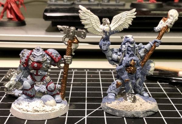
 I thought I’d try some dwarf flesh for his face, which came out pinker than I recall. The yellows on both are just the first coat, and will get brighter. Their armour got some Agrax in the recesses and the gold and fur got some all over
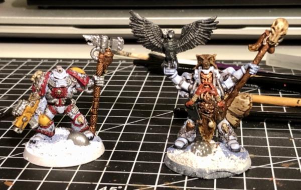
 . Next I’ll wash the metals with nuln oil before tidying up the colours I’ve washed then highlighting can commence. Njal’s runes look better after the Agrax wash, but I’m not sure what colour to go for with them. A yellowy Red seems like the classic so I might copy the MegaDave inspired power weapon recipe. That or I’ll go bright green or blue? Decisions, Decisions!
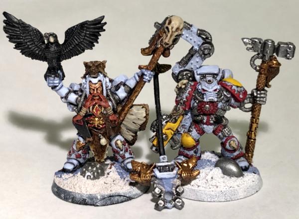
 until there's some washes to give depth. Really like this classic look of the models, even if I wasn't active when they first were around.

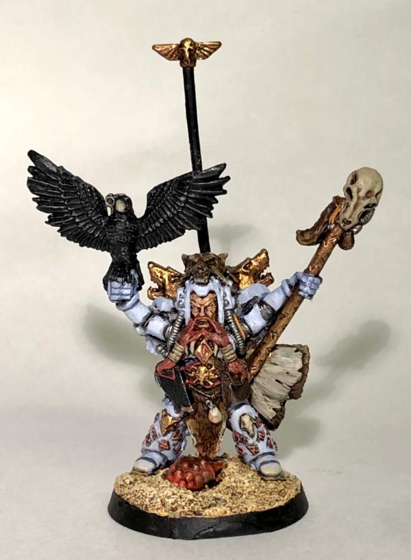
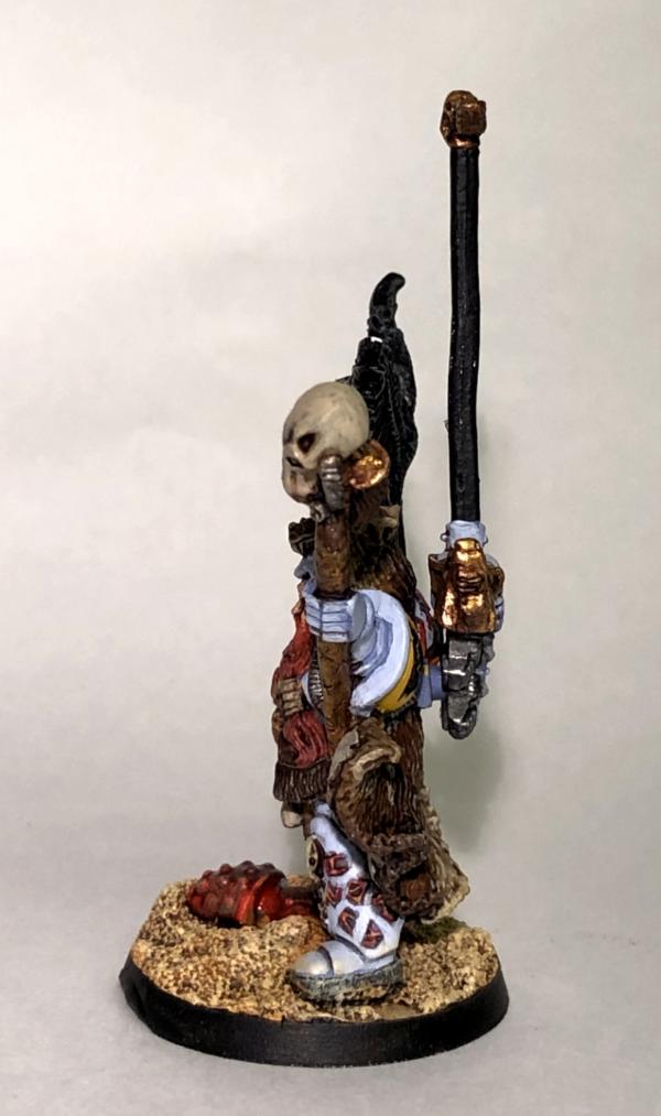
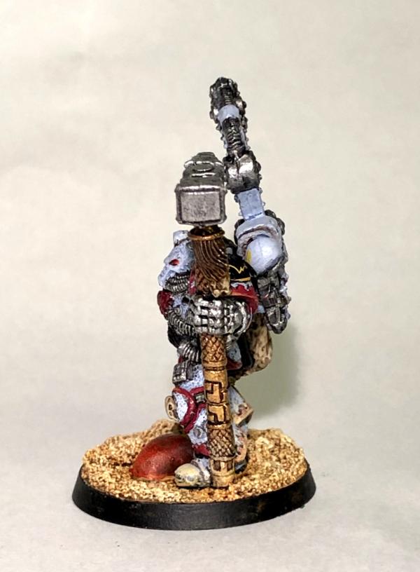
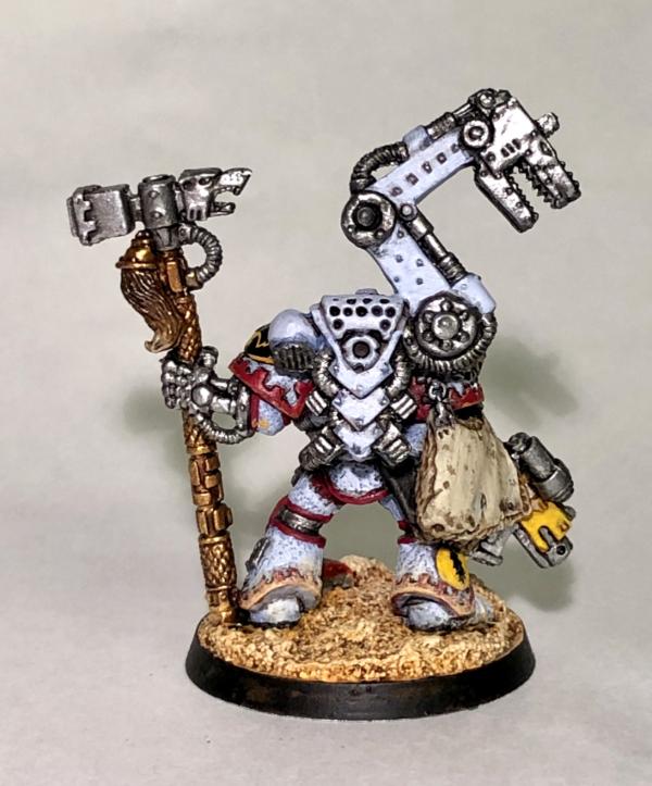
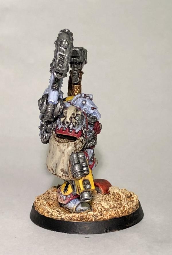
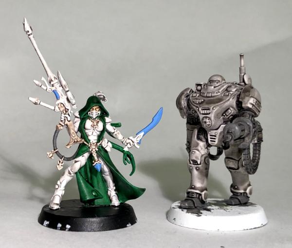
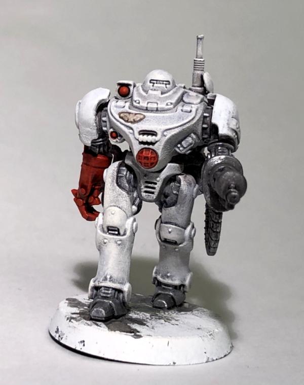
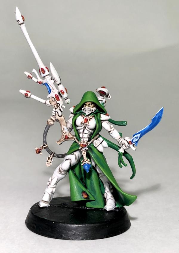
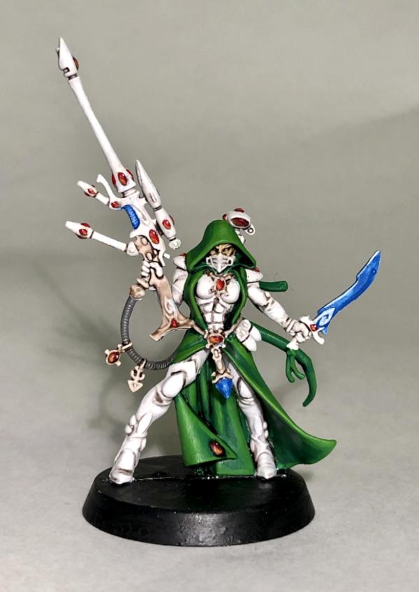
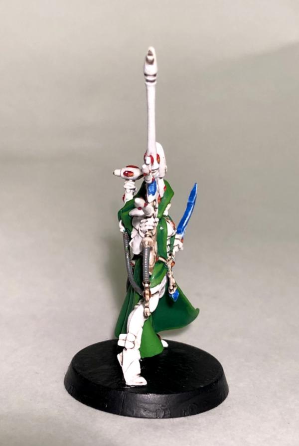
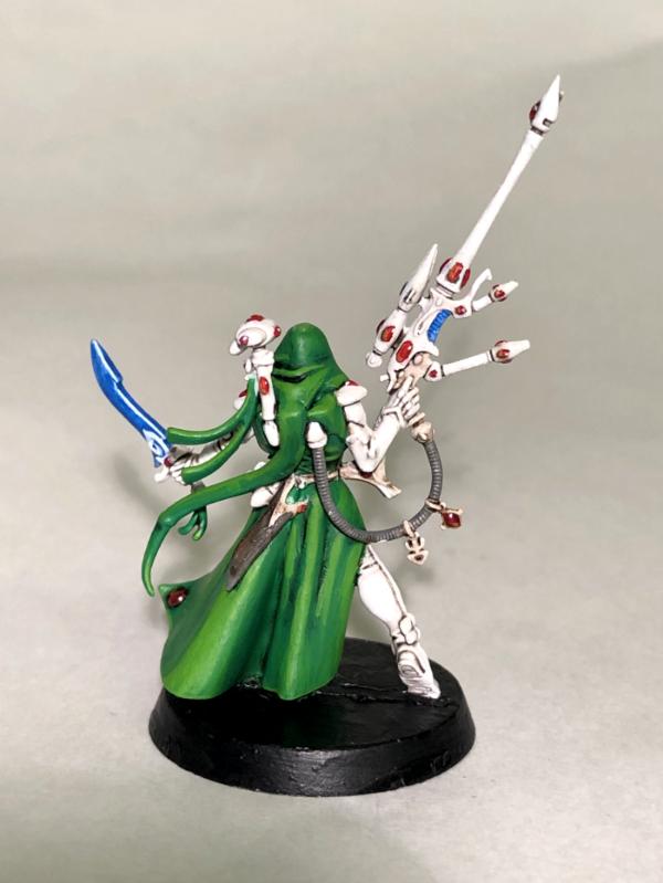
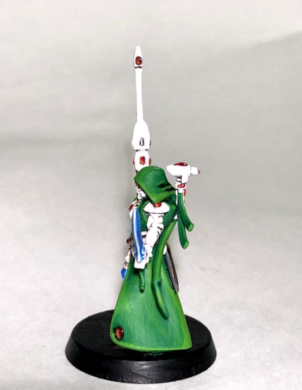
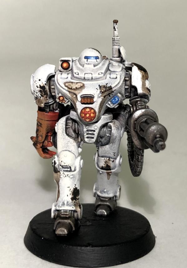
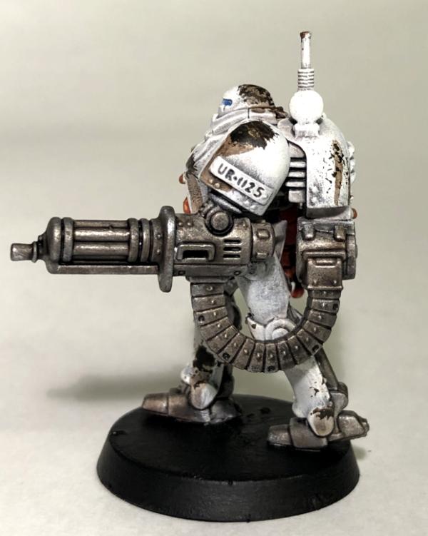
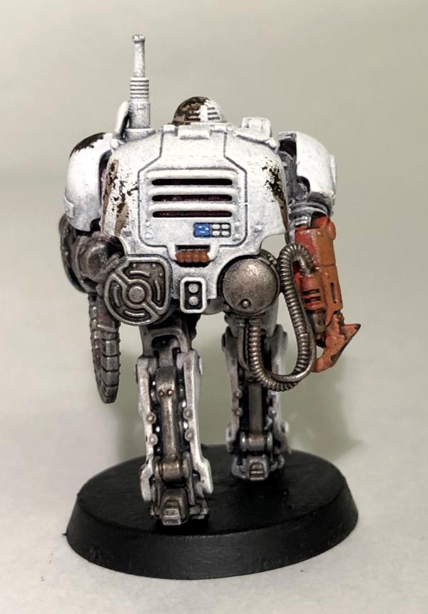
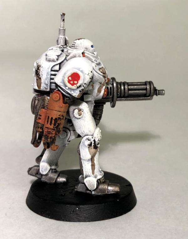
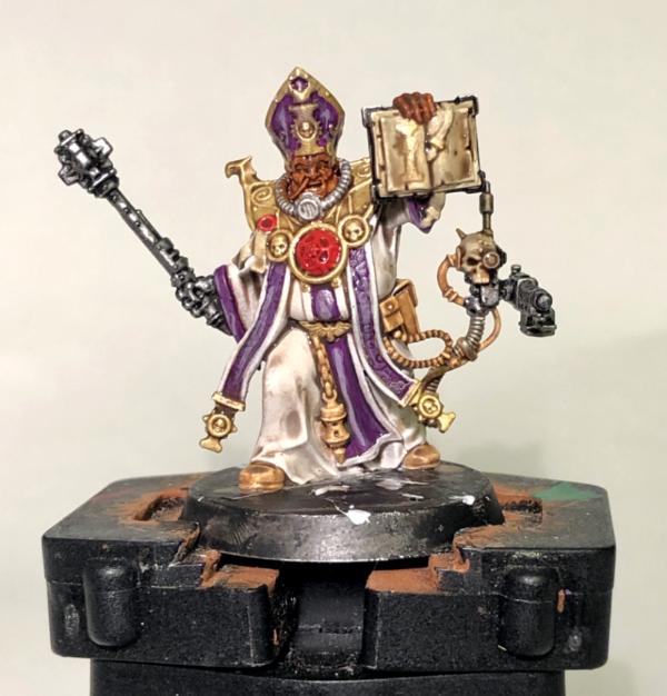


 wow! Thanks for all the comments, you’ve all kept me busy for a while with this whole “Social Distancing” thing. Thankfully my kids are oblivious, apart from being sad not to see their school friends next week. We really are living in interesting times. To that end we’ve all got to keep our spirits up, so my wife and I are getting our hobbies on. Yesterday was gardening day followed by painting evening for me (and trinket making for my wife, glittery butterfly kids key rings at the moment).
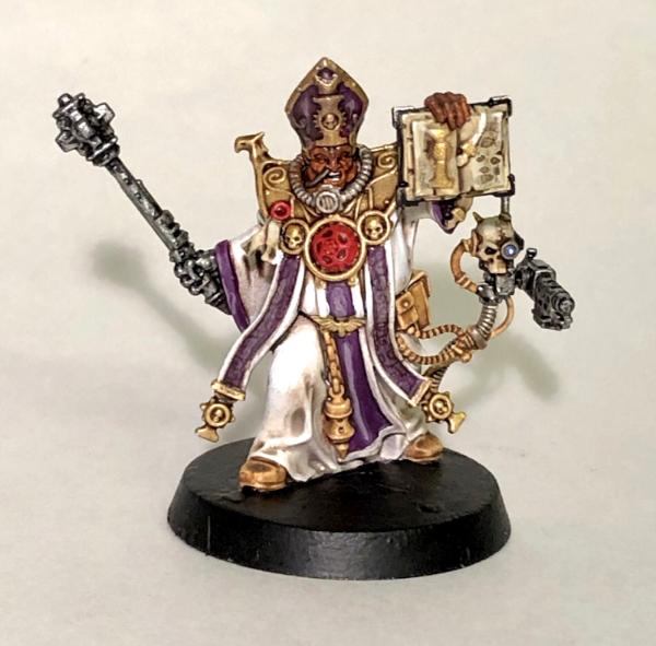
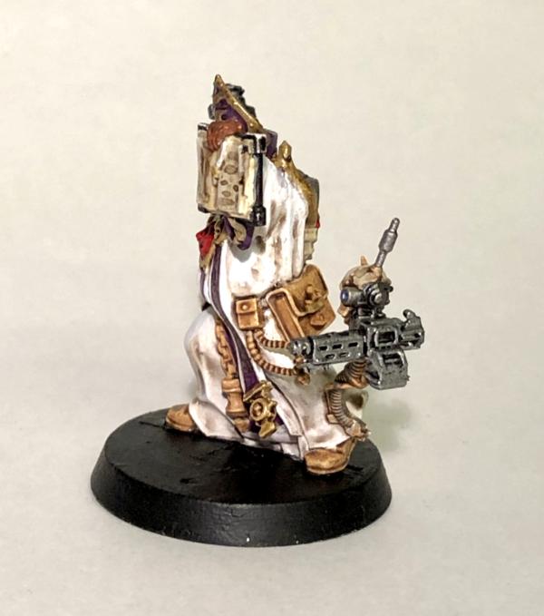
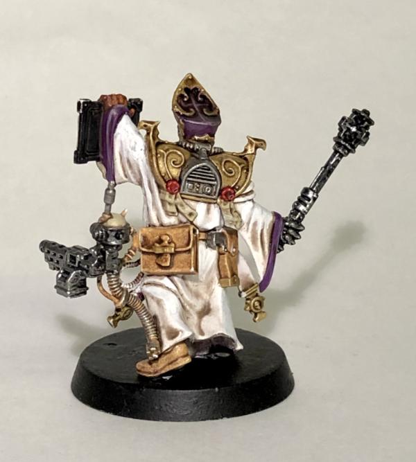
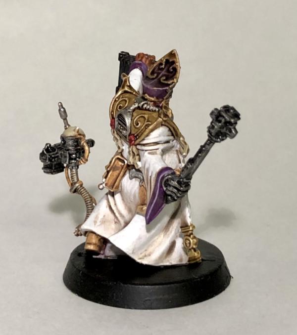
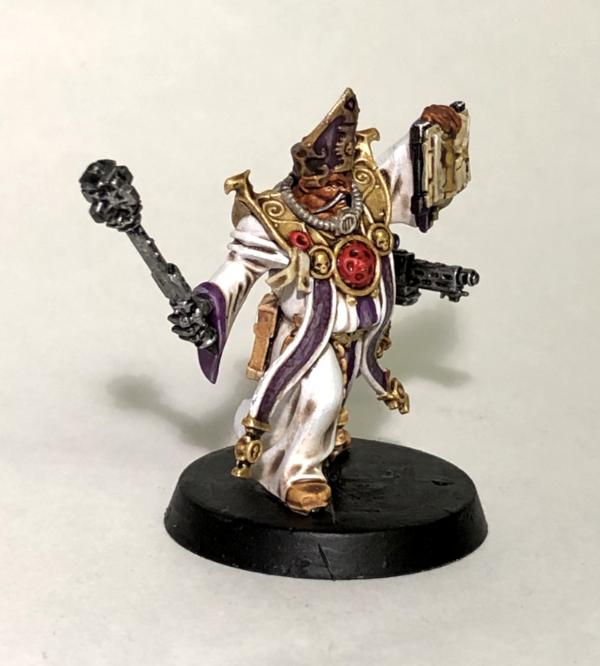
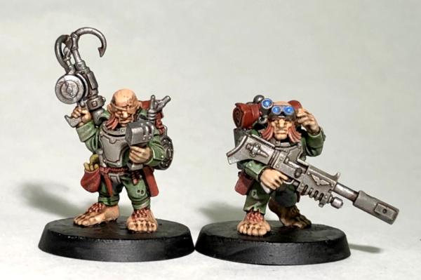
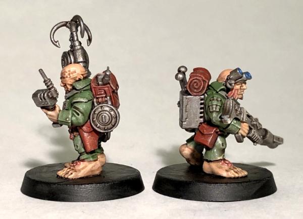
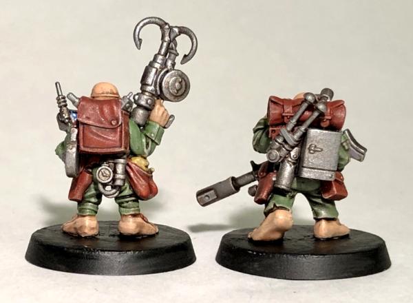
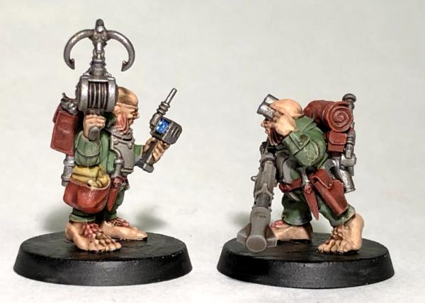
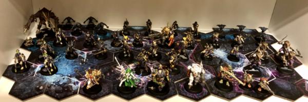
 it must be pretty cold in the fortress, so leg warmers are a must have item. Every Kroot whose any Kroot is wearing them
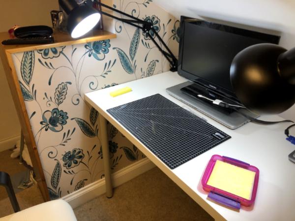
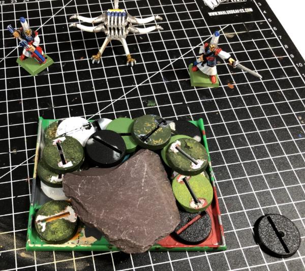
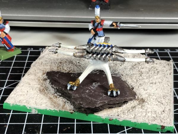
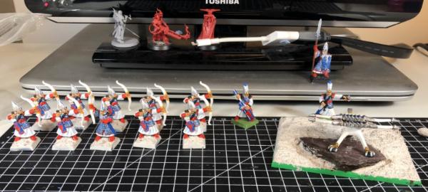
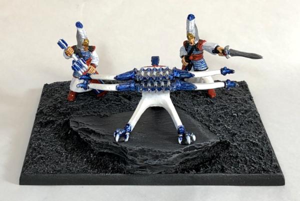
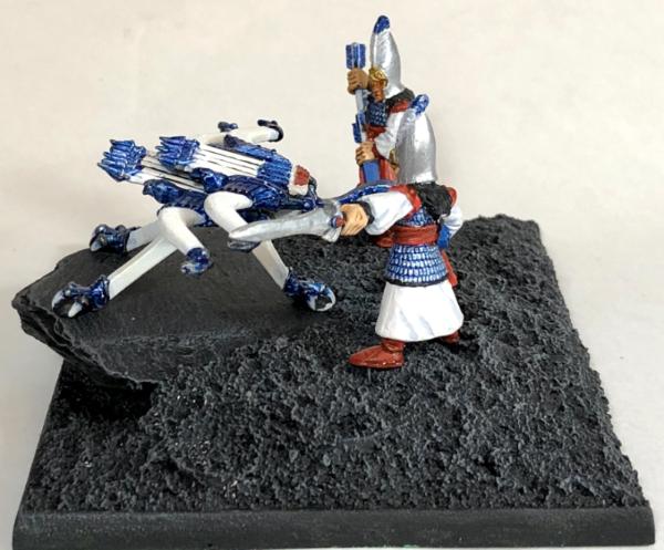

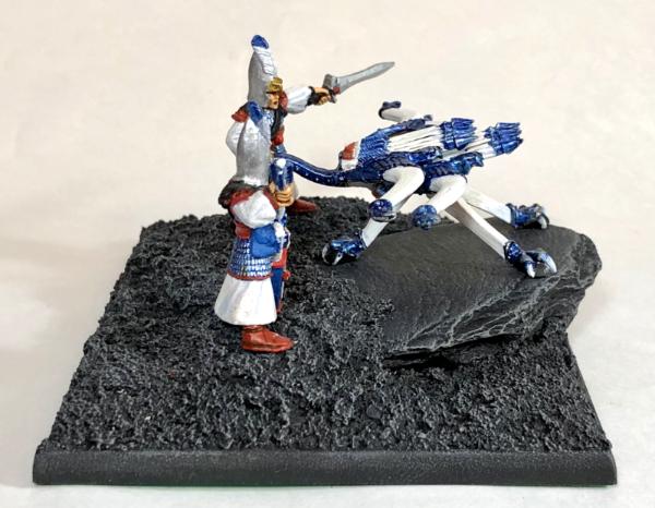
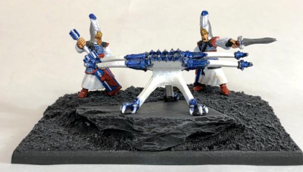
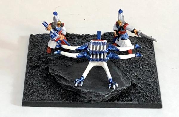
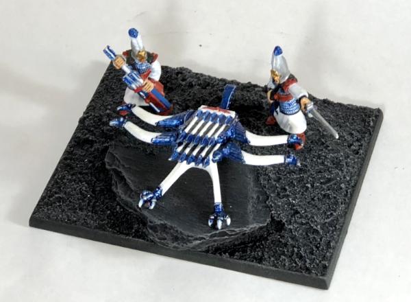
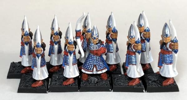
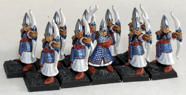
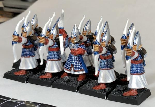
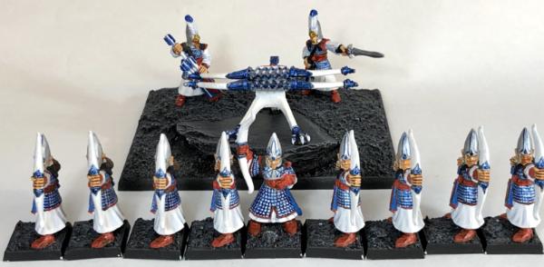
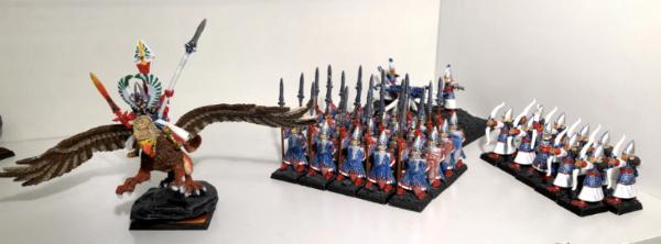
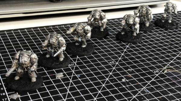
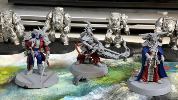


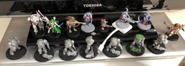
 Totally worth it! Nerve wracking on the last one at the top, which I think is slightly off centre. That’s the firing position on a minigun
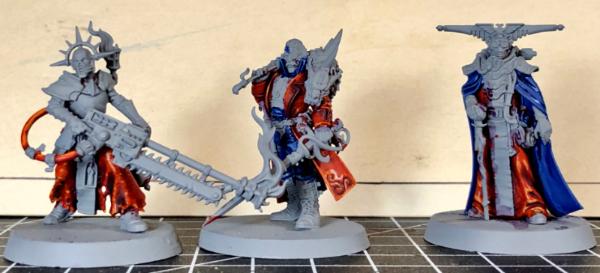
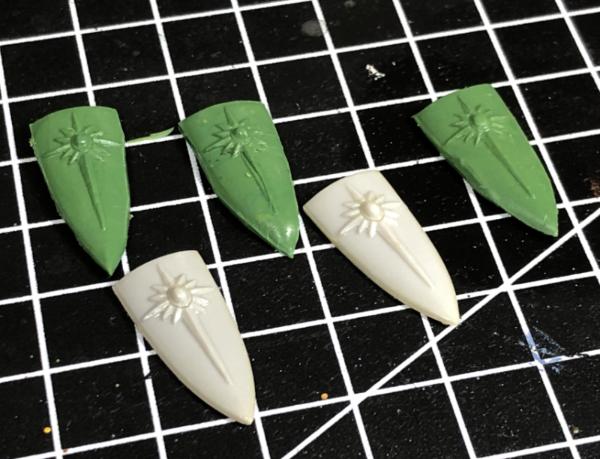

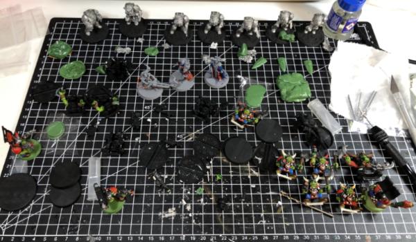
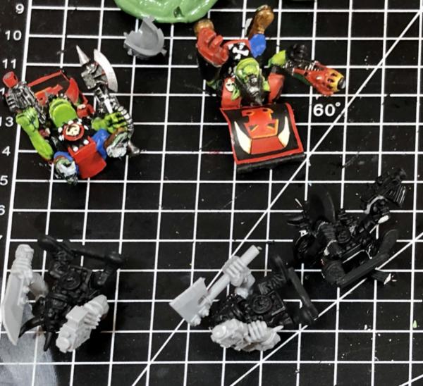
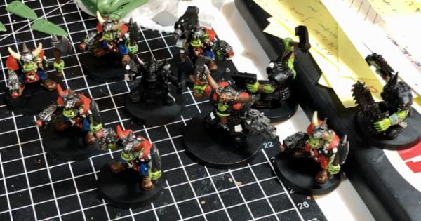
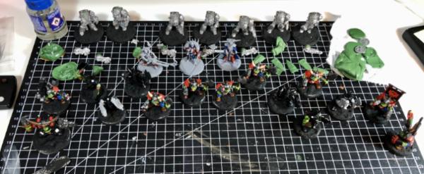
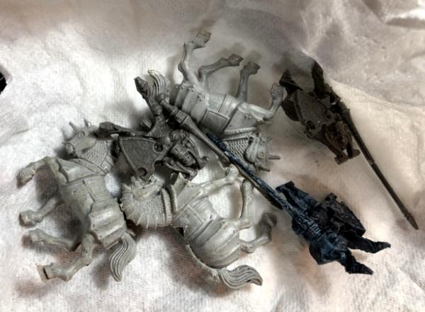
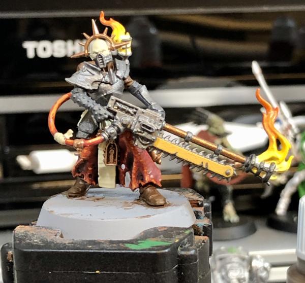

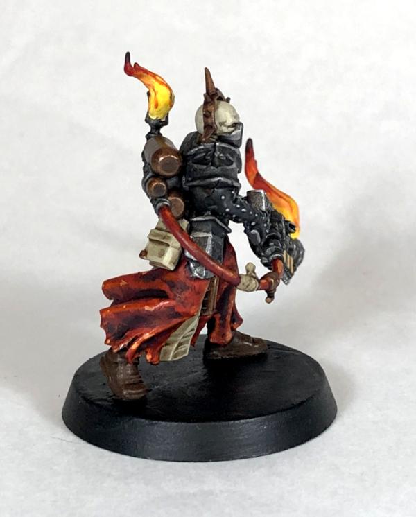
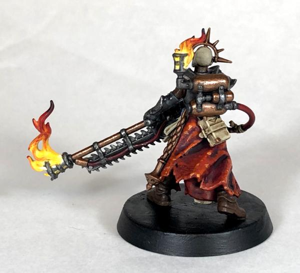
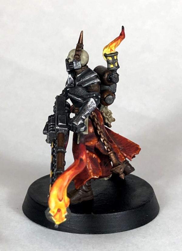
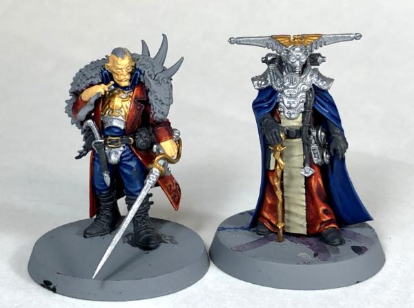
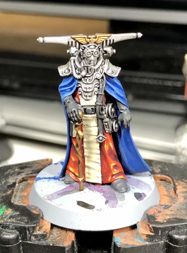
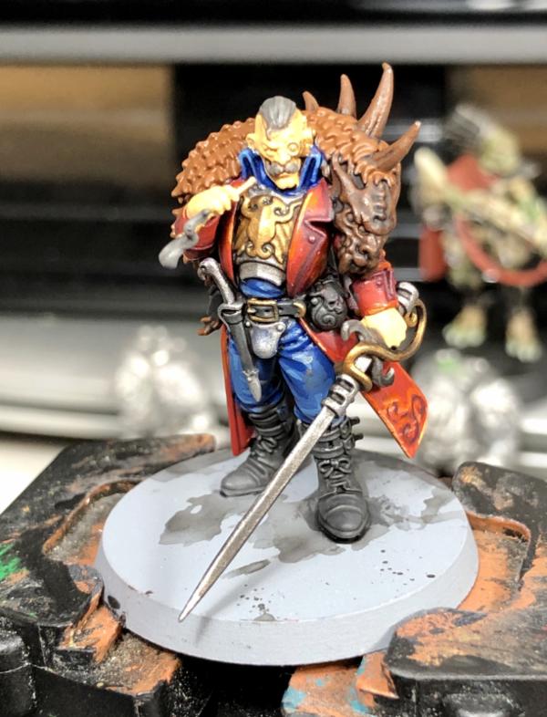
 And great work on Vorne, your flames really pop! Navigator and
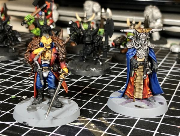

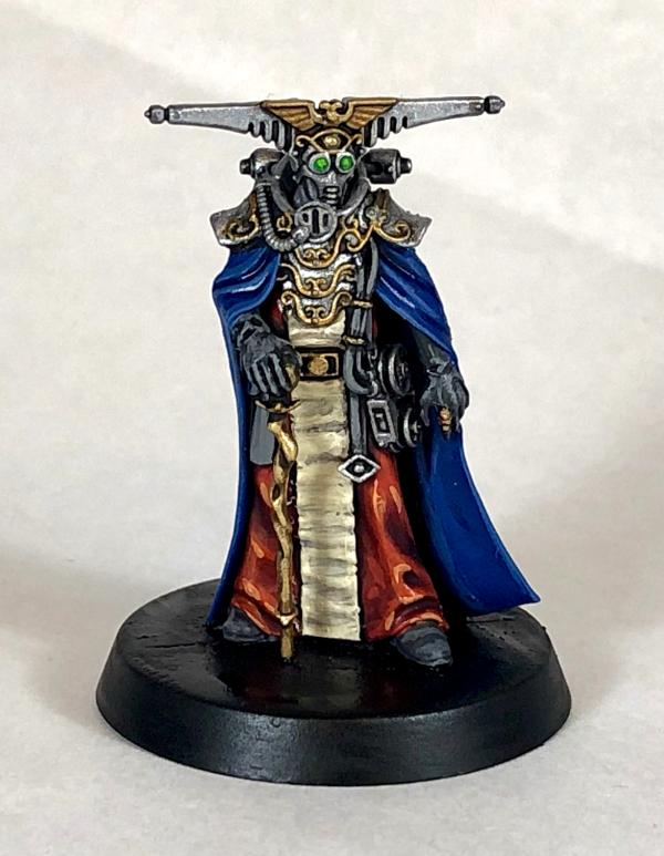
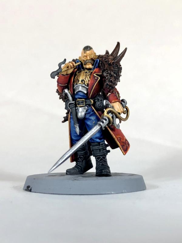
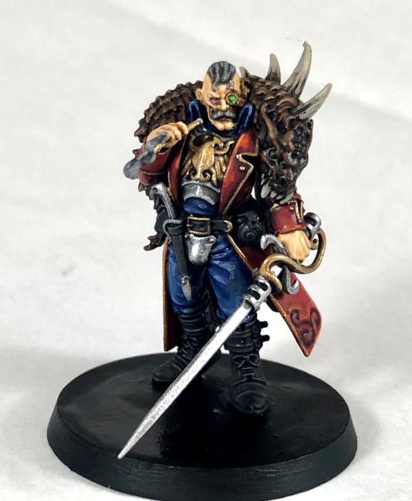
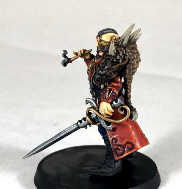
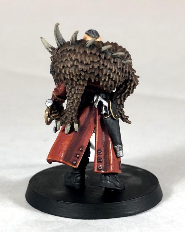
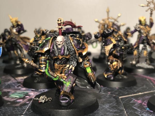
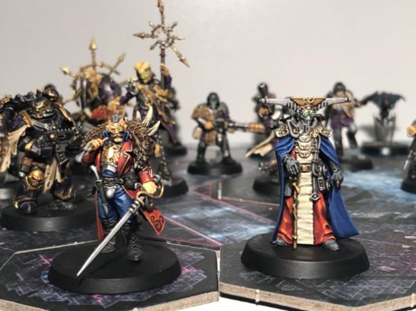
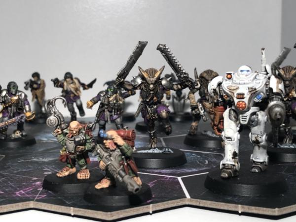
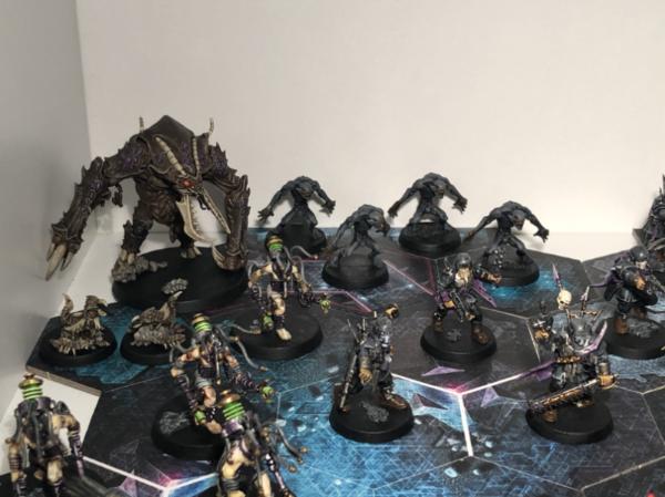
 . The Zoat and Ascension will follow once they’re released. I’d like to get some 3D printed terrain too as it looks cool!