| Author |
Message |
 |
|
|
|
|
Advert
|
Forum adverts like this one are shown to any user who is not logged in. Join us by filling out a tiny 3 field form and you will get your own, free, dakka user account which gives a good range of benefits to you:
- No adverts like this in the forums anymore.
- Times and dates in your local timezone.
- Full tracking of what you have read so you can skip to your first unread post, easily see what has changed since you last logged in, and easily see what is new at a glance.
- Email notifications for threads you want to watch closely.
- Being a part of the oldest wargaming community on the net.
If you are already a member then feel free to login now. |
|
 |
2016/07/29 13:31:25
Subject: WORST 40k artwork thread
|
|

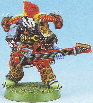
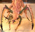
The Last Chancer Who Survived
|
OH GOD NOT MY FACE
|
|
|
 |
|
2016/07/29 14:13:16
Subject: WORST 40k artwork thread
|
|

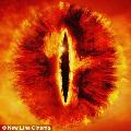
Powerful Phoenix Lord
|
(rubs your nose in a pool of glorious colour) EMBRACE THE PAIN!
|
|
|
|
|
2016/07/29 15:10:14
Subject: Re:WORST 40k artwork thread
|
|

Fixture of Dakka
|
PourSpelur wrote: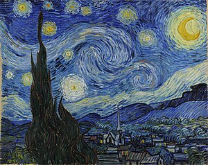
Look at this hack work. It's just a bunch of dots and splashes of color. The proportions are all wrong. What's that thing on the left? A tree? Saruman's tower? The trash heap this painting belongs on?
Whatever it is I'm glad this scribble will be instantly recognized as hot garbage.
OK, I'm not implying that Blanche belongs on the wall next to Van Gogh. What I'm implying is that good art provokes a response. I get that response from Blanche. If you don't that's fine. What I disagree with is the assertion that because you don't like it, it's bad.
Thing is, that is horrible art. If his other art work wasn't so great, then nobody would have batten a eye lash over this.
Horrible is horrible. For what ever reason the person became popular and that is why anything he does is "great work" now. Just like Howard Stern, people will go crazy over his art work just because of his name. Is he a great artist? No, he will even say it himself, but people still go crazy over it because of who he is, not what he actually painted. That is the only reason why people will go crazy over this artwork that is posted. Not that it's nice or good but because of the name associated to it.
Horrible artwork is horrible artwork. It's because the name on it that makes it so "great".
|
Agies Grimm:The "Learn to play, bro" mentality is mostly just a way for someone to try to shame you by implying that their metaphorical nerd-wiener is bigger than yours. Which, ironically, I think nerds do even more vehemently than jocks.
Everything is made up and the points don't matter. 40K or Who's Line is it Anyway?
Auticus wrote: Or in summation: its ok to exploit shoddy points because those are rules and gamers exist to find rules loopholes (they are still "legal"), but if the same force can be composed without structure, it emotionally feels "wrong". |
|
|
|
|
2016/07/29 16:15:32
Subject: Re:WORST 40k artwork thread
|
|
Trigger-Happy Baal Predator Pilot
|
lol, oh man yeah the old chapter icons that looked like a child drew them!
personal fav, the space sharks
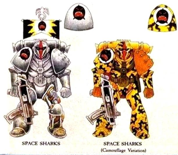
raaaar!!!
I've kinda got a soft spot for the old hair metal noise marines. They look like members of GWAR
|
|
|
|
|
|
2016/07/29 17:38:05
Subject: WORST 40k artwork thread
|
|

Glorious Lord of Chaos
The burning pits of Hades, also known as Sweden in summer
|
I really really do not like that bright clean flat style.
|
I should think of a new signature... In the meantime, have a  |
|
|
|
|
2016/07/30 07:00:07
Subject: Re:WORST 40k artwork thread
|
|
Flashy Flashgitz
Armageddon
|
Funnily enough Rainbow Warriors are some of the least rainbow marines in 40k 
As for Blanche, eeeeehhhh. I mean saying its 'surreal nightmare art' doesn't really work for me all that well when he's supposed to be drawing actual humans. I mean even with massive amount of cybernetics humans are still supposed to have human proportions. I've found them more goofy then scary. Surreal nightmare art to me is like....Zdislav Beksinki stuff. I don't see H.R Giger in those colorful collages of blurry space marines.
And regarding 'atmosphere', thats a tricky subject as I find it pretty subjective. I don't think more blur = atmosphere. And having the same atmosphere repeated ad naseum doesn't do 40k art justice either. Diversity would help flesh out different factions better if you ask me. Why can't I see any Eldar art with a sad, somber tone? Or humorous Ork art? Or Chaos art that doesn't feel like Imperium art? And that AoS ghoul picture I posted earlier in the thread, cmon how can you say that doesn't have atmosphere? :/
|
|
This message was edited 1 time. Last update was at 2016/07/30 07:00:58
"People say on their first meeting a Man and an Ork exchanged a long, hard look, didn't care much for what they saw, and shot each other dead." |
|
|
|
|
2016/07/30 07:42:20
Subject: Re:WORST 40k artwork thread
|
|

Committed Chaos Cult Marine
|
 Don Savik wrote: Don Savik wrote:Funnily enough Rainbow Warriors are some of the least rainbow marines in 40k
As for Blanche, eeeeehhhh. I mean saying its 'surreal nightmare art' doesn't really work for me all that well when he's supposed to be drawing actual humans. I mean even with massive amount of cybernetics humans are still supposed to have human proportions. I've found them more goofy then scary. Surreal nightmare art to me is like....Zdislav Beksinki stuff. I don't see H.R Giger in those colorful collages of blurry space marines.
And regarding 'atmosphere', thats a tricky subject as I find it pretty subjective. I don't think more blur = atmosphere. And having the same atmosphere repeated ad naseum doesn't do 40k art justice either. Diversity would help flesh out different factions better if you ask me. Why can't I see any Eldar art with a sad, somber tone? Or humorous Ork art? Or Chaos art that doesn't feel like Imperium art? And that AoS ghoul picture I posted earlier in the thread, cmon how can you say that doesn't have atmosphere? :/
I sort of agree, but Blanche isn't supposed to be drawing actual humans. I've said it before in this thread, but he's drawing to convey to us the horror of the grim darkness of the far future.
I also mentioned it's subjective - most of the "horrific" art others posted I found flat and boring. Blanche's art just conveys much more atmosphere and emotion for subjective me.
I do agree different art styles though, and I'd say Blanche's art is generally in the realm of the Eye of Terror, while many of the others are more realistic, but less atmospheric. The ghoul one specifically didn't do much for me, it was just ghouls with a lot of skulls and skull iconography. Just "skulls" isn't horrific. It looked like a D&D illustration.
|
|
|
|
|
2016/07/30 11:04:31
Subject: WORST 40k artwork thread
|
|
The Last Chancer Who Survived
|
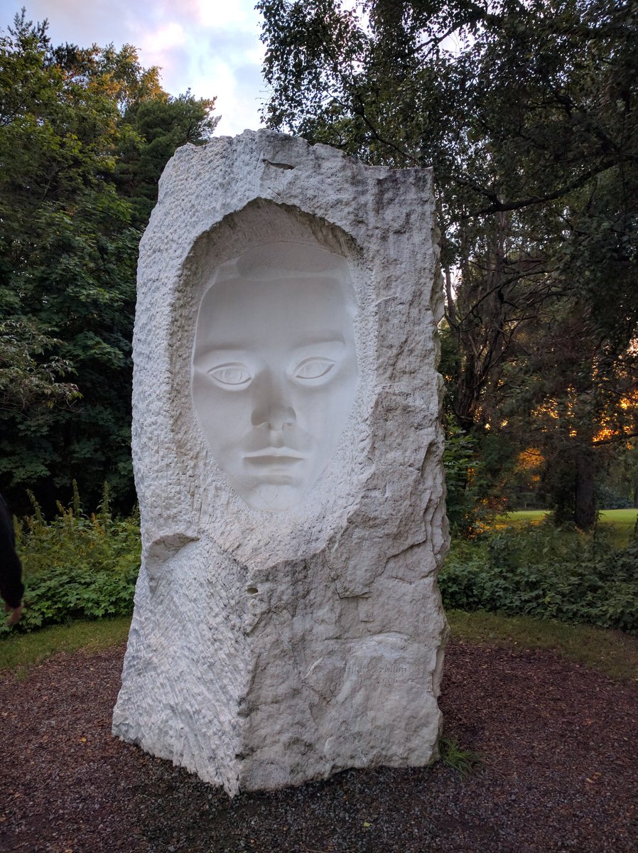
Not exactly GrimDank, but I found an image that shows the kind of art you could put into 40k that would actually enhance the universe: 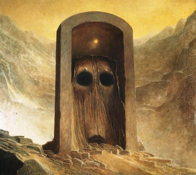 This is a good one because, (surrealism aside), it brings up waaay more questions than it could ever answer. What is it? It looks like an entryway, but the passage does not extend behind the arch. Why? Does it lead out of the reality in which the arch sits? If it is an entryway, why does this door thing not have any visible way of opening? Could it, perhaps, not be a door? If it's not a door, why is it blocking the entryway? It has a face, so can it see? What would it see? Why would a door or barricade need to see? Some things do better outside of written depiction, and many things in 40k could benefit from such images accompanied by a mere title.
|
|
This message was edited 1 time. Last update was at 2016/07/30 11:05:52
|
|
|
|
|
2016/07/30 15:04:18
Subject: WORST 40k artwork thread
|
|

Crazed Spirit of the Defiler
|
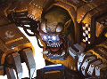
Ironically, the artwork i probably hate most of all is the official art of purturabo. Where is head is like 80 times smaller than the actual headspace of his armour and his eyes are glowing for some reason.
|
|
|
|
|
|
2016/07/30 15:12:45
Subject: WORST 40k artwork thread
|
|
Decrepit Dakkanaut
|
 ThunderFury 2575 wrote: ThunderFury 2575 wrote:Ironically, the artwork i probably hate most of all is the official art of purturabo. Where is head is like 80 times smaller than the actual headspace of his armour and his eyes are glowing for some reason.
Pretty sure it's supposed to be him as a daemon.
Also whoever did the artwork in the Necron codices (especially 3d edition) gets my praise.
|
CaptainStabby wrote:If Tyberos falls and needs to catch himself it's because the ground needed killing.
 jy2 wrote: jy2 wrote:BTW, I can't wait to run Double-D-thirsters! Man, just thinking about it gets me Khorney.
 vipoid wrote: vipoid wrote:Indeed - what sort of bastard would want to use their codex?
 MarsNZ wrote: MarsNZ wrote:ITT: SoB players upset that they're receiving the same condescending treatment that they've doled out in every CSM thread ever.
|
|
|
|
|
2016/07/30 16:54:18
Subject: WORST 40k artwork thread
|
|
Pyromaniac Hellhound Pilot
|
 Selym wrote: Selym wrote:Not exactly GrimDank, but I found an image that shows the kind of art you could put into 40k that would actually enhance the universe:
This is a good one because, (surrealism aside), it brings up waaay more questions than it could ever answer.
What is it?
It looks like an entryway, but the passage does not extend behind the arch. Why?
Does it lead out of the reality in which the arch sits?
If it is an entryway, why does this door thing not have any visible way of opening?
Could it, perhaps, not be a door?
If it's not a door, why is it blocking the entryway?
It has a face, so can it see?
What would it see?
Why would a door or barricade need to see?
Some things do better outside of written depiction, and many things in 40k could benefit from such images accompanied by a mere title.
Stealing that for a 40k RPG. I have just the thing to do with it...
|
|
|
|
|
2016/07/30 17:57:17
Subject: Re:WORST 40k artwork thread
|
|
Consigned to the Grim Darkness
|
Yes he is. He's done it countless times. And, like most of his attempt at producing something that might be called "Art", he failed. Seriously, stop making excuses for him. Even if you like some of the guy's art, you can still admit when it's bad. FFS, even I, a well established hater of the bland Blanche art that people seem to be fooling themselves in to loving, am willing to say he's still better than someone like Rob Liefeld.
|
|
This message was edited 5 times. Last update was at 2016/07/30 18:00:26
The people in the past who convinced themselves to do unspeakable things were no less human than you or I. They made their decisions; the only thing that prevents history from repeating itself is making different ones.
-- Adam Serwer
My blog |
|
|
|
|
2016/07/30 18:22:37
Subject: WORST 40k artwork thread
|
|
Imperial Guard Landspeeder Pilot
On moon miranda.
|
I might be weird, but I like the old stuff by Blanche and Gibbons and artists like that. Yeah, it's cartoony or odd looking in some ways, but it really just captures the overall feel of the universe perfectly, in fact, defined it really. When I think "Great 40k art", these are the names that come to my mind. Those styles just really do it for me. They have that 80's heavy metal look and often combine that with some old medieval artwork styles to get something that really fits that sort of "central dark ages europe in SPAAAAACE" thing that is 40k.
It's really the newer stuff that mostly fills my "worst 40k art" thoughts. It may be better executed in technical terms, may have more vivid colors and flashier stylings, but does not feel appropriate to the setting to me. Newer stuff tends to just feel stylistically inappropriate, a lot of it looks like someone just redid a piece from League of Legends or World of Warcraft or the like, and lacks the atmosphere and that sort of 80's heavy metal "feel" that I really think defines the 40k universe. A lot of the newer stuff also just copies the models far too literally, often down to including sculpting compromises made to accommodate plastics manufacture, and that just doesn't look right.
|
IRON WITHIN, IRON WITHOUT.
New Heavy Gear Log! Also...Grey Knights!
The correct pronunciation is Imperial Guard and Stormtroopers, "Astra Militarum" and "Tempestus Scions" are something you'll find at Hogwarts. |
|
|
|
|
2016/07/30 20:17:03
Subject: Re:WORST 40k artwork thread
|
|
Stern Iron Priest with Thrall Bodyguard
|
 Melissia wrote: Melissia wrote:Yes he is. He's done it countless times. And, like most of his attempt at producing something that might be called "Art", he failed.
Seriously, stop making excuses for him. Even if you like some of the guy's art, you can still admit when it's bad. FFS, even I, a well established hater of the bland Blanche art that people seem to be fooling themselves in to loving, am willing to say he's still better than someone like Rob Liefeld.
nobody needs to "fool themselves into loving" anything...
get over yourself...
people like what they like...
look at Davor's post calling Starry Night "horrible art"...
there is nothing horrible about it, unless it doesn't float your boat...
if it does, then it becomes a beautiful interpretation, or impression  , of the night sky...
John Blanche has a great amount of technical skill, as shown by his early works, like We are Legion, Nuln, Knights Panther, the Battlefleet Gothic box cover, and others...
he has gone through a few iterations of style, and arrived at a place where he is comfortable enough to get loose, and work to capture a feeling, rather than photo-realism...
if all art had to be realistic, it would end up boring...
do you think that Picasso couldn't draw, simply because he decided to develop his Cubist style???
is Impressionism "bad art"???
is Expressionism???
even Liefeld has done some pretty incredible drawings 
styles differ...
look at the explosion of Chibi minis in the last few years...
the style is not for me, at all, but i am not going to call it bad, and get angry at the fans...
at least the style has inspired some pretty cool paint jobs, and got people being creative...
Blanche inspires, and that is the best part!!!
cheers
jah
|
Paint like ya got a pair!
Available for commissions.
|
|
|
|
|
2016/07/30 20:27:45
Subject: WORST 40k artwork thread
|
|
Warning From Magnus? Not Listening!
|
Alright, I'm tired of the Blanche fight. Mods have been alerted.
Drop it. Seriously, no one is going to "win" the  argument.
|
|
This message was edited 1 time. Last update was at 2016/07/30 20:28:05
 Necrons - 3000 pts Necrons - 3000 pts
 HH Imperial Militia/Cults - 1000 points Check out my P&M blog! (https://www.dakkadakka.com/dakkaforum/posts/list/805464.page) HH Imperial Militia/Cults - 1000 points Check out my P&M blog! (https://www.dakkadakka.com/dakkaforum/posts/list/805464.page)
 Bretonnia - 4500 pts Bretonnia - 4500 pts
Dakka trades (50): Gav99 (3), FenrisianStuart21 (2), gardeth, norrec65, syypher, Sargow, o Oni o, Rommel44, Lloyld, riverrat88, GloboRojo (2), Cocking_08, mickmoon (2), Acardia, Twoshoesvans, Prandtl, Thedragisal, CptJake, toasteroven, allworkandnoclay, CleverAntics (2), system seven, Siphen, Craftbrews, jmsincla, ellis91, HurricaneGirl, Bionic Reaper, quickfuze, VanHallan, quiestdeus, -iPaint-, Shadowblade07, Dez, Gremore, Ph34r, SwordBird, slyndread (2), JoeBobbyWii, VeternNoob, Madoch1, Dax415, CaptainRexKrammer, francieum, Telmenari, Melevolence |
|
|
|
|
2016/07/30 20:51:26
Subject: WORST 40k artwork thread
|
|
The Last Chancer Who Survived
|
While I don't think mods are needed here, this kind of argument IS essentially "my opinion is better than your opinion".
Anyone up for suggesting art styles that could improve 40k?
|
|
|
|
|
2016/07/30 21:08:51
Subject: Re:WORST 40k artwork thread
|
|
Pyromaniac Hellhound Pilot
|
I don't know about style, per se, but it definitely needs to move away from the clean-cut model tracing. The art can be so much more than digital (or pen and ink, or paint, or whatever medium you choose) copies of Official Citadel Models battling; that's a huge issue in Age of Sigmar art and it's a problem in 40k, too. More pictures of giant hive cities. More pictures of insane landscapes. More pictures of grim manufactorums and weird-looking servitors and little dudes in robes holding auto-quills. Battle scenes are great, but the decision to focus on 40k - and Age of Sigmar - as a wargame over a setting is really hurting the brand. I got interested in the wargame because I like the setting, and I doubt I'm alone. The art has so much more room than the models to explore and get really wild, and the thing that all these settings have - 40k, the Warhammer World, even Age of Sigmar - is that there's a lot of space for creativity.
This is a big part of what I'm talking about. It doesn't look like something that belongs in any Warhammer-linked universe; those don't look like elite soldiers of Chaos mounted on twisted daemon-steeds, they look like generic villains on lizard-horse-monsters. Where's the baroque gribbly bits? The tentacles? The leering faces? I see a couple of spikes and horns and two skulls, and the less said about tiny Archaon in the background, the better. That could be anyone's setting.
I guess the Stormcast are pretty representative of what Stormcast are, but that's it's own problem. 
|
|
This message was edited 1 time. Last update was at 2016/07/30 21:09:19
|
|
|
|
|
2016/07/30 21:47:17
Subject: Re:WORST 40k artwork thread
|
|

Thunderhawk Pilot Dropping From Orbit
In the Warp, getting trolled by Tactical_Spam, AKA TZEENTCH INCARNATE
|
I'm also in the "move-away-from-model-tracing"-camp. Personally, I absolutely adore the black-and-white drawings that grace the older codices, like this one from an old CSM codex:

This is the sort of artwork that really catches my attention. There are so many little details and oddities that just make you wonder about what's running around in the rest of the setting. It sends my imagination into overdrive, and it's something that just doesn't happen to me when I look at the more recent artwork.
|

Tactical_Spam: Ezra is fighting reality right now.
War Kitten: Vanden, you just taunted the Dank Lord Ezra. Prepare for seven years of fighting reality...
War Kitten: Ezra can steal reality
Kharne the Befriender:Took him seven years but he got it wrangled down
|
|
|
|
|
2016/07/30 22:02:36
Subject: Re:WORST 40k artwork thread
|
|
The Last Chancer Who Survived
|
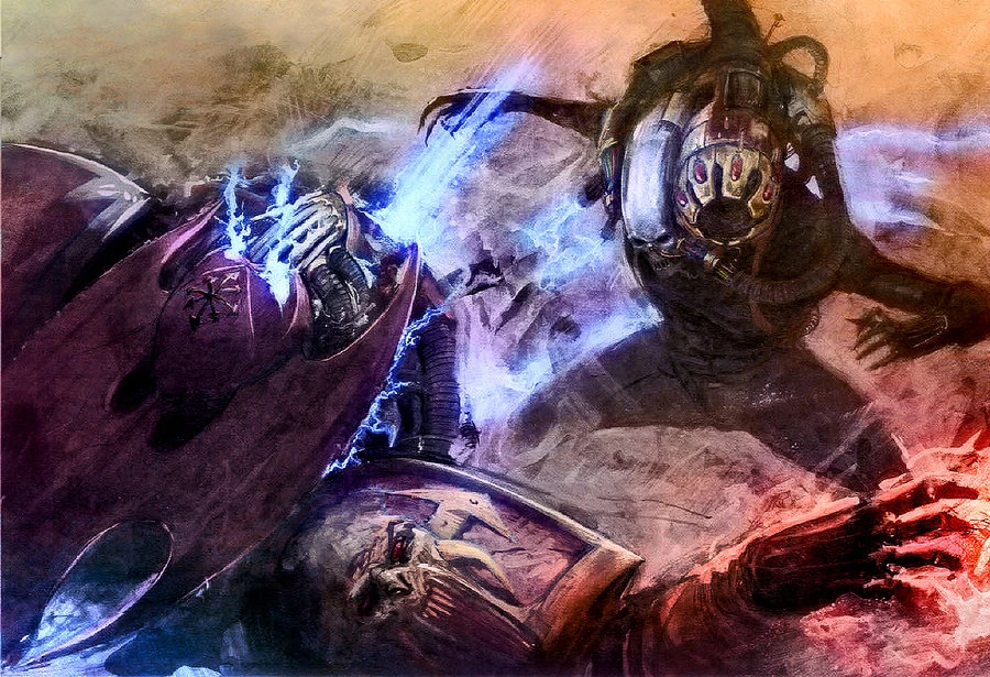
Culexus strikes again. Lots of motion in this one - the kind of thing that nakes you wish you could make such scenarios haplen.
|
|
This message was edited 1 time. Last update was at 2016/07/30 22:03:01
|
|
|
|
|
2016/07/30 22:20:23
Subject: Re:WORST 40k artwork thread
|
|
Glorious Lord of Chaos
The burning pits of Hades, also known as Sweden in summer
|
Selym wrote:
Culexus strikes again. Lots of motion in this one - the kind of thing that nakes you wish you could make such scenarios haplen.
You can, he seems to be firing his animus speculum.
|
I should think of a new signature... In the meantime, have a |
|
|
|
|
2016/07/30 23:32:18
Subject: WORST 40k artwork thread
|
|
The Last Chancer Who Survived
|
Exactly. Art should inspire you to take to the TT.
|
|
|
|
|
2016/07/31 01:14:07
Subject: Re:WORST 40k artwork thread
|
|
Fixture of Dakka
West Michigan, deep in Whitebread, USA
|
All I know is that everything in the Mordheim books are just the right kind of bad. I think they are Blanche work, but still so much more evocative than "modern" stuff.
|
     
"By this point I'm convinced 100% that every single race in the 40k universe have somehow tapped into the ork ability to just have their tech work because they think it should." |
|
|
|
|
2016/07/31 03:41:12
Subject: Re:WORST 40k artwork thread
|
|
Consigned to the Grim Darkness
|
 Ezra Tyrius wrote: Ezra Tyrius wrote:I'm also in the "move-away-from-model-tracing"-camp. Personally, I absolutely adore the black-and-white drawings that grace the older codices, like this one from an old CSM codex:
This is the sort of artwork that really catches my attention. There are so many little details and oddities that just make you wonder about what's running around in the rest of the setting. It sends my imagination into overdrive, and it's something that just doesn't happen to me when I look at the more recent artwork.
This is a reaqlly good example of Chaos artwork done right, to me.
|
The people in the past who convinced themselves to do unspeakable things were no less human than you or I. They made their decisions; the only thing that prevents history from repeating itself is making different ones.
-- Adam Serwer
My blog |
|
|
|
|
2016/07/31 03:49:05
Subject: WORST 40k artwork thread
|
|
Flashy Flashgitz
Armageddon
|
Ugh that picture of chaos reminded me of something I hated. I'm not defending the art thats model tracing, I could give less of a crap either way, but when I see cool as hell art in a miniatures game I kind of want to.....you know......buy the miniature of it.
Seriously I would pay 20 bucks for that marine with the 4-eyed mask. But its art thats 'way too intricate for GW to make into a miniature' which is both a good and bad thing I guess.
|
"People say on their first meeting a Man and an Ork exchanged a long, hard look, didn't care much for what they saw, and shot each other dead." |
|
|
|
|
2016/07/31 07:56:40
Subject: WORST 40k artwork thread
|
|
The Last Chancer Who Survived
|
Don Savik wrote:Ugh that picture of chaos reminded me of something I hated. I'm not defending the art thats model tracing, I could give less of a crap either way, but when I see cool as hell art in a miniatures game I kind of want to.....you know......buy the miniature of it.
Seriously I would pay 20 bucks for that marine with the 4-eyed mask. But its art thats 'way too intricate for GW to make into a miniature' which is both a good and bad thing I guess.
Well, GW did try to do X-treme detail. With failcast...
Bought some failcast swooping hawks recently, they didn't make the abdomen at all. Behind the arms is a block of resin.
|
|
|
|
|
2016/07/31 09:44:31
Subject: Re:WORST 40k artwork thread
|
|
Committed Chaos Cult Marine
|
Melissia wrote:Yes he is. He's done it countless times. And, like most of his attempt at producing something that might be called "Art", he failed.
Seriously, stop making excuses for him. Even if you like some of the guy's art, you can still admit when it's bad. FFS, even I, a well established hater of the bland Blanche art that people seem to be fooling themselves in to loving, am willing to say he's still better than someone like Rob Liefeld.
I simply will not. I love his art and it's done in a particular style on purpose. It's different, but that works for me. Art is subjective, and you can no more convince me his art is bad than you can convince me opera is good. I fething hate opera (it seriously stresses me out), but I still understand why people can appreciate it. I understand why you don't like Blanche and I cannot change your taste in art anymore than you can change mine.
 Vaktathi wrote: Vaktathi wrote:I might be weird, but I like the old stuff by Blanche and Gibbons and artists like that. Yeah, it's cartoony or odd looking in some ways, but it really just captures the overall feel of the universe perfectly, in fact, defined it really. When I think "Great 40k art", these are the names that come to my mind. Those styles just really do it for me. They have that 80's heavy metal look and often combine that with some old medieval artwork styles to get something that really fits that sort of "central dark ages europe in SPAAAAACE" thing that is 40k.
It's really the newer stuff that mostly fills my "worst 40k art" thoughts. It may be better executed in technical terms, may have more vivid colors and flashier stylings, but does not feel appropriate to the setting to me. Newer stuff tends to just feel stylistically inappropriate, a lot of it looks like someone just redid a piece from League of Legends or World of Warcraft or the like, and lacks the atmosphere and that sort of 80's heavy metal "feel" that I really think defines the 40k universe. A lot of the newer stuff also just copies the models far too literally, often down to including sculpting compromises made to accommodate plastics manufacture, and that just doesn't look right.
My thoughts exactly.
Selym wrote:Not exactly GrimDank, but I found an image that shows the kind of art you could put into 40k that would actually enhance the universe:
This is a good one because, (surrealism aside), it brings up waaay more questions than it could ever answer.
What is it?
It looks like an entryway, but the passage does not extend behind the arch. Why?
Does it lead out of the reality in which the arch sits?
If it is an entryway, why does this door thing not have any visible way of opening?
Could it, perhaps, not be a door?
If it's not a door, why is it blocking the entryway?
It has a face, so can it see?
What would it see?
Why would a door or barricade need to see?
Some things do better outside of written depiction, and many things in 40k could benefit from such images accompanied by a mere title.
Love the Grimdark typo!
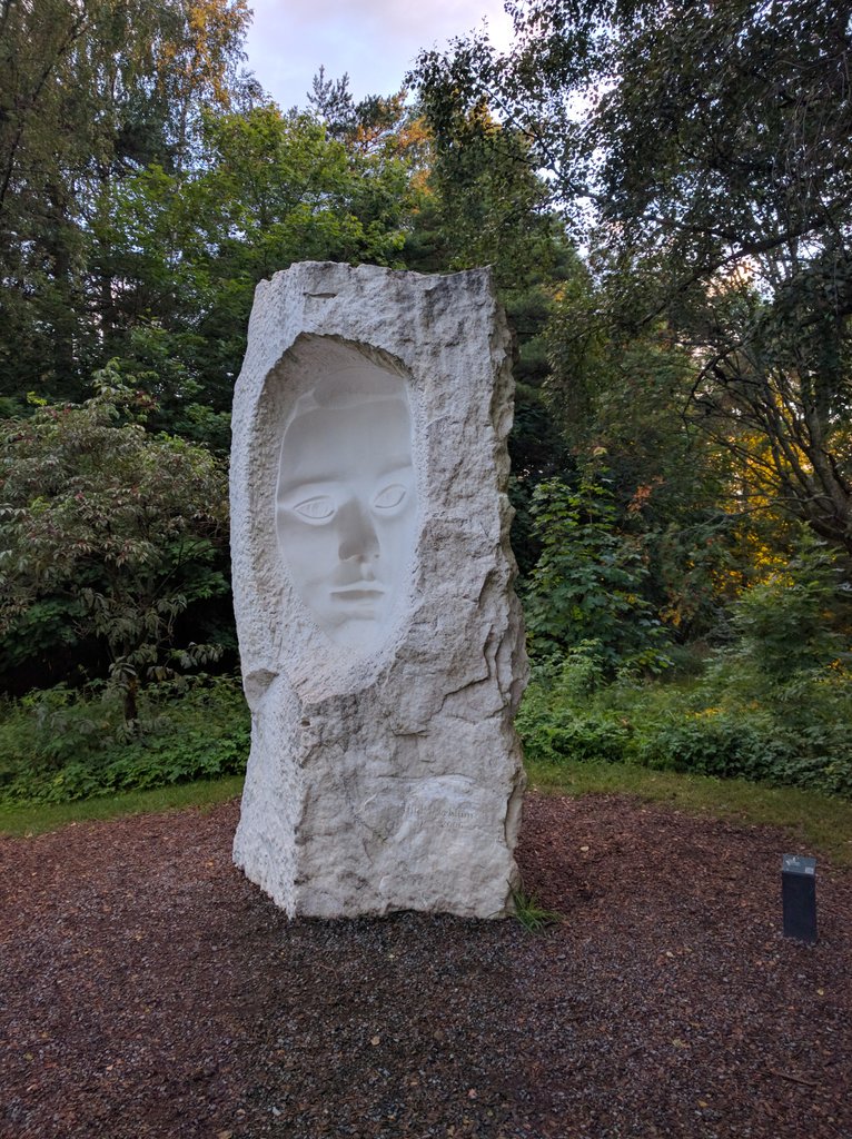
Saw something similar yesterday in a park. Zordon's gaze followed me.
|
|
|
|
|
2016/07/31 13:57:08
Subject: Re:WORST 40k artwork thread
|
|
Trigger-Happy Baal Predator Pilot
|
 AegisGrimm wrote: AegisGrimm wrote:All I know is that everything in the Mordheim books are just the right kind of bad. I think they are Blanche work, but still so much more evocative than "modern" stuff.
I LOVE the Mordheim book! That was the ultimate representation of everything I loved about the warhammer fantasy universe, which is a shame because it's basically the dead opposite of the AoS universe. Automatically Appended Next Post: Don Savik wrote:Ugh that picture of chaos reminded me of something I hated. I'm not defending the art thats model tracing, I could give less of a crap either way, but when I see cool as hell art in a miniatures game I kind of want to.....you know......buy the miniature of it.
Seriously I would pay 20 bucks for that marine with the 4-eyed mask. But its art thats 'way too intricate for GW to make into a miniature' which is both a good and bad thing I guess.
Well, maybe too intricate for GW. Forgeworld tho:

(fifty seven pounds sterling though although he does come with some awesome bodyguard figs)
|
|
This message was edited 1 time. Last update was at 2016/07/31 14:00:37
|
|
|
|
|
2016/07/31 14:35:30
Subject: Re:WORST 40k artwork thread
|
|
Thunderhawk Pilot Dropping From Orbit
In the Warp, getting trolled by Tactical_Spam, AKA TZEENTCH INCARNATE
|
Damn you, Forgeworld, why must you be so awesome... and expensive 
Also, I get where you're coming from, Don Savik. There's plenty of stuff in the artwork that looks awesome as hell and would be lovely to get on the tabletop, but part of the appeal of said artwork is that not all of the things depicted are available as miniatures.
I believe artwork (and fluff, for that matter) should not only serve as a medium to show how awesome, badass and grimdark the models we know and love are, but also as a source of inspiration for our own creations.
For example: before Forgeworld's Primarch models, there were few actual models of said Primarchs ( AFAIK, though, I have heard there were some Primarch/Daemon primarch models in Epic). There was, however, artwork and fluff of the Primarchs, and those things inspired people to create their own versions of famous characters like Angron, Fulgrim, Mortarion, etc.
After much conversion work, green stuff, blood, sweat and tears, they had their own Primarchs to lead their armies. Were they as good as FW's Primarchs are now? Of course not. But they were impressive nonetheless, and in turn they inspired others to do their own thing with was available.
To me, it's always about finding a balance between accepting that your bought model is an identical clone to a thousand others, or investing considerable time and effort into making your own, with the risk of it going wrong.
A very good example of this is Krautscientist's currently WiP Daemon Primarch Angron, who's also based off some of the available artwork on the world's angriest Primarch
|
Tactical_Spam: Ezra is fighting reality right now.
War Kitten: Vanden, you just taunted the Dank Lord Ezra. Prepare for seven years of fighting reality...
War Kitten: Ezra can steal reality
Kharne the Befriender:Took him seven years but he got it wrangled down
|
|
|
|
|
2016/07/31 14:45:40
Subject: WORST 40k artwork thread
|
|
Powerful Phoenix Lord
|
Regarding art styles I'd like to see with 40K material...I love Jakub Rozalski's style.
While it's all computer quasi-fake-oil painting...he has a really good eye for atmosphere.

I can see something like the above being on an Imperial world etc.
|
|
|
|
|
2016/07/31 15:59:38
Subject: Re:WORST 40k artwork thread
|
|
Pyromaniac Hellhound Pilot
|
Now THAT is some good Knight World art!
|
|
|
|
|
|
|