| Author |
Message |
 |
|
|
|
|
Advert
|
Forum adverts like this one are shown to any user who is not logged in. Join us by filling out a tiny 3 field form and you will get your own, free, dakka user account which gives a good range of benefits to you:
- No adverts like this in the forums anymore.
- Times and dates in your local timezone.
- Full tracking of what you have read so you can skip to your first unread post, easily see what has changed since you last logged in, and easily see what is new at a glance.
- Email notifications for threads you want to watch closely.
- Being a part of the oldest wargaming community on the net.
If you are already a member then feel free to login now. |
|
 |
2016/07/31 17:26:00
Subject: Re:WORST 40k artwork thread
|
|

Lady of the Lake
|
|
|
|
|
 |
|
2016/07/31 18:07:38
Subject: WORST 40k artwork thread
|
|

Trigger-Happy Baal Predator Pilot
|
^^^ oh yesss
|
|
|
|
|
|
2016/07/31 18:49:51
Subject: WORST 40k artwork thread
|
|
Powerful Phoenix Lord
|
What I see above is...crap...crap...and crap. 
|
|
|
|
|
2016/07/31 18:53:46
Subject: WORST 40k artwork thread
|
|

Glorious Lord of Chaos
The burning pits of Hades, also known as Sweden in summer
|
The first one is horrible, the second is excellent, and the third is solid.
|
I should think of a new signature... In the meantime, have a  |
|
|
|
|
2016/07/31 19:02:35
Subject: Re:WORST 40k artwork thread
|
|
Pyromaniac Hellhound Pilot
|
Is Horus even in that last picture? 
If I didn't know what I was looking at, I would have guessed the Emperor is shoving...something through some kind of glowing purple portal.
|
|
|
|
|
2016/07/31 19:29:21
Subject: WORST 40k artwork thread
|
|
Imperial Guard Landspeeder Pilot
On moon miranda.
|
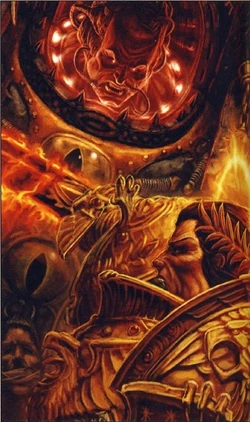
I actually like the first two, but really do not like that 3rd one.
The 3rd picture is just...far too dynamic, like absurdly so. Also suffering painfully from pinhead syndrome on the guys in the background and CG overload. You can barely even make out Horus at all behind all the ridiculous CG effects. It also just lacks the awesome dread of Horus standing victoriously over a defeated Sanguinius, beckoning the Emperor to face him. It's a lot of flash and a big background, but misses the actual pivotal feel of the scene.
The first one is a bit wonky, but I dig the trippyness of it, and it actually looks like a miniatures diorama, something one might actually be able to relatively faithfully recreate.
The second one is a masterpiece.
|
|
This message was edited 1 time. Last update was at 2016/07/31 19:30:53
IRON WITHIN, IRON WITHOUT.
New Heavy Gear Log! Also...Grey Knights!
The correct pronunciation is Imperial Guard and Stormtroopers, "Astra Militarum" and "Tempestus Scions" are something you'll find at Hogwarts. |
|
|
|
|
2016/07/31 19:44:03
Subject: WORST 40k artwork thread
|
|

The Last Chancer Who Survived
|
Pic 1 looks odd to me, doesn't do it for me.
Pic 2 is a damn classic. Great feels, you know what is going on and it has everyone placed in such a way as to tell a story.
Pic 3 would be cool, if you could actually see Horus, and if they were in a larger-than-life stage duel.
|
|
|
|
|
2016/07/31 21:27:24
Subject: Re:WORST 40k artwork thread
|
|
Using Object Source Lighting
|
 Pilau Rice wrote: Pilau Rice wrote:I would pick some of the newer CG images, a lot of them just seem to lack soul to me.
This. Ugly mostly CG stuff and the stuff that's clearly just tracing models is super-boring and terrible composition, regardless of any degree of technically decent rendering. Stuff like Blanch's sketches (on a good day) where they're about imagining stuff in the setting rather than putting models on backgrounds was what got me excited about 40k.
And yeah, most 2nd edition color was just heinous.
Regarding the static color thingies, they're super-boring and FW actually does them nicely, but I wouldn't even call them 'artwork'- they're barely illustrations, closer to just schematics.
|
|
|
|
|
|
2016/07/31 21:48:34
Subject: WORST 40k artwork thread
|
|
Powerful Phoenix Lord
|
 Vaktathi wrote: Vaktathi wrote:I actually like the first two, but really do not like that 3rd one.
The 3rd picture is just...far too dynamic, like absurdly so. Also suffering painfully from pinhead syndrome on the guys in the background and CG overload. You can barely even make out Horus at all behind all the ridiculous CG effects. It also just lacks the awesome dread of Horus standing victoriously over a defeated Sanguinius, beckoning the Emperor to face him. It's a lot of flash and a big background, but misses the actual pivotal feel of the scene.
The first one is a bit wonky, but I dig the trippyness of it, and it actually looks like a miniatures diorama, something one might actually be able to relatively faithfully recreate.
The second one is a masterpiece.
This was done on several occasions actually.

I'm a bit surprised that people actually like the 2nd one...which I find to be pretty bad. Different strokes for different folks.
|
|
|
|
|
2016/07/31 21:51:03
Subject: WORST 40k artwork thread
|
|
The Last Chancer Who Survived
|
One of my favourite depictions of Horus.
|
|
|
|
|
2016/07/31 21:53:03
Subject: WORST 40k artwork thread
|
|
Powerful Phoenix Lord
|
Mine is by far the Mark Gibbons version which is maybe/maybe not actually Horus. I don't recall, but it's perfect to me. (posted the pic a few pages back so I won't regurgitate it)
|
|
|
|
|
2016/07/31 21:58:46
Subject: WORST 40k artwork thread
|
|
The Last Chancer Who Survived
|
 Elbows wrote: Elbows wrote:Mine is by far the Mark Gibbons version which is maybe/maybe not actually Horus. I don't recall, but it's perfect to me. (posted the pic a few pages back so I won't regurgitate it)
This one?
I thought it could have been an early Horus, but I wasn't sure. Just looks like a generic CSM champion, really. Automatically Appended Next Post: Just noticed the Mark Of Khorne on his chest.
Defo not Horus. No Eye of Horus either.
|
|
This message was edited 1 time. Last update was at 2016/07/31 21:59:28
|
|
|
|
|
2016/07/31 22:04:34
Subject: WORST 40k artwork thread
|
|
Glorious Lord of Chaos
The burning pits of Hades, also known as Sweden in summer
|
Looks like you got the wrong link there Selym.
|
I should think of a new signature... In the meantime, have a |
|
|
|
|
2016/07/31 22:05:42
Subject: WORST 40k artwork thread
|
|
The Last Chancer Who Survived
|
damnit, my copypasta failed Automatically Appended Next Post: http://www.dakkadakka.com/dakkaforum/posts/list/90/696815.page#8793351
there we go
|
|
This message was edited 1 time. Last update was at 2016/07/31 22:06:15
|
|
|
|
|
2016/08/01 00:30:53
Subject: WORST 40k artwork thread
|
|
Powerful Phoenix Lord
|
Yeah, I just pictured him looking much more like that. Shame.
|
|
|
|
|
2016/08/01 02:20:56
Subject: WORST 40k artwork thread
|
|

Fixture of Dakka
|
Selym wrote:While I don't think mods are needed here, this kind of argument IS essentially "my opinion is better than your opinion".
Anyone up for suggesting art styles that could improve 40k?
I would say the Heave Metal art they had in the 70s and 80s magazine. Then I guess that would be more for Age of Sigmar, but still I think it would have made some great 40K art as well. Funny every time I see 'eavy Metal art, I swear GW ripped off the name from Heavy Metal magazine.
|
Agies Grimm:The "Learn to play, bro" mentality is mostly just a way for someone to try to shame you by implying that their metaphorical nerd-wiener is bigger than yours. Which, ironically, I think nerds do even more vehemently than jocks.
Everything is made up and the points don't matter. 40K or Who's Line is it Anyway?
Auticus wrote: Or in summation: its ok to exploit shoddy points because those are rules and gamers exist to find rules loopholes (they are still "legal"), but if the same force can be composed without structure, it emotionally feels "wrong". |
|
|
|
|
|
|