| Author |
Message |
 |
|
|
|
|
Advert
|
Forum adverts like this one are shown to any user who is not logged in. Join us by filling out a tiny 3 field form and you will get your own, free, dakka user account which gives a good range of benefits to you:
- No adverts like this in the forums anymore.
- Times and dates in your local timezone.
- Full tracking of what you have read so you can skip to your first unread post, easily see what has changed since you last logged in, and easily see what is new at a glance.
- Email notifications for threads you want to watch closely.
- Being a part of the oldest wargaming community on the net.
If you are already a member then feel free to login now. |
|
 |
2016/07/20 17:29:29
Subject: WORST 40k artwork thread
|
|

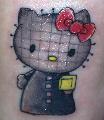
The Last Chancer Who Survived
|
Dat face tho o.0
|
|
This message was edited 1 time. Last update was at 2016/07/20 17:29:38
|
|
|
 |
|
2016/07/20 17:44:56
Subject: Re:WORST 40k artwork thread
|
|

Steady Dwarf Warrior
Karaz Ankor
|
I really like the old grainy black and white pictures, and the awkward looking battle scenes aswell! It's as if the artist thought "Let's cram all kinds of stuff in each picture! Explosions, people hitting each other with swords, titans, explosions and shooting, shooting, SHOOTING!" Add weird stances (elbows bolted to the body and knees pointing 90 degrees in the wrong direction and it's pure gold! 
|
|
|
|
|
2016/07/20 17:56:05
Subject: WORST 40k artwork thread
|
|

Consigned to the Grim Darkness
|
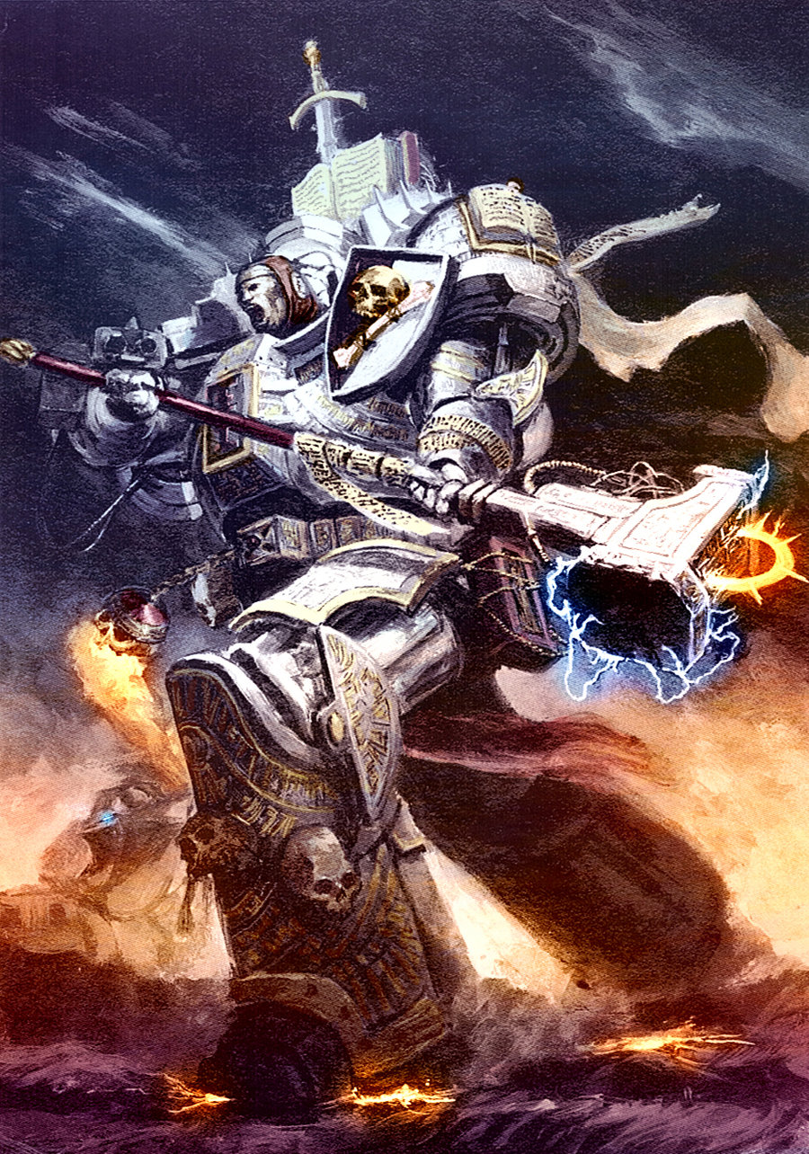
I suppose I should go on record thinking that almost anything drawn by John Blanche qualifies to at least be in the running for "worst 40k art"  This vomitous dungheap, for example. It's ridiculous, overly detailed to the point of being flat out ugly, badly proportioned, badly posed, with a bizarre and inconsistent perspective (look at the legs as opposed to the rest of the body), and just a washed out mess of an image. And it's par for the course for a Blanche piece.
|
|
This message was edited 2 times. Last update was at 2016/07/20 18:07:58
The people in the past who convinced themselves to do unspeakable things were no less human than you or I. They made their decisions; the only thing that prevents history from repeating itself is making different ones.
-- Adam Serwer
My blog |
|
|
|
|
2016/07/20 18:05:12
Subject: WORST 40k artwork thread
|
|

Lady of the Lake
|
It gets better.
|
|
|
|
|
|
2016/07/20 20:21:06
Subject: WORST 40k artwork thread
|
|
Powerful Phoenix Lord
|
I have to agree with the Blanche stuff...partially. I believe he's a supremely mediocre artist, but I think his stuff captures the "atmosphere" very well, particularly in the older stuff.
If that makes any sense.
|
|
|
|
|
2016/07/20 20:54:29
Subject: WORST 40k artwork thread
|
|
Steady Dwarf Warrior
Karaz Ankor
|
 Elbows wrote: Elbows wrote:I have to agree with the Blanche stuff...partially. I believe he's a supremely mediocre artist, but I think his stuff captures the "atmosphere" very well, particularly in the older stuff.
If that makes any sense.
I think it makes perfect sense. When Inquisitor was a thing there used to be concept art by Blanche in WD. I wouldn't call it awesome art but definitely very atmosperic.
|
|
|
|
|
2016/07/20 21:07:22
Subject: WORST 40k artwork thread
|
|

Fresh-Faced New User
|
from what i have seen, all the newer(7th ed) publications had this ugly new same design. compare them to the older books and decide for yourself.
and if you compare you can find pictures that are from like 1st or 2nd edition, not to say that is bad, because the new artworks are of lower quality.
also i do not like the colour schemes at all, those pages are just dead weight.
wish they showed some of that old spirit.
|
|
|
|
|
2016/07/20 21:23:47
Subject: WORST 40k artwork thread
|
|
The Last Chancer Who Survived
|
|
|
|
|
|
2016/07/20 21:38:17
Subject: Re:WORST 40k artwork thread
|
|
Longtime Dakkanaut
|
 Jehan-reznor wrote: Jehan-reznor wrote:nareik wrote: Jehan-reznor wrote:Most stuff by John blanche IMHO his ideas are great and they make great design studies but most of them are just unfinished sketches
Isn't that the point though? John Blanche is every hobbyist's concept artist, putting out a bunch of crazy ideas for us to incorporate in to our own models?
Not if it is used as cover art and artwork
I thought the 2nd ed box and the epic 40k box arts were kinda fun!
|
|
|
|
|
2016/07/20 22:54:18
Subject: WORST 40k artwork thread
|
|
Powerful Phoenix Lord
|
A lot of the old codices and boxes had those comically huge engagements in art...

My only beef with them (beyond being kinda okay art) was that they often gave the impression that a Space Marine chapter was deployed in its entirety, or that the Eldar have billions of people to throw into a battle etc.
The scale didn't work with the fluff much at all. Still, better that than nothing. I guess better than this bag of mediocrity:

Besides, without the old crazy art, you can't get stuff like this:

|
|
|
|
|
2016/07/20 23:03:25
Subject: WORST 40k artwork thread
|
|

Fixture of Dakka
|
MasterBeard wrote: Elbows wrote:I have to agree with the Blanche stuff...partially. I believe he's a supremely mediocre artist, but I think his stuff captures the "atmosphere" very well, particularly in the older stuff.
If that makes any sense.
I think it makes perfect sense. When Inquisitor was a thing there used to be concept art by Blanche in WD. I wouldn't call it awesome art but definitely very atmosperic.
Very well said MasterBeard. I would most of the new art for AoS and 40K is not atmospheric at all.
|
Agies Grimm:The "Learn to play, bro" mentality is mostly just a way for someone to try to shame you by implying that their metaphorical nerd-wiener is bigger than yours. Which, ironically, I think nerds do even more vehemently than jocks.
Everything is made up and the points don't matter. 40K or Who's Line is it Anyway?
Auticus wrote: Or in summation: its ok to exploit shoddy points because those are rules and gamers exist to find rules loopholes (they are still "legal"), but if the same force can be composed without structure, it emotionally feels "wrong". |
|
|
|
|
2016/07/21 00:22:14
Subject: WORST 40k artwork thread
|
|
Heroic Senior Officer
|
Davor wrote:GW art has gone down hill big time. I have been complaining a lot about it in Age of Sigmar. Sadly GW is outsourcing their art work and basically getting what they pay for.
Pay crap, get crap. A lot of the art coming out of GW is just what you would find as amateur art on the net. Now if GW went to Heavy Metal art especially for Age of Sigmar instead of this crap they are using now, then they can say they have a premium product. This new artwork is not premium at all.
Davor wrote: Elbows wrote:That's definitely old school, likely 80's or early 90's. Probably from one of the Titanicus initial game rule books etc.
Or Rogue Trader.
Sadly I find this art way better than what the new art GW has now.
Davor wrote:MasterBeard wrote: Elbows wrote:I have to agree with the Blanche stuff...partially. I believe he's a supremely mediocre artist, but I think his stuff captures the "atmosphere" very well, particularly in the older stuff.
If that makes any sense.
I think it makes perfect sense. When Inquisitor was a thing there used to be concept art by Blanche in WD. I wouldn't call it awesome art but definitely very atmosperic.
Very well said MasterBeard. I would most of the new art for AoS and 40K is not atmospheric at all.
There's a point you're trying to make here, but I can't put my finger on it.
Personally, I prefer the newer stuff, especially the Scion art, nice stuff there. And the FW style of adding effects and stuff to pictures of minis is pretty cool as well.
|
|
|
|
|
|
2016/07/21 01:45:56
Subject: WORST 40k artwork thread
|
|
Fixture of Dakka
|
 Bobthehero wrote: Bobthehero wrote:
There's a point you're trying to make here, but I can't put my finger on it.
Personally, I prefer the newer stuff, especially the Scion art, nice stuff there. And the FW style of adding effects and stuff to pictures of minis is pretty cool as well.
I said GW, nothing against FW.
For an example of what is not premium art, would be those space marines lined up to show different colour schemes, or the necrons or what ever unit it is that GW is showing off in the codex. That is not great art we are sue to in having in codices. It's not bad, but not premium or great. Then you have AoS that has a lot of bad art in my opinion that GW is charging a premium price for. Also not liking the new 40K are as well.
I Don't remember the Scoin art but that could be the exception if I remember correctly. That is good artwork but the rest, blah.
|
Agies Grimm:The "Learn to play, bro" mentality is mostly just a way for someone to try to shame you by implying that their metaphorical nerd-wiener is bigger than yours. Which, ironically, I think nerds do even more vehemently than jocks.
Everything is made up and the points don't matter. 40K or Who's Line is it Anyway?
Auticus wrote: Or in summation: its ok to exploit shoddy points because those are rules and gamers exist to find rules loopholes (they are still "legal"), but if the same force can be composed without structure, it emotionally feels "wrong". |
|
|
|
|
2016/07/21 03:43:04
Subject: Re:WORST 40k artwork thread
|
|
Insect-Infested Nurgle Chaos Lord
|
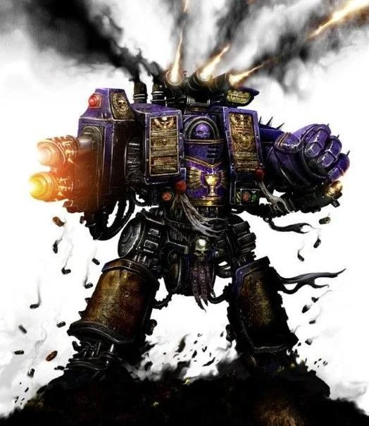
This one for me:
On top of the dreadnought having proportions of a contemptor from the waist down, what really bothers me is that the artist somehow got the lascannon arm in reverse.
The smoking shell casing near the legs are also distracting, as they look more like a bad erasing job than actual smoke coming from shell casings, making the painting look half-done. I have no clue where the original source for this pic is, as it was listed on the Warhammer Wikia (which means it could very well be fanart instead of official art).
But it's mainly that lascannon. It really, really bugs me. Way more than it should.
|
Gwar! wrote:Huh, I had no idea Graham McNeillm Dav Torpe and Pete Haines posted on Dakka. Hi Graham McNeillm Dav Torpe and Pete Haines!!!!!!!!!!!!! Can I have an Autograph!
Kanluwen wrote:
Hell, I'm not that bothered by the Stormraven. Why? Because, as it stands right now, it's "limited use".When it's shoehorned in to the Codex: Space Marines, then yeah. I'll be irked.
When I'm editing alot, you know I have a gakload of homework to (not) do. |
|
|
|
|
2016/07/21 05:16:53
Subject: Re:WORST 40k artwork thread
|
|
Regular Dakkanaut
|
 MechaEmperor7000 wrote: MechaEmperor7000 wrote:This one for me:
On top of the dreadnought having proportions of a contemptor from the waist down, what really bothers me is that the artist somehow got the lascannon arm in reverse.
The smoking shell casing near the legs are also distracting, as they look more like a bad erasing job than actual smoke coming from shell casings, making the painting look half-done. I have no clue where the original source for this pic is, as it was listed on the Warhammer Wikia (which means it could very well be fanart instead of official art).
But it's mainly that lascannon. It really, really bugs me. Way more than it should.
It almost looks like the top is a lascannon, and the bottom is a meltagun
|
|
|
|
|
2016/07/21 06:53:35
Subject: WORST 40k artwork thread
|
|
The Last Chancer Who Survived
|
With shell casings flying from an energy weapon, and the external armour casing facing the sarcophagus. Someone give that artist a slap on the writs.
|
|
|
|
|
2016/07/21 06:58:31
Subject: Re:WORST 40k artwork thread
|
|

[MOD]
Otiose in a Niche
|
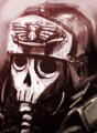
Who can forget this?
(no matter how hard you try)

|
|
|
|
|
|
2016/07/21 07:01:19
Subject: WORST 40k artwork thread
|
|
The Last Chancer Who Survived
|
Image is so bad, it won't even load for me -.-
|
|
|
|
|
2016/07/21 08:07:09
Subject: WORST 40k artwork thread
|
|
Mysterious Techpriest
|
Please stop that 2nd edition stuff.
My eyes hurt!
Those colours....! I cannot take it anymore!
*wimpers*
Especially with the ork one I expect it to be a search picture with Kiss somewhere hidden in there..
|
Data author for Battlescribe
Found a bug? Join, ask, report:
https://discord.gg/pMXqCqWJRE |
|
|
|
|
2016/07/21 08:48:43
Subject: WORST 40k artwork thread
|
|
Longtime Dakkanaut
|
 Thairne wrote: Thairne wrote:Please stop that 2nd edition stuff.
My eyes hurt!
Those colours....! I cannot take it anymore!
*wimpers*
Especially with the ork one I expect it to be a search picture with Kiss somewhere hidden in there..
First people were complaining JB used too little colour, now they complain it is too much...Right bunch of Goldieloxes, the lot of you  .
|
|
|
|
|
2016/07/21 16:27:18
Subject: Re:WORST 40k artwork thread
|
|
Fixture of Dakka
|
That was great for back then. Thing is, this is even better than the SOME of the stuff GW is putting out now.
|
Agies Grimm:The "Learn to play, bro" mentality is mostly just a way for someone to try to shame you by implying that their metaphorical nerd-wiener is bigger than yours. Which, ironically, I think nerds do even more vehemently than jocks.
Everything is made up and the points don't matter. 40K or Who's Line is it Anyway?
Auticus wrote: Or in summation: its ok to exploit shoddy points because those are rules and gamers exist to find rules loopholes (they are still "legal"), but if the same force can be composed without structure, it emotionally feels "wrong". |
|
|
|
|
2016/07/21 16:38:53
Subject: WORST 40k artwork thread
|
|
Automated Rubric Marine of Tzeentch
|
Elbows wrote:A lot of the old codices and boxes had those comically huge engagements in art...
Err... Maybe it's just me, but why is that swooping hawk firing into his own lines?
|
|
|
|
|
2016/07/21 17:03:26
Subject: WORST 40k artwork thread
|
|
Powerful Phoenix Lord
|
He's the beginning of the Dark Eldar.
|
|
|
|
|
2016/07/21 17:13:58
Subject: WORST 40k artwork thread
|
|
Consigned to the Grim Darkness
|

More terribad john blanche art.
|
The people in the past who convinced themselves to do unspeakable things were no less human than you or I. They made their decisions; the only thing that prevents history from repeating itself is making different ones.
-- Adam Serwer
My blog |
|
|
|
|
2016/07/21 17:19:57
Subject: WORST 40k artwork thread
|
|
The Last Chancer Who Survived
|
To summarise my reaction to some of the images in this thread:
|
|
|
|
|
2016/07/22 02:24:38
Subject: WORST 40k artwork thread
|
|
Powerful Phoenix Lord
|
I found one of my very favourite...awful Blanche Eldar drawings (almost all of his Eldar stuff is absolute crap...he needs to stick to gritty weird gothic Imperials).
This is actually a picture I just took from the 2nd edition codex...we have pinhead marines but what about microscopic Guardians piloting warwalkers?

For comparison...a normal Warwalker 2-3x as tall as a normal guardian on foot...
(Image borrowed from Agis)
|
|
|
|
|
2016/07/22 04:43:59
Subject: Re:WORST 40k artwork thread
|
|
Flashy Flashgitz
Armageddon
|
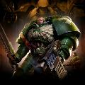
While you could argue the majority of the AoS art is low quality, I think its a vast improvement as far as basic skill is concerned.
Here's one that wont garner a lot of praise, but I see
A. normal proportions
B. looking at their enemies
C. distinct color palletes
D. they look like their respective models
E. a background that while a simple storm, doesn't make my eyes bleed
Most of the AoS arts aren't very atmospheric I'll agree with that.
|
"People say on their first meeting a Man and an Ork exchanged a long, hard look, didn't care much for what they saw, and shot each other dead." |
|
|
|
|
2016/07/22 07:12:27
Subject: WORST 40k artwork thread
|
|
The Last Chancer Who Survived
|
It looks like a kids' cartoon.
I hate it. So so much... >:C
|
|
|
|
|
2016/07/22 07:51:11
Subject: WORST 40k artwork thread
|
|
Longtime Dakkanaut
|
I don't personally like the style for 40k. It's too kiddy for what is supposed to be a very dark setting.
Then again this all goes hand in hand with them wanting to broaden 40k's appeal. Hence the hearsay and rumors that Slaanesh is being ousted for the Eldar god of death.
|
|
|
|
|
2016/07/22 08:11:35
Subject: WORST 40k artwork thread
|
|
Decrepit Dakkanaut
|
I dislike the new art. It's soulless advertisement for miniatures. It looks like LEGO cover art. Give me Blanche any day.
|

Peregrine - If you like the army buy it, and don't worry about what one random person on the internet thinks.
|
|
|
|
|
|
|
 Member of
  DKoK Blog:
 Have a look, I guarantee you will not see greyer armies, EVER! Now with at least 4 shades of grey