| Author |
Message |
 |
|
|
|
|
Advert
|
Forum adverts like this one are shown to any user who is not logged in. Join us by filling out a tiny 3 field form and you will get your own, free, dakka user account which gives a good range of benefits to you:
- No adverts like this in the forums anymore.
- Times and dates in your local timezone.
- Full tracking of what you have read so you can skip to your first unread post, easily see what has changed since you last logged in, and easily see what is new at a glance.
- Email notifications for threads you want to watch closely.
- Being a part of the oldest wargaming community on the net.
If you are already a member then feel free to login now. |
|
 |
2016/07/19 05:17:38
Subject: Re:WORST 40k artwork thread
|
|

Lady of the Lake
|
|
|
|
|
 |
|
2016/07/19 05:34:19
Subject: Re:WORST 40k artwork thread
|
|

Confessor Of Sins
|
Regarding the pinhead Marines thing, that's actually where human evolution is headed according to current trends in real life. Our heads are getting smaller and smaller as generations go on. And apparently biologists don't really know why.
|
|
|
|
|
2016/07/19 05:39:41
Subject: Re:WORST 40k artwork thread
|
|
Lady of the Lake
|
 Pouncey wrote: Pouncey wrote:Regarding the pinhead Marines thing, that's actually where human evolution is headed according to current trends in real life. Our heads are getting smaller and smaller as generations go on. And apparently biologists don't really know why.
Well it's more the marine would be stupid to have a large head given the size of the amour he's wearing too. 
|
|
|
|
|
2016/07/19 05:41:24
Subject: WORST 40k artwork thread
|
|

Master Shaper
Gargant Hunting
|
I like the bomb squig picture. It's pretty orky, if I do say so myself.
|
Irishpeacockz-Blackjack needs a pay raise for being the welcomer to the crusade
Palleus-Write a school essay about Kroot! Pride. Prejudice. And Cannibalsim. |
|
|
|
|
2016/07/19 05:51:10
Subject: Re:WORST 40k artwork thread
|
|
Confessor Of Sins
|
 n0t_u wrote: n0t_u wrote: Pouncey wrote:Regarding the pinhead Marines thing, that's actually where human evolution is headed according to current trends in real life. Our heads are getting smaller and smaller as generations go on. And apparently biologists don't really know why.
Well it's more the marine would be stupid to have a large head given the size of the amour he's wearing too.
And I'm saying that humans in general might just have heads that small by the time we get to the 41st millennium...
|
|
|
|
|
2016/07/19 08:05:38
Subject: Re:WORST 40k artwork thread
|
|

Mysterious Techpriest
|

This one.
I... it is so, so terrible.
The marine in the front needs some help with his neck! The helmet looks TERRIBLE.
The one in the back seems to be missing a leg. At least the proportions in general look possible, but still...
|
Data author for Battlescribe
Found a bug? Join, ask, report:
https://discord.gg/pMXqCqWJRE |
|
|
|
|
2016/07/19 08:20:25
Subject: Re:WORST 40k artwork thread
|
|

Glorious Lord of Chaos
The burning pits of Hades, also known as Sweden in summer
|
I love this one. 4th edition memories!
|
I should think of a new signature... In the meantime, have a  |
|
|
|
|
2016/07/19 09:01:32
Subject: Re:WORST 40k artwork thread
|
|

The Last Chancer Who Survived
|
Pouncey wrote: n0t_u wrote: Pouncey wrote:Regarding the pinhead Marines thing, that's actually where human evolution is headed according to current trends in real life. Our heads are getting smaller and smaller as generations go on. And apparently biologists don't really know why.
Well it's more the marine would be stupid to have a large head given the size of the amour he's wearing too.
And I'm saying that humans in general might just have heads that small by the time we get to the 41st millennium...
Well that would explain the state of human intelligence in M41...
|
|
|
|
|
2016/07/19 09:23:39
Subject: Re:WORST 40k artwork thread
|
|

Stalwart Veteran Guard Sergeant
Warsaw
|
The new Wulfen still give me nightmares, but this artwork takes the cake.

|
Check out my wargaming blog "It always rains in Nuln". Reviews, rants and a robust dose of wargaming and RPG fun guaranteed. 
https://italwaysrainsinnuln.wordpress.com/
 15K White Scars Brotherhood of the Twin Wolves (30K) 15K White Scars Brotherhood of the Twin Wolves (30K)
 6K Imperial Fists 35th Cohort (30K) 6K Imperial Fists 35th Cohort (30K)
 7K Thousand Sons Guard of the Crimson King (30K) 7K Thousand Sons Guard of the Crimson King (30K)
 3K Talons of the Emperor (30K) 3K Talons of the Emperor (30K)
 2K Mechanicum Legio Cybernetica (30K) 2K Mechanicum Legio Cybernetica (30K)
 1K Titans of Legio Astorum 1K Titans of Legio Astorum
3K Knights of House Cadmus (30K)
 12K Cadian/Catachan/Tallarn/ST Battlegroup "Misericorde" (40K) 12K Cadian/Catachan/Tallarn/ST Battlegroup "Misericorde" (40K)
 1K Inquisitorial Task Force "Hoffer" (40K) 1K Inquisitorial Task Force "Hoffer" (40K)
 2K Silver Wardens (UM Successors) 4th Company "The Avenged" (40K) 2K Silver Wardens (UM Successors) 4th Company "The Avenged" (40K)
 10K Empire of Man Nuln Expeditionary Force (WFB) 10K Empire of Man Nuln Expeditionary Force (WFB)
 5K Vampire Counts (WFB) 5K Vampire Counts (WFB) |
|
|
|
|
2016/07/19 12:27:25
Subject: WORST 40k artwork thread
|
|
Glorious Lord of Chaos
The burning pits of Hades, also known as Sweden in summer
|
My reaction:
'Those Chaos Marauders are pretty nice.'
'Wait, what's with the faces?'
|
I should think of a new signature... In the meantime, have a |
|
|
|
|
2016/07/19 13:04:11
Subject: Re:WORST 40k artwork thread
|
|
Trigger-Happy Baal Predator Pilot
|
n0t_u wrote: Pouncey wrote:Regarding the pinhead Marines thing, that's actually where human evolution is headed according to current trends in real life. Our heads are getting smaller and smaller as generations go on. And apparently biologists don't really know why.
Well it's more the marine would be stupid to have a large head given the size of the amour he's wearing too.
Yeah, I agree, marine heads should be proportionally more small compared to their body than say, a normal human, but that size should at least be kind of consistent! Automatically Appended Next Post:
Ohhh, this is good, 5th element terminators Automatically Appended Next Post:  Xathrodox86 wrote: Xathrodox86 wrote:The new Wulfen still give me nightmares, but this artwork takes the cake.
I hate what's happened to space wolves over the last 15 years so so soooo much. Like, I'm not happy as a 40k blood angels player, or a 40k player in general (I've jumped ship to 30k), but if I was a wolves player, I might even be more angry. Automatically Appended Next Post: Xathrodox86 wrote:The new Wulfen still give me nightmares, but this artwork takes the cake.
Oh yeah, that's miserable. Like, other than me hating the minis, and the fluff, and the rules, that artwork is the worst piece in this thread yet. I get that warcraft is popular, has been popular for a long time, and brought a bunch of nerdiness mainstream. EVERYTHING doesn't have to look like warcraft! (main reason I have zero interest in age of sigmar).
|
|
This message was edited 3 times. Last update was at 2016/07/19 13:28:30
|
|
|
|
|
2016/07/19 14:36:47
Subject: WORST 40k artwork thread
|
|
Death-Dealing Devastator
|
Kiddification of 40K continues unabated.
I'd rather have the pinhead SMs and weird old school drawings like the one with the terminators (see above) than the modern "let's appeal to the kiddies" crud. Half of it is sanitized and the other half is so silly that no amount of "it's weird and grim-dark future" hand waving will help it.
And if the rumors of "age of sigmar, 40k version" are true... we'll probably see even more of it, like an Angron model riding a giant boar from the EoT yelling "want to ride Oinker?!!!"
|
|
|
|
|
2016/07/19 15:14:35
Subject: WORST 40k artwork thread
|
|
Nurgle Chosen Marine on a Palanquin
|
So I haven't seen a single decent critique of the artwork aside from "I don't like it because I don't like it". No one in this thread has said anything worse than "its bad",
That comment hit it on the nose. That is some bad artwork. Poor proportions, stuff misplaced limbs, things that just straight up don't make sense. Look for conflicting art styles in the same image, unfinished art. I'm sure everyone saw the whole " 40k stuff in comic books" recently. That was bad artwork. The tau ships were obviously out of place in the comic.
Everything posted has been good finished artwork that can be appreciated in it's own right, and just about all of it has had someone say that they like it.
Stop liking stuff you don't like, and find something that you think is legitimately bad. The only reason people don't like that wulfen artwork is because it isn't all super gritty and is artwork of a unit they think is silly. It isn't bad art, its good art that you don't like.
That SW codex cover is some awesome work, and has some sweet detail. You have the blood claw missing his helmet because he took a shot to the head, and you can see the dent in the helmet and the wound on his head. Nice attention to detail that tells a story is awesome, and that is why it was a codex cover.
To finish this rant, "kiddification"? Look at the old John Blanche 40k art. Stuff was insane crazy, it's changed a lot to keep up with what the majority of people like. It moved away from that style and people said "get off my lawn!" and now it is doing it again and you are saying "get off my lawn!" 40k is just appealing to the new generations to hook them while they are young. Just accept it, the artwork isn't going to be as grimdark as it was in the past, oh well.
|
|
This message was edited 1 time. Last update was at 2016/07/19 15:19:18
|
|
|
|
|
2016/07/19 15:38:23
Subject: WORST 40k artwork thread
|
|
Powerful Phoenix Lord
|
Have to disagree with you Gwarsh. Art is not inherently good, nor bad. It's entirely up to the viewer/customer. As such I can categorically state a piece of art is bad when/where I feel like.
I come from an artsy background, and it's entirely just to provide your opinion on art. That's all it is.
This thread is about the "worst" 40K art and it wasn't stated "show us stuff which is technically wrong (ie. missing limbs etc.)" but the "worst". It can be my worst. Your worst. Etc.
|
|
|
|
|
2016/07/19 15:40:07
Subject: WORST 40k artwork thread
|
|
Dark Angels Librarian with Book of Secrets
|
 gwarsh41 wrote: gwarsh41 wrote:So I haven't seen a single decent critique of the artwork aside from "I don't like it because I don't like it". No one in this thread has said anything worse than "its bad",
That comment hit it on the nose. That is some bad artwork. Poor proportions, stuff misplaced limbs, things that just straight up don't make sense. Look for conflicting art styles in the same image, unfinished art. I'm sure everyone saw the whole " 40k stuff in comic books" recently. That was bad artwork. The tau ships were obviously out of place in the comic.
Everything posted has been good finished artwork that can be appreciated in it's own right, and just about all of it has had someone say that they like it.
Stop liking stuff you don't like, and find something that you think is legitimately bad. The only reason people don't like that wulfen artwork is because it isn't all super gritty and is artwork of a unit they think is silly. It isn't bad art, its good art that you don't like.
That SW codex cover is some awesome work, and has some sweet detail. You have the blood claw missing his helmet because he took a shot to the head, and you can see the dent in the helmet and the wound on his head. Nice attention to detail that tells a story is awesome, and that is why it was a codex cover.
To finish this rant, "kiddification"? Look at the old John Blanche 40k art. Stuff was insane crazy, it's changed a lot to keep up with what the majority of people like. It moved away from that style and people said "get off my lawn!" and now it is doing it again and you are saying "get off my lawn!" 40k is just appealing to the new generations to hook them while they are young. Just accept it, the artwork isn't going to be as grimdark as it was in the past, oh well.
Some of them have been legit art critiques, such as the one where the guy's knee was at a 90 degree angle to his body, or the guy with no legs. I do agree the kiddification aspect is dumb.
OT, I always hated the beaky helmets. I think it's a lame helmet, as it offers no tactical advantage (imagine trying to aim down a scope with that big schnoz) and just makes them look like a Big Bird merged with Storm Troopers.
|
 ~1.5k ~1.5k
Successful Trades: Ashrog (1), Iron35 (1), Rathryan (3), Leth (1), Eshm (1), Zeke48 (1), Gorkamorka12345 (1),
Melevolence (2), Ascalam (1), Swanny318, (1) ScootyPuffJunior, (1) LValx (1), Jim Solo (1), xSoulgrinderx (1), Reese (1), Pretre (1) |
|
|
|
|
2016/07/19 16:14:20
Subject: WORST 40k artwork thread
|
|
Powerful Phoenix Lord
|
I personally love the MkVI helmet...for whatever reason. I mean, surely it's a bit more aerodynamic for assault marines yeah?
|
|
|
|
|
2016/07/19 16:24:13
Subject: WORST 40k artwork thread
|
|
Dark Angels Librarian with Book of Secrets
|
 Elbows wrote: Elbows wrote:I personally love the MkVI helmet...for whatever reason. I mean, surely it's a bit more aerodynamic for assault marines yeah?
Is the Hammer of Wrath from driving their beak into the enemy? 
|
|
This message was edited 1 time. Last update was at 2016/07/19 16:24:21
~1.5k
Successful Trades: Ashrog (1), Iron35 (1), Rathryan (3), Leth (1), Eshm (1), Zeke48 (1), Gorkamorka12345 (1),
Melevolence (2), Ascalam (1), Swanny318, (1) ScootyPuffJunior, (1) LValx (1), Jim Solo (1), xSoulgrinderx (1), Reese (1), Pretre (1) |
|
|
|
|
2016/07/19 16:35:18
Subject: WORST 40k artwork thread
|
|
Powerful Phoenix Lord
|
I don't even know what Hammer of Wrath is, but I'll simply say yes. 100%.
|
|
|
|
|
2016/07/19 16:35:58
Subject: WORST 40k artwork thread
|
|
The Last Chancer Who Survived
|
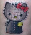
Since miniature painting is an artform, Ima stretch the definition of this thread:
Oh god why ;_;
|
|
|
|
|
2016/07/19 16:44:55
Subject: WORST 40k artwork thread
|
|
Trigger-Happy Baal Predator Pilot
|
Elbows wrote:
This thread is about the "worst" 40K art and it wasn't stated "show us stuff which is technically wrong (ie. missing limbs etc.)" but the "worst". It can be my worst. Your worst. Etc.
Exactly. This isn't an art class. I'm just trying to have some yucks here. Like, I LIKE the bomb squig, but my friend's reaction was so immediate and visceral I started cracking up.
I also JUST remembered that these are things that exist:
http://www.somethingawful.com/dungeons-and-dragons/wtf-warhammer-40k/1/
http://www.somethingawful.com/dungeons-and-dragons/mordheim-warhammer-art/1/
http://www.somethingawful.com/dungeons-and-dragons/wtf-rogue-trader/1/
http://www.somethingawful.com/dungeons-and-dragons/rogue-trader-returns/1/
|
|
|
|
|
|
2016/07/19 16:51:13
Subject: WORST 40k artwork thread
|
|
Longtime Dakkanaut
|
I think the mkVI looks really sinister and used it for a squad of renegade chaos space marines in one of my armies! Mk6 for everyone, except the melta guys and aspiring champion, who got MK8 because they were too important to die.
|
|
|
|
|
2016/07/19 18:43:51
Subject: WORST 40k artwork thread
|
|
Powerful Phoenix Lord
|
 Selym wrote: Selym wrote:Since miniature painting is an artform, Ima stretch the definition of this thread:
Oh god why ;_;
Personally I don't see what's so bad about these...after all, this is what sells on ebay as "professionally painted"! ...ugh...
|
|
|
|
|
2016/07/20 00:32:24
Subject: Re:WORST 40k artwork thread
|
|

Storm Trooper with Maglight
|
I'ts really late here and I am too tired to browse for gak work. But atm I can't think of more disturbing artwork than this masterpiece depicting Imperial Knights during the Heresy Era. That "gem" I found recently was from Wikipedia (source of what rule book/slate or w/e was this made for is unknown to me):

|
|
This message was edited 3 times. Last update was at 2016/07/20 00:49:20
|
|
|
|
|
2016/07/20 00:45:06
Subject: WORST 40k artwork thread
|
|
Powerful Phoenix Lord
|
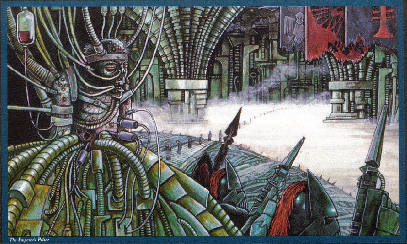
That's definitely old school, likely 80's or early 90's. Probably from one of the Titanicus initial game rule books etc.
|
|
|
|
|
2016/07/20 02:06:26
Subject: WORST 40k artwork thread
|
|
Fixture of Dakka
|
Elbows wrote:That's definitely old school, likely 80's or early 90's. Probably from one of the Titanicus initial game rule books etc.
Or Rogue Trader.
Sadly I find this art way better than what the new art GW has now.
|
Agies Grimm:The "Learn to play, bro" mentality is mostly just a way for someone to try to shame you by implying that their metaphorical nerd-wiener is bigger than yours. Which, ironically, I think nerds do even more vehemently than jocks.
Everything is made up and the points don't matter. 40K or Who's Line is it Anyway?
Auticus wrote: Or in summation: its ok to exploit shoddy points because those are rules and gamers exist to find rules loopholes (they are still "legal"), but if the same force can be composed without structure, it emotionally feels "wrong". |
|
|
|
|
2016/07/20 03:20:25
Subject: Re:WORST 40k artwork thread
|
|

Fixture of Dakka
|
Most stuff by John blanche IMHO his ideas are great and they make great design studies but most of them are just unfinished sketches
|
|
|
|
|
|
2016/07/20 07:49:25
Subject: Re:WORST 40k artwork thread
|
|
Flashy Flashgitz
Armageddon
|
I think my vote goes towards all the old cover art that tried to make a battle mural with a disastrous color scheme. Don't get me wrong I love color over gritty dark grimdark but the vibrant hues hurt my eyes.
Those poor space marines are packed in like sardines! Whats the point of making them swarm like that if you're only going to give definition to the first row, and make the rest a colored blur? I'd like to at least see what they're fighting.
Don't even get me started on Brother-Captain Lockjaw. Are his elbows bolted to his chest? Who taught him how to hold a sword? His humongous feet remind me of old League of Legends models.
Exhibit B: Man even as a fan of the gargant design I hate this picture. Would it be that hard to draw them shooting at each other? I mean you can do that without obscuring detail, you don't have to have them face the camera. And yeesh the tanks behind the warlord's foot. Theres either crystal clear and vibrant things in the picture, or blurry silhouette. No blending of the foreground and background at all (my biggest problem with these old arts). It literally looks like they're fighting in front of a mural of blue trash.
I mean, this art did inspire me to get into 40k. I'm not going to lie about that. Its got enough cool elements that its easy to see why so many people liked it. But I cannot say that its good art. Seriously go back at look at all the art of deformed clown-marines fighting enemies they aren't even looking at. Its not pretty.
|
|
This message was edited 1 time. Last update was at 2016/07/20 07:51:18
"People say on their first meeting a Man and an Ork exchanged a long, hard look, didn't care much for what they saw, and shot each other dead." |
|
|
|
|
2016/07/20 08:02:11
Subject: Re:WORST 40k artwork thread
|
|
Longtime Dakkanaut
|
 Jehan-reznor wrote: Jehan-reznor wrote:Most stuff by John blanche IMHO his ideas are great and they make great design studies but most of them are just unfinished sketches
Isn't that the point though? John Blanche is every hobbyist's concept artist, putting out a bunch of crazy ideas for us to incorporate in to our own models?
|
|
|
|
|
2016/07/20 08:03:48
Subject: Re:WORST 40k artwork thread
|
|
Fixture of Dakka
|
nareik wrote: Jehan-reznor wrote:Most stuff by John blanche IMHO his ideas are great and they make great design studies but most of them are just unfinished sketches
Isn't that the point though? John Blanche is every hobbyist's concept artist, putting out a bunch of crazy ideas for us to incorporate in to our own models?
Not if it is used as cover art and artwork
|
|
|
|
|
|
2016/07/20 17:17:09
Subject: Re:WORST 40k artwork thread
|
|
Lady of the Lake
|
|
|
|
|
|
|
|
|