Forum adverts like this one are shown to any user who is not logged in. Join us by filling out a tiny 3 field form and you will get your own, free, dakka user account which gives a good range of benefits to you:
No adverts like this in the forums anymore.
Times and dates in your local timezone.
Full tracking of what you have read so you can skip to your first unread post, easily see what has changed since you last logged in, and easily see what is new at a glance.
Email notifications for threads you want to watch closely.
Being a part of the oldest wargaming community on the net.
If you are already a member then feel free to login now.
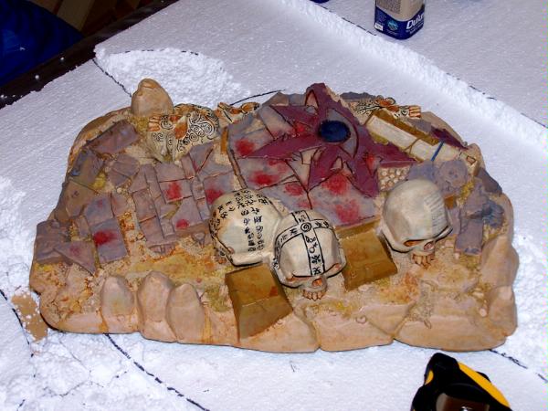
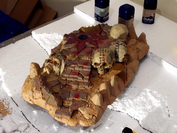
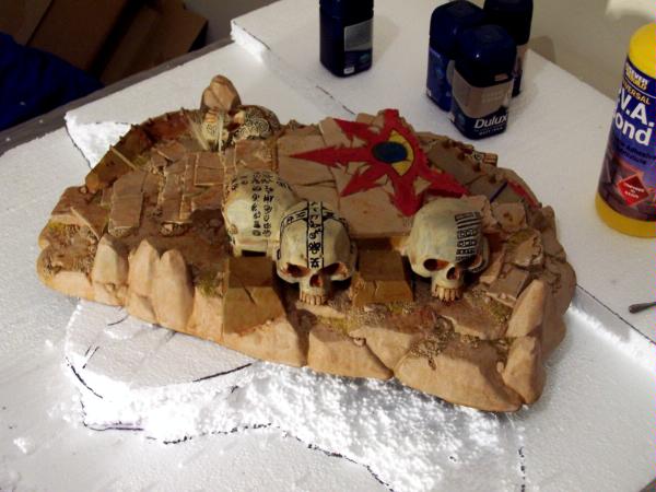
Hey there, just hoping for a few suggestions for making my ToS better. One thing I am going to do is add more field grass, and some more static grass. Something else I am thinking of doing is painting over the horrific designs I managed to do on the 2 upright skulls on the right side (as you go up the stairs) and paint on some better ones.
The general colour of the rock needs to stay about the same, as that is the colour of my gaming table and other terrain (such that it is).
Anyway, pictures:
The offending skulls can be seen in this picture:
This message was edited 1 time. Last update was at 2010/02/16 20:59:49
I actually quite like the designs on the skulls. Doesn't matter if some aren't as polished as others, as they would have been hand painted by some slightly nervous cultist...
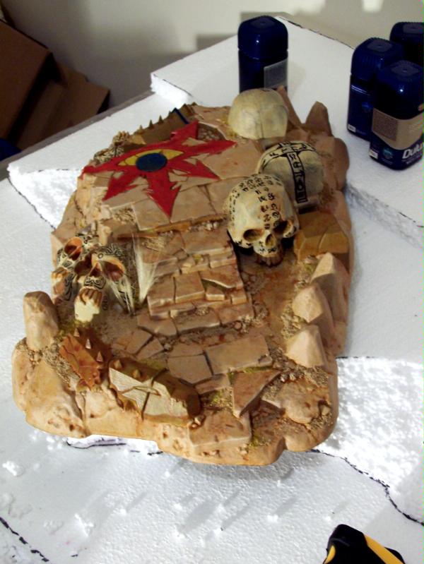
Hard to tell from the lighting in the pics, but the red on the chaos star could possibly stand to be a little darker.
Other than that, the only real problem with it is a general lack of contrast. One fix would be to darken up the colour of the actual temple stone (just the cut pavers and the pillars) so that they stand out a bit more from the skulls and the underlying rock.
Maybe you hate them, but I think the skulls look pretty decent. The thing I see that stands out as cheesy is the painting of the chaos symbol on the floor(it just seems out of place in color and style compared to the more realistic looking skulls).
As you said it could use some little odds and ends to make it look better. How about some spears with skulls, stretched skin, skull piles(like the ones GW sells), more blood splashes (or brown crusted blood), etc. The main part of the temple is really well done from what I can see, but it could just use some little finishing touches.
edit: wrote this before insaniak posted, guess we thought alike.
This message was edited 1 time. Last update was at 2010/02/15 21:19:27
In the embrace of the great Nurgle, I am no longer afraid, for with His pestilential favour I have become that which I once most feared: Death.
Like everyone said, the symbols are pretty damn fine. The one thing that erks me is the brightness and general cleansliness of the star. Remember it's an evil shrine dedicated to the gods. It should be dirty and filthy with the taint of the warp on it. But all in all, a damn good job.
metallifan said: I almost wonder is "Matt Ward" another pen name for C.S. Goto?
metallifan said: The Imperium would probably love Hitler...
Play KoL! Click my sig to go to the main website and sign up!
metallifan said: I almost wonder is "Matt Ward" another pen name for C.S. Goto?
metallifan said: The Imperium would probably love Hitler...
Play KoL! Click my sig to go to the main website and sign up!
metallifan said: I almost wonder is "Matt Ward" another pen name for C.S. Goto?
metallifan said: The Imperium would probably love Hitler...
Play KoL! Click my sig to go to the main website and sign up!
My Temple is mostly one color as well, so I made the Chaos Icon a brass color to stand out, then mixed a wash of Gryphonne Sepia and Baal Red to make it look as though it had been drenched in blood many times.
Came out better than I hoped. Maybe you could try it.
27th Member of D.O.O.M.F.A.R.T.
Resident Battletech Guru.
I'd agree. Weather and chip the symbol. Streaks that all go in the same direction, like from dirty rain could look really good. Thinned GW Graveyard Earth low-lighted with Gryphonne Sepia should look nice
I play:
1000 pt Sons of Calthus
1000 pt Splinter Fleet Goliath
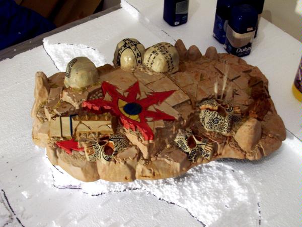
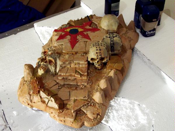
I will probably redo 2 of the skulls to have similar designs on them, it is just they look a bit sloppy at the moment and they really bug me.
I was planning on doing the stonework a kind of greenish colour to match the plinths, but make it slightly bluer so it looks a bit different and adds another colour on there.
I might try my hand at using a sponge to add chips etc onto various places.
I will try and find some generic WHFB/40K bits to add in (I use this piece for 40K and may use it for FB if I ever start playing).
And GRASS FOR THE HULA GOD shall be added, perhaps half hiding some of the extra bits, as if they had been there a while.
Like most I think the skulls look great and it's a really imaginative idea to have painted them up like that.
As for the chaos star I'm not sure I'd do it red at all, perhaps go more for a different stone colour, maybe grey then add some old blood effects in dark browns and very dark reds to make it look like a place of sacrifice?
Can I suggest skipping forward 10 years to the age where you don't really care about what people say on the internet. Studies show that it decreases your anger about life in general by 37%. - Flashman
Silver, if you take no other advice here you must take what I am about to give with the utmost consideration. In all of my years dispensing with artistic critisisms nothing has ever been so blatantly obvious and needed in any work than what this Temple of Skulls cries out for: Beer cans! Lots and lots of beer cans! Not just any beer, but cheap American (or Mexican in a pinch, Tacate per se) beer. I mean, really when it comes down to it Chaos really are nothing more than a bunch of frat boys trying to use their Greek who-joo crap to intimidate other frats. See where I am coming from? Maybe even throw in a braw and panties to illustrate a story long-gone.
Okay okay okay, in all seriousness just some darker washes and you are good. Darker washes might make the skulls and chaos emblem pop a little bit more since as it stands they tend to fade passivly into one another. Oh, and uh.... Beer cans!
The star is definately too bright and clean. If you could make it look like it's been painted in blood, for example, or look like the stone underneath is cracked/chipped, I think it'd look better. Restatement for the restatement god!
The blood spatters are a little bright. If you dull them down a bit, stipple a bit of grey through them, it would make them look more like old bloodstains.
I think I have darkened them quite significantly now with a mix of flesh wash and codex grey, as well as actually wearing away some of the original red with a sponge.
Go packing material
Do you have any other suggestions for improvements? To be honest my imagination is somewhat lacking at the moment
a) blood is actually darker o_o
b) Blood splatter is almost never a pool like that , when and if there is a pool like that , there is usually a body . But since there are none , it would look very dramatic to have some smears going away from the pooled blood. As if its been dragged away.
c) Have some blood pools near the stairs run / flow down the stairs.
SilverMK2 wrote:It is possible, though I want room to have models move around on it
Yes i was thinking that but i was afraid of possibility of offending some people if i suggested adding some crucified bodies><
Or make a tree near it , with the leafs = body like the movie 300 @_@ <= good idea!
This message was edited 1 time. Last update was at 2010/02/16 22:15:27
warpcrafter wrote:I really like it as it is. By the way, where did you get the inspiration for the runes painted on the skulls?
The 3 laying down skulls were just random swirly doodles (roughly inspired possibly by some tribal markings, but not based on anything in particular)
The skull at the side of the stairs has "letters" based on the iconographic alphabet, such as that used by Japan and China, but obviously made up.
The next skull around has the 4 chaos symbols on the front, and now has simmilar letters as to the skull next to it.
The one on the end was actually originally inspired by Voyager (if you can guess which crewmen/women, you get a cookie ). Now it is a fusion of that and the more tribal skulls on the other side.


 -Kulvain Hestarius, Death Guard


 Sons of Calthus
 Splinter Fleet Goliath
 ) and one skull to repaint.