| Author |
Message |
 |
|
|
|
|
Advert
|
Forum adverts like this one are shown to any user who is not logged in. Join us by filling out a tiny 3 field form and you will get your own, free, dakka user account which gives a good range of benefits to you:
- No adverts like this in the forums anymore.
- Times and dates in your local timezone.
- Full tracking of what you have read so you can skip to your first unread post, easily see what has changed since you last logged in, and easily see what is new at a glance.
- Email notifications for threads you want to watch closely.
- Being a part of the oldest wargaming community on the net.
If you are already a member then feel free to login now. |
|
 |
2011/07/24 21:49:42
Subject: Starting out - Imperial Fists
|
|

Dakka Veteran
|
Thanks heaps santobell, soon as I get back will have to hit up.w shop.
Could anyone recommend a good, brush application matte varnish? I tried the Microsystems one but it was pretty shiny.
|
|
This message was edited 3 times. Last update was at 2011/07/24 22:58:25
|
|
|
 |
|
2011/08/03 23:28:32
Subject: Re:Starting out - Imperial Fists
|
|
Dakka Veteran
|
hey everyone, well i'm finally back from the mines (literally) and had a chance to start painting something.
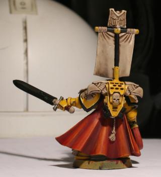
i thought i would start with my captain for something different. he isn't anywhere near finished, but i thought to myself "hey, it is a WIP blog after all!".
as you can see i haven't done his trims yet, but this will hopefully give you an idea of the colour scheme to comment on. my first go at painting a cape, i found it quite difficult to do. too long in yellow i guess, struggling to change colours 
so, to keep him in line with the rest of my forces aquilla, crux etc will all be done as bone. the banner will be cream with the trim in black for contrast. the laurel on the banner will be green with highlights to increase contrast. power sword (another nerve wracking thing to paint) will either be done in red or green - looking for thoughts there. green would go with the eyes and the power weapon on my terminators; red would go with the cape...and seals etc. any thoguhts or tips please speak up folks.
|
|
|
|
|
|
2011/08/03 23:55:45
Subject: Starting out - Imperial Fists
|
|

Automated Rubric Marine of Tzeentch
|
Very good painting! Love the Sternguard.
|
|
|
|
|
2011/08/04 00:35:57
Subject: Starting out - Imperial Fists
|
|
Veteran Inquisitorial Tyranid Xenokiller
|
That captain looks really good. How did you do the yellow so evenly?
|
|
|
|
|
|
2011/08/04 00:51:23
Subject: Re:Starting out - Imperial Fists
|
|
Long-Range Land Speeder Pilot
|
I love the look, the only thing I would change is the color of the ropes and the banner. They blend in with all the bone color way too much that they loss their pop. For my IF cap'n i used reapers blond hair/golden blond with a wash of linen white for the rope.
\But with that tiny exception on my part I really think it is turning out real crisp and nice.
|
If not for the mediocre who would be great, and thank goodness for those who are just terrible they make even those who are mediocre look great
May the Sons of Dorn forever be vigilant  |
|
|
|
|
2011/08/04 01:01:09
Subject: Re:Starting out - Imperial Fists
|
|
Fighter Pilot
|
Love the yellow work and you seem to be handling the work of yellow very well. I think yellow is a pain and the sternguard look amazing.
|
Yarrr... |
|
|
|
|
2011/08/04 01:22:01
Subject: Starting out - Imperial Fists
|
|
Raging Rat Ogre
|
San76 wrote:Thanks heaps santobell, soon as I get back will have to hit up.w shop.
Could anyone recommend a good, brush application matte varnish? I tried the Microsystems one but it was pretty shiny.
We'll have to organise a game once you get these fella's finished mate.
Oh and a Brush on Matte, Flatcoat by Testors is pretty good and designed for the types of paints GW and Armpainter do, you can also get it in a spray.
The good thing with Clear coat is you can spray something matte then paint a gloss (standard GW varnish) on the spots you want shiny and vice versa,
you can also remove a shine buy painting matte over the top and if you use a spray and get a frosting effect you can paint gloss over it to remove this nasty
issue.
You can get testors paint gear from the same place as the plastic card and grating.
|
|
|
|
|
|
2011/08/04 09:09:30
Subject: Starting out - Imperial Fists
|
|

Thunderhawk Pilot Dropping From Orbit
|
Green for the power weapon would look good and also contrast with the yellow quite nicely I think. As to the techniques for painting it, do you have any ideas yet. If I may could I recommend you check out the tutorial by Catattafish, its only one method but I think it comes off quite nicely for those without access to an airbrush.
http://www.youtube.com/watch?v=y1km0XLk10A
|

No trees were hurt in the making of this sig, however many electrons were disturbed.
|
|
|
|
|
2011/08/04 09:43:47
Subject: Starting out - Imperial Fists
|
|
Tail-spinning Tomb Blade Pilot
|
It would seem that every time Santobell posts there's an emphasis on grating card in some recepie or t'other.
No disrespect but I really don't think you need anything like that. A simple sand and texture base would be all you need for these or something like Optio's link would show off your army quite well.
The painting is very well done indeed and things are coming along nicely, you're already producing some fine work.
|
If I am not in my room, is it still my room? |
|
|
|
|
2011/08/05 00:29:09
Subject: Re:Starting out - Imperial Fists
|
|
Dakka Veteran
|
as always, thanks so much for the kind words!!
40k ninja, im glad you like the yellow. i use the following recipe:
-prime in black
-undercoat in iyander darksun (making sure its nice and even)
- 1:1 blend of iyander darksun / golden yellow
- wash in gryphonne sepia but dot let it pool too much.
- pin stripe all lines, recesses etc in Devlan Mud
- coats of golden yellow till i hit the tone i like. usually 2-3.
- highlight in 1:1 golden yellow/skull white.
its a bit of a mission but thats the glory and the pain of the IF im afraid.
dalsiandon, i know what you mean. i am worried that the reopes will not pop but im at a loss for which colours to paint them. natural instinct is red, but then the rope on the back will just blend in. green...sort of doesnt make sense, white will blend in...any ideas be greatfully recieved.
santo, mate i would love a match once they done. i fear for my forces though, im very new to all this.
lenny, i checked out the link you sent; thank you. i might try that one...ive got a vision in mind...making it happen though....
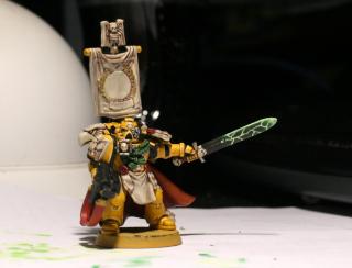
Automatically Appended Next Post: Hi folks,
well a day off is a day to paint.
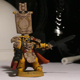
did some more work on my captain, i hope you like it. obviously, still very much a WIP but i figure regular updates are better than BOOM - finished product.
anyways, as you can see i have started work on the power sword. still some more work to do on the emitters and the hilt.
did a little work on the bone pieces and the banner. much, much more to do there.
also, i took on board comments from folks re: the ropes on his chest and so have opted for a different colour than the white i was originally going for. had a chat with Peter at my local GW and he had a bunch of suggestions. i actually then chickened out of the brighter colours and bought a bunch of greys...but got home and figured, why not green?
anyways, as always, all comments/tips gratefully received.
|
|
This message was edited 1 time. Last update was at 2011/08/05 07:45:53
|
|
|
|
|
2011/08/05 11:05:42
Subject: Starting out - Imperial Fists
|
|
Thunderhawk Pilot Dropping From Orbit
|
The ropes look much better, dalsiandon was right limiting the amount of bone on the miniature has helped heaps.
For your cloak some details along the hem would also look great I think. Simple tram lines or even something more complex would help to emphasis his rank but also break up the large panel of colour the cloak presents
|
No trees were hurt in the making of this sig, however many electrons were disturbed.
|
|
|
|
|
2011/08/07 05:45:25
Subject: Re:Starting out - Imperial Fists
|
|
Long-Range Land Speeder Pilot
|
I like the green on the ropes, its not a color you expect but it really does make them pop, and it doesn't look bad at all. I think it actually gives it a nice off set to the red and yellow, and it gives life to the bone. Why? well the red and yellow look so bright on this model and the bone looks so dull or plane that the green really fits right in the middle as a balance of not to bright not to dark not to boring not to flashy.
|
|
This message was edited 1 time. Last update was at 2011/08/07 05:49:51
If not for the mediocre who would be great, and thank goodness for those who are just terrible they make even those who are mediocre look great
May the Sons of Dorn forever be vigilant |
|
|
|
|
2011/08/09 09:37:19
Subject: Re:Starting out - Imperial Fists
|
|
Dakka Veteran
|
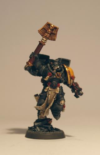
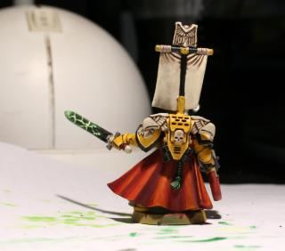
Thanks guys,
i hadn't thought of it that was dalsiandon but i think you are right.
Lenny, i would try that if i had the skills - i know i dont.
yet
anyways, an update - have tried the whole banner thing. completed the power sword...
|
|
|
|
|
|
2011/08/09 23:57:12
Subject: Re:Starting out - Imperial Fists
|
|
Long-Range Land Speeder Pilot
|
He looks real good.
|
If not for the mediocre who would be great, and thank goodness for those who are just terrible they make even those who are mediocre look great
May the Sons of Dorn forever be vigilant |
|
|
|
|
2011/08/10 00:33:39
Subject: Starting out - Imperial Fists
|
|
Focused Dark Angels Land Raider Pilot
|
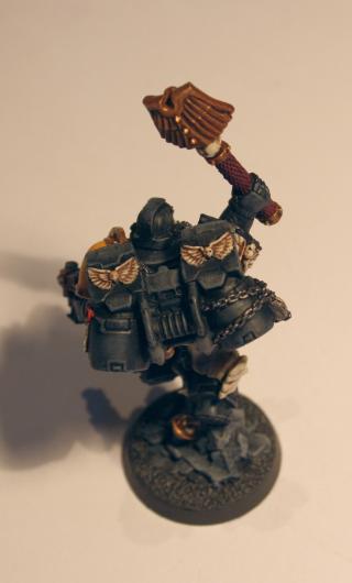
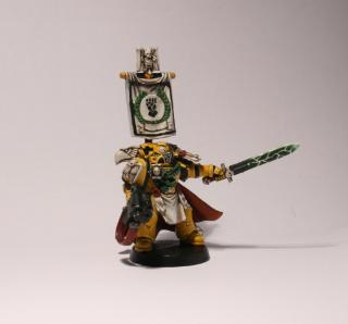
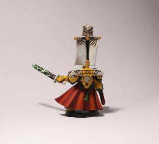
Looks very good for a beginner, especially for yellow. One question - are you doing anything else with the shoulder pad iconography and the eagle heads? They look a bit bland/unfinished imho. Otherwise excellent work.
|
|
|
|
|
2011/08/10 01:17:11
Subject: Starting out - Imperial Fists
|
|

Homicidal Veteran Blood Angel Assault Marine
|
Very nice start San76. Make sure you drill out those barrels though - it's easy and makes a model that much more complete.
|
|
|
|
|
|
2011/08/24 23:58:23
Subject: Re:Starting out - Imperial Fists
|
|
Dakka Veteran
|
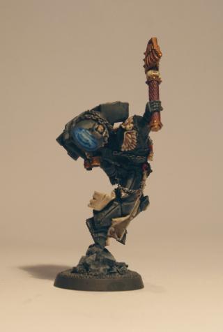
Sorry its taken me a while, works been a cow.
Thanks for your kind words everyone
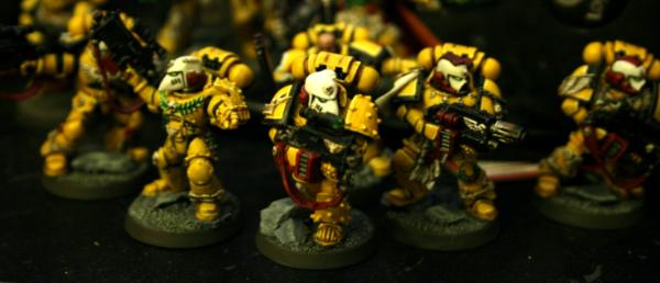
Eggroll, i definately will try the barrel thing once i get time. what i have been working on is basing the models. Santo, if your out there, i was going to go for the metal plating like you suggested but i havent had a chance to get into town and buy some; instead, i've decided to go with a barren, sand and rock theme - its easier for my first go and i had the gear for it. tried to set up a simple, dark base for contrast with the yellow. as always, thoughts greatfully recieved.
ps (sorry i didnt have a chance to set the shots up on white or lighting on the sternguard; you know how life can be...)
|
|
|
|
|
|
2011/08/25 00:15:22
Subject: Re:Starting out - Imperial Fists
|
|

Sergeant
|
Realy Nice Fists 
|
ImperialFists: 2000+
 GK: WIP GK: WIP
"Do not ask me to approach the battle meekly, to creep through the shadows, or to approach my foes quietly in the dark. I am Rogal Dorn. Imperial Fist. Space marine. Emperor's Champion. Let my enemy's cower at the thunder of my advance and tremble at the sight of me."
"...where Astarters of lesser chapters wear the Emperor's Aquila. We do not wear His symbol. We are His symbol." Imperial fists |
|
|
|
|
2011/09/12 04:36:42
Subject: Re:Starting out - Imperial Fists
|
|
Dakka Veteran
|
|
|
This message was edited 1 time. Last update was at 2011/09/13 00:47:06
|
|
|
|
|
2011/09/20 15:11:26
Subject: Starting out - Imperial Fists
|
|
Raging Rat Ogre
|
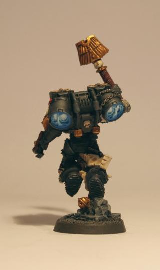
@ - Elmodiddly - All good matey though you did slightly misread my intention there. I mentioned them again so San would know which shop I was talking about
as he is new to it all and I've been buying everything from bases, buildings, paint, decals, air brush gear and even rocket engines from that particular store for the better part of 15 years.
Even so your quite right a standard base would look just fine, heck you could paint the ground narloc green and it wouldn't hurt how they look considering the excellent paint job San has done on them.
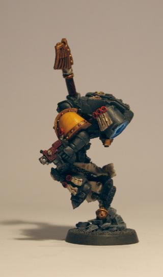
@ - San76
That chappy is looking excellent the engine glow is spot on mate!
As far a matchgoes, not to worry about win or loss I'm dead terrible at the game anyway as I paint and convert much
more than I get to play these days.
|
|
|
|
|
|
2011/09/22 01:56:59
Subject: Re:Starting out - Imperial Fists
|
|
Long-Range Land Speeder Pilot
|
Another great looking model. Love the engine effect.
|
If not for the mediocre who would be great, and thank goodness for those who are just terrible they make even those who are mediocre look great
May the Sons of Dorn forever be vigilant |
|
|
|
|
2011/09/22 02:05:24
Subject: Starting out - Imperial Fists
|
|
Implacable Black Templar Initiate
|
Awesome Fists, keep up the great work.
|
 4000+pts 100% painted 4000+pts 100% painted
  Undivided 2500pts 100% painted Undivided 2500pts 100% painted
 DeathSkullz 2000pts 95% painted DeathSkullz 2000pts 95% painted
Daemons 1250pts 80% painted |
|
|
|
|
2011/09/22 02:59:29
Subject: Starting out - Imperial Fists
|
|
Dakka Veteran
|
Well Im with the popular opions, your skills dont suck.
The simple bases work well with the overall color and the off black color (also called grey) is nice.
So what direction if any do you have with this army, point size, vehicle preference, or just enough to impress the chicks?
|
|
|
|
|
2011/09/22 03:09:46
Subject: Starting out - Imperial Fists
|
|
Perfect Shot Black Templar Predator Pilot
|
Wow, amazing stuff man! I love to see imperial fists, these are some rock hard sons of dorn you got there! I really want to see more and I look forward to it! Great work!
|
|
|
|
|
|
2011/09/22 05:19:32
Subject: Starting out - Imperial Fists
|
|
Decrepit Dakkanaut
|
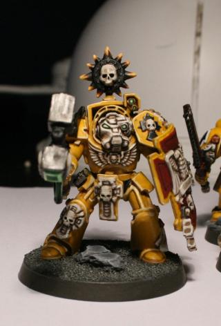
I love the engine effect on the jump pack. I painted my chaplain with a red/yellow flame effect, but I was never all that happy with it.
Love the blue high heat/plasma feel of yours so I might give it a try.
I assume that is something like Ultramarine/Ice Blue/White that is blended together in stages?
|
|
|
|
|
2011/09/22 09:06:24
Subject: Starting out - Imperial Fists
|
|
Warning From Magnus? Not Listening!
|
Great looking models!
|
Notice: If you notice this notice you will notice that this notice is not worth noticing
|
|
|
|
|
2011/09/22 09:17:56
Subject: Re:Starting out - Imperial Fists
|
|
Fresh-Faced New User
uk
|
Very nice indeed. IMHO that is the perfect yellow for Imperial Fists. Again very nice.
|
|
|
|
|
2011/09/22 10:42:57
Subject: Starting out - Imperial Fists
|
|

Repentia Mistress
|
People that can paint yellow this well makes me clench my teeth in jealousy. Nice job. Subbed
|
|
|
|
|
2011/09/22 12:54:54
Subject: Starting out - Imperial Fists
|
|
Navigator
|
Mate, cracking work. I've had that chaplain on my desk for a while and been putting off painting him. Gonna use your pics as a guide!
|
|
|
|
|
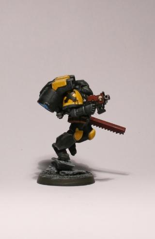
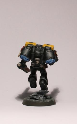
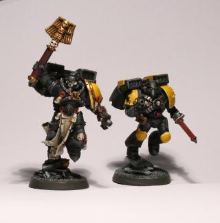
2011/10/04 13:48:25
Subject: Re:Starting out - Imperial Fists
|
|
Dakka Veteran
|
Guys thanks so much for all your kind words! sorry i haven't replied sooner but work has been kicking my arse lately.
i know - excuses, excuses, right?
@ Santo - mate...thanks again for the store tip. you cant possibly be worse at the game than me...recently i used the cover removing sternguard shells against blood angels who...wait for it... weren't even in cover. yup, thats how bad i am (for the record while my sternguard died that squad of assault marines were later defeated to a man by my scouts! my opponent was not well pleased).
@ 1-i - I wish i could say i had it all mapped out but really, we all know the chicks dig dudes in yellow
thanks so much everyone for your kind words on the thruster exhausts. i was SO goign to go red but at last minute went with blue; i think it was a good call. i based my method on the mighty Eggroll's ( http://www.dakkadakka.com/dakkaforum/posts/list/180/313003.page near bottom of page) but since i don't have an airbrush i did it all with drybrushing. the recipe i used was:
- undercoat in Mordian
- regal blue across the lot
- enchanted blue, staying away from outer edges and concentrating in the two main exhaust recesses
- ice blue, pulling in further from outer edges and concentrating in the two main exhaust recesses
- a light wash of a very, very, very dilute enchanted blue/regal blue (1:1) to kind of pull together the layers of paint (this is kinda optional - im not convinced it did much)
- 1:1 skull white and ice blue in centre of thruster and along edges
- 3:1 (or so) skull white /ice blue right in centre and on a couple of edges.
@ Axlbush, your too kind mate. it is one of my favourite models, such a dynamic pose and so many little bits and pieces to paint.
well, enough talk... time for pics. ive decided i liked my chappy so much that he is going to get an assault squad as his personal bodyguard. they are still going to be Fists but i thought i might try to make them visually a bit different; partly to mark them as his bodyguard, partly to break up the sea of yellow. so, i decided to go for something between the chaplain and the full canary . this was also my first attempt at free hand with the assault symbol on the shoulder. honestly, the idea of potentially having to repaint yellow almost put a stop to it!
anyways, hope you like him. his squadies should be coming soon (i hope). i tried to get the light as diffuse as possible but there is still some flare. sorry.
as always, tips and comments gratefully received
|
|
|
|
|
|
|
|