| Author |
Message |
 |
|
|
|
|
Advert
|
Forum adverts like this one are shown to any user who is not logged in. Join us by filling out a tiny 3 field form and you will get your own, free, dakka user account which gives a good range of benefits to you:
- No adverts like this in the forums anymore.
- Times and dates in your local timezone.
- Full tracking of what you have read so you can skip to your first unread post, easily see what has changed since you last logged in, and easily see what is new at a glance.
- Email notifications for threads you want to watch closely.
- Being a part of the oldest wargaming community on the net.
If you are already a member then feel free to login now. |
|
 |
2018/08/31 13:00:30
Subject: Re:40k Chaos Renegades - little bit o' STUFF
|
|

Fixture of Dakka
|
Love it love it love it!
The marines are excellent looking. The Enforcers are just magnificent (branding iron guy is the best), and the dark apostle is already shaping up to be good.
Ok, i'll stop gushing now...
BECAUSE I HAVE TOO MANY IDEAS AND NOT ENOUGH FOCUS.
I can sympathise with you on that.
|
|
|
|
 |
|
2018/08/31 13:18:54
Subject: 40k Chaos Renegades - little bit o' STUFF
|
|

Cackling Chaos Conscript
|
From one Renegade to another, great stuff! I'll be checking in on this regularly.
|
|
|
|
|
2018/09/23 22:37:14
Subject: Re:40k Chaos Renegades - little bit o' STUFF
|
|

Angry Chaos Agitator
|
No, MORE  I CRAVE your applause.
In all seriousness though; thanks I appreciate it.
Thank you! There's not enough of us if you ask me.
So it's been way too long since I've done any hobby, let alone update this thread. I have made a little progress this evening though!
This update might be a little bit wordy, but hopefully some of my thought processes are of interest to at least one person out there! Quite a lot of thought has gone into this army and I figured I may as well share a little bit more of it in the future; since I am no good at crafting backstory, I feel like I should have something else of substance to say!
I have been itching to start on the characters ever since the birth of this army, but I forced myself to hold back. I really wanted to get a strong grasp of the 'baseline' feel for the army first. I think it can be very difficult if you begin with the characters; when you really try to make your characters unique, when you backtrack you can sometimes leave yourself with very little of interest to work with when it comes to making your rank and file troops. If that makes any sense at all, lol. BUT ANYWAY. I am happy with the themes and feel of my troops so far; I think there's a characterful base to expand on now, and I feel ready to build upon that. So far, what I have going is a Dark Apostle and an Exalted Champion. I also have a Mutant Champion or two on the back-burner, and a handful psykers (Malefic Lord, Psyker Coven, Sorcerer) somewhere in the depths of my imagination.
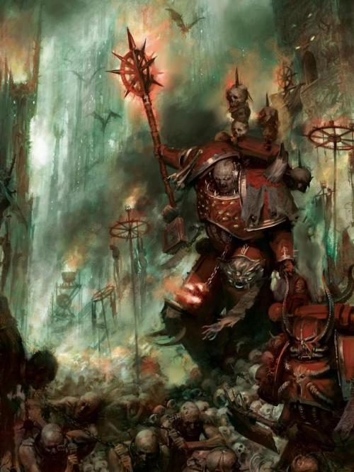
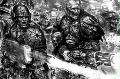
I was at a bit of an impasse with my Dark Apostle for a while, purely because of posing. I definitely see the Apostles as leaders and rallying points for their allies, and they should stand out as such visually. I was struggling to come up with a pose that captured both this and the hunched-over, hulking poses of the rest of my Astartes. Luckily, as per usual, someone else's idea came to the rescue! This piece of art:
I love the Apostle's pose in this. He's got the right amount of HUNCH to fit what I am going for, and there's some interesting things going on: I can't make out what his left arm is meant to be doing, but his pose to me almost suggests that he is dragging something along the ground. I definitely like the idea of an Apostle dragging the corpse of a non-believer along with him as an example; I've got a couple of spare mutant bodies hanging around along with a noose bit or two, so we will see where that goes!
Another key aspect of the pose is the weapon held aloft. The power maul takes on the guise of some kind of profane icon (which I guess it is), a real focal point both visually and thematically. This is what sells the Apostle as a figure to be followed, and a sort of living icon of Chaos. Definitely the vibe I want to go for. This works especially well alongside the Astartes I have done so far; the poses of the troops I am keep deliberately 'closed down', I want to keep them looking tight, insular and self-contained. Using the fully extended arm is a big departure from that and will hopefully signpost the Apostle as a character of note.
My Apostle so far, apologies for the poor photos:
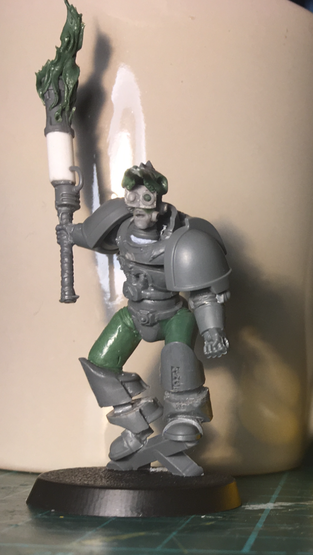
He's looking more than a little awkward right now; the body needs a whole lot of bulking out, and the pose is blue-tacked and not completely final. But hey, it's progress!
Thanks for looking all and let me know any comments/ criticisms/ hateful thoughts you have!
|
|
|
|
|
2018/09/24 10:56:49
Subject: Re:40k Chaos Renegades - little bit o' STUFF
|
|
Fixture of Dakka
|
I'm that "at least one person". I love hearing about what peoples thoughts and motivations on their armies are. It's one of the more interesting aspects to the hobby I think.
That's a good bit of art to base your apostle off.
I was going to agree with you that it looked like he was dragging a corpse along side him. But on closer look it looks more like he's holding a rod or something similar. Impossible to tell exactly what though.
Having your apostle dragging some poor shmuck by the scruff of his neck would add a gak load of character to the model though.
|
|
|
|
|
|
2018/09/24 11:56:08
Subject: 40k Chaos Renegades - little bit o' STUFF
|
|
Dispassionate Imperial Judge
|
Looking great! Love the crypt ghoul conversions - I did a similar thing on mine (but with a lot of Mantic and other bits mixed in)
|
|
|
|
|
|
2018/09/30 11:54:38
Subject: 40k Chaos Renegades - little bit o' STUFF
|
|

Painlord Titan Princeps of Slaanesh
|
One more of us, one less of them.
Excellent work.
|
|
|
|
|
|
2018/10/06 15:27:12
Subject: Re:40k Chaos Renegades - little bit o' STUFF
|
|
Angry Chaos Agitator
|
 Snrub wrote: Snrub wrote:I'm that "at least one person". I love hearing about what peoples thoughts and motivations on their armies are. It's one of the more interesting aspects to the hobby I think.
Me too! I always like to hear about other peoples' thoughts so I figured there must be people who want to hear mine ;]
 ArbitorIan wrote: ArbitorIan wrote:Looking great! Love the crypt ghoul conversions - I did a similar thing on mine (but with a lot of Mantic and other bits mixed in)
Thank you! Loving the mutants; they're exceptionally filthy looking  Thanks a lot!
As always, progress is slow. Partially because of LIFE, and partially because - to my great shame - I may have gotten a little enthusiastic about a small loyalist warband that I am starting to work on... BUT I DIGRESS; this thread is exclusively for cowards, murderers, tyrants and other chaotic scum.
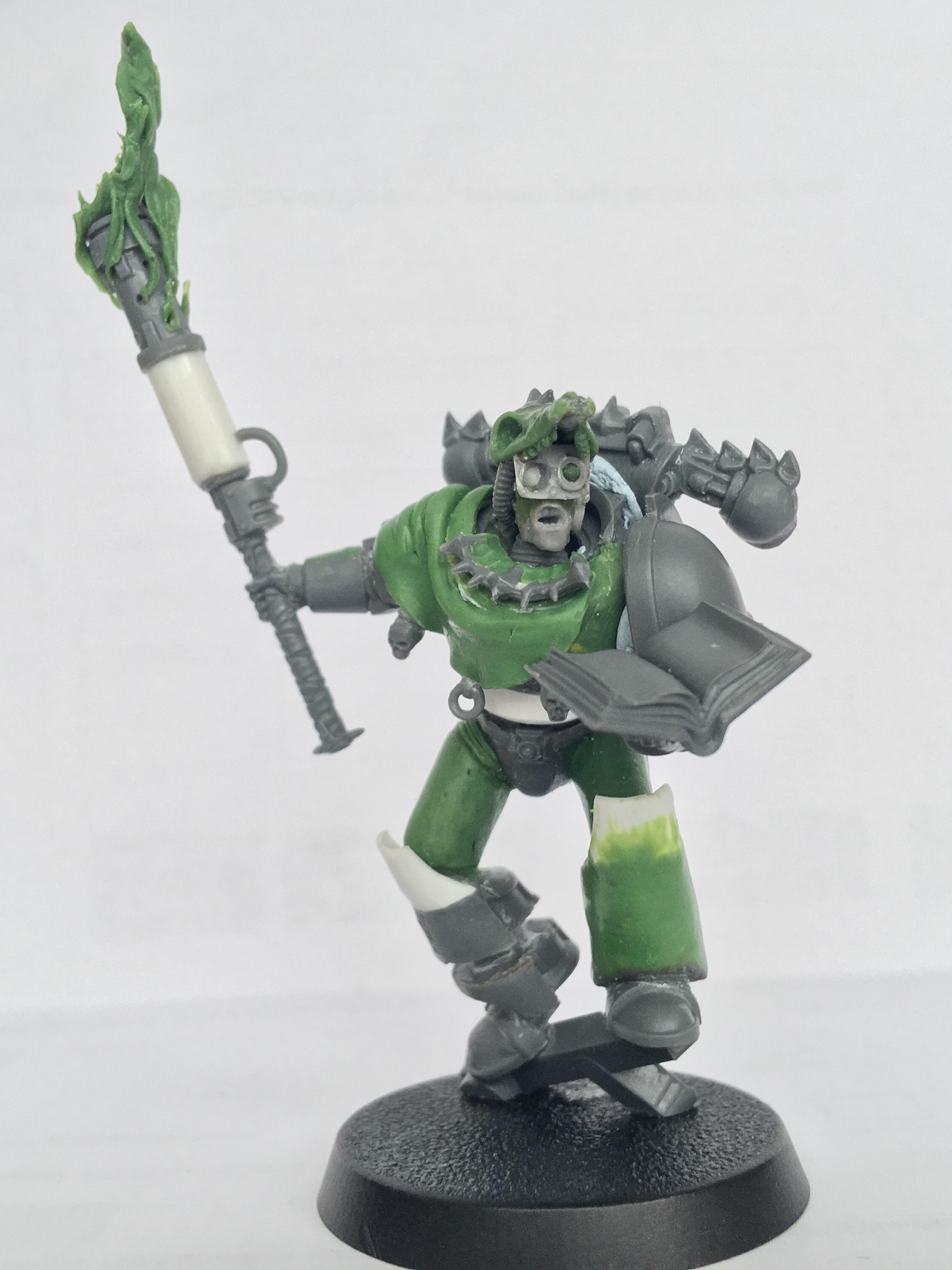
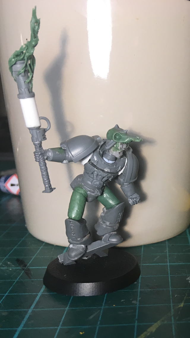
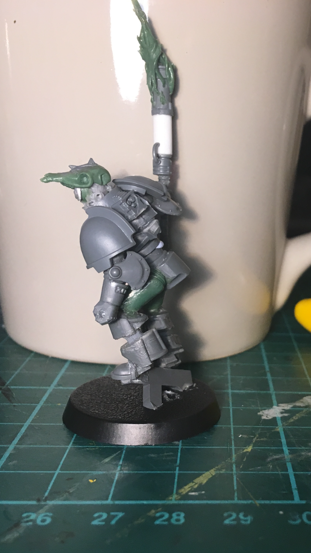
So the apostle was looking criminally awkward in its previous state, but progress has been made! I think he is starting to shape up pretty well:

As much as I liked the idea of him dragging an unfortunate mutant along side him, the pose wasn't sitting right with me. It looked to awkward, and too 'planar' - if that word makes any sense at all in this context, ha; his body was very flat, kind of starfish posed? adding the book coming across his body rather than in line with it adds a lot of balance to the model. That was an atrocious description that I should probably just delete and not mention. Well, tough. It's there now.
I felt the book was a necessary addition; I'm not convinced that his DARK APOSTLE-ness is strong enough without it. Hopefully it's enough to make it immediately obvious what the model is supposed to represent.
He's got a lot of flat, plain surfaces, and there's definitely detail work to do. That being said I have started to build up some details on top of the basic model; trying to capture a bit of a nomad/ shaman feel, building up some more bone motifs with the really neat CSM possessed power pack (I didn't take a good picture of that bit, oops), and adding a few little dangly bits to his robe-looking bit. What do you even call a piece of fabric like that? Beats me; it looks sort of priest-like and that's all I need to know!
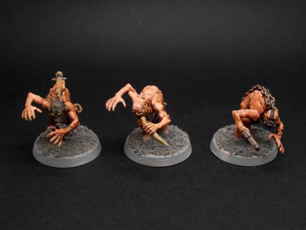
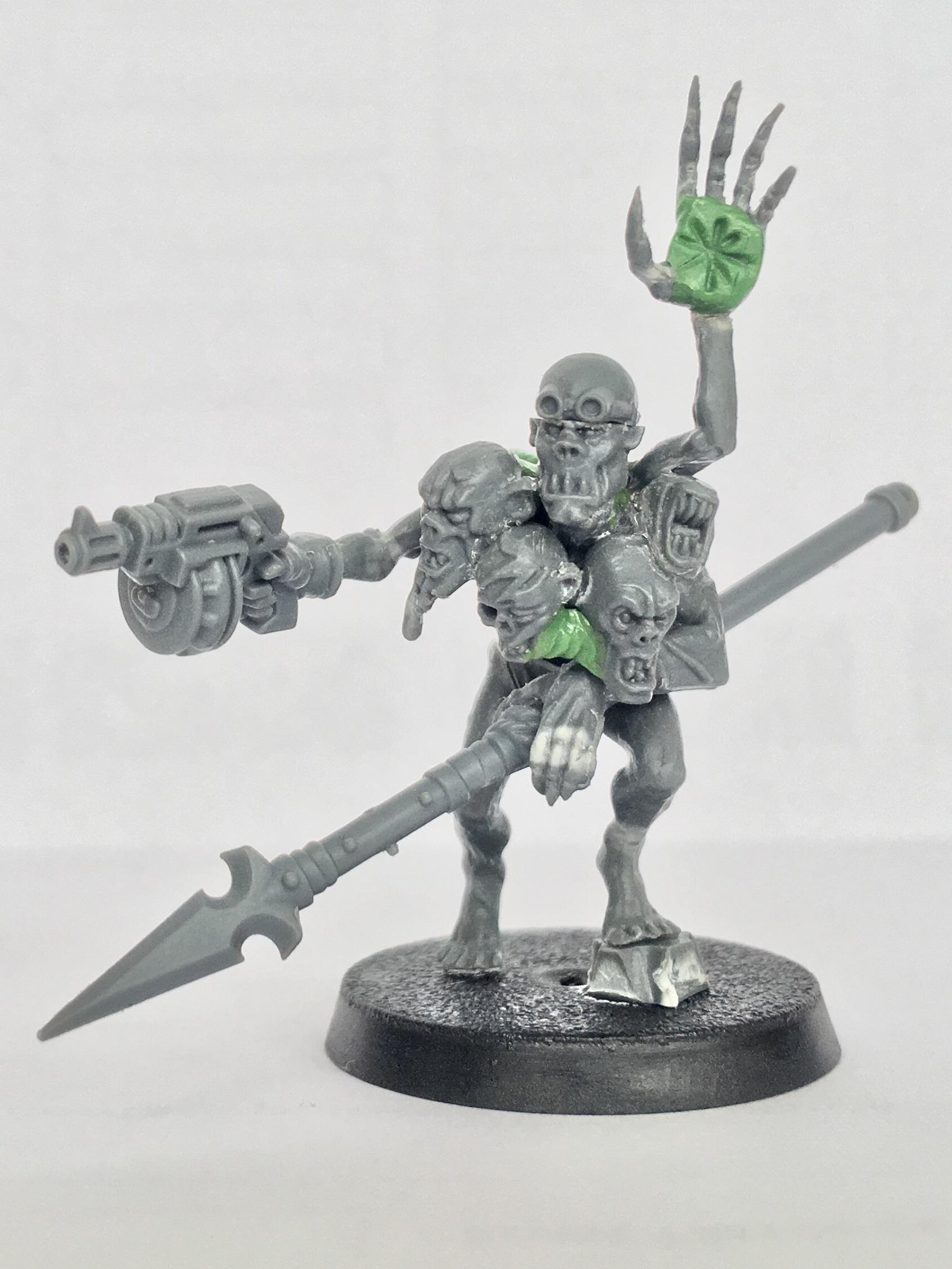
I also started on my mutant champions. the standard mutant are intentionally very subdued; I want them to look like believable, underclass worker-types. Rather than big, souped-up chaos beasties. The champions, however, I can have a bit more fun with. As the leaders of the rabbles I imagine these actually have some kind of allegiance and devotion to chaos, and have been rewarded in kind with HIDEOUS PROTRUSIONS. Very WIP still but it's a start:
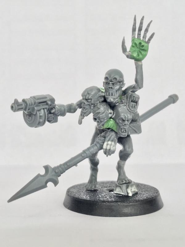
I quite like him so far, but I think he is lacking a few arms... I like the idea of mutation giving rise to useless forms; I want to add a few malformed, spastic looking limbs sprouting out. I also tried to capture this with the head that is going a little necrotic; I imagine some chaos-spawned body parts just wouldn't be able to sustain themselves on a real being, so they start to die and rot while still attached. That all sounds quite miserable - perfect!
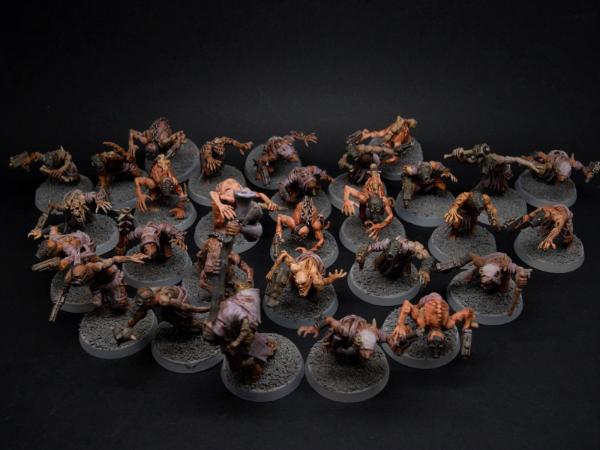
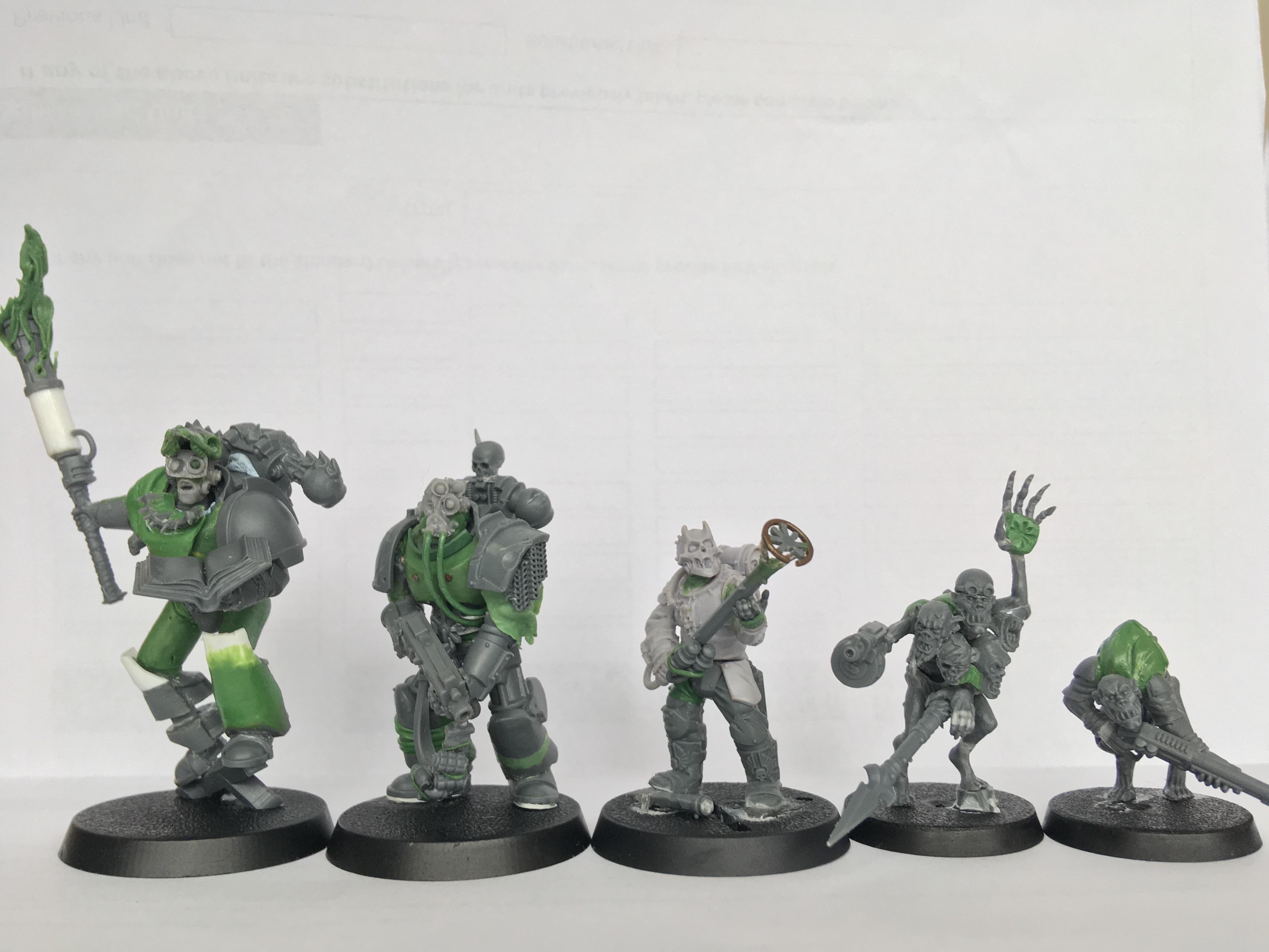
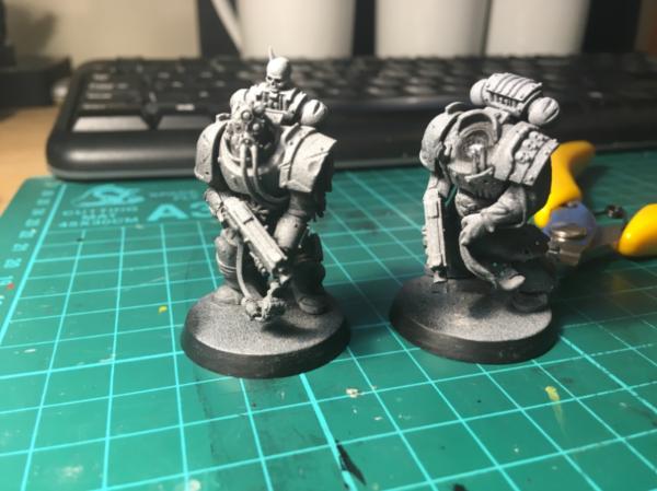
Putting the units I have so far together, I think I have a nice little size gradient:
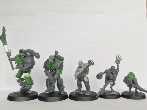
I am very pleased with how this element has turned out; I really want to sell a hierarchical feel with this army. I want there to be a strong sense of who is most valuable, and scale is the most immediately obvious way of achieving this. From right to left, the image shows the pecking-order of the army in microcosm: at the bottom, the slave-mutant field workers, followed by their leaders. Then the human servants, the enforcers keeping the mutants in check, The Astartes tower over the mere humans, which are in turn lead by the mightiest of their kind. There will be a bunch off extra steps and divergent paths in the hierarchy eventually, but this basic structure is pretty core to what I want to capture. Feedback on what you lot think on how this is working out would be appreciated!
High res:
Thanks for looking folks! As always, your bone-headed insults, death threats, and constructive criticism are welcome!
|
|
|
|
|
2018/10/06 15:41:18
Subject: 40k Chaos Renegades - little bit o' STUFF
|
|
Dakka Veteran
|
Great work. I love original conversions like this.
Will keep an eye on this thread for sure.
|
|
|
|
|
2018/10/07 07:03:24
Subject: 40k Chaos Renegades - little bit o' STUFF
|
|
Mighty Chosen Warrior of Chaos
|
Excellent work, seen a lot of mutant conversions and these are among the best.
|
|
|
|
|
|
2018/10/07 11:18:45
Subject: Re:40k Chaos Renegades - little bit o' STUFF
|
|
Fixture of Dakka
|
That dark apostle will be awesome when finished. Have you decided what he'll be standing on?
Regarding the large amounts of flat spaces on him, I would think that'd be a boon on a model like a dark apostle. Leaves you plenty of space for scrawly text and other profane runes/icons.
The scale shot really shows how much effort you've put into each of your models. From the lowest to the mightiest, everyone gets some attention to make them look different.
|
|
|
|
|
|
2018/10/07 17:32:17
Subject: 40k Chaos Renegades - little bit o' STUFF
|
|

Crushing Black Templar Crusader Pilot
|
This project is amazing! Great work man!
|
|
|
|
|
2018/10/08 09:49:12
Subject: 40k Chaos Renegades - little bit o' STUFF
|
|
Mysterious Techpriest
|
Awesome conversions.
The look you've gone for with the marines is really cool.
Can't wait to see more!
|
|
|
|
|
|
2018/10/08 14:50:06
Subject: 40k Chaos Renegades - little bit o' STUFF
|
|

Been Around the Block
|
Brilliant stuff! Really inspiring! I especially love the Astartes grabbing his tattered cloak. You got a talent for interesting poses!
|
|
|
|
|
2018/10/11 00:34:32
Subject: 40k Chaos Renegades - little bit o' STUFF
|
|
Angry Chaos Agitator
|
Thanks for the comments all!
Snrub wrote:That dark apostle will be awesome when finished. Have you decided what he'll be standing on?
Regarding the large amounts of flat spaces on him, I would think that'd be a boon on a model like a dark apostle. Leaves you plenty of space for scrawly text and other profane runes/icons.
Basing is something I am still not sure on; I think I want to go for a marshy look? Sticking with the agri-world theme, as if the fields and irrigation systems have been neglected, and left behind a damp bog. Whatever the Apostle is stood on I want to match with the overall basing theme, so it may be a little while before I have that sorted!
Also that's a good point re; Apostle. I hadn't though to leave space for painted detailed... I will do now!
PaL031 wrote:Brilliant stuff! Really inspiring! I especially love the Astartes grabbing his tattered cloak. You got a talent for interesting poses!
Thank you very much! I try to put particular effort into posing - I think it is an often neglected part of conversions.
|
|
|
|
|
2018/10/12 18:03:17
Subject: 40k Chaos Renegades - little bit o' STUFF
|
|
Cackling Chaos Conscript
|
Glad to see more of your unique work, subbed. Any ideas on the paint scheme of the Dark Apostle, is he going to be Legion affiliated?
|
|
|
|
|
2018/10/17 04:55:40
Subject: Re:40k Chaos Renegades - little bit o' STUFF
|
|
Fixture of Dakka
|
Marshy/boggy/farmland style basing would be awesome and very appropriate. Bit of a challenge I think, but the results will be undoubtedly well worth it.
I would suggest having the Apostle standing on a piece of neglected farm equipment or maybe just a big mossy rock. I mean, a pile of bodies would be good too. 
|
|
|
|
|
|
2018/10/23 00:46:26
Subject: Re:40k Chaos Renegades - Painting?! More likely than you'd think! Still, not very much of it...
|
|
Angry Chaos Agitator
|
 Cardinal Xaphan wrote: Cardinal Xaphan wrote:Glad to see more of your unique work, subbed. Any ideas on the paint scheme of the Dark Apostle, is he going to be Legion affiliated?
Thank you! Also that's a very well-timed question; painting is what has been on the agenda as of late! I think he is going to be unaffiliated, as with the rest of the Astartes. I will go into more detail on this when I have something to show, but there's a bit of concept behind the painting! But rest assured - they will all look FILTHY.
Snrub wrote: I would suggest having the Apostle standing on a piece of neglected farm equipment or maybe just a big mossy rock. I mean, a pile of bodies would be good too.
A BIG ROCK is my lazy back-up choice some cool piece of decay farming equipment sounds very cool though - if I manage to find the bits and inspiration for that!
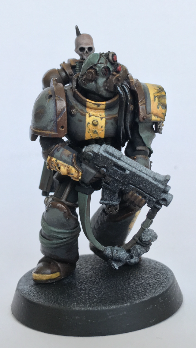
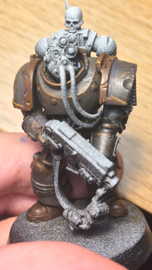
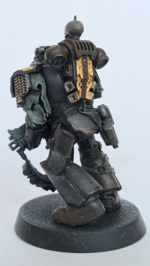
SO PAINTING. I have been banging my head against the proverbial wall painting-wise since my last update, I think I am finally getting close to what I want for my Astartes. It's not much, but that one arm you can see below is more or less what I am going for:
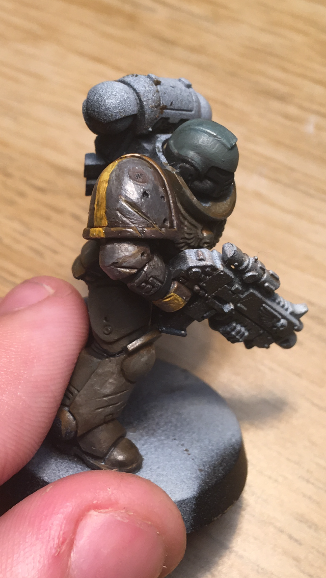
...It's had about 6 coats layered on top of each other as I have repainted lazily without stripping, so excuse the thick paint! The yellow is slighly off in colour and is VERY rough in its shape, but the base armour is about right I think. Really trying to make it dirty and decayed; I think it's pretty good on that front
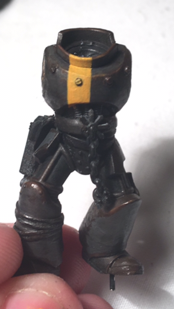
Some cheeky zenithal priming of my first 2 guys, one head is MIA for some reason 
Please let me know what you think of the paint! I know it's not all that much to go on but any feedback, criticisms, or death threats would be greatly appreciated! Thanks for looking folks!
|
|
|
|
|
2018/10/23 05:23:33
Subject: 40k Chaos Renegades - Painting?! More likely than you'd think! Still, not very much of it...
|
|
Painlord Titan Princeps of Slaanesh
|
IMO it looks good, but maybe a little too dark and grungy for an entire army?
|
|
|
|
|
|
2018/10/23 21:09:44
Subject: 40k Chaos Renegades - Painting?! More likely than you'd think! Still, not very much of it...
|
|
Angry Chaos Agitator
|
It is looking pretty dull I agree; I am hoping to push the contrast quite a bit more on the shading next time, so that should help. Particularly in the image, the gradient of tones is too shallow, which I think contributes to the darkness.
Also the painting so far is a kind of base layer; I am wanting to build on top of that, with yellow areas and also some areas of lighter metallics too. There's going to be more to the armour than just that all over; there's a decent amount of cloth and cabling on the models themselves, which again should help to break it up a bit more.
Fingers crossed that the final outcome will be a little more vibrant! Thanks for the feedback.
|
|
This message was edited 1 time. Last update was at 2018/10/23 21:10:02
|
|
|
|
|
2018/10/24 16:01:03
Subject: 40k Chaos Renegades - Painting?! More likely than you'd think! Still, not very much of it...
|
|
Painlord Titan Princeps of Slaanesh
|
De nada, happy to assist in whatever way I can.
I know from painting my Renegades and Heretics in a fairly drab grey scheme that they look pretty good up-close under ideal lighting, but they just look like an unpainted mess from table-top distance under artificial lighting.
|
|
|
|
|
|
2018/11/01 03:53:00
Subject: Re:40k Chaos Renegades - Painting?! More likely than you'd think! Still, not very much of it...
|
|
Fixture of Dakka
|
Dull grey metallics work well for the renegade astartes.
My concern with it though is on an army wide basis. If the rest of the force is dull and grimy then the astartes wont stand out as much as they probably should. On their own, they'd be fine, but beside a horde of mutant farmer rabble they'll just sort of blend in almost.
Maybe.
Maybe not. Only one way to find out!
|
|
|
|
|
|
2018/11/02 12:53:34
Subject: Re:40k Chaos Renegades - MORE Painting?! EVEN More likely than you'd think!
|
|
Angry Chaos Agitator
|
@Snrub: Well below there are some pictures that should give you more of an idea! There's quite a lot of YELLOW on the Astartes, and it's almost definitely the most distinctive feature painting-wise. The idea is to relegate the yellow to just a spot colour on the general rabble (used for markings and eye lenses and not much else). HOPEFULLY that will be enough to make the marines stand out. Maybe indeed! We will find out together 
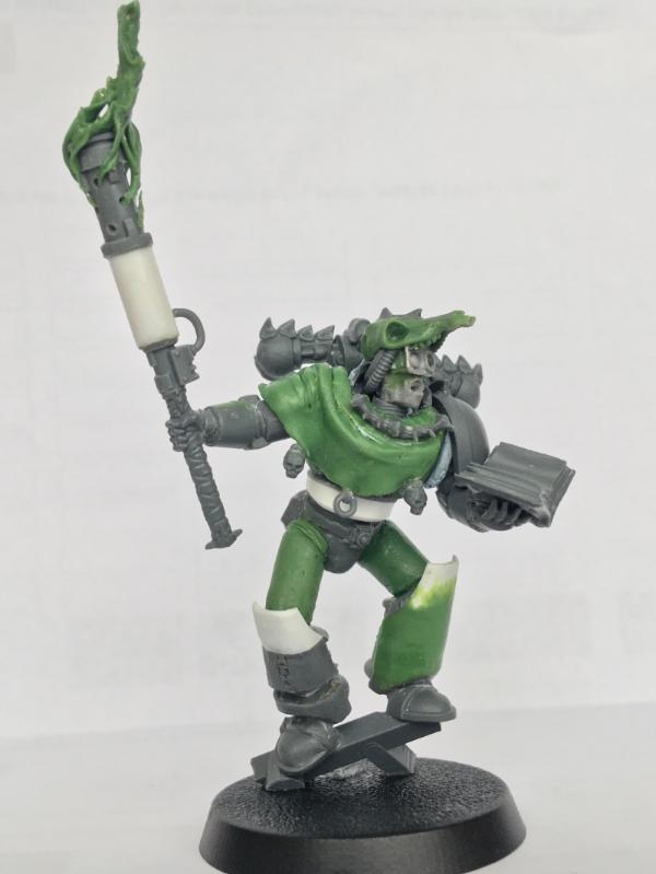
Painting the Astartes is something that I have been thinking about quite a bit. It's very much a part of my VISION of Chaos that there is no real uniformity or strong cohesion. This is something I have worked on in the modelling stage, mismatching armour parts and the like. When it comes to painting, I don't want the Astartes to look they they belong to a particular legion. I imagine it's an eclectic, ragtag group of renegades that have banded together over time, rather than a full legion or group of brothers from the same loyalist beginning.
The base colour for the power armour is what I imagine to be 'neutral' power armour; i.e. it's what lies underneath the blue, or the red, or the whatever colour that space marines are usually clad in. If left unmaintained, to decay and rust, I imagine the armour would tend to a dirty grey-brown. I built up the layers from a dark drown rusty colour that lies underneath, to a plain grey colour on top. This is the starting point; the common armour that all of these Renegade Astartes are clad in.
I think they would want to mark themselves, in order to stamp some kind of identity on the neutral, decayed armour, and to show their allegiance and unity with their new brethren. This is where the yellow comes in; I painted it as stripes, running over the top of all the trim, rivets, and other surface details, as if it was paint roughly applied onto the Astartes' armour themselves. There isn't a specific pattern or way of marking the armour, just bands of yellow. This means there can be a lot of potential variation between different models but also still a strong visual unity. I don't plan on using much in the way of iconography (much too imperial for me tastes), so these yellow stripes are the markings that denote this particular group of renegades.
On a technical level, I think making the stripes of colour as straight as possible is important. It's a little more fitting with the concept to just slap the yellow on very roughly, but visually the models are already very decayed and messy, so I think applying the yellow deliberately sloppily would leave the paint job looking lazy. Painting the straight lines is time consuming, and weathering them after is miserably stressful... But I do enjoy the process. I think it's a pretty good balance between messiness and neatness, the juxtaposition is pretty cool visually and I think the straight yellow lines are just enough to keep the models from looking too sloppy.

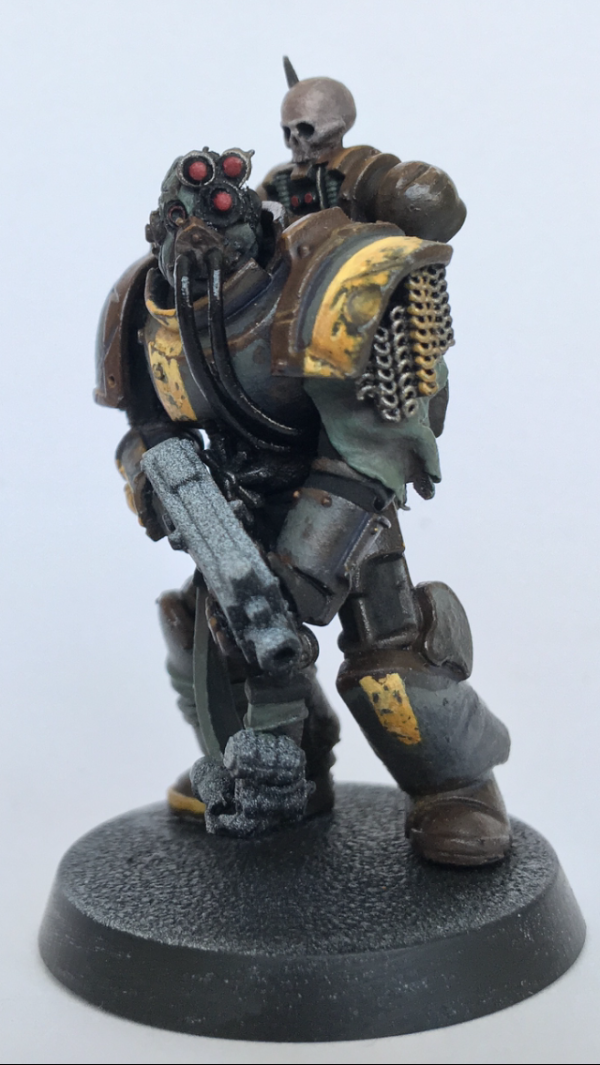
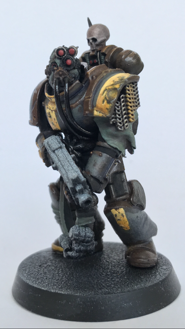
Not quite finished but definitely getting there; the gun is obviously unpainted, and the face needs quite a lot of work. I will not be able to paint though for a short while so this is where he will stay for a bit!
Apologies for the mediocre photography; I really should invest some time in taking good photos... A black background and not using a smartphone is probably what's needed!
Better quality:
Thanks for looking all! As always comments are welcome, as well as any grave insults to my family's honour.
|
|
This message was edited 2 times. Last update was at 2018/11/02 12:55:48
|
|
|
|
|
|
|