 JamesY wrote:
Right, in feltmonkey style, I am going to try and write a comment for every entry. I'll be honest, I voted for everyone (besides myself, obviously) this month, as the standard was so high, and it was my little boy's second birthday, so I might have gotten carried away with the festivities and good spirits. Anyway, here goes;
Nevelon - Really great jog on the camo, and nice to see a different take on ultramarines. Thanks for picking up the reins also to keep it all going.
MobileSuitRandom - Nice scheme, especially the robes-they look like they are being worn on a battlefield.
Vejut - Nice choice of blue to contrast the sandy bases, which look great.
Whittlesey40k - Really crisp; I can see every detail nice and clear.
Captain Brown - Solid and consistent all the way around, and you have balanced the black against the bone well.
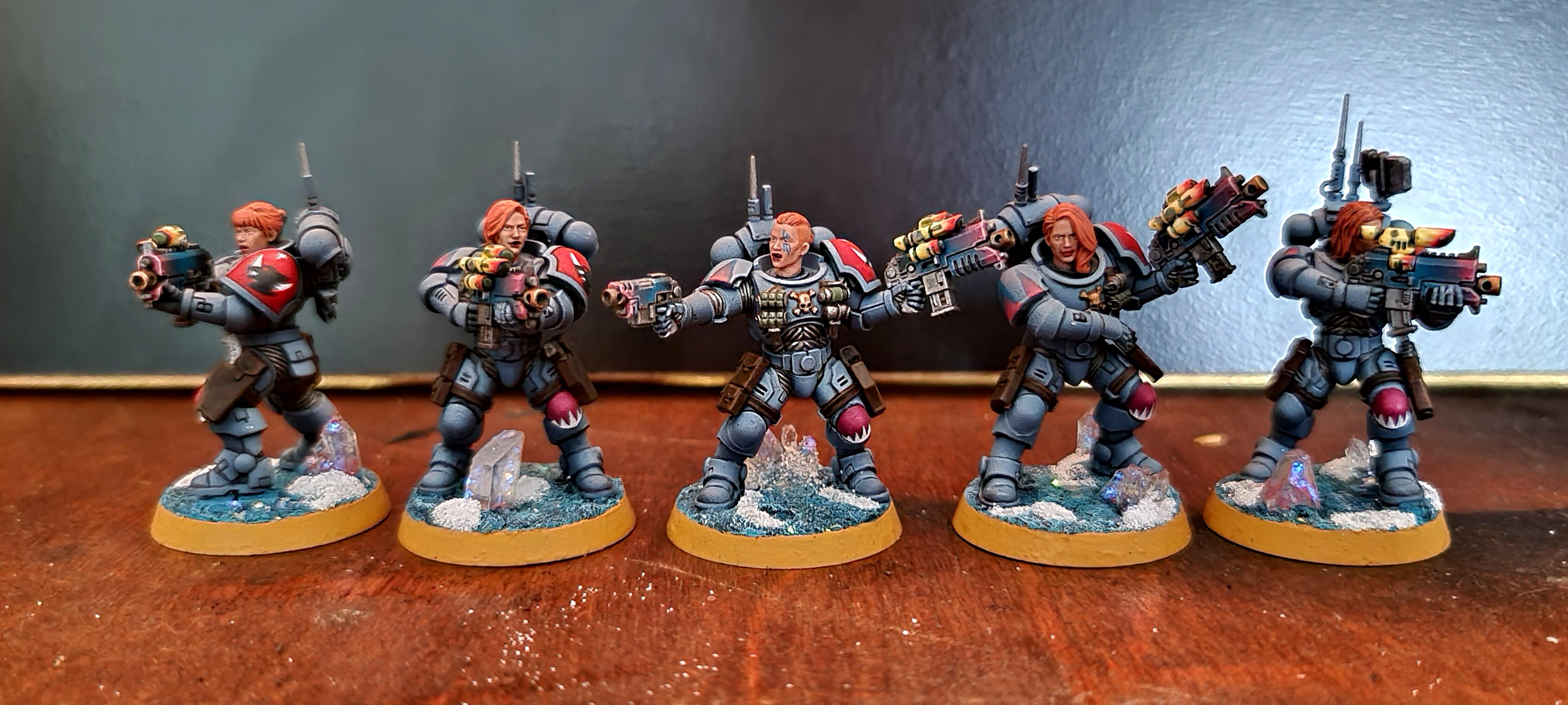
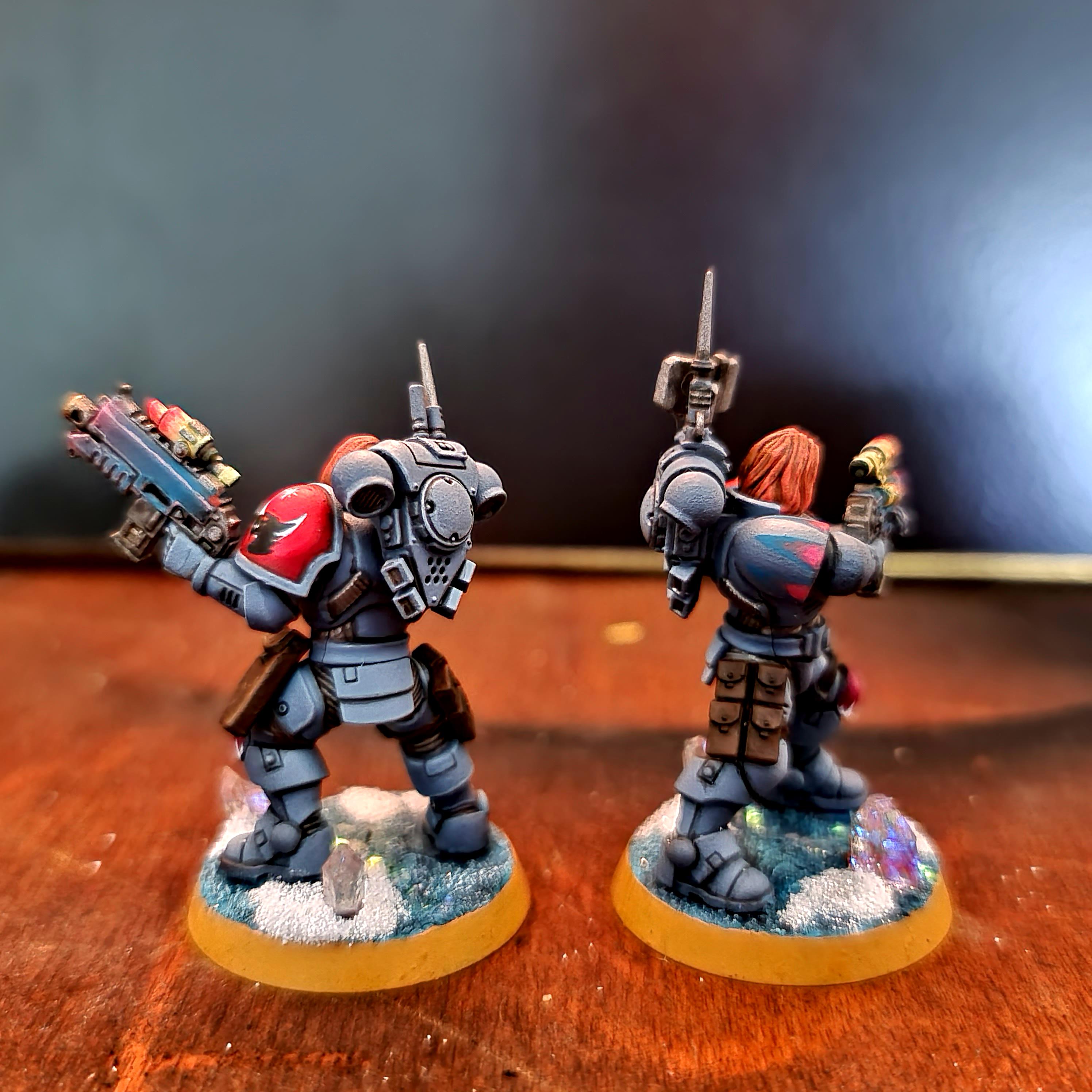
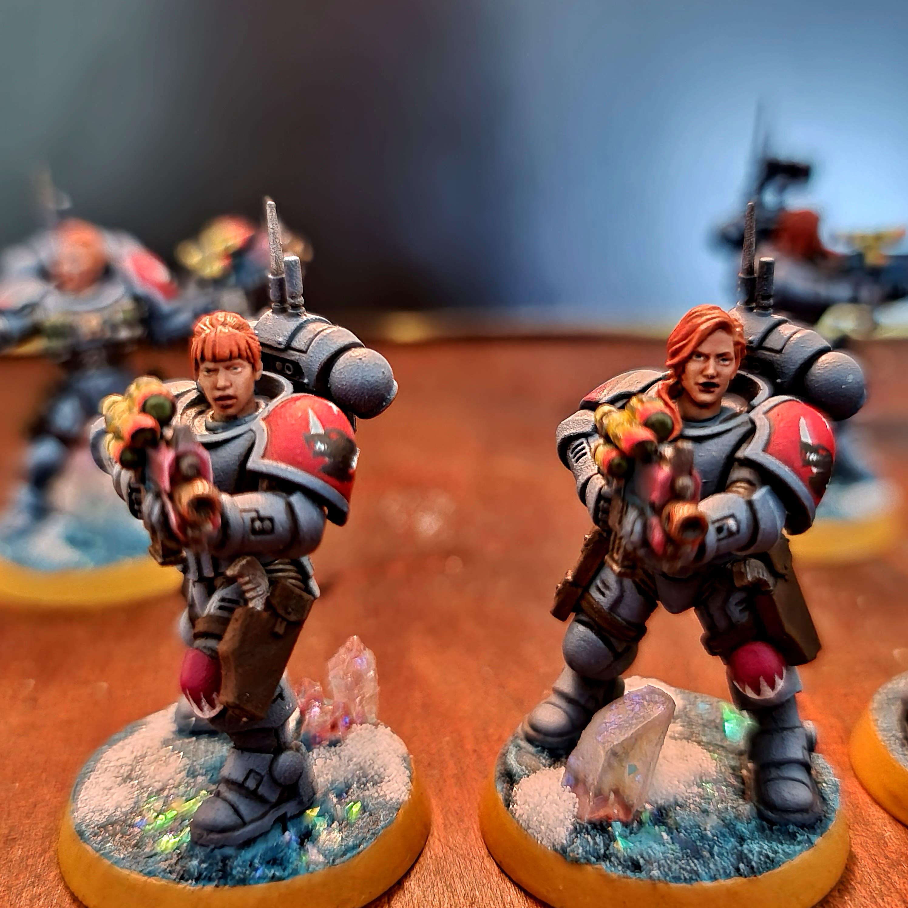
Endtransmission - These are fantastic. They look like they are in a warzone, and you have balanced the tones of the base and the tunics really well so that they stand out, whilst still looking like they can blend in.
Queen_annes_revenge - Really nice composition. The
osl on the leg looks spot on (not that the rest doesn't), and the extra touches like the bottles and paint splatters really help sell the scene.
CancelledApocalypse - A great selection of colours, all really neatly highlighted and shaded. The black and red is my favourite, great looking mini.
416_SpaceWolves - They are neat and the paint looks well applied. You have gotten to a good point to be able to start building up new skills like shading and highlighting.
Pariah Press - A great scheme on beautiful models. Always appreciate seeing something new for the first time. I don't know how they come when new, but I really like the posing on them too.
JoshInJapan - Really nice and clean looking, and they definitely look like they belong in some utopian setting. Extra recognition for the homemade element.
Jamie Shred - Really good use of blacklining, every detail just pops right out. Really bright and crisp.
DV8 - The whole model just looks really crisp and well executed. The autumnal leaves were a really well picked addition.
Freya - Excellent work on those faces, you have pulled off a female paint job tremendously well. And those eyebrows, the girls I teach would be proud of those!
Deadshot - All the details are crisp and clear to see, and overall a really neat paintjob.
Mothniper - The multitude of colours work well together, and the tattoos are really neat-those faces are really small, so you've done really well to get all that detail into them.
JustALittleOrkish - Skeletons by night? They look great and definitely unique.
Viterbi - Great choice of colours, almost like the brides of the Sons of Horus. Not sure how well that would go down with the ecclesiarchy though. The scenery in the background looks really good also.
Thechosen1 - Nice and consistent camo pattern-the colours tie in well together.
Turaxa - Nice city camo scheme, and if that is a plastic orlock head from the one true version of necromunda, then an extra vote for you!
Jadenim - Clean, crisp and you've done a good job of keeping them looking like they belong in the
40k universe, which can often be lost when using third party kits.
Timppaka - I really like these conversions; the reiver head on the palatine body is a great match, and you have definitely created a very sinister tone to them in the paint work.
Ezki - This is definitely one of my favourite entries this month-clean and dirty at the same time. The browns look great against the blues and the snow. It's an excellent piece.
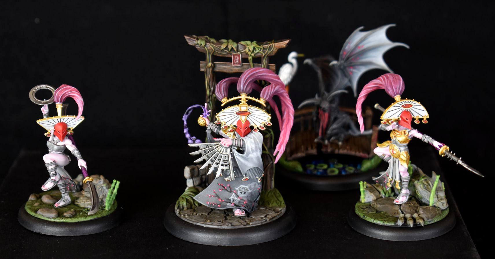
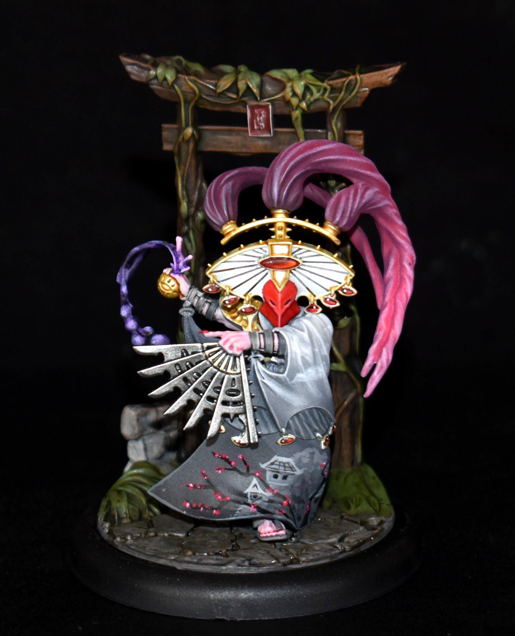
Chris56 - The bases are a work of art in themselves, and help to sell the oriental theme as much as the fantastic kimonos do. Really impressive work. Look forward to seeing the whole warband.
Statistx - You've balanced the weathering and the gore just right, which is not easy on a model that size where its easy to overdo it or be too conservative. The shading on the white also looks really well executed.
Paradigm - Really moody and atmospheric, and you've created some great textures. Even more impressive with the eyesight difficulties you've been having. Hope you are recovering alright.
Tim 121RVC - Lovely work on the red pyramid, the blending looks clean and uniform all the way around.
Maxwin - It all looks really neat and precise. The warriors look like they mean business, and the green blade really stands out, and looks great against the pink matter that is coming out of the fella on the floor. Great job all round.
Modock - I don't even know where to start. It all looks great, the posters, the graffiti, the aging on the walls. Great piece of terrain.
Feltmonkey-they look wonderfully clean and crisp, and really well placed highlights. With the speed to did them in, I wouldn't be surprised if you have the whole indomitus box painted by now. Also-thanks for the comments on mine, and for commenting on everyone every month. Doing similiar myself now has definitely given me an appreciation for how big a commitment it is for you to do it every month.
Midget Gems - Lovely bright green skin, which contrasts well with muted colours elsewhere (that orange really pops.) Plus it's Orks, and that is always a plus. You've done a great job on the leather straps as well.
Maharg - Clean, crisp, neat and tidy. An army looking like that would be very impressive on the table, and its always nice to see alternatives to the box art.
Ms07b3 - Really nice choice and placement of colour. Those diamonds on the chest and boot cuff are ridiculously well done. How did you manage to get so many in without losing their shape?
I think that's it, apologies if I have missed anyone.


 Ultramarines, 3rd Co. and friends, 16k+
  4k
4k  4k Points
 Competition Index


 Finished Forge World Elysian Army
  Finished Tau Sept Cadre
  Alaitoc Eldar Warhost
  Finished Order of Our Martyred Lady - Sisters of Battle
  Finished Necromundian Imperial Guard Regiment