| Author |
Message |
 |
|
|
|
|
Advert
|
Forum adverts like this one are shown to any user who is not logged in. Join us by filling out a tiny 3 field form and you will get your own, free, dakka user account which gives a good range of benefits to you:
- No adverts like this in the forums anymore.
- Times and dates in your local timezone.
- Full tracking of what you have read so you can skip to your first unread post, easily see what has changed since you last logged in, and easily see what is new at a glance.
- Email notifications for threads you want to watch closely.
- Being a part of the oldest wargaming community on the net.
If you are already a member then feel free to login now. |
|
 |
2010/10/12 22:30:57
Subject: Your opinion on colour scheme
|
|

Painting Within the Lines
|
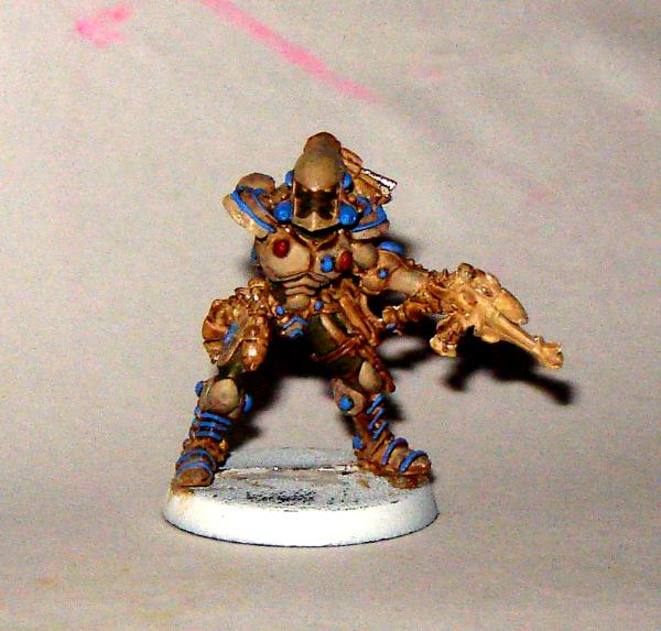
The title says it all, i'm not great at picking out what colour (or if your American Color) goes with what...
So i'd really appreciate your thoughts on this before I commence highlighting.
Thanks
Hangfire
|
FOW: Soviet - Tankovy
Infinity: Aleph
|
|
|
 |
|
2010/10/12 22:36:09
Subject: Re:Your opinion on colour scheme
|
|

Decrepit Dakkanaut
|
Honestly I like how the blue contrasts on the dull white color of the mini. I think it looks good man.
|
|
|
|
|
2010/10/12 22:39:59
Subject: Your opinion on colour scheme
|
|
Painting Within the Lines
|
Thanks for prompt response, it actually Kommando Khaki but looks lighter in the pictures.
My inspiration was my old Windows 98 theme - knew it had to be good for something.
|
FOW: Soviet - Tankovy
Infinity: Aleph
|
|
|
|
|
2010/10/12 22:44:29
Subject: Your opinion on colour scheme
|
|

Shroomin Brain Boy
|
good looking mini, scheme looks really nice
My inspiration was my old Windows 98 theme - knew it had to be good for something
epic decision
|
|
This message was edited 1 time. Last update was at 2010/10/12 22:45:04
|
|
|
|
|
2010/10/13 01:43:50
Subject: Re:Your opinion on colour scheme
|
|
Sadistic Inquisitorial Excruciator
|
Yes that is quite nice.  Brilliant, using an old Windows scheme. Nothing wrong with going with a set of colors you know you like together!
|
"When your only tools are duct tape and a shovel, all of life's problems start to look the same!" - kronk
"Evil will always triumph because good is dumb." - Darth Helmet
"History...is, indeed, little more than the register of the crimes, follies, and misfortune of mankind" - Edward Gibbon, The Decline and Fall of the Roman Empire |
|
|
|
|
2010/10/13 02:10:13
Subject: Your opinion on colour scheme
|
|
Pyromaniac Hellhound Pilot
|
It's a bit similar to my marines here, as well as another army posted in the same thread: http://www.dakkadakka.com/dakkaforum/posts/list/319507.page
M.
|
|
|
|
|
|
2010/10/13 15:26:01
Subject: Your opinion on colour scheme
|
|
Stealthy Space Wolves Scout
|
I really like the colors and the contrast but I think that there is, perhaps, too many spots of the blue scattered about the model. What if you were to paint the helmet entirely blue, while keeping all the other smaller blue points, to give it a focal-point again ?
|

"You never see toilets in the 41st Millennium - that's why everyone looks so angry all the time." - Fezman 1/28/13
|
|
|
|
|
2010/10/15 16:57:07
Subject: Re:Your opinion on colour scheme (more advice please)
|
|
Painting Within the Lines
|
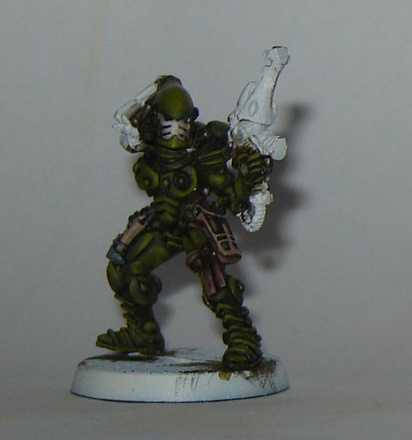
Thanks Myrthe, that's some good feedback.
I'm not entirely comfortable with the colour scheme, so I painted another one...this time using Catachan green as the base colour and highlighting with catachan green/kommando khaki mixes.
The photo makes him look a lot brighter than he is. Up close I'm quite happy with him. From 3 feet away he looks like a black blob, whereas mr desert up top is easy to see from 3 feet away. (Did I make 3 feet up as a standard distance? I'm sure I read that somewhere)
I guess that's a problem with all dark coloured minis.
So thoughts on what I should do about it?
i) Another colour to accentuate it (like the blue on Mr desert - only less blobby) maybe red or orange
ii) Increase the highlighting to help the armour plates stand out
iii) Go with the deserty/Eygptian theme - hope you don't mind Infantryman
iv) Go with a Lugganath scheme (Orange and Black)
v) Something else entirely
 Automatically Appended Next Post: Automatically Appended Next Post: Please anyone?
|
|
This message was edited 1 time. Last update was at 2010/10/15 18:21:47
FOW: Soviet - Tankovy
Infinity: Aleph
|
|
|
|
|
2010/10/15 18:22:08
Subject: Re:Your opinion on colour scheme
|
|
Chalice-Wielding Sanguinary High Priest
Arlington TX, but want to be back in Seattle WA
|
the character looks egyptian themed....which actually would make a pretty impressive eldar army. I like the look
|
 4250 points of Blood Angels goodness, sweet and silky W12-L6-D4 4250 points of Blood Angels goodness, sweet and silky W12-L6-D4
 1000 points of Teil-Shan (my own scheme) Eldar Craftworld in progress 1000 points of Teil-Shan (my own scheme) Eldar Craftworld in progress
 800 points of unassembled Urban themed Imperial Guard 800 points of unassembled Urban themed Imperial Guard
 650 points of my do-it-yourself Tempest Guard 650 points of my do-it-yourself Tempest Guard
 675 points of Commoraghs finest! 675 points of Commoraghs finest!
The Dude - "Jackie Treehorn treats objects like women, man."
Lord Helmet - "I bet she gives great helmet."
|
|
|
|
|
2010/10/15 19:54:13
Subject: Your opinion on colour scheme
|
|
Drop Trooper with Demo Charge
|
I think you should keep with the subdued pattern you already have, adding bright colors to the model would defeat the purpose of the camo. i really like the how the greens are blended. I say stick with it. even a highlighted black on the weapon or kakhi would be nice.
On a side note: i have never seen an Eldar army painted with a subdued color scheme, good work.
|
IMMA FIRIN MAH LASCANNON!!!
O o
/¯/________________________
| FREEEEEEEEEEMMMMMMMM!!!
\_\¯¯¯¯¯¯¯¯¯¯¯¯¯¯¯¯¯¯¯¯¯¯¯¯
|
|
|
|
|
|
|