Forum adverts like this one are shown to any user who is not logged in. Join us by filling out a tiny 3 field form and you will get your own, free, dakka user account which gives a good range of benefits to you:
No adverts like this in the forums anymore.
Times and dates in your local timezone.
Full tracking of what you have read so you can skip to your first unread post, easily see what has changed since you last logged in, and easily see what is new at a glance.
Email notifications for threads you want to watch closely.
Being a part of the oldest wargaming community on the net.
If you are already a member then feel free to login now.
"It is the great irony of the Legiones Astartes: engineered to kill to achieve a victory of peace that they can then be no part of." - Roboute Guilliman
"As I recall, your face was tortured. Imagine that - the Master of the Wolves, his ferocity twisted into grief. And yet you still carried out your duty. You always did what was asked of you. So loyal. So tenacious. Truly you were the attack dog of the Emperor. You took no pleasure in what you did. I knew that then, and I know it now. But all things change, my brother. I'm not the same as I was, and you're... well, let us not mention where you are now." - Magnus the Red, to a statue of Leman Russ
Mandorallen turned back toward the insolently sneering baron. 'My Lord,' The great knight said distantly, 'I find thy face apelike and thy form misshapen. Thy beard, moreover, is an offence against decency, resembling more closely the scabrous fur which doth decorate the hinder portion of a mongrel dog than a proper adornment for a human face. Is it possibly that thy mother, seized by some wild lechery, did dally at some time past with a randy goat?' - Mimbrate Knight Protector Mandorallen.
Excerpt from "Seeress of Kell", Book Five of The Malloreon series by David Eddings.
"You need not fear us, unless you are a dark heart, a vile one who preys on the innocent; I promise, you can’t hide forever in the empty darkness, for we will hunt you down like the animals you are, and pull you into the very bowels of hell." Iron - Within Temptation
Lego, on a similar note, are we likely to see an overhaul of the worksafe theme to bring it in-line with the new Dakka theme? Most of the recent Dakka changes have passed me by somewhat because I use the worksafe theme (I find it easier to read)
There will be gradual updates of the worksafe theme to bring it inline with the main theme. Bit by bit though so that people dont complain about too much change too quickly.
Check out our new, fully plastic tabletop wargame - Maelstrom's Edge, made by Dakka!
I write my emails in Unown.
It confuses my teachers no end.
Veteran Sergeant wrote:If 40K has Future Rifles, and Future Tanks, and Future Artillery, and Future Airplanes and Future Grenades and Future Bombs, then contextually Future Swords seem somewhat questionable to use, since it means crossing Future Open Space to get Future Shot At.
Polonius wrote:I categorically reject any statement that there is such a thing as too much boob.
Coolyo294 wrote:Short answer: No.
Long answer: Noooooooooooooooooooooooooooooooooooooooooooooooooooooooo.
Dakka Bingo! By Ouze "You are the best at flying things"-Kanluwen
"Further proof that Purple is a fething brilliant super villain " -KingCracker
"Purp.. Im pretty sure I have a gun than can reach you...."-Nicorex
"That's not really an apocalypse. That's just Europe."-Grakmar
"almost as good as winning free cake at the tea drinking contest for an Englishman." -Reds8n
Seal up your lips and give no words but mum.
Equip, Reload. Do violence.
Watch for Gerry.
This new font is very annoying, i have to lean back to read the larger font properly.
Its not too noticeable once you're in the thread, numbers at the bottom look a bit weird though. It is, however, very noticeable in the "My Subscribed Threads" page.
This message was edited 1 time. Last update was at 2011/12/05 13:31:33
To those who say that they hate the new font, can you take some screenshots of the worst areas just so I can make sure nothing odd is happening on certain configurations please?
Check out our new, fully plastic tabletop wargame - Maelstrom's Edge, made by Dakka!
I'm used to it now, it's still a little annoying how much space things take up (especially in the little user information section next to posts) but in general it doesn't really bother me much.
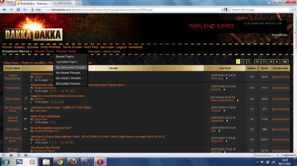
Hmm both screenshots are from Chrome - I wonder if it's a Chrome rendering issue? Can't say I have noticed anything on Firefox (but then again I have only briefly switched to the new theme to check - I normally use worksafe theme).
filbert wrote:Hmm both screenshots are from Chrome - I wonder if it's a Chrome rendering issue? Can't say I have noticed anything on Firefox (but then again I have only briefly switched to the new theme to check - I normally use worksafe theme).
Here.
Automatically Appended Next Post: And with opera.
This message was edited 1 time. Last update was at 2011/12/06 19:31:32


 Black Consuls 1750pts
 High Elves 1500pts
 Imperial Guard 1000pts
 Inquisitorial Allies WIP
 Vampire Counts WIP
 Creator of the First Piston and Sticky Piston on Dakka Minecraft!
 " -KingCracker