| Author |
Message |
 |
|
|
|
|
Advert
|
Forum adverts like this one are shown to any user who is not logged in. Join us by filling out a tiny 3 field form and you will get your own, free, dakka user account which gives a good range of benefits to you:
- No adverts like this in the forums anymore.
- Times and dates in your local timezone.
- Full tracking of what you have read so you can skip to your first unread post, easily see what has changed since you last logged in, and easily see what is new at a glance.
- Email notifications for threads you want to watch closely.
- Being a part of the oldest wargaming community on the net.
If you are already a member then feel free to login now. |
|
 |
2013/02/25 02:47:33
Subject: Cataphractii Terminator Sergeant - Feedback Appreciated
|
|

Focused Dark Angels Land Raider Pilot
|
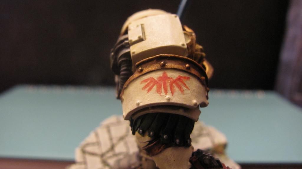
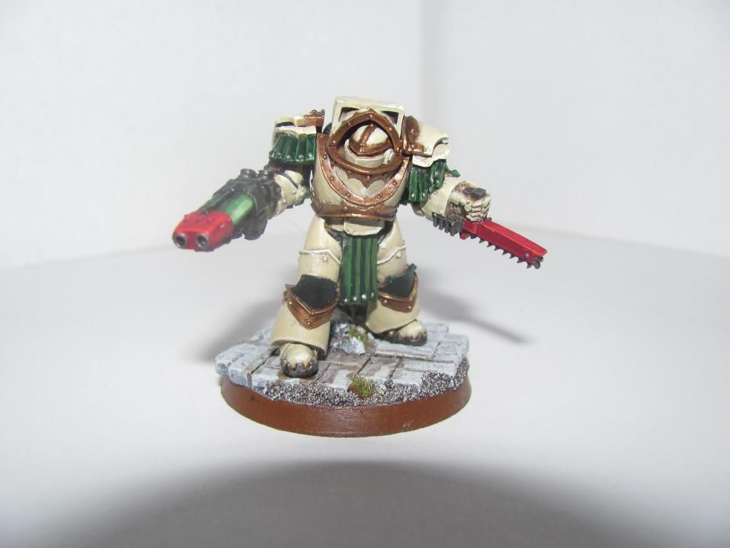
First time trying a lot of new techniques. First freehand chapter symbol in ages.
New things I've done I haven't tried before (or it's been years):
1) Dry blending on armor and leather.
2) Freehand Chapter Symbol
3) Blonde Hair
4) Power Sword that's not just black, highlighted gray.
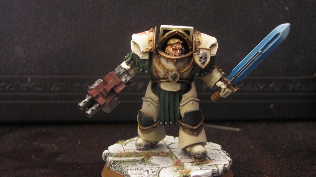
Spoilered below is my absolute best effort before some major changes. See if you can tell the difference:
|
|
This message was edited 1 time. Last update was at 2013/02/25 02:49:46
|
|
|
 |
|
2013/02/25 03:44:41
Subject: Cataphractii Terminator Sergeant - Feedback Appreciated
|
|
Terminator with Assault Cannon
|
Wow, the face is great! I think you need some more weathering on the armor. The bone color is just too clean. Great job so far though!
|
SickSix's Silver Skull WIP thread
My Youtube Channel
JSF wrote:... this is really quite an audacious move by GW, throwing out any pretext that this is a game and that its customers exist to do anything other than buy their overpriced products for the sake of it. The naked arrogance, greed and contempt for their audience is shocking.
= Epic First Post.
|
|
|
|
|
2013/02/25 04:05:05
Subject: Cataphractii Terminator Sergeant - Feedback Appreciated
|
|
Possessed Khorne Marine Covered in Spikes
Ohio
|
Looks really nice! Looks better than your previous one, the green looks more subtle and contrasts the bright bone color.
|
  The Black Hand The Black Hand
|
|
|
|
|
2013/02/25 13:35:47
Subject: Cataphractii Terminator Sergeant - Feedback Appreciated
|
|

Nasty Nob
|
Love the paintjob, though 1 small suggestion if I can. Grab some decals for the chapter symbols, with the great paintjob on the rest of the mini, a nice chapter symbol would go along ways.
|
Current Project: Random quaratine models!
Most Recently Completed: Stormcast Nightvault Warband
On the Desk: Looking into 3D Printing!
Instagram Updates: @joyous_oblivion |
|
|
|
|
2013/02/25 14:37:56
Subject: Cataphractii Terminator Sergeant - Feedback Appreciated
|
|

Water-Caste Negotiator
|
The face and the sword are sensational, but I think that some more intense highlights would go a long way (I did notice a subtle shade around some of the armour panels). Though I know how difficult it is to photograph highlights 
|
 Tau 2000pts Tau 2000pts
Please stop by and give some votes! I'm new here and want your opinions!  |
|
|
|
|
2013/02/25 14:53:47
Subject: Cataphractii Terminator Sergeant - Feedback Appreciated
|
|
Lead-Footed Trukkboy Driver
|
Yes over all great job!! I would say that more pronounced highlights around the edging would make the model. The green areas need a subtle, lighter green highlight just on the highest sides. Please post more, this is a great effort and I would love to see your progress!!
|
Just forgot what I was going to say.  |
|
|
|
|
2013/02/25 15:21:59
Subject: Cataphractii Terminator Sergeant - Feedback Appreciated
|
|
Focused Dark Angels Land Raider Pilot
|
 caminacambob wrote: caminacambob wrote:The face and the sword are sensational, but I think that some more intense highlights would go a long way (I did notice a subtle shade around some of the armour panels). Though I know how difficult it is to photograph highlights
There is a final level highlight on the raised sections of the front, left hand armor (the directly he's facing, towards the "off screen" light source) of Menoth White Highlight:Morrow White at a 1:1 level. It's possible to see it in person, but the photos don't bring it out. I have a lot of issues with the light armors just washing right out when using flash photography so I've stuck with more diffused lighting. Unfortunately, it ends up being grainier.
And yeah, the chapter symbol is easily the weakest part of the paint job. :(
|
|
|
|
|
|
2013/02/25 15:33:03
Subject: Re:Cataphractii Terminator Sergeant - Feedback Appreciated
|
|
Dakka Veteran
|
He looks good - well done 
What I would say is maybe add a touch of verdigris around the bolts on the bronze armour as a way to add a bit more green to the mini (but that's a personal thing). The chapter symbol is okay, whilst the face is very well done. You could perhaps have had a bit more depth in the armour, but it looks good so...me'h.
It's a solid job IMHO 
|
|
|
|
|
|
2013/02/25 16:46:58
Subject: Cataphractii Terminator Sergeant - Feedback Appreciated
|
|

Stealthy Space Wolves Scout
|
well done.
the armour would really benefit from some deeper shadows.
i really like the red stormbolter but i think it doesnt work to well with the blue power weapon
|
|
|
|
|
|
2013/02/25 17:23:11
Subject: Cataphractii Terminator Sergeant - Feedback Appreciated
|
|
Jovial Plaguebearer of Nurgle
|
I agree on the deeper shadows, but I also think that painting all of the bolts silver would go a long way to make the armor seem less flat.
|
|
|
|
|
|
2013/02/26 00:34:24
Subject: Cataphractii Terminator Sergeant - Feedback Appreciated
|
|

Witch Hunter in the Shadows
|
Nice job mate.
|
|
|
|
|
|
2013/02/26 05:20:33
Subject: Cataphractii Terminator Sergeant - Feedback Appreciated
|
|
Focused Dark Angels Land Raider Pilot
|
Thoughts on the feedback so far:
1) Yeah, the chapter symbol is weak. I spent a while trying to recreate it on paper and decided to finally put brush to model and it's... meh. I USED to be able to do it. Before I stopped painting and sold my old Dark Angels army. Now? Not so much. That's why I pushed myself to try it and keep it. I even repainted that three times (sealed the bone armor with Dullcote then used brush cleaner to "erase" the failures) before settling.
2) The rivets is a good idea. I've seen it used well on others after poking around the forum a bit. The next set will have them picked out in silver (with a black or brown undercoat).
3) Shadows is another new thing for me. You can see how I have them on the right leg and I lined every downward facing surface (doesn't always show in the photos). It's not always apparent in the photos. I'll try to make it more obvious. I've been working off a color wheel, matching opposite color to base to make the true color that the shadows should be. Essentially this is my first real attempt at any actual zenithal lighting.
4) The face is shamefully easy. P3 brand Ryn Flesh, Wash of Citadel Riekland Flesh Shade, Highlight Ryn Flesh, Highlight 1:1 mix of Ryn Flesh:Menoth White Highlight. Getting the eyes and teeth were the hardest part.
5) I like the blue power weapon, but that's just me. I started painting in 2nd Edition (the red period, I know now), and it pulls at the heartstrings a bit with the bright weapon colors.
|
|
|
|
|
|
2013/02/26 05:46:36
Subject: Re:Cataphractii Terminator Sergeant - Feedback Appreciated
|
|
Stalwart Space Marine
|
Fantastic job! i "REALLY" like the look of this guy. He screams "CHARACTER"! I will certainly have to give your flesh tones a try. Ass for the chapter badge i think if you made it a bit more solid and slightly bigger it will good fine. As for the Bolts it's great for breaking up a color but as you dont really need that i would just suggest adding a bit more depth rather then making them all silver. But i can certainly understand if you want to as i did on mine  Great job on actually using complementary colors as well! Many people don't think the same way but i feel it adds more realism.
AGAIN FANTASTIC JOB! I would really like to see the squad 
|
For the glory of Dorn, and all who follow him!    |
|
|
|
|
2013/02/26 06:40:00
Subject: Cataphractii Terminator Sergeant - Feedback Appreciated
|
|
Decrepit Dakkanaut
|
So, you're running a very fine line between realistic and cartoonish levels of contrast, so take everything I say with a touch of caution
1.) The armor could use the TEENIEST bit more contrast I don't know if it should be very lightly washed, or lightly highlighted. As for the leather, the effect is completely lost. It definitely needs a little more contrast. The thing to consider will be if you want more saturation, or merely a more pronounced shading/highlighting.
2.) The problem with the chapter symbol is that it lacks definition. I'd go back over it with a bit more paint on the brush and make some bolder strokes. If you make mistakes (assuming your paint is thin enough), you can always go back in and re-paint your bone color over any mistakes made with the red.
I've done the same thing with contrasting colors before to make fine detail. You put on the one color, and it has the customary rounded edges of the paintbrush, but then you go back over the edges (or at least the ends) with the background color, and it makes it look really crisp. Avoid putting too much paint down, though.
3.) The hair looks really nice, actually.
4.) The same thing with contrast. Either make the darks darker or try and make the white lines a little bit thinner. At the moment, it looks slightly... caked on.
Of course, all of this advice is given on a model that is shown at a way huger size than in real life. Over all, the model looks nice. You're at the point where improvements are sort of nit-picky.
|
|
This message was edited 1 time. Last update was at 2013/02/26 06:40:36
|
|
|
|
|
2013/02/26 13:09:32
Subject: Cataphractii Terminator Sergeant - Feedback Appreciated
|
|
Chalice-Wielding Sanguinary High Priest
Arlington TX, but want to be back in Seattle WA
|
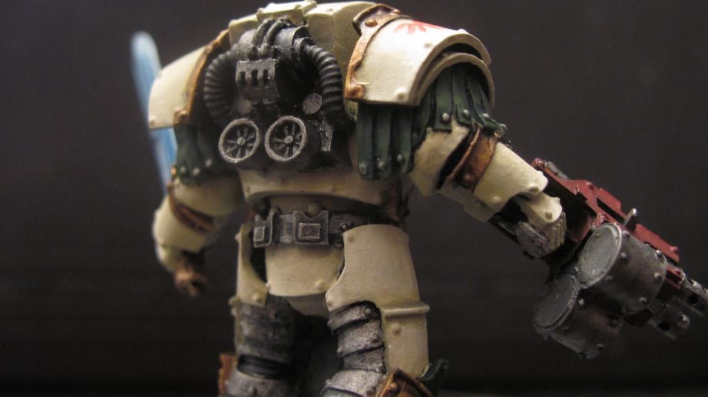
Real nice paint job. I love the visible power generator on the terms back
|
 4250 points of Blood Angels goodness, sweet and silky W12-L6-D4 4250 points of Blood Angels goodness, sweet and silky W12-L6-D4
 1000 points of Teil-Shan (my own scheme) Eldar Craftworld in progress 1000 points of Teil-Shan (my own scheme) Eldar Craftworld in progress
 800 points of unassembled Urban themed Imperial Guard 800 points of unassembled Urban themed Imperial Guard
 650 points of my do-it-yourself Tempest Guard 650 points of my do-it-yourself Tempest Guard
 675 points of Commoraghs finest! 675 points of Commoraghs finest!
The Dude - "Jackie Treehorn treats objects like women, man."
Lord Helmet - "I bet she gives great helmet."
|
|
|
|
|
2013/02/26 17:13:49
Subject: Re:Cataphractii Terminator Sergeant - Feedback Appreciated
|
|
Focused Dark Angels Land Raider Pilot
|
Gearhart wrote:Fantastic job! i "REALLY" like the look of this guy. He screams "CHARACTER"! I will certainly have to give your flesh tones a try. Ass for the chapter badge i think if you made it a bit more solid and slightly bigger it will good fine. As for the Bolts it's great for breaking up a color but as you dont really need that i would just suggest adding a bit more depth rather then making them all silver. But i can certainly understand if you want to as i did on mine Great job on actually using complementary colors as well! Many people don't think the same way but i feel it adds more realism.
AGAIN FANTASTIC JOB! I would really like to see the squad
Actually, it's your Imp Fist Cataphracts that I was looking at in regards to picking out the rivets. They look spectacular.
|
|
|
|
|
|
2013/02/27 03:46:54
Subject: Re:Cataphractii Terminator Sergeant - Feedback Appreciated
|
|
Stalwart Space Marine
|
 CIsaac wrote: CIsaac wrote:
Actually, it's your Imp Fist Cataphracts that I was looking at in regards to picking out the rivets. They look spectacular.
Thanks! Your far too kind my friend... But if that's the case then by all means go for it, In your case I think it will break up the color nicely as well as add a better sense of depth to the rivets themselves! Hope to see some more mate!
|
|
This message was edited 1 time. Last update was at 2013/02/27 03:48:03
For the glory of Dorn, and all who follow him! |
|
|
|
|
2013/02/27 06:13:04
Subject: Re:Cataphractii Terminator Sergeant - Feedback Appreciated
|
|
Secretive Dark Angels Veteran
|
Very nice, much better than the first one (photography?) Still not a fan of the colour scheme, however. Green and bone just doesn't look as nice as red and bone.
Get some weathering/chipping in?
|
|
|
|
|
|
|
|
 Dark Angels (Black Armor Themed)
 :
:
 Mechanicus
 Ravenwing
 Deathwing