Switch Theme:

WIP First GK terminator.  [RSS] Share on facebook Share on Twitter Submit to Reddit
»
Author Message
Advert


Forum adverts like this one are shown to any user who is not logged in. Join us by filling out a tiny 3 field form and you will get your own, free, dakka user account which gives a good range of benefits to you:
  • No adverts like this in the forums anymore.
  • Times and dates in your local timezone.
  • Full tracking of what you have read so you can skip to your first unread post, easily see what has changed since you last logged in, and easily see what is new at a glance.
  • Email notifications for threads you want to watch closely.
  • Being a part of the oldest wargaming community on the net.
If you are already a member then feel free to login now.


Made in us
Neophyte undergoing Ritual of Detestation


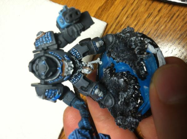
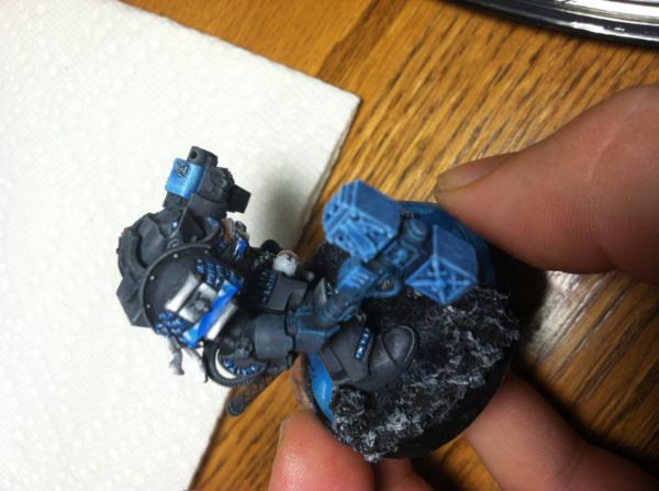
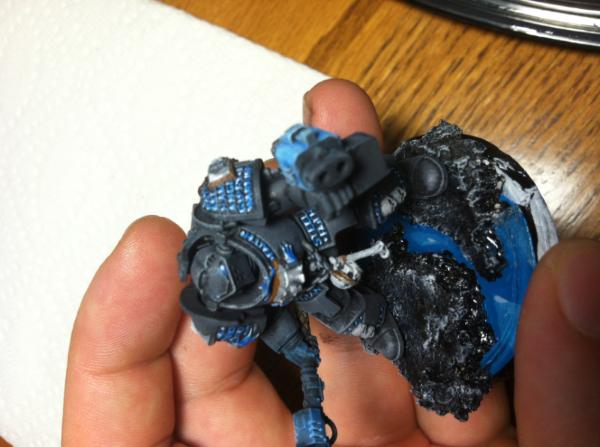
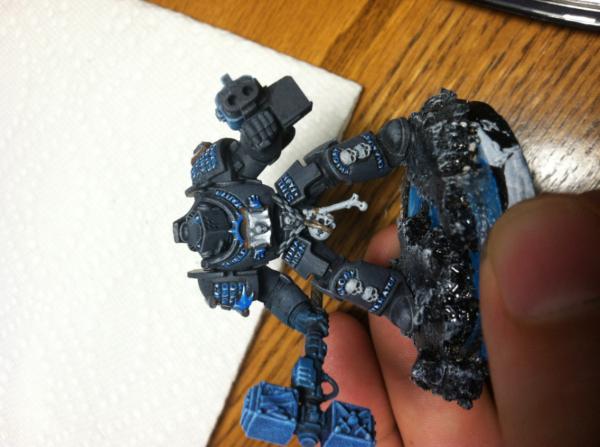
Ok so this is a work in progress. Looking for some advice as I modify him or move forward with other minis.

Things I am still needing to finish.
- Glue mini to base
- Use some polyethylene to add snow to the base
- Mess with my polymer on the base to make it more ice like
- Maybe add some more white highlights to the hammer in the corners to make it pop a little more.


Things I wanted to do with this mini.
- Have a cool color scheme
- not use metalic paints at all (I don't like them)
- not use washes (I much prefer working with inks)
- go for a very dark grey (its 5 parts the darkest grey I could find with 4 parts black, though it comes out lighter after layers of dry brushing other highlights in)
- try a few different techniques out

Things I tried on a previous test mini
- tried adding in an orange for lettering (didn't like it)
- tried wet blending the entire thing (worked but I lost patience lol)
- I am not that great at NMM =/

I don't have much experience with painting. I have probably completed a total of 20 minis (mostly a color or two with dry brushing because I am lazy) over the past 10+ years. I did this test mini a little bit each night after work while watching TV. Advice would be appreciate, or ideas to go further.
   
Made in at
Been Around the Block


Maybe a bit natural shadow/highlight could help, at the moment the grey/black looks a little flat.

But I like the colour scheme, the blue looks very nice ... and how did you do the eyes? They look amazing.
   
Made in us
Decrepit Dakkanaut


Madison, WI

I like the grey and blue together. Nice effect with the highlights on the letters. You might try a little more contrast in the grey... it's a bit flat (but not bad at all).

Anvildude: "Honestly, it's kinda refreshing to see an Ork vehicle that doesn't look like a rainbow threw up on it."

Gitsplitta's Unified Painting Theory
 
   
Made in gb
Brigadier General


The new Sick Man of Europe

I ask why you don't like using metallic paints.

This message was edited 1 time. Last update was at 2013/09/03 15:07:43


DC:90+S+G++MB++I--Pww211+D++A++/fWD390R++T(F)DM+
 
   
Made in us
Grey Knight Psionic Stormraven Pilot


Sacramento, CA

I am no great painter, so take this with a grain of salt. But the grey is way out of contrast with your other work in this figure. If you're not going to use metalics, then you need to work with the whole grey spectrum to enhance your shading. Add a bit more black for the shadowed areas, and a bit of white for the highlighted areas. Right now it just looks primered. with a bit of blue and white area's painted. You should add some color to the weapons accented areas. There are trim pieces on the armor that I would think about coloring other than grey. If you look at the shoulder pads, you can see that there is the pad, then a piece along the upper edge that should probably take on a bit of a different color. Mabye a lighter grey or darker, whichever you like more. Basically, I'd give the grey areas a lot more shading work. Don't forget that black outlining can really make detail pop. Hopefully this helps a little bit.


REPENT! For tomorrow you die!

"I may not have gone where I intended to go, but I think I have ended up where I needed to be." - Douglas Adams 
   
Made in gb
Morphing Obliterator


Medrengard

Just a guess about the eyes, but is it blue ink over a white base? I use this technique on my plasma coils.

This message was edited 1 time. Last update was at 2013/09/03 22:33:12


12000 pts
5000pts 
   
Made in us
Neophyte undergoing Ritual of Detestation


The eyes are actually 3 shades of blue that is what the lettering was done with. As for the grey there actually is more shading but the iphone didn't pic up as much. The highlights could use more yes, but I found that I lost the dark grey feel I was going for if I added in too much with the highlights.
   
Made in us
Perfect Shot Ultramarine Predator Pilot


San Jose, California

hard highlights on the armor edges would give it some pop.

being recalculated~4.5k 750 875 My p&m blog where there are space marines http://www.dakkadakka.com/dakkaforum/posts/list/545810.page DA:90+S+G++M++B--I+Pw40k12+D+A++/wWD-R+T(M)DM+
 TheDraconicLord wrote:
Holy crap, you have been pumping out Smurfs like a man-possessed
 Kid_Kyoto wrote:

Morris, tragically sold his soul to the Chaos Gods of Flowers, Dancing, Laughter and Friendship. The Morris Heresy is on record as the shortest and least successful heresy in Imperial history.
 Camkierhi wrote:
thats the best group of ass I've seen on the net, and I've looked at alot.
 
   
Made in us
Grey Knight Psionic Stormraven Pilot


Sacramento, CA

If you just lined edges with black ink, that would create greater definition. For instance, look at the last picture. If you look at the hand and the gun, it is hard to see that they are really separate. But if you were to line inbetween each finger with black ink. Then line the edges of the gun. You'd give each area definition from each other. Also, I'd put some black ink in each of the barrel holes. In the area that is under and behind the shoulder pads, I'd shade those areas with a darker grey. That way the shoulder pad would stick out a bit more. You really only need to define each area of the model a bit more. Lining with black ink will help a lot. Just use a very fine brush.


REPENT! For tomorrow you die!

"I may not have gone where I intended to go, but I think I have ended up where I needed to be." - Douglas Adams 
   
 
Forum Index » Painting & Modeling
Go to: