| Author |
Message |
 |
|
|
|
|
Advert
|
Forum adverts like this one are shown to any user who is not logged in. Join us by filling out a tiny 3 field form and you will get your own, free, dakka user account which gives a good range of benefits to you:
- No adverts like this in the forums anymore.
- Times and dates in your local timezone.
- Full tracking of what you have read so you can skip to your first unread post, easily see what has changed since you last logged in, and easily see what is new at a glance.
- Email notifications for threads you want to watch closely.
- Being a part of the oldest wargaming community on the net.
If you are already a member then feel free to login now. |
|
 |
2011/03/26 11:53:04
Subject: GW 'artists', please read about proportion
|
|

Oberleutnant
|
Ultrafool wrote:ArbeitsSchu wrote:Ultrafool wrote:Man when will people stop complaining about a freakin drawing. Of course his proportions are wrong because he is a 7-10ish super human with x amount of the same organ that is from a game you play with plastic toy soldiers. I hate when people bash on an artist when most of them don't even have the talent to draw a stick figure. Seriously guys its a picture or drawing or whatever.
But given the wide availability of the internet, and the huge variety of people who use it, there are also more than a few who have copious amounts of artistic talent or are well-tutored in art and art-history and who are very well qualified to say whether a piece of art has merit, or is in fact the scribblings of a talentless oik. Can I assume from your statement that you don't mind people who CAN draw bashing an artist?
People who can draw or have knowledge of art don't bash, they critique in a intellegent way. Not "it has a small dumb looking head and its just plain stupid because the head makes everything look ugly", but say in what areas the artist can improve and yada yada.
Clearly you never spent any time with Brian Sewell. (British Art Critic and complete posh-bitch and the very definition of pretentious.) I'm paraphrasing because I can't quite get his unique tone, but his response would certainly be "You could improve it by learning about proportion and giving him a bigger head." along with some cutting jibe in reference to some artist you never heard of, but feel you should have.
I should stress.. I have spent time with this man, and his peers. "Bash" is too brute a word for the razor-sharp snide commentary they employ, but if anything it is more painful than "bashing". Automatically Appended Next Post: @Chibi.. Moopy and others already covered some of the response, so i won't go over the same ground. However, I will add a few things.
It isn't just the head which is too small. Its the fact that in order for the rest of his limbs to reach the required parts of his armour to operate them, he would have to be incredibly oddly distorted, a little like the Cloners in Star Wars whatever-episode, with the long wavy necks and so on. Whilst it is true that the background says that Marines have a variety of extra organs, they do not have so many that the torso would be substantially larger, or any that might give them long tentacle-limbs or any of the other strange changes necessary for that marine to use his fingers.
Secondly, there are plenty of references to people other than marines using Powered Armour, and they aren't all bent out of shape. In fact some of them are very much IN shape..Sisters of Battle have power-armoured corsets! So it can't be the nature of the armour. Likewise, marine armour has never been described as operating like a Dreadnought - a pilot who "drives" a suit - so it seems unlikely that he physically doesn't reach to his fingers. Jes Goodwin scales a Marine as being 8ft to the top of his backpack, 7ft at the neckline. Even his version doesn't completely work..in fact its almost impossible to fit a man in a marine suit and make it look the same as the art/figures..but his depiction, by the use of proper proportions LOOKS like it might work.
I've never seen ANY fluff that suggested that Marines have teeny heads either. In other words, a fluff-based interpretation doesn't explain the sheer deformity of that style of Marine.
Even allowing for a worms-eye view, the marines physical proportions are still very wrong. There is nothing amiss with the artists rendering skills, or his colour-choice, JUST his use of proportion...which could have easily been avoided with a mild increase in noggin-size, and shaving an inch or two off the odd limb. Nobody is expecting Marines to be exactly human-shaped in proportion...the Arnold-body-builder example is probably closest, with all proportions increased to a larger size. Some degree of distortion is expected, this being "fantasy" art, with a long tradition of exaggerating certain attributes, but some of these marine pictures are an exaggeration too far.
And if I had to pick a GW artist who does draw Marines well, its Goodwin all the way. Gothic and the Eldritch is a beautiful book, with a full-sized drawing of a Marine in the back...but then GW artists have always been variable in quality.
|
|
This message was edited 1 time. Last update was at 2011/03/26 12:20:21
"There's a time when the operation of the machine becomes so odious—makes you so sick at heart—that you can't take part. You can't even passively take part. And you've got to put your bodies upon the gears and upon the wheels, upon the levers, upon all the apparatus, and you've got to make it stop. And you've got to indicate to the people who run it, to the people who own it that unless you're free, the machine will be prevented from working at all" Mario Savio |
|
|
 |
|
2011/03/26 12:21:19
Subject: GW 'artists', please read about proportion
|
|
Courageous Silver Helm
|
Mark1130 wrote: I play this game and others to escape reality. Pic like the grey knights helps. If I wanted to see the correct size of a forarm, I'll look at a fitness mag. The style the artist used helps me imagine a 40k Human Space Marine and there sheer power and size.
I incourage GW to continue this kinda of art. It reminds me of the overall scale and power of the 40k Universe and it races.
Amen.
Also, after spending the morning in my local GW, helping the blue-shirts herd the usual influx of hyped-up 11-yearolds, I can say that no-on in the store (including the gang of regulars who are not kids, I must add) has anything but good things to say about that cover.  So... success achieved- at least in Portsmouth. No-one will be shunning the Grey Knights because they have small heads here! 
At the end of th day, though, I think this comes down to personal artistic preference, and there really is no right or wrong answer with that. Some people will like the art and takeit as it is, and some people will wince every time they look at it. Nothing has changed with that, and nothing WILL change with it. For as long as someone has a pencil to draw with other people will either like or dislike the work that they produce. 
|
I have recently been diagnosed with swelling in the brain, so please excuse spelling mistakes and faulty sentences. I am losing my ability to type and talk effectively, but dammit, that is not going to stop me from trying. |
|
|
|
|
2011/03/26 12:55:55
Subject: Re:GW 'artists', please read about proportion
|
|

Joined the Military for Authentic Experience
On an Express Elevator to Hell!!
|
Fitness mag for a correct size of forearm? You mean like this?

or like this ?
(Sorry couldn't resist)
|
|
|
|
|
|
2011/03/26 14:03:22
Subject: GW 'artists', please read about proportion
|
|

Foxy Wildborne
|
ITT:
Art is objectively bad because I don't like it.
The cover sucks because the head is too realistic.
The cover sucks because the limbs aren't realistic enough.
|
|
This message was edited 1 time. Last update was at 2011/03/26 14:03:35
The old meta is dead and the new meta struggles to be born. Now is the time of munchkins. |
|
|
|
|
2011/03/26 16:10:46
Subject: GW 'artists', please read about proportion
|
|

Guard Heavy Weapon Crewman
Toronto
|
[Deleted by Moderator].
|
|
This message was edited 2 times. Last update was at 2011/03/26 20:29:40
|
|
|
|
|
2011/03/26 22:28:24
Subject: GW 'artists', please read about proportion
|
|

Blood-Drenched Death Company Marine
|
Mark1130 wrote:
Why does everything have to be realistic? Why cant artists exagerated things?
While not the OP, I'll chime in on this one.
Regardless of the genre, artwork works really well when you set up rules. You are visually telling the audience these "rules" through your art and they're accepting it. The rules could be: using a very tight color pallet, using strong value contrast, using specific compositional elements, etc. When you draw the vast majority of the art work realistically, you've set up another rule- you've set the audience's expectation for a realistic piece. Then you give them the out of proportioned head they say, "Huh" because you broke the rule. In this case it's magnified because the face is a primary compositional element that they eye goes to first.
That said, every rule can and has been broken and created great art because of it. However you have to be careful because it can be jarring to your audience; some people don't like broken rules. I think I said everything else in my previous posts in the discussion with Chibi, which I greatly enjoyed.
I don't take issue with the artist, but with the art director. If your boss tells you to paint something, you paint it.
|
|
This message was edited 6 times. Last update was at 2011/03/27 00:32:22
|
|
|
|
|
2011/03/27 03:40:47
Subject: Re:GW 'artists', please read about proportion
|
|
Fixture of Dakka
|
After seeing the Grey Knights in the flesh? YOU think that that painting is out of scale?
Your joking, right?
If your butt hurtover the painting, stay away from them at your local shop.
Wost thing I'm calling on GW these days is thier scale creep. That painting is picasso, compared to the minis.
Along with them being too out of scale, I don't mind saying that they are a power gamers wet dream.
Don't bother even putting down your minis as an opponent, because that painting isn't the only thing your going to be butthurt about....
|

At Games Workshop, we believe that how you behave does matter. We believe this so strongly that we have written it down in the Games Workshop Book. There is a section in the book where we talk about the values we expect all staff to demonstrate in their working lives. These values are Lawyers, Guns and Money. |
|
|
|
|
2011/03/27 05:33:30
Subject: GW 'artists', please read about proportion
|
|

Anti-Armour Swiss Guard
|
May as well ask comics artists to pull their heads in and do anatomically correct art.
Ain't going to happen there, either.
Comicbookfanboys have accepted it as normal. Therefore the 'standard' has been redefined.
|
I'm OVER 50 (and so far over everyone's BS, too).
Old enough to know better, young enough to not give a ****.
That is not dead which can eternal lie ...
... and yet, with strange aeons, even death may die.
|
|
|
|
|
2011/03/27 07:01:37
Subject: GW 'artists', please read about proportion
|
|

[MOD]
Anti-piracy Officer
Somewhere in south-central England.
|
Grot6 and chromedog combine to make an interesting point about the proportions of the actual models.
40K is so widespread, among younger gamers at least, that the weird disproportion of GW's "heroic" figures has come to be seen as standard and realistic.
That's why there are always complaints of "this model wouldn't fit in 40K" whenever someone posts a picture of a model from an alternative manufacturer.
|
|
|
|
|
|
2011/03/27 07:07:59
Subject: GW 'artists', please read about proportion
|
|
Joined the Military for Authentic Experience
On an Express Elevator to Hell!!
|
chromedog wrote:May as well ask comics artists to pull their heads in and do anatomically correct art.
Ain't going to happen there, either.
Comicbookfanboys have accepted it as normal. Therefore the 'standard' has been redefined.
I guess perhaps the common perception is then that this isn't 'comic book' art. The level of detail the guy has got with the picture is massively impressive, and while not photo-realistic, its pushing towards that end of the scale and away from abstraction.
There was an artist who did a series of Slaine comic books for 2000AD some years back, of digitially drawn art, but I'm not sure if its the same guy or just the same style. Because the other aspects of the art in that comic looked so perfect (and absolutely anatomically correct), it looks absolutely tremendous. But, while attempting realism, and where the human form is concerned, you could make an argument for correct anatomical proportions.
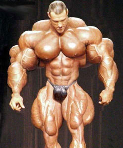
I think perhaps this is part of the reason why so many people are crying foul about this painting and previously the BA one. In the same way that so many people look at that god-awful weightlifter photo and comment that it must have been photoshopped. This piece has attempted to marry two conceptual styles together, and at least in my opinion has failed.
|
|
|
|
|
|
2011/03/28 12:07:28
Subject: GW 'artists', please read about proportion
|
|
Regular Dakkanaut
|
ph34r wrote:Anyone want to post the cover for the WD for those of us who do not enjoy shelling out $10 a month for an advertisement? Is it the codex cover?
 Automatically Appended Next Post:
And also...
 Automatically Appended Next Post:
Compare...

|
|
This message was edited 3 times. Last update was at 2011/03/28 12:13:25
|
|
|
|
|
2011/03/28 12:53:57
Subject: GW 'artists', please read about proportion
|
|

Druid Warder
|
if the IG were drawn in the same proportions then that would be a problem
but the IG are routinely drawn with more realistic proportions so this is a deliberate artistic direction
these professional artists are pros for a reason they know what the rules are. but sometimes it pays to know WHEN to break those rules too
|
Hey, I just met you,
and this is crazy,
but I'm a demon,
possess you, maybe?
|
|
|
|
|
2011/03/28 14:55:10
Subject: GW 'artists', please read about proportion
|
|
Dominar
|
With the full authority of my completely irrelevant credentials, I safely say that there is literally no tinyhead/huge body violation worse than the Grey Knight Grand Master pic in the 'unit fluff' section of the GK codex. It literally looks like a mutated midget piloting a giant GK Terminator battlemech.
|
|
|
|
|
2011/03/28 15:05:04
Subject: GW 'artists', please read about proportion
|
|
[DCM]
Coastal Bliss in the Shadow of Sizewell
Suffolk, where the Aliens roam.
|
ArbeitsSchu wrote:
Automatically Appended Next Post:
@Chibi.. Moopy and others already covered some of the response, so i won't go over the same ground. However, I will add a few things.
It isn't just the head which is too small. Its the fact that in order for the rest of his limbs to reach the required parts of his armour to operate them, he would have to be incredibly oddly distorted, a little like the Cloners in Star Wars whatever-episode, with the long wavy necks and so on. Whilst it is true that the background says that Marines have a variety of extra organs, they do not have so many that the torso would be substantially larger, or any that might give them long tentacle-limbs or any of the other strange changes necessary for that marine to use his fingers.
Secondly, there are plenty of references to people other than marines using Powered Armour, and they aren't all bent out of shape. In fact some of them are very much IN shape..Sisters of Battle have power-armoured corsets! So it can't be the nature of the armour. Likewise, marine armour has never been described as operating like a Dreadnought - a pilot who "drives" a suit - so it seems unlikely that he physically doesn't reach to his fingers. Jes Goodwin scales a Marine as being 8ft to the top of his backpack, 7ft at the neckline. Even his version doesn't completely work..in fact its almost impossible to fit a man in a marine suit and make it look the same as the art/figures..but his depiction, by the use of proper proportions LOOKS like it might work.
I've never seen ANY fluff that suggested that Marines have teeny heads either. In other words, a fluff-based interpretation doesn't explain the sheer deformity of that style of Marine.
Even allowing for a worms-eye view, the marines physical proportions are still very wrong. There is nothing amiss with the artists rendering skills, or his colour-choice, JUST his use of proportion...which could have easily been avoided with a mild increase in noggin-size, and shaving an inch or two off the odd limb. Nobody is expecting Marines to be exactly human-shaped in proportion...the Arnold-body-builder example is probably closest, with all proportions increased to a larger size. Some degree of distortion is expected, this being "fantasy" art, with a long tradition of exaggerating certain attributes, but some of these marine pictures are an exaggeration too far.
And if I had to pick a GW artist who does draw Marines well, its Goodwin all the way. Gothic and the Eldritch is a beautiful book, with a full-sized drawing of a Marine in the back...but then GW artists have always been variable in quality.
Thats my take on the situation pretty much spot on.
Of course everyone has missed the obvious conclusion, artist is a big Thrud the Barbarian fan. 
|
"That's not an Ork, its a girl.." - Last words of High General Daran Ul'tharem, battle of Ursha VII.
Two White Horses (Ipswich Town and Denver Broncos Supporter)
|
|
|
|
|
2011/03/28 18:35:52
Subject: Re:GW 'artists', please read about proportion
|
|
Longtime Dakkanaut
|
I never realised how serious this discussion could get! First off I actually like the painting in question but I think even allowing for artistic licence the head is way too small for the body. As far as I can make out his feet would just about reach the armour knees. What irritates me is that the artist has no doubt put a lot of time and effort into the painting only to spoil the finish with a small head! I'm sure that marines and Grey Knights would look truly imposing if they actually looked like they dominated the armour, a good comparison would be a toddler trying to wear an American football uniform in adult size: how would that be imposing?
|
|
|
|
|
|
2011/03/28 22:09:51
Subject: Re:GW 'artists', please read about proportion
|
|
Oberleutnant
|
Those images above would be better scaled for a Dreadnought than standard power armour..or at a push Terminator armour.
|
"There's a time when the operation of the machine becomes so odious—makes you so sick at heart—that you can't take part. You can't even passively take part. And you've got to put your bodies upon the gears and upon the wheels, upon the levers, upon all the apparatus, and you've got to make it stop. And you've got to indicate to the people who run it, to the people who own it that unless you're free, the machine will be prevented from working at all" Mario Savio |
|
|
|
|
2011/03/29 00:20:53
Subject: GW 'artists', please read about proportion
|
|
Smokin' Skorcha Driver
|
In a lot of the art Sm head look too small, even with there helmets on. Personally, I prefer that look to the actual models, who may I remind you, aren't that great in terms of proportional realism either.
Also, if it was Terminator armor it would look fine, since that armor is so huge and bulky.
|
|
This message was edited 1 time. Last update was at 2011/03/29 00:22:45
|
|
|
|
|
2011/03/29 03:38:02
Subject: GW 'artists', please read about proportion
|
|
Anti-Armour Swiss Guard
|
Pacific wrote:chromedog wrote:May as well ask comics artists to pull their heads in and do anatomically correct art.
Ain't going to happen there, either.
Comicbookfanboys have accepted it as normal. Therefore the 'standard' has been redefined.
I guess perhaps the common perception is then that this isn't 'comic book' art. The level of detail the guy has got with the picture is massively impressive, and while not photo-realistic, its pushing towards that end of the scale and away from abstraction.
There was an artist who did a series of Slaine comic books for 2000AD some years back, of digitially drawn art, but I'm not sure if its the same guy or just the same style. Because the other aspects of the art in that comic looked so perfect (and absolutely anatomically correct), it looks absolutely tremendous. But, while attempting realism, and where the human form is concerned, you could make an argument for correct anatomical proportions.
I think perhaps this is part of the reason why so many people are crying foul about this painting and previously the BA one. In the same way that so many people look at that god-awful weightlifter photo and comment that it must have been photoshopped. This piece has attempted to marry two conceptual styles together, and at least in my opinion has failed.
It isn't 'comic book' art?
It sure as hell isn't "high art" either. It is closer to "comic book art" than high art though and this is why I drew the parallel.
It follows the "superheroic" themes of comic books.
Nobody wants to play an "everyman" tabletop game when they can be a superhuman fighting machine.
Several noted '2000AD' artists (and writers) have worked on 40k over the years. Simon "the Biz" Bisley to name one (and he also did Slaine for several years). Biz isn't noted for his "accuracy" (not in Lobo anyway).
|
I'm OVER 50 (and so far over everyone's BS, too).
Old enough to know better, young enough to not give a ****.
That is not dead which can eternal lie ...
... and yet, with strange aeons, even death may die.
|
|
|
|
|
2011/03/29 04:50:23
Subject: Re:GW 'artists', please read about proportion
|
|
Jinking Ravenwing Land Speeder Pilot
|
bushido wrote: Cave paintings were the pinnacle of human culture and everything since has been a cheap money-grab perpetrated by evil corporations.
Sigged.
OT: It was drawn by a professional artist who knows proportions, he did it on purpose. Sorry you/I don't like it.
|
|
|
|
|
|
2011/03/29 07:12:43
Subject: GW 'artists', please read about proportion
|
|
Blood-Drenched Death Company Marine
|
sourclams wrote:With the full authority of my completely irrelevant credentials, I safely say that there is literally no tinyhead/huge body violation worse than the Grey Knight Grand Master pic in the 'unit fluff' section of the GK codex. It literally looks like a mutated midget piloting a giant GK Terminator battlemech.
Amen.
|
|
|
|
|
|
2011/03/29 08:16:54
Subject: GW 'artists', please read about proportion
|
|
Longtime Dakkanaut
|
The blood angel on the left (original art) makes it look like a midget is piloting a robot suit.
That's what these small head marines look like to me, which I find pretty funny.
Maybe I should write a fanfiction where there's some marine fighting but an Ork or Eldar goes and pops his head because it's the size of a tomato.
|
hello |
|
|
|
|
2011/03/29 11:47:20
Subject: GW 'artists', please read about proportion
|
|

Possessed Khorne Marine Covered in Spikes
Kelowna BC
|
the fact that the head is small is a deliberate decision by the artist as part of his stylistic idiom.
he *knows* the head is too small. if you look at the photoshop the above poster made with the closer-to-scale head, the more 'realistic' head actually looks hokier than the original because it detracts from the grandiose, over the top nature of marines in power armour. it's by this same token that live action films based on anime characters often fall flat. oftentimes, mediums aren't directly transferable (think Calvin and Hobbes), so what looks fine on the cover of men's health looks silly on the cover of Conan the Barbarian--and vice versa.
criticisms revolving around things like proportion in a realm where proportion doesn't really apply to either the imaginative schema informing the universe or the suspension of disbelief as part of the artist-perceiver dialogue are kind of baseless and speak more to the limitations of the critic than to any failing of the artist.
|
|
|
|
|
2011/03/29 13:10:54
Subject: GW 'artists', please read about proportion
|
|
Oberleutnant
|
hemingway wrote:the fact that the head is small is a deliberate decision by the artist as part of his stylistic idiom.
he *knows* the head is too small. if you look at the photoshop the above poster made with the closer-to-scale head, the more 'realistic' head actually looks hokier than the original because it detracts from the grandiose, over the top nature of marines in power armour. it's by this same token that live action films based on anime characters often fall flat. oftentimes, mediums aren't directly transferable (think Calvin and Hobbes), so what looks fine on the cover of men's health looks silly on the cover of Conan the Barbarian--and vice versa.
criticisms revolving around things like proportion in a realm where proportion doesn't really apply to either the imaginative schema informing the universe or the suspension of disbelief as part of the artist-perceiver dialogue are kind of baseless and speak more to the limitations of the critic than to any failing of the artist.
@ the underlined. People do keep insisting that the fluff says Marines have tiny heads. It doesn't. People by extension are insisting that the fluff for Marines agrees they must be monstrously misshapen to fit the armour they wear. Again, it doesn't. (At least not the loyalists anyway.) If anything it opposes that view, and always has. Unless Space Marine scouts underwent some grotesque transformation I missed, they are always depicted as reasonably humaniform (allowing for the exaggeration of the scale and the "comic"-style.) and nowhere is it implied that they undergo some obscene Violet Beauregarde-style stretching process to get them to fit full power-armour.
I don't think anyone posting here has any objection to Comic Art, or the exaggeration within that style, nor do they even deny that GW art is a similar style. (Actually, its probably got more in common with High Fantasy art than Comic Art per se, but those two are clearly linked.) Readers understand that there is going to be bulking up and proportional tweaking when you draw a seven-foot uber-mensch. They even "get" that the artist chose (or was instructed) to render such a wee teeny pin-head. Many of us understand implicitly what "suspension of disbelief" is, and what happens when you screw it up.
I think the problem is that people object to the lengths to which this stylistic interpretation has been stretched (or shrunken) without fluff justification to such a ludicrous degree that it begins to turn into farce. Its a little mean-spirited to suggest that critics of the pictures just haven't understood them.
|
"There's a time when the operation of the machine becomes so odious—makes you so sick at heart—that you can't take part. You can't even passively take part. And you've got to put your bodies upon the gears and upon the wheels, upon the levers, upon all the apparatus, and you've got to make it stop. And you've got to indicate to the people who run it, to the people who own it that unless you're free, the machine will be prevented from working at all" Mario Savio |
|
|
|
|
2011/03/29 13:21:48
Subject: GW 'artists', please read about proportion
|
|
Regular Dakkanaut
|
|
|
This message was edited 1 time. Last update was at 2011/03/29 13:22:08
|
|
|
|
|
2011/03/29 14:26:41
Subject: GW 'artists', please read about proportion
|
|
Joined the Military for Authentic Experience
On an Express Elevator to Hell!!
|
chromedog wrote:
It isn't 'comic book' art?
It sure as hell isn't "high art" either. It is closer to "comic book art" than high art though and this is why I drew the parallel.
It follows the "superheroic" themes of comic books.
Nobody wants to play an "everyman" tabletop game when they can be a superhuman fighting machine.
Several noted '2000AD' artists (and writers) have worked on 40k over the years. Simon "the Biz" Bisley to name one (and he also did Slaine for several years). Biz isn't noted for his "accuracy" (not in Lobo anyway).
I think you have misunderstood me a little chromedog (or more likely, my point was confusing and badly written)!
I was drawing a distinction between abstract art (thinking of 2000AD examples.. erm, Lobo, Lazarus Churchyard, those with a more surreal artistic style) and those which make an attempt to pass as realistic (Slaine, Button Man, even Judge Dredd for the most part).
So, the artist in both cases (with BA and GK) has made this beautifully piece of digitally rendered art, going into tremendous detail. Such a level of detail in fact that, were you to squint (and were marines to actually exist ^^) it would almost pass for reality. But, for one small factor - that small factor being the small head. Traditionally, artists designing characters in computer games have always said that accurately portraying the human body and facial expression is one of the most difficult things you can do. Because it is something we are so attuned to, we automatically point out something as being 'incorrect', or of incorrect proportion. The illusion of reality is shattered.
Now with Lobo or Lazarus Churchyard (you can think of a hundred other examples) such an attempt to mimic reality is not attempted by the artist, so you don't get the same feeling of 'well, thats wrong' even when arms grow out of Lazarus' head and stretch halfway across the page. The artist has set wider boundaries for them self in the context of the art style they are using.
Look at the picture below:

Similar method of digital art. Again, a stunningly well rendered piece of art. But, while Slaine is someone who wrestles grizzly bears in his spare time and could probably knock an SUV on its side, look at his proportions. Part of its attraction is the level of detail, that it accurately portrays how Slaine would look if he were real. But, shrink his head to half the size, and I would argue the illusion of reality (and therefore the efficacy of the piece of art itself) would be ruined. Note that there have been other, more 'abstract' portrayals of Slaine in the past, but in each case they have suited the medium the artist has used, and have seemed acceptable within that wider field.
I think that's all it comes down to really (all I am doing here is trying to explain why this and the previous BA art have spawned multiple threads across the internet). Ultimately any kind of art is subjective, and people will always enjoy the BA and now GK (in the same way I'm sure there are some people who still like the Nagash: Comedy lord of the Undead model, or the Ogre Cheerleader) but for most people the effect is ruined for this piece because something doesn't sit quite right with them, and the cause of that is the size of the head.
|
|
|
|
|
|
2011/03/29 15:16:16
Subject: GW 'artists', please read about proportion
|
|
Regular Dakkanaut
|
Curis wrote:
That's more a problem with the design of the armor. For a person to actually fit in GW's power armor, their shoulders would have to be a couple feet wider (I'm talking the actual joint, not the bulk of muscle) and/or the armor itself would be very thin. There's a similar problem around the crotch and hips. If a GW marine tried to stand with his legs together, it would pop his hips out of joint. In your earlier photoshop comparison picture, there'd be no way that marine could put a helmet on. We're all arguing about genetically modified super-humans and how they fit into an artist's interpretation of completely impractical armor. It just doesn't work.
|
|
This message was edited 1 time. Last update was at 2011/03/29 15:16:48
|
|
|
|
|
2011/03/30 06:08:09
Subject: GW 'artists', please read about proportion
|
|
Jinking Ravenwing Land Speeder Pilot
|
I don't think they're in the armor the same way a medieval knight wears armor. I think they just link up the limbs to theirs and when they move the leg that is several feet below their real legs will move while the marine himself is mostly in the torso of the armor. Same for the arms. Also
|
|
|
|
|
|
2011/03/30 06:16:30
Subject: Re:GW 'artists', please read about proportion
|
|
Longtime Dakkanaut
|
Except for the fact that GW's published plenty of diagrams and such illustrating that the armor is worn like a medieval knight's armor.
So there are legitimate grounds to complain that the cover looks bad in comparison to established artwork and proportions.
|
|
|
|
|
2011/03/30 06:24:31
Subject: GW 'artists', please read about proportion
|
|
Jinking Ravenwing Land Speeder Pilot
|
perhaps they are in process of retconning it? Or seeing how opinion goes via sales and deciding on that?
Don't get me wrong, I like the more normal proportions, just offering an explanation as to what I think when I see the tiny head.
|
|
|
|
|
|
2011/03/30 06:38:27
Subject: GW 'artists', please read about proportion
|
|
Blood-Drenched Death Company Marine
|
hemingway wrote: if you look at the photoshop the above poster made with the closer-to-scale head, the more 'realistic' head actually looks hokier than the original because it detracts from the grandiose, over the top nature of marines in power armour.
That is a mater of opinion, I do not a agree. The only way to truly show how bulky and massive that suit of power armor is to put it next to a regular sized human, such as a guardsman.
hemingway wrote: criticisms revolving around things like proportion in a realm where proportion doesn't really apply to either the imaginative schema informing the universe or the suspension of disbelief as part of the artist-perceiver dialogue are kind of baseless and speak more to the limitations of the critic than to any failing of the artist.
Are you trying to start a flame war here? I really hope not, since this thread has been civil until your post. It's obvious you weren't reading Chibi & my discussion about the reasons behind our opinions.
Proportion has EVERYTHING to do with humans and marines in 40k, so that's a blatantly false statement with nothing to back it up. There is NO mention in the fluff of marines having pin heads.
Automatically Appended Next Post:
solkan wrote:Except for the fact that GW's published plenty of diagrams and such illustrating that the armor is worn like a medieval knight's armor.
So there are legitimate grounds to complain that the cover looks bad in comparison to established artwork and proportions.
Thank you.
|
|
This message was edited 4 times. Last update was at 2011/03/30 08:39:15
|
|
|
|
|
|
|


 1,000 pts 27-8-10
 15 pts 0-0-0
 1,000 pts 3-1-0