| Author |
Message |
 |
|
|
|
|
Advert
|
Forum adverts like this one are shown to any user who is not logged in. Join us by filling out a tiny 3 field form and you will get your own, free, dakka user account which gives a good range of benefits to you:
- No adverts like this in the forums anymore.
- Times and dates in your local timezone.
- Full tracking of what you have read so you can skip to your first unread post, easily see what has changed since you last logged in, and easily see what is new at a glance.
- Email notifications for threads you want to watch closely.
- Being a part of the oldest wargaming community on the net.
If you are already a member then feel free to login now. |
|
 |
2011/03/26 02:12:41
Subject: GW 'artists', please read about proportion
|
|

Oberleutnant
|
Ultrafool wrote:Man when will people stop complaining about a freakin drawing. Of course his proportions are wrong because he is a 7-10ish super human with x amount of the same organ that is from a game you play with plastic toy soldiers. I hate when people bash on an artist when most of them don't even have the talent to draw a stick figure. Seriously guys its a picture or drawing or whatever.
But given the wide availability of the internet, and the huge variety of people who use it, there are also more than a few who have copious amounts of artistic talent or are well-tutored in art and art-history and who are very well qualified to say whether a piece of art has merit, or is in fact the scribblings of a talentless oik. Can I assume from your statement that you don't mind people who CAN draw bashing an artist?
Given the huge variety of people who have drawn Marines over the years, I will say this: some of them have definitely captured the essence of the marine better than others. The "pinhead" look is not one that screams "superhuman warrior". It is more reminiscent of that scene in Men in Black where the guys head opens up and there is a tiny pilot inside.
|
"There's a time when the operation of the machine becomes so odious—makes you so sick at heart—that you can't take part. You can't even passively take part. And you've got to put your bodies upon the gears and upon the wheels, upon the levers, upon all the apparatus, and you've got to make it stop. And you've got to indicate to the people who run it, to the people who own it that unless you're free, the machine will be prevented from working at all" Mario Savio |
|
|
 |
|
2011/03/26 02:14:32
Subject: GW 'artists', please read about proportion
|
|

Mutilatin' Mad Dok
|
@Moopy
Mmm I guess your right, I went in rant mode. But when you have better understanding of drawing or art, you tend critique works in a lighter sense I guess. Meh what do I know, this guy drew a space marine and in my view, it looks good because I know that it takes skill to draw something like that very well.
Edit spelling.
|
|
This message was edited 1 time. Last update was at 2011/03/26 02:16:57
"See a sword is a key cause when you stick it in people it unlocks their death" - Caboose
|
|
|
|
|
2011/03/26 02:18:48
Subject: Re:GW 'artists', please read about proportion
|
|

Joined the Military for Authentic Experience
On an Express Elevator to Hell!!
|
bushido wrote:Pacific wrote:Furthermore, I think you could make a pretty good case for the quality of GW art having gone downhill over recent years.
The internet serves exactly two purposes: 1. To distribute an endless amount of porn. 2. To give people everywhere a forum to complain about any- and everything imaginable.
If it is to be believed, every form of entertainment has been "going downhill" since the beginning of time. But especially now that we can share our profound thoughts with our thumbs while we're supposed to be paying attention in class, or on the road, or at work. Cave paintings were the pinnacle of human culture and everything since has been a cheap money-grab perpetrated by evil corporations. 
Haha yes fair point..
I will change that point then, 'quantity' instead of 'quality'. There is a lot less art being produced nowadays then there was previously, regardless of quality, and that's despite modern computer methods making design faster than it has been at any point previously.
|
|
|
|
|
|
2011/03/26 02:25:51
Subject: GW 'artists', please read about proportion
|
|
Mutilatin' Mad Dok
|
ArbeitsSchu wrote:Ultrafool wrote:Man when will people stop complaining about a freakin drawing. Of course his proportions are wrong because he is a 7-10ish super human with x amount of the same organ that is from a game you play with plastic toy soldiers. I hate when people bash on an artist when most of them don't even have the talent to draw a stick figure. Seriously guys its a picture or drawing or whatever.
But given the wide availability of the internet, and the huge variety of people who use it, there are also more than a few who have copious amounts of artistic talent or are well-tutored in art and art-history and who are very well qualified to say whether a piece of art has merit, or is in fact the scribblings of a talentless oik. Can I assume from your statement that you don't mind people who CAN draw bashing an artist?
People who can draw or have knowledge of art don't bash, they critique in a intellegent way. Not "it has a small dumb looking head and its just plain stupid because the head makes everything look ugly", but say in what areas the artist can improve and yada yada.
|
"See a sword is a key cause when you stick it in people it unlocks their death" - Caboose
|
|
|
|
|
2011/03/26 02:36:46
Subject: Re:GW 'artists', please read about proportion
|
|
Blood-Drenched Death Company Marine
|
I do agree that there are better ways to critique someone's work.
Bad "It sucks because it's wrong."
Good: "It doesn't work because of xxx and yyy.", and then give suggestions and examples of how to make it better or point to other pieces (preferably not your own so you don't look like an egotist) where the idea does work. Suggestions that lead to solutions.
There are some who can't take critique because they're too wrapped up in their art- they take it as you are attacking THEM personally instead of commenting on their work. There are those who can't critique because they're too rude (I do not count being direct as being rude), or can't communicate their ideas effectively.
It's a dance where feet can get stepped on.
|
|
This message was edited 1 time. Last update was at 2011/03/26 02:40:06
|
|
|
|
|
2011/03/26 02:40:56
Subject: Re:GW 'artists', please read about proportion
|
|
Mutilatin' Mad Dok
|
Moopy wrote:I do agree that there are better ways to critique someone's work.
Bad "It sucks because it's wrong."
Good: "It doesn't work because of xxx and yyy.", and then give suggestions and examples of how to make it better or point to other pieces (preferably not your own so you don't look like an egotist) on how it does work. Suggestions that lead to solutions.
There are some who can't take critique because they're too wrapped up in their art- they take it as you are attacking THEM personally instead of commenting on their work. There are those who can't critique because they're too rude (I do not count being direct as being rude), or can't communicate their ideas effectively.
It's a dance where feet can get stepped on.
100% true. Sorry if my intial post came out too strong.
|
"See a sword is a key cause when you stick it in people it unlocks their death" - Caboose
|
|
|
|
|
2011/03/26 02:41:07
Subject: Re:GW 'artists', please read about proportion
|
|
Noble of the Alter Kindred
United Kingdom
|
The "pinhead" look is not one that screams "superhuman warrior". It is more reminiscent of that scene in Men in Black where the guys head opens up and there is a tiny pilot inside.
The pinhead look is based on the fluff as far as I can tell.
Okay you don't like true scale heads, but what is the objective criteria of your dismissal of the drawings?
ie why is it incorrect in terms of proportion and perspective?
FWIW I have already outlined a counter critique to your judgement.
In addition to that, the artist has chosen a worm's eye POV to emphasise the bulk and height of the marine, thus making the head appear smaller.
Chibi da Firenzi
Trompe l'oeuil skulls for the Emprah!
|
|
|
|
|
|
2011/03/26 02:45:41
Subject: Re:GW 'artists', please read about proportion
|
|
Blood-Drenched Death Company Marine
|
Ultrafool wrote:
100% true. Sorry if my intial post came out too strong.
No worries. 
|
|
|
|
|
|
2011/03/26 02:53:51
Subject: GW 'artists', please read about proportion
|
|
Courageous Silver Helm
|
See, I actually think the art in GW publications has improved in recent years. I have High Elf books and Wood Elf books where head size seemed to bear norelation to anything at all- let along the body it was attatched to! In the 40K books poses were static or looked painful, heads and hands always looked too big, and while the designs might have been nice they lacked movement (at least for me- other people might have loved them, of course. Which is the main problem with any art- it's always so sunbjective...)
By contrast, the new art I have seen is dynamic and interesting, and while propotions may have been changed a little, it does not look jarring to me at all and fits better with the descriptions in the books.
At the end sof the day, though the internet would be empty if people didn't compalin about anything, so..... carry on.
|
I have recently been diagnosed with swelling in the brain, so please excuse spelling mistakes and faulty sentences. I am losing my ability to type and talk effectively, but dammit, that is not going to stop me from trying. |
|
|
|
|
2011/03/26 02:54:29
Subject: Re:GW 'artists', please read about proportion
|
|
Blood-Drenched Death Company Marine
|
Chibi Bodge-Battle wrote:The "pinhead" look is not one that screams "superhuman warrior". It is more reminiscent of that scene in Men in Black where the guys head opens up and there is a tiny pilot inside.
The pinhead look is based on the fluff as far as I can tell.
Okay you don't like true scale heads, but what is the objective criteria of your dismissal of the drawings?
ie why is it incorrect in terms of proportion and perspective?
FWIW I have already outlined a counter critique to your judgement.
Ultimately it boils down this: if it looks/feels wrong, then it is wrong. It doesn't matter if that's the way, "it's supposed to be". I have heard this from a variety of artists and professors and I agree with them.
In this case we see a human and the regular human proportions instantly jump into our mind; this image recognition has been imprinted into us as babies. So when we see a human shape with an abnormal head, we instantly think something is wrong. Not only that, it's the first thing we see in the entire image- we zip right by all the other beautifully rendered armor. Example:
This feels right: 
This feels wrong: 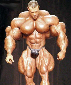
Now it doesn't matter that image 2 really exists, it simply feels wrong. And it's warning signs that as artist, we should be avoiding.
|
|
This message was edited 3 times. Last update was at 2011/03/26 02:58:51
|
|
|
|
|
2011/03/26 02:57:28
Subject: GW 'artists', please read about proportion
|
|
Courageous Silver Helm
|
Yeah, but to me the 1st pic looks like a human, and the 2nd one looks like a Space Marine with no armour on.
I dunno, maybe I just don't think of them as looking like 'normal' people, but when they hae bigger heads they look wrong. Smaller head +huge armour works better for me.
|
I have recently been diagnosed with swelling in the brain, so please excuse spelling mistakes and faulty sentences. I am losing my ability to type and talk effectively, but dammit, that is not going to stop me from trying. |
|
|
|
|
2011/03/26 03:02:48
Subject: GW 'artists', please read about proportion
|
|
Blood-Drenched Death Company Marine
|
I think #2 works great as a monster or a mutant- a great template for a villain because it has that "off feeling". I'd play that up because at that point the feeling is perfect for the subject: something should be "wrong" or "off" for the bad guy.
However, in the hero we see part of ourselves, and we do not like that warning feeling associated with us.
|
|
|
|
|
|
2011/03/26 03:04:18
Subject: GW 'artists', please read about proportion
|
|
Courageous Silver Helm
|
Moopy wrote:I think #2 works great as a monster or a mutant- a great template for a villain because it has that "off feeling". I'd play that up because at that point the feeling is perfect for the subject: something should be "wrong" or "off" for the bad guy.
However, in the hero we see part of ourselves, and we do not like that warning feeling associated with us.
Ah- maybe that's the problem. I don't see Space Marines as the 'heroes' in any way shape or form. 40k is a world of villains in my eyes, even if someof them think they are the 'good guys.'
Edit: Actually, now I think about it that is especially true of Grey Knights- they do some pretty mesed up stuff in the name of the 'greater good'... 
|
|
This message was edited 1 time. Last update was at 2011/03/26 03:05:42
I have recently been diagnosed with swelling in the brain, so please excuse spelling mistakes and faulty sentences. I am losing my ability to type and talk effectively, but dammit, that is not going to stop me from trying. |
|
|
|
|
2011/03/26 03:07:29
Subject: GW 'artists', please read about proportion
|
|
Mutilatin' Mad Dok
|
#2 made me throw up in my mouth a little.
|
"See a sword is a key cause when you stick it in people it unlocks their death" - Caboose
|
|
|
|
|
2011/03/26 03:09:09
Subject: GW 'artists', please read about proportion
|
|
Noble of the Alter Kindred
United Kingdom
|
If it looks wrong it is wrong?
If only aesthetics were that simple.
|
|
|
|
|
|
2011/03/26 03:15:13
Subject: GW 'artists', please read about proportion
|
|
Blood-Drenched Death Company Marine
|
More specifically if it "feels" wrong, then it's generally wrong, and that idea should be avoided. For a lot of folks seeing a man with a pinhead feels wrong, and thus this thread was started. ;D
#2 feels wrong as the hero (unless you're Rob Liefield). However it feels great a monster.
WTF in this case means: What's This For? Hero? Thumbs down. Monster? Thumbs up.
I bet if you took the WD Blood Angel cover, converted it over to say a Word Bearer chaos marine, people would actually like it more because chaos is deformed.
|
|
This message was edited 4 times. Last update was at 2011/03/26 03:18:22
|
|
|
|
|
2011/03/26 03:16:14
Subject: Re:GW 'artists', please read about proportion
|
|
Ancient Chaos Terminator
|
Pacific wrote:
Who can forget the travesty of the incorrectly assembled Leman Russ on the box cover.
Ahh not being a guard player, how is it incorrectly built? I was looking at the pics and they seem fine to me.
I wasnt realy happy with the last BA cover, but I guess having seen this GK art before on the Omnibus I was more used to it. plus on the Omnibuss its smaller and I think has less impact of proportion.
Ohh and paint number 2 green and give him some tusks I think he would make a great ork.
|
|
This message was edited 1 time. Last update was at 2011/03/26 03:20:00
"I have traveled through the Realm of Death and brought back novelty pencils"
Oh, somewhere in this favored land the sun is shining bright;
the band is playing somewhere and somewhere hearts are light,and somewhere men are laughing, and somewhere children shout but there is no joy in Mudville — mighty Casey has struck out. |
|
|
|
|
2011/03/26 03:22:20
Subject: GW 'artists', please read about proportion
|
|
Noble of the Alter Kindred
United Kingdom
|
Moopy wrote:More specifically if it "feels" wrong, then it's generally wrong, and that idea should be avoided. For a lot of folks seeing a man with a pinhead feels wrong, and thus this thread was started. ;D
#2 feels wrong as the hero (unless your Rob Liefield). However it feels great a monster.
WTF in this case means: What's This For? Hero? Thumbs down. Monster? Thumbs up.
My love for my girlfriend feels wrong. I'm just not good enough for her. Therefore my love is wrong.
|
|
|
|
|
|
2011/03/26 03:28:24
Subject: GW 'artists', please read about proportion
|
|
Blood-Drenched Death Company Marine
|
it also means your a bad person. ;D
|
|
|
|
|
|
2011/03/26 03:49:16
Subject: GW 'artists', please read about proportion
|
|
Noble of the Alter Kindred
United Kingdom
|
Maybe, but it also means your concepts are flawed.
Man with a pinhead was seen by people not fully engaging with the concepts of perception, perspective and misunderstanding the fluff.
SM = hummie pumped up to humungous proportions, therefore his head needs must be increased by the same percentage.
Why? There is no reason for this to happen.
A baby's head is proportionally larger than an adults.
The head/body proportion changes as the baby grows to adulthood, because the body is increasing in size from say 18" to six foot; whereas the head probably only doubles in size.
The body mass shift from human to marine is a similar jump in difference as a child entering school to being fully mature. However, the marine's brain is not increased afaik, and there is no need to make it bigger just to make it "feel" right.
Not sure if the brain would need to me made bigger at least not in direct proportion to the necessary increase in body size due to the extensive physiological change in becoming a marine.
Due to our CONDITIONING, the small head looks and feels wrong, but is in fact correct.
Anyone who has done life drawing and struggled with drastic foreshortening of the body, looking from the feet, will tell you that the instinct is to make the head bigger than it actually should when taking perspective into account.
The human head draws our attention and we prioritise it's importance, by drawing it bigger than it should be. This is a common error that has to be overcome by the student.
Feeling right or wrong has its place in aesthetics, but is not the only principle.
When you take into account the bigger bulk of the space marine, and the artist's POV as I mentioned. and the relative size of head to body in bulky power armour, pinhead feels right to me even if it looks weird due to our familiarity with HUMAN proportions.
Apologies for the long ramble, and I hope that it makes sense.
|
|
This message was edited 1 time. Last update was at 2011/03/26 03:54:42
|
|
|
|
|
2011/03/26 03:50:49
Subject: GW 'artists', please read about proportion
|
|
Boosting Space Marine Biker
|
@buzzsaw
I guess my point is that the heroic scale in the models was designed to highlight the intended portions of small models when viewed from the tabletop at distance. This has trickled down into the artwork at least in my opinion. As I mentioned I would be inclined to exaggerate the hero and not his armor. I guess I just wanted to add a different perspective to the common threads of...."wrong proportion always equals bad artist.
|
Peace is an individual conquest; it has never been a deed of the masses. |
|
|
|
|
2011/03/26 04:27:50
Subject: Re:GW 'artists', please read about proportion
|
|
Hauptmann
Diligently behind a rifle...
|
Nicorex wrote:Pacific wrote:
Who can forget the travesty of the incorrectly assembled Leman Russ on the box cover.
Ahh not being a guard player, how is it incorrectly built? I was looking at the pics and they seem fine to me.
I wasnt realy happy with the last BA cover, but I guess having seen this GK art before on the Omnibus I was more used to it. plus on the Omnibuss its smaller and I think has less impact of proportion.
Ohh and paint number 2 green and give him some tusks I think he would make a great ork.
Look at the sponsons and front mounted bolter, tell me what you see.
|
 Catachan LIX "Lords Of Destruction" - Put Away Catachan LIX "Lords Of Destruction" - Put Away
1943-1944 Era 1250 point Großdeutchland Force - Bolt Action
"The best medicine for Wraithlords? Multilasers. The best way to kill an Avatar? Lasguns."
"Time to pour out some liquor for the pinkmisted Harlequins"
Res Ipsa Loquitor |
|
|
|
|
2011/03/26 04:28:37
Subject: Re:GW 'artists', please read about proportion
|
|
Joined the Military for Authentic Experience
On an Express Elevator to Hell!!
|
Nicorex wrote:Pacific wrote:
Who can forget the travesty of the incorrectly assembled Leman Russ on the box cover.
Ahh not being a guard player, how is it incorrectly built? I was looking at the pics and they seem fine to me.
I wasnt realy happy with the last BA cover, but I guess having seen this GK art before on the Omnibus I was more used to it. plus on the Omnibuss its smaller and I think has less impact of proportion.
Ohh and paint number 2 green and give him some tusks I think he would make a great ork.
++Edited out my response, so if you follow Stormrider's suggestion, you can go through the emotional stages of surprise, followed by sadness (or maybe laughter) and then anger++ 
Chibi, you make valid points, and you've brought some interesting points to the discussion. I also think that it was obviously the artists intent to draw the proportions of the figure in such a way. By I honestly don't believe this is intended to be an abstract piece of art, especially in the modern era of artwork catering to the model design rather than visa-versa.
Furthermore, If we were to run a poll on here saying, "do you think this characters head is too small?", I would bet my mortgage on what the answer would be. Therefore, IMO it doesn't matter what the artist is trying to achieve, the fact is I would say, like that bloody awful weightlifting photo that seems to find its way onto the internet constantly, if 90% of the people who look at the photo say " lol, why the hell is that guy's head so small", then you have to feel that it's missed the boat somewhat.
It makes me think of those disproportioned pictures of cows and horses you sometimes see displayed, where the artist has made a mistake in basic proportion, but has painted it with immaculate detail. The impact of everything else is ruined, because your attention is first drawn to the one 'incorrect' feature. I know what you are saying about 'conditioning', but I still think it goes too far off the other end of the scale.
|
|
This message was edited 1 time. Last update was at 2011/03/26 04:30:09
|
|
|
|
|
2011/03/26 04:32:05
Subject: Re:GW 'artists', please read about proportion
|
|
Hauptmann
Diligently behind a rifle...
|
I think some people are forgetting that every Grey Knight has a psychic hood, thus adding to his girth around the back of his head, remove it and it'll look a bit more realiststic (at least as real as it could be).
This issue wasn't half bad really, several articles about assembly & painting of the new Grey Knights, plus a fully painted and assembled Flesh Tearers army. Plus a battle report betwitxt Chaos Daemons and the Grey Knights to boot.
|
Catachan LIX "Lords Of Destruction" - Put Away
1943-1944 Era 1250 point Großdeutchland Force - Bolt Action
"The best medicine for Wraithlords? Multilasers. The best way to kill an Avatar? Lasguns."
"Time to pour out some liquor for the pinkmisted Harlequins"
Res Ipsa Loquitor |
|
|
|
|
2011/03/26 04:32:15
Subject: GW 'artists', please read about proportion
|
|
Blood-Drenched Death Company Marine
|
@Chibi
What you say makes a lot of sense and you have excellent observations.
"Due to our CONDITIONING, the small head looks and feels wrong, but is in fact correct. "
Exactly, and this is my point. Because we have been conditioned to see something someway, it looks off when it's not. That feeling often makes people inherently not like a piece even if they can't put their finger on it. As artists, we should learn to avoid that feeling or use it to our advantage depending on the subject (see previous post examples). Since this is supposedly the hero, we have part of ourselves invested in the image and don't like it when things feel off.
So, even though the fluff would say it's right, we should avoid it since it feels wrong. I've seen many shadows that are a warm green, but if I were to paint them, people would think I'm nuts, so I avoid it.
|
|
This message was edited 1 time. Last update was at 2011/03/26 04:33:02
|
|
|
|
|
2011/03/26 04:38:08
Subject: Re:GW 'artists', please read about proportion
|
|
Noble of the Alter Kindred
United Kingdom
|
If it was the artist's intention to convey something and an audience is incapable of perceiving that content, that does not make the work of art wrong.
Such a poll result may only reveal the ignorance of the voters .
 Automatically Appended Next Post: Automatically Appended Next Post: If you want to illustrate other peoples' perceptions of the world carry on as you are.
If you wish to be an artist paint what you see.
If you see green shadows paint the shadows green, and let us see how you see the world.
In all humility, I think that is the best thing I have ever said on the internet to anyone. I can give no more to you than that.
so I shall withdraw from the thread and bid you all goodnight.
|
|
This message was edited 1 time. Last update was at 2011/03/26 04:44:10
|
|
|
|
|
2011/03/26 04:49:02
Subject: Re:GW 'artists', please read about proportion
|
|
Joined the Military for Authentic Experience
On an Express Elevator to Hell!!
|
I agree with you entirely (and very eloquently written by the way) but we are talking about a piece of mass-produced fantasy art designed to rope in consumers which will be used a handful of times and then lost amongst the myriad of other pieces, not a Gaudi or a Picasso
|
|
|
|
|
|
2011/03/26 09:47:53
Subject: GW 'artists', please read about proportion
|
|

[MOD]
Anti-piracy Officer
Somewhere in south-central England.
|
Exactly.
So long as the WD cover pulls in more punters than it annoys, it counts as a successful piece of commercial art.
You can't blame the artist for the appearance. He would have worked to direction by the art editor, who in turn would be instructed by reference material of the 40K background.
|
|
|
|
|
|
2011/03/26 10:21:04
Subject: Re:GW 'artists', please read about proportion
|
|
Regular Dakkanaut
|
Hero scale.
|
|
|
|
|
2011/03/26 10:36:22
Subject: GW 'artists', please read about proportion
|
|
Freaky Flayed One
Photo Gallery Coming Soon...
|
I have 2 questions for the OP.
Why does everything have to be realistic? Why cant artists exagertae things?
I play this game and others to escape reality. Pic like the grey knights helps. If I wanted to see the correct size of a forarm, I'll look at a fitness mag. The style the artist used helps me imagine a 40k Human Space Marine and there sheer power and size.
I incourage GW to continue this kinda of art. It reminds me of the overall scale and power of the 40k Universe and it races.
|
"I don't know half of you half as well as I would like, I like less than half of you, half as well as you deserve".
 BloodRavens: 3500pts (100% Painted). BloodRavens: 3500pts (100% Painted).
 Necrons: 3000pts. (100% Painted) . Necrons: 3000pts. (100% Painted) .
 Tau: 1850pts. (100% Painted). Tau: 1850pts. (100% Painted). |
|
|
|
|
|
|

