| Author |
Message |
 |
|
|
|
|
Advert
|
Forum adverts like this one are shown to any user who is not logged in. Join us by filling out a tiny 3 field form and you will get your own, free, dakka user account which gives a good range of benefits to you:
- No adverts like this in the forums anymore.
- Times and dates in your local timezone.
- Full tracking of what you have read so you can skip to your first unread post, easily see what has changed since you last logged in, and easily see what is new at a glance.
- Email notifications for threads you want to watch closely.
- Being a part of the oldest wargaming community on the net.
If you are already a member then feel free to login now. |
|
 |
2017/01/24 14:10:24
Subject: Thoughts on the Eldar Triumvirate guys?
|
|

Wicked Warp Spider
|
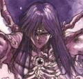
What I'm personally most supprised by after this release, is that within a hobby involving both sculpts and paintjobs so many people cannot distinguish what contributes to the overall psychological effect of a model. When I first saw the trailer and images, I was dissapointed too. But not by models themselves...
Yncarne has a ver, very, very bad paintjob. Someone realy messed up this one. First of all - this model is painted almost exclusively using just two fundamental colors of CMYK palette, creating a red-blue colour blindness effect. What is even worst, is that it uses the more "eye jumping" one for the swirl. Try for yourselves, open up this image in any capable image processor, get a HSV palette and turn of cyans and magentas and PUFF - the model is now almost entirely in B&W with just some gold and red accents and looks a LOT better, gorgeous even. Suddenly nothing draws attention from the Avatar itself, the form remains busy but is now well balanced and the whole thing becomes what it should be - a newborn god rising from dust and soulstones.
Given that sculpting software work on a "gray clay" basis and sculptors do not see bad paintjobs while sculpting, blaming the whole "AoS/WoWification of 40K" solely on sculptors is completely innacurate. Overabundance of anisotrophy effects, "non-metalic-metal", highly "shiny and chrome", overall "shouty" aesthetics of a AoS factions and many new 40K releases is not because of bad sculpts, it is because bad taste use of layer paints and some perks of plastic as a medium. Try pinterest search on any model, and it is almost certain, that there will be at least one paintjob that will "sell" any given model to you or even make you fall in unexpected love.
|
|
|
 |
|
2017/01/24 14:24:16
Subject: Thoughts on the Eldar Triumvirate guys?
|
|

Wicked Warp Spider
|
nou wrote:
Given that sculpting software work on a "gray clay" basis and sculptors do not see bad paintjobs while sculpting, blaming the whole " AoS/WoWification of 40K" solely on sculptors is completely innacurate. Overabundance of anisotrophy effects, "non-metalic-metal", highly "shiny and chrome", overall "shouty" aesthetics of a AoS factions and many new 40K releases is not because of bad sculpts, it is because bad taste use of layer paints and some perks of plastic as a medium. Try pinterest search on any model, and it is almost certain, that there will be at least one paintjob that will "sell" any given model to you or even make you fall in unexpected love.
Are you implying that weird proportions, bad poses and swirls are painted? I think those are sculpted, am I wrong?
|
Generic characters disappearing? Elite units of your army losing options and customizations? No longer finding that motivation to convert?
Your army could suffer Post-Chapterhouse Stress Disorder (PCSD)! If you think that your army is suffering one or more of the aforementioned symptoms, call us at 789-666-1982 for a quick diagnosis! |
|
|
|
|
2017/01/24 14:59:42
Subject: Thoughts on the Eldar Triumvirate guys?
|
|

Agile Revenant Titan
|
nou wrote:What I'm personally most supprised by after this release, is that within a hobby involving both sculpts and paintjobs so many people cannot distinguish what contributes to the overall psychological effect of a model. When I first saw the trailer and images, I was dissapointed too. But not by models themselves...
Yncarne has a ver, very, very bad paintjob. Someone realy messed up this one. First of all - this model is painted almost exclusively using just two fundamental colors of CMYK palette, creating a red-blue colour blindness effect. What is even worst, is that it uses the more "eye jumping" one for the swirl. Try for yourselves, open up this image in any capable image processor, get a HSV palette and turn of cyans and magentas and PUFF - the model is now almost entirely in B&W with just some gold and red accents and looks a LOT better, gorgeous even. Suddenly nothing draws attention from the Avatar itself, the form remains busy but is now well balanced and the whole thing becomes what it should be - a newborn god rising from dust and soulstones.
Given that sculpting software work on a "gray clay" basis and sculptors do not see bad paintjobs while sculpting, blaming the whole " AoS/WoWification of 40K" solely on sculptors is completely innacurate. Overabundance of anisotrophy effects, "non-metalic-metal", highly "shiny and chrome", overall "shouty" aesthetics of a AoS factions and many new 40K releases is not because of bad sculpts, it is because bad taste use of layer paints and some perks of plastic as a medium. Try pinterest search on any model, and it is almost certain, that there will be at least one paintjob that will "sell" any given model to you or even make you fall in unexpected love.
Exactly!
My first thought when I saw it was 'yeesh what is that discordant mess?'.
Then I looked again, imagined the swirls in a bleached white colour, the armour in bone (or grey), the skin in ash grey and deep reds for the gemstones. Phenomenal. You'll see 
 Kaiyanwang wrote: Kaiyanwang wrote:
Are you implying that weird proportions, bad poses and swirls are painted? I think those are sculpted, am I wrong?
Which bits are out of proportion with what other bits? I can't see it, and if it's something I can convert out that would be helpful to know what looks too big and what looks too small.
Poses aren't perfect (aside from not-Malys), but I wouldn't say they're bad at all. The bar is set with Khorne Berserkers for bad posing.
|
|
|
|
|
|
2017/01/24 15:15:35
Subject: Thoughts on the Eldar Triumvirate guys?
|
|
Wicked Warp Spider
|
Kaiyanwang wrote:nou wrote:
Given that sculpting software work on a "gray clay" basis and sculptors do not see bad paintjobs while sculpting, blaming the whole " AoS/WoWification of 40K" solely on sculptors is completely innacurate. Overabundance of anisotrophy effects, "non-metalic-metal", highly "shiny and chrome", overall "shouty" aesthetics of a AoS factions and many new 40K releases is not because of bad sculpts, it is because bad taste use of layer paints and some perks of plastic as a medium. Try pinterest search on any model, and it is almost certain, that there will be at least one paintjob that will "sell" any given model to you or even make you fall in unexpected love.
Are you implying that weird proportions, bad poses and swirls are painted? I think those are sculpted, am I wrong?
I'm implying only, that both good and bad poses can be either exagerated or tamed by paintjobs, that lack of detail on many new models (due to technicalities of plastic process) is subsituted by cheap painting effects and that a lot of "first impression" of a release is a combined effect of BOTH sculpt and paintjob. And that sculptors have absolutely no controll over what GW painters came up with at the final moment. A lot of Forgeworld range is so tempting to buy, because it is presented in gray resin. Just try and look at Warhammer Community Yncarne picture in color and B&W to see for yourself how huge difference bad paintjob does to this model.
I'm not trying to convince you or anyone else, that you should like this model. I'm totaly indifferent to personal tastes or purchase choices of people on the other half of the globe. I personally don't see Yncarne pose or swirl as inherently bad, or that it has weird proportions. You may dislike swirls, I like them. You may dislike heroic proportions or overdynamic poses, I'm indifferent to them. I'm not at all a person of "my personal taste is a sole definition of what looks good or bad". I don't ever participate in threads about factions which aesthetics I find boring or comical. But I see a lot of comments after this release, that show inability to pinpoint why certain things in different releases feel "spot on" and others are awkward, bad, hilarious or 'meh'. To be crystal clear - everyone is entitled to has his own taste and be dissapointed or astonished by new GW releases, but if we are trying to talk about design and quality of it in a bit more depth than "my taste is better than yours" pointless ping-pong, then separating bad paintjobs from bad sculpts is crucial, and if you want to talk about sole quality of form, then you must do so without any psychological influence of colour. And one simply cannot talk about shift from WHFB to AoS aesthetics and throw "WoWification" of GW without understanding what layers contribute to this effect.
|
|
This message was edited 1 time. Last update was at 2017/01/24 15:23:38
|
|
|
|
|
2017/01/24 15:21:19
Subject: Thoughts on the Eldar Triumvirate guys?
|
|

Pragmatic Primus Commanding Cult Forces
|
I think they all three look awesome
|
Error 404: Interesting signature not found
     |
|
|
|
|
2017/01/24 15:21:35
Subject: Re:Thoughts on the Eldar Triumvirate guys?
|
|
Wicked Warp Spider
|
Just a quick PS shift of hue/saturation/lightness on those models, without any deeper thoughts on how to approach to painting them, as a visual aid to my argument (not by any means a "my color prefference is better than yours" post)
As a bit of a bonus, this is how not-Malys looks with a bit tamed "feather crown" and without an overoriental fan in her hand.
|
|
|
|
|
2017/01/24 15:53:57
Subject: Re:Thoughts on the Eldar Triumvirate guys?
|
|

Powerful Phoenix Lord
|
Darken up Ynnead's body a bit for contrast and I am sold on this scheme.
-
|
|
|
|
|
2017/01/24 16:24:59
Subject: Thoughts on the Eldar Triumvirate guys?
|
|
Agile Revenant Titan
|
Yep. Sold.
|
|
|
|
|
|
2017/01/24 16:31:10
Subject: Thoughts on the Eldar Triumvirate guys?
|
|
Sinewy Scourge
|
So just something I heard on facebook in my local GW group,
Biel Tan puts all there spirit stones in like the center of their craftworld and seers go there for advice and stuff, and the books and stuff /are/ called fracture of biel tan, and there /are/ tons of spirit stones spiraling around on the avatar, just a thought.
|
|
|
|
|
|
2017/01/24 16:37:33
Subject: Re:Thoughts on the Eldar Triumvirate guys?
|
|
Wicked Warp Spider
|
 Galef wrote: Galef wrote:
Darken up Ynnead's body a bit for contrast and I am sold on this scheme.
As I said, this is pure "desaturate cyans and magentas" quick hack. Since original has so separated colour scheme (very straightforward to play with PS) I did in fact fiddled a bit with different colours of swirl and avatar, but I prefer to leave out my personal preferences out of this discussion. One observation though - almost ANY alternative was better than what GW has shown: other color contrasts, desaturates, main color shifts etc... And all of this without even going further than HSV sliders...
|
|
|
|
|
2017/01/24 16:40:54
Subject: Thoughts on the Eldar Triumvirate guys?
|
|
Agile Revenant Titan
|
Yeah they nuked Cadia, I'm wondering if they'll nuke Biel-Tan...
|
|
|
|
|
|
2017/01/24 16:55:36
Subject: Thoughts on the Eldar Triumvirate guys?
|
|

Longtime Dakkanaut
|
Unhappy with all three D:
The lady pose is awful, They need a designer with talent to get into the eldar. At least the cat is nice, The other two are just boring.
Sort of amazed these are getting much praise, But to each there own.
Just think they are so avg and forgettable. Do not even think i would get for a farseer at this point.
|
|
|
|
|
2017/01/24 16:57:16
Subject: Re:Thoughts on the Eldar Triumvirate guys?
|
|

Swift Swooping Hawk
|
Btw i read some side commentary that maybe the Avatar it's not the only with extra building options (dual daggers) at least a helmless Visarch option commented as a possibility (still a low rumour)
About the Avatar appearance i truly truly love those ghostly look and it's pretty close to what i visualized as a possibility (most of my army theme is black and khorne red with some traces of white here and there ) and i think it can look quite superb. (only if my lowly skill can do a bit of justice to it i'll be pleased)
|
|
This message was edited 1 time. Last update was at 2017/01/24 16:59:33
|
|
|
|
|
2017/01/24 17:50:11
Subject: Re:Thoughts on the Eldar Triumvirate guys?
|
|
Worthiest of Warlock Engineers
|
I am just thankful I dont play Eldar because those miniatures are just bad.
Yes, they have lovely detail sculpted on, but they are just so everywhere with the gribblies, "detail" and flashy bits that they make no sense, especially that magicy dancey one with the spirally swirl whatsit psychic thingy - he makes my eyes confused.
No, I really do not like these.
|
Free from GW's tyranny and the hobby is looking better for it
DR:90-S++G+++M++B++I+Pww205++D++A+++/sWD146R++T(T)D+
|
|
|
|
|
2017/01/24 18:19:45
Subject: Thoughts on the Eldar Triumvirate guys?
|
|
Longtime Dakkanaut
|
Its to each their own but I like them. The Avatar is probably the only question mark but that is due to the suspect colour choice. Not Malys looks great and Yriel-Arhra looks good too.
|
|
|
|
|
2017/01/25 06:30:35
Subject: Re:Thoughts on the Eldar Triumvirate guys?
|
|
Horrific Howling Banshee
|
The color is 90% of the problem. The ugly  horn is the other. My horrid skills at PS turned up a better version. I'm thinking It'll look fine after we take a knife and a good color scheme to it.
http://imgur.com/eiyJSMD
|
|
This message was edited 1 time. Last update was at 2017/01/25 06:31:27
 Badablack wrote: Badablack wrote:40k starts with the question, “Who is worse, Satan or the Nazis?” And goes from there. It’s a big colorful ball pit full of horrible people screaming and shooting each other.
chromedog wrote:From the Fuggly DEldar of the time, before they let Jes goodwin have his good and proper way with the entire faction design.
I don't want the best army, just one that isn't an exercise in picking up my models by turn 3.
Badablack wrote:40k starts with the question, “Who is worse, Satan or the Nazis?” And goes from there. It’s a big colorful ball pit full of horrible people screaming and shooting each other.
PenitentJake wrote:It doesn't matter if you're not dominating the game; if you have 3-4 x as many models and options than the rest of us and you're still getting new kits, we're still gonna rip on the faction. If I had 100 + Drukhari kits all in plastic to choose from, or 100 + Sisters kits, I think I'd be more likely to be receptive to Space Marine player's complaints about anything.
|
|
|
|
|
2017/01/25 06:55:22
Subject: Thoughts on the Eldar Triumvirate guys?
|
|

Resolute Ultramarine Honor Guard
|
Hey guys, it isn't WoW yet until a new Ghazgkull model comes out with shoulder pads bigger than his body.
I like WoW, but yeah.
Edit: looking at the model and how it looks like it's absorbing soul stones, I'm betting it will get stronger the more eldar that die around it/on the board.
Or something like that. Would fit the theme, at least.
|
|
This message was edited 1 time. Last update was at 2017/01/25 06:56:55
 warboss wrote: warboss wrote:Is there a permanent stickied thread for Chaos players to complain every time someone/anyone gets models or rules besides them? If not, there should be.
|
|
|
|
|
2017/01/25 11:14:07
Subject: Thoughts on the Eldar Triumvirate guys?
|
|
Agile Revenant Titan
|
Huh. That is better.
Not sure I'd remove the horn myself as I like the quasi-daemonic look fitting with the fluff, but it does look more eldar without it. Less alien though, which I think is what I like most about it 
The colour choice is absolutely a terrible one...
|
|
|
|
|
|
2017/01/26 11:55:31
Subject: Thoughts on the Eldar Triumvirate guys?
|
|
Hooded Inquisitorial Interrogator
|
I kind of like them, but if it's another triumvirate box with no individual releases then I don't know if I'll buy them; I'd prefer to buy one at a time. The Avatar of Ynnead I quite like, except for that dumb horn which ruins the look; I don't know what it is about GW and horns, but Magnus' nipple horns ruin his model too IMO.
Thing is, thematically they don't do much for me; before I saw the avatar (and learned the names) I was excited thinking these might be new Phoenix Lords, who have been in desperate need of new models for years, just like most of the aspect warriors. When GW rushed out the Codex: Craftworlds update I had hoped it was to also bring a raft of new models as a second wave but… nope; Wraithknights and expensive Dire Avengers was all Eldar seem to be getting, now it's another wave of new stuff, when the old stuff really needs to be replaced.
At least Visarch could be used as many different things.
|
|
|
|
|
|
2017/01/26 12:47:03
Subject: Thoughts on the Eldar Triumvirate guys?
|
|
Ork-Hunting Inquisitorial Xenokiller
|
nou wrote:
Yncarne has a ver, very, very bad paintjob. Someone realy messed up this one.
All three of these models were painted by Aidan Daly
https://www.instagram.com/ninja_aidan/
He said the Yncarne is "The most difficult model I've ever had to paint."
I think if the rules for the Yncarne are good, you're going to see a lot of grey plastic/primed ones! If Belisarius Cawl is daunting to paint then what is that?!
Edit to spell the guy's name right ffs
|
|
This message was edited 1 time. Last update was at 2017/01/26 12:50:15
TO of Death Before Dishonour - A Warhammer 40k Tournament with a focus on great battles between well painted, thematic armies on tables with full terrain.
Read the blog at:
https://deathbeforedishonour.co.uk/blog |
|
|
|
|
2017/01/26 14:16:34
Subject: Thoughts on the Eldar Triumvirate guys?
|
|
Agile Revenant Titan
|
 Haravikk wrote: Haravikk wrote:I kind of like them, but if it's another triumvirate box with no individual releases then I don't know if I'll buy them; I'd prefer to buy one at a time. The Avatar of Ynnead I quite like, except for that dumb horn which ruins the look; I don't know what it is about GW and horns, but Magnus' nipple horns ruin his model too IMO.
Thing is, thematically they don't do much for me; before I saw the avatar (and learned the names) I was excited thinking these might be new Phoenix Lords, who have been in desperate need of new models for years, just like most of the aspect warriors. When GW rushed out the Codex: Craftworlds update I had hoped it was to also bring a raft of new models as a second wave but… nope; Wraithknights and expensive Dire Avengers was all Eldar seem to be getting, now it's another wave of new stuff, when the old stuff really needs to be replaced.
At least Visarch could be used as many different things.
Yeah I agree that the Phoenix Lords are in dire need of remodelling. They're every bit as iconic for Eldar players as Primarchs are for SM ones, and I'd love to see some evocative plastics.
My personal hope is that they'll do a 'Rhana Dandra' style campaign where they'll release each plastic Phoenix Lord in turn alongside a plastic kit for their aspect (or two phoenix lords at a time with a dual-kit). Absolute wishlisting though.
Silentz wrote:nou wrote:
Yncarne has a ver, very, very bad paintjob. Someone realy messed up this one.
All three of these models were painted by Aidan Daly
https://www.instagram.com/ninja_aidan/
He said the Yncarne is "The most difficult model I've ever had to paint."
I think if the rules for the Yncarne are good, you're going to see a lot of grey plastic/primed ones! If Belisarius Cawl is daunting to paint then what is that?!
Edit to spell the guy's name right ffs
Yeah Cawl looks both terrifying and interesting to paint. Same with the Yncarne (although on first look I'd definitely say that Cawl seems scarier).
Perhaps the difficult part of the painting was trying to make the body stand out from the, as others have put it, 'swirly gak'. Hence the odd colour choice of blue and purple.
We shall see when I finally pick up the model! I'm no great shakes at all, but I've got some interesting ideas I want to try out
|
|
|
|
|
|
2017/01/26 14:32:31
Subject: Thoughts on the Eldar Triumvirate guys?
|
|

Oozing Plague Marine Terminator
|
I do like the sword guy. For me it's one of the best eldar minis.
The Avatar is also pretty nice, though the mutations are too much for my taste. I actually do like the spirit-stone-tornado though.
With the lady... I like the sword and that helmet... but what's going on with her hips? I get she's an alien but... it looks really bad. While the sword guy is one of the best eldar miniatures, she might be the worst.
|
|
|
|
|
|
|


