| Author |
Message |
 |
|
|
|
|
Advert
|
Forum adverts like this one are shown to any user who is not logged in. Join us by filling out a tiny 3 field form and you will get your own, free, dakka user account which gives a good range of benefits to you:
- No adverts like this in the forums anymore.
- Times and dates in your local timezone.
- Full tracking of what you have read so you can skip to your first unread post, easily see what has changed since you last logged in, and easily see what is new at a glance.
- Email notifications for threads you want to watch closely.
- Being a part of the oldest wargaming community on the net.
If you are already a member then feel free to login now. |
|
 |
2016/08/20 07:12:32
Subject: Harlequin test scheme
|
|

Rampaging Carnifex
|
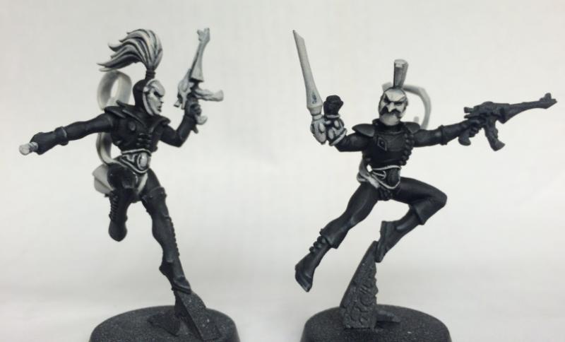
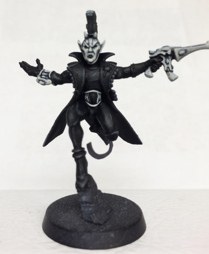
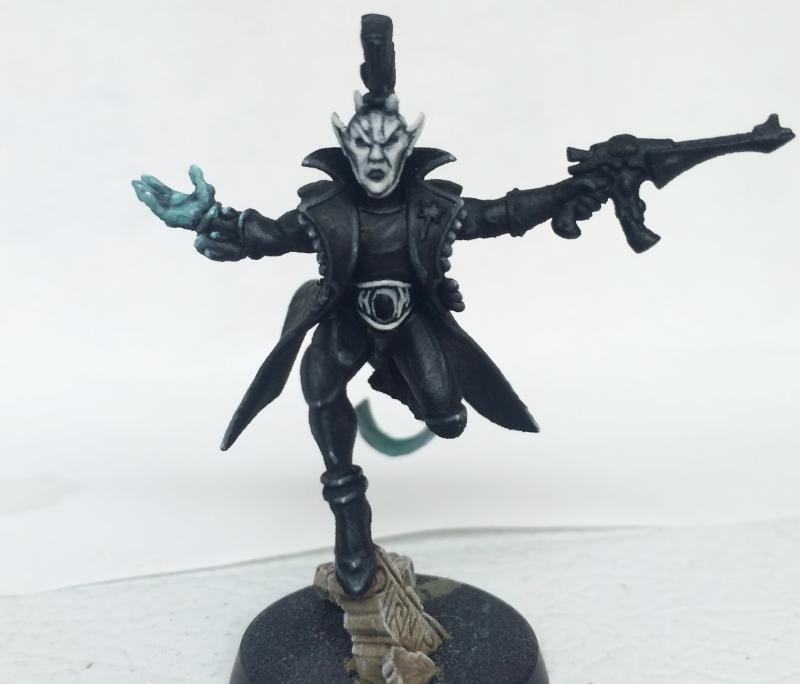
With the new Death Masque box i've started collecting the Harlequins. I love the ninja clowns, but I don't really like their traditional color schemes. I want to go with a very minimal color palette. These are two mini's with a black and white scheme. I suspect a lot of people won't like the simplicity of the scheme - but I am curious if there are others out there that might agree with me about the black and white being cool. I'm considering adding some diamond patterning on a few guys and the transports as well. My sense is that I really like how they look on an individual model basis; the black highlighting looks fantastic IMO and the white adds a really sinister feel to the Harlequins, but my concern is that they won't pop on the table even with the bright white highlight and contrast. I am wondering if I should add a splash of color to these guys - and do all their hair, for example, in a different flourescent shade. They aren't finished yet, but I was eager to share. I've also decided to add some pearlescent medium to the eventual white highlight to add a bit of sparkly effect to the extreme white. Anyway, just some musings. Lay into me, or not!
|
|
|
|
 |
|
2016/08/20 07:26:39
Subject: Harlequin test scheme
|
|

Dipping With Wood Stain
|
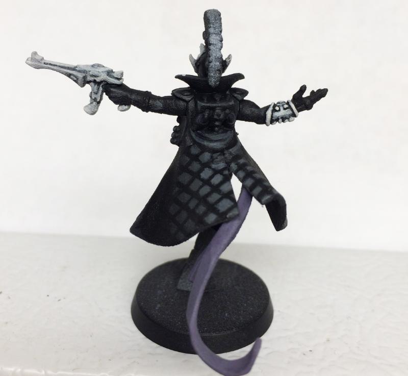
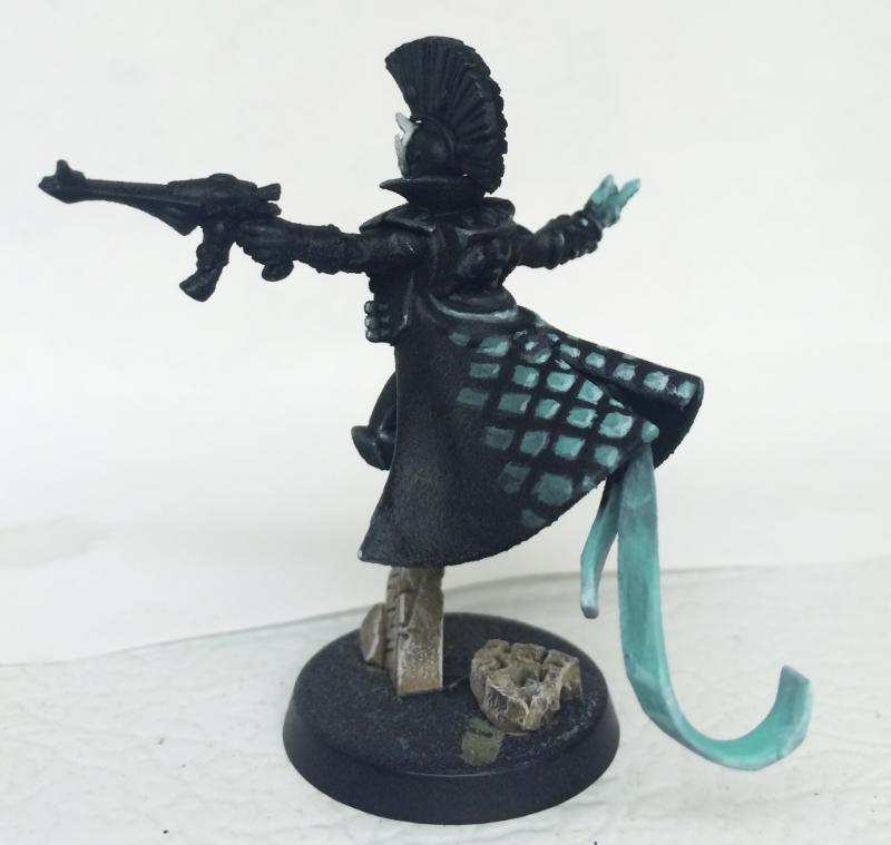
Perhaps instead of highlighting the black areas with greys, try using other colours? I tend to highlight black armour with various shades of blue, but you could easily use other colours.
Here's an example, actually! Painted this guy yesterday just for shiggles to unwind after finishing something else.
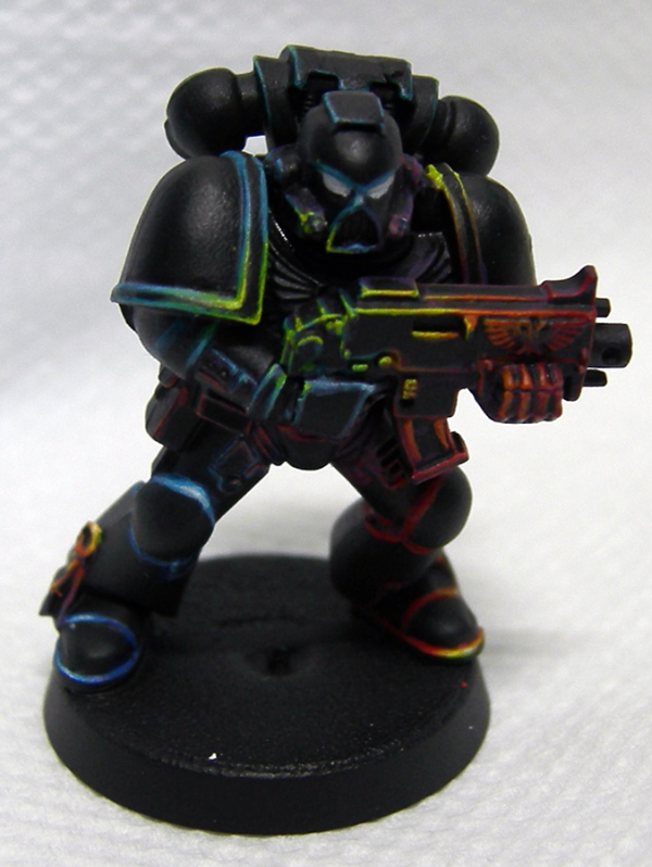 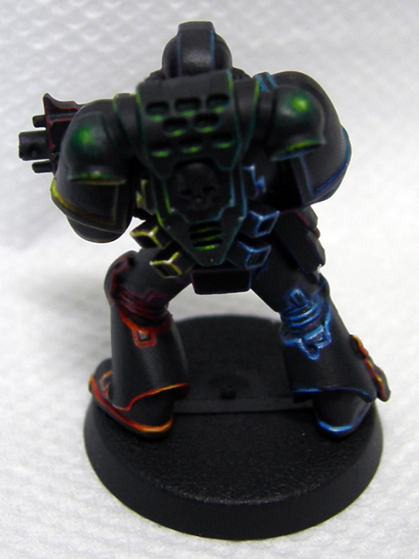
He's a rather extreme example of using colours other than greys to highlight black, but hopefully he'll give you some ideas!
|
|
|
|
|
|
2016/08/20 07:28:05
Subject: Harlequin test scheme
|
|
Rampaging Carnifex
|
Oh thats an interesting thought - rainbow highlights on the black. Thanks for the idea!
|
|
|
|
|
|
2016/08/20 07:47:08
Subject: Harlequin test scheme
|
|
Dipping With Wood Stain
|
No worries, happy to help!  I recommend planning out where you want each colour to go first before you start painting, then do the darkest colour for each area first before you start moving up to the lighter colours. Makes it easier to correct any oopsies!
|
|
|
|
|
|
2016/08/20 13:29:38
Subject: Harlequin test scheme
|
|
Powerful Phoenix Lord
|
I think it could work the way you started...primarily if the bases are a contrasting colour and if you add say one more colour. Perhaps a brass or gold highlight on various bits. Add in one or two gems and you could set it off nicely. As it sits now they're really quite muted.
|
|
|
|
|
2016/08/20 18:30:56
Subject: Harlequin test scheme
|
|

Irked Necron Immortal
|
I really like the cl scheme you've come up with, could contrast if you put them on a really jazzy base. Also agree on adding some diamonds if you can, just to help identify them as harlequins.
On a side note, loving the rainbow marine!
|
|
|
|
|
|
2016/08/21 07:53:11
Subject: Re:Harlequin test scheme
|
|
Rampaging Carnifex
|
|
|
|
|
|
|
2016/08/21 11:33:11
Subject: Harlequin test scheme
|
|

Regular Dakkanaut
|
The pink bits do help a lot.
I was going to suggest painting the gems/jewellery in (for example) in red. They all seem to be wearing some kind of gem stone on the waist or chest.
|
|
|
|
|
|
2016/08/21 15:43:47
Subject: Harlequin test scheme
|
|
Blood Angel Captain Wracked with Visions
|
I think you've done a great job with the monochromatic scheme, but I agree that a spot colour could help. What about a bright red, similar to Sin City?

|
|
This message was edited 1 time. Last update was at 2016/08/21 15:45:01
|
|
|
|
|
2016/08/22 06:44:17
Subject: Re:Harlequin test scheme
|
|
Rampaging Carnifex
|
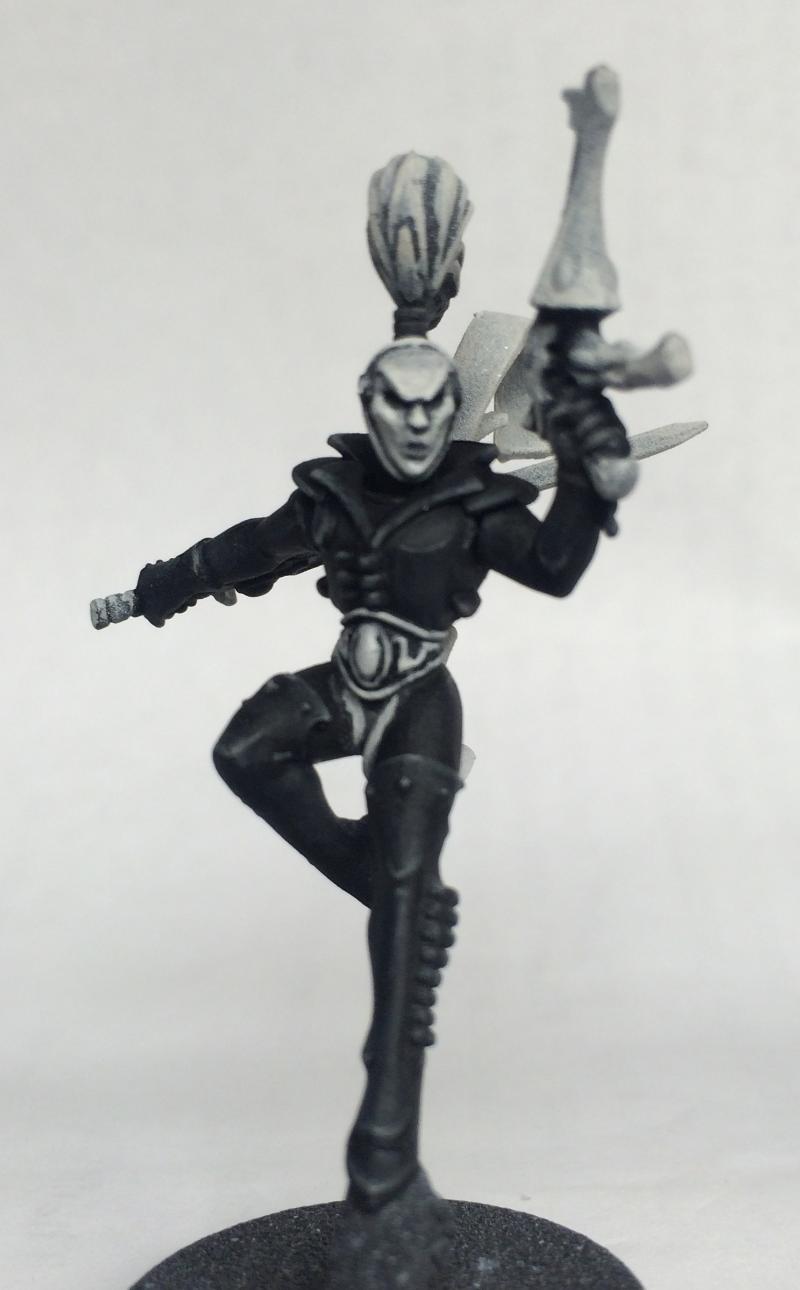
Sin City was what I was thinking - that monochrome with the splash of color. I've started my troupe master with a test of some diamond patterning. Really happy with how it's turning out - and I like doing the sashes in different colors. I gotta clean up the diamonding a bit as I finish it up.. but the general effect I think turned out nice. I am going to work on more blending so it fades more to dark and lightens at the apex.
|
|
|
|
|
|
2016/08/22 06:50:39
Subject: Harlequin test scheme
|
|
Perfect Shot Dark Angels Predator Pilot
|
A dash of colour could actually make these guys look really cool. I suggest I really bright colour (like red or pink etc.) somewhere on the black areas, it'll really pop that way. So far though, I like where these are going.
Good job! 
|
hi |
|
|
|
|
2016/09/03 06:25:21
Subject: Re:Harlequin test scheme
|
|
Rampaging Carnifex
|
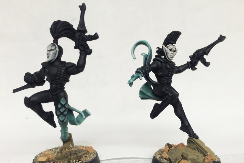
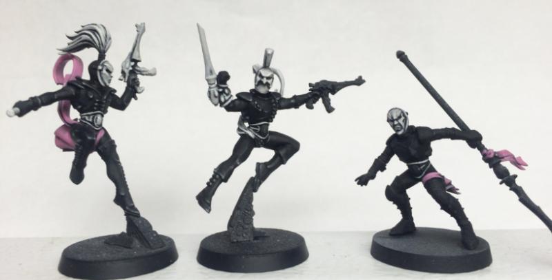
So I've been experimenting with various monochrome black and white schemes, and haven't been completely happy with them. I finally decided on what i'm going to do. It involves doing a strong ghost effect on the black and white Harlequins to add that pop of color. Here are the WIP shots of my two test models. Really happy with where these two are going - feeling confident to commit to this scheme and move forward on the rest of the models.
|
|
|
|
|
|
2016/09/03 16:05:18
Subject: Harlequin test scheme
|
|
Powerful Phoenix Lord
|
Looks good. I still think a small amount of gold on tiny bits would really work. Like buttons, or tiddly bits. That or I'd suggest brighter grey highlights or something. They're very close, but they still look unfinished.
|
|
|
|
|
2016/09/03 16:32:35
Subject: Harlequin test scheme
|
|
Dakka Veteran
|
Looking good, love the crisp detailing. Were it me I'd probably go with picking out some details in a dark grey, just to break up the black. Things like the gun magazine and fancy belt details maybe
|
|
|
|
|
|
2016/09/03 16:59:17
Subject: Harlequin test scheme
|
|
Ferocious Blood Claw
|
I prefer this greatly over the color schemes GW proposes. It gives them that speechless and uncanny, black and white pantomime feel. One tiny colored detail might work, such as the red lips of a pantomime, or a small red tear below the eye. So far I favor a strict black and white scheme even over the minimal color additions you did, too. Good stuff, curious to see how it turns out.
|
|
This message was edited 1 time. Last update was at 2016/09/03 17:00:30
|
|
|
|
|
2016/09/03 18:16:43
Subject: Re:Harlequin test scheme
|
|
Rampaging Carnifex
|
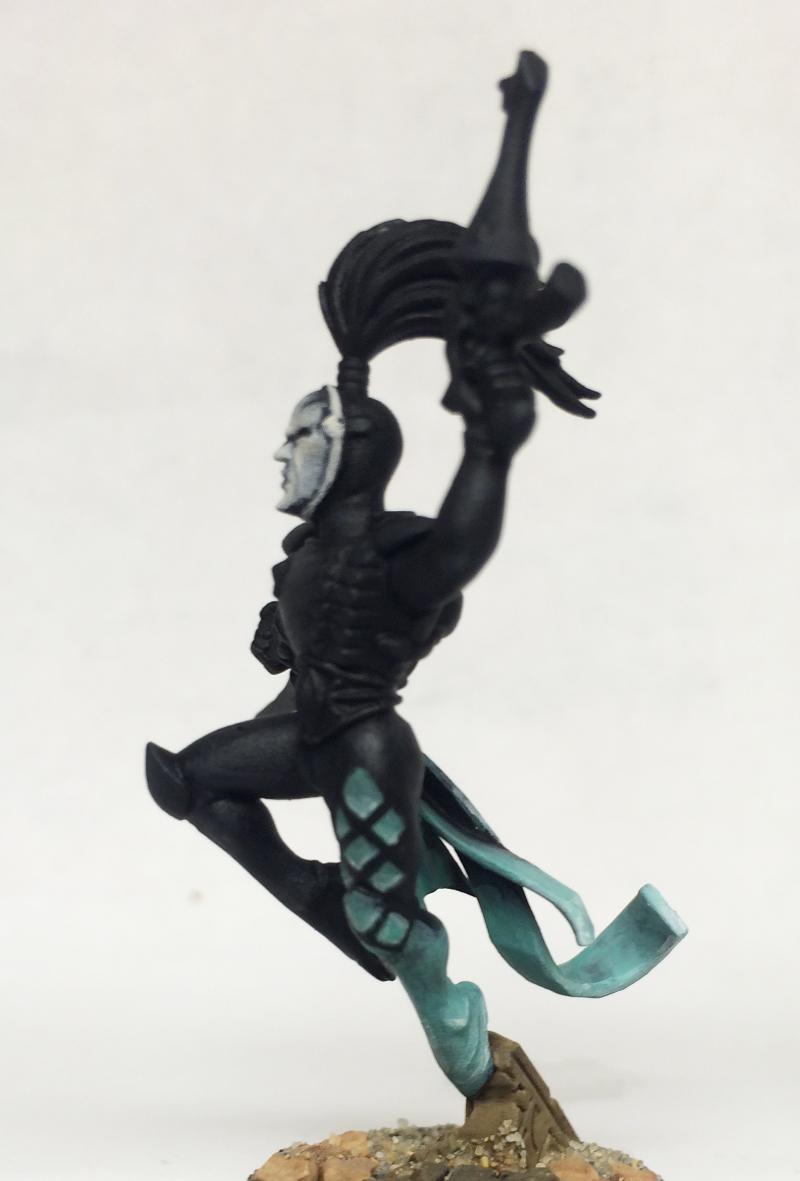
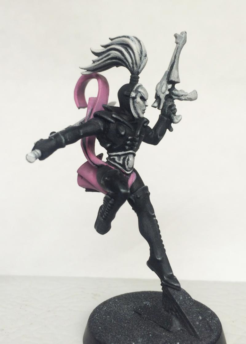
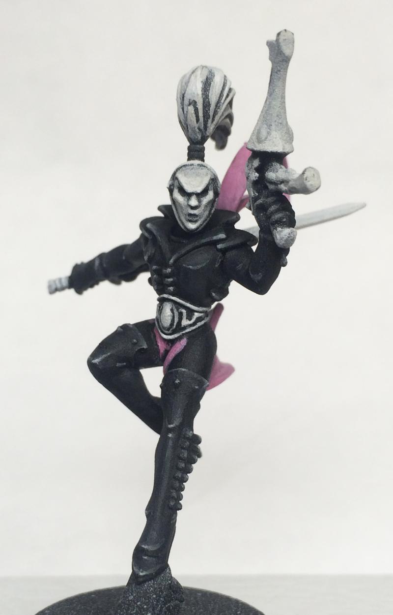
Yeah, those two I posted still need highlighting on the black. I'm waiting to pick up a new pot of light grey to finish them off. Here is the Troupe Master - he is much closer to being finished. The black has a lot of highlight work on him. Still unsure about some of the details - what to do with the belts, for instance. Previously, they were white along with the weapons and mask, but i'm considering a strict black and white where the only white is their masks. I'm really happy with how his diamond patterning turned out. Zoomed in like this I see it needs to be cleaned up a bit, but other than that, I think it's looking good.
|
|
|
|
|
|
2016/09/03 21:01:39
Subject: Harlequin test scheme
|
|
Bloodthirsty Bloodletter
|
I'll echo previous suggestions for introducing an additional grey tone to bring out more of the details, particularly metallic parts. I did this with my own monochrome Harlies using multiple tones of grey to distinguish different textures.
I like what you have in mind for the diamond patterns.
|
|
|
|
|
|
2016/09/04 12:13:47
Subject: Harlequin test scheme
|
|
Screaming Shining Spear
|
|

"Pit Crew! Take this box out back, throw in a rabid Honey Badger and SET IT ON FIRE!"
If I were an Eskimo, I'd build my igloo next to a supermarket on a tropical beach. |
|
|
|
|
|
|


 1500
1500

 1500
1500
