Forum adverts like this one are shown to any user who is not logged in. Join us by filling out a tiny 3 field form and you will get your own, free, dakka user account which gives a good range of benefits to you:
No adverts like this in the forums anymore.
Times and dates in your local timezone.
Full tracking of what you have read so you can skip to your first unread post, easily see what has changed since you last logged in, and easily see what is new at a glance.
Email notifications for threads you want to watch closely.
Being a part of the oldest wargaming community on the net.
If you are already a member then feel free to login now.
2019/06/07 09:20:35
Subject: VOTE For The Winner of the Unofficial Painting Challenge Round 51: To The Death!
It's time once again to cast your votes and pick a winner for last month's challenge. May's challenge was set to the theme 'To The Death', calling for the most stalwart fighters, the grittiest survivors, the warriors who would spit in the eye of death time and time again.
As always, feel free to cast as many votes as you like, and for any reason that you think an entry deserves recognition. Whether it's the quality of the paintjob, the choice of mini, the reflection of the theme or anything else that catches your eye, give it a vote.
The Entrants:
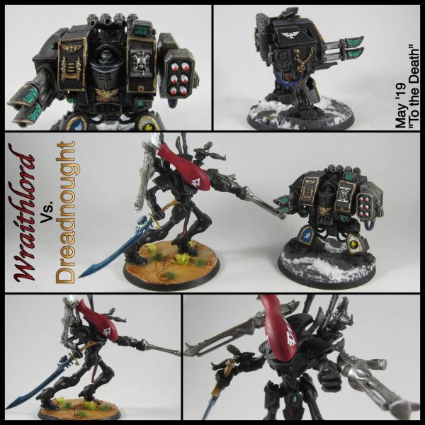
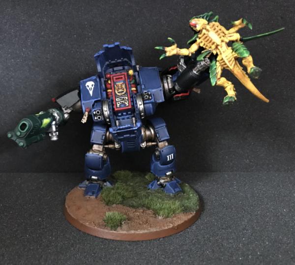
Nevelon: Wraithlord and Dreadnought
Spoiler:
Jamie Shred: Carnevale Gang
Spoiler:
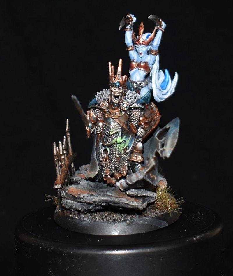
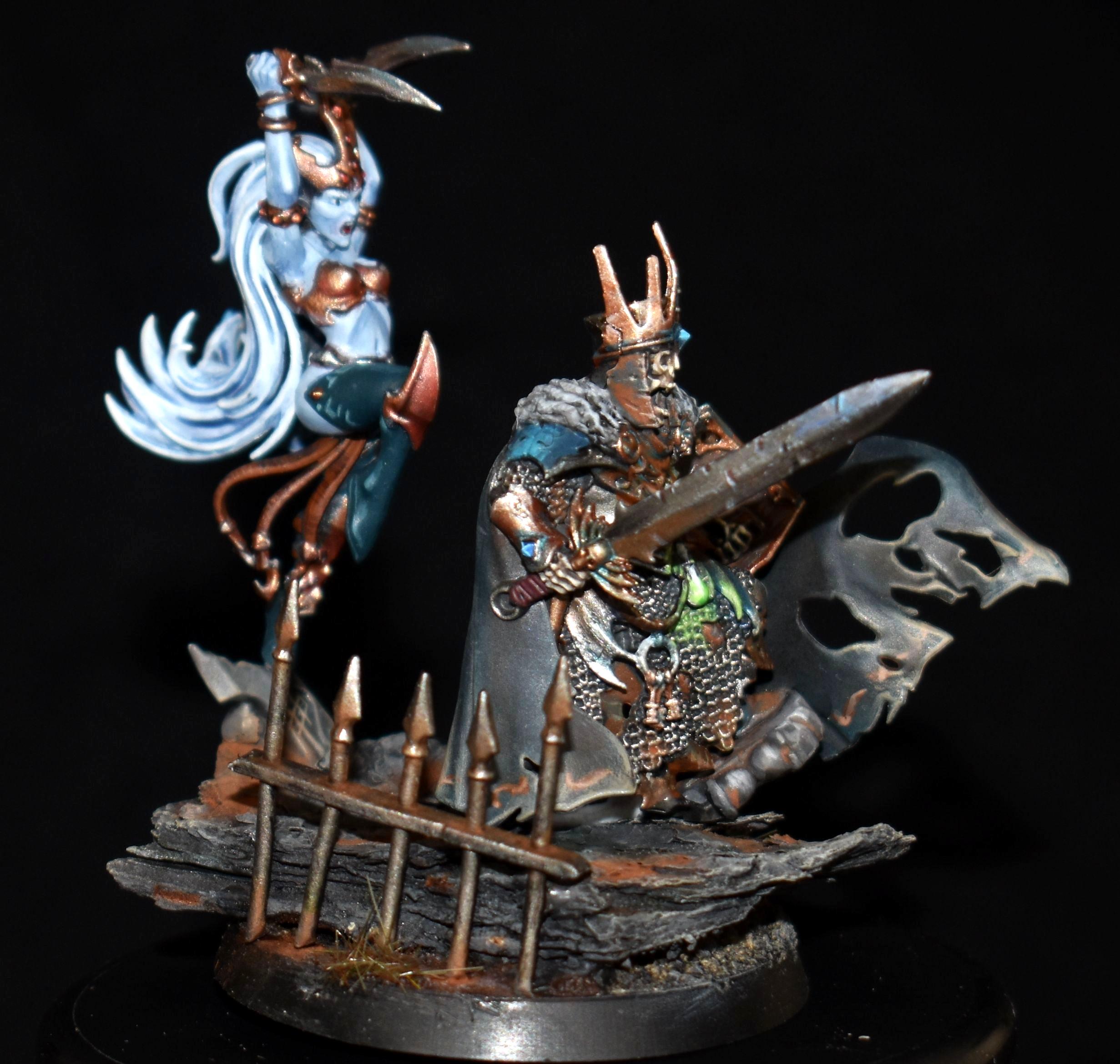
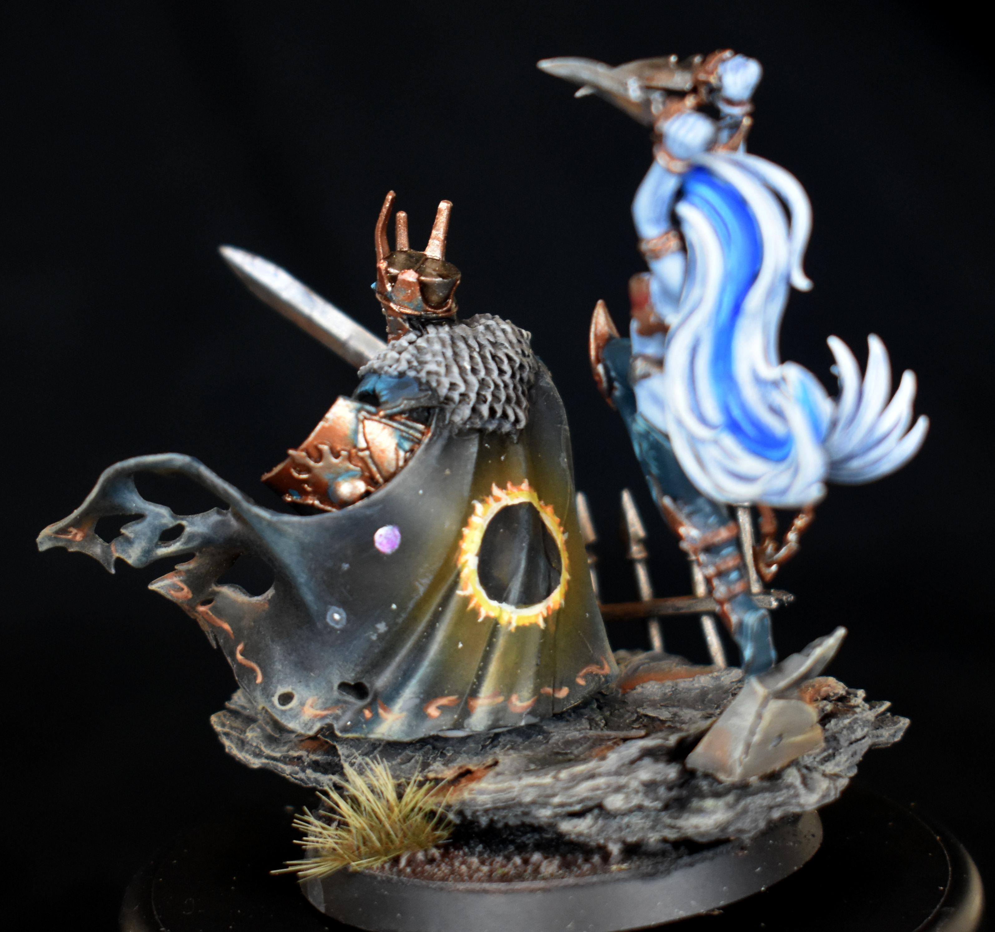
queen_annes_revenge: Abbadon of the Black Legion
Spoiler:
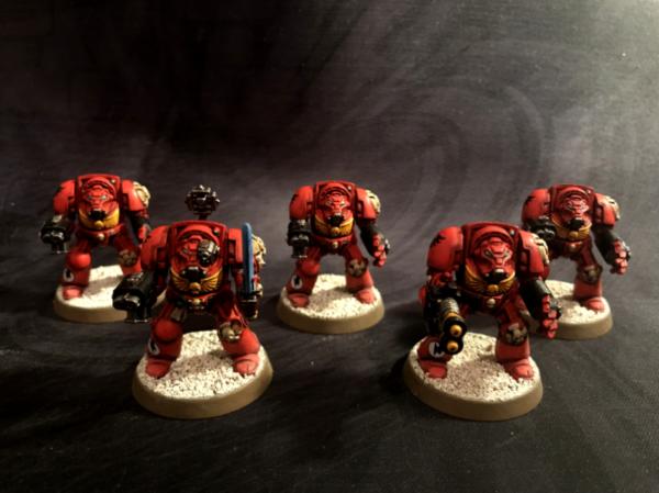
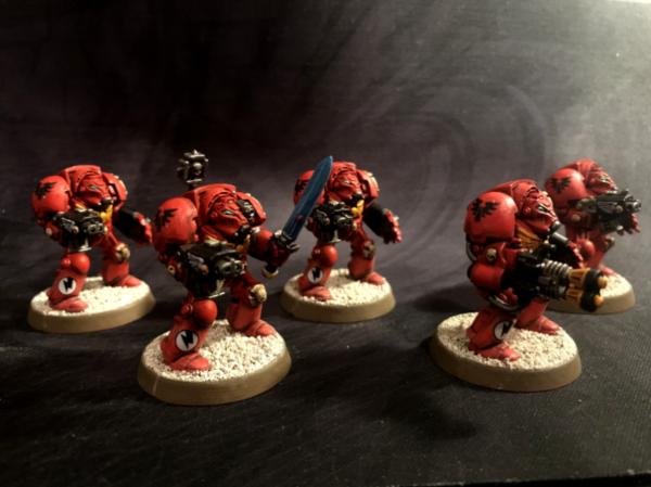
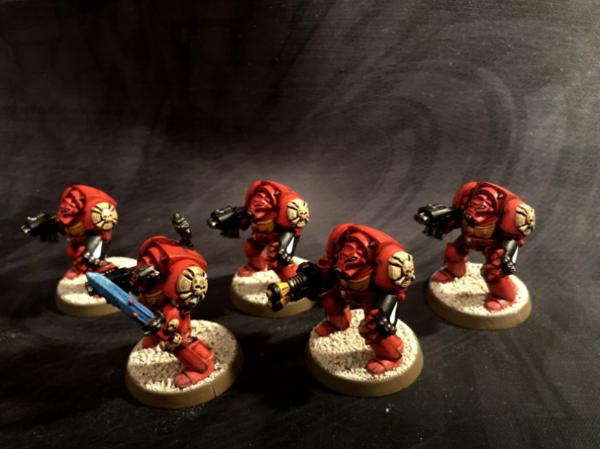
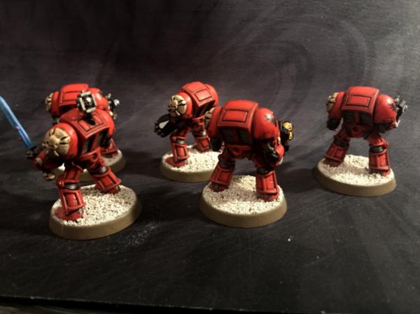
Rybrook: Blood Angels Terminators
Spoiler:
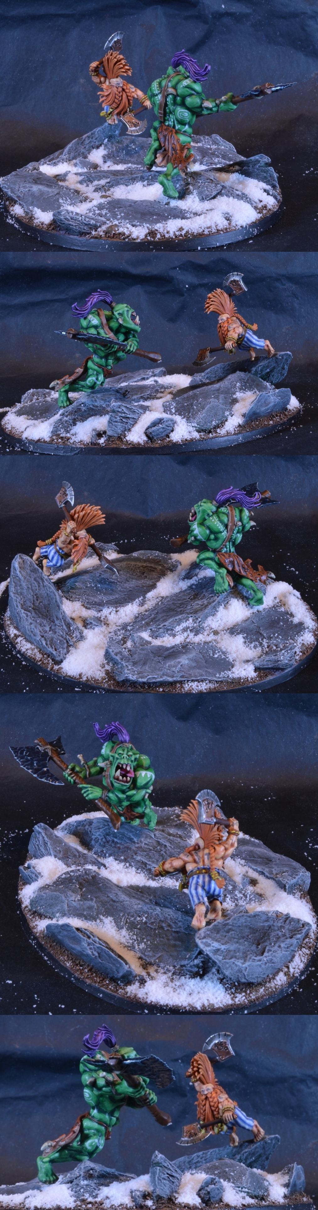
Midget Gems: Savage Orc vs Dwarf Slayer
Spoiler:
[
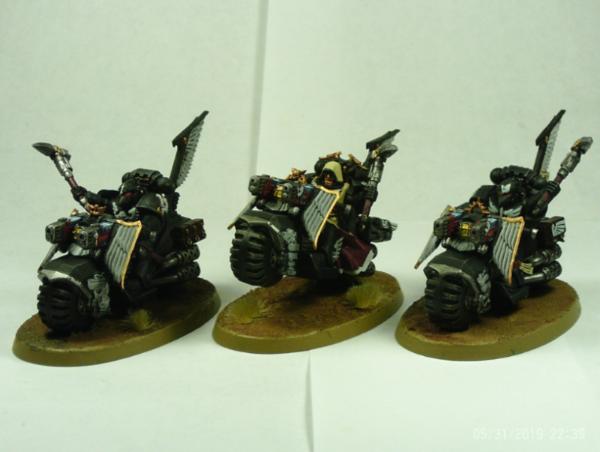
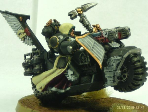
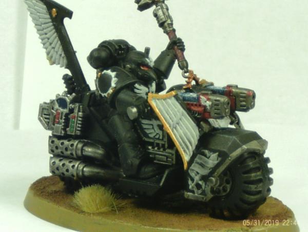
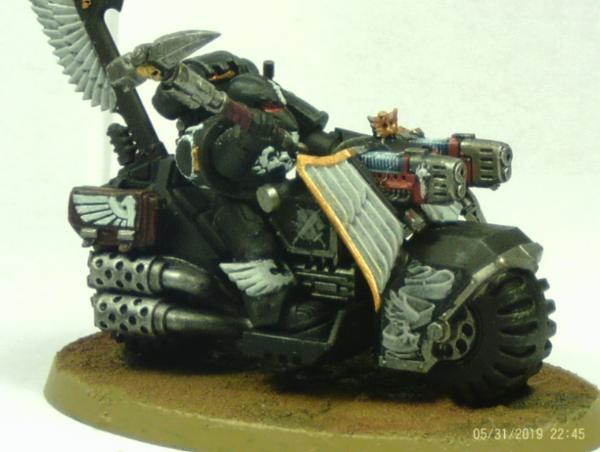
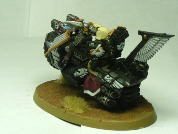
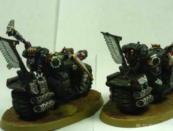
ZergSmasher: Ravenwing Bikers
Spoiler:
DrGiggles: Flesh Hounds of Khorne
Spoiler:
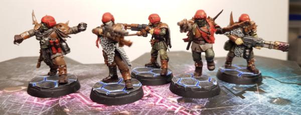
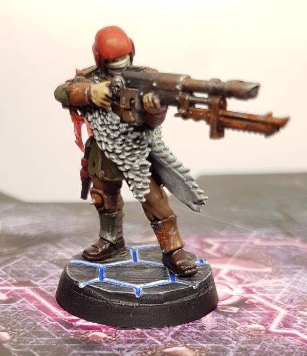
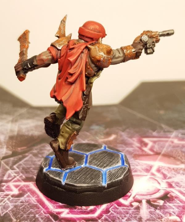
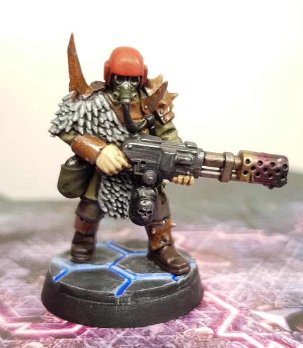
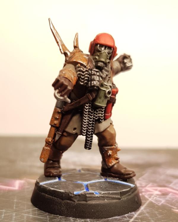
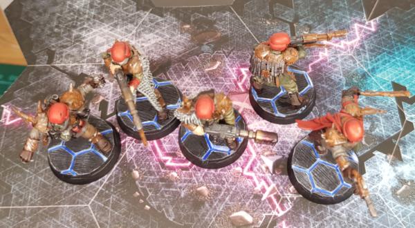
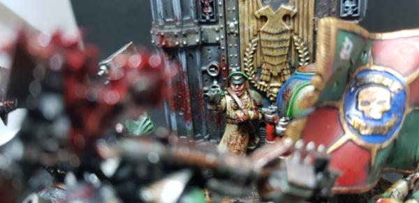
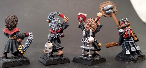
Flinty: Traitor Guardsmen
Spoiler:
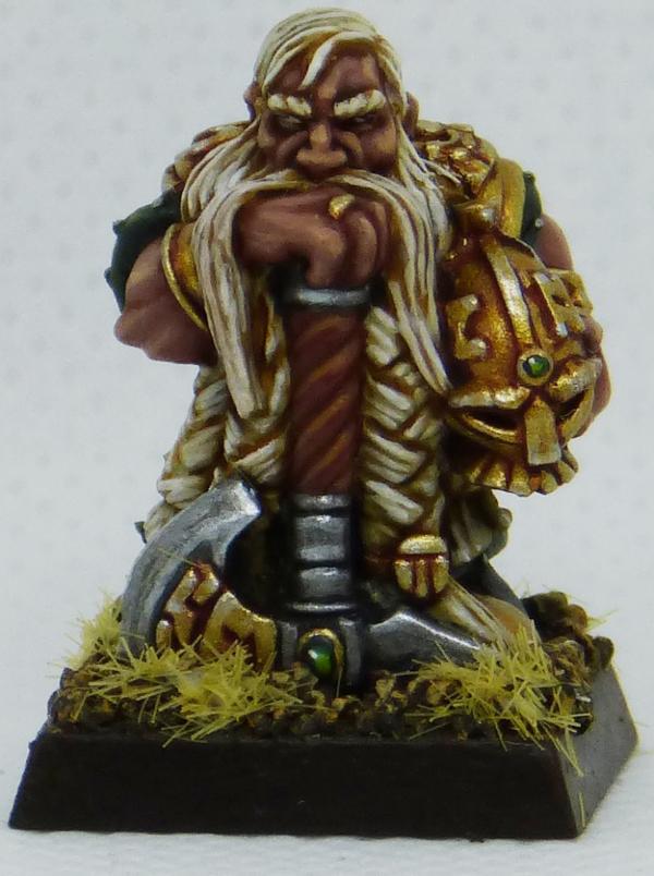
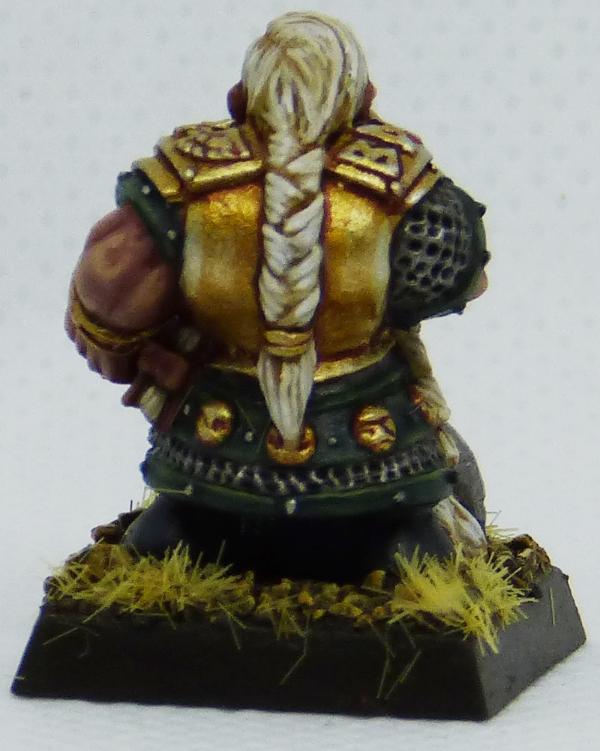
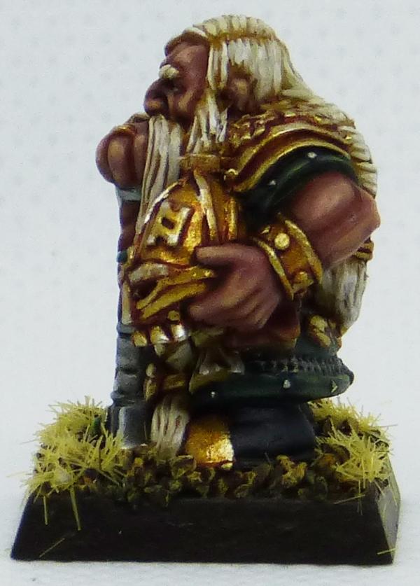
Maharg: Dwarf Hero
Spoiler:
JustALittleOrkish: Poxwalkers
Spoiler:
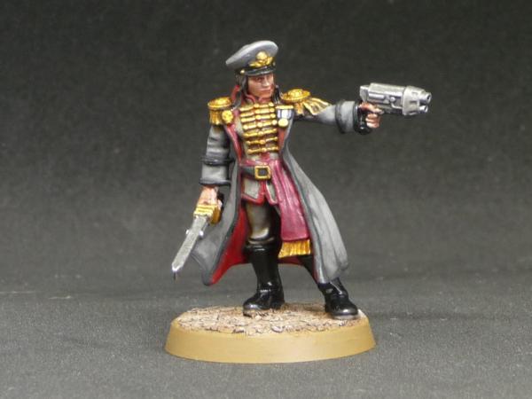
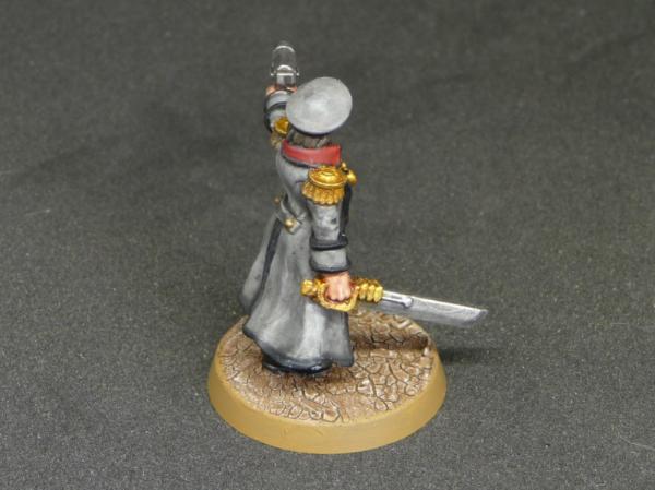
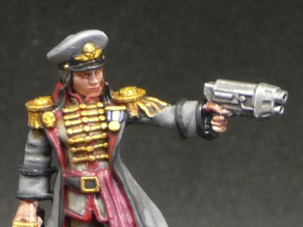
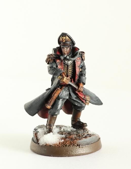
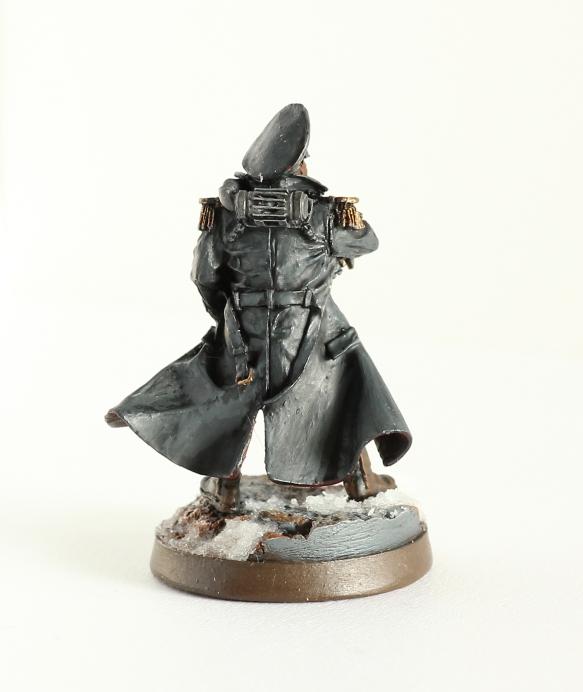
Jadenim: Commissar
Spoiler:
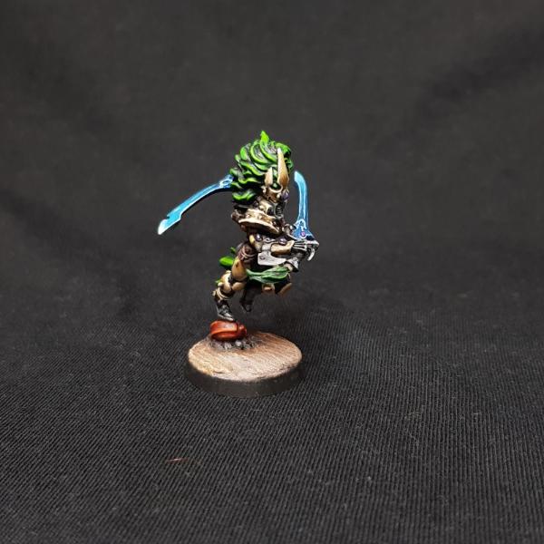
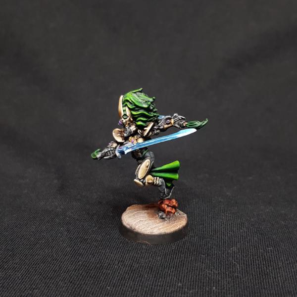
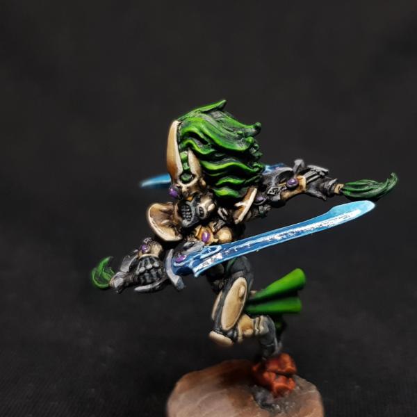
Tyranid Horde: Howling Banshee Exarch
Spoiler:
lipsdapips: Ultramarines Captian
Spoiler:
ChaosDad: Wraithlord
Spoiler:
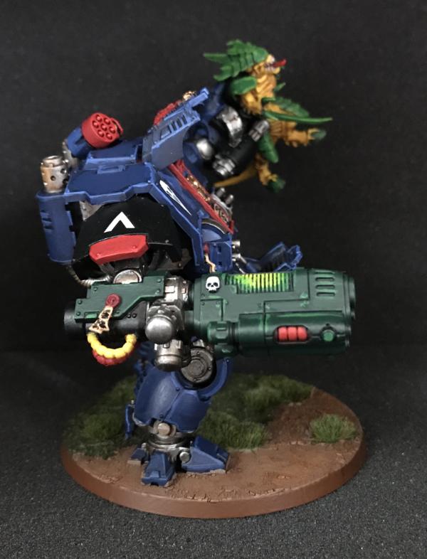
Aash: Redemptor Dreadnought
Spoiler:
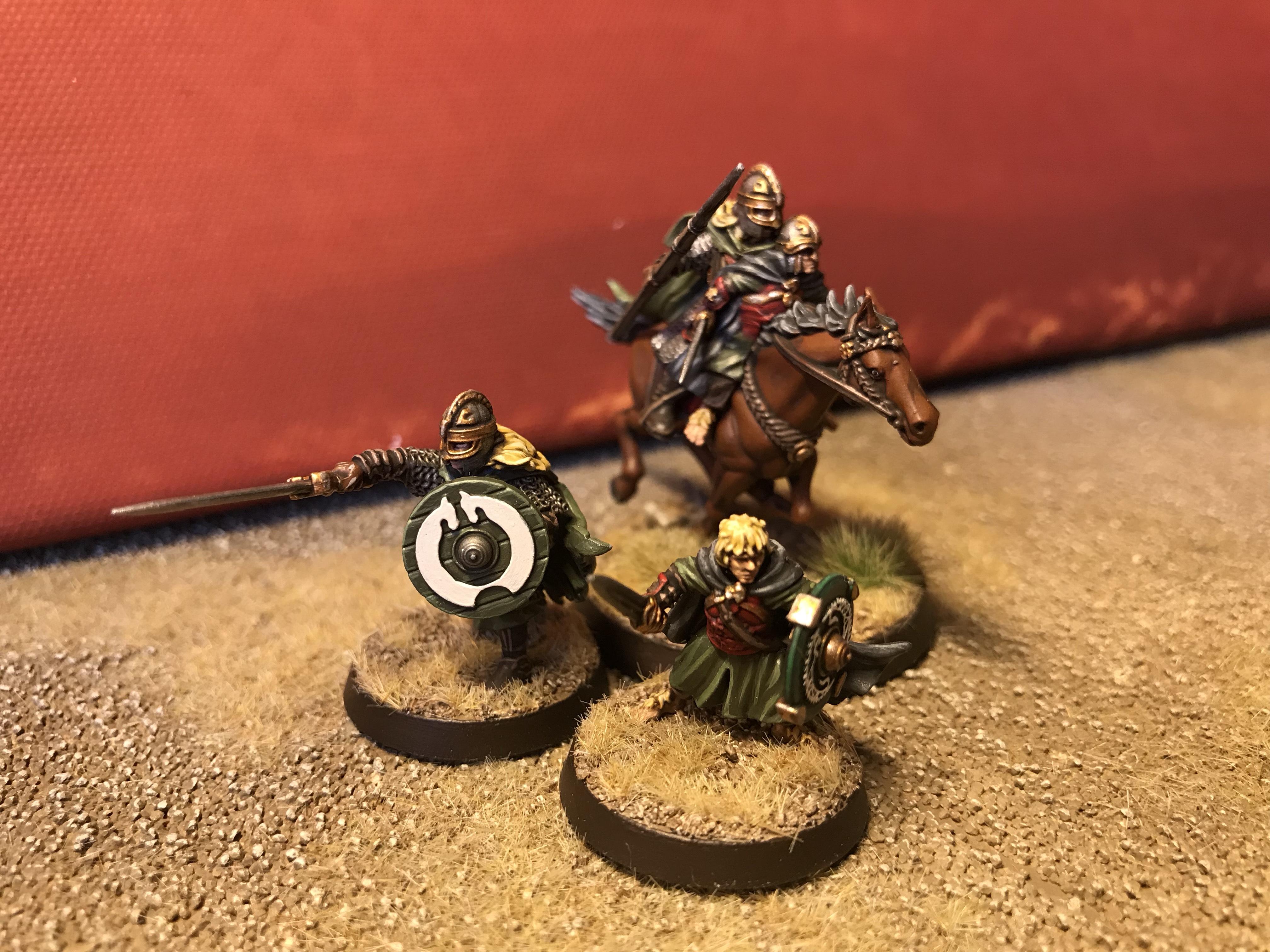
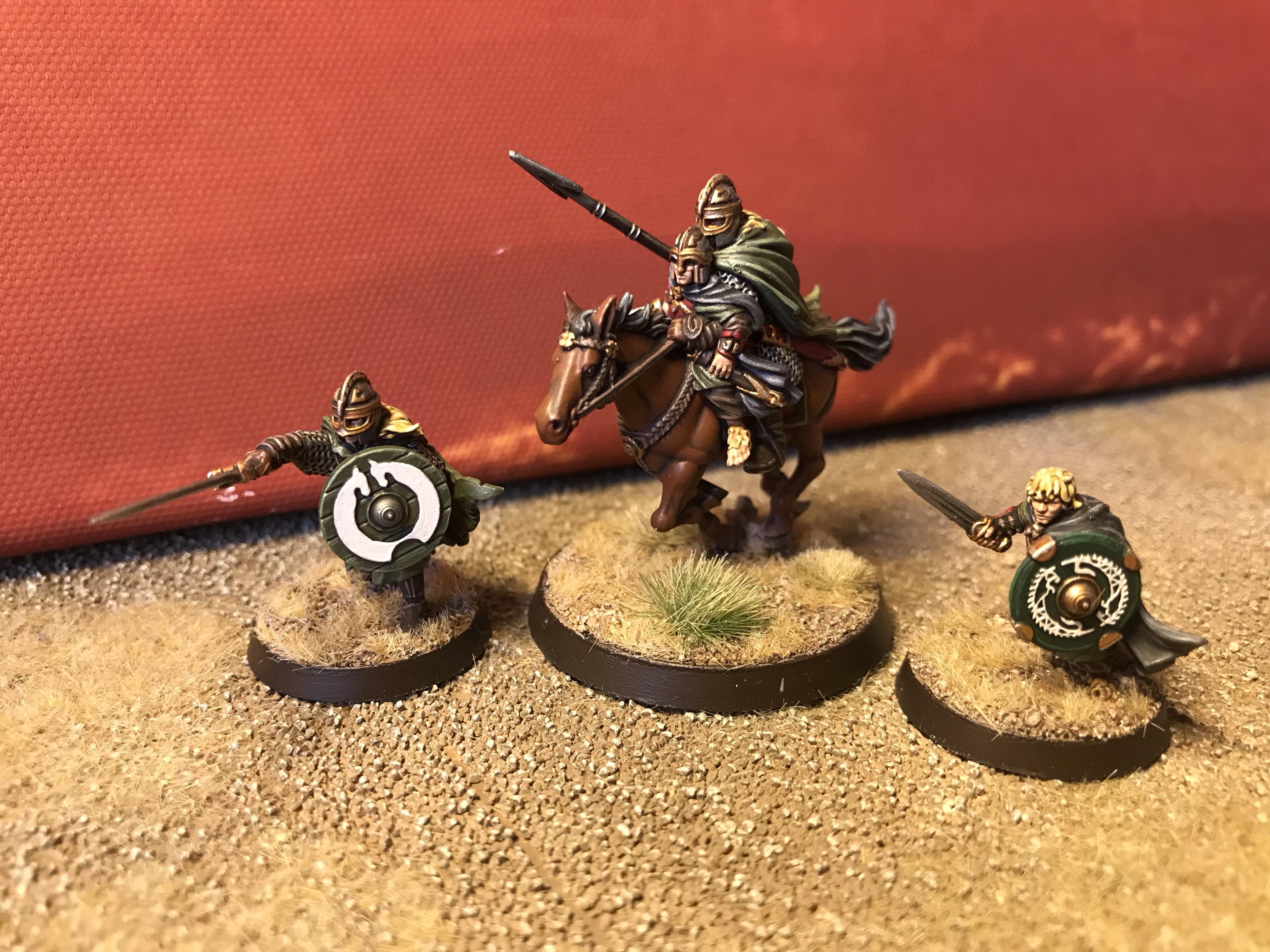
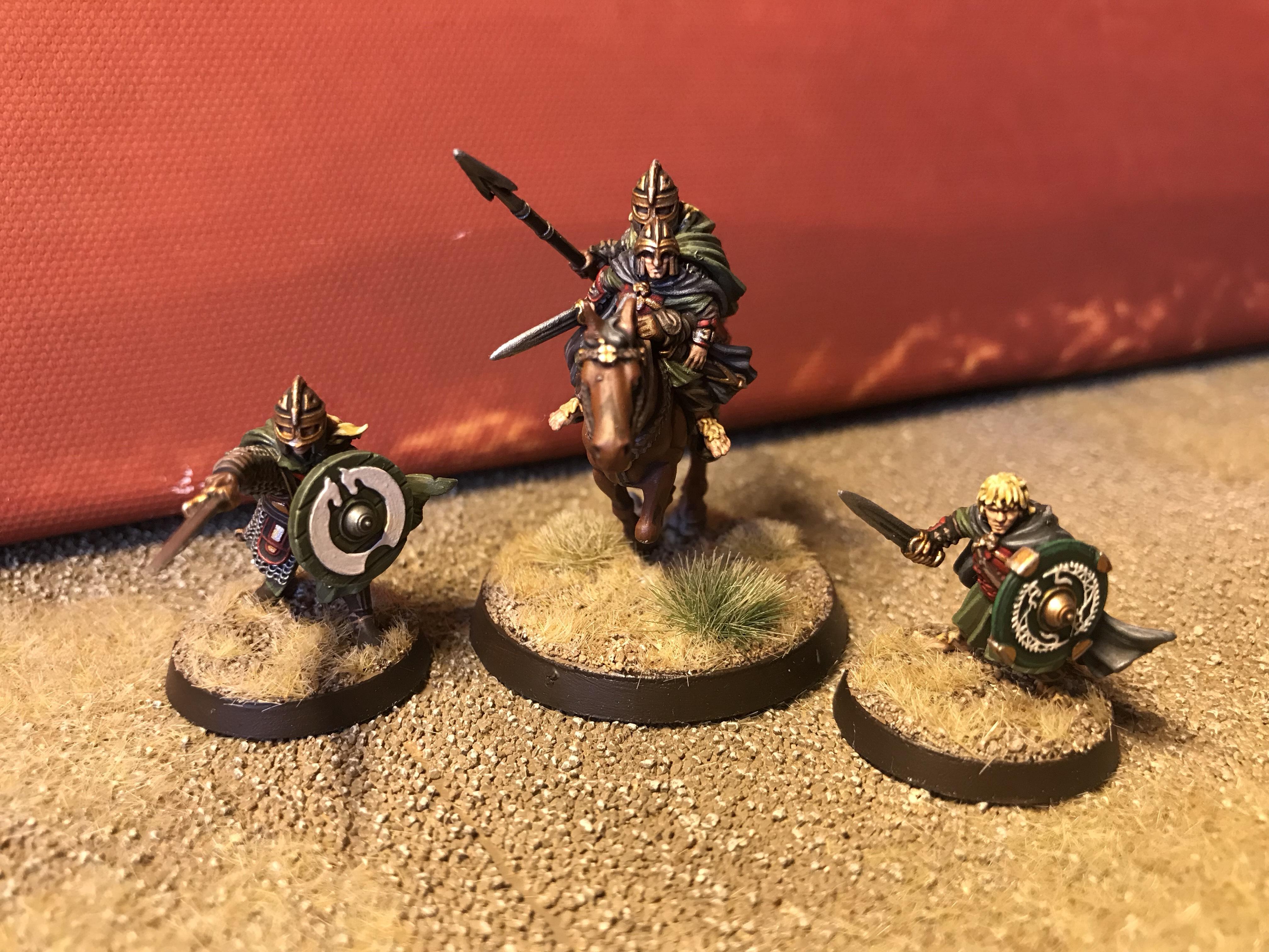
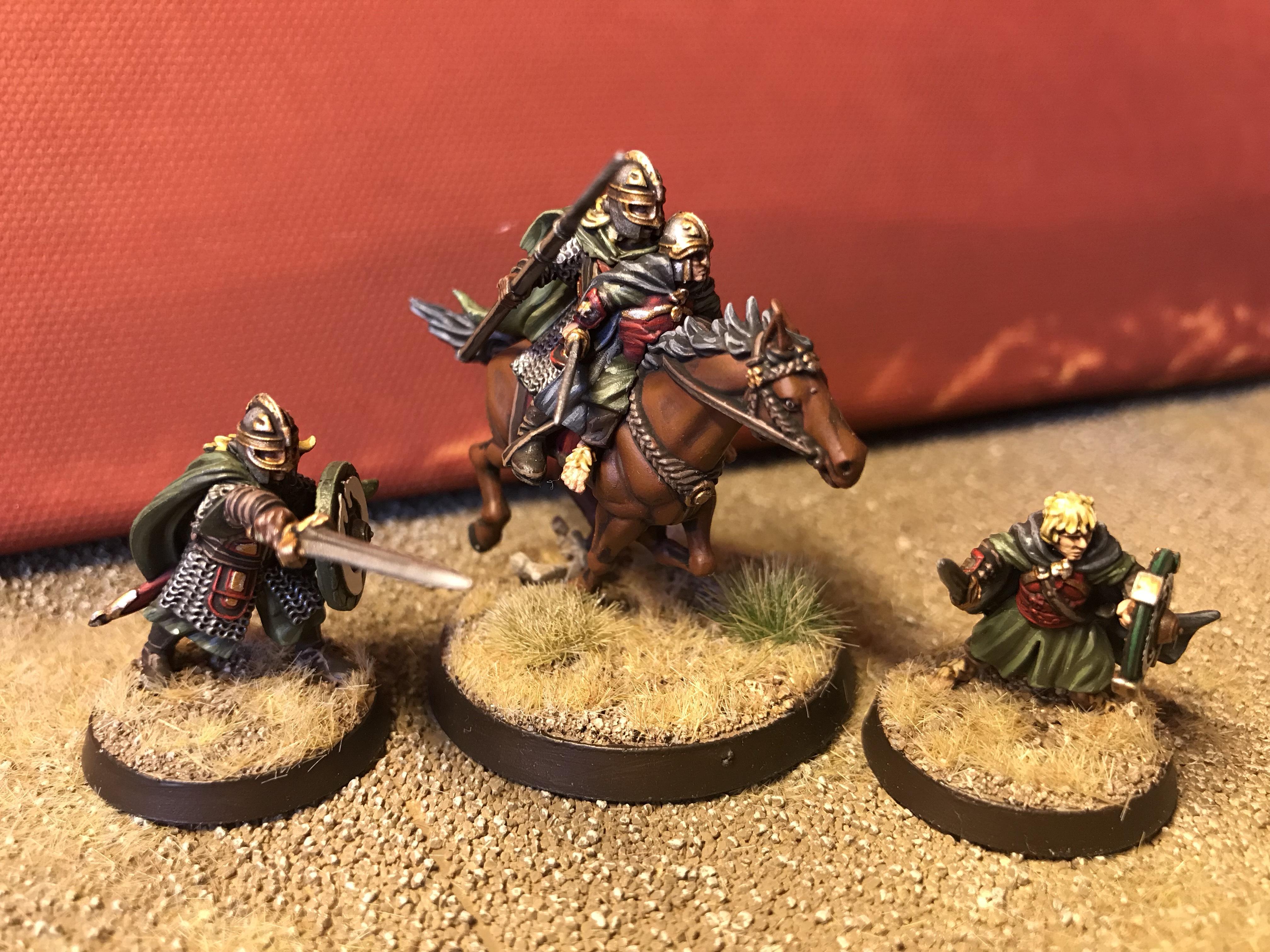
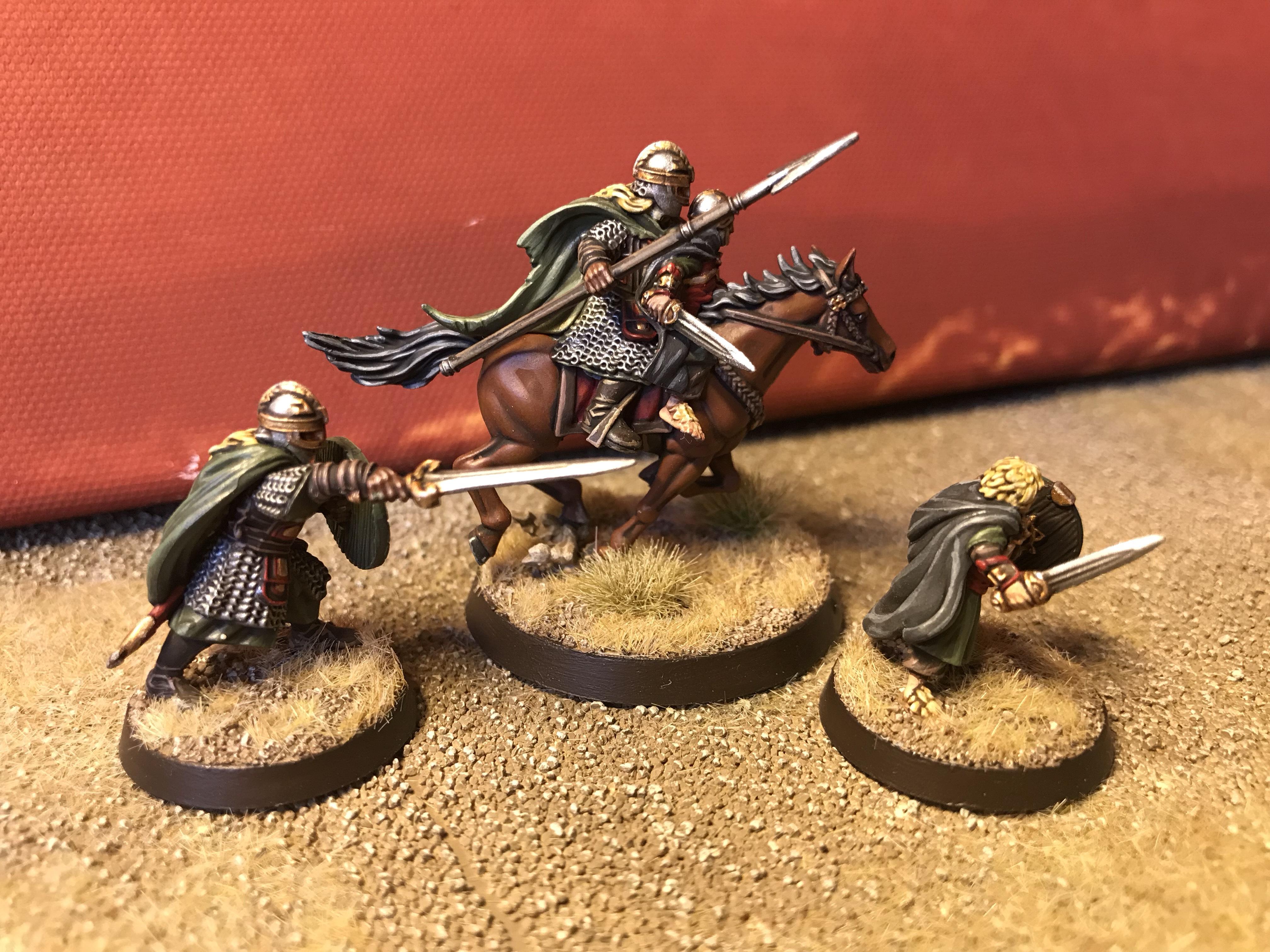
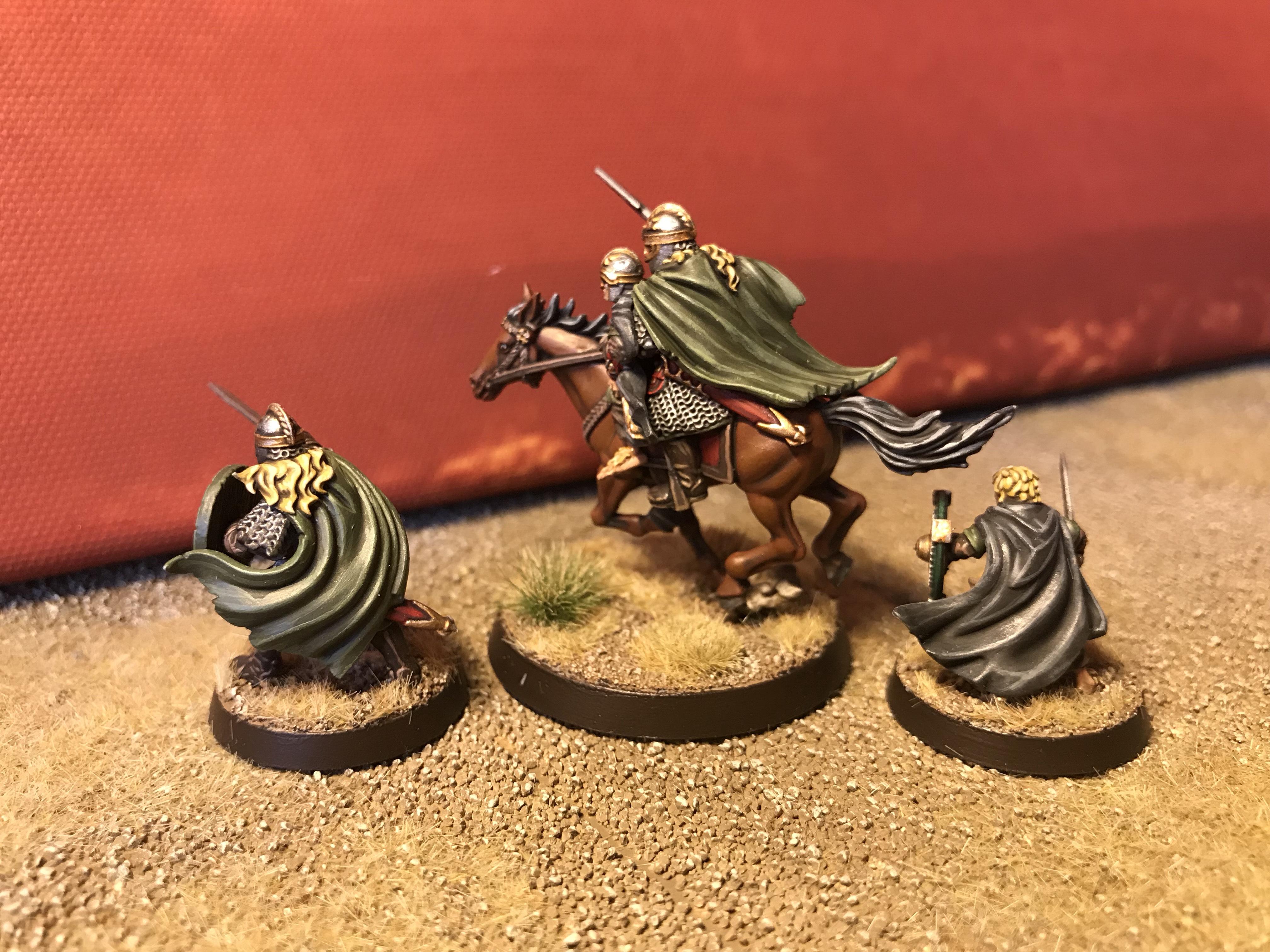
Oppl: Eowyn and Merry
Spoiler:
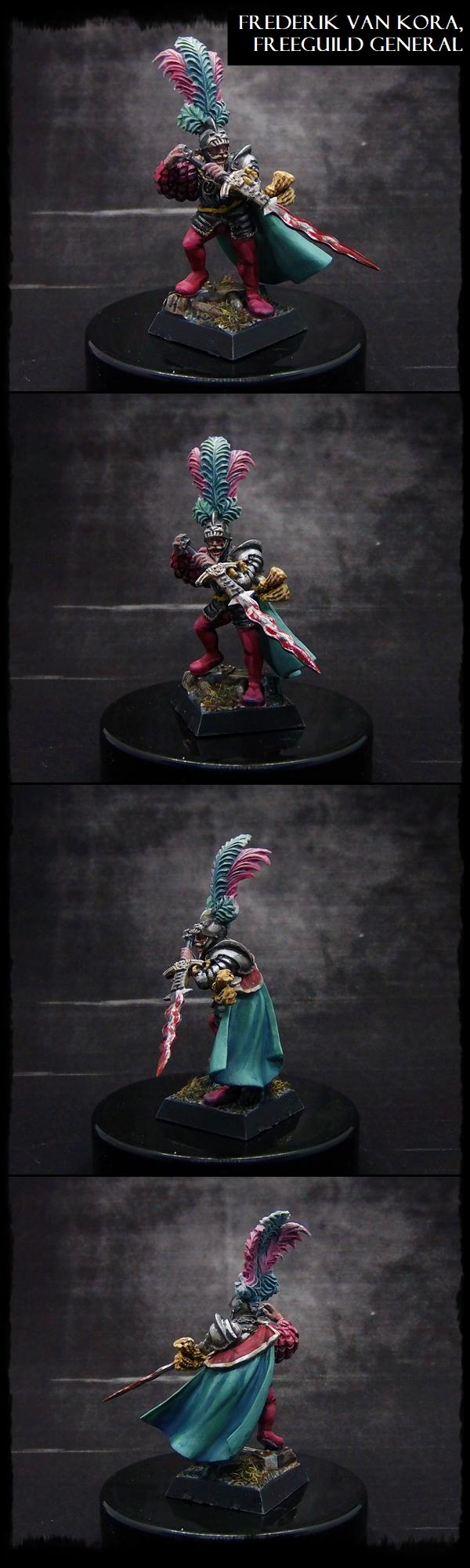
Paradigm: Freeguild Captain
Spoiler:
Captain Brown: Imperial Guard squad
Spoiler:
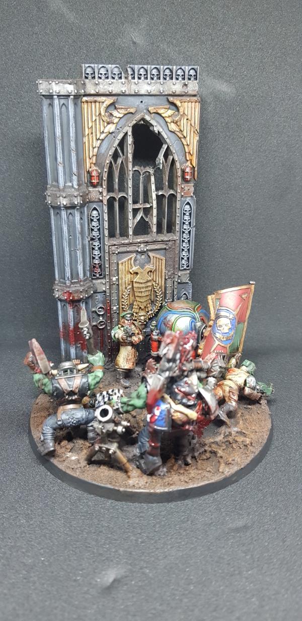
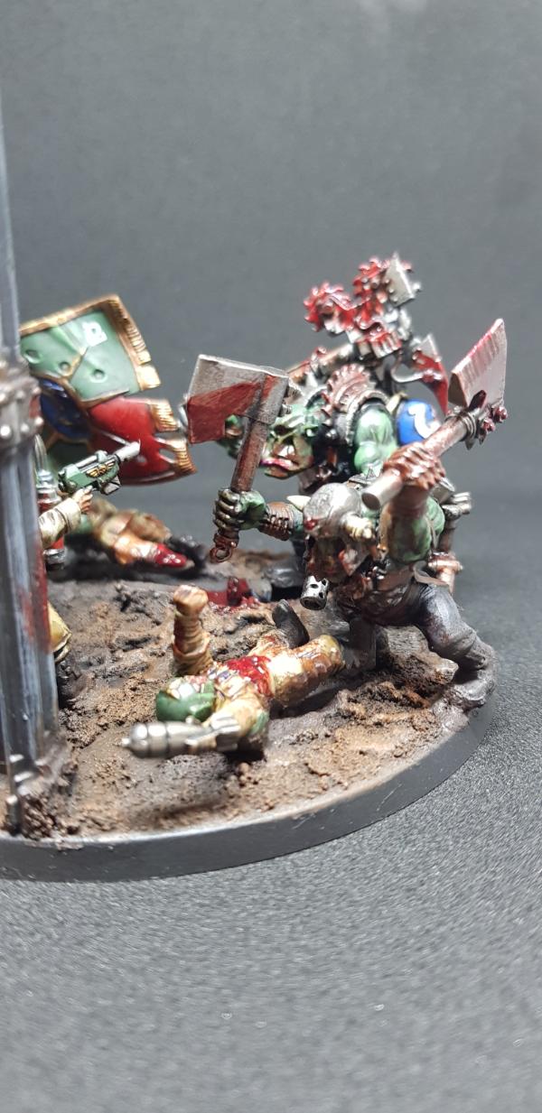
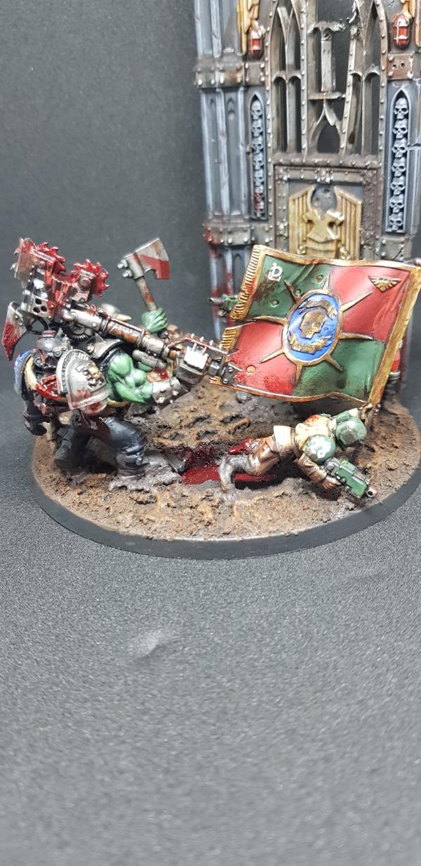
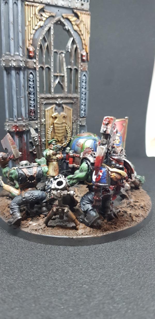
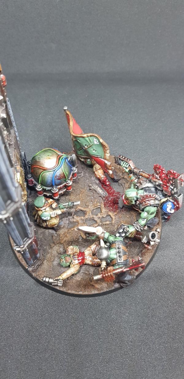
Deadshot: Last Stand diorama
Spoiler:
Tim 121RVC: Orc Boss
Spoiler:
feltmonkey: Janus Faith
Spoiler:
DV8: Winston Churchill
Spoiler:
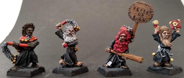
dukeofbeer: Empire Flagellants
Spoiler:
DanceofSlaaneesh: Stormcast Castigator
Spoiler:
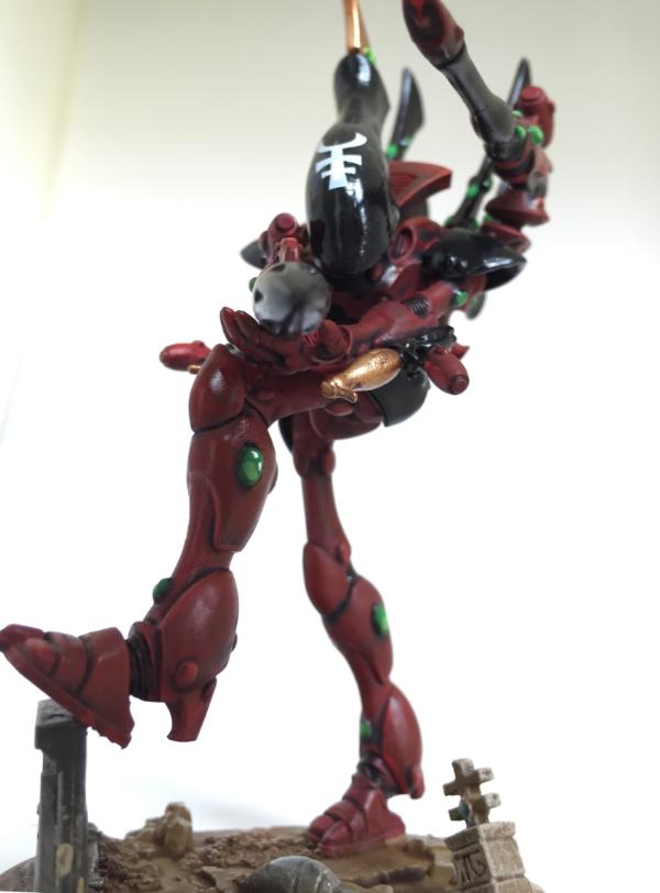
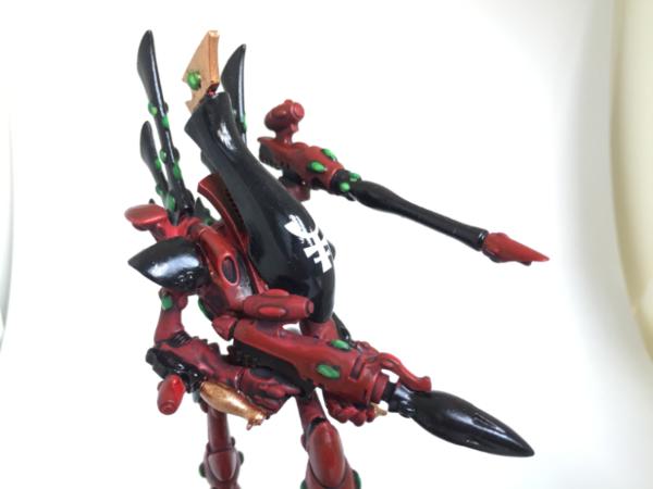
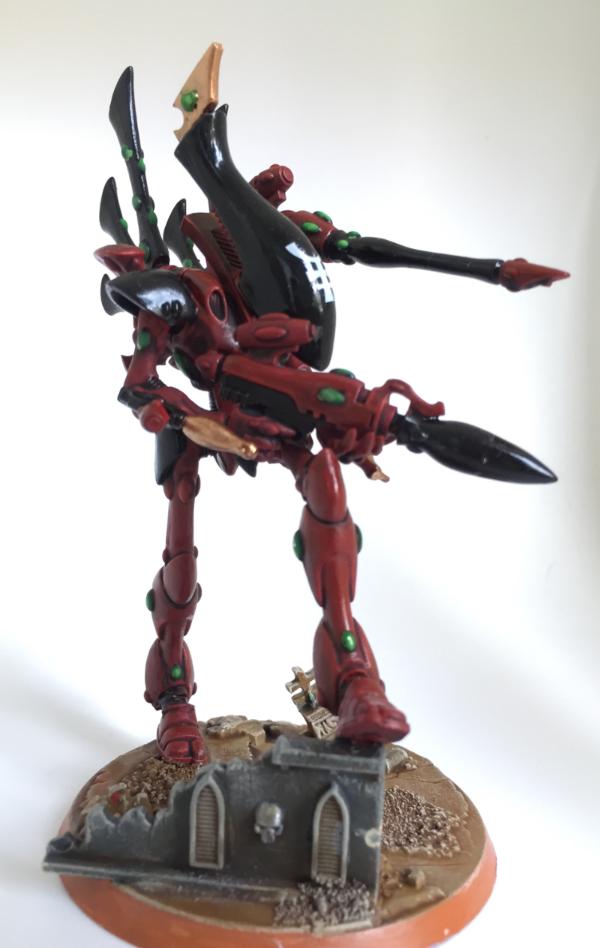
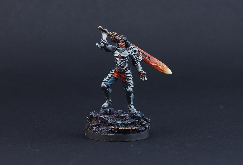
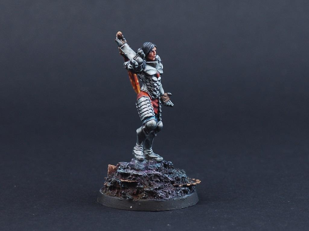
Bellerophon: Wraithknight
Spoiler:
Chris56: Wight King vs Witch Elf
Spoiler:
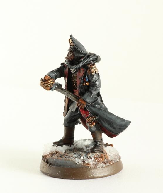
Peregrine: Commissar
Spoiler:
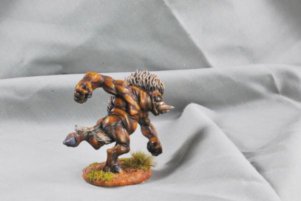
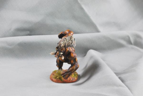
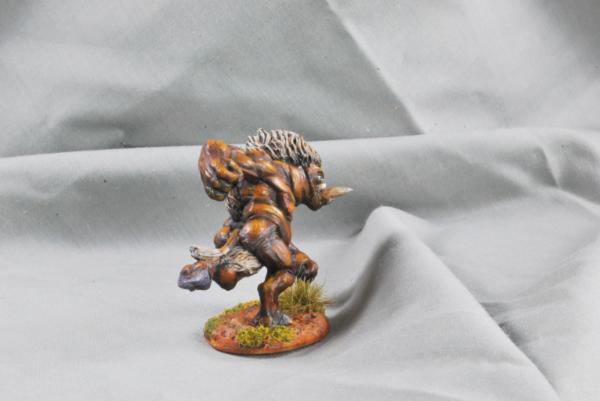
vejut: Wereboar
Spoiler:
2019/06/07 11:11:05
Subject: VOTE For The Winner of the Unofficial Painting Challenge Round 51: To The Death!
Some pretty great entries this month. Puts my brushwork to shame, for sure. I voted for:
queen_annes_revenge: Great job on Abaddon. The new model is amazing and this makes me really want to get it for myself (only reason I haven't already is because I'm thinking about selling most of my Chaos collection)
Midget Gems: Very well painted diorama that fits the theme perfectly.
lipsdapips: That Captain looks great. With the beard and everything he makes me think a little bit of Sean Connery.
Oppl: I like just about anything Lord of the Rings related, and you did a great job on those models.
DV8: Churchill turned out really good. I'm sure it's tough to make all those different textures look good at that scale, but you pulled it off.
Really everyone did pretty good. I'm happy with my own entry, although I did kind of rush it at the end and it shows. Too much time spent playing Warframe and SMITE instead of painting. Shout out as always to Paradigm for taking the time to run these challenges and set up the voting threads and everything. We all appreciate your hard work! See you all in the Mad Science challenge!
My armies (re-counted and updated on 11/7/24, including modeled wargear options):
Dark Angels: ~16000 Astra Militarum: ~1200 | Imperial Knights: ~2300 | Leagues of Votann: ~1300 | Tyranids: ~3400 | Stormcast Eternals: ~5000 | Kruleboyz: ~3500 | Lumineth Realm-Lords: ~700
Check out my P&M Blogs: ZergSmasher's P&M Blog | Imperial Knights blog | Board Games blog | Total models painted in 2024: 40 | Total models painted in 2025: 21 | Current main painting project: Warhammer 40k Leviathan set
Mad Doc Grotsnik wrote: You need your bumps felt. With a patented, Grotsnik Corp Bump Feelerer 9,000.
The Grotsnik Corp Bump Feelerer 9,000. It only looks like several bricks crudely gaffer taped to a cricket bat.
Grotsnik Corp. Sorry, No Refunds.
2019/06/08 11:21:11
Subject: Re:VOTE For The Winner of the Unofficial Painting Challenge Round 51: To The Death!
Right, feedback time. First off, great work everybody!
Nevelon: Nice choice to pick the wraithlord and dreadnought, they make a good thematic pair and I like the reposing you've done on the wraith. Seeing the Deathwatch dread makes me want to put a few more together for my own Deathwatch, so you must be doing something right there!
Jamie Shred: Cool choice of models there. The shading/layering/highlighting on the fabric works nicely, and I'm especially fond of your red tone. The freehand on the cloak was a nice touch to break up an area of flat colour.
queen_annes_revenge: I always have high expectations when I see one of your models, and he certainly doesn't disappoint. Beautiful painting all round. I'm particularly drawn to the primaris helmet on his trophy rack for some reason, I'm not sure whether it's the colour or the way you've painted it but it looks great. The freehand Lupercal on the cloak is worth the victory alone!
Rybrook: You've hit my soft spot for terminators there. Always loved those guys, especially in that classic Blood Angels scheme.
Midget_Gems: Great diorama, with a real sense of motion. Both combatants look good - I like the dwarf's stripy trousers, and the orc's flint axe.
ZergSmasher: Wheelie, wheee! Nice use of the ravenwing models there, they look gritty and ready for action.
DrGiggles:I like the more subdued tone of the red that a lot of people might use, it's well shaded and highlighted, and nicely blended into the black areas. Good work.
Flinty: Nice varied colour palette there keeps these guys interesting and very fitting to the models. I like the tarnished, rusty look you've got on the metallics.
Maharg: I love that model, it's so determined and characterful. The skin and hair tones work great.
JustALittleOrkish: The bases stand out for me on these guys, very suitably slimy and Nurgle-y. I like the subdued but well shaded colours on the models.
Jadenim: Another lovely model from Victoria, the grey on the cloak here is particularly nice and fits the sculpt. The skin tone is also really well done.
Tyranid Horde: That's a beautiful paintjob. I love the mirrorswords and the green tone on the hair.
lipsdapips: Clean, precisely highlighted, very well done skin tone and face, interestingly posed model... I feel like I could say this about every model you paint and I'm impressed each time.
ChaosDad: The missile launcher looks good in the rifle pose, it's a nice shade of red and I like your gem effect.
Aash: Clever pose. The tyranid works surprisingly well in mid-air despite being posed for walking on the ground, and the glow on the plasma coils is nicely done.
Oppl: Good colour choices, they really suit the models and the source material
Paradigm: Old world Empire has always been cool, he looks good in the magenta and blue, and I like the layers on the cloak.
Captain Brown: I like the brighter camo-looking fatigues against the matt -style armour. I also like that it's the plasma gunners who are bothering to wear their helmets and eye protection. Good luck with that, guys...
Deadshot: Very well put together diorama here, full of interesting little details. I like the injured officer, the bloody mess through most of the piece, and the deathwatch trophy.
Tim 121RVC: Looking good on the raised base. I like the metallic tone on the armour and the red chains.
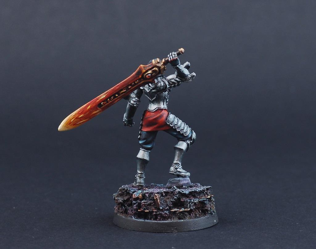
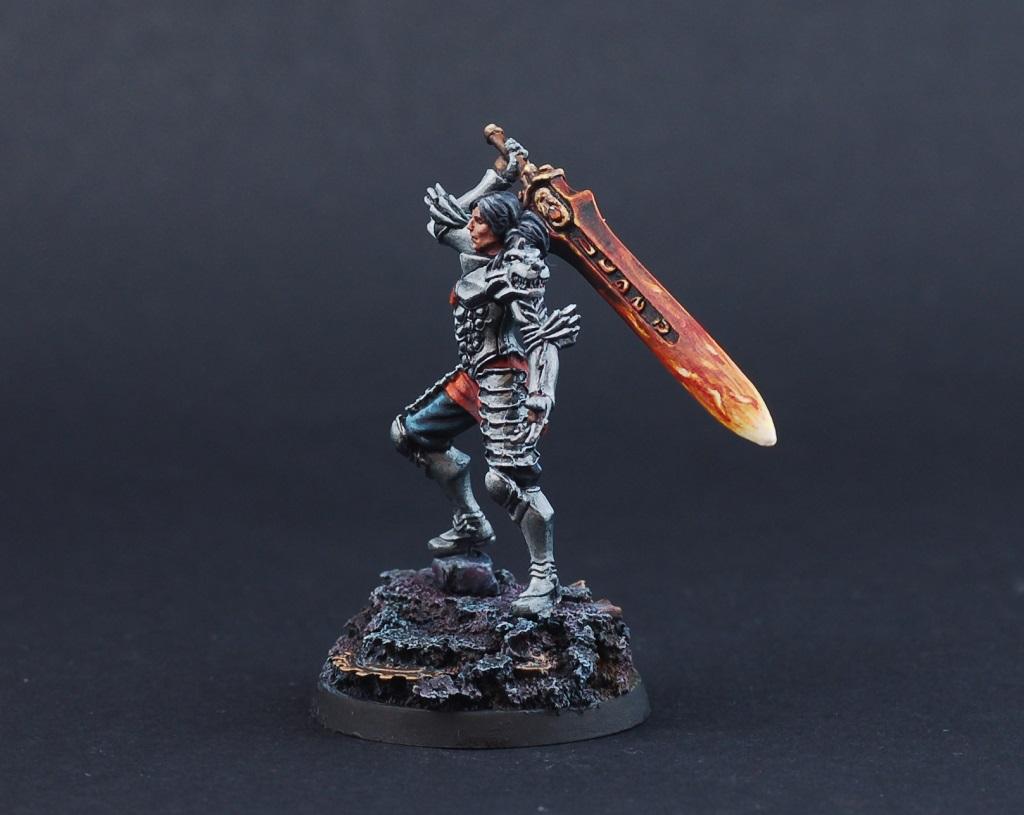
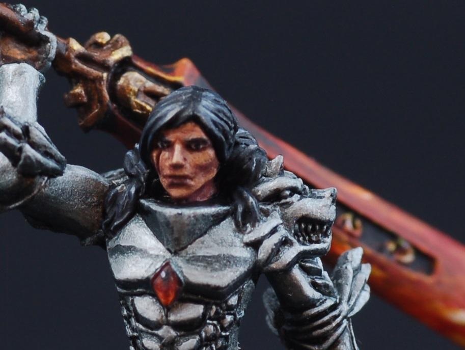
feltmonkey: Beautifully painted all-round. I could pick out any part of it for individual praise, but I'll stick with one and say my favourite part is the flame effect on the end of the sword.
DV8: I don't think I'd have the confidence to take on a bust like that, with so much thought to go into the variations in tones for areas that you could do with a single shaded/highlighted tone on a smaller model. You've pulled it off.
dukeofbeer: Those models have so much character. Good thematic choice! I'll always have a soft spot for good old school square based fantasy models. Nicely painted and detailed.
DanceofSlaanesh: I'm enjoying the almost cel-shaded style you've developed here, it's looking really cool and not something that you often see. Good job.
Bellerophon: Hey, that's me. I'm proud of this model, and thanks for the votes!
Chris56: Great idea, there's so much character in this and I love the pose of the leaping witch elf. The rusty metal on the wight king is a nice touch.
Peregrine: Good choice. I like the subdued scheme and especially the red tone on the inner cloak and lapels.
vejut: This one looks interesting, the contrast between the shades and highlights gives it a cool effect and really brings out the texture in the model.
Thanks for the feedback Bellerophon, I have had loads of practice with red as Blood Angels are my main 40k army so really happy you like it.
It was really tough choosing but my votes went to.
Chris56 - Great little scene that very much reminds my of a certain scene from Game of Thrones and that freehand on the cloak puts mine to shame. Fantastic work.
Bellerophon - That's a huge model to paint in just a month and it's done to a really high standard all round.
Dance of Slaaneesh - Love your cartoon/cell shaded style. Would you mind sharing your process for the gold? I assume it's NMM?
Feltmonkey - Love the detail on the face and the overall clean and contrasting look.
Lipsdapips - Just awesome! The highlighting is fantastic, sword looks great and the face is very realistic.
Midgetgems - Those tattoos are awesome, really well done.
Queen Anne's Revenge - Awesome work again and I can't believe how quickly you finished him.
2019/06/08 13:04:20
Subject: VOTE For The Winner of the Unofficial Painting Challenge Round 51: To The Death!
Queen Annes Revenge, Maharg,Dead shot, Dance Of Slaneesh all get my votes because i like those ones equally the most, but it was sooo hard to pick because there are soo many ones that also deserved a vote.
This message was edited 2 times. Last update was at 2019/06/08 13:51:45
Thanks for the feedback. Next month i try to make detailed feedback on every entry too.
@Jamie Shred I use this process described better then i can do on this website http://www.hessers.space/blog/layering-glazing-wet-blending/ But of course i pick a brown and and gold looking yellow instead. Then i try to think about where to put the highlights as if it where relfecting a sun or a bright light. Something im not very good at hence the cartoony looking result
2019/06/08 14:07:17
Subject: Re:VOTE For The Winner of the Unofficial Painting Challenge Round 51: To The Death!
Bellerophon wrote: Right, feedback time. First off, great work everybody!
queen_annes_revenge: I always have high expectations when I see one of your models, and he certainly doesn't disappoint. Beautiful painting all round. I'm particularly drawn to the primaris helmet on his trophy rack for some reason, I'm not sure whether it's the colour or the way you've painted it but it looks great. The freehand Lupercal on the cloak is worth the victory alone!
Thanks! Yeah I pulled some late nights trying to get him ready for fest but still didn't manage! Yeah I'm surprised about the trophy helmet, I only used 3 or 4 layers for the contrast on that bit due to rushing, which is about half what I normally would, but it still came out quite striking.. Lucky blends I guess ha.
Automatically Appended Next Post: I voted for oppl, and dv8.
This message was edited 2 times. Last update was at 2019/06/08 14:09:11
Heresy World Eaters/Emperors Children
Instagram: nagrakali_love_songs
2019/06/08 15:01:54
Subject: Re:VOTE For The Winner of the Unofficial Painting Challenge Round 51: To The Death!
A lot of inspiring highlighting on some of the models I really want to try myself some day!
Nevelon: Nice green/blue accent on the DN's cannons.
Midget Gems: Great dio with these two arch enemies. Tough boys, on their bare feet in a cold looking environment.
Dr Giggles: I love the skin tones and how the black + red work together. Truly devil-ish!
Flinty: Excellent rust, I don't think that could've been done any better.
JustALittleOrkish: Cool bases with that slime! I also like the blue hammer a lot. Maybe unintended, but a beautiful ghostly look.
Tyranic Horde: Interesting contrast on this model between the green and black.
Lipsdapips: Very impressive work on the head, the skin looks fantastic.
Aash: Cool green lighting effect on the cannon.
Paradigm: Great paintjob all around, but the cloak stands out for me.
Deadshot: Kudos for making/painting all that in a month, the banner is my favorite part.
Feltmonkey: I don't think I've ever seen such a flaming sword effect. Love it, very original.
DV8: Suitable entry for the deadline around D-day and a terrific paintjob.
Dukeofbeer: Funny models, I was unfamiliar with them. The third one reminds me of Yosemite Sam from Looney Tunes!
DanceofSlaaneesh: I like everything on this entry, very inspiring work.
Bellerophon: Smooth green highlighting, really makes everything glowing.
Chris56: I like how all the bronze/rust ties both models and the base together.
Peregrine: Good work on the black leather!
2019/06/08 17:44:53
Subject: VOTE For The Winner of the Unofficial Painting Challenge Round 51: To The Death!
@Jamie Shred I use this process described better then i can do on this website http://www.hessers.space/blog/layering-glazing-wet-blending/ But of course i pick a brown and and gold looking yellow instead. Then i try to think about where to put the highlights as if it where relfecting a sun or a bright light. Something im not very good at hence the cartoony looking result
Cheers. How long does it take you to do each model this way? I can't imagine doing a whole army this way but it would be great for my sanguinary guard.
2019/06/08 19:40:16
Subject: VOTE For The Winner of the Unofficial Painting Challenge Round 51: To The Death!
Cheers. How long does it take you to do each model this way? I can't imagine doing a whole army this way but it would be great for my sanguinary guard.
I painted the model over 3 evenings, but i couldnt tell you any exact time. i watch youtube vids and surf the net at the same time etc. It will take alot of time though, since you cant really get a gold effect if you do not mage a gradient, the edge highlight approach wont work in this case. but sanguinary guard deserve your best if you want to challange yourself its great fun. Be prepared for some trial and error, thats why i use some cheap stormcasts in this learning process.
2019/06/09 00:07:12
Subject: Re:VOTE For The Winner of the Unofficial Painting Challenge Round 51: To The Death!
Bellerophon wrote: Right, feedback time. First off, great work everybody!
Spoiler:
Nevelon: Nice choice to pick the wraithlord and dreadnought, they make a good thematic pair and I like the reposing you've done on the wraith. Seeing the Deathwatch dread makes me want to put a few more together for my own Deathwatch, so you must be doing something right there!
Jamie Shred: Cool choice of models there. The shading/layering/highlighting on the fabric works nicely, and I'm especially fond of your red tone. The freehand on the cloak was a nice touch to break up an area of flat colour.
queen_annes_revenge: I always have high expectations when I see one of your models, and he certainly doesn't disappoint. Beautiful painting all round. I'm particularly drawn to the primaris helmet on his trophy rack for some reason, I'm not sure whether it's the colour or the way you've painted it but it looks great. The freehand Lupercal on the cloak is worth the victory alone!
Rybrook: You've hit my soft spot for terminators there. Always loved those guys, especially in that classic Blood Angels scheme.
Spoiler:
Midget_Gems: Great diorama, with a real sense of motion. Both combatants look good - I like the dwarf's stripy trousers, and the orc's flint axe.
ZergSmasher: Wheelie, wheee! Nice use of the ravenwing models there, they look gritty and ready for action.
DrGiggles:I like the more subdued tone of the red that a lot of people might use, it's well shaded and highlighted, and nicely blended into the black areas. Good work.
Flinty: Nice varied colour palette there keeps these guys interesting and very fitting to the models. I like the tarnished, rusty look you've got on the metallics.
Maharg: I love that model, it's so determined and characterful. The skin and hair tones work great.
JustALittleOrkish: The bases stand out for me on these guys, very suitably slimy and Nurgle-y. I like the subdued but well shaded colours on the models.
Jadenim: Another lovely model from Victoria, the grey on the cloak here is particularly nice and fits the sculpt. The skin tone is also really well done.
Tyranid Horde: That's a beautiful paintjob. I love the mirrorswords and the green tone on the hair.
lipsdapips: Clean, precisely highlighted, very well done skin tone and face, interestingly posed model... I feel like I could say this about every model you paint and I'm impressed each time.
ChaosDad: The missile launcher looks good in the rifle pose, it's a nice shade of red and I like your gem effect.
Aash: Clever pose. The tyranid works surprisingly well in mid-air despite being posed for walking on the ground, and the glow on the plasma coils is nicely done.
Oppl: Good colour choices, they really suit the models and the source material
Paradigm: Old world Empire has always been cool, he looks good in the magenta and blue, and I like the layers on the cloak.
Captain Brown: I like the brighter camo-looking fatigues against the matt -style armour. I also like that it's the plasma gunners who are bothering to wear their helmets and eye protection. Good luck with that, guys...
Deadshot: Very well put together diorama here, full of interesting little details. I like the injured officer, the bloody mess through most of the piece, and the deathwatch trophy.
Tim 121RVC: Looking good on the raised base. I like the metallic tone on the armour and the red chains.
feltmonkey: Beautifully painted all-round. I could pick out any part of it for individual praise, but I'll stick with one and say my favourite part is the flame effect on the end of the sword.
DV8: I don't think I'd have the confidence to take on a bust like that, with so much thought to go into the variations in tones for areas that you could do with a single shaded/highlighted tone on a smaller model. You've pulled it off.
dukeofbeer: Those models have so much character. Good thematic choice! I'll always have a soft spot for good old school square based fantasy models. Nicely painted and detailed.
DanceofSlaanesh: I'm enjoying the almost cel-shaded style you've developed here, it's looking really cool and not something that you often see. Good job.
Bellerophon: Hey, that's me. I'm proud of this model, and thanks for the votes!
Chris56: Great idea, there's so much character in this and I love the pose of the leaping witch elf. The rusty metal on the wight king is a nice touch.
Peregrine: Good choice. I like the subdued scheme and especially the red tone on the inner cloak and lapels.
vejut: This one looks interesting, the contrast between the shades and highlights gives it a cool effect and really brings out the texture in the model.
Thanks, it had to be done I really like the retro themes.
I did have to rush these, had a lot of issues this month you know because real life and stuff, non the less I enjoyed painting them
A good amount of quality entries this month, voted for at least a dozen I think.
Thanks for the comments Zerg, Bellerophon, Jamie, Tim, yeah these guys don't need shoes! I was happy how it turned out and doing it has highlighted to me a few areas I need to get better at/practise.
Comments
Nevelon: 2 big guys done, the Eldar Walkers pose is really dynamic
Jamie Shred: You have done really well with these guys, I like how you let us see your progress in the thread and well done on the Freehand for the cloak queen_annes_revenge: The Cloak is awesome, really well done and I really like all the little details on the base too.
Rybrook: A solidly painted squad of terminators, they look very uniform together
Midget Gems: Need to learn how to do NMM on the Dwarf Axes and it would have looked much better, missed a trick with the orcs axes and should have blended the blue into the edge to make it look thinning to a cutting edge. Ok as a scene overall, that one has been in my list of ideas for quite some time
ZergSmasher: Solid painting Zerg, the white and black have a good contract against each other.
DrGiggles: 3 nice looking flest hounds, I like that you added extra highlights to the flesh.
Flinty: Nice rusty metal effect, you are doing that very well.
Maharg: You've managed to get some really nice detail on such a small model, the blond hair is especially good.
JustALittleOrkish: really interesting use of colour to make the weapons stand out and the bases look really cool as well.
Jadenim: very clean paintwork on all the very small details, nice to see a gray commissar as a change
Tyranid Horde: Really nice green and blue colours and a cool looking model.
lipsdapips: The way you have painted him makes me think Sean Connery is now an Ultramarine A high standard of painting all round.
ChaosDad: Nice effect with the shiny black it adds interest to the model and good gems.
Aash: Well painted Dread and a fun scene, good job.
Oppl: You have done very well to match all the details between the 4 models so they look like the same character on horse or not.
Paradigm: Some good vivid colours from you Para, suits the model very well Captain Brown: you are very good with your camo CB, a good looking Squad
Deadshot: Really cool diorama, very atmospheric with loads of nice detail. I really like this scene.
Tim 121RVC: Good conversion to make this model feel different to the normal Black Orcs, Good base and painting all round.
feltmonkey: The flames on the sword are a nice effect, and well done on the eyes, can be so hard to get them to not look cross eyed etc.
DV8: A really master class in how to paint black, love your bust painting.
dukeofbeer: cool models, you have painted their faces well and their expressions made me laugh.
DanceofSlaaneesh: your style is really interesting Dance, another really good entry from you, keep it up Bellerophon: I think you have excelled yourself this month Bellerophon, brilliant model, really love the panel edge highlighting and the sentinel in the base made me realise how big that guy is.
Chris56: Great effect on the cloak with the sun and planets, I bit of a shame some part of model is out of focus in each photo. It fits the theme really well.
Peregrine: A good model, I like that you haven't over binged or coloured him and that suits a Krieg Commissar
vejut: nice tone to the skin and good pose of the boar/man thing.
Too many positives to list, but to those I voted for.
Some were showpieces. I loved em. Queen_ann for instance. Stellar showpiece.
But special notes go towards those who did "high contrast" right. Those must look fantastic on the table top. Jamie Shred for instance or Tyranid Horde
Oppl and Bellerophon for keeping it clean, super clean. Feels good man.
Lipsadips, your work on the detail and highlighting make the model feel like it was much larger than 28mm scale. Solid.
Consummate 8th Edition Hater.
2019/06/09 22:45:06
Subject: VOTE For The Winner of the Unofficial Painting Challenge Round 51: To The Death!
Thanks to Bellerophon, Tim 121RVC, Midget Gems and meatybtz fro your kind comments and those who voted for me! I really do appreciate it and it's nice to know what I've done right
Took a few days but I did get some time to sit down and line up a few comments for everyone:
Nevelon: Really like the pose on the Wraithlord and the green accent on the lascannons work surprisingly well.
Jamie Shred: Good job on those cloaks, especially the black, it's a colour I always tend to struggle with on fabric.
queen_annes_revenge: This was the outright winner for me, excellent work all round.
Rybrook: Cool looking squad of termies, that old flamer is sweet!
Midget Gems: Great character in this duel, really impressed by the tats you've painted on the orc.
ZergSmasher: Great biker squad, the hammers look great and the flashes of red help break up the colour well.
DrGiggles: The flesh on those flesh hounds is well done, the brands especially.
Flinty: Very nice rust effects on your metallics and the flamer nozzle heat marks is awesome!
Maharg: Great character in this model, liking the blonde hair, how did you manage it?
JustALittleOrkish: Great bunch of poxwalkers, I really like how you've let the slime/goop overspill on the edge of the base!
Jadenim: Good blend of greys on her cloak, the old plasma pistol is a neat touch too.
Tyranid Horde: Thought this would do better than where it currently stands but happy enough with my effort in blending, something I've not done on an entire model before.
lipsdapips: Crisp and clean as always, good to see you're going for some central highlights to your armour panels. Great work!
ChaosDad: That gloss black really works well on a wraithlord, great basing too!
Aash: Fun scene and a well painted dread and warrior to boot!
Oppl: This got a vote from me, great set of minis and very well painted.
Paradigm: I think I said this on your blog but the hues of blue you've achieved are really nice!
Captain Brown: Great camo, the plasma guys are my favourites of the bunch!
Deadshot: This one got my vote as your diorama properly embodies the theme in my opinion. Great job all round!
Tim 121RVC: This deserved more in my opinion. It's a really well painted model and the red you've used is great.
feltmonkey: Great looking armour and that gemstone in the chest is great!
DV8: Another one that deserves more votes, excellent painting and I'm jealous of all the different shades you've achieved!
dukeofbeer: Characterful models and you've done them justice, especially in the faces and hair.
DanceofSlaaneesh: I've bookmarked that link you've provided in the hopes I can paint up a model to something similar to yours, great style.
Bellerophon: Big undertaking doing a model that size in a month, the white is so crisp and the freehand is brilliant. Got my vote.
Chris56: Another one respecting the theme, well done and I like the freehand on the cloak!
Peregrine: Suitably gritty and muted for DKoK. Good work all round on this one.
vejut: Great browns for this mini, can definitely see this guy charging headlong into a brawl!
Thanks for the feedback from everyone, I think this is the largest # of votes I've received so far which is surprising given the quality of this month's entries.
As much fun as receiving praise is I wouldn't mind a little critique to try and see what I could better next time. What do you all think I could have done to improve the paint job? (Besides paint the rim black, ran out of time)
3500+
3300+
1000
1850
2000
2019/06/11 13:45:49
Subject: Re:VOTE For The Winner of the Unofficial Painting Challenge Round 51: To The Death!
DrGiggles wrote: Thanks for the feedback from everyone, I think this is the largest # of votes I've received so far which is surprising given the quality of this month's entries.
As much fun as receiving praise is I wouldn't mind a little critique to try and see what I could better next time. What do you all think I could have done to improve the paint job? (Besides paint the rim black, ran out of time)
Your painting technique looks good.. My suggestions to you are to work on bringing up your contrast, particularly on the red and black areas. Another thing would be to learn about contrast in relation to colour theory.
Using this model as an example, you have a subject that is black and red in colour, but you've put it on a grey base. So subconsciously, the black tends to blur into the grey, and the only contrast you have is the black and red (which is the starkest contrast after black/white). What I'd do here is take reds complimentary colour, which is green, and work that into the base. You could do this by putting some grass tufts or green foliage, putting green moss or using a green powder over the rock etc. This will create a pleasing contrast to the eye and help distinguish the base from the model.
This is what I've done on my Abaddon. There are a lot of red areas on his cloak, hair etc, so I made the conscious decision to make the trophy helmet green, and work lots of green foliage and powders into the base.
I found that once I started painting for demon these things were constantly pushing themselves to the forefront of my mind. They really do aid in the composition and overall look of the piece, and you'll find most of the trophy winners don't pick their colours randomly, every element is thought through.
This message was edited 4 times. Last update was at 2019/06/11 13:53:06
Heresy World Eaters/Emperors Children
Instagram: nagrakali_love_songs
2019/06/11 15:12:01
Subject: VOTE For The Winner of the Unofficial Painting Challenge Round 51: To The Death!
Thanks for all the great comments! Certainly not my most dynamic entry, but a fun relaxing piece for sure!
My votes went to:
QAR - Great work; the crispness of the freehand is really what sold it for me! Great stuff! Now we need to push you into dynamic zenithal lighting!
Oppl - Very clean work; almost makes me wish I'd painted my Rohan...until I remembered how much I hated that game...
Danseofslaanesh - Your NMM keeps improving! My only critique is I think you need more variation in your lights and darks. Metal in an environment, even brushed/matte metal (re: not shiny and chrome) will reflect something from the environment, so you are going to get a lot of nuances of light spots and dark spots (and also the hues and tones in the color) and everything in between. I'd love to see your next NMM piece have some more of that detail in there. And you need those specular "ping" highlights man! Just throw em on there! Take a look at Darren Latham's NMM as reference if you're interested.
This message was edited 2 times. Last update was at 2019/06/11 15:13:05
DV8 wrote: Thanks for all the great comments! Certainly not my most dynamic entry, but a fun relaxing piece for sure!
My votes went to:
QAR - Great work; the crispness of the freehand is really what sold it for me! Great stuff! Now we need to push you into dynamic zenithal lighting!
Thanks! Yeah light sourcing is something I often grapple with. Usually I tend to just place my light sources above, and then I'm other areas just do what seems best to make the area stand out. Maybe I should look into that more.
Heresy World Eaters/Emperors Children
Instagram: nagrakali_love_songs
2019/06/11 21:57:45
Subject: Re:VOTE For The Winner of the Unofficial Painting Challenge Round 51: To The Death!
DrGiggles wrote: Thanks for the feedback from everyone, I think this is the largest # of votes I've received so far which is surprising given the quality of this month's entries.
As much fun as receiving praise is I wouldn't mind a little critique to try and see what I could better next time. What do you all think I could have done to improve the paint job? (Besides paint the rim black, ran out of time)
I try not to give out advice since you never know how someone will take it but as you have asked for some heres a few things to consider.
Are you happy with the model and what do you think you can improve next time or is there a specific area you want to improve in?
Your Brushwork and paint control is good.
A smother transition on the skin between the dark red shading and orange highlight will help it look like living skin. Next time you could try wet blending, or building up to a lighter colour using very thin layers/glazes.
Queen_anne is right and you don't realise how much colour theory can impact your model until you start looking into it. Heres some Colour theory but there are lots of guides or websites that talk about it http://miniaturepainting.co.uk/tutorials/colour-theory/ I sometimes use this website to check the colours I'm planning to use. http://paletton.com/#uid=25C0u0kw0drmCmTraidHF8LSh4q If you find the colour code using another website e.g. the Dakka Paint Comparison Chart https://www.dakkadakka.com/wiki/en/Paint_Range_Compatibility_Chart then it will tell you different colour combs depending on what option you select e.g. For Krone Red the closest complimentary GW paint is Warpstone Glow (you wont be able to get exact matches but can normally find something close).
For your painting I think making the face bolder would have helped bring more life into the model, you want to draw the viewers eye to where you want them to look which is normally the face of the model or its centre. To do that I add extra highlights around the face to make it lighter and stand out more. For your Flesh hounds I would have added green glowing eyes (for the red/green complimentary colours), much whiter teeth and pink tongue, and added more highlights to the sharper edges around the face like the ridges of the eyes, the snout and ribs of the neck fins. Green on the base is a go suggestion from Queen_anne
Example
Spoiler:
My two cents and hope you might find it useful
This message was edited 1 time. Last update was at 2019/06/11 21:58:17
Damn that's some smashing effort everyone!!! So jealous of the skills showcased. I'm not going to presume to offer criticism.
I really need to get my behind in gear and enter the next one.
Favourite 5 -
Abbadon - Absolutely smashing work. The work on the claw particulary cought my eye. Beatiful model.
Tyranid Horde: Howling Banshee Exarch - Beatiful paint job. Interesting head. Is that what they look like or was that a conversion? Don't actualy have any Shees...
Paradigm: Freeguild Captain - Love the sword. Looks like he's about to receive a charge and fight to the death! If he had Leather pants Id have voted for him!
feltmonkey: Janus Faith - Sick mini. what is it from ?
Midget Gems: Savage Orc vs Dwarf Slayer - Gets my vote because I love the theme and execution! Very nice duel and basing scheme!
This message was edited 2 times. Last update was at 2019/06/12 03:21:32
AngryAngel80 wrote: I don't know, when I see awesome rules, I'm like " Baby, your rules looking so fine. Maybe I gotta add you to my first strike battalion eh ? "
DrGiggles wrote: Thanks for the feedback from everyone, I think this is the largest # of votes I've received so far which is surprising given the quality of this month's entries.
As much fun as receiving praise is I wouldn't mind a little critique to try and see what I could better next time. What do you all think I could have done to improve the paint job? (Besides paint the rim black, ran out of time)
I try not to give out advice since you never know how someone will take it but as you have asked for some heres a few things to consider.
Are you happy with the model and what do you think you can improve next time or is there a specific area you want to improve in?
Your Brushwork and paint control is good.
A smother transition on the skin between the dark red shading and orange highlight will help it look like living skin. Next time you could try wet blending, or building up to a lighter colour using very thin layers/glazes.
Queen_anne is right and you don't realise how much colour theory can impact your model until you start looking into it. Heres some Colour theory but there are lots of guides or websites that talk about it http://miniaturepainting.co.uk/tutorials/colour-theory/ I sometimes use this website to check the colours I'm planning to use. http://paletton.com/#uid=25C0u0kw0drmCmTraidHF8LSh4q If you find the colour code using another website e.g. the Dakka Paint Comparison Chart https://www.dakkadakka.com/wiki/en/Paint_Range_Compatibility_Chart then it will tell you different colour combs depending on what option you select e.g. For Krone Red the closest complimentary GW paint is Warpstone Glow (you wont be able to get exact matches but can normally find something close).
For your painting I think making the face bolder would have helped bring more life into the model, you want to draw the viewers eye to where you want them to look which is normally the face of the model or its centre. To do that I add extra highlights around the face to make it lighter and stand out more. For your Flesh hounds I would have added green glowing eyes (for the red/green complimentary colours), much whiter teeth and pink tongue, and added more highlights to the sharper edges around the face like the ridges of the eyes, the snout and ribs of the neck fins. Green on the base is a go suggestion from Queen_anne
Example
[spoiler]
My two cents and hope you might find it useful
[/spoiler]
Thanks to you and QAR for the advice, I hadn't put much thought into complimentary colors. Green for the eyes and maybe a patch of moss or a green wash in crevices where water would collect would probably help the model 'pop' more so I'll try that with the ones I still need to finish. I'll also try adding another highlight of a slightly brighter orange to the face and see how much it helps.
Overall though I'm pretty happy with the results though, they are probably the best paint job I've done so far. The monthly competition is definitely pushing me to get better.
3500+
3300+
1000
1850
2000
2019/06/12 21:02:23
Subject: Re:VOTE For The Winner of the Unofficial Painting Challenge Round 51: To The Death!
Has the vote closed? I think I missed my chance, as I can see the results but don't seem to be able to vote.
After some struggling I managed to decide who I would vote for if I still could. I decided to limit myself to my favourite 5, which was really tough since everything entered is so good, so well done to everyone!
queen_annes_revenge: I love the new Abaddon model and what you've done with it is absolutely stunning. I especially love the freehand
JustALittleOrkish: There's something about what you've done here that really appeals to me, the ethereal weapons makes me think of Ghostbusters and the green on the bases puts me in mine of the Toxic Avenger. I'd never have thought to try that and I really like it!
lipsdapips: Really good. What you can do is what I imagine my models like before I start to paint. It's exactly what I want my Space Marines to look like!
DV8: I can't believe how good this looks. It's fantastic.
DanceofSlaaneesh: I'm really impressed with this. I don't usually like the Stormcast models, but here you've made something that captures a different aspect of them. It's like a cel-shaded animation has come to life for the tabletop.
Unfortunately I won't be entering the next few monthly painting competitions because of work commitments, but am looking forward to it when I next get the chance!
2019/06/12 21:12:59
Subject: Re:VOTE For The Winner of the Unofficial Painting Challenge Round 51: To The Death!
Nevelon - I generally prefer your work when you move away from the Ultramarines as I think you allow yourself to spread your painting wings a bit, and these are a good example. Really nice work. I'm not a fan of that tinsel green you use, but they both look great.
Jamie Shred - Lovely work, with great colour choices and bold highlights. I'd give them a matte spray personally as there's a bit of a reflective shine on them that detracts from the realism, but that's down to personal choice. The freehand is very nice.
queen_annes_revenge - Your stuff gets better and better. This is spectacular, particularly the freehand lettering and the tones on the sword. I love the muted colours, too.
Rybrook - Great neat work, excellent work on the heraldry. Your work is lovely, but I am not a massive fan of those sculpts. The bent-leg stance makes it look a bit like they're all farting in unison.
Midget Gems - A lovely little diorama, with a nice sense of movement and dynamics. Great work on the little touches like the striped trousers and tattoos on both characters.
ZergSmasher - I really like Ravenwing Black Knights generally, and your painting is nice and detailed.
DrGiggles - You've painted the highlights really nicely, and overall it's all neat and looks good. You could do with a really bright spot colour or two to make them more eye-catching, such as glowing green eyes and ivory teeth or something.
Flinty - Good work, sort of simple but effective. The rust effects look good.
Maharg - Great painting, nice smooth hightlights. The detail on the face is lovely.
JustALittleOrkish - Great, gribbly painting. The filter on the photos makes it difficult to pick out what you've done with them a bit, but I like them.
Jadenim - Understated, but you've picked out all the details well. The face is good. You could do with pushing the contrast - the highlight tone you've picked is very close to the base tone, so you don't see the highlights.
Tyranid Horde - Really good, solid stuff. Great blending, variation of tone, and detail.
lipsdapips - Nice work pushing your technique and introducing subtle gradients into your highlights. The face and details as always are excellent. I also really like the way you photograph your miniatures. They always look huge, weirdly!
ChaosDad - Really nice and neat, and the gems look great. Nice work making an interesting pose as well.
Aash - This is really good, neat painting, a fun pose, and I really like the plasma glow effect. Zoomed out, the gold cross and wreath looks like a face with a big silly grin, which I very much enjoyed.
Oppl - I'm a big fan of Lord of the Rings, and you've done a good job on these. Your highlights are very bold, but perhaps they could do with a little bit of blending and tidying up in places. Overall though really good.
Paradigm - Colours that are both bright and muted. This is a strange miniature, half knight, half jester. Lovely stuff.
Captain Brown - Nice clean painting, good contrast, and good camo.
Deadshot - Love it. There's a lot going on here, and I'm always in awe of anyone showing this much ambition for the challenge. Great work!
Tim 121RVC - Good clean work. I like the variation of tones on the metals, and I really like the trousers.
DV8 - A very weird miniature, but a great paint job. Most of the bust is his black jacket and coat, and you've done really well to add interest to these areas with the introduction of greenish light.
dukeofbeer - These are really fun miniatures, and you've painted them really well. All the faces are great, and the little details are fantastic.
DanceofSlaaneesh - These cel-shaded nmm stormcast are really interesting and original. Are you doing a whole army like this?
Bellerophon - Super neat and clean, good use of transfers, great freehand. It's a really impressive model overall. Good job painting something so big in a month, too!
Chris56 - The choice of colours here is terrific. The pale blue and rusty copper complement each other really nicely. I like the little bit of OSL on the green vial. Of course, the star of the show is the freehand on the cloak. Your freehand is always great.
Peregrine - Nicely grim and atmospheric. These big-hatted space-nazis always look cool.
vejut - I really like what you've done with the skin on this guy. You've obviously put a lot of time and effort in to him, and it shows.
Thanks for the votes, everyone who voted for me, and thanks for the comments, Bellerophon, Jamie Shred, Tim 121RVC, Midget Gems, Tyranid Horde, and Argive. Argive - the miniature is from a range called Anima Tactics. Unfortunately, it's all discontinued now, so really hard to get hold of.
2019/06/12 22:54:50
Subject: VOTE For The Winner of the Unofficial Painting Challenge Round 51: To The Death!
Cheers feltmonkey, and thanks Argive, that's the standard head for the most recent banshee sculpt but maybe the paint job makes it slightly different?
Following along with Dr.Giggles' request for feedback, may I ask for some too? I'm always keen to improve and there's something everyone can gain from feedback, even if it's not necessarily on their own work!


 ~16000 Astra Militarum:
  ~1200 | Imperial Knights:
  ~2300 | Leagues of Votann:
  ~1300 | Tyranids:
  ~5000 | Kruleboyz:
  ~3500 | Lumineth Realm-Lords:
  ~700
~700


 Heresy World Eaters/Emperors Children

 A high standard of painting all round.


 Cadre Coronal Afterglow w1;d0;l0
  3500+
3500+
 3300+
3300+
 1000
1000
 2000
2000 


 Eldar- 4436 pts
