| Poll |
 |
|
|
|
| Author |
Message |
|
|
|
|
|
Advert
|
Forum adverts like this one are shown to any user who is not logged in. Join us by filling out a tiny 3 field form and you will get your own, free, dakka user account which gives a good range of benefits to you:
- No adverts like this in the forums anymore.
- Times and dates in your local timezone.
- Full tracking of what you have read so you can skip to your first unread post, easily see what has changed since you last logged in, and easily see what is new at a glance.
- Email notifications for threads you want to watch closely.
- Being a part of the oldest wargaming community on the net.
If you are already a member then feel free to login now. |
|
 |
2020/02/28 19:21:44
Subject: Need opinions on cloth for my sisters of battle
|
|

Impassive Inquisitorial Interrogator
|
|
|
|
 |
|
2020/02/28 20:07:37
Subject: Need opinions on cloth for my sisters of battle
|
|
Veteran Inquisitorial Tyranid Xenokiller
|
The white is very nice, but I don't envy you having to pain a whole army.
|
New Career Time? |
|
|
|
|
2020/02/28 20:28:34
Subject: Need opinions on cloth for my sisters of battle
|
|
Preacher of the Emperor
|
I went with beige, although I might mess around with the method, maybe Rakarth-Ushtabi-Agrax or something. Those old Sisters robes take a wash really well. The color could shift in either direction, toward the white or the brown, but the white seems too stark and the brown too dark and muddled.
|
|
|
|
|
|
2020/02/28 22:43:19
Subject: Need opinions on cloth for my sisters of battle
|
|

Fixture of Dakka
|
Beige goes best with the green, rather than a dry-brush do a wash over white or bone base.
My two cents,
CB
|
|
|
|
|
|
2020/03/01 02:09:47
Subject: Need opinions on cloth for my sisters of battle
|
|

Trigger-Happy Baal Predator Pilot
|
I like the purple myself, some brighter highlights could really make it pop
|
|
|
|
|
2020/03/01 06:27:40
Subject: Need opinions on cloth for my sisters of battle
|
|
Norn Queen
|
The first contrasts and compliments the dark teal the best imo.
|
These are my opinions. This is how I feel. Others may feel differently. This needs to be stated for some reason.
|
|
|
|
|
2020/03/01 17:54:43
Subject: Need opinions on cloth for my sisters of battle
|
|
Powerful Phoenix Lord
|
Creme or white...but I'd say creme because white is a nightmare to paint.
|
|
|
|
|
2020/03/03 18:00:40
Subject: Re:Need opinions on cloth for my sisters of battle
|
|
Impassive Inquisitorial Interrogator
|
Thanks for all the feed back everybody! It seems like cream colored robes are the winner, and as that was my first instinct, I decided to go with that. Here is an (almost) finished sister from the new range to give you all an idea of how it looks when I actually take my time on the robes. Its not perfect, and I still need to paint the buttons and figure out what I want to do with the bases, but the robes and armor are good enough for what I am looking to achieve.
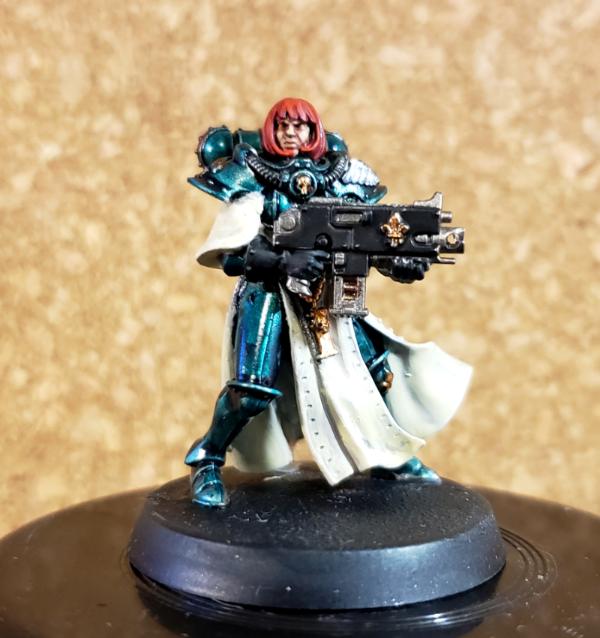
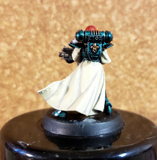

Thanks for looking and giving me feedback!!
|
|
|
|
|
2020/03/04 10:25:41
Subject: Need opinions on cloth for my sisters of battle
|
|
Blood Angel Terminator with Lightning Claws
|
Cream looks good
Was a velvety red not an option?
|
 DV8 wrote: DV8 wrote:Blood Angels Furioso Dreadnought should also be double-fisted.
|
|
|
|
|
2020/03/04 12:35:50
Subject: Need opinions on cloth for my sisters of battle
|
|
Preacher of the Emperor
|
It looks pretty good... what's your method? Are you washing into the recesses or building up from a light gray? It does seem a little flat and washed out in places-- for example, a little detail would make those buttons pop nicely. But you've managed to avoid the streaky, blotchy, textured mess that is usually white paint on smooth surfaces, so great job there. If you're still in the experimental phases, maybe try a thinned Agrax wash and then revisit the highlights with whatever you're using for white?
|
|
|
|
|
|
2020/03/04 16:03:09
Subject: Re:Need opinions on cloth for my sisters of battle
|
|
Impassive Inquisitorial Interrogator
|
Rybrook, I hadn't really considered red as I have a word bears army, a blood angels army, and an ork speed freek army so I'm trying to stay away from red.
MacPhail, thanks for the feed back! I looks a tad washed out largely due to the lighting I had on hand. I will definitely be doing the buttons to add some contrast and definition. The cream is two thin coats of rakarth flesh, followed by at least 2 thin coats of screaming skull, then a an edge highlight of a white/screaming skull mix. I was hesitant to do any shading washes as I don't want too much contrast between the shadows and the main color, but I may try a thinned wash on one of my old metals and see how it looks.
|
|
|
|
|
|
|


 Finished Forge World Elysian Army
  Finished Tau Sept Cadre
  Finished Ork Waaagh |
  Alaitoc Eldar Warhost
  Finished Order of Our Martyred Lady - Sisters of Battle
  Finished Necromundian Imperial Guard Regiment