| Author |
Message |
 |
|
|
|
|
Advert
|
Forum adverts like this one are shown to any user who is not logged in. Join us by filling out a tiny 3 field form and you will get your own, free, dakka user account which gives a good range of benefits to you:
- No adverts like this in the forums anymore.
- Times and dates in your local timezone.
- Full tracking of what you have read so you can skip to your first unread post, easily see what has changed since you last logged in, and easily see what is new at a glance.
- Email notifications for threads you want to watch closely.
- Being a part of the oldest wargaming community on the net.
If you are already a member then feel free to login now. |
|
 |
2017/01/16 14:12:44
Subject: Criticism wanted - where am I going wrong?
|
|

Esteemed Veteran Space Marine
|
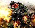
Pretty much as the title explains. I've been painting (Slowly) for the best part of 4-5 years now. I don't paint quickly, but I do steadily chip away at things and I paint for at least an hour most nights. I can see that I have made progress over the years, but nowadays I feel more and more like I'm making no progress in increasing my skill. With that in mind, here are a couple of my latest paint-jobs. The photography could perhaps be a little better (I recognise it's a little over-exposed and bright), but it gives a good impression of where I'm at. So, any criticism, tips or pointers would be much appreciated in helping me increase my skill or showing me where I can improve. Be as brutal as you like.


Any help would be great. Cheers.
|
|
|
|
 |
|
2017/01/16 14:18:29
Subject: Re:Criticism wanted - where am I going wrong?
|
|

Ultramarine Land Raider Pilot on Cruise Control
|
Honestly those paint jobs look fine to me. Better than fine. Which I realize is not helpful feedback. My question would be, in what way are you unhappy with the paintjobs? Is there a particular technique you'd like to learn/improve on? Is there a particular style you want to emulate?
|
|
|
|
|
|
2017/01/16 14:20:58
Subject: Re:Criticism wanted - where am I going wrong?
|
|
Longtime Dakkanaut
|
Those look pretty fantastic! 
Seriously, what is there to improve? Unless you're looking to do blending on the Power Armour, I don't think there's much for you to improve on; my only criticism is that the parchment on the first model (particularly on the shoulder pad) looks a little too faded with shade, but even then the writing on it looks good.
I don't know what else to tell you, other than those are some fine Salamanders 
G.A
|
G.A - Should've called myself Ghost Ark
Makeup Whiskers? This is War Paint! |
|
|
|
|
2017/01/16 14:24:57
Subject: Criticism wanted - where am I going wrong?
|
|
Is 'Eavy Metal Calling?
|
First off, they do look pretty damn good. Colours and highlights are sharp, the edging and freehand are neat, the basing is good and the quality is consistent.
Often I find I'll get stuck in a rut of not progressing quality-wise if I'm just painting loads of the same thing. If you've painted a lot of these guys, it may well be you're just sitting at a level you've gotten comfortable at, you know the process so you're almost doing it on autopilot now. The easiest way to get out of it in my experience is to go and paint something totally different.
This will help as a palette cleanser, to get to thinking technically again rather than just painting the same thing, and also give you scope to try out new techniques, which is often the best way to progress; over an army you'll get as good as you can at the techniques involved but not really try anything new. With these, you've clearly got a good method for painting that green armour, and for doing the neat flame patterns so perhaps try something with a lot of metallics, or go for a less neat, more rugged look. Try out different basing methods, or experiment with some 'special effects' stuff like source lighting or NMM.
That will get you trying out new ideas and techniques and approaching painting in a different way, which will in turn give you experience with a wider range of methods and let you improve overall as a painter as they get added to your arsenal.
The last thing I'd say is that if you are working through an army, you don't want to change what you're doing on them too much. If you paint something different, then really push the boat out, but when you go back to painting Salamanders, go back to the methods you're using now. There's nothing worse than getting part way through an army, suddenly making a big jump in ability then going back and doing the rest at that new level, it leaves you with an army that looks inconsistent and your older stuff will end up looking worse by comparison. In that regard, finding a level you're happy at and staying there for a bit while you finish the project is not necessarily a bad thing.
Hope that helps!
|
|
|
|
|
|
2017/01/16 14:27:17
Subject: Criticism wanted - where am I going wrong?
|
|
Powerful Phoenix Lord
|
Personally I think they look fantastic. If I were to modify anything? I'd learn how to paint to the same level...faster. That's something you can work on. You have well beyond table-top quality paintjobs. At the end of the day they're toy soldiers. If you can start cranking out armies like this you should be happy for the rest of your life. 
|
|
|
|
|
2017/01/16 15:06:38
Subject: Criticism wanted - where am I going wrong?
|
|

Regular Dakkanaut
|
What are you doing wrong? Nothing? They look great.
|
|
|
|
|
2017/01/16 15:45:28
Subject: Criticism wanted - where am I going wrong?
|
|
Regular Dakkanaut
|
Well the bases are a little bland. Having another color. A bit of grass, or just a different colored rock would make it a lot more interesting. You can do a lot of interesting things with bases.
For the top mini it looks like some of the color from the base got on the side of the base. Keeping the sides one consistent color goes a long way to making them look finished.
The corrugated pipe coming out of the second models gun looks bland being in steal and then having the pieces wrapped around it also be in steal. Doing the pipe section in black with grey highlights would have made it stand out better.
Obviously I'm nit picking some pretty great looking models. More then anything you probably just need to branch out into something different to what you are used to. I suggest just look at other peoples stuff and get inspired. Go through pictures of golden demon winners and find something you want to emulate. Pick an army with a lot of flesh, or try doing some elaborate free hand to mix things up.
|
|
|
|
|
2017/01/16 16:14:22
Subject: Re:Criticism wanted - where am I going wrong?
|
|
Esteemed Veteran Space Marine
|
Well that's... not the response I expected, so thank you all for the compliments.
@brushcommando - I'm not sure where I feel they're lacking, I just get the general sense that I could do better. I think the main thing is that I always feel they look rather dull - like they could do with a little something to make them pop. But it just escapes me as to what exactly is wrong. That's where I was hoping you guys would help. Thanks for the compliment though.
@General Annoyance - Thanks!  I've only ever done large-scale blending on my Vulkan and like these, I felt it was too sub-par, so I was too embarrassed to show it. I'd really like to get better at it though, because I often feel my shading and highlighting is too linear.
@Paradigm - Thanks Para, that praise means more than you'd guess. I've admired your models for quite a few years now, so it's nice to hear from you. I think you've hit the nail right on the head in saying that I've probably just become a bit jaded with doing the same thing over and over. It doesn't help that my hobby budget is rather low, so I tend to prioritise my Salamanders and some historicals that I do (British Redcoats and Archaic Spartans) - I never get round to splashing out on a new force. Looking at your models, I feel one aspect that lets me down is that my weathering isn't very realistic, so that's one area I'd really like to work on. I'm tentatively dipping my toe in, but trying to get over the mental block of ruining the few models I do have is hard. Anyway, thanks for the insight.
@Elbows - Cheers, Elbows! You're definitely right - I need to learn how to paint faster. I think if I could churn them out faster, I wouldn't be as worried about trying new techniques as it would be easier for me to repaint if I mess it up.
@ExFideFortis - Cheers.
@coblen - Thanks for the help. I should have said before, but the bases aren't finished (That's why I put this in P&M, not showcase). I do have some grass clumps which I haven't got round to putting on, and I ran out of black to paint the Veteran Sergeant's base rim with (You'll notice the lower one is done). However, your other points are still valid - perhaps I need some more contrast to make things pop more or maybe I need to push the boat out more on my freehanding. Thanks all the same. 
|
|
This message was edited 1 time. Last update was at 2017/01/16 16:18:56
|
|
|
|
|
2017/01/16 16:24:43
Subject: Re:Criticism wanted - where am I going wrong?
|
|
Longtime Dakkanaut
|
 Warpig1815 wrote: Warpig1815 wrote:@General Annoyance - Thanks! I've only ever done large-scale blending on my Vulkan and like these, I felt it was too sub-par, so I was too embarrassed to show it. I'd really like to get better at it though, because I often feel my shading and highlighting is too linear.
Personally, I hate blends on flat areas like Power Armour - I think it should just be used on areas such as cloaks, or if you're trying to simulate light catching on the armour in small areas. It's probably personal preference, but I think excessive blending like I've seen with airbrush only models makes the miniature look washed out. I can suggest someone to go to if you're looking to practice blending though - electriceve. "The Queen of Blends" actually set me off on the technique by giving me a tutorial on how to make smooth transitions  You can learn a lot just by watching her too (there's a stream tonight at 7PM GMT, if you're interested, or just check out previous VODs, such as the initial stages of her painting Magnus the Red). Hope this helps G.A
|
|
This message was edited 1 time. Last update was at 2017/01/16 16:28:35
G.A - Should've called myself Ghost Ark
Makeup Whiskers? This is War Paint! |
|
|
|
|
2017/01/16 16:46:52
Subject: Re:Criticism wanted - where am I going wrong?
|
|
Esteemed Veteran Space Marine
|
Yeah that's great - I'll check it out. I do like subtle blending. I'm not a fan of blending every single piece of a model, but just the blending of cloth or of a particular shiny trinket. Pretty much, I like the style of blending that the 'Eavy Metal team does - it's not as 'in your face' as a model done 100% with NMM.
|
|
|
|
|
|
2017/01/17 00:03:14
Subject: Criticism wanted - where am I going wrong?
|
|
Longtime Dakkanaut
|
I think your stuff looks really good, if your looking to further your skill level maybe look at OSL stuff? Might be fun to try out a new technique, I'm not an amazing painter but I enjoy trying new techniques that I see people using on here and elsewhere. I might be mirroring what someone else already said since I didn't read replies in which case if I did just disregard! Your stuff looks great though!
|
|
|
|
|
2017/01/17 02:19:08
Subject: Criticism wanted - where am I going wrong?
|
|
Fireknife Shas'el
|
This is damn fine work. I understand the desire to stretch your talents, but remember that the main criteria for 'better' paint jobs once you've reached a certain level if TIME spent per mini. If you're a slow painter (I am too), better minis means fewer minis, especially if you have limited time to paint.
One minor criticism I have is that you're putting maybe to much edge-lighting on the armor. Look at the multi-melta Salamander's knee, you've got highlights on the bottom of the kneepad and the top of the shin pad. When two plates come together, you shouldn't highlight both edges.
|
|
|
|
|
|
2017/01/17 02:48:02
Subject: Re:Criticism wanted - where am I going wrong?
|
|
Junior Officer with Laspistol
|
I think the minis look great. ONLY because you asked for suggestions...
The eyes could be done in a way to make them more noticeable. Dark on dark doesn't make things pop.
To which, if you want more pop, prime in white, not black. Harder to work with, as you have no "natural" shading to work with, but the colours will be much more vibrant.
The bases could use a little life. It looks like desert, so if that's what you're after, good. But to make them more interesting, small dabs of grass would help. Take a brush, dab in glue, and put a few small "spots" on your base. Sprinkle static grass on, and it will look like small clumps of grass barely hanging on for dear life. I'm a "production painter" at best, and I base coat my bases Bestial Brown, glue sand directly on top [with some small pebbles for interest] and then wash Agrax overtop of the sand. I then spot the bases with glue and sprinkle grass... has a wasteland flavour that I like. Reminds me of Fallout scenery.
Otherwise, black, dark green, boltgun metal and "subdued" flames are going to lack the "pop" that brighter models will have. They look great, and consistent, but the nature of the subdued colours means they aren't going to pop. For what it's worth, keeping the "tone" consistent through a model is something I struggle with, and you've done a great job here.
PS: I love what you did with the DC Thunder Hammer!
|
|
|
|
|
2017/01/17 10:49:01
Subject: Re:Criticism wanted - where am I going wrong?
|
|
Esteemed Veteran Space Marine
|
@Rotgut - Thanks. I aim to try out some Plasma OSL shortly. I've not done it up until now as I never really feel the need to use plasma weapons, but I've just finished a marine with a Plasma Cannon, so I'm eager to try out some OSL.
@John Prins - I think you're spot on. For the most part, I try to use the Studio painted mini for inspiration on where to put highlights, but admittedly there are places where I have have tended just to highlight for the sake of it. Hopefully, in the few models I've been painting since posting this thread, I've tried to rectify this. Are there any other areas that are particularly off?
@greatbigtree - Cheers! Eyes are something I still haven't quite mastered. I do admit that my photography contributes to making them look darker than they are (These actually have a splash of orange in the lense front, but you can't see it), but I could do with increasing the contrast of them to make them pop - so, good point! As for the base, you're the second to make that observation, so perhaps I need to adress my bases to make them more engaging. Thanks for the good suggestions.
|
|
|
|
|
|
2017/01/17 11:29:18
Subject: Criticism wanted - where am I going wrong?
|
|

Regular Dakkanaut
|
Grime streaks, Paints chips, dust around the feet, little bit of rust in the metals.
|
|
|
|
|
2017/01/17 21:02:27
Subject: Criticism wanted - where am I going wrong?
|
|
Fireknife Shas'el
|
If you want brighter eyes on the helmets, put white down before the red. You don't have to prime the whole mini in white to make a small part of it pop - you can just put down a coat of white before the bright color.
Alternatively, a coat of high density pigment paint of the same general color over the black before you put the real colors down. This works fantastic for yellows - there are some good mustard yellow paints out there that are opaque as heck and they're a great basecoat for brighter yellows. Automatically Appended Next Post: 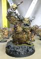 Udo wrote: Udo wrote:Grime streaks, Paints chips, dust around the feet, little bit of rust in the metals.
Hey, Salamanders take care of their kit. 
|
|
This message was edited 1 time. Last update was at 2017/01/17 21:03:24
|
|
|
|
|
2017/01/17 22:01:12
Subject: Criticism wanted - where am I going wrong?
|
|
Dakka Veteran
|
I have to say, the use of Centurion heads on your Devastator was a great idea.. it goes with the slightly more fortified armor look they have.
|
|
|
|
|
2017/01/18 07:20:30
Subject: Criticism wanted - where am I going wrong?
|
|
Fresh-Faced New User
|
Let me preface this with - these models look fantastic and are a very high quality.
To really make them showcase - I would....
- Add an additional very sharp highlight on the very sharp edges/corners in snot(moot?) green then a dot of white on the very corners will make them pop more.Making things look sharp is about contrast. Very dark greens in your recesses and very bright highlights.
- Spruce up the bases a bit, a couple of grass tufts will go a long way to giving the model a bit more context.
- Spend the extra time making the eyes really bright (black, red, orange, yellow and a dot of white style) and an extra level of highlight or 2 on any exposed face (the focus point of the model)
|
|
|
|
|
2017/01/18 07:25:50
Subject: Criticism wanted - where am I going wrong?
|
|
Member of the Ethereal Council
|
Try a different model. For along time I got stuck on my SM. So I switched to tau. Tried several new techniques, and did great with them. Get a coteaz or something.
|
|
|
|
|
|
2017/01/18 08:36:08
Subject: Criticism wanted - where am I going wrong?
|
|
Arch Magos w/ 4 Meg of RAM
|
It looks great! My suggestion for improvement would be to go brighter with your highlights to really catch the edges and points where light would hit. Just small dots of a brighter colour on all the sharp corners. For example, I can see the power armour is edge highlighted all around but you coul paint brighter highlights to catch the corners of the hand plate, the edges of the helmet and other areas. The black could be done with something like Fenrisian Grey (which is a light blue colour).
I hope this is useful! To be honest the sharper highlights are the fastest step in painting a model. Dotting the corners only takes a few minutes and really elevates the paint job.
|
Bye bye Dakkadakka, happy hobbying! I really enjoyed my time on here. Opinions were always my own :-) |
|
|
|
|
2017/01/18 14:59:14
Subject: Re:Criticism wanted - where am I going wrong?
|
|
Esteemed Veteran Space Marine
|
Well thanks for all the help people - I'm much obliged to you. I'm gonna go away and paint up another couple, hopefully taking into account all this advice, then I should be able to show you the results soon(ish)- see if they're any better. Thanks once again.
@John Prins - Never thought to base with white. I always assumed that black was best to get the shadows in the eye corners. I'll try that. I also agree that Salamanders take care of their kit. I can get away with dust and paint chips - but not so much with rust or oil/grime streaks.
@Sauragnmon - That was the idea. When I think of Mk VIII armour, this is what I have in mind. The only thing that would be better for me is the deathwatch legs, but I do like the castellations of the Dev legs.
@Wopbopadobop and Bottle - I've given the increased highlights a go on the two other Devastators I'm currently painting and I have to say it goes a long way towards making me feel better about my painting - it makes the green much more vibrant. I do think poor photography contributes to how dull the highlights seem on my models. I mean you are right, but in reality they are a little more pronounced than my photos would suggest. Needless to say, I'm happier now having taken on board the advice for lighter highlights.
@hotsauceman1 - I really should, but I get into the mindset where all I buy is SM stuff or the odd historical. I'd love to do an IG army - but I don't want to get into them if they're going to release new kits at some point (Hopefully )
|
|
|
|
|
|
2017/01/18 15:50:48
Subject: Criticism wanted - where am I going wrong?
|
|

Storm Trooper with Maglight
|
Maybe a second layer of edge highlight with a bit of a brighter green will make them pop. Nothing else I can add. I don't like the sand bases, but this is personal preferences.
GJ.
|
|
This message was edited 1 time. Last update was at 2017/01/18 15:51:05
|
|
|
|
|
2017/01/18 16:16:46
Subject: Re:Criticism wanted - where am I going wrong?
|
|
Pulsating Possessed Space Marine of Slaanesh
|
As others have stated, the models look fantastic. The colors are solid, details are all well appointed, freehand is well thought out, and color selection is appropriate.
Where you might want to try and improve isn't so much "improvement" as it is "experiment". Your models really do look fantastic, and are what I tend to call "GW Standard". By that, I mean that this is how the model is intended to look to appeal to the widest audience. There is nothing to point out as a major flaw, but nothing really "pops" on them either. Before diving in head first with NMM or OSL, I'd say try your hand at blending techniques for the armour, experiment with other metallic shades for the guns/gears/gizmos, and try your hand at breaking away from the "GW Standard Color Mold".
I, too, have found myself in ruts before, and find it best to stop whatever it is I'm doing, pick up a completely different model that has nothing to do with my main project, and just go to town. Paint whatever the hell I want, add things in the modeling stage, kitbash the crap out of it, and see what surfaces. It also works REALLY well when I choose a finished, but REALLY old (as in I finished painting it a long time ago), model. Giving it a fresh update with new details, personal touches, new base colors/pieces/artifacts, or just small fun things like hazard strips on flamers or battle scars on faces. Whatever works for you, just let the creativity flow, and see what happens.
Cheers
PS: Small side note, and it is really just personal preference, but I'd try your hand at painting the edge/rim of the base (even if it is black). Really helps finish off the look, and covers any stray brush strokes from the basing process.
|
----Warhammer 40,000----
  10,000 10,000  |
|
|
|
|
2017/01/18 16:40:51
Subject: Re:Criticism wanted - where am I going wrong?
|
|
Esteemed Veteran Space Marine
|
Just to make it clear (I'm not trying to be snarky, I just forgot to mention it in the OP) - I usually do put Grass Clumps on, I just forgot to on these guys (The bases aren't 100% - hence why they're in P&M not Showcase). Similarly, I do paint the rims black, but I ran out of black to do the Sergeant's base.
Aside from that, I certainly am taking on board everybodies advice - it's really helpful to see thing from an 'outsiders' point of view so to speak. You guys can pick up on things I miss, good and bad, so it's great hearing from you all.
@Aipoch - A couple of other people have mentioned doing something completely different to break the mould and I've only just remembered I have a Slaughterpriest left from a WD - I think that's sufficiently different for me to break away from Salamanders, so I think that's on the agenda.
|
|
|
|
|
|
2017/01/18 20:50:44
Subject: Re:Criticism wanted - where am I going wrong?
|
|
Fireknife Shas'el
|
Warpig1815 wrote:
@John Prins - Never thought to base with white. I always assumed that black was best to get the shadows in the eye corners. I'll try that.
You can do both. Paint the eye white, then give it a black 'eyeliner' with very thin black paint.
|
|
|
|
|
|
2017/01/18 22:53:09
Subject: Re:Criticism wanted - where am I going wrong?
|
|
Tail-spinning Tomb Blade Pilot
My ancient "lab"
|
It sounds to me like you want to go from your "tabletop quality" models to "competition quality" models. What you have is excellent, and i'd be content with for playing a game. But if you truly want improvement, i'd try some OSL, cool basing techniques(I know you're going to base these guys, i'm just saying innovate and try something unique to army!), and, if you really want to, blending and NMM.
|
|
|
|
|
|
|
|


 5000pts
  6000pts
  3000pts

