| Author |
Message |
 |
|
|
|
|
Advert
|
Forum adverts like this one are shown to any user who is not logged in. Join us by filling out a tiny 3 field form and you will get your own, free, dakka user account which gives a good range of benefits to you:
- No adverts like this in the forums anymore.
- Times and dates in your local timezone.
- Full tracking of what you have read so you can skip to your first unread post, easily see what has changed since you last logged in, and easily see what is new at a glance.
- Email notifications for threads you want to watch closely.
- Being a part of the oldest wargaming community on the net.
If you are already a member then feel free to login now. |
|
 |
2019/06/16 14:45:34
Subject: Re:Theo's getting back into GW specialist games pg 44
|
|

Is 'Eavy Metal Calling?
|
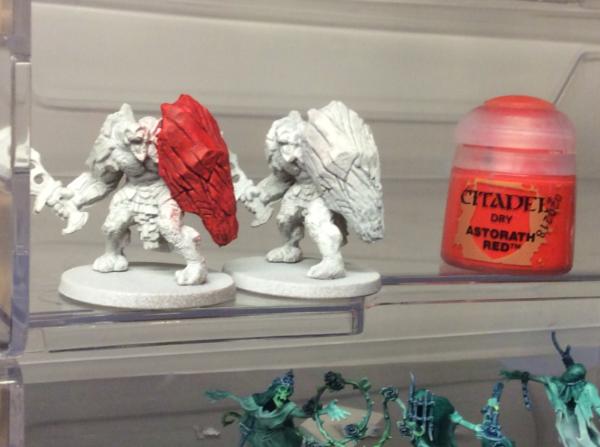
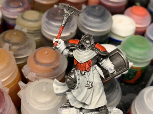
Briancj wrote:thank you for having the primed white and contrast white next to each other. That's...interesting.
Yeah, I knew the apothecary white was close to the ulthan grey, but didn’t know it was going to be more grey than white.
Snrub wrote:Ooh that red is really vibrant. I like it a lot. A quick drybrush will look excellent over that.
The white is one that I was interested in too. I'm keen to see a few examples of that used.
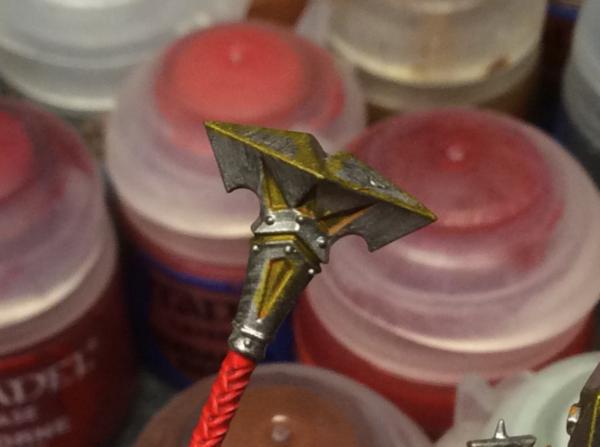
Well to give you more of an example see below. I do like the vibrant color of the red too.
So I drybrushed quickly this morning both the shields. The red got astorath red dry and the apothecary white got a dusting of Praxeti white. I think I’m really pleased with the outcomes.
Working on my Banshees and glaivewraiths right now.
Happy Father’s Day to all you lot that fit the bill  .
Edit:
Glaivewraiths
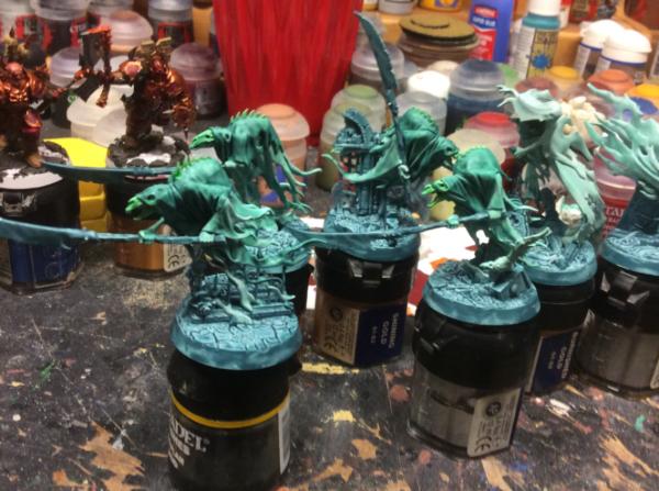
Banshees
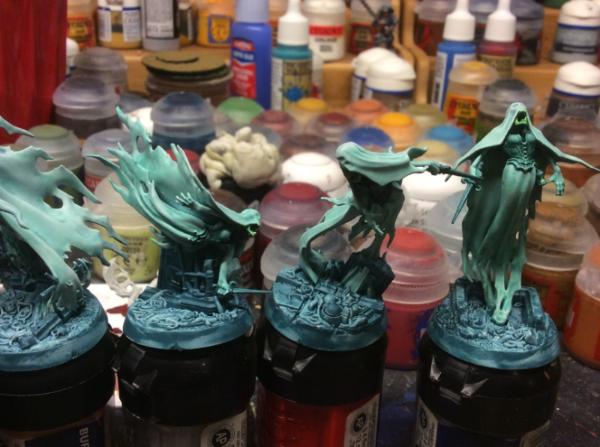
Tried out doing the whole of the bases with Nighthaunt Gloom to give a spooky feeling.
|
|
This message was edited 1 time. Last update was at 2019/06/16 16:25:03
LOL, Theo your mind is an amazing place, never change.-camkierhi 9/19/13
I cant believe theo is right.. damn. -comradepanda 9/26/13
None of the strange ideas we had about you involved your sexual orientation..........-Monkeytroll 12/10/13
I'd put you on ignore for that comment, if I could...Alpharius 2/11/14 |
|
|
 |
|
2019/06/16 16:24:43
Subject: Theo's getting back into GW specialist games pg 44
|
|

Decrepit Dakkanaut
|
This is one of the most useful Contrast tutorials I've seen. Keep it up squire!
|
Theophony"... and there's strippers in terminator armor and lovecraftian shenanigans afoot."
Solar_Lion: "Man this sums up your blog nicely."
Anpu-adom: "being Geek is about Love. Some love broadly. Some love deeply. And then there are people like Graven.  |
|
|
|
|
2019/06/16 20:05:13
Subject: Theo's getting back into GW specialist games pg 44
|
|
Is 'Eavy Metal Calling?
|
Thanks, updated while you posted, but also just had to run errands and grab BBQ stuff for tonight.
BBQ stuff which included Iyanden Yellow contrast paint 
|
LOL, Theo your mind is an amazing place, never change.-camkierhi 9/19/13
I cant believe theo is right.. damn. -comradepanda 9/26/13
None of the strange ideas we had about you involved your sexual orientation..........-Monkeytroll 12/10/13
I'd put you on ignore for that comment, if I could...Alpharius 2/11/14 |
|
|
|
|
2019/06/16 21:13:19
Subject: Theo's getting back into GW specialist games pg 44
|
|
Walking Dead Wraithlord
|
It is good to see results from the field. I like how those shields turned out. Thank you for taking the time to share the process. Also glad to see they look good over regular primer.
|
|
|
|
|
2019/06/17 11:07:48
Subject: Theo's getting back into GW specialist games pg 44
|
|
Is 'Eavy Metal Calling?
|
 youwashock wrote: youwashock wrote:It is good to see results from the field. I like how those shields turned out. Thank you for taking the time to share the process. Also glad to see they look good over regular primer.
No problem, the pics from actual people (not Uber painters trying to break the paints down) are showing up in the contrast thread and there’s are plenty of great results so far. These photos I’m doing are great for me to see the actual steps later on because I’ll eventually forget what I did and do it another way  .
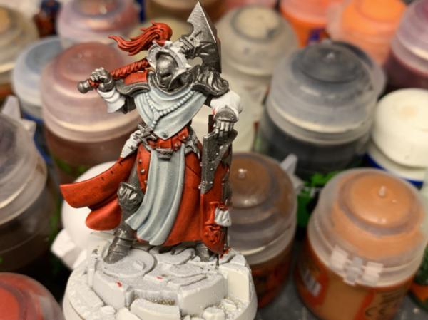
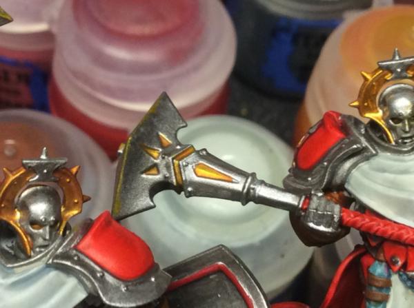
Well apothecary white robes applied to white rustoleum primer.hard to see the shades of white, but here goes.
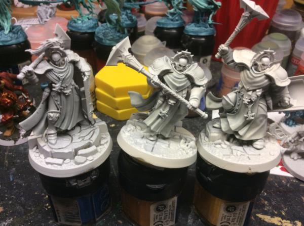
Also did a shield in the Iyanden yellow and a shield with the blood angels red over leadbelcher. I have three shields drying with stormhost silver to try the contrasts over that.
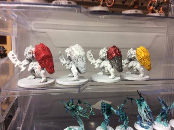
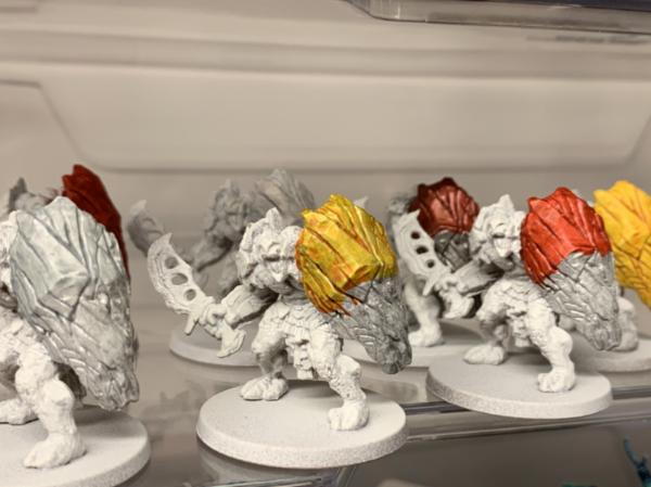
That picture almost makes the red look like brass, but a closer look next to brass scorpion and Khorne red show the difference.
 Automatically Appended Next Post:
Edit: did the colors over stormhost silver. Apothecary white, iyanden yellow and Blood Angel Red.
Started work on a sigmarine. More work done since this picture.
Edit2: almost done
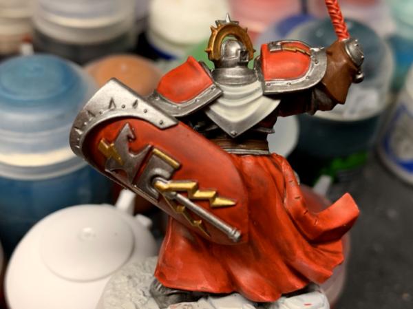
Any suggestions on where to go from here?
|
|
This message was edited 2 times. Last update was at 2019/06/17 18:07:36
LOL, Theo your mind is an amazing place, never change.-camkierhi 9/19/13
I cant believe theo is right.. damn. -comradepanda 9/26/13
None of the strange ideas we had about you involved your sexual orientation..........-Monkeytroll 12/10/13
I'd put you on ignore for that comment, if I could...Alpharius 2/11/14 |
|
|
|
|
2019/06/17 18:24:02
Subject: Theo's getting back into GW specialist games pg 44
|
|
Gargantuan Great Squiggoth
|
Just a edge highlight in an orange over the red robes maybe.
But looks fantastic to me, very interesting about the paints. I am looking to paint a fair bit this year, might just have to look into them a bit more. I paint by a long winded method, and it is quite daunting to think of painting armies like it, but if I can do it with these to a decent standard, will be great. Personally I am a fan of GW paints, I know they are maybe expensive, but it is all relative, I love Angrax and Seraphin Sepia, etc. I have never come across anything that can touch them. So yeah I am a GW fan, and wont apologise for it, they are brilliant.
|
|
|
|
|
|
2019/06/17 19:08:24
Subject: Theo's getting back into GW specialist games pg 44
|
|
Walking Dead Wraithlord
|
I too would be interested in seeing a quick highlight pass. Looks pretty good so far. Very intriguing.
|
|
|
|
|
2019/06/17 20:56:16
Subject: Theo's getting back into GW specialist games pg 44
|
|
Decrepit Dakkanaut
|
Yeah, something like VJ flame orange? Thin but high pigment.
|
Theophony"... and there's strippers in terminator armor and lovecraftian shenanigans afoot."
Solar_Lion: "Man this sums up your blog nicely."
Anpu-adom: "being Geek is about Love. Some love broadly. Some love deeply. And then there are people like Graven. |
|
|
|
|
2019/06/18 12:15:37
Subject: Theo's getting back into GW specialist games pg 44
|
|
Is 'Eavy Metal Calling?
|
Camkierhi wrote:Just a edge highlight in an orange over the red robes maybe.
But looks fantastic to me, very interesting about the paints. I am looking to paint a fair bit this year, might just have to look into them a bit more. I paint by a long winded method, and it is quite daunting to think of painting armies like it, but if I can do it with these to a decent standard, will be great. Personally I am a fan of GW paints, I know they are maybe expensive, but it is all relative, I love Angrax and Seraphin Sepia, etc. I have never come across anything that can touch them. So yeah I am a GW fan, and wont apologise for it, they are brilliant.
I’ve used GW paints for a very long time and I feel how you do as well. Then again, I also paints straight from the pot  . I think bulk armies like Orks, nids and guard will have such a boon from these paints. Definitely worth the price in my book.
youwashock wrote:I too would be interested in seeing a quick highlight pass. Looks pretty good so far. Very intriguing.
I forgot to highlight the red, I drybrushed the white, but not the red . Good call.
inmygravenimage wrote:Yeah, something like VJ flame orange? Thin but high pigment.
see above
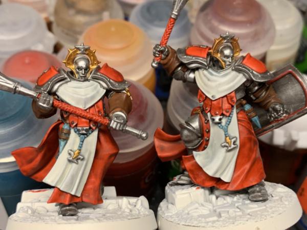
Anyway, finished up this brute last night before bed.  yes they both still need the reds highlighted I’m going to have bruises on my face from all these facepalms .
|
LOL, Theo your mind is an amazing place, never change.-camkierhi 9/19/13
I cant believe theo is right.. damn. -comradepanda 9/26/13
None of the strange ideas we had about you involved your sexual orientation..........-Monkeytroll 12/10/13
I'd put you on ignore for that comment, if I could...Alpharius 2/11/14 |
|
|
|
|
2019/06/18 12:39:33
Subject: Theo's getting back into GW specialist games pg 44
|
|
Decrepit Dakkanaut
|
Lovely indeed. Great job. Even better once highlighted. 
|
Theophony"... and there's strippers in terminator armor and lovecraftian shenanigans afoot."
Solar_Lion: "Man this sums up your blog nicely."
Anpu-adom: "being Geek is about Love. Some love broadly. Some love deeply. And then there are people like Graven. |
|
|
|
|
2019/06/18 17:54:42
Subject: Theo's getting back into GW specialist games pg 44
|
|
Rogue Inquisitor with Xenos Bodyguards
|
Very nice color work there Theo! Liking the metallic red myself
|
"Your mumblings are awakening the sleeping Dragon, be wary when meddling the affairs of Dragons, for thou art tasty and go good with either ketchup or chocolate. "
Dragons fear nothing, if it acts up, we breath magic fire that turns them into marshmallow peeps. We leaguers only cry rivets!


|
|
|
|
|
2019/06/18 22:14:34
Subject: Theo's getting back into GW specialist games pg 44
|
|
Mastering Non-Metallic Metal
|
Good work on all the things.
Nice ghosties.
Good find/steal of the shelves.
Interesting experiments with the paints.
|
     Mastodon: @DrH@dice.camp Mastodon: @DrH@dice.camp
The army-                   ~2295 points (built). ~2295 points (built).
 
* -=]_,=-eague Spruemeister General. * A (sprue) Hut tutorial *
Dsteingass - Dr. H..You are a role model for Internet Morality! // inmygravenimage - Dr H is a model to us all
Theophony - Sprue for the spruemeister, plastic for his plastic throne! // Shasolenzabi - Toilets, more complex than folks take time to think about! |
|
|
|
|
2019/06/20 03:21:50
Subject: Theo's getting back into GW specialist games pg 44
|
|
Is 'Eavy Metal Calling?
|
inmygravenimage wrote:Lovely indeed. Great job. Even better once highlighted.
Thanks, all will get the highlights once I have this trio base coated.
shasolenzabi wrote:Very nice color work there Theo! Liking the metallic red myself
It is a nice metallic red, and thanks.
Dr H wrote:Good work on all the things.
Nice ghosties.
Good find/steal of the shelves.
Interesting experiments with the paints.
Thanks Dr. H, I just follow in the experimenting footsteps of my brothers here.
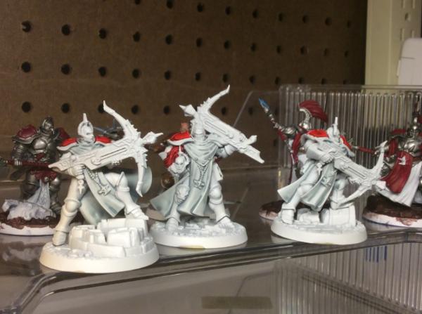
Little time to paint today, but the third of the trio is almost completed to the same level.
I wanted to show some sort of energy in the mauls these guys carry, so the texture in the head was given a coating of the Iyaden yellow on top of stormhost silver. I also put the yellow into the eye sockets.
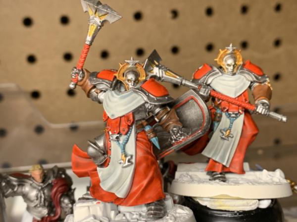
I think it works, let me know what you all think.
|
LOL, Theo your mind is an amazing place, never change.-camkierhi 9/19/13
I cant believe theo is right.. damn. -comradepanda 9/26/13
None of the strange ideas we had about you involved your sexual orientation..........-Monkeytroll 12/10/13
I'd put you on ignore for that comment, if I could...Alpharius 2/11/14 |
|
|
|
|
2019/06/20 04:36:52
Subject: Theo's getting back into GW specialist games pg 44
|
|
Longtime Dakkanaut
|
I think that Storm cast scheme is looking great, it really pops. I think the ideal Contrast paint for energy weapons and the like may be Talassar blue but he yellow fits in well with the lightning based background of the Stormcast.
When finished this warband will look amazing.
|
|
|
|
|
|
2019/06/20 11:15:50
Subject: Theo's getting back into GW specialist games pg 44
|
|
Martial Arts Fiday
|
I like your unique color scheme! They look more like fighting monks than weird moving statues like the all gold ends up looking.
For the weapons, maybe do a very thin line of a darker wash (orange or sepia) around the edges of the lighted area. I find it makes the center look lighter and defines the edges well. If there is a break between the light and the glowing area it makes it more realistic than just a see less area of yellow. Just my $0.02.
|
"Holy Sh*&, you've opened my eyes and changed my mind about this topic, thanks Dakka OT!"
-Nobody Ever
Proverbs 18:2
"CHEESE!" is the battlecry of the ill-prepared.
 warboss wrote: warboss wrote:
GW didn't mean to hit your wallet and I know they love you, baby. I'm sure they won't do it again so it's ok to purchase and make up.
Albatross wrote:I think SlaveToDorkness just became my new hero.
EmilCrane wrote:Finecast is the new Matt Ward.
Don't mess with the Blade and Bolter! |
|
|
|
|
2019/06/20 13:33:28
Subject: Theo's getting back into GW specialist games pg 44
|
|

Grisly Ghost Ark Driver
|
I really like the contrast paints over the metallic, that works really well! Would look great with an edge highlight of Stormhost too, to really bring out the metallicness of it.
|
|
|
|
|
|
2019/06/20 14:23:37
Subject: Theo's getting back into GW specialist games pg 44
|
|
Walking Dead Wraithlord
|
Those guys are looking cool. The girl with the maul over her shoulder is such a great model. I like the yellow energy idea, but agree it could use a little more pop. Either darker around the edges or brighter in the middle and you should be there.
|
|
|
|
|
2019/06/20 16:41:21
Subject: Re:Theo's getting back into GW specialist games pg 44
|
|
Posts with Authority
Boston-area [Watertown] Massachusetts
|
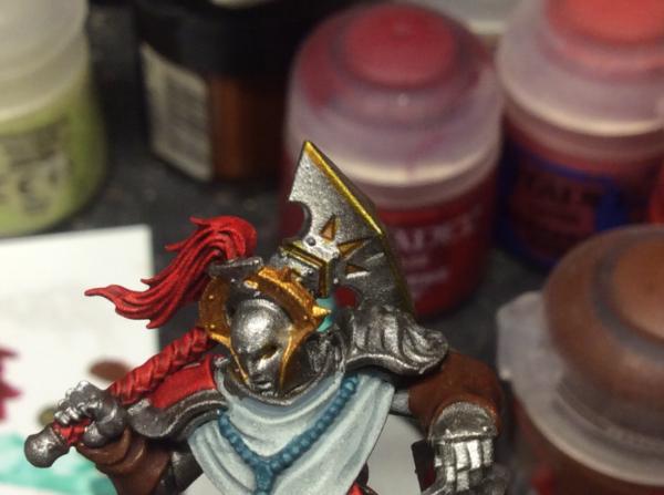
The use of yellow, as opposed to the usual blue-white, is grand. I, too, would add some contrast, ither a lighter yellow inthe centre, or a darker yellow on the edges.
Also, up to this point, I thought the face/helmets were pretty bland. But with the yellow in the eye sockets, it looks great!
--Brian
|
Falling down is the same as being hit by a planet — "I paint to the 20 foot rule, it saves a lot of time." -- Me
ddogwood wrote:People who feel the need to cheat at Warhammer deserve pity, not anger. I mean, how pathetic does your life have to be to make you feel like you need to cheat at your toy army soldiers game?
 |
|
|
|
|
2019/06/20 18:06:23
Subject: Theo's getting back into GW specialist games pg 44
|
|
Is 'Eavy Metal Calling?
|
ListenToMeWarriors wrote:I think that Storm cast scheme is looking great, it really pops. I think the ideal Contrast paint for energy weapons and the like may be Talassar blue but he yellow fits in well with the lightning based background of the Stormcast.
When finished this warband will look amazing.
I kind of wanted to steer clear of the blue color for energy as that’s so normal, I think the yellow do fit well though.
SlaveToDorkness wrote:I like your unique color scheme! They look more like fighting monks than weird moving statues like the all gold ends up looking.
For the weapons, maybe do a very thin line of a darker wash (orange or sepia) around the edges of the lighted area. I find it makes the center look lighter and defines the edges well. If there is a break between the light and the glowing area it makes it more realistic than just a see less area of yellow. Just my $0.02.
Hopefully the close ups below help show off the color variation achieved with the contrast paints. Thanks
Gwyn chan 'r Gwyll wrote:I really like the contrast paints over the metallic, that works really well! Would look great with an edge highlight of Stormhost too, to really bring out the metallicness of it.
Yes, the edge chipping with stormhost silver will definitely help. Thanks.
youwashock wrote:Those guys are looking cool. The girl with the maul over her shoulder is such a great model. I like the yellow energy idea, but agree it could use a little more pop. Either darker around the edges or brighter in the middle and you should be there.
I really like that model in particular, I goofed up when I assembled her as she comes with an unhelmeted option that I wanted to do , but I didn’t pay attention so that version will happen later when these are released as a Shadespire team.
Briancj wrote:The use of yellow, as opposed to the usual blue-white, is grand. I, too, would add some contrast, ither a lighter yellow inthe centre, or a darker yellow on the edges.
Also, up to this point, I thought the face/helmets were pretty bland. But with the yellow in the eye sockets, it looks great!
--Brian
Their eyes really do need something to make them pop. Most times I see black or blue, but the yellow has given them energy/life.
So third one I should up to the same detail level as the other two, so extra highlights will soon be added.
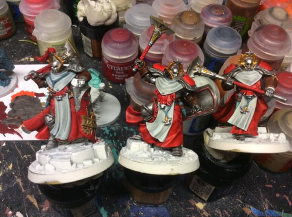
Also some close ups of the mauls to show off the yellow color, hopefully it shows the contrast a little better.
I might add another coat of the contrast which will show off more variation.
|
LOL, Theo your mind is an amazing place, never change.-camkierhi 9/19/13
I cant believe theo is right.. damn. -comradepanda 9/26/13
None of the strange ideas we had about you involved your sexual orientation..........-Monkeytroll 12/10/13
I'd put you on ignore for that comment, if I could...Alpharius 2/11/14 |
|
|
|
|
2019/06/20 18:55:42
Subject: Theo's getting back into GW specialist games pg 44
|
|
Walking Dead Wraithlord
|
For some reason I am getting a big Transformers/Destro feel from these guys now. Especially in the last pic. Weird.
|
|
|
|
|
2019/06/21 08:38:26
Subject: Theo's getting back into GW specialist games pg 44
|
|
Decrepit Dakkanaut
|
youwashock wrote:For some reason I am getting a big Transformers/Destro feel from these guys now. Especially in the last pic. Weird.
Yeah I can see that too, Superion-y. But then I'm a transformers nerd. And, Theo, they look boss.
|
Theophony"... and there's strippers in terminator armor and lovecraftian shenanigans afoot."
Solar_Lion: "Man this sums up your blog nicely."
Anpu-adom: "being Geek is about Love. Some love broadly. Some love deeply. And then there are people like Graven. |
|
|
|
|
2019/06/21 23:55:34
Subject: Re:Theo's getting back into GW specialist games pg 44
|
|

Fixture of Dakka
|
Really digging the orange and white stormcast, Theo.
But that Apothecary white. I need to get that. Looks awesome.
|
|
|
|
|
|
2019/06/22 09:18:54
Subject: Theo's getting back into GW specialist games pg 44
|
|

Dipping With Wood Stain
|
You've hit the nail in the head with that red and white SCE scheme. Very effective!
|
|
|
|
|
|
2019/06/22 15:08:11
Subject: Theo's getting back into GW specialist games pg 44
|
|
Is 'Eavy Metal Calling?
|
youwashock wrote:For some reason I am getting a big Transformers/Destro feel from these guys now. Especially in the last pic. Weird.
Definitely feeling the Destro with the shiny head
inmygravenimage wrote: youwashock wrote:For some reason I am getting a big Transformers/Destro feel from these guys now. Especially in the last pic. Weird.
Yeah I can see that too, Superion-y. But then I'm a transformers nerd. And, Theo, they look boss.
Thanks, from what I remember of superion he was a jet wasn’t he? It’s been a while though.
Snrub wrote:Really digging the orange and white stormcast, Theo.
But that Apothecary white. I need to get that. Looks awesome.
It’s a red, but if the pics are coming across orange I’m good with that too . Thanks
mcmattila wrote:You've hit the nail in the head with that red and white SCE scheme. Very effective!
Thanks, I didn’t want to do gold, so I modified the blue gold scheme to the red silver. I might mess about with a bronze green theme just for giggles to see if that works.
So with the trio to a level I’m happy with, sans bases, it’s off to the next group from the storm strike box set. I think they are called castigators, which is weird as they have crossbows and not whips/scourges/ cat of nine tails  .
Cloth done in the apothecary white, but I think I’ll redo the back cloaks to the blood angels red to bring them more in line with the Sequestors.
Also started the Gryph hound who is looking like a rooster right now  . My family (uncles) did raise bird dogs for competition when I was young and bloodhounds too, but these bird dogs are a “whole ‘nother animule” as they might say.
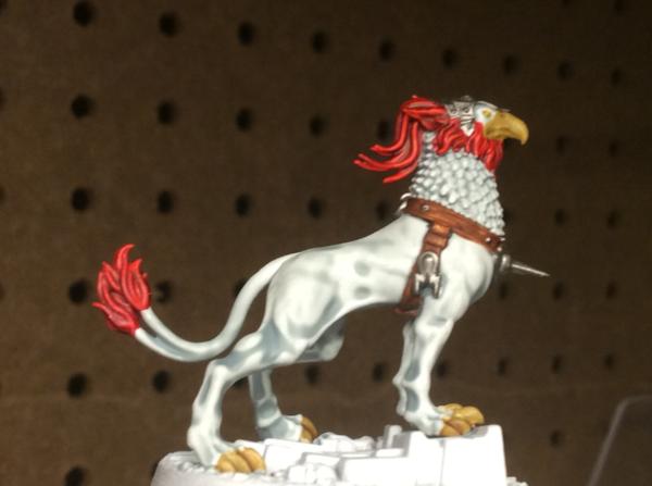
Im thinking of adding stripes to his back in an outlandish color as that seems the norm for all the Gryph hounds I’ve seen painted. Then again most of the other painted ones have an absolutely different colored head compared to the body, kind of like parakeets and some other ornamental bird species. I guess it’s time for silly research into bird colors, which defeats my original plan of making these look like the St. Louis Cardinals baseball team colors .
Edit: okay, so quick research and paint splatter, couldn’t decide between a few styles....so, did them all
Remember these are about a 6” distance photo, they look great at 3’, which isn’t about the mark I shoot for, if not the 20’ mark.
|
|
This message was edited 3 times. Last update was at 2019/06/22 15:49:42
LOL, Theo your mind is an amazing place, never change.-camkierhi 9/19/13
I cant believe theo is right.. damn. -comradepanda 9/26/13
None of the strange ideas we had about you involved your sexual orientation..........-Monkeytroll 12/10/13
I'd put you on ignore for that comment, if I could...Alpharius 2/11/14 |
|
|
|
|
2019/06/22 16:02:44
Subject: Re:Theo's getting back into GW specialist games pg 44
|
|
Posts with Authority
Boston-area [Watertown] Massachusetts
|
God only knows where you got that "20 foot rule" from, but I kinda like it.
|
Falling down is the same as being hit by a planet — "I paint to the 20 foot rule, it saves a lot of time." -- Me
ddogwood wrote:People who feel the need to cheat at Warhammer deserve pity, not anger. I mean, how pathetic does your life have to be to make you feel like you need to cheat at your toy army soldiers game?
|
|
|
|
|
2019/06/22 19:57:03
Subject: Theo's getting back into GW specialist games pg 44
|
|
Longtime Dakkanaut
|
I really like your work on the Gryph Hound, I remember the pains I went to painting the Eltharion On Stormwing model about 20 odd years ago. Painting patterns from nature is no easy task at all, and you have done it really well. The additional work on your mauls has paid off as well.
|
|
|
|
|
|
2019/06/23 02:13:26
Subject: Theo's getting back into GW specialist games pg 44
|
|
Walking Dead Wraithlord
|
I suppose you could say he's the cock of the walk. He really looks like some fantastical beast with all the different patterns. The red/white tying him squarely to the rest of the Stormcast is a solid move. Superion was a bunch of jets. Then they get all Voltron-y and make Superion.
|
|
|
|
|
2019/06/23 16:24:28
Subject: Re:Theo's getting back into GW specialist games pg 44
|
|
Is 'Eavy Metal Calling?
|
Briancj wrote:God only knows where you got that "20 foot rule" from, but I kinda like it.
Necessity is the Mo- Fo of invention
ListenToMeWarriors wrote:I really like your work on the Gryph Hound, I remember the pains I went to painting the Eltharion On Stormwing model about 20 odd years ago. Painting patterns from nature is no easy task at all, and you have done it really well. The additional work on your mauls has paid off as well.
Thanks, I tried to look to my cats for inspiration, but I got sidetracked petting them , life is hard to imitate with little plastic things, sure we can build walls and tables, but people, not so much.
youwashock wrote:I suppose you could say he's the cock of the walk. He really looks like some fantastical beast with all the different patterns. The red/white tying him squarely to the rest of the Stormcast is a solid move. Superion was a bunch of jets. Then they get all Voltron-y and make Superion.
Yes, I thought he was a mega dude, but I also got him confused with Jetfire .
Well little work time, but 1castigator is done...I think, I’m not sold on the crossbow though. Thoughts and ideas would be great.
And obligatory group shot
Also all the previous guys (pre contrast) have gone for a swim in some simple green stripper.
|
LOL, Theo your mind is an amazing place, never change.-camkierhi 9/19/13
I cant believe theo is right.. damn. -comradepanda 9/26/13
None of the strange ideas we had about you involved your sexual orientation..........-Monkeytroll 12/10/13
I'd put you on ignore for that comment, if I could...Alpharius 2/11/14 |
|
|
|
|
2019/06/23 18:43:58
Subject: Theo's getting back into GW specialist games pg 44
|
|
Walking Dead Wraithlord
|
I think the crossbow works as it is. The only thing I would want to add would be a darker line along the bottom edge to separate it from his shoulder. Other than that I think he looks good and fits right in with the rest.
|
|
|
|
|
2019/06/23 20:47:24
Subject: Re:Theo's getting back into GW specialist games pg 44
|
|
Posts with Authority
Boston-area [Watertown] Massachusetts
|
Agreed on the contract line for the crossbow, otherwise all good!
|
Falling down is the same as being hit by a planet — "I paint to the 20 foot rule, it saves a lot of time." -- Me
ddogwood wrote:People who feel the need to cheat at Warhammer deserve pity, not anger. I mean, how pathetic does your life have to be to make you feel like you need to cheat at your toy army soldiers game?
|
|
|
|
|
|
|