Forum adverts like this one are shown to any user who is not logged in. Join us by filling out a tiny 3 field form and you will get your own, free, dakka user account which gives a good range of benefits to you:
No adverts like this in the forums anymore.
Times and dates in your local timezone.
Full tracking of what you have read so you can skip to your first unread post, easily see what has changed since you last logged in, and easily see what is new at a glance.
Email notifications for threads you want to watch closely.
Being a part of the oldest wargaming community on the net.
If you are already a member then feel free to login now.
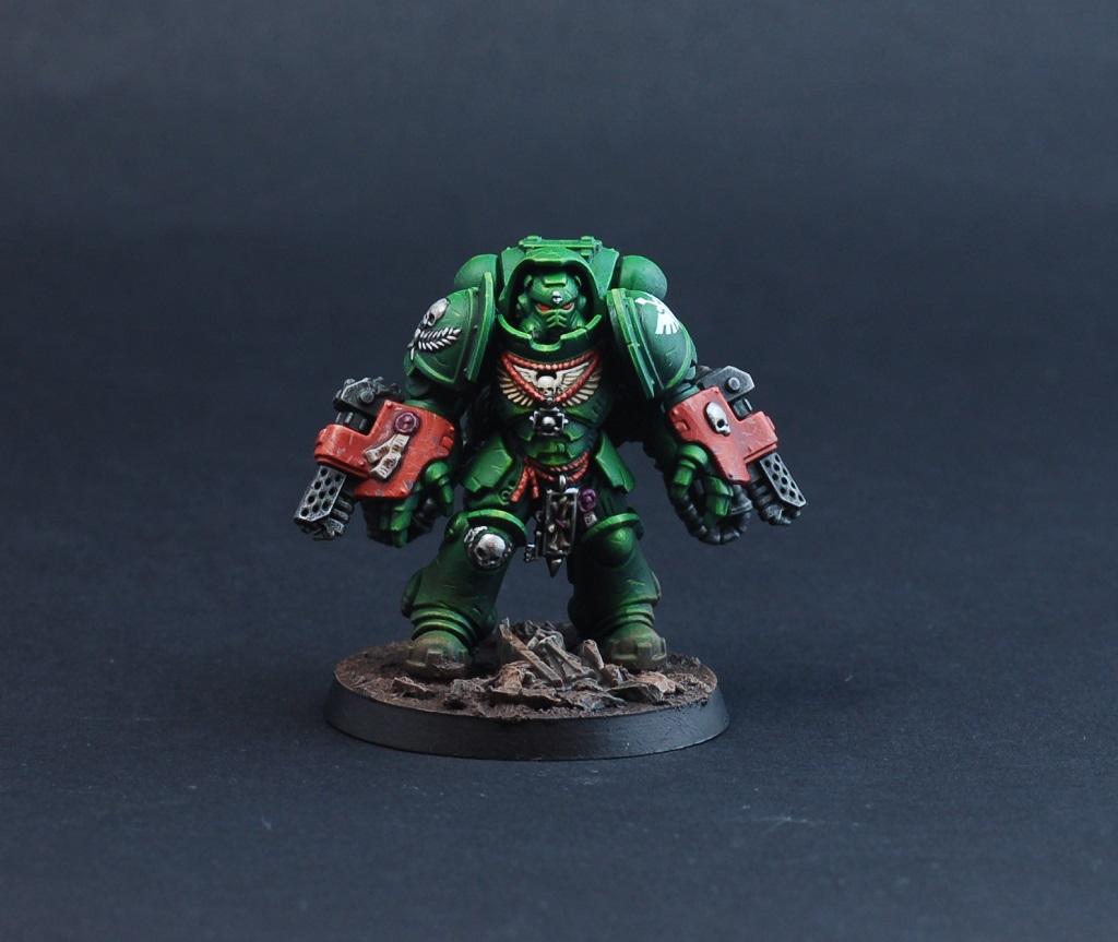
So I am just going to come out and say it. I know it takes skill and I know it makes the models pop but I really dislike edge highlighting. Light doesn’t work like that and to highlight top edges bottom edges and all sides just makes the models look like cartoons, really clean I agree, but really toy like.
I am about to paint some Deathwatch and everyone uses blue edge highlights which to me just look weird, has anyone seen any examples of shaded paint jobs on them where the curved edges of the big panels have actually been shaded through?
There's edge highlighting and edge highlighting though. Edge highlighting doesn't have to mean that you go round the edges of every panel in the same shade. Flat armour panels with the same shade of highlight all round the edges, and the same shade used on the shins as on the helmet (aka the Games Workshop methed, although the top Eavy Metal artists don't actually use this method) is not a look I'm massively keen on either. You can paint edge highlights but concentrate on the upper edges, and get brighter higher up the model, so towards the face which is where you want to draw the eye anyway.
On this guy, I edge-highlighted, but the upper edges of each panel are lighter than the bottom edges, and the edges around the top third of the model are considerably lighter than around the ankles.
As for a tutorial on shaded and gradiated armour panels, there are a lot of examples on YouTube, some better than others, some more achievable than others. Darren Latham's video on it is excellent. Be warned though, if you're painting an army like this be prepared for a lot of work!
Thanks Feltmonkey. Have to say your work is stunning, yours actually looks like the highlights match the light source rather than just highlighting everything. Love the fact that you've left the feet pretty dull as they should be if lit from above. Let's face it most of our models are in bases that would suggest they were on a battlefield being lit by some sort of sun. So to put bright highlights under the knee cap is just weird to me.
That video is really good, still prefer it before he adds the final highlights though, all gets a bit not black anymore after about halfway.
I think you need to do a tutorial mate prefer your look to GW and most I've seen, very restrained and realistic, but obviously a lot of work.
I think the thing is that for many people new to highlighting the actual painting act itself is enough of a challenge to master. The more practice they get the better, but its only once they've a solid foundation that they can then move onto selective highlighting to represent a specific light source.
Otherwise they are trying to learn two related skills at once and whilst learning light angles might be a bit quicker to pick up; they'd hit the barrier that their highlighting skills wouldn't give them the effect they'd necessarily want. Which might well lead them to get confused on what's going wrong (is it my painting or is it my choice of what to paint etc...).
Yeah I tend to pay attention to my edges and apply lighter and darker edging depending on the area. Sometimes a little artistic licence is applied to make some areas stand out, but usually I try to keep it on line with my light sources.
Happygeorge wrote: Thanks Feltmonkey. Have to say your work is stunning, yours actually looks like the highlights match the light source rather than just highlighting everything. Love the fact that you've left the feet pretty dull as they should be if lit from above. Let's face it most of our models are in bases that would suggest they were on a battlefield being lit by some sort of sun. So to put bright highlights under the knee cap is just weird to me.
That video is really good, still prefer it before he adds the final highlights though, all gets a bit not black anymore after about halfway.
I think you need to do a tutorial mate prefer your look to GW and most I've seen, very restrained and realistic, but obviously a lot of work.
Thanks! That's very kind.
I would try to put together a tutorial, but if I'm honest, I don't think I've ever managed to nail the look quite as well as I didn on that individual model since, and I painted him 18 months ago.
What you're saying about the Darren Latham video is interesting - perhaps the thing to do to achieve the look you want is to follow the tutorial up until the halfway point where it's what you want and then stop? You don't have to edge highlight at all if you don't want to - they're your models - and I know of several really good painters who don't edge highlight at all. For example, you could search on Instagram for Soulway Studios. He does a lot of larger-scale models rather than infantry, but he creates incredible, realistically-weathered stuff. Zatcaskagoon's channel on YouTube has a whole other approach as well.
I like this thread, when I started painting a couple of years ago all I could find were examples of minis that were edge highlighted and every section was colour graded up to almost white. like a bright light shining was over them. And I thought this was the way to paint and the standard to achieve and the techniques I need to learn.
Now I just think about what I want the model to look like, the way I paint them represents who the model is rather than thinking about light sources. I recently did a sort of word bearers war band and I want them to look plain or somber, because there are religious zealots unconcerned with looking flash. I use gentle edge highlighting as a way of adding distinctions on detail because there isn’t a significant transition from light to dark.
But I totally agree that you see sooooo much OTT edge highlighting and as much as I agree that it takes real talent I am finding it a bit boring to look at. I blame the amount of power armour in 40K. If it wasn’t so top heavy with marine players there wouldn’t be so much emphasis IMO
Generally the area's you want to draw attention to are the ones you want to take to very bright contrast. So I will use pure white on faces, with the highlights usually getting less vivid the lower down you go. Obviously some areas do require high contrast like the light areas on NMM for example.
mrFickle wrote: I like this thread, when I started painting a couple of years ago all I could find were examples of minis that were edge highlighted and every section was colour graded up to almost white. like a bright light shining was over them. And I thought this was the way to paint and the standard to achieve and the techniques I need to learn.
Now I just think about what I want the model to look like, the way I paint them represents who the model is rather than thinking about light sources. I recently did a sort of word bearers war band and I want them to look plain or somber, because there are religious zealots unconcerned with looking flash. I use gentle edge highlighting as a way of adding distinctions on detail because there isn’t a significant transition from light to dark.
But I totally agree that you see sooooo much OTT edge highlighting and as much as I agree that it takes real talent I am finding it a bit boring to look at. I blame the amount of power armour in 40K. If it wasn’t so top heavy with marine players there wouldn’t be so much emphasis IMO
Thank goodness others agree, I thought I might get run out of town
I think it’s become habit to look at a model and write it off if it doesn’t have edge highlights.
The cynic in me thinks it might the years of brainwashing by GW, changing paint names and creating new types,colours and must haves, along with the whole parade ready thing......oh you want me to buy a dozen more completely different colour and specification paints do you. Seems weird that the law of 40k and the colour schemes that go back over 30yrs have changed and continue to change in line with paint marketing
I just finished an orc band with a Deff Dred and never having painted one before I stuck it on here for feedback. I was pretty pleased with it but expected people to comment on not liking the colour scheme or that there was too much/not enough rust, or damage, then 3 people say about edge highlights. Now I appreciate the feedback so I sit and look at the model and think about where I would put them and decide, nowhere, it’s a dirty, damaged, rusty old metal tub, I gave it a heavy wash and let the wash pool and stain every surface in order for it to look oily and grimy, like it was put together and maintained by a group of filthy green skins. I fully accept that would be some people’s preference but thought it weird that that was what they saw.
It's definitely easy to get trapped in a GW or even a wargaming bubble when it comes to miniature painting. There's so many different approaches to painting minis out there that completely skip on most or all of the 'essential' techniques that you see used in wargaming pieces.
It was kind of a big thing for me when I saw scale-modellers (historical tanks and the like) not even really considering light and shadow. That whole approach tends to use weathering and dust tones to accentuate details, rather than light and shadow. Texture is king in that world, not shading. It's a completely different approach with totally different techniques that gives a great outcome.
Lots to explore and IMO if you ever get frustrated with seeing certain techniques time and time again just venture outside of the kind of modelling you'd normally look at and you'll find a wealth of alternative appraoches.
shmvo wrote: It's definitely easy to get trapped in a GW or even a wargaming bubble when it comes to miniature painting. There's so many different approaches to painting minis out there that completely skip on most or all of the 'essential' techniques that you see used in wargaming pieces.
It was kind of a big thing for me when I saw scale-modellers (historical tanks and the like) not even really considering light and shadow. That whole approach tends to use weathering and dust tones to accentuate details, rather than light and shadow. Texture is king in that world, not shading. It's a completely different approach with totally different techniques that gives a great outcome.
Lots to explore and IMO if you ever get frustrated with seeing certain techniques time and time again just venture outside of the kind of modelling you'd normally look at and you'll find a wealth of alternative appraoches.
Oh I agree and although I do love the imagery of 40k I am painting other stuff too. I have been doing a load of 3D printed scenery for Gloomhaven and the figures for our game, also have a mate who designs games and loves painting minis but never touches GW stuff. I just keep coming back to it because I love the characters, have to say I didn’t love painting tyrannids they were super dull, and the Orcs weren’t a barrel of laughs either. I have Grey knights that I’m currently on, a Deathwatch team plus Dreadnought and then the Indomitus set. Once that lots done I may look at other companies, I do like the wargames stuff.
I posted a thread on here a while ago asking about trends in painting and was suprised to here that those long time painters have seen numerous trends come and go and it revealed a few different techniques which was great. It also helped reassure me that edge highlighting wasn’t the main route to success.
I think GW definitely helped make edge highlighting a common theme because of their Battle ready, parade ready approach. All the battle ready paint schemes they provide have a base coat wash and highlight, so you need at least 3 paints to get battle ready. And I think a a lot of people like to try and follow the GW paint schemes. So it’s been a good little money earner for them. But in some instances it doesn’t work, I’ve often written about how I dislike the highlighting in the GW colour scheme for dark angles.
I’m more likely to use highlighting on characters to make them stand apart from the crowd.
I also think one of the reasons I like Metallica so much is because they provide their own natural highlight based on the room your in. Thinking about shoulder pads etc.
shmvo wrote: It's definitely easy to get trapped in a GW or even a wargaming bubble when it comes to miniature painting. There's so many different approaches to painting minis out there that completely skip on most or all of the 'essential' techniques that you see used in wargaming pieces.
It was kind of a big thing for me when I saw scale-modellers (historical tanks and the like) not even really considering light and shadow. That whole approach tends to use weathering and dust tones to accentuate details, rather than light and shadow. Texture is king in that world, not shading. It's a completely different approach with totally different techniques that gives a great outcome.
Lots to explore and IMO if you ever get frustrated with seeing certain techniques time and time again just venture outside of the kind of modelling you'd normally look at and you'll find a wealth of alternative appraoches.
That often comes down to the larger scale of those models though your 1/48 and 1/35 etc. Because they are larger you can focus more on realism and less on forced contrast, but that generally becomes more important on your smaller scales like 28/30mm etc, where the contrast is used to create the illusion of scale. When I'm working on larger scales like my recent gandalf, I pushed the contrast a lot less because of the larger scale.
I must say I absolutely feel the same way, the over contrasted edge highlighting (whatever that is called) is really impressive and I don't mean anything by it but its not for me. It seems cartoonish and a bit too absurd and it never really fits with any of the miniatures.
I'm sure some people really like it and again totally fair enough, but yeah I'm personally not a fan.
Olthannon wrote: I must say I absolutely feel the same way, the over contrasted edge highlighting (whatever that is called) is really impressive and I don't mean anything by it but its not for me. It seems cartoonish and a bit too absurd and it never really fits with any of the miniatures.
I'm sure some people really like it and again totally fair enough, but yeah I'm personally not a fan.
I agree, I have been thinking about painting up the primaris from the indomitus box as sort of virtuous paladins bringing safety to humanity in their darkest hour, and in this context I would probably have a go at the exaggerated contrast and highlighting as I think it fits the character. All irony intended by the way, the imperium is pure evil. But it’s fits the context of the squad/army to be look like over the top good guys despite the fact they are wielding implements of death. It also fits my personal annoyance that I think that GW has tried to use primaris to reframe SM as the good guys.
Anyway.
More other gripe with this style of painting by is that it tends to be the style I see win competitions. I don’t follow comps and wouldn’t enter but when I see a pic of a competition winner on Twitter or Instagram it tends to fit that bill.
There is a reason for that though. High contrast is what creates the illusion of reality (in a scale sense rather than colour) on small scale miniatures. The simple fact is that lower contrast generally means flatter looking schemes. High contrast edging is a must if you want to draw attention to specific areas, which in turn is a must if you want your entry to stand out. This means that you actually need to be skilled at selecting areas for higher contrast edge highlights, and where to tone it down or forgo it entirely. This does not mean that eavy metal edge everything! style always wins. There are tons of golden demon winners where this isn't the case.
queen_annes_revenge wrote: There is a reason for that though. High contrast is what creates the illusion of reality (in a scale sense rather than colour) on small scale miniatures. The simple fact is that lower contrast generally means flatter looking schemes. High contrast edging is a must if you want to draw attention to specific areas, which in turn is a must if you want your entry to stand out. This means that you actually need to be skilled at selecting areas for higher contrast edge highlights, and where to tone it down or forgo it entirely. This does not mean that eavy metal edge everything! style always wins. There are tons of golden demon winners where this isn't the case.
Excellent point, and I was going to make it myself. We have to remember that we're painting teeny tiny models here. I've wavered between edge highlighting and not (because for some reason it's really cool right now to crap on the 'eavy metal style in the youtube/instagram/whatever circles these days). But I always seem to come back to it for space marines to at least a certain extent. From a distance, the models with some edge highlighting always "pop", while the ones without it look dull. Sure, when held up to my face the ones without it look more realistic, but I'm not painting historical figures.
On the other hand, if you want that more realistic style, then go for it! There's nothing "wrong" with any style.
As for painting Deathwatch, if you are going to paint a whole army, I would, uh, steer clear of that Darren Latham style, unless you want to literally never finish the army in your lifetime. Or just use it on your Captain or Watchmaster. That method also gives the impression of "shiny" black armor (think Darth Vader), so consider whether you want that or a more matte look.
A faster "realistic" method could be to use a dark grey or "light" black such as Corvus Black or German Grey and then shade. Or airbrush in black and then airbrush highlight with a lighter color. Lots of youtube videos with examples out there.
You can still get some contrast on edges by using strategic sponge chipping if you want a worn look..
I think that artistically the internet has bred a new kind of realistic style that likely looks outstanding in photographs where the model is viewed many times its original size on the screen; compared to when its viewed at 1ft away on the tabletop; where many of the fine details are invisible.
Indeed sometimes hyper detail at that distance can look less pleasing to the eye then less detail painted for that viewing angle.
You see this in many forms of art; photography gets the very same with some people going nuts over individual pixels and such; when their main output is a resized photo on the internet. Where that 1 pixel really won't make one bit of difference.
I mostly paint with drybrushing and washes. I think my stuff looks fine, especially since I paint large armies.
Recently I've been pushing myself to try more freehand, more careful highlighting and recently edge highlighting. I was happy with the results and it was fun to try out new stuff. But I went back to drybrushing and washes afterwards for some other minis, and just banged some stuff out. If the mood takes me I'll try blending again or whatever. I try not to stress about it, painting is one my main stress relievers these days so I just enjoy the process and do whatever I feel like.
I'm a really crap photographer anyway because I am too disorganised and lazy to get a proper set up, and in person my models are being used as gaming pieces and look great for that use.
I think painting for the internet is cool though. The stuff often looks really striking and it's interesting to try some of it out. But I'm aware it's not the be all and end all of mini painting. To me, much more important is having fully completed armies.
queen_annes_revenge wrote: There is a reason for that though. High contrast is what creates the illusion of reality (in a scale sense rather than colour) on small scale miniatures. The simple fact is that lower contrast generally means flatter looking schemes. High contrast edging is a must if you want to draw attention to specific areas, which in turn is a must if you want your entry to stand out. This means that you actually need to be skilled at selecting areas for higher contrast edge highlights, and where to tone it down or forgo it entirely. This does not mean that eavy metal edge everything! style always wins. There are tons of golden demon winners where this isn't the case.
Excellent point, and I was going to make it myself. We have to remember that we're painting teeny tiny models here. I've wavered between edge highlighting and not (because for some reason it's really cool right now to crap on the 'eavy metal style in the youtube/instagram/whatever circles these days). But I always seem to come back to it for space marines to at least a certain extent. From a distance, the models with some edge highlighting always "pop", while the ones without it look dull. Sure, when held up to my face the ones without it look more realistic, but I'm not painting historical figures.
On the other hand, if you want that more realistic style, then go for it! There's nothing "wrong" with any style.
As for painting Deathwatch, if you are going to paint a whole army, I would, uh, steer clear of that Darren Latham style, unless you want to literally never finish the army in your lifetime. Or just use it on your Captain or Watchmaster. That method also gives the impression of "shiny" black armor (think Darth Vader), so consider whether you want that or a more matte look.
A faster "realistic" method could be to use a dark grey or "light" black such as Corvus Black or German Grey and then shade. Or airbrush in black and then airbrush highlight with a lighter color. Lots of youtube videos with examples out there.
You can still get some contrast on edges by using strategic sponge chipping if you want a worn look..
What is the “eavy metal” style?
It’s interesting what you say about distance. I paint my models to look good at the distance they are when I am holding them whilst painting them. So probably 12 inches from my face.
The eavy metal style is that of the games workshop painting team, and is generally know for being super smooth with everything edged with super crispy highlights. It's competition standard stuff.
However I made something of a misnomer here, and I would actually call what we are discussing here the gw box art style instead, where there isn't much in the way of layered transitions, but everything is edge highlighted like crazy.
This message was edited 1 time. Last update was at 2021/02/10 22:29:28
This thread reminds me somewhat of the complaints about dipping a decade or so ago, and the complaints about drybrushing before that.
Any technique used badly will give you bad results. A technique isn't bad in itself. It's just a matter of figuring out how to apply that technique to get the look you want.
I don't recall the drybrushing, but I do seem to have lingering memories of some people being insanely against dipping because it was cheating or somesuch. I also seem to recall Tyranids often doing it for gaunts to get paint on the models quicker etc...
Overread wrote: I think that artistically the internet has bred a new kind of realistic style that likely looks outstanding in photographs where the model is viewed many times its original size on the screen; compared to when its viewed at 1ft away on the tabletop; where many of the fine details are invisible.
Indeed sometimes hyper detail at that distance can look less pleasing to the eye then less detail painted for that viewing angle.
You see this in many forms of art; photography gets the very same with some people going nuts over individual pixels and such; when their main output is a resized photo on the internet. Where that 1 pixel really won't make one bit of difference.
Yeah 100%. I think for me coming back into the hobby suddenly seeing that style of painting everywhere was quite jarring. Particularly on instagram where those kinds filters seem to suit that style of contrast painting.
And yes, I like the " 'eavy metal style" as well. I think the trouble is I don't know what you call that whacky ass style I'm not a fan of.
Thing is there's nout wrong with saying that, people don't have to get defensive about the mega contrast painting style..
Overread wrote: I don't recall the drybrushing, but I do seem to have lingering memories of some people being insanely against dipping because it was cheating or somesuch. I also seem to recall Tyranids often doing it for gaunts to get paint on the models quicker etc...
The opposition to dipping was partly from it being 'cheating' (much the same things people are saying about Contrast now) but also from it looking quite muddy when it is overdone, or uses too dark a dip. Particularly early on when people were generally using whatever woodstains they could find locally, results were often somewhat mixed.
Before dipping became a thing, drybrushing was the usual target of the painting elitists. While people seem to have largely got over it by now, for a long while it was sneered at as a 'beginner's technique' or something to be used for quick and rough results.
I reckon one could also JUST wash the feet and back of the model with a dark wash, and the front (or alternately, the left side vs right side, and viola, color from sunlight, the easy way.
Would that work to establish light directionality without great effort?
Happygeorge wrote: So I am just going to come out and say it. I know it takes skill and I know it makes the models pop but I really dislike edge highlighting. Light doesn’t work like that and to highlight top edges bottom edges and all sides just makes the models look like cartoons, really clean I agree, but really toy like.
I am about to paint some Deathwatch and everyone uses blue edge highlights which to me just look weird, has anyone seen any examples of shaded paint jobs on them where the curved edges of the big panels have actually been shaded through?
It depends how you do it really. The fact is that when it comes to large, flat surfaces, it is actually more-or-less mimicking reality. So for something like a space-marine that is made up of almost all large-flat surfaces, it's legit. Try painting metallics, especially NMM without edge-highlighting - I'd go as far as to say it doesn't work. That's because it is realistic. Don't forget, there's different levels to edge highlighting. There's drawing a bright line on the edge, and there's drawing a scratched, broken, textured line with different values.
But I definitely get what you are saying. I'm not a fan of the GW-style of ridiculous edge-highlighting and I am not at all impressed when people bring the "space marine style" edge-highlighting over to everything else ... so everything is edge highlighted, even different materials that would not be in real life. That's just amateur-ish. But it still makes for a decent, albeit cartoonish table-top quality model, so meh. Live and let live.
This message was edited 2 times. Last update was at 2021/02/11 03:35:54
insaniak wrote: This thread reminds me somewhat of the complaints about dipping a decade or so ago, and the complaints about drybrushing before that.
Any technique used badly will give you bad results. A technique isn't bad in itself. It's just a matter of figuring out how to apply that technique to get the look you want.
My starting of the thread was not about complaining, people can paint their models with one coat emulsion for all I care. What I wanted was some pointers to anyone that doesn’t think black armour glows blue round the edges and develop bright blue lines down it when lit from a single light source. I would even go as far to say that the higher quality the edging gets the worse it is, it just looks ridiculous. The most daft being the top of the lower greave of a space marine. Unless he has LED’s built in to his kneecap then that is not a highlight area.
Dry brushing works because by default it hits the high points, washes work because they gather in the recesses, edge highlighting only looks good if your setting imagining your mini as a vogue model being lit from all sides. You just need to look at a photo of a knight in armour or of Darth Vader until non coloured light to see how unrealistic it all is.
It is just an opinion though, I was just looking for pointers to people not doing the radioactive glow look, seems a lot of others don’t like it either.
And that's fine of course! Just look at heresy paint scheme iron hands, raven guard, and dark angels.
GW does stuff like that not just as a style choice, but as a differentiator. They want the DW black armor to be different from RG, which is different from Iron Hands, etc.
So yesterday I drove home in the company of a snow plough truck with a large, convex blade on its front.
The blade reflected light in the center, and grew darker and duller towards each edge -- there was no apparent edge highlighting because the edges of this metallic (but lighlt color painted) giant metal surface are not, in fact, painted a different collor. The edge grew duller than the center. I expect a single model of your army painted only in a very reflective gloss version of the color background you like would let you (if you held it up to a powerful light) see light and shadow in an exaggerated manner to then emulate model by model. IF you wanted realism.
In the scrap blade light reflection example I mention ...
Light in the situation of our drive was mostly from the top .. so a concave blade showed its lightest color area not on the top, but in the middle to bottom of the blade.
This is slightly different example of light hitting metal with colored paint. Look at almost any single thing in the GW world, its a conVEX surface being struck by light (in our imagination, usually from above). If you want to model that, stop and consider the light source will reflect its brightest spot at the higher third of the field, with the edges (other than the one edge closest to that light source) being rather dull and dark, because of the inherent failure of light to bend in most planetary environments.
Result of analysis?
So to realistically paint a panel of metal on marine body armor, you would give it a base color that is light, and a dark wash or contrast paint color that allows that panel to accumulate a darker hue on the bottom 2/3 to half. Then ever so lightly lighten that top 1/2's top edge (perhaps by the physical remove of an as yet wet wash) to create a reflection from the surface (and impacting of light on the surface) of an upper world light source. IF you want to get cute abotu it, rotate this 20 degrees in your head and say its not noon on that world.
Seems like it would work. A dozer blade on a leman russ, by comparison, shows the invert the lighter portion of the paint to reflect the different nature of its reflection of the light.
You could easily do a light colored armor suit with red source lighting if you wanted (a dying star world), I suppose, but of course, the easiest tactic is to use light that is similar to the light in the gaming parlors and tables. For a big diorama where you want to blow the little minds of the judges, perhaps you include a red sun, and the reflection of that red sun in the water below the troops' feet, and their armor reflective of the reddish hue of the dying heavenly bodies' output, as they stand and prepare to slog across the open mud and rock to their deaths.
If that made sense. Put those models on the table, however, and you would be wise (this is a lot of theory and not all of it is tested by me yet, so I am in LARGE part putting this up for people to comment on) to include some colors mixed in to your lightening that will react to and reflect human / earth artificial lighting (ie, yellowish to whitish). So that you may have a reddish hue but also the thing looks like the light in the room when you play a bit.
So from a paint perspective, perhaps mix a bit of red with a bit of yellow, if you wanted your world (I paint for a world called "planet mudball" which is a messy, muddy place under a red star and a yellow star).
This message was edited 1 time. Last update was at 2021/02/11 15:39:28


 Heresy World Eaters/Emperors Children