| Author |
Message |
 |
|
|
|
|
Advert
|
Forum adverts like this one are shown to any user who is not logged in. Join us by filling out a tiny 3 field form and you will get your own, free, dakka user account which gives a good range of benefits to you:
- No adverts like this in the forums anymore.
- Times and dates in your local timezone.
- Full tracking of what you have read so you can skip to your first unread post, easily see what has changed since you last logged in, and easily see what is new at a glance.
- Email notifications for threads you want to watch closely.
- Being a part of the oldest wargaming community on the net.
If you are already a member then feel free to login now. |
|
 |
2021/07/14 19:45:31
Subject: "Another Massive Warhammer Preview Online is Coming, and it’s Mighty, Fighty, and Green"-pics pg 17
|
|

Inspiring SDF-1 Bridge Officer
|
I don't really see the mad, tbh. More like I see people wanting to talk and there's not much else.
|
|
|
 |
|
2021/07/14 19:48:21
Subject: "Another Massive Warhammer Preview Online is Coming, and it’s Mighty, Fighty, and Green"-pics pg 17
|
|

Decrepit Dakkanaut
|
 Altruizine wrote: Altruizine wrote: JonWebb wrote: JonWebb wrote:I wonder if the reason it’s 2xcircle or whatever is because it’s going to be like x wing (or dare I say it fallout) where you move front to back along the template not front to front.
Thus 2x 3 is not the same as 6 as you add the width of the base with each incremental move.
It lets you place and pivot the widget as you move and weirdly we find it seems to gel with non wargamers when we demo at shows (but drives some of us vets up the wall at first).
That would still be psychotic, given the design of the template would require you to place it/pick it up three times to move one standard infantry model.
*shrug* There won't be too many models on the table and if the additional rules bring additional context to why then I don't think it will be that much of a burden.
|
|
|
|
|
2021/07/14 19:50:18
Subject: "Another Massive Warhammer Preview Online is Coming, and it’s Mighty, Fighty, and Green"-pics pg 17
|
|

Grizzled Space Wolves Great Wolf
|
 Nazrak wrote: Nazrak wrote:Can’t believe we’ve got page after page of people getting mad about one particular GW colour scheme when you can, y’know, paint your guys however you like.
It's not "mad", it's just discussion.
People get inspired (or not) by the schemes they see others paint, and the appeal of a model is often strongly linked to the scheme a person sees it painted in, so it's hardly surprising people are discussing it.
|
|
|
|
|
2021/07/14 19:52:56
Subject: Re:"Another Massive Warhammer Preview Online is Coming, and it’s Mighty, Fighty, and Green"-pics pg 17
|
|

Regular Dakkanaut
Canada
|
I dunno, those cotton candy blue pants are really pissing me off.
|
Old World Prediction: The Empire will have stupid Clockwork Paragon Warsuits and Mecha Horses |
|
|
|
|
2021/07/14 20:10:00
Subject: "Another Massive Warhammer Preview Online is Coming, and it’s Mighty, Fighty, and Green"-pics pg 17
|
|

Longtime Dakkanaut
Germany
|
Nazrak wrote:Can’t believe we’ve got page after page of people getting mad about one particular GW colour scheme when you can, y’know, paint your guys however you like.
Tell that to all the Marine players salty GW is only relasing Ultramarines and not their super-special totally unique chapter.
|
"Tabletop games are the only setting when a body is made more horrifying for NOT being chopped into smaller pieces."
- Jiado |
|
|
|
|
2021/07/14 20:29:14
Subject: "Another Massive Warhammer Preview Online is Coming, and it’s Mighty, Fighty, and Green"-pics pg 17
|
|

Boom! Leman Russ Commander
|
'Eavy Metal schemes are bright, colourful and neat so that they're easy to standout on the webstore and all the detail is shown off. It's deliberately crisp even when it shouldn't be - look at how clean and tidy the Death Guard on the webstore are except for the tentacles and pustules. Their armour is as proper and polished as any Custodes.
Look at the green-scheme they've been using on the articles and then look at the Imperial Armour books. They're extremely similar, the greens and browns and greys all going onto more or less the same areas. The difference is that the FW painters probably used more matte paints, slightly darker tones and actively utilised weathering technics and possibly pigments to achieve the more realistic, faded, grimy look to them.
Another good comparison is how FW painted the Horus Heresy kits prior to Betrayal at Calth.
|
|
This message was edited 1 time. Last update was at 2021/07/14 20:31:17
|
|
|
|
|
2021/07/14 20:31:18
Subject: "Another Massive Warhammer Preview Online is Coming, and it’s Mighty, Fighty, and Green"-pics pg 17
|
|

Posts with Authority
|
 Arbitrator wrote: Arbitrator wrote:'Eavy Metal schemes are bright, colourful and neat so that they're easy to standout on the webstore and all the detail is shown off. It's deliberately crisp even when it shouldn't be - look at how clean and tidy the Death Guard on the webstore are except for the tentacles and pustules. Their armour is as proper and polished as any Custodes.
Look at the green-scheme they've been using on the articles and then look at the Imperial Armour books. They're extremely similar, the greens and browns and greys all going onto more or less the same areas. The difference is that the FW painters probably used more matte paints, slightly darker tones and actively utilised weathering technics and possibly products to achieve the more realistic, faded, grimy look to them.
Oils, filters, pigments? Something along those lines I'd wager.
|
"The larger point though, is that as players, we have more control over what the game looks and feels like than most of us are willing to use in order to solve our own problems" |
|
|
|
|
2021/07/14 20:35:27
Subject: "Another Massive Warhammer Preview Online is Coming, and it’s Mighty, Fighty, and Green"-pics pg 17
|
|
Boom! Leman Russ Commander
|
 tauist wrote: tauist wrote: Arbitrator wrote:'Eavy Metal schemes are bright, colourful and neat so that they're easy to standout on the webstore and all the detail is shown off. It's deliberately crisp even when it shouldn't be - look at how clean and tidy the Death Guard on the webstore are except for the tentacles and pustules. Their armour is as proper and polished as any Custodes. Look at the green-scheme they've been using on the articles and then look at the Imperial Armour books. They're extremely similar, the greens and browns and greys all going onto more or less the same areas. The difference is that the FW painters probably used more matte paints, slightly darker tones and actively utilised weathering technics and possibly products to achieve the more realistic, faded, grimy look to them.
Oils, filters, pigments? Something along those lines I'd wager.
The old Forge World Masterclass books made use of oil filters and pin washes I think? Definitely pigments, at least. Forge World stopped selling their own range of pigments not too long ago, which does make me wonder if it's why their Horus Heresy schemes have been a lot closer to 'Eavy Metal. Someone up at head office telling them Lil Timmy's confused how they achieved the more realistic look and they can't risk him finding out other companies sell weathering oils, pigments, etc.
|
|
This message was edited 2 times. Last update was at 2021/07/14 20:36:37
|
|
|
|
|
2021/07/14 20:49:32
Subject: "Another Massive Warhammer Preview Online is Coming, and it’s Mighty, Fighty, and Green"-pics pg 17
|
|
Grim Dark Angels Interrogator-Chaplain
Vigo. Spain.
|
TBH, in general, Forgeworld paint schemes is horrible to properly show the actual details of the models they are selling.
|
 Crimson Devil wrote: Crimson Devil wrote:
Dakka does have White Knights and is also rather infamous for it's Black Knights. A new edition brings out the passionate and not all of them are good at expressing themselves in written form. There have been plenty of hysterical responses from both sides so far. So we descend into pointless bickering with neither side listening to each other. So posting here becomes more masturbation than conversation.
ERJAK wrote:Forcing a 40k player to keep playing 7th is basically a hate crime.
|
|
|
|
|
2021/07/14 20:52:42
Subject: "Another Massive Warhammer Preview Online is Coming, and it’s Mighty, Fighty, and Green"-pics pg 17
|
|
Grizzled Space Wolves Great Wolf
|
The old FW Masterclass books used techniques that were reliant on products GW didn’t sell. Often explicitly stating a product name that wasn’t a GW product.
|
|
|
|
|
2021/07/14 20:52:44
Subject: "Another Massive Warhammer Preview Online is Coming, and it’s Mighty, Fighty, and Green"-pics pg 17
|
|
Longtime Dakkanaut
Germany
|
Everything Forgeworld paints looks the same.
|
"Tabletop games are the only setting when a body is made more horrifying for NOT being chopped into smaller pieces."
- Jiado |
|
|
|
|
2021/07/14 20:54:46
Subject: "Another Massive Warhammer Preview Online is Coming, and it’s Mighty, Fighty, and Green"-pics pg 17
|
|
Grizzled Space Wolves Great Wolf
|
 Galas wrote:TBH Galas wrote:TBH, in general, Forgeworld paint schemes is horrible to properly show the actual details of the models they are selling.
Sometimes that’s true, but not always. DKoK would be one example.
In the end GW has a comical style and FW a more realistic one.
|
|
|
|
|
2021/07/14 21:13:40
Subject: "Another Massive Warhammer Preview Online is Coming, and it’s Mighty, Fighty, and Green"-pics pg 17
|
|
Grisly Ghost Ark Driver
|
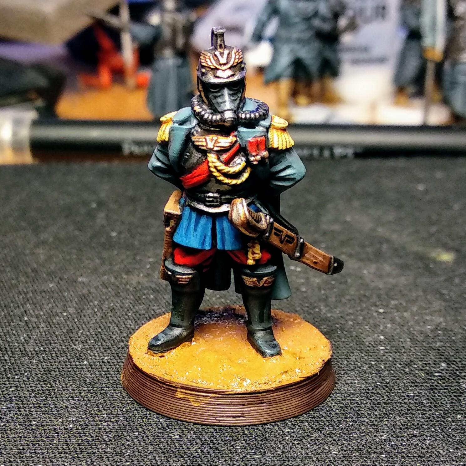
 Esmer wrote: Esmer wrote:Krieg are one of those regiments were the more they look like their Real Life inspiration and the less like your typical GW studio paint job, the better.
Bleak, black gas mask goggles and mat, paled out greens and blues for the uniform are superior to cartoony bright red goggles and clear-cut, sharp contrasts.
Imperial German Uniforms 1842 to 1918 This is a non-commercial reference site, and I don't know how accurate it is, although it does have photograph of some uniforms. Some are period photos and so B&W, but some are color, presumably museum pieces or memorabilia. Note that as the Great War went on, the uniform details were simplified, which is in direct contradiction of the 40k ethos which is even the lowest ranking guardman has to be blinged out!
Assuming I do get a hold of the new Kriegers, I was planning on using the Model 1907/10 Feldrock uniform regs. This was the first issue of the now-famous German feldgrau, but they kept the traditional Dunkelblau (dark blue) for dress uniforms. And I'd use Vallejo, since they have a historical line of paints.
I suppose one could paint Kriegers in Dunkelblau: there must be times they do wear dress uniforms, but it would be out of place on the battlefield. If there are field grade and higher Krieg officers released at some point, they can be in parade dress, like the much-hated staff officers and general officers in the Great War, who had comfortable billets safely behind the lines and kept fighting the war like it was still 1870. History shows us how well THAT worked.
 Albertorius wrote: Albertorius wrote: Wha-Mu-077 wrote: Wha-Mu-077 wrote:Krieg using bright colour like early French army is just as outdated as the Imperial Guard's main tank bring an upgunned British Mark 1, from 1916. But I don't see anyone complaining about that.
I actually did a first paint test a while ago with basically that scheme:
That looks pretty good, Albertorius.
|
|
|
|
|
|
2021/07/14 22:33:25
Subject: "Another Massive Warhammer Preview Online is Coming, and it’s Mighty, Fighty, and Green"-pics pg 17
|
|
Regular Dakkanaut
|
The more pics of the Krieg dudes the more I like them. If they expand the range w/heavy weapons and officers I will be sorely tempted to pick some up.
|
|
|
|
|
2021/07/15 00:11:20
Subject: "Another Massive Warhammer Preview Online is Coming, and it’s Mighty, Fighty, and Green"-pics pg 17
|
|
Shadowy Grot Kommittee Memba
The Great State of New Jersey
|
Arbitrator wrote:'Eavy Metal schemes are bright, colourful and neat so that they're easy to standout on the webstore and all the detail is shown off. It's deliberately crisp even when it shouldn't be - look at how clean and tidy the Death Guard on the webstore are except for the tentacles and pustules. Their armour is as proper and polished as any Custodes.
Look at the green-scheme they've been using on the articles and then look at the Imperial Armour books. They're extremely similar, the greens and browns and greys all going onto more or less the same areas. The difference is that the FW painters probably used more matte paints, slightly darker tones and actively utilised weathering technics and possibly pigments to achieve the more realistic, faded, grimy look to them.
Another good comparison is how FW painted the Horus Heresy kits prior to Betrayal at Calth.
This. If you can't understand why this matters, then go look at the official product photography for Conquest by parabellum. simply got awful photos that Phil to do the miniatures justice. having actually seen unpainted conquest meetings in person, I was shocked at how wonderful and detailed the sculpts were, something that the photos just do not effectively communicate in large part because of the attempt at a grittier and more realistic style of painting.
Not sure if you're trying to troll me or just clueless, but Im just going to say "Damnit they're French" and leave it at that.
|
|
|
|
|
|
2021/07/15 01:38:55
Subject: "Another Massive Warhammer Preview Online is Coming, and it’s Mighty, Fighty, and Green"-pics pg 17
|
|
Longtime Dakkanaut
Annandale, VA
|
 Ancestral Hamster wrote: Ancestral Hamster wrote: Esmer wrote:Krieg are one of those regiments were the more they look like their Real Life inspiration and the less like your typical GW studio paint job, the better.
Bleak, black gas mask goggles and mat, paled out greens and blues for the uniform are superior to cartoony bright red goggles and clear-cut, sharp contrasts.
Imperial German Uniforms 1842 to 1918 This is a non-commercial reference site, and I don't know how accurate it is, although it does have photograph of some uniforms. Some are period photos and so B&W, but some are color, presumably museum pieces or memorabilia. Note that as the Great War went on, the uniform details were simplified, which is in direct contradiction of the 40k ethos which is even the lowest ranking guardman has to be blinged out!
Assuming I do get a hold of the new Kriegers, I was planning on using the Model 1907/10 Feldrock uniform regs. This was the first issue of the now-famous German feldgrau, but they kept the traditional Dunkelblau (dark blue) for dress uniforms. And I'd use Vallejo, since they have a historical line of paints.
I suppose one could paint Kriegers in Dunkelblau: there must be times they do wear dress uniforms, but it would be out of place on the battlefield. If there are field grade and higher Krieg officers released at some point, they can be in parade dress, like the much-hated staff officers and general officers in the Great War, who had comfortable billets safely behind the lines and kept fighting the war like it was still 1870. History shows us how well THAT worked.
Uh... In spite of the name, the basic Death Korps infantry uniform is almost entirely French. Take a 1918 poilu, add the neck protector rim from the German stahlhelm, and add a British gas mask hose/bag, and you're pretty much done.
I mean, there's a reason the FW studio schemes have historically been blue, and the GW one is a more colorful and vibrant take on the same basic theme. So if you want to paint Death Korps to match their real world inspiration, look to bleu horizon. It's a great color to do weathering over if you want that grim and gritty look, FWIW.

All that said I'm still considering painting some up in Afrika Korps colors just because I like the idea of tropical Krieg.
|
|
This message was edited 1 time. Last update was at 2021/07/15 01:40:29
|
|
|
|
|
2021/07/15 02:01:43
Subject: "Another Massive Warhammer Preview Online is Coming, and it’s Mighty, Fighty, and Green"-pics pg 17
|
|
Owns Whole Set of Skullz Techpriests
Versteckt in den Schatten deines Geistes.
|
I thought Kreigers were not-French and Steel Legion were not-Germans?
|
|
|
|
|
|
2021/07/15 02:15:44
Subject: Re:"Another Massive Warhammer Preview Online is Coming, and it’s Mighty, Fighty, and Green"-pics pg 17
|
|
Grisly Ghost Ark Driver
|
From the trivia section of this Death Korps of Krieg entry.
"As with many Imperial Guard regiments, the Death Korps is based in part upon real-world militaries from Human history, similar in uniform, appearance and style to the Imperial German Army of World War I and the Wehrmacht of World War II."
From the regiment appearance.
"Spiked helmets are famously worn by the troops of the Death Korps of Krieg; however this is in truth rarely the case in the field, but many Krieg troops maintain the tradition either with improvised spikes or, less commonly, older patterns of the spiked helmet that have survived and been passed down through families."
The pickelhaube is Prussian/Germanic, kepis are French, as are Adrian helmets.
Now when were the DKoK introduced, and in what Forgeworld supplement? What does it say there regarding inspiration? Or is GW claiming this is yet 100% original GW idea with no reference to anything real or fictional?
|
|
|
|
|
|
2021/07/15 02:30:28
Subject: "Another Massive Warhammer Preview Online is Coming, and it’s Mighty, Fighty, and Green"-pics pg 17
|
|
Longtime Dakkanaut
Annandale, VA
|
H.B.M.C. wrote:I thought Kreigers were not-French and Steel Legion were not-Germans?
Yeah, the Krieg uniform is primarily French and the Steel Legion are very similar to WW2-era Fallschirmjaeger. Although the DKoK Engineers track closer to German with their shorter cut of field jacket.
IE 'Fun facts a fan just made up wholesale'. There's very little about their uniform that matches WW1 Germans in particular (pretty much just the neck protector on the helmet) and literally nothing about their uniform that comes from Wehrmacht. I've never seen FW content featuring pickelhaubes. Don't take the wikis as gospel.
|
|
This message was edited 2 times. Last update was at 2021/07/15 02:32:27
|
|
|
|
|
2021/07/15 02:39:07
Subject: Re:"Another Massive Warhammer Preview Online is Coming, and it’s Mighty, Fighty, and Green"-pics pg 17
|
|
Hacking Shang Jí
|
Ancestral Hamster wrote:
Now when were the DKoK introduced, and in what Forgeworld supplement? What does it say there regarding inspiration? Or is GW claiming this is yet 100% original GW idea with no reference to anything real or fictional?
Not sure about when they showed up in Forgeworld books (I think it's Siege of Vraks), but they're in the 3rd edition codex just as a drawing. Miniatures at that time were Cadians, Catachan, Mordian, Valhallans, and Tallarn (plus Ogryns and Ratlings).
|
The Imperial Navy, A Galatic Force for Good. |
|
|
|
|
2021/07/15 03:36:59
Subject: Re:"Another Massive Warhammer Preview Online is Coming, and it’s Mighty, Fighty, and Green"-pics pg 17
|
|
Guard Heavy Weapon Crewman
|
Ancestral Hamster wrote:From the trivia section of this Death Korps of Krieg entry.
"As with many Imperial Guard regiments, the Death Korps is based in part upon real-world militaries from Human history, similar in uniform, appearance and style to the Imperial German Army of World War I and the Wehrmacht of World War II."
From the regiment appearance.
"Spiked helmets are famously worn by the troops of the Death Korps of Krieg; however this is in truth rarely the case in the field, but many Krieg troops maintain the tradition either with improvised spikes or, less commonly, older patterns of the spiked helmet that have survived and been passed down through families."
The pickelhaube is Prussian/Germanic, kepis are French, as are Adrian helmets.
Now when were the DKoK introduced, and in what Forgeworld supplement? What does it say there regarding inspiration? Or is GW claiming this is yet 100% original GW idea with no reference to anything real or fictional?
The wiki entry is not official and is someone guessing poorly. As for where "they are french" comes from its simple comparison if you look up references for ww1 era french uniforms they use several of their uniform components in the death korp, well if you look up ww1 german and ww2 german uniforms there is almost no overlap. No official source from GW needed they wear their influence on their sleeve.
|
|
|
|
|
2021/07/15 04:11:53
Subject: "Another Massive Warhammer Preview Online is Coming, and it’s Mighty, Fighty, and Green"-pics pg 17
|
|
Powerful Pegasus Knight
|
chaos0xomega wrote: Wha-Mu-077 wrote:chaos0xomega wrote: Gert wrote: Gert wrote:The past couple of days I've been seeing people photoshopping different heads onto the Krieg bodies and honestly they're prime for conversion material.
My favorite is the one that swapped the stahlhelm/adrian bastard child for more of a straight adrian: https://twitter.com/DiceyJune/status/1414700718351536141/photo/1
Which has me thinking that the more adrian/brody hybrid style helmets used by the Crucible Guard in Warmachine might be some good conversion fodder.
The Shock Gendarmerie of Guerre shall rise!
At this point you could just buy Grognards from WGA
If I wanted mediocre Napoleonic guard knockoffs Id just kitbash actual Napoleonic minis.
WGA are mediocre, what are you smoking?
|
|
|
|
|
2021/07/15 04:42:42
Subject: "Another Massive Warhammer Preview Online is Coming, and it’s Mighty, Fighty, and Green"-pics pg 17
|
|
Grizzled Space Wolves Great Wolf
|
chaos0xomega wrote: Arbitrator wrote:'Eavy Metal schemes are bright, colourful and neat so that they're easy to standout on the webstore and all the detail is shown off. It's deliberately crisp even when it shouldn't be - look at how clean and tidy the Death Guard on the webstore are except for the tentacles and pustules. Their armour is as proper and polished as any Custodes.
Look at the green-scheme they've been using on the articles and then look at the Imperial Armour books. They're extremely similar, the greens and browns and greys all going onto more or less the same areas. The difference is that the FW painters probably used more matte paints, slightly darker tones and actively utilised weathering technics and possibly pigments to achieve the more realistic, faded, grimy look to them.
Another good comparison is how FW painted the Horus Heresy kits prior to Betrayal at Calth.
This. If you can't understand why this matters, then go look at the official product photography for Conquest by parabellum. simply got awful photos that Phil to do the miniatures justice. having actually seen unpainted conquest meetings in person, I was shocked at how wonderful and detailed the sculpts were, something that the photos just do not effectively communicate in large part because of the attempt at a grittier and more realistic style of painting.
I've gotta say, I completely disagree. On a more realistically painted model I find it easier to figure out the level of detail of the underlying sculpt.
Obviously it just comes down to personal taste, but I can see perfectly well how well detailed the FW DKOK are from the FW paint jobs, and the Conquest models look super detailed in the official product photography I have seen, so I don't know what you're getting at there. They aren't even what I'd describe as gritty and realistic, they simply used less saturated colours, but still used hyper-realistic shading and highlights.
I think you guys have just been overly trained by GW to look at comical miniatures.
If anything I'd go the other way, when GW overdoes the comical style it can completely warp the geometry of a model. Look at so many Ork models that have square muscles... except they don't, GW just decided to edge highlight them as if they do. Or half the beastmen range, that looks far worse in GW's promotional images than they do in person because the GW studio decided to paint the shading in the muscle crevices as if they were panel lines on a Leman Russ battle tank.
So often the GW studio exaggerates details that are subtle in reality, or hides detail that does exist by not exaggerating it as much as other parts of the model.
|
|
|
|
|
2021/07/15 04:46:29
Subject: "Another Massive Warhammer Preview Online is Coming, and it’s Mighty, Fighty, and Green"-pics pg 17
|
|
Irked Necron Immortal
Sentient Void
|
This is GW so please use proprietary names: Freanch & Germonds
I am going to paint the argued upon bits Basilicanum Grey until the figures are almost black. Rivet counting SciFi variations on historical themes is super lame.
|
Paradigm for a happy relationship with Games Workshop: Burn the books and take the models to a different game. |
|
|
|
|
2021/07/15 04:48:49
Subject: Re:"Another Massive Warhammer Preview Online is Coming, and it’s Mighty, Fighty, and Green"-pics pg 17
|
|
Grizzled Space Wolves Great Wolf
|
lurch wrote:The wiki entry is not official and is someone guessing poorly. As for where "they are french" comes from its simple comparison if you look up references for ww1 era french uniforms they use several of their uniform components in the death korp, well if you look up ww1 german and ww2 german uniforms there is almost no overlap. No official source from GW needed they wear their influence on their sleeve.
I've always just seen DKoK as "generic WW1 trench soldier". The greatcoat is modelled off what was most commonly french, the helmet is a bit of a mix with a somewhat unique shape, the name is obviously German.
|
|
|
|
|
2021/07/15 08:59:06
Subject: "Another Massive Warhammer Preview Online is Coming, and it’s Mighty, Fighty, and Green"-pics pg 17
|
|

Huge Bone Giant
|
 Daedalus81 wrote: Daedalus81 wrote: Altruizine wrote: JonWebb wrote:I wonder if the reason it’s 2xcircle or whatever is because it’s going to be like x wing (or dare I say it fallout) where you move front to back along the template not front to front.
Thus 2x 3 is not the same as 6 as you add the width of the base with each incremental move.
It lets you place and pivot the widget as you move and weirdly we find it seems to gel with non wargamers when we demo at shows (but drives some of us vets up the wall at first).
That would still be psychotic, given the design of the template would require you to place it/pick it up three times to move one standard infantry model.
*shrug* There won't be too many models on the table and if the additional rules bring additional context to why then I don't think it will be that much of a burden.
I'm not thrilled by custom measuring tools that still measure inches and a weird system of symbols that replaces an established system of symbols that's been in use for hundreds of years and taught in every school that the designer can assume their customers to have learned from early childhood and used for a decade or more. It inherently adds unnecessary complication. I wouldn't consider mitigating circumstances that make it less of a burden than it could be a good argument in its favor.
That's before you consider that FFG and Modiphius use a controlled and consistently implemented basing system and GW does not. This isn't a system to use with GW's lax miniatures first approach.
chaos0xomega wrote:
Not sure if you're trying to troll me or just clueless, but Im just going to say "Damnit they're French" and leave it at that.
Technically what you should say is "damnit, they're human space soldiers from forty thousand years in the future and you can paint them however you like".
|
Nehekhara lives! Sort of!
Why is the rum always gone? |
|
|
|
|
2021/07/15 11:30:10
Subject: "Another Massive Warhammer Preview Online is Coming, and it’s Mighty, Fighty, and Green"-pics pg 17
|
|
Secretive Dark Angels Veteran
Canada
|
 osjclatchford wrote: osjclatchford wrote:You know I've just realised that the gaunts ghosts models were probably designed with this game system in mind... Just saying...
By Jove! I like that train of thought.
Next bring on The Last Chancers!
|
All you have to do is fire three rounds a minute, and stand |
|
|
|
|
2021/07/15 11:40:56
Subject: Re:"Another Massive Warhammer Preview Online is Coming, and it’s Mighty, Fighty, and Green"-pics pg 17
|
|

Trazyn's Museum Curator
|
Ancestral Hamster wrote:From the trivia section of this Death Korps of Krieg entry. "As with many Imperial Guard regiments, the Death Korps is based in part upon real-world militaries from Human history, similar in uniform, appearance and style to the Imperial German Army of World War I and the Wehrmacht of World War II."
Except that's wrong because the DKoK overcoat is clearly based on what the French wore and the helmet is a modified Adrian. The only thing German about them is the name and the grenades. The gas mask is supposed to be British too. There's a lot of WW1 in there, but it's mostly French. I don't mean to be come across as attacking your source (I also use the 40k wiki at times), but I doubt the editors are that well versed in history.
|
|
This message was edited 2 times. Last update was at 2021/07/15 11:45:20
What I have
 ~4100 ~4100
 ~1660 ~1660
Westwood lives in death!
Peace through power!
A longbeard when it comes to Necrons and WHFB. Grumble Grumble
|
|
|
|
|
2021/07/15 12:14:12
Subject: Re:"Another Massive Warhammer Preview Online is Coming, and it’s Mighty, Fighty, and Green"-pics pg 17
|
|

Torch-Wielding Lunatic
|
|
This space is intentionally left blank. |
|
|
|
|
2021/07/15 12:21:46
Subject: Re:"Another Massive Warhammer Preview Online is Coming, and it’s Mighty, Fighty, and Green"-pics pg 17
|
|

Foxy Wildborne
|
Love it, total trainwreck.
|
The old meta is dead and the new meta struggles to be born. Now is the time of munchkins. |
|
|
|
|
|
|