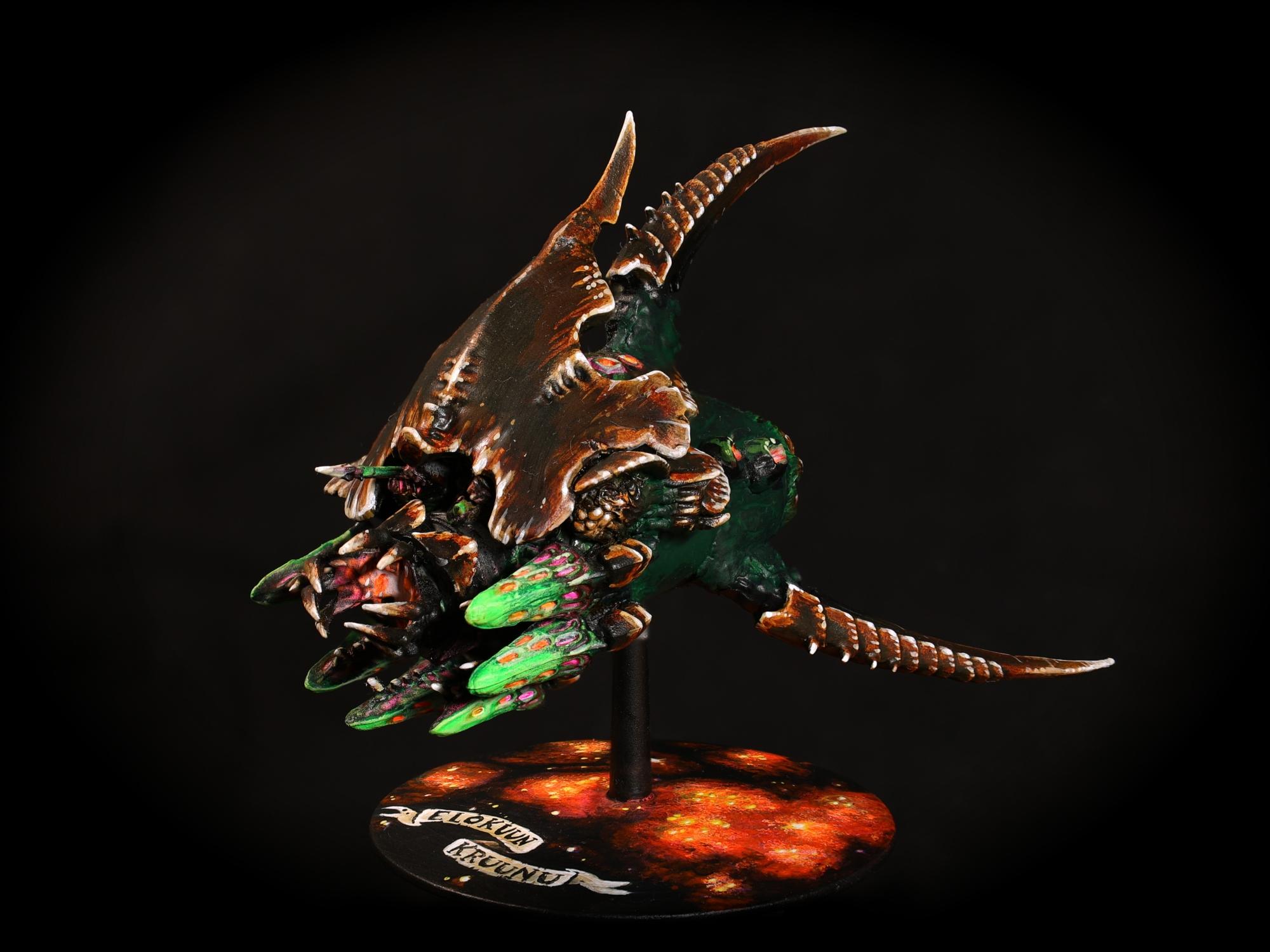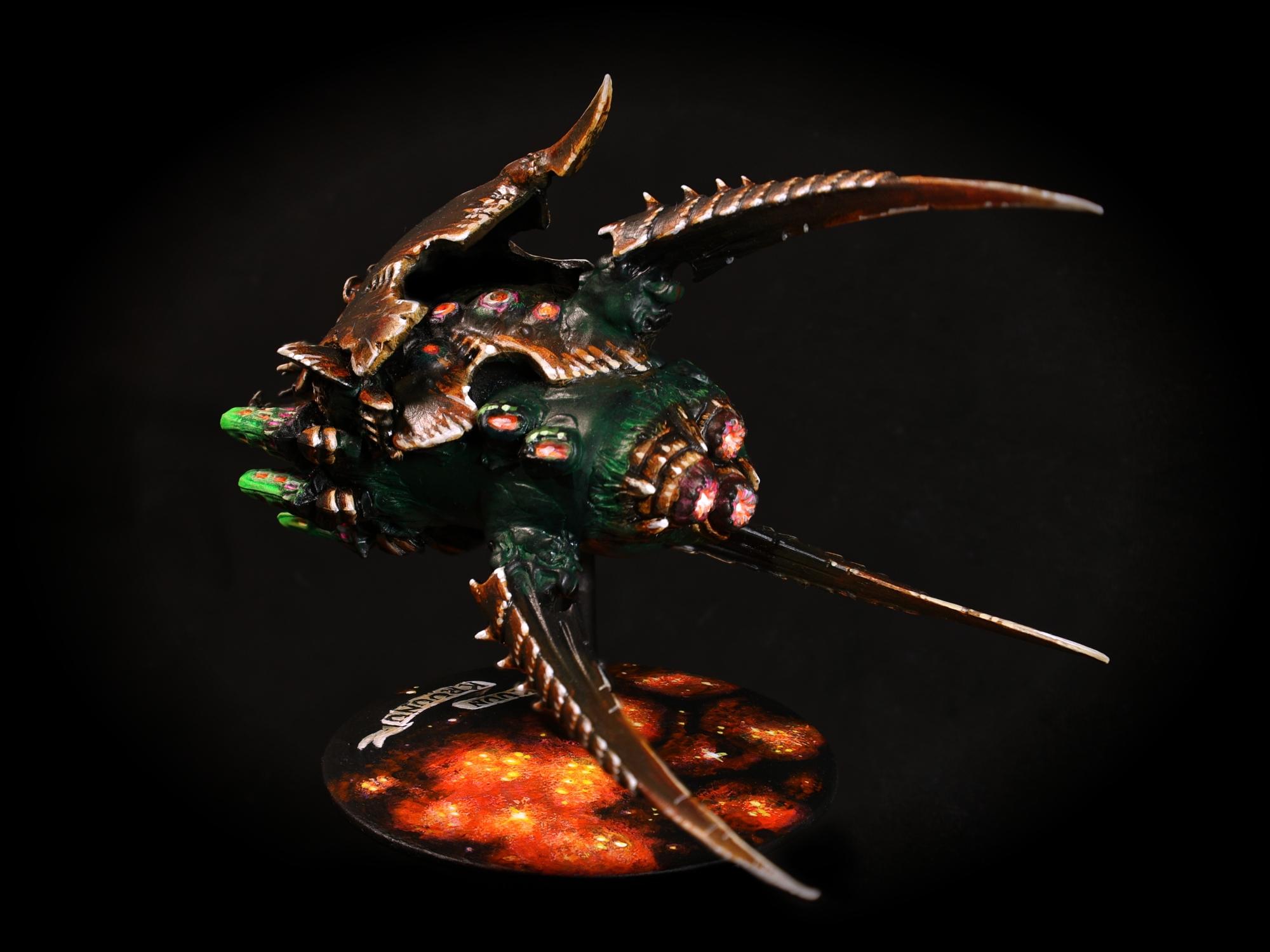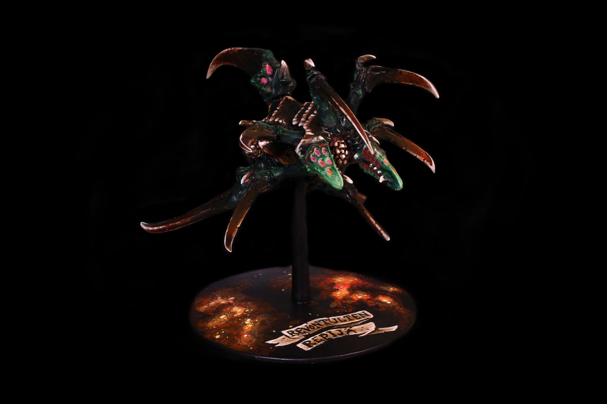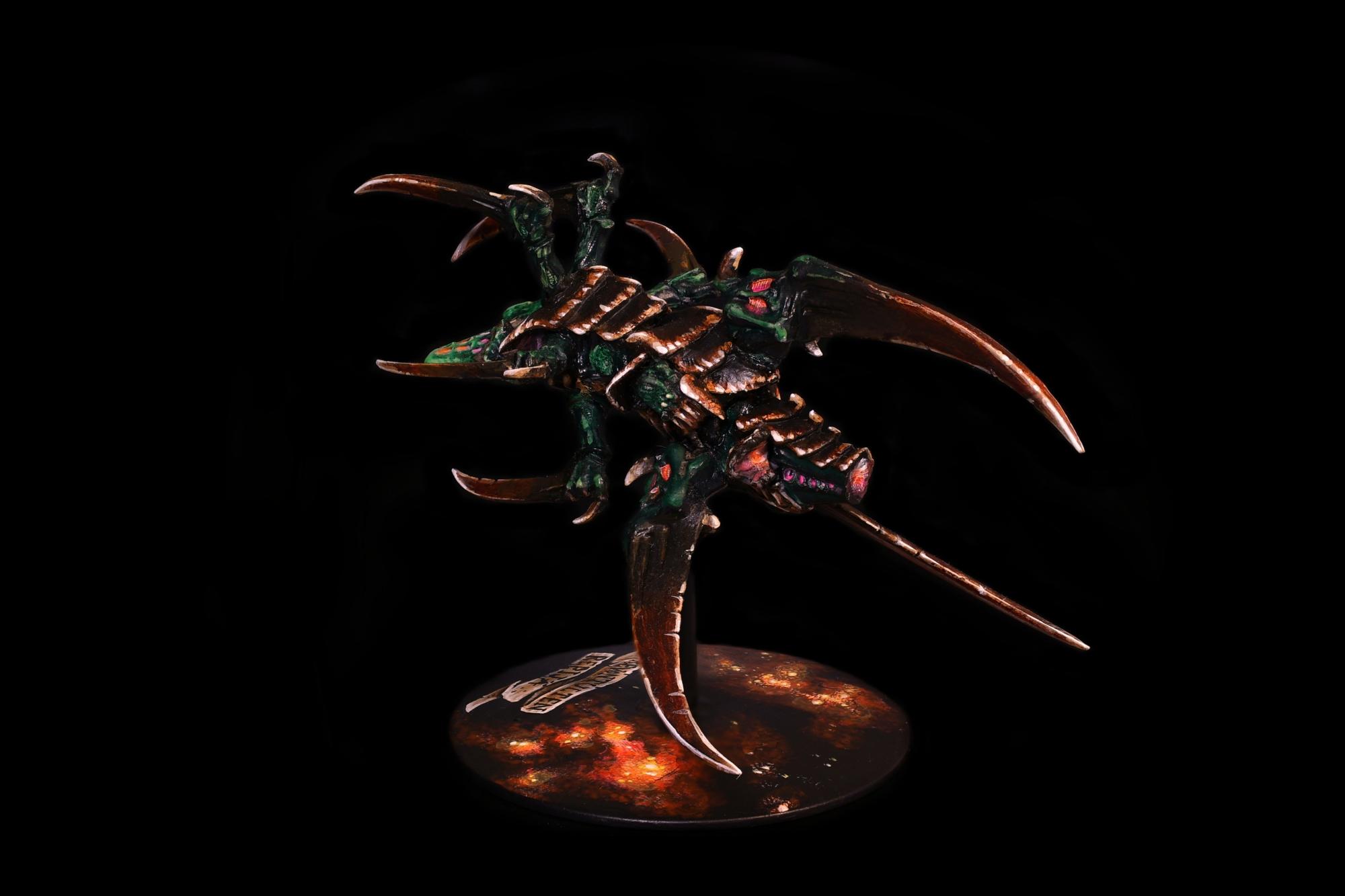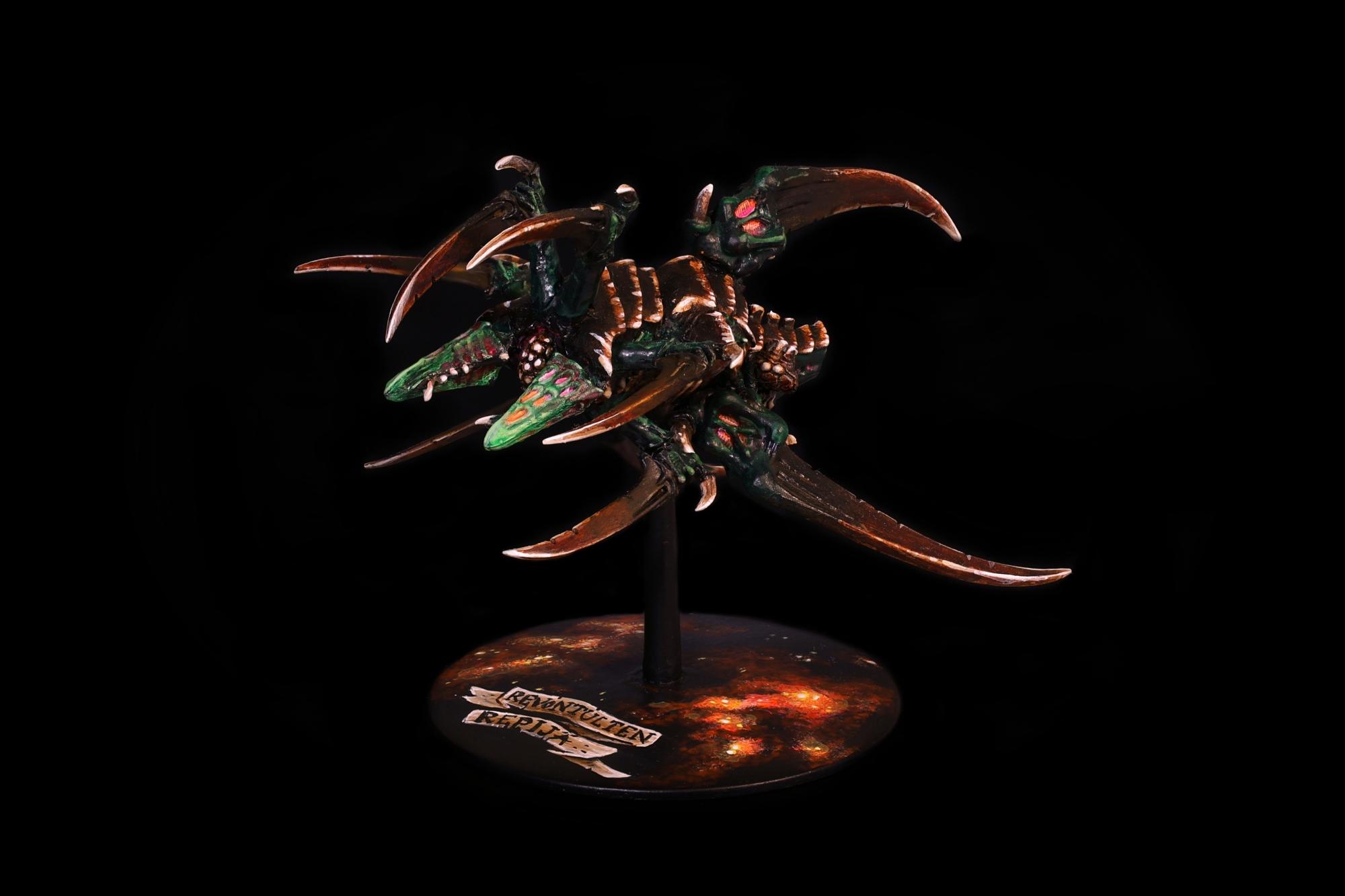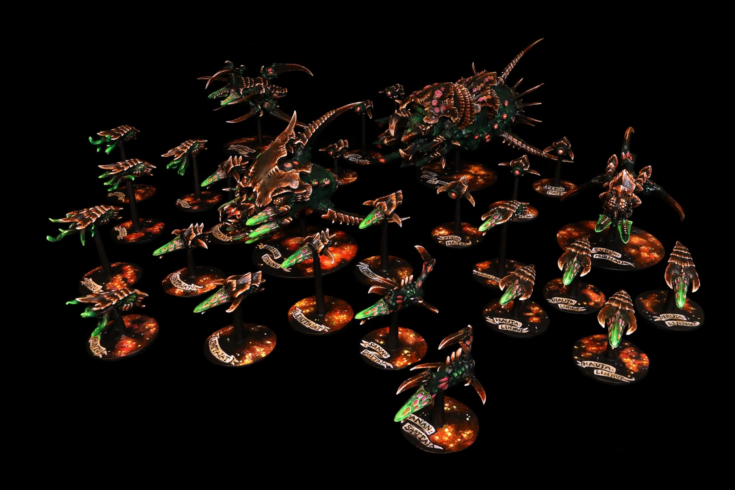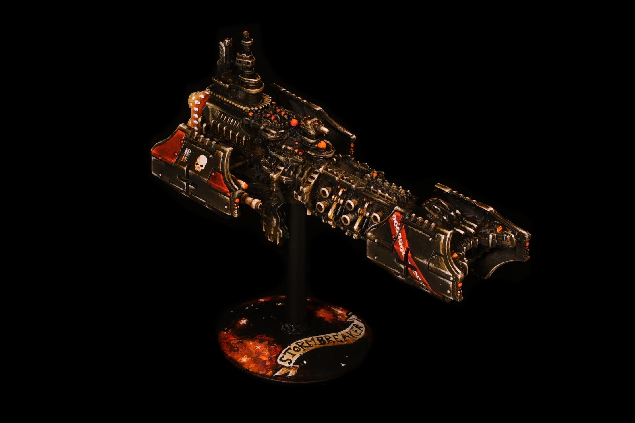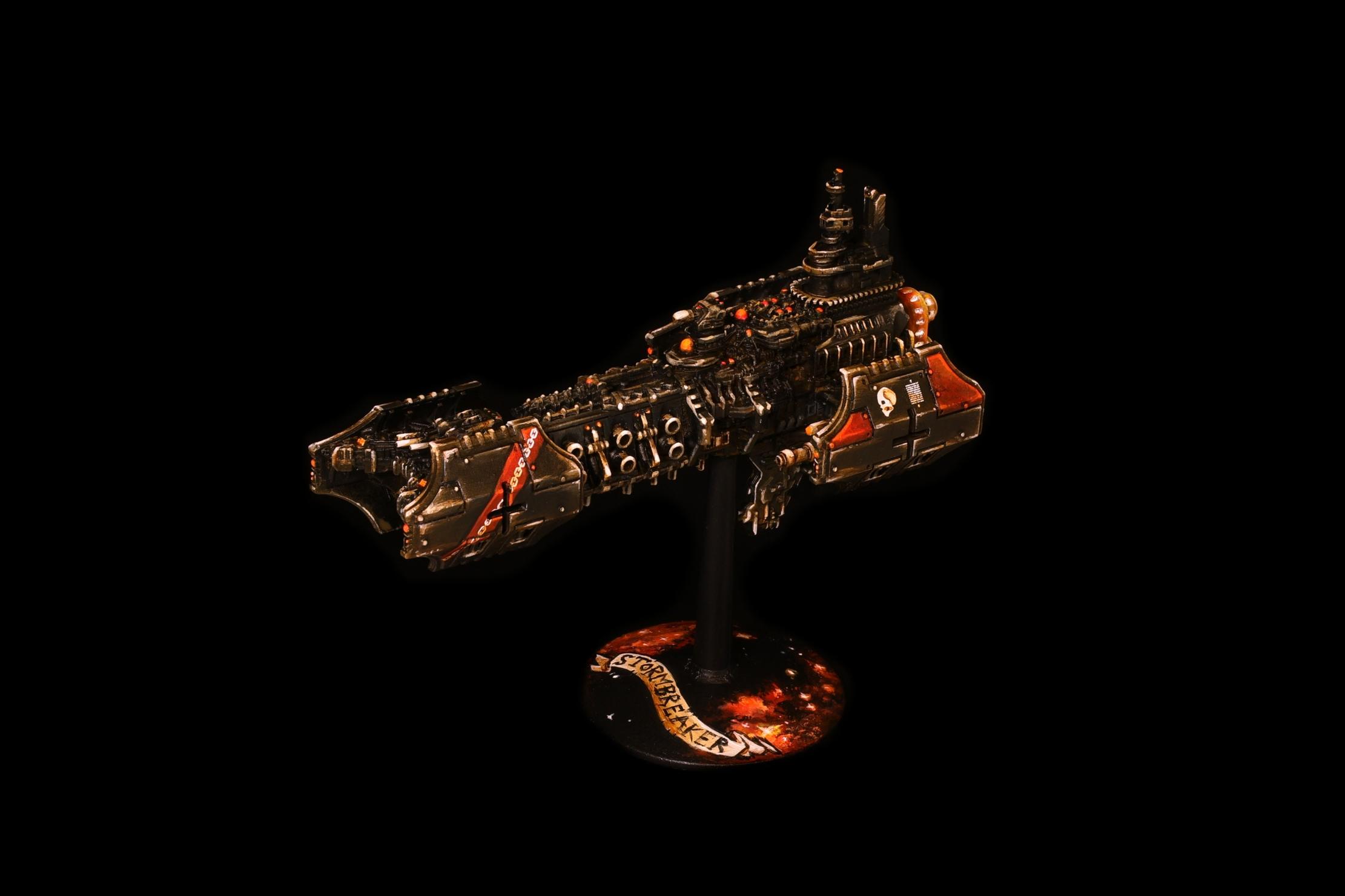
Sherrypie's quick and dirty baroque: so you like chiaroscuro?
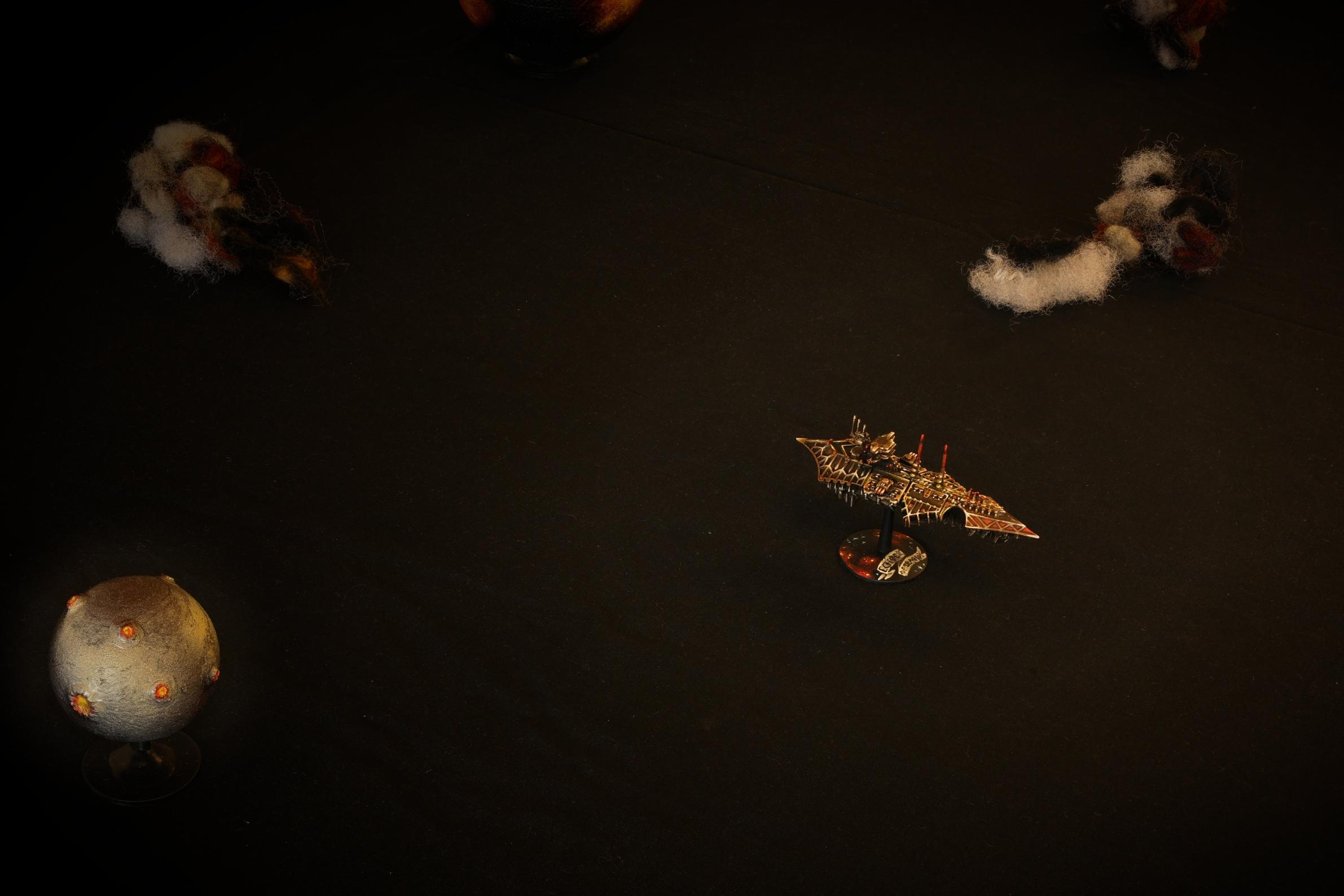
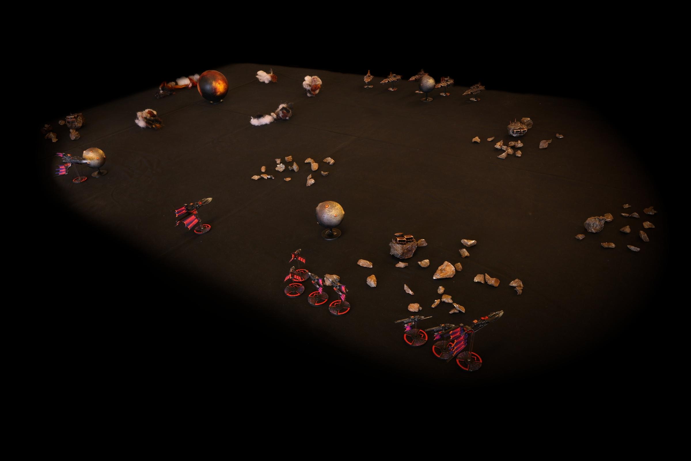
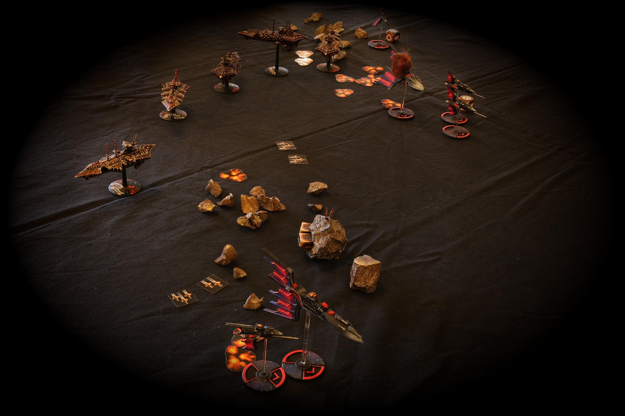
I like baroque aesthetics. Heavy shadows, stark lighting, deep reds and autumnal browns. Restricted Zorn palette and Blanchitsu, old masters and all that jazz. I am also profoundly prone to making due with what I've got within an arms's reach, whether that's a suboptimal shade of yellow or painting with a pine needle because I was outside at the time and it worked well enough (true story): don't get hung up on paint choices. These have been painted mostly with Vallejo Game Colors, but that's an insignificant detail. There's an
AP tone and an AK ink in there as well. Any paint line you like will do, the general ideas won't change.
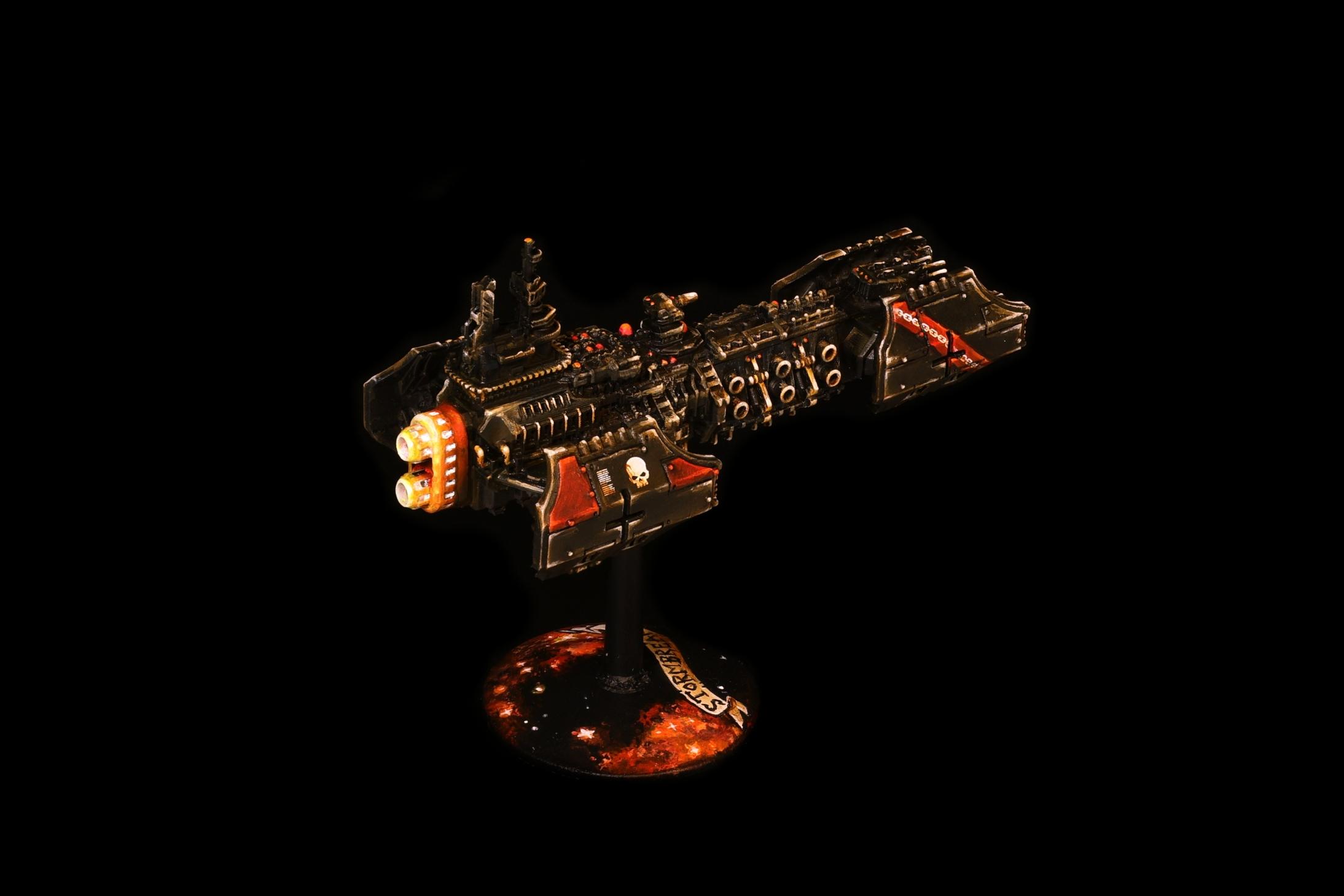
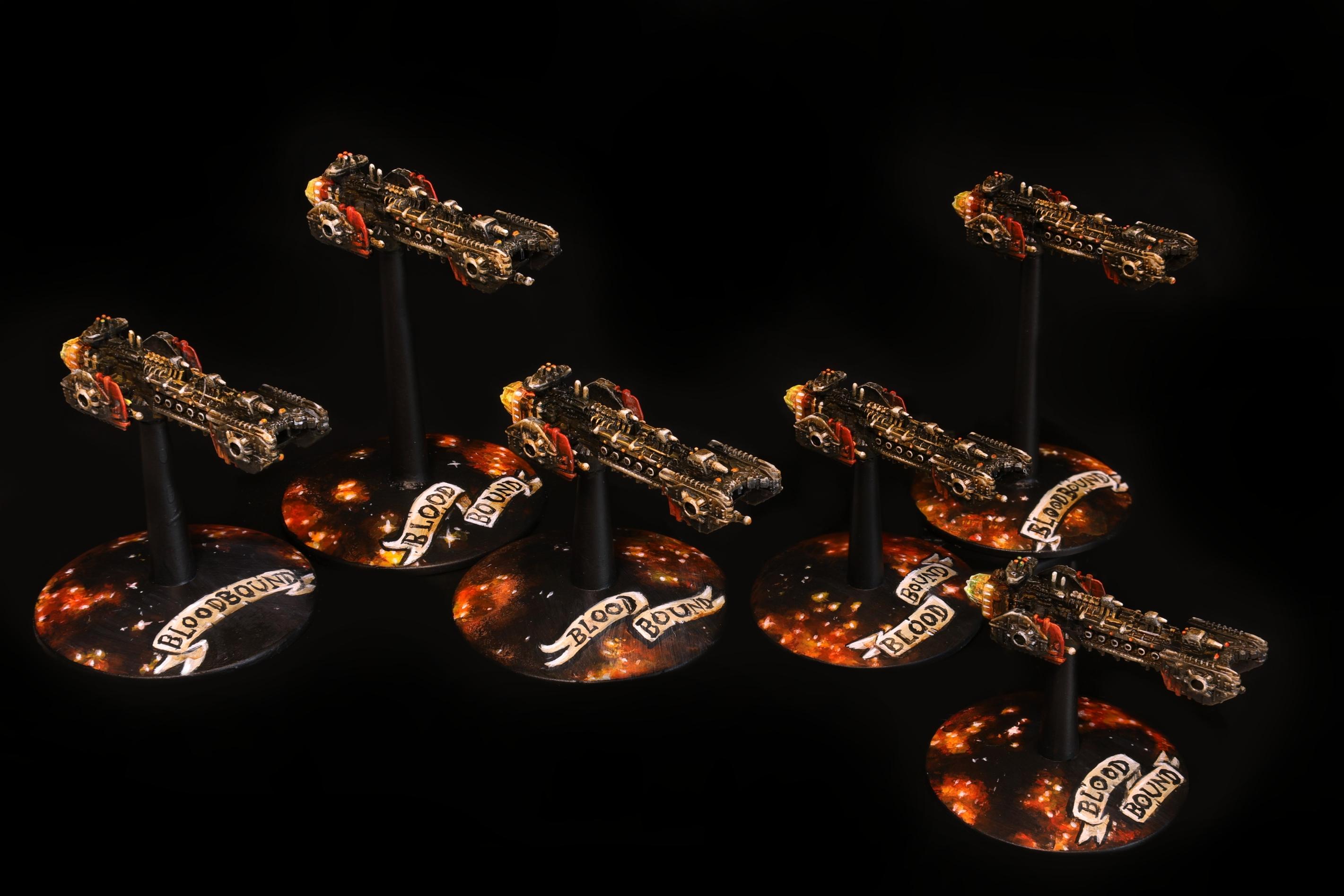
Similarly, these BFGalaxy escort full of spindly little details were about the worst models to demonstrate this rough and "painterly" process with, but that's life. I'll think about it next time

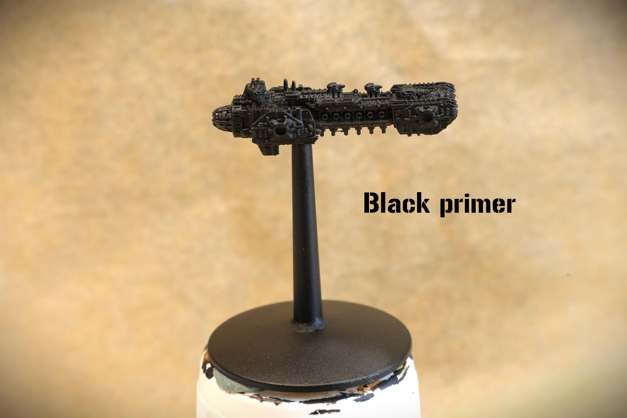
1) Prime black. We're going to want those heavy shadows everywhere.
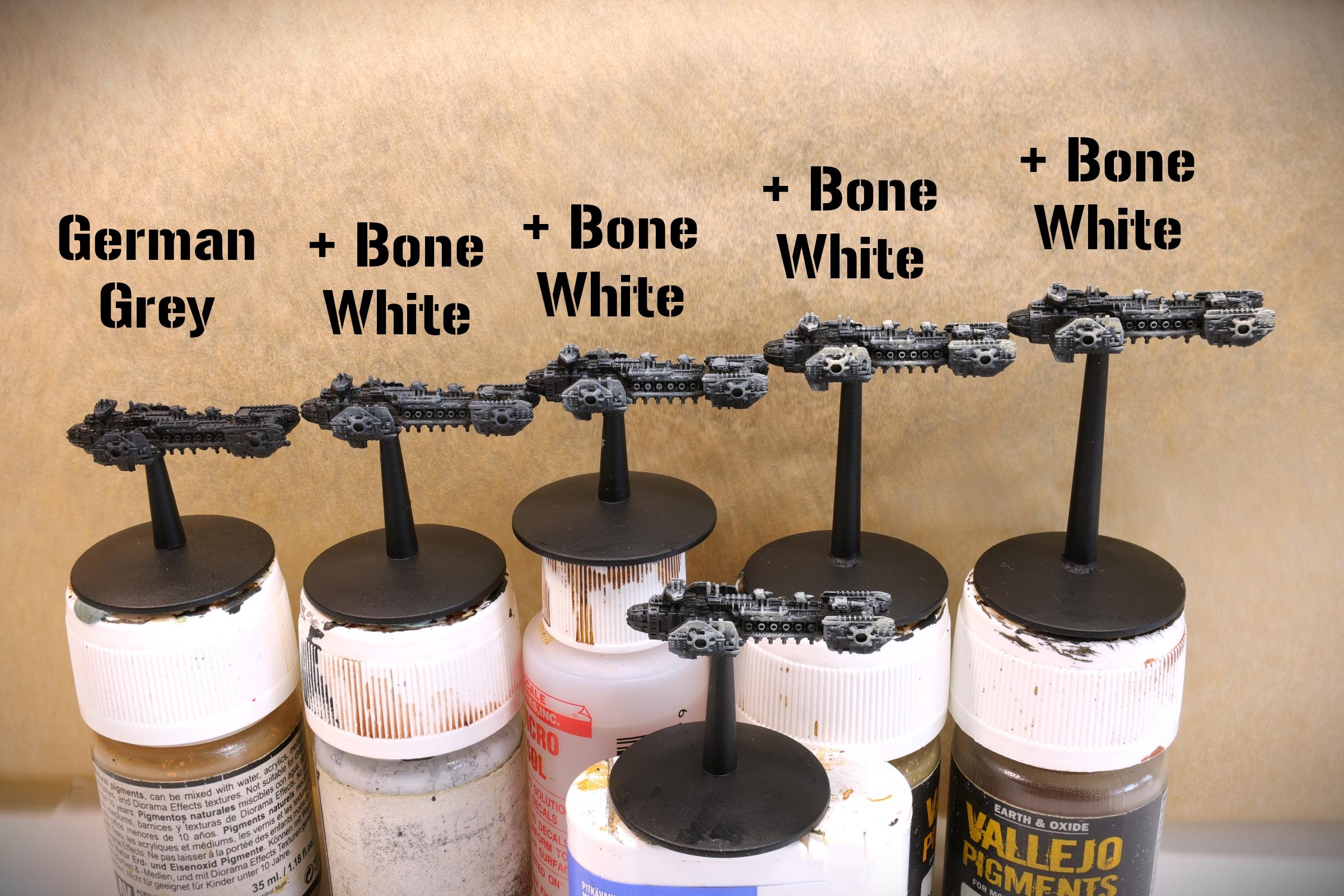
2) Build up the base by overbrushing successively lighter blends of grey + bone. The slightly blueish German Grey is here partly by accident from testing stuff out, but builds up to a darker finish than my usual Imperial ships under all the washes. For my otherwise pretty similar but warmer navy scheme, I'd replace the grey with a dark brown.
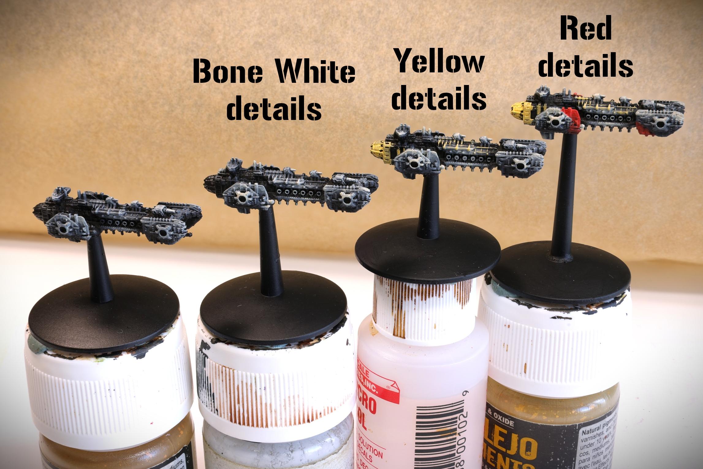
3) Block in the rest of the main colours. Bone for guns, yellow for engines and various bits. At this point I usually go over the model, trying to find some nice places for spot colours like heraldic fields, stripes and such to go.
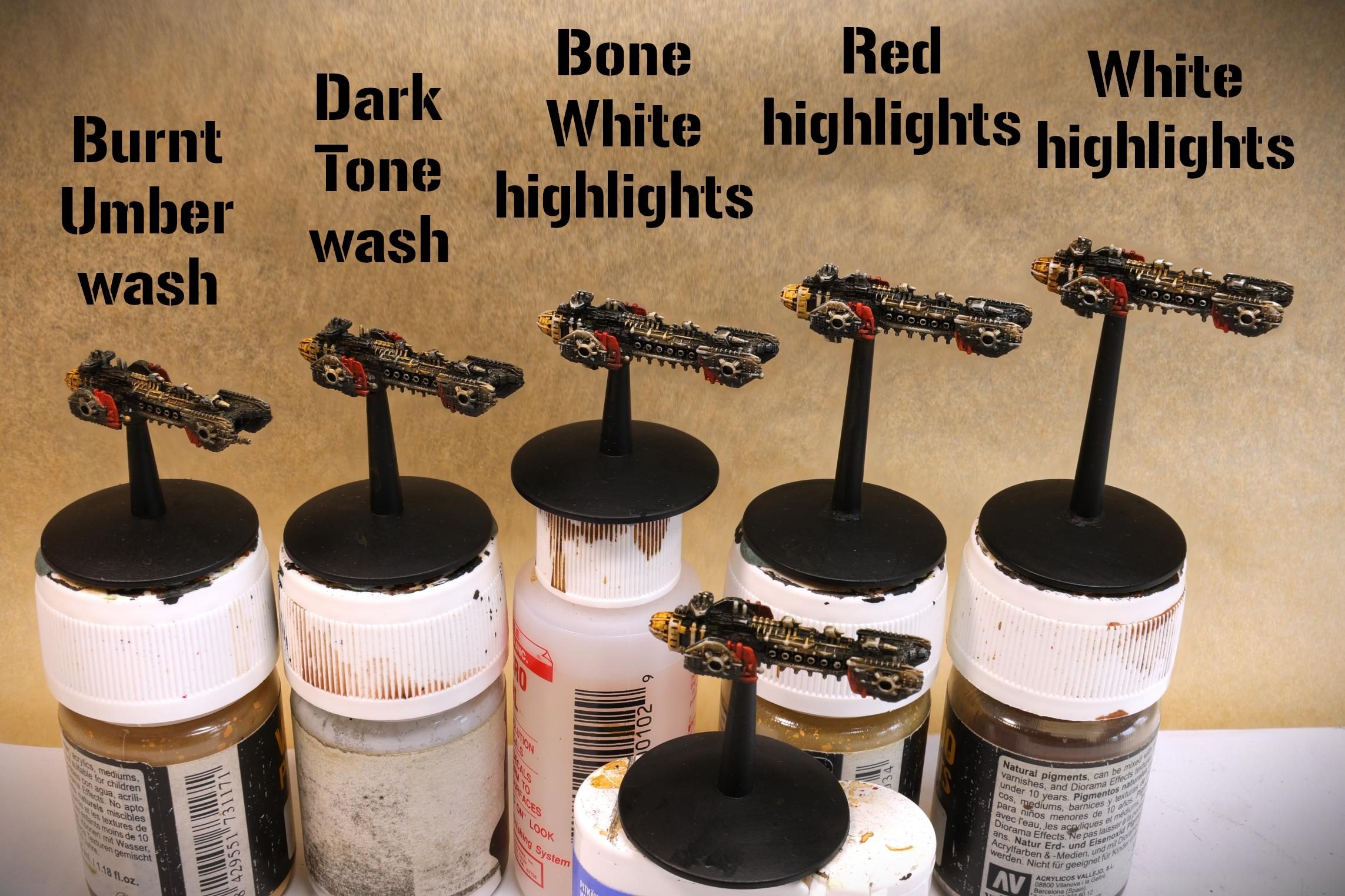
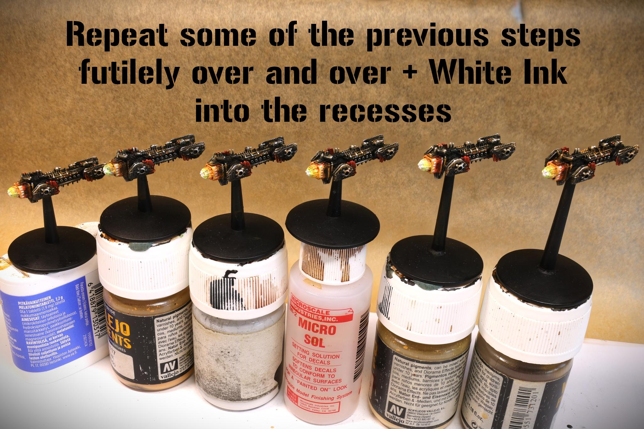
4) Washes and details. My go-to liquid talent is Vallejo's Model Air series Burnt Umber, a slightly reddish deep brown that's runny enough to be used as a brush-applied wash straight from the palette. Agrax and similar washes do about the same. Similarly, my black-ish wash at the moment is Army Painter's Dark Tone, after one too many times that my Nuln Oil dried white. Works nicely for generous applications. With the washes done, it's time to start detailing things again. First with more bone, using fine edge highlights and finishing with sharp lines and dots of pure white. I do usually make another pass with more washes and edge highlights here, to soften the transitions a bit. The reds get a bit of orange blended in. The various little lights are white dots covered with fluo paints.
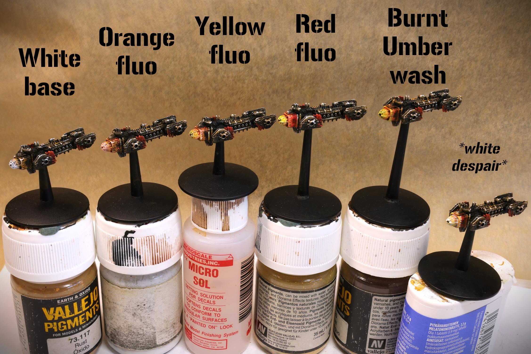
5-6) For engine flares, my usual workflow starts from white, putting yellow on the halfway mark, adding more orange, red and eventually umber as we get farther away from the heat source. I use fluorescent paints here to help a bit with the brightness. Ultimately, this is usually a desperate wrassle of trial and error full of Bob Ross quotes and happy little accidents, where I'm just splodging more bright stuff on one end and darker stuff on the other until it looks acceptable. One can always neaten things up later, but sometimes the sculpt is fighting you and it's just better to let good enough be.
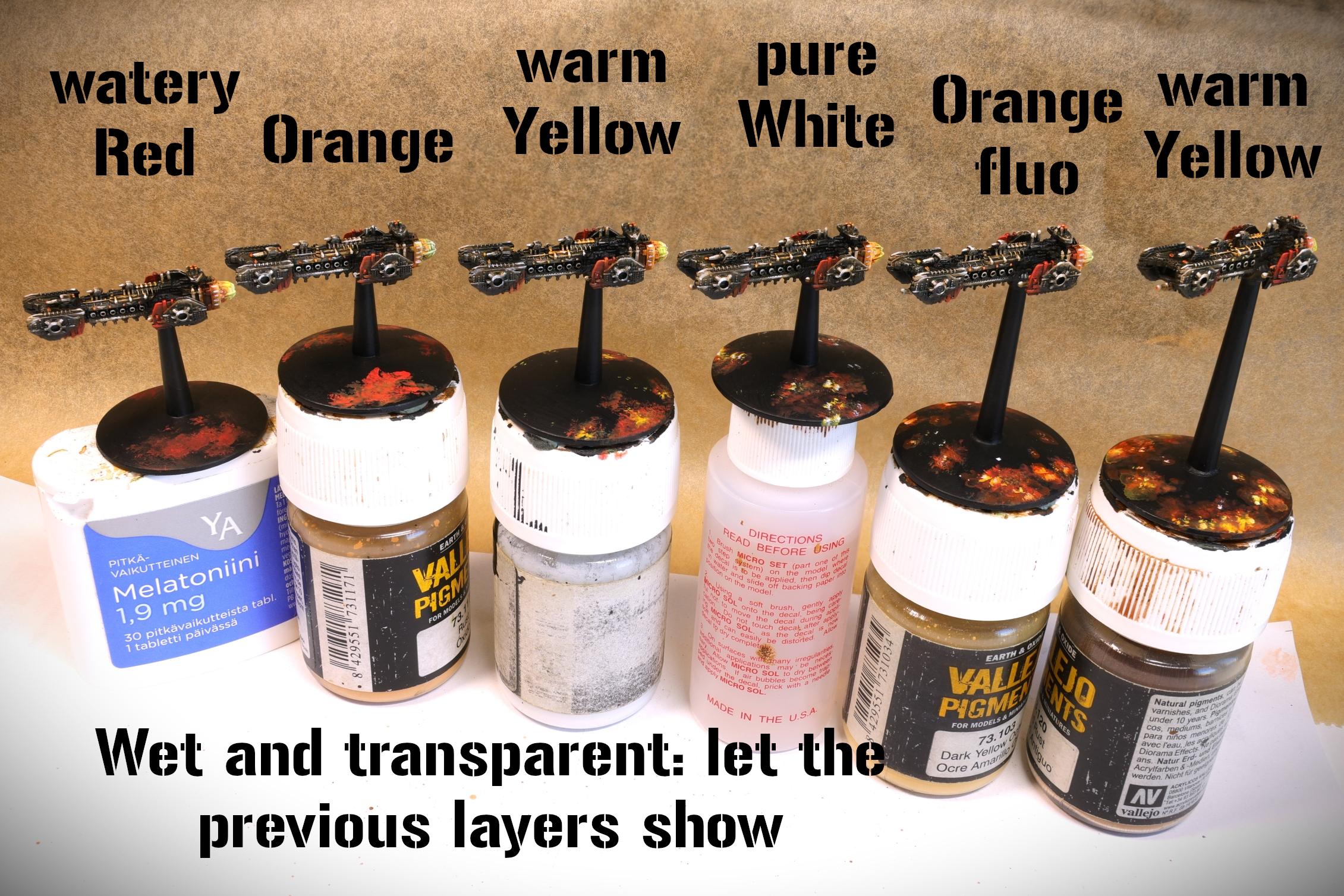
7) For my bases, it's the same but just messier. Take a bad brush that's already hardened to abuse and stipple on some red, orange and yellow. These can be wet, it dries into nice nebulae shapes and is a fun way to use the last drops remaining on your wet palette. Put white stars on with a sharper brush. Now, alternating layers of fluorescent orange and red with pure white stars, build up the clouds until satisfactory.
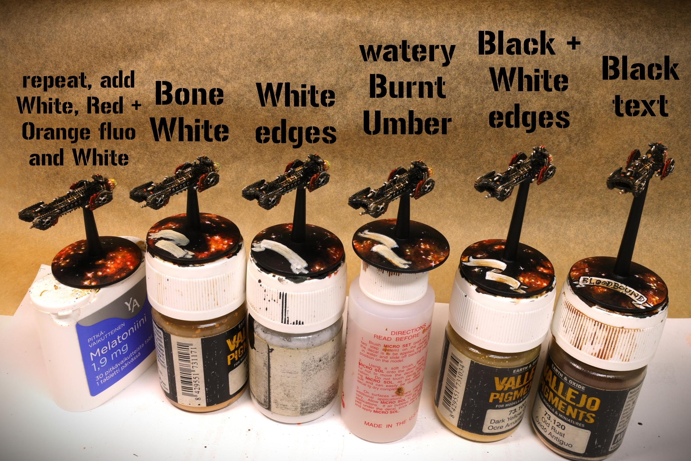
8) For the scrolls, you could start from a brown base, but here I've gone the lazy route of just starting from bone. Some white towards the edges, a watered down brush of burnt umber in the folds and that's the basics down. With a fine brush, I then carefully neaten the outline of the scroll with black, highlight the sharp edges with white and jot down the actual lettering. When writing on models, I start from the middle letter of each word and try to fit the names somewhat neatly onto the scroll. If it doesn't work, no biggie, just cover it up and try again.
And that's it. Matt varnish on top and they're ready for deployment.
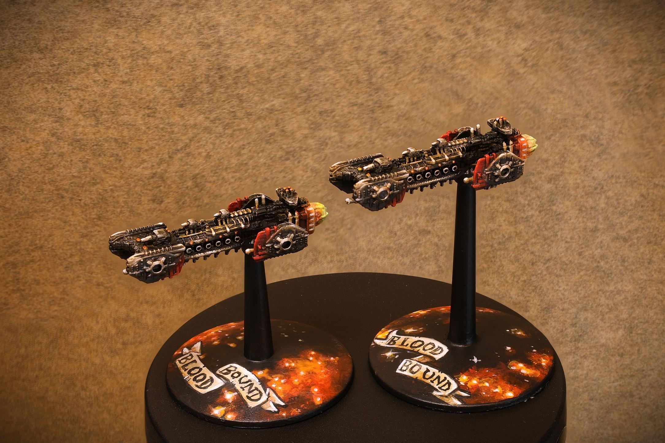
Hope this helps someone or at least amused you today