| Author |
Message |
 |
|
|
|
|
Advert
|
Forum adverts like this one are shown to any user who is not logged in. Join us by filling out a tiny 3 field form and you will get your own, free, dakka user account which gives a good range of benefits to you:
- No adverts like this in the forums anymore.
- Times and dates in your local timezone.
- Full tracking of what you have read so you can skip to your first unread post, easily see what has changed since you last logged in, and easily see what is new at a glance.
- Email notifications for threads you want to watch closely.
- Being a part of the oldest wargaming community on the net.
If you are already a member then feel free to login now. |
|
 |
2012/04/10 13:30:04
Subject: Re:MajorTom11's BA and Sucessor thread + All kinds of stuff - Contemptor pretty much done!(Update4/11)
|
|

Lady of the Lake
|
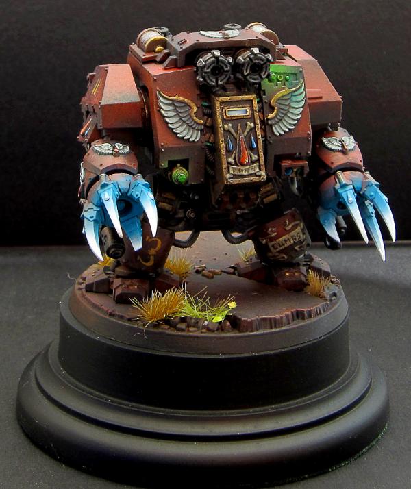
Your OSL is always the same; quite nice to look at. Your assault troops from a while ago are probably one of the things that made me get so interested in trying out the technique.
So more or less another echo about how good it is. 
|
|
|
|
 |
|
2012/04/10 14:20:36
Subject: MajorTom11's BA and Sucessor thread + All kinds of stuff - Contemptor pretty much done!(Update4/11)
|
|

Pragmatic Primus Commanding Cult Forces
|
Great work as always!
|
|
|
|
|
|
2012/04/10 16:06:46
Subject: MajorTom11's BA and Sucessor thread + All kinds of stuff - Contemptor pretty much done!(Update4/11)
|
|

Homicidal Veteran Blood Angel Assault Marine
|
Nice job MajorTom! Paintjob ain't bad either 
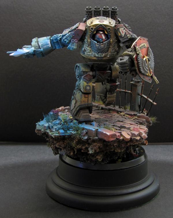
Gold looks good to me, at least on the left side, plenty of depth. I think the right side where the OSL is hitting looks a bit muted, though that's probably because the matte paint has taken the shine from the gold surface. Have you considered hitting those gold areas that get hit with the OSL with some satin varnish? I've never tried it myself so proceed at your own caution but realistically, metallic areas that are hit with light should still retain its shiny properties.
|
|
|
|
|
|
2012/04/10 17:10:23
Subject: MajorTom11's BA and Sucessor thread + All kinds of stuff - Contemptor pretty much done!(Update4/11)
|
|
Blood Angel Chapter Master with Wings
|
As good a critique as I expected my friend!
I agree and disagree to a point – The metal represented by traditional metallic is flake metal, so not inherently as reflective as chrome metal. I think the glow is relatively appropriate since it is flat metal, however, were it NMM, I’d be up the creek. As the gold paint itself has no specular reflectivity, only shine, I think in terms of realism I am still ok from that point of view. I do think though that I created a problem for myself in that the glow looks really good if you take it in context of the environment being kind of dark. The effect works particularly well when lit from that side.
The main issue in going balls-out with the OSL, is that the rest of the lighting should be zenithally sourced from the sword too, and right now the rest of it is zenithal from the top… so barring naturally occurring shadows from real lights, the effect is a little off…
My choice now would be to go in and artificially introduce shadows via a very delicate airbrushing session, or to just leave well enough alone and hold on to the lesson for next time lol.
On my first OSL attempt with the Greyknight, I learned that the glow had to be significantly darker and lighter in tone than the source, so I think I accomplished that this time around, the sword does look like it could like the surrondings in that way. But now, I have to learn that the overall lighting in non-osl painting also needs to be sourced in that direction as well.
Still, a pretty fun learning process!
|
|
|
|
|
|
2012/04/10 17:15:38
Subject: Re:MajorTom11's BA and Sucessor thread + All kinds of stuff - Contemptor pretty much done!(Update4/11)
|
|
Fixture of Dakka
On a boat, Trying not to die.
|
Tom! Looking good! 
But, I did see a few things that looked off to me.
The lettering seemed wrong. It feels like you mixed and matched fonts, and to me, that looks weird. It's mainly the A's that bug me.
The gold armor seems a bit grainy to me. I think it might just be the camera, but it looks rough. If it is rough, was it an error or a planned paintjob, to make it look gritty?
The bricks should be a bit smashed up behind the Dread. Yes, it's a minor gripe, but while I'm at it...
Anyway, it looks amazing as always. I just wish I could paint as well as you. 
|
Every Normal Man Must Be Tempted At Times To Spit On His Hands, Hoist That Black Flag, And Begin Slitting Throats. |
|
|
|
|
2012/04/10 17:22:50
Subject: MajorTom11's BA and Sucessor thread + All kinds of stuff - Contemptor pretty much done!(Update4/11)
|
|

Spawn of Chaos
|
That contemptor is cream worthy
Where did the shield come from!
|
Word Bearers  Wins: 16 Losses: 3 Draws: 0 Wins: 16 Losses: 3 Draws: 0
Sons of Sovereign javascript:emoticon(' '); javascript:emoticon(' '); javascript:emoticon(' '); Wins: 2 Losses: 2 Draws: 0 '); Wins: 2 Losses: 2 Draws: 0 |
|
|
|
|
2012/04/10 17:30:36
Subject: MajorTom11's BA and Sucessor thread + All kinds of stuff - Contemptor pretty much done!(Update4/11)
|
|
Longtime Dakkanaut
|
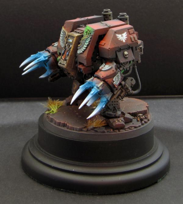
Bloody lovely mate. The sword really gives the whole mini a great feel. Brilliant centre piece, well done!
|
|
|
|
|
2012/04/10 18:17:03
Subject: MajorTom11's BA and Sucessor thread + All kinds of stuff - Contemptor pretty much done!(Update4/11)
|
|
Calculating Commissar
|
He looks absolutely stunning.
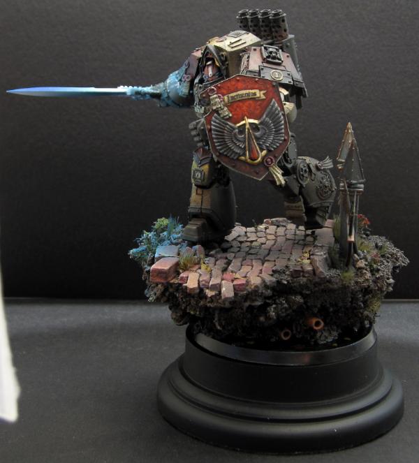
But I'm going to be really really picky and agree with Eggroll about the osl looking a bit off on the gold. While it may not be as shiny as actual gold, it's still going to reflect light differently. If you look at a gold car, for example, it is probably about the same level of reflectiveness (is that even a word?) as your dread would be. You can see light reflecting and refracting in different ways across the bodywork; not just a solid glow.
Having said that, I really don't expect you to go back and redo it as you've already pointed out the two different virtual light sources throwing things off a bit too. We're only pushing to make you even better (even if it does make me cry inside a bit each time I see one of your models )
One other picky-picky osl thing. You've got the eyes glowing and providing a bit of light around them on the helmet. The left eye should also be putting a bit of a glow inside/around the edge of the armoured hood-thingy (see my brain be in gear tonight... not!). Currently it looks pitch black in there...
|
|
This message was edited 1 time. Last update was at 2012/04/10 18:17:53
|
|
|
|
|
2012/04/10 19:32:02
Subject: MajorTom11's BA and Sucessor thread + All kinds of stuff - Contemptor pretty much done!(Update4/11)
|
|
Fixture of Dakka
|
Truly a piece of art, very very nice work indeed.
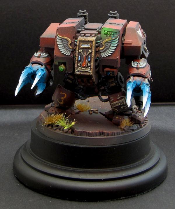
Will you be adding a touch of gloss to the blood drop on the shield?
In regards to the OSL one thing I noticed (although I'm nowhere near a good enough painter as you so shouldn't really comment) is the hilt of the sword looks like it has OSL but I don't think the light from the sword would go back that far due to his hand being in the way.
|
|
This message was edited 1 time. Last update was at 2012/04/10 19:35:44
|
|
|
|
|
2012/04/11 02:02:17
Subject: MajorTom11's BA and Sucessor thread + All kinds of stuff - Contemptor pretty much done!(Update4/11)
|
|
Blood Angel Chapter Master with Wings
|
Lake wrote:That contemptor is cream worthy
Where did the shield come from!
Chowderhead wrote:Tom! Looking good!
But, I did see a few things that looked off to me.
The lettering seemed wrong. It feels like you mixed and matched fonts, and to me, that looks weird. It's mainly the A's that bug me.
The gold armor seems a bit grainy to me. I think it might just be the camera, but it looks rough. If it is rough, was it an error or a planned paintjob, to make it look gritty?
The bricks should be a bit smashed up behind the Dread. Yes, it's a minor gripe, but while I'm at it...
Anyway, it looks amazing as always. I just wish I could paint as well as you.
Thanks Mat!
Will answer your points in order -
The letters follow the same typographic DNA - Serifs, double thick primary ascender, sweeping flourish on the top corner, squarish... I think maybe I'm just not that great at lettering lol!
Gold is a bit grainy, it is kind of par for the course with metalics and AB, particularly on Resin... partly due to high dispersion rates at the lower parts (spread out flakes) and partly because metallic coat so smooth and thin that the shine ends up really accentuating flaws you never saw when prepping the model. That being said, the effect is exasperated by the giant photos, this stuff is pretty much invisible to the naked eye. The gold does not photograph well, trust me when I say it looks much better IRL. Hopefully, some peeps can attest after seeing it themselves at Adepticon!
Bricks are smashed under his foot, I was intending to smash up some more, but given the fact he is running pretty hard, measuring reasonable footfall length there wasn't enough distance to put another one on the base. But, the edge where the footfall would have been is pretty smashed up
endtransmission wrote:He looks absolutely stunning.
But I'm going to be really really picky and agree with Eggroll about the osl looking a bit off on the gold. While it may not be as shiny as actual gold, it's still going to reflect light differently. If you look at a gold car, for example, it is probably about the same level of reflectiveness (is that even a word?) as your dread would be. You can see light reflecting and refracting in different ways across the bodywork; not just a solid glow.
Having said that, I really don't expect you to go back and redo it as you've already pointed out the two different virtual light sources throwing things off a bit too. We're only pushing to make you even better (even if it does make me cry inside a bit each time I see one of your models )
One other picky-picky osl thing. You've got the eyes glowing and providing a bit of light around them on the helmet. The left eye should also be putting a bit of a glow inside/around the edge of the armoured hood-thingy (see my brain be in gear tonight... not!). Currently it looks pitch black in there...
I agree, I am not here just to try and get my bum kissed, good advice is good advice. That pic convinced me, I will add some subtle specular hightlights in white to the fore-facing bits, as I did with the GK. For the eye, believe it or not, there is a blue glow in the hooded area and on the inside of the chest piece, the shadows and longer camera exposure obscured them a bit, but I think you can see it on the earlier crappier iphone pics. Still there I promise lol!
GiraffeX wrote:Truly a piece of art, very very nice work indeed.
Will you be adding a touch of gloss to the blood drop on the shield?
In regards to the OSL one thing I noticed (although I'm nowhere near a good enough painter as you so shouldn't really comment) is the hilt of the sword looks like it has OSL but I don't think the light from the sword would go back that far due to his hand being in the way.
Definitely gloss on the jewel -
I did not notice I had oversprayed the back hilt you are absolutely right!
Good critiques guys thank you!
Going back in, I will be doing some cleanups and additional work, mostly going to attempt to add some shading, put the highlights on the glow, and just go back and do a general tightening up and additional coat of grunge and weathering... so still a ways to go, but for all intents and purposes, it reached the 'you get the idea' stage lol
|
|
This message was edited 1 time. Last update was at 2012/04/11 02:48:17
|
|
|
|
|
2012/04/11 02:10:12
Subject: MajorTom11's BA and Sucessor thread + All kinds of stuff - Contemptor pretty much done!(Update4/11)
|
|
Phanobi
Canada,Prince Edward Island
|
Amazing work as always Tom! The newest contemptor is truly stunning, a real work of art. 
|
|
|
|
|
|
2012/04/11 02:19:26
Subject: Re:MajorTom11's BA and Sucessor thread + All kinds of stuff - Contemptor pretty much done!(Update4/11)
|
|
Fixture of Dakka
On a boat, Trying not to die.
|
The Kerning is perfect, however. Better than I've seen in a good while! This is a Proof of Concept that puts GD winners to shame!
|
|
This message was edited 1 time. Last update was at 2012/04/11 02:36:14
Every Normal Man Must Be Tempted At Times To Spit On His Hands, Hoist That Black Flag, And Begin Slitting Throats. |
|
|
|
|
2012/04/11 02:56:06
Subject: MajorTom11's BA and Sucessor thread + All kinds of stuff - Contemptor pretty much done!(Update4/11)
|
|
Blood Angel Chapter Master with Wings
|
@ CC - thanks my friend, you are overly kind as always
@Chow-d'air - Lol points to Felzie for using 'kerning'! First, apologies for my ipaderificly spelled previous response, I am surprised you could even make sense of it lol... note to self, proof read before answering -
I don't know about GD, I'm being dead serious here btw, my lettering is not good enough to win anything. There are plenty of other things too of course, but my lettering really sucks. I should really practice on paper until I can get it reasonably right before hitting the models up lol! Freehand (at least thin steady freehand) is one of my big weaknesses, and lettering is under that category.
Thanks for looking bud -
p.s - how was the leading though??
|
|
|
|
|
|
2012/04/11 16:00:56
Subject: MajorTom11's BA and Sucessor thread + All kinds of stuff - Contemptor pretty much done!(Update4/11)
|
|
[SWAP SHOP MOD]
Decrepit Dakkanaut
OH-I Wanna get out of here
|
The Dread is really amazing looking, but that base. Oh that base. Super sexy. Still really like the idea of a "Wizard of Oz" Inquisitor and retune (Dread tin man, the FW Show model dog a toto, etc).
|
|
|
|
|
2012/04/11 17:50:09
Subject: MajorTom11's BA and Sucessor thread + All kinds of stuff - Contemptor pretty much done!(Update4/11)
|
|
Calculating Commissar
|
How about Toto the Wulfen?
|
|
This message was edited 1 time. Last update was at 2012/04/11 17:52:37
|
|
|
|
|
2012/04/11 17:55:53
Subject: MajorTom11's BA and Sucessor thread + All kinds of stuff - Contemptor pretty much done!(Update4/11)
|
|
[SWAP SHOP MOD]
Decrepit Dakkanaut
OH-I Wanna get out of here
|
Or a skin wolf (round base obviously)? I kinda like the cyber mastiff from the LE show model though. I'm thinkin the FW Huron model for the lion. Scarecrow, any ideas?
|
|
|
|
|
2012/04/11 23:15:02
Subject: MajorTom11's BA and Sucessor thread + All kinds of stuff - Contemptor pretty much done!(Update4/11)
|
|
Phanobi
Canada,Prince Edward Island
|
How about a skinny daemonhost? Preferably without a straw hat!
|
|
|
|
|
|
2012/04/12 00:45:59
Subject: MajorTom11's BA and Sucessor thread + All kinds of stuff - Contemptor pretty much done!(Update4/11)
|
|
Crafty Bray Shaman
NOVA
|
Epic Contemptor.
That will be all.
|
|
|
|
|
|
2012/04/12 05:39:31
Subject: MajorTom11's BA and Sucessor thread + All kinds of stuff - Contemptor pretty much done!(Update4/11)
|
|
Fully-charged Electropriest
|
The scarecrow could be some sort of daemon host, perhaps?
|
|
|
|
|
2012/04/12 08:43:30
Subject: MajorTom11's BA and Sucessor thread + All kinds of stuff - Contemptor pretty much done!(Update4/11)
|
|
Calculating Commissar
|
whalemusic360 wrote:Or a skin wolf (round base obviously)? I kinda like the cyber mastiff from the LE show model though. I'm thinkin the FW Huron model for the lion. Scarecrow, any ideas?
Oh god. Now I can't get the image of an inquisitor in gingham colour/patterned armour stepping out of a droppod that has landed on top of a rogue inquisitor. DAMN YOU WHALE! I so didn't need another project.
The scarecrow would probably be pretty good as a ragged ganger who has been drafted into her retinue, a bit like Scabbs or a Ratskin.
You could also have one of those old squats in exo armour as TikTok from Return to Oz
|
|
This message was edited 4 times. Last update was at 2012/04/12 08:58:09
|
|
|
|
|
2012/04/12 12:16:49
Subject: MajorTom11's BA and Sucessor thread + All kinds of stuff - Contemptor pretty much done!(Update4/11)
|
|
[SWAP SHOP MOD]
Decrepit Dakkanaut
OH-I Wanna get out of here
|
Make it so ET, make it so.
|
|
|
|
|
2012/04/12 19:56:24
Subject: MajorTom11's BA and Sucessor thread + All kinds of stuff - Contemptor pretty much done!(Update4/11)
|
|
Calculating Commissar
|
|
|
|
|
|
|
2012/04/16 04:35:05
Subject: MajorTom11's BA and Sucessor thread + All kinds of stuff - Contemptor pretty much done!(Update4/11)
|
|
Blood Angel Chapter Master with Wings
|
Woo, looks like you guys have been brainstorming in my absence lol! I'm sure you could do a solid job on the concept EndTransmission, I may give it a crack myself someday
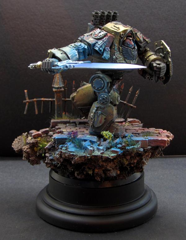
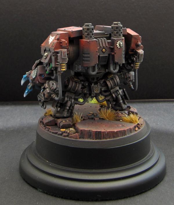
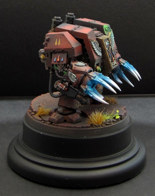
So, taking a great deal of advice from the previous, I have finished the Contemptor... lots of small things, but the biggest changes are specular highlights on the arm and lit areas, and the addition of deep shadows on the opposite side of the light, on the ground as well as the model... The entire effect IRL is all the more convincing now and I am quite happy with the result. Unfortunately I think I messed up my exposure setting, and the the image is brighter than I want it to be to show the effect maybe, and also on both models there is a ton of tiny scratches and weathering that isn't completely visible... Oh well, you get the idea!

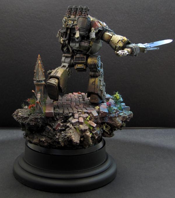
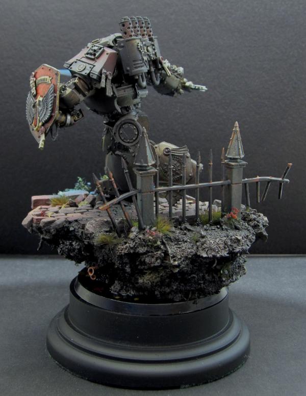
I also whipped together this guy today, I realized I might need it to complete something... The dread is fullt magnetized, feet to base, hips, and a magnet on top for the magna grapple... and something else... older readers will recall
Especially on this model, there is a lot of weathering and chipping not really visible in the shots though :(
That's it for a bit, off to Adepticon this week for my first real life view of wargaming and wargamers... this should be interesting lol!
|
|
This message was edited 1 time. Last update was at 2012/04/16 04:42:09
|
|
|
|
|
2012/04/16 06:00:30
Subject: MajorTom11's BA and Sucessor thread + All kinds of stuff - Contemptor & Furioso done!(Update4/16)
|
|
Lord Commander in a Plush Chair
California + Philidelphia
|
these are marvelous tom! i especialy enjoy your dread on the nice brick base with the glowing powersword! i'm fully subscribed as i cant waite to see what comes out of these (especialy seeing how inspirational your 4th gen genestealers where on all of my modeling, im sure i'll see something that is great here as well)
|
 [ [
"Don't worry, Vik! You have all of your internet friends to keep you company! And, as everyone knows, internet friends are at least one step above imaginary friends "-Rawson
"Does an Ork shiiiit green?" "...Rogue! -you rock!" "Damn you too Rogue!""[TTFN]... That means tittyfething right?""Yep, that's me, a two-dollar whore"-Dsteingass
"... but if we all fail together we can make it look like we´ve won actually.." "...to all killers out there...: my face will hit your fist so hard it´s gonna bleed...your fist that is...""lol....OMG... you are a serial""he knows no pain...nor fear^^ he is a riveteer""yep... some of the dakka chaps here sure made the joints of my jaw quite loose...""er... emailsex... now that at least sounds like the perfect safer sex... but i like mine a bit more...wet""do you know what they call a quarter pounder of a buckte full of rivets in france?" "No...what?" "Rivitz royal"-Viktor von Domm
" I expected to hear gak like that from RW, not you Vik... for shame Sir, for shame"-AnUnearthlyChilde
"We are Vik's private collection of muses for the monkey on his back.....""you, guys are worse than my children......"-mxwllmdr
"Singling one out as odd in a =][_= thread is like going into an asylum, pointing at someone at random and saying "that person's insane""-Shrike |
|
|
|
|
2012/04/16 06:54:11
Subject: MajorTom11's BA and Sucessor thread + All kinds of stuff - Contemptor & Furioso done!(Update4/16)
|
|
Old Sourpuss
|
Is this so he can ride in the MajorTom Pattern Stormraven?
I've been watching your threads for a while now, and that's the only thing I can think of...
|
DR:80+S++G+M+B+I+Pwmhd11#++D++A++++/sWD-R++++T(S)DM+
 
Ask me about Brushfire or Endless: Fantasy Tactics |
|
|
|
|
2012/04/16 07:30:51
Subject: MajorTom11's BA and Sucessor thread + All kinds of stuff - Contemptor & Furioso done!(Update4/16)
|
|
Calculating Commissar
|
Both are looking great. There are just two things left; one each
1) The Contemptor. The lighting on the gold looks much better now, nice job. I am, however now paying more attention to the red areas, and wondering if the lighting is actually right for them. If you were to shine a blue light onto a red object, it turns purple, rather than having a nice consistent blue playing over it. I think this is my one issue with OSL in general, that it tends to get painted as "Here's a coloured light, it will make everything around it that colour"... in actuality, it won't. Which is why I can't quite get to grips with OSL as I can't let go of real life
Here's a snippet I found on coloured lighting that might be of use:
Red and blue are at opposite ends of the visible light spectrum, red being of low frequency, and blue being of high frequency. Sunlight contains frequencies across the whole frequency range, which appears white. An object that appears white reflects all frequencies.
A red object appears red because it reflects red (low frequency) light, and absorbs all other colours. Blue light contains only high frequencies. If you are in a darkened room, lit only by blue light, white objects will appear blue because they are reflecting the blue light, and no other frequency is available.
But a red object absorbs high-frequency (blue) light, and since this is the only light in the room, it does not reflect any light. Objects that do not reflect any light appear black. Some objects appear black even in sunlight, because they absorb all frequencies and do not reflect any.
So to answer the question, when you have a red object that is lit only by blue light, it will appear black.
With a useful image from elsewhere

Figure: Variously illuminated space achieved using a color illumination device
(a) Color diagram on control screen; (b)°V(f) Color of the object under illumination of white light, green light, electric bulb light, blue light, and red light; (g) Inside the equipment in white color illumination; and (h) Inside the equipment illuminated by an electric bulb
Something to think on next time you're doing OSL
2) The Furioso. He's looking great, but it looks like you missed the visor? In the photos it looks plain white
|
|
This message was edited 2 times. Last update was at 2012/04/16 11:25:41
|
|
|
|
|
2012/04/16 11:04:52
Subject: Re:MajorTom11's BA and Sucessor thread + All kinds of stuff - Contemptor & Furioso done!(Update4/16)
|
|

Ragin' Ork Dreadnought
Ingelheim am Rhein, Germany
|
WOW! Just wow! That sword-and-shield contemptor is incredibly awesome, I love it! And the warboss also looks really nice!
Subd and exalted!
|
|
|
|
|
|
2012/04/16 13:14:29
Subject: MajorTom11's BA and Sucessor thread + All kinds of stuff - Contemptor & Furioso done!(Update4/16)
|
|
[DCM]
.
|
You going for the Crystal Brush with that Contemptor?
You really should!
Also, the Furioso probably looks weedly compared to the Contemptor proving without a doubt that once you go Contemptor, you never go back (to 'regular' Dreads)!
|
|
|
|
|
2012/04/16 13:30:55
Subject: MajorTom11's BA and Sucessor thread + All kinds of stuff - Contemptor & Furioso done!(Update4/16)
|
|
Lone Wolf Sentinel Pilot
where am I? *looks around* Well i'm...errr...I...I...don't know!
|
Wow. The contemptor is absolutely stunning!
|

MAY YER BOLTER NAE FALTER!!!! |
|
|
|
|
2012/04/16 13:36:54
Subject: MajorTom11's BA and Sucessor thread + All kinds of stuff - Contemptor & Furioso done!(Update4/16)
|
|
Longtime Dakkanaut
Thunder Bay, Ontario, Canada
|
That's a pretty wild swing of colour saturation front to back.
It really makes it look like the only hting lighting the model is the sword.
I always draw inspiration out of stuff like this as I work towards doing more painting with my air brush
|
|
|
|
|
|
|
|


 [Eggroll's Blood Angels WIP Log]


 23,000pts
  1850pts