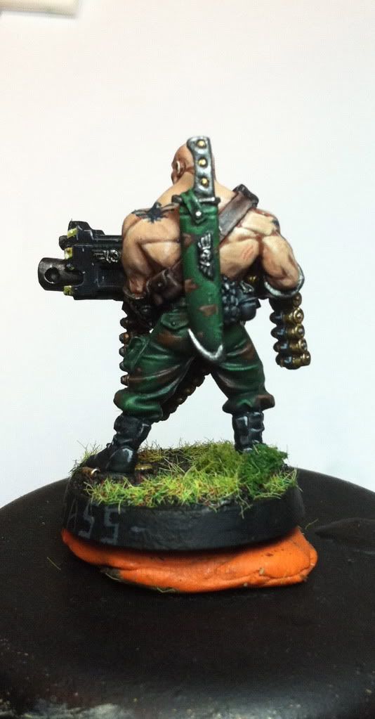
that belt is soooo....well i run out of adjectives...but defintaly mucho^^
the hair, well he is pretty badass already... so the red hair prooves this just as well...as again for that belt...the looks surpreme!
yep and i am glad to be back too.... there is so much backlog i have to read... and only i have been away for a week....you are such a productive bunch here at dakka....gosh...seems the next holidays i have to get a webconnection to stay ontop of all this great work^^
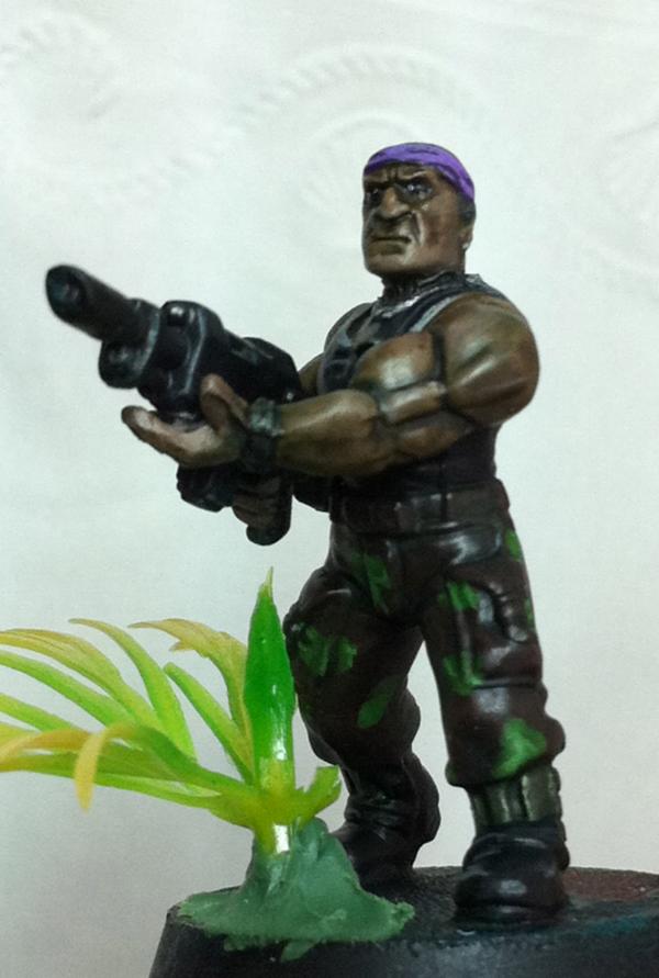
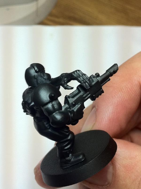
Last update for today. I promise! >_< Tried out three different schemes for his bracers. Green, then silver and gold. which looked HORRIBLE. So i went with a sold silver. Did a minor sky earth thing on it and i got the p3 silver which i must say i like alot. Quicksilver i think it is. Its gotta a blue ish tint. Anyways i also did more work on the grenades and flower but not interested in showing right now.
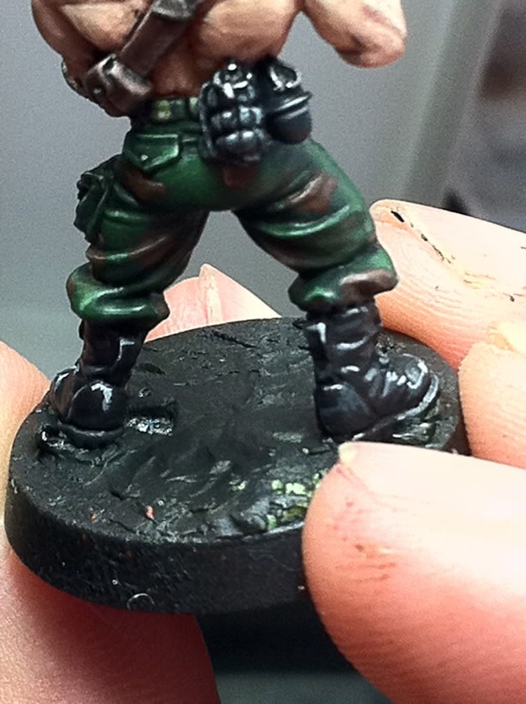
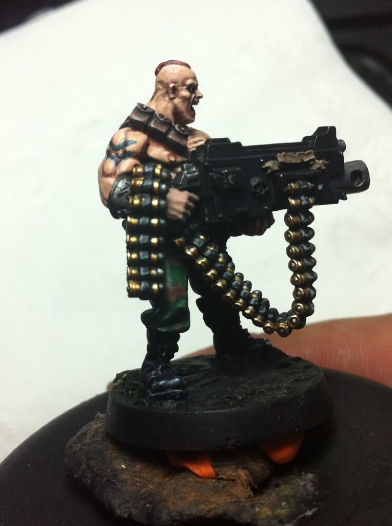
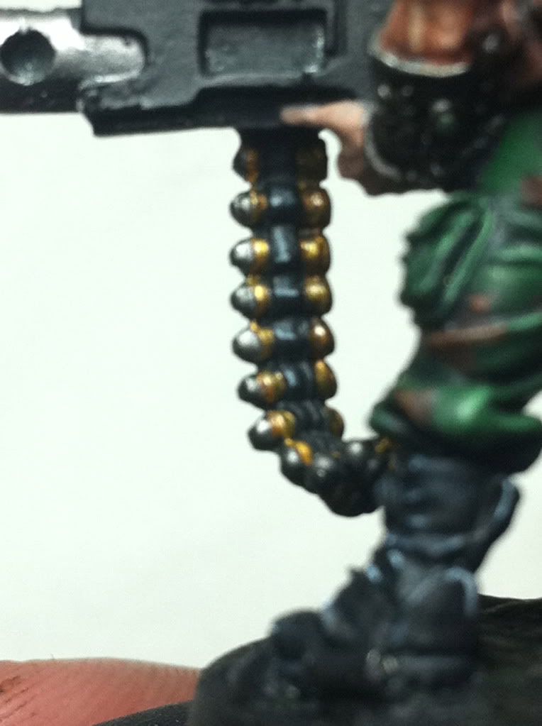
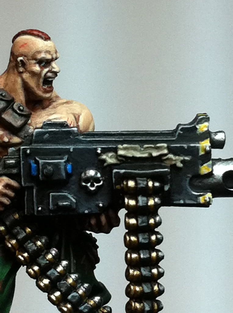
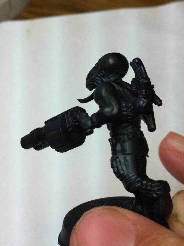
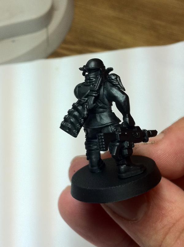
Ok so, well...the flower wasnt makin it. I knew in my mind when i put it on that even though i realllyyy wanted it...there simply wasnt room and its placement was too close to his leg. Essentially there was too much green right there. It just looked funny, I cant explain it. But. I chopped it off. :( Sorry. But i think its best for the mini. I finished up the boots. Maybe a couple touch ups here and there. The grenades are also basically done. And ive begun work on the hard part. The gun. the bullet feed especially. This took about an hour, to base coat the shells which are brass. Steingass asked me a while back how i do brass shells, and i wasnt sure. But heres my mixes. Burnished gold 75% + 25% Snakebite leather. There here i wash with devlan mud. I dont want the color to get too orangish...ill pick out details with straight burnished gold. then mithril silver to that mix.
grenades and boots - flower
from afar
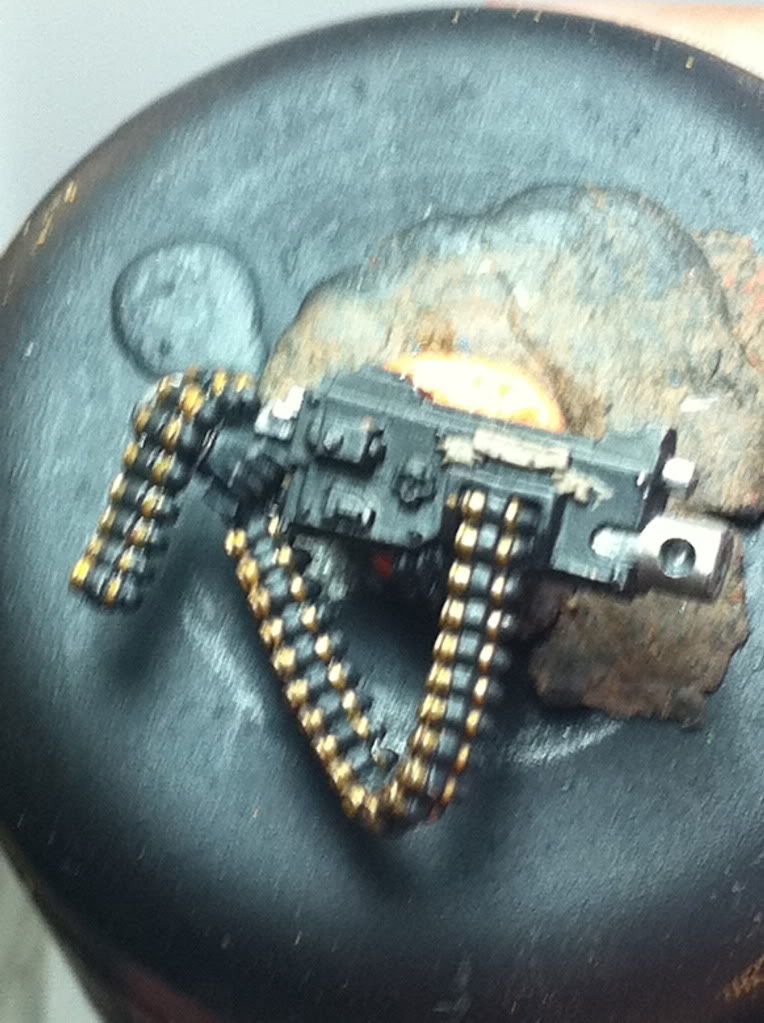
the beginnings off the bullet feed
the paintjob of the boots looks like a really shiny pair of boots^^ someone is huffing and puffing on them each day ...those are loved boots^^
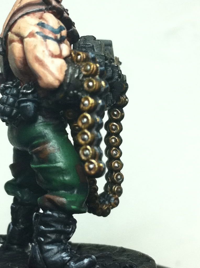
also the grenades...very three-dimensional looking!
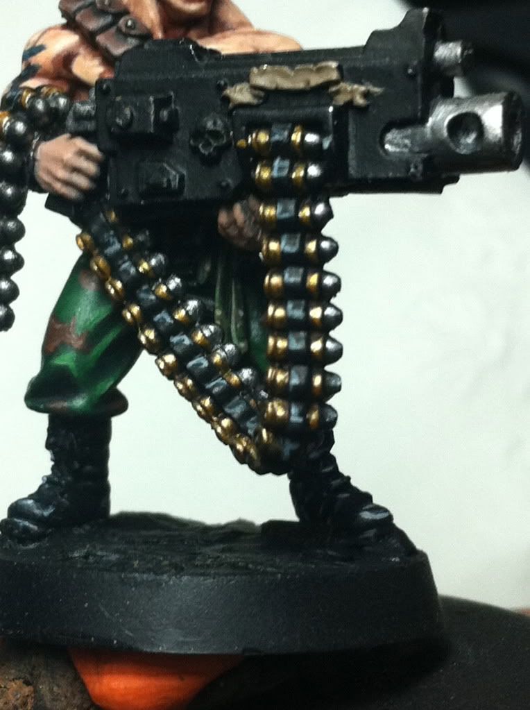
but the main course is the amobelt! ever since i had a MG3 in my own hands i have fallen in love with brass shells^^
the pic is a bit blurred so i can´t really say what color the peaks of the bolts are...? or will they get their treatment in the fullnes of time yet...
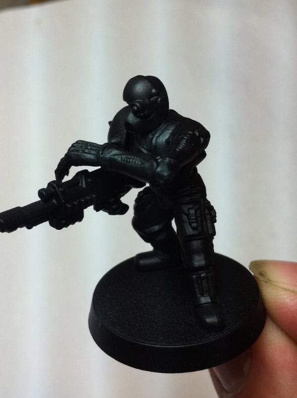
ill probably dial back the reflection on the boots maybe add some dirt and yeah the shell tips are not painted yet. The will be silver obvi. Its far from done. hence the lame pic. Just showing color.
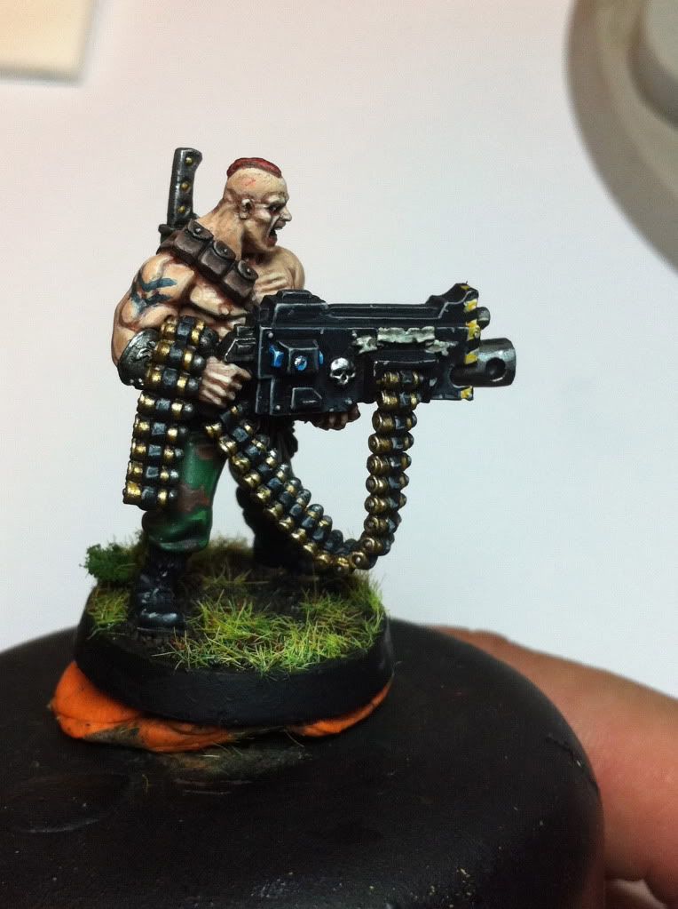
Guys thanks for the feedback. Ive reached a point in this minis life where im starting to dislike him. This happens all the time. I start seeing things i dont like etc etc etc...The bolter casing is so bland and gigantic and it covers up the great detail on his abs completely. Oh well, the gun is the centerpiece of the model now and i dont particularly love painting bolters. Actually.i hate them. As such, the real hurdle for me on this mini, and has always been, the bolter casing. So i better put in some time on it or else i could ruin the mini. We will see if i do anything worth sharing today...Oh what i will add later tho, is some mini's i picked up for cheap and maybe a few shots of the requested glow in the dark plants
well i like the heavy bolter...in fact i have to ask you since you got rid of that plant....could you do some spent bolter casings ...like a heap of them as the decoration of the base....i am thinking of something like this:
well not as much as these...but something that shows the drama of a gunnerd that is spending lots of amo...
the brass by the way add nicely some different color to the model in my opinion...
and if the weapons as such is putting you off...have you thought about swaping it with a heavy stubber from a necromunda gangmenber?
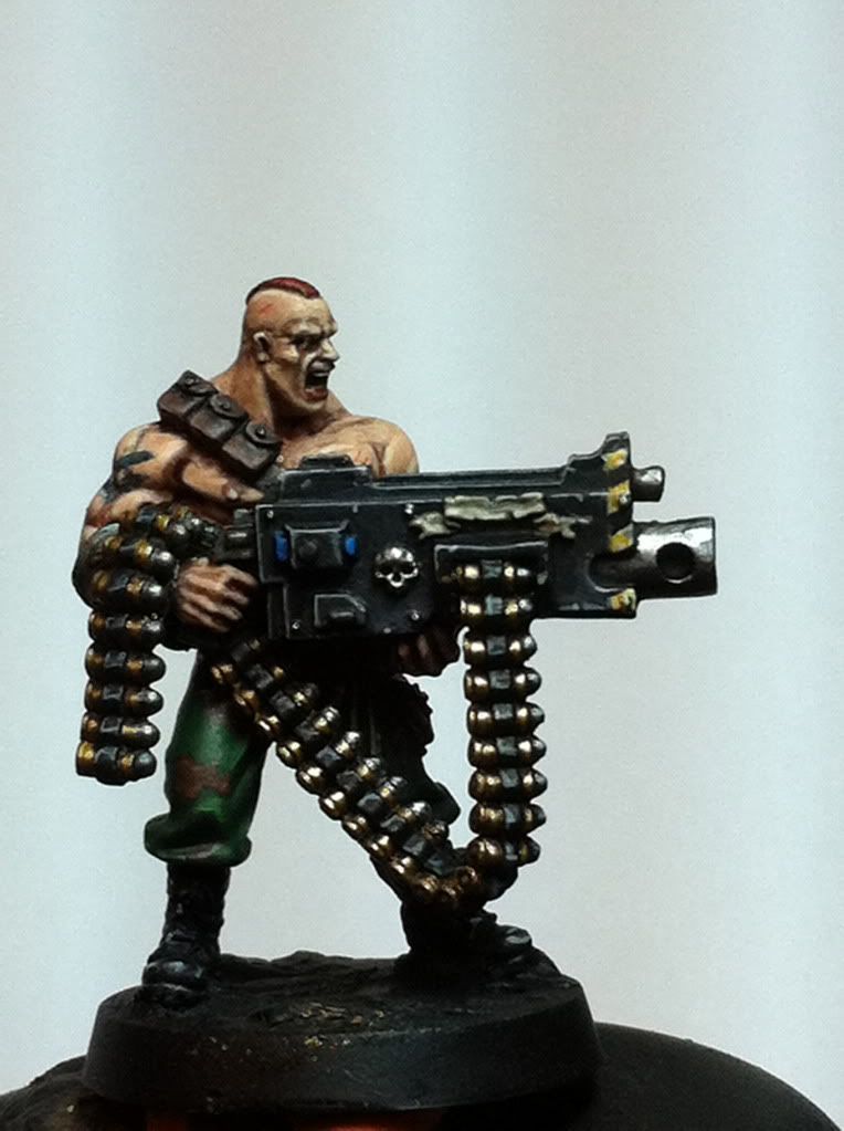
otherwise i think the model looks awsome and thankfully we all have seen here how cool and well detailed the abbs of serg. steingass are....
you go far with your bullets mister you even painted the center silver? why am i saying this to you, you painted it
but the boots are what throw me off he look i am a big bad a** dude in a jungle but i don't want my boots to become dirty, what gives man? dirty them up a bit there just to nice
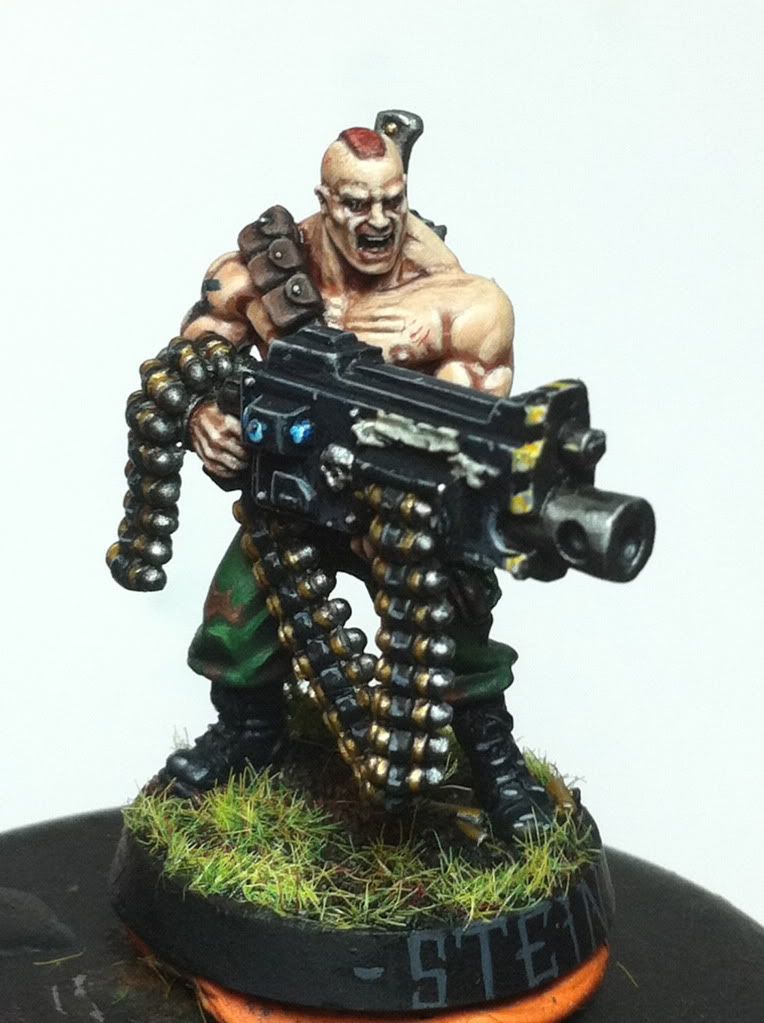
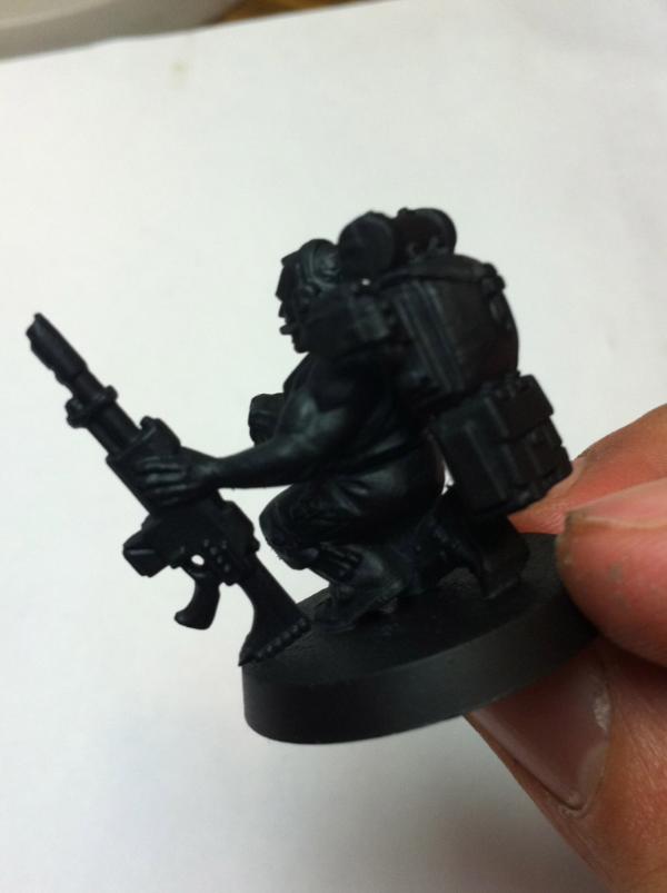
Hmm fatty, you and vik have different ideas of the drama behind this model And Vik, there are a few casings around his foot which i shall paint and perhaps add another stack as i have a few bits from the ork battleforce. Anyways the casing is coming along slightly better than i anticipated. I dont hate it...for some reason in my head i imagined danger striping around the barrel...from some video game?? i cant remember where the image came from but i kinna' like it. I mean its totally pointless...SHOOT THIS WAY.. ... heres todays update. Lots of stuff still to do for him...
yeah lots of things to do to him.... he looks so much unfinished he is almost not started with at all....you´re kidding right? i think i would have called it a ready mini days ago^^
i like the idea of the hazard stripes too! looks like doom (?) or other ego shooters^^ but i think a fitting design!
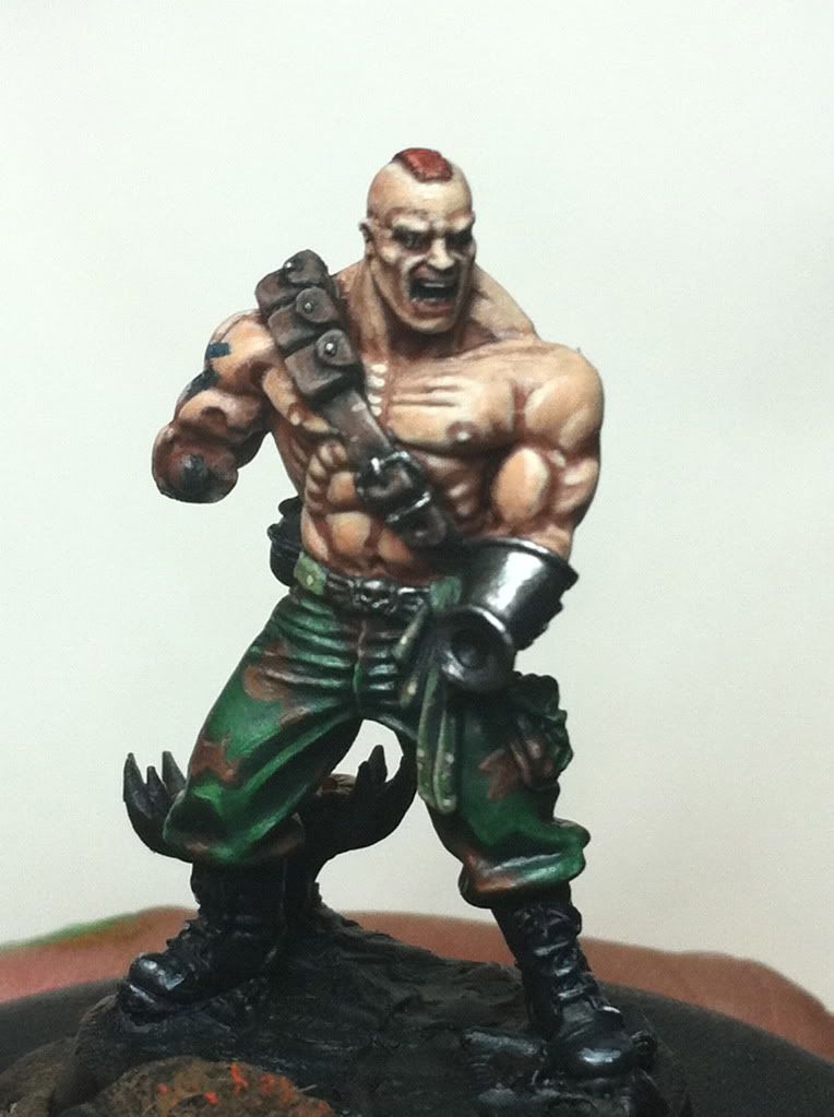
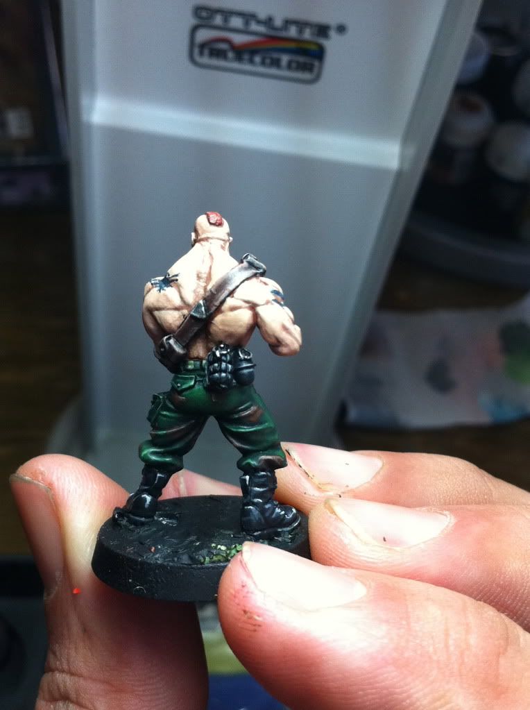
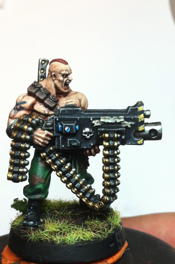
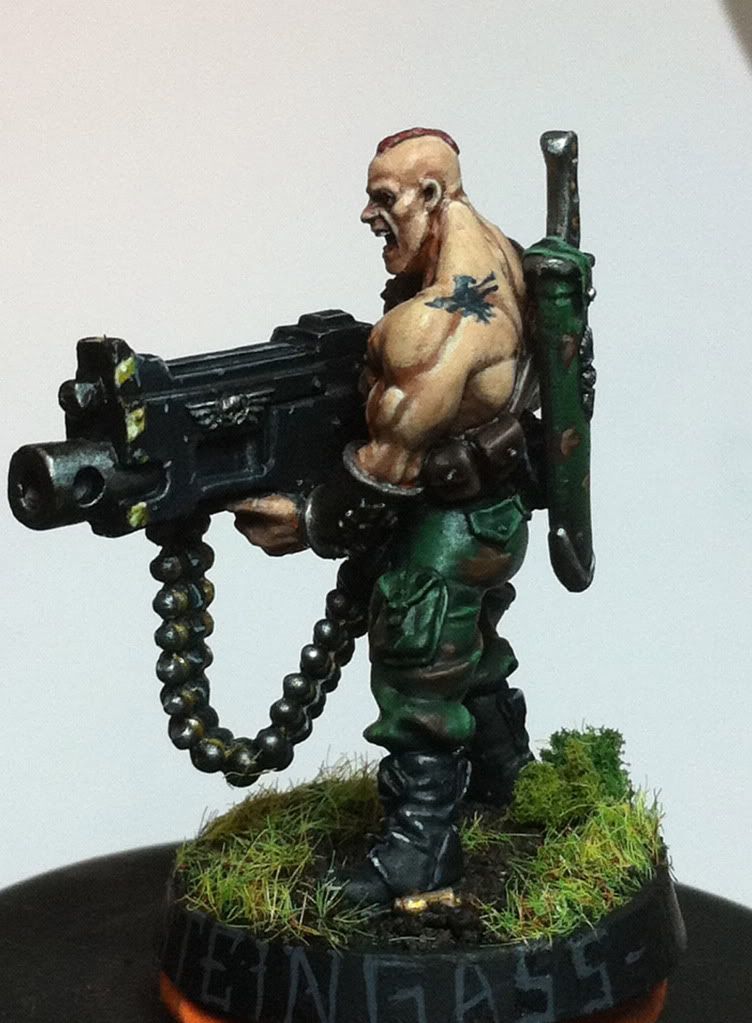
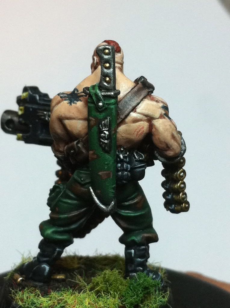
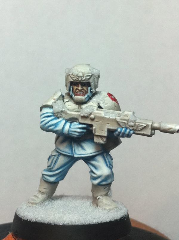
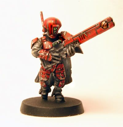
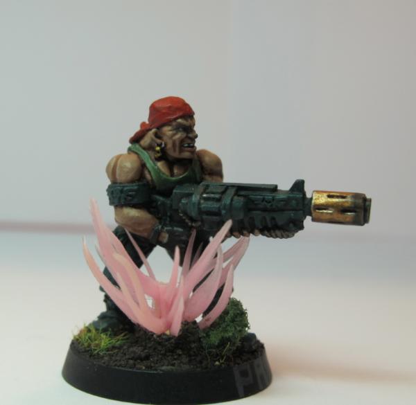
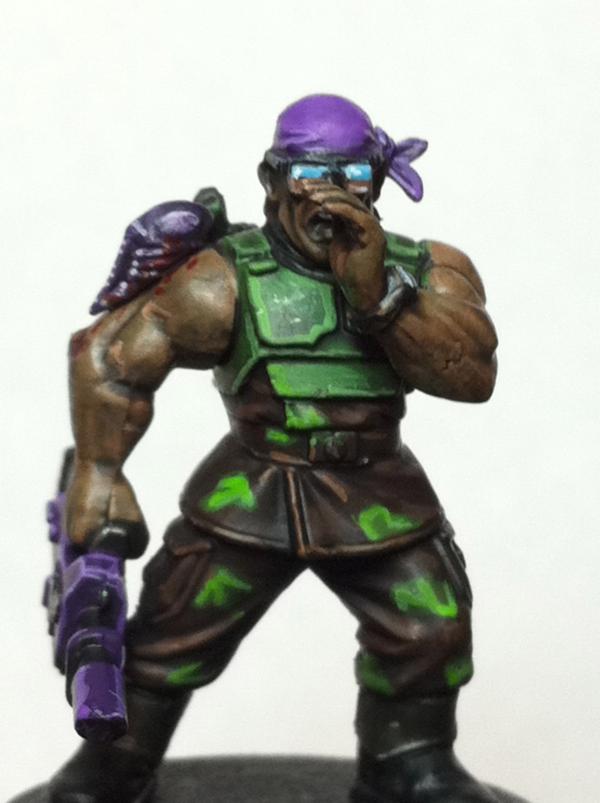
Firstly, thanks everyone for their positive feedback! Man, it sure helps with the inspiration to paint, to have you guys cheering it on so to speak! So, thanks guys Anyways, here he is. I think it's my favorite mini that ive painted to date. Gunnery Sgt. Steingass!! Sorry for the basic pics and what not...:s PS i jknow i left the little label above the mag clip blank...i dunno what to write/paint yet lol! But it probably wont be steingass LOL further away
closer views
beautiful mini!!! i now like the sheat of the knife the most!!^^ as for the label...how about something like "feth" or "ripper" or some marine motto like "semper fi"....
Thanks guys! Wow, im glad you all dig him!! I am pretty pleased with this finished product because it was challenging, and i think at least rose to the challenges. Firstly, the skin. I actually like the skin least on the model, and i strive to do better next time, but it was the first time i used a different approach and its pretty solid i think. Really though, my biggest worry, was painting the gun. For some reason, large flat surfaces scare me. High detail i relish, but a big flat tank surface, i dunno what to do with it. lol And im sure we all have a thing that for some reason is difficult to paint. For me...its bolters. Maybe it goes back to the days of bright red ultramarine bolters...and mine just always looked...burnt orange:( FYI, the master of ordnance on page 1 was painted as an inside joke to myself, in that i could never paint a real red when i was younger...But i digress...So the bolter came out better than expected and i the sky/earth..as small as i was able to get it...on each individual bullet, was new for me too. My biggest enemy on the project, as usual, was the final stretch and my patience. I get excited...i think its obvious the sword was the last thing i painted. I generally am not happy with it, it needs touching up...a little extra bit of tlc and patience, then ok So blahhh enough of my blabbering, really thanks for all the suggestions, compliments and positive feedback, and just general interest! its really inspired me! In a sec ill attach some ideas for fattys mini...whos to follow i dunno
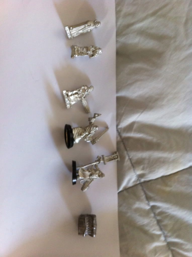
heres a line up for fattys mini. it may not be my next project but its on this list asap. Anyways, there are 3 different priests, 1 scribe, some kinda magos or astropath, and yes...a mimic. i actually reallllly wanna paint this mimic. it looks hilarious. Anyways...yup sorry the pic is sideways
Well this is part of the few catachans i like, those ogryns i especially like they look like they just jumped out of a graphic novel they look fantastic
im loving everything in this blog! keep up the great work! I look forward to getting on dakka and reading this post and its updates inspires me to actually try to get my IG up to par.
that mimic is a nice piece...i would definatly see your skills on that piece...reminds me of the chest of the discworld novels...where it tends to eat too noisy chaps and runs on hundreds of little feets...
swampyturtle wrote:im loving everything in this blog! keep up the great work! I look forward to getting on dakka and reading this post and its updates inspires me to actually try to get my IG up to par.
ive seen em man! They are wayyy beyond par sir! Im subbed to your thread! And im glad my work inspires you !! Likewise
@ Vik, yeah theres so much character in that mini. I mean its not applicable at all in my army but whatever lol...who paints a chest!?
i hope that you fair sir!^^ as for how to use... make it at least stand o a 40mm base and call it a cool and frightening objective marker and yet again your set for win^^
Thanks Fartylol...so here are two cheap-o IG models im doing next. (Sorry Fatty, but i promise youre up very soon, i have some other painting ideas i want to try first) The First pic is a tester scheme for a Conscript squad for Catachan. This will be painted in a quicker fashion so please dnt expect steingass II. However the next pic down, which is immeadiatly being shipped off this thread to the 40k paint comp thread (no wip updates on that mini will be here), is going to be an attempt at a winter scheme that i have in my mind. No Camo on that, think more Starwars. Yeah, im entering an unconverted snap together in a competition, obviously im not expecting much lol. Anyways, whatcha guys think of schemes?
Catachan Conscript Squad Idea#1
Tundra Scheme #1
catachan conscripts sounds interessting to me... only the colsed pots don´t bring my mind into picturing a painted mini for me... i am kinda blocked for this...make a strip of paper and show the paints side by side thus i can picture it...
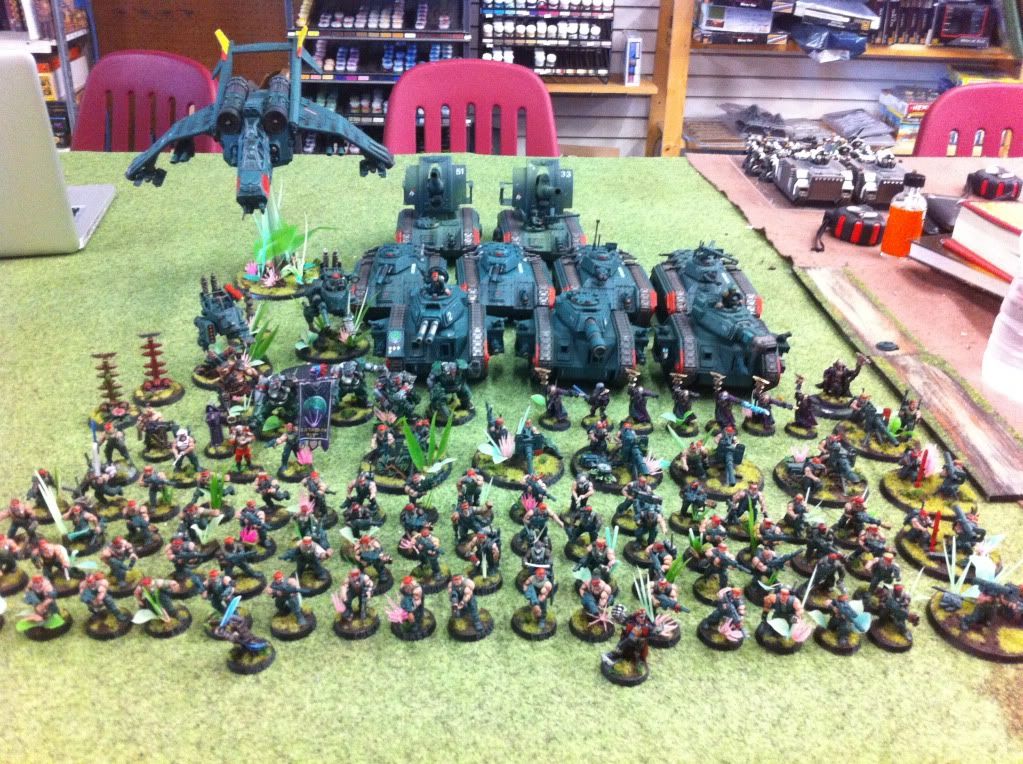
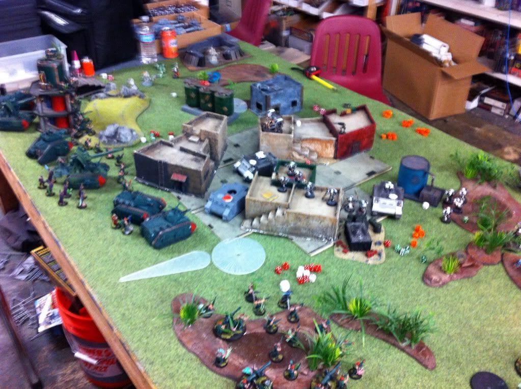
Hmmmm well i guess you guys will just have to head over to the competition thread to follow up on the tundric cadian cause this thread, is all about the jungle. LOL for now That first jungle conscript looks like junk. Strike 1. Ill try another idea...Since my wip sections are in full swing, and there is no need to draw out interest by withholding pics of finished work, i thought id finally, oh yes, finally, post a full army pic. And one pic under it, is of me getting my kicked by a Grey Knight army. I swear to god, the only way to beat these guys is to bring ONLY infantry...>_< I cant stand GK's. Looks, models, and rules. Anyways, heres the full, so far, Catachan 913th. If theres anything you wanna see up close, just let me know THE COMPLETE 913TH AS OF 10/12/11
ME SUCKING AT40K
you know what... your the winner of hearts as the knights there are badly if at all painted and thats a defintite drag for me...so feel inner power of having painted the better/stronger army where it counts^^
achem...where was that other blog where your wips would be to be seen??^^
i like the sound of brother Fattius he with your army there is no way you can suck in 40k. just say yeah my army is so awesome i just take out your tank with my awesome painted models what shooting just the power of awesome
LOL! Brian, the word is out! Im a 40k pushover!! You just wanna break my spirit even further!! :( <---not really sad
@ The rest of the gang (Goliath), thanks as always for the positivity! Especially from such talented people! I learn so many things from every one of your threads!
@ Vik, heres the link for the painting comp here on dakka.
Great looking army! The good thing about being imperial guard is that (assuming your alive) after a battle who cares if you won or lost at least you can still enjoy some booze and women unlike those stiff necked genetic freaks. lol
Depraved wrote:Great looking army! The good thing about being imperial guard is that (assuming your alive) after a battle who cares if you won or lost at least you can still enjoy some booze and women unlike those stiff necked genetic freaks. lol
when IG lose, they lose hard lol In my poor commanding hands anyways...
Also, ill be slowly switching over all these pics to dakka gallery pics. Ive already uploaded page 1 to the gallery, but will be switching out the codes to do that in edit mode in the next few days. Apparently, its better to have all your pics through dakka as they can then put your blog on the homepage and what not. Any advice on this process is welcomed. Im assuming i just do the same as with photobucket, using the pic buttons...then the html link...then pic button again?
For each picture, there will be a number of links available. Use the "forums" link, which will automatically provide the proper formatting to embed in a forum posting.
click on one of your pictures in the gallery, and check 'em all out.
Viktor von Domm wrote:that mimic is a nice piece...i would definatly see your skills on that piece...reminds me of the chest of the discworld novels...where it tends to eat too noisy chaps and runs on hundreds of little feets...
Ah the Luggage. Most homicidal pice of furniture on the Discworld... Awesome stuff Vic, They look really good.
Ahh now that ive subscribed (i thought i had already) i can keep a closer eye on this, also to say i think i might just "borrow" the way you write their names on the base as i dont really like the scribbley white or even the parchment look keep up the nice minis
books... and a ton of that... i have alost all books of my favorite author terry pratchett... (there are a couple of games too but they did not do for me^^) really this is a good read...if you are in for funny, intelligent and fanastic stories that may be a challenge to read a few times...my books i´ve read for noumerous times and this is saying a lot!!!
and... this reminds me of the brit song...: rule britania...
which has this line woven in the song...: "and we shall never be slaves...." ^^
baoh wrote:bloody hell! you have got so much painted, your like the obi wan of painting, you do what you want! lol
Whateva! I do what i want! Thanks baoh. However ive been painting this army and ONLY this army, to the exclusion of many other ideas and projects, for two years now. Its not crazy i dont think...or is it? The character models obviously took loonger and stuff, if you checked those out further back in the blog. But your catachans are totally unique to themselves, i really cant wait to see more of them!
@ Vik, theres always an, @ Vik, at the bottom of my posts lol. I just noticed Anyways, im off to the bookstore today to buy those Maybe some good inspiration in there for modelling.
PS i apologize for the lack of any interesting WIP in here, after this weekend ill be starting something new
Guys just to let you know ive begun to update all the pics to my gallery. So, vik, i know you wanted to zoom in on stuff, i think you can on most. Also theres voting enabled on alot of it and etc etc. Then, soon, all the pics here will be linked from the gallery
baoh wrote:bloody hell! you have got so much painted, your like the obi wan of painting, you do what you want! lol
Whateva! I do what i want! Thanks baoh. However ive been painting this army and ONLY this army, to the exclusion of many other ideas and projects, for two years now. Its not crazy i dont think...or is it? The character models obviously took loonger and stuff, if you checked those out further back in the blog. But your catachans are totally unique to themselves, i really cant wait to see more of them!
nah that's not crazy, you just have the dedication i and a few others lack lol. yeah i've seen your harker model, he's been painted really well, like the rest of this army it has its own unique-ness to it.
i really love the guns being painted all green it all feels goldilocks! sort of wanna paint harker now!
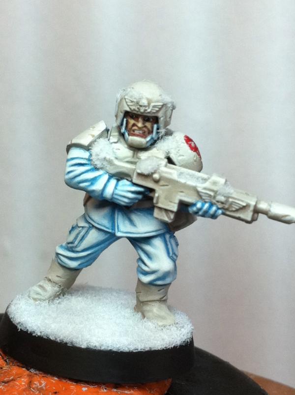
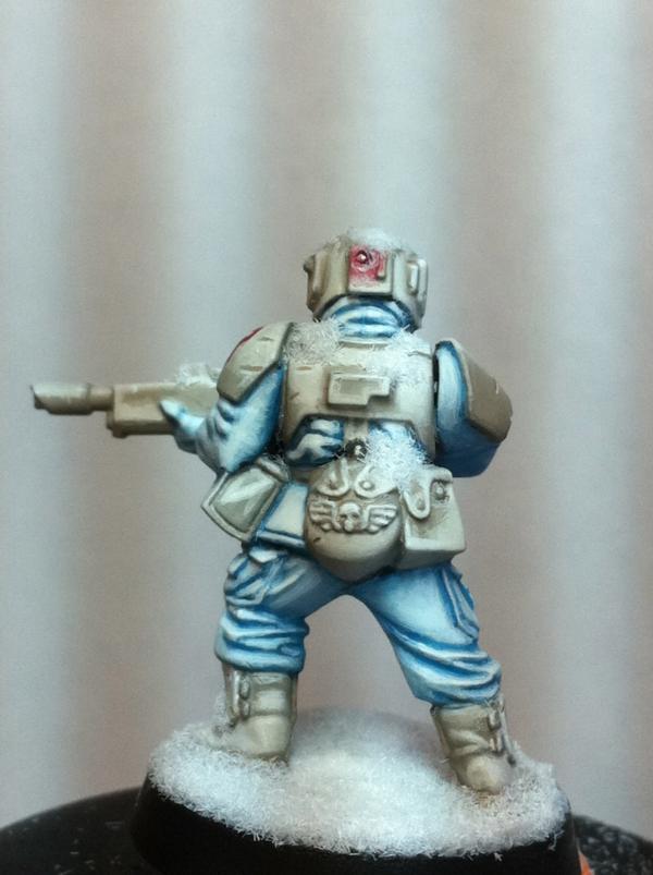
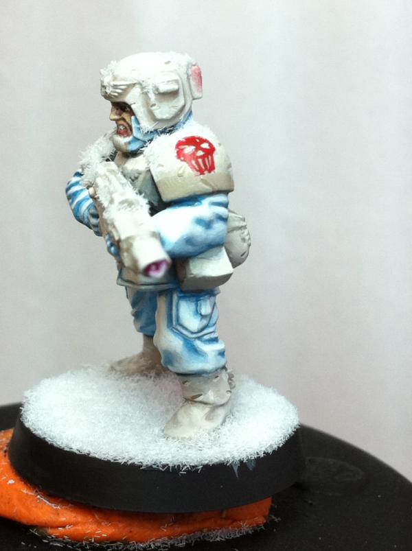
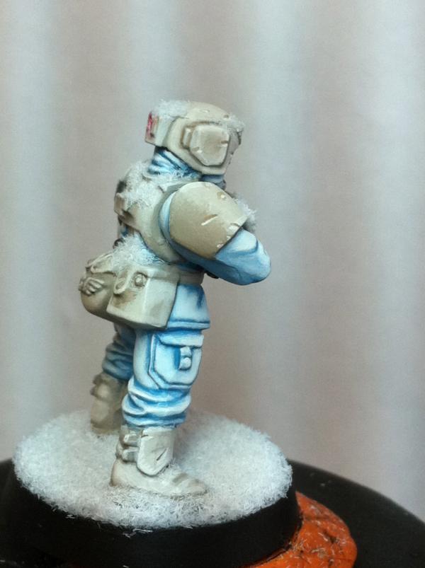
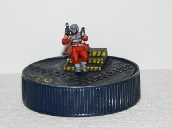
Hey guys! Apologies for no updates here because ive been working on this tundra cadian for the painting comp thread I decided since its almost done but not quite, but pretty much, lol, thatd id post a pic of it here for those not interested in the painting comp thread. Anyways here it is. I should mention, too, that this is my second time using the snow flock. The base is fine but the snow in the crevices im not liking how it came out. I wanted to it be more icey but i couldnt seem to get rid of the fuzz. What am i doing wrong here? I mixed it with PVA and water etc...any recommendations would be really appreciated as far as using snow flock is concerned
i say do as briancj sugested on top of the already aplied snow... i guess you can fix it! and the stonbe idea is lovley too...that or some plastic card to act as some cracked ice standing upright...
You got a weird batch of the stuff, the GF9 snow flck I got isnt fuzzy like that, it's more granular, and when mixed with Super Glue it appears halfways melted. Your color scheme looks awesome though!
i dont want to add a stone to the base. The lack of anything there, in my mind, envokes the imagination. A lone guard wandering in the middle of a blizzard/ice plateau. There are no rocks...However, i will try the next mix and post an update here. Im not posting to the 40k comp thread until hes totally done Thanks for your input guys, its invaluable!
PS Fatty. I PROMISE to get on your mini asap. just needed a diversion for a little bit
dsteingass wrote:You got a weird batch of the stuff, the GF9 snow flck I got isnt fuzzy like that, it's more granular, and when mixed with Super Glue it appears halfways melted. Your color scheme looks awesome though!
Thanks Stein, im using the GW stuff. If you use it with super glue how do you apply it without ruining your brush? Or is it spreadable to where you can use a different applicator?
Heres an updated shot of the ice effect. I tried Steingasses super glue mix. had i had the sense to ask this BEFORE i went ahead and did something without research, it wouldve been EXACTLY what i wanted. In this case, i still think its a minor upgrade considering its applied over an incorrect ice mix. I like it better still though, and with maybe a tudge more TLC here and there, it can be salvaged. So. Thanks Steingass!
That dissolved it just enough! Very cool! When i found that out (accidentaly) , I put some dead static grass on parts to break it up, it looked like a spring thaw(on the base) .
Thanks fellas. From now on ill run my terrain questions through the zen master (steingass) before attempting something on my own lol Fatty thanks man, he is a tasty popsicle treat And Leigen, thanks and welcome to my thread, im glad to have caught your interest!
This Cadian is essentially done and and served only as a little vacation from the steaming hot jungles to a nice cool tundra plateau! But, its time to get some more work done on the army. EVerything of my WIP so far has just been character painting. I want to do a good one for fatty, but i need to fill some ranks and recharge my character meter because painting that white guard drained me. Fattys mini will be 1/2 Priests, but I still need a few more heavy weapons teams...also i need a 3rd sentinel and another bunch of guardsman....hmmm the sentinel is probably up next...but, any requests?
Thats a pretty awesome snow color scheme. I really like the blue. The red is a perfect counterpoint. You might consider putting some large ice crystals on the base. Paint them in a similar blue color.
I actually had a funny idea to have a really fat guy weighing the thing down and hes all wired in cuz hes to big to get out...and there are all these screens and panels hes watching hanging on the cage of the sentinel
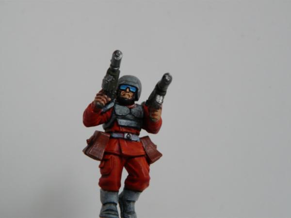
I like your Catachans. Great paint job - simple, yet effective and stylish. Superb brush controll. And the bases are just amazing Sergeant Harker is very cool. The hazard stripes around the barrel looks funky
Nice skin tones on that guy - your faces in particular look awesome.
By the way, you can create the dirtied snow effect by washing the flock with a bit of dirty brush water. It takes a bit of practice, but it gives you the melting March snow look instead of the fresh December stuff.
Thanks guys much appreciated. @ wonko thanks sir, ill try that! Whats the opinion on the base? I like the simplicity of it but it seems im getting suggestions to busy it up...
Im really likeing the red glowing effects on the back of the helm, and in the barrel of the lasgun nice work
Automatically Appended Next Post: Also since this is for a competiton i would suggest that on parts like the tip of the nose, mix your highlight with either pinkish or red to make it look like the cold has been nipping at it, and maybie even adding a mix of blue and your lipcolor to highlight the lip
Good ideas guys! It looks like ill need to pull this base off him and do a seperate thing. Ill have to think what i want to do, i want it to be an icey plain, sorta hoth scene, when luke is wandering alone...hence the basic base here. And rogue wolves ill do that..those are good suggestions that i didnt think of
Automatically Appended Next Post: i only said that as while looking at this amazing GD entry http://www.warseer.com/forums/showthread.php?t=308616 they guy wanted it to be a cold snowy scene although he left the faces untouched by the cold and i gave him the suggestion also although since he didnt do it i think something like that attention to detail could help you win the competition
Automatically Appended Next Post: -By the way since i have some untouched models and i cannot paint any IG till i get some green paint, i think im going to join this competiton to pass the time!
@ Rogue, yeah i saw that thread on warseer. How could you miss it really, it pretty much dominated that blog. Its incredibly done!!
@ Bass...good to meet another musician here on dakka Thanks for stopping by!
Today i began work on my 3rd sentinel. Also a few more basic troops and a heavy weapons team. Yes its that time. The fun is over. No more bright blue powerswords for bebop. Its time to do some filling in the ranks. I thought though, to keep it interesting, ill do a quick step by step on how i paint my rank and file, as well as the bases. Also, and more fun, ill extrapolate, in a step by step, how i paint stubble, as ive recieved a few comments about that. So here are a few quick WIPs of whats to come, and a closer up of the position of the sentinel. Which i like as its a bit action packed with it in full stride. Heres the stuff:
ah yeah rank and file.. i know your pain. stupid orks....... but why not make a few conversions to stop the endless lookalikes? some small stuff like guard with a stump of missing leg?
and on the advertising bit check out my new blog in my sig... it needs some love
Aye, not a bad idea mate! These two are the last of a bunch of crappos i bought of a guy. 20 for 5 bucks built n primed not all that well...after these dudes i can put some more fun into it.
and army list comin your way
but my IG arnt strong enough to lift any hammers... although as my guys start getting mauled and falling on each other the gear on gear will make noises!
Automatically Appended Next Post: jk my IG rape them dirty nids and orcs! chaos.... thats a different story for a different time
Ok, so NOW Brother Fattius needs the Lute from the Brettonian mounted Grail Knights sprue strapped to his back! Just shorten the neck (with the proper number of frets of course for a Ukelele!)
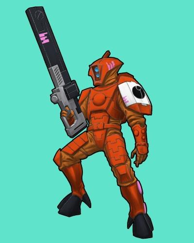
What the heck is going on in here?! LOL Im glad you guys have kept yourselves entertained while ive been away not doing anything productive>_<!! LOL. Actually thats not entirely true. What i mentioned before about filling in the ranks, was a total lie. I cant stand to do another green mother ing catachan let alone 10- 20 more. I tried...it looks awful, im rushing it. Its time for a break. i got over 100 troops, etc etc, Ive been doing this army for years now. So, once i finish the special characters (Priests, Straken), this last sentinel and my final executioner, ill be switching over to something that has been brooding in my mind. A new army. A huge decision on my part. I will take everything ive learned doing this army, and put it towards my next decided project. TAU. Yes. Before you say anything let me 'splain. They fit all the criteria im looking for. Alien. Exotic. Open Ended Color Scheme. Non-Horde. Armor. Everything i haven't had in my current army. Ive got a strong theme in my mind and this blog will shift its focus to my burgeoning Tau army. Ill be doing a tester model here, actually several, before finalizing it and all of your input will be greatly appreciated. Im a bit nervous!! The theme, in my mind, is basically orange. Everything bright orange. I don't wanna give away more than that. So thats whats on deck! But for now, before i get ahead of myself, ive airbrushed the base coat onto my 3rd sentinel...he's well on his way. Here that is. Also, PS, the finalized version of my tundra cadian is posted to the 40k comp thread Check it out Action Pose Sentinel
>
ok so a tau...well.. it will certainlx benifit from your painting skills and a burnout due to painting masses of the same mini won´t happen here...orange is a nice color when in a glass^^ as my morning juice^^ it will be a really freshing colr to be seen done by you after all that green^^
as for the sentinel...well he looks nice and dynamic but after mentioning the new big thing in the clouds it is a bit .....................................well...guess your feeling that too^^
by the way... will you be opening a new thread for the taus?
ahh tau.. funny thing is once i get my ork army painted i will switch over to a imperial guard horde army. well at least a count as bring in the kroot!
Ok so, here is the first test mini (ignore the sloppiness in certain spots please). Its just base coats, Blazing orange for the armor, and a P3 orange for the cloths, then a red wash (which is still wet in the pic). This is the idea im going for...ill play this one out and see the results. I think youll either love it or hate it. Im envisioning light greys for the weapons and grenades, and probably that jade color for markings. Red lights for the eyes. (not certain yet on that) Also, Not sure about the hoofs. I hate that part of the model. I think its really poorly designed. I dunno what anything is. Where the armor stops and cloth begins and what is actually his hoof. Anyways, more work has been done on the sentinel. Ill post more WIP on that when its necessary So input fellas? On the scheme?
DELETED PIC CHECK PGE 16 FOR SAID SCHEME Also, tried three tones for the base...i think i like the lighter the best. PS the bases will be cvered with plasticard that has textured panelling to look starship floor tiles. I dont have the proper tool yet to cut a circle out of the plasticard, so the current base is just for color testing
seriously... i am not too sold yet on the scheme...somehow the glossy paint doesn´t speak to me...the cold cadian was a much more apealing scheme...but as you stated it is a test mini and your real deal mini will look much different...as for the base... what about metal or for that matter grey? the blue of course is a complementarry color but somehow not really making an impression... to tell you my true concern... what would you say if you addept the cold cadian scheme on a tau mini? somehow the blue fishfaces will look better in my view with that scheme...lightewr tones...subdued and smooth... that orange somehow screams more at me...i know probably not really helpful to come out at you with that...have you considered some other colors and schemes?
I think maybe the reason you can't tell where one thing starts and another begins is because the two oranges look identical. At least in the pics they do from here.
I don't know very much about color theory, but I do know that your eyes know what looks right before your brain agrees.
I second Jake on this one, especially after he sketched in the black for contrast. The strong contrast between the armor and cloth IMO is central to the design of the Tau "look and feel". I think the designers always meant for that contrast to be there. Unfortunately, I think it is because of this design limitation that your freedoms and artistic license have to be limited to within it's limits. You don't have to use black per se, but whatever contrast color the cloth is, the recesses in the armor plate may have to match it, or be similar.
for me the tau have a definite japanese feel to them... so why not go a different route and give a wooden look a try... like old samurai armor was made from wood... that armor plates could be wooden looking and then some light cloth underneath...guess this is a bit crazy...hmmm...have to think that one ip and store it for my future self^^
RSJake wrote:I like the orange armour, but I think the cloth part needs to be darker to break up the colors. Right now it looks a bit like a prison jumpsuit.
But if you had the cloth black, I think it punch it up. Like so:
that picture actually sold me on the orange alot better than anything ive seen so far for the tau. I think its a keep However i would suggest a blue or a green for the lenses and for the gun i would suggest it be black as well with orange highlights.
Anyone else thinking treat o treat tau or is it just me
These are all great ideas. @ Vik, painting them in the theme i used for my cadian is a good idea, however i painted that guy over the course of a week. I dont know ifi can hang with that kinda dedication. :( But it would work perfectly! Let me post another few wips of this orange and if you still dnt like it ill chuck the idea. I should note, that, the two oranges look identical because of the baal red wash. Once i reapply and begin highlighting, they will go their seperate ways. The cloth will be a much lighter creamier orange. Like creamscicle As far as the black goes, its looks nice, but also has been done and is a little bit obvious for my style, but thanks for sharing that, and irt certainly helps me see all of the possibilities! Please keep em coming and will post soon another update, and i promise if it sucks ill ditch it, but gimmie the benefit of the doubt some of my sources of inspiration on this theme.
It was just a suggestion. I can't wait to see how your idea comes out.
I'm not very familiar with Tau in general, just snippets that I have gleaned here and there, but I have thought for quite a while that Fire Warriors with Flame Painted armour would look pretty good! But at this scale, flames like that would be hard, and for more than one model it would be very impractical. I have seen it on Space Marines, but I don't know what the difference in size is between the marines and tau.
no fair going sex sells for your orange scheme^^ that is like backstabbing^^
i had an idea... you made your cadian with blue as a hint to the cloth....if warmer feel is your thing with the tau then why not substitute the blue in the schmee with a orange or red wash? i know you built up the colors so no wash used but i think you know what i mean...
and i actually do look forward to an update as i think benefit of the doubt is always to be considered...after all i too have ventured the orange road once...:
oh and even a further ideacame across my mind... if you ever want to go into another army built consider this: DASM...bonearmor...you know you are menat to do this...your able and almost certainly willing^^ that cadian armor is still bugging me like heck^^
And a good suggestion at that Jake! Your input is invaluable, and your mock up saved me the time of painting it to see what it would look like!! We are in stage 1 of even planning this army im just having fun flexing my imagination with this scheme. And what i meant by obvious, is that, its a naturally good looking scheme, it popped into my mind when i was thinking out the orange, and i moved past it only because i know myself and my strange love with flamboyant color schemes. Essentially its not bizarre enough LOL. Anyways like i menteioned, ill go one step further with this theme before liustening to you gentlemen and changing it up
i think that if you want that bright orange armor it would look good dusted browns to make it duller/look like it was used, or use a darker armor like viks, just my oppinion
thanks for your input fellas! Vik that cadian looks AWESOME I love the glasses especially. OK, heres an idea, what abouttt....Using an ice blue for the cloth like i did with the cadian? Except i cant do it the same way, that was so painstaking i can only do it one guy. But essentially that but a more army painter approach...?
so you want to barter with me about your paintscheme...ha!! got my fist foot in^^ hmmm i think this seriously needs a test mini as we have to see the two colors together on the mini...for the numerous minis of that army a simpler aproach is fully justified...simple in your terms is a weeksload of paint in my terms lol....
i dont dig the orange.. sorry but then again you did prove us all wrong with that other model.......
you know my orks used to have orange trousers and white shirts... that was the last time i paint while the dutch soccer team was in the final of the world championships. its a tricky color but it can work..... you know i might switch my ork army back to those colors.....
but i am rambling i will give you my two cents when you finished this mini including base before i say anything about it
Rogue Wolves wrote:this one is my favorite, they didnt make orange too abnormaly bright and their grey looks nice too
this, that is one nice looking Fire warrior. I tend to feel the greys off set the orange and allow for it to catch the eye faster instead of the black which drowned out the orange in jakes picture. Still ether way you cant go wrong
woohoo! I like this, this is perhaps the nets best source for orange tau discussion! A question, i notice alot of people using a paint program to color in outlines of space marines or etc etc for trying out schemes. Does anyone know how to do this?? Id like to do that instead of posting such crappy pictures of my tester models on my precious blog. Its dirtying up the place:(Plus it seems easier, and faster! That way we can try and line up all these schemes and see whats really up! I love that orange and grey tau too !
The best free paint program is called "Gimp". And you use the magic wand or lasso tool (there are tutorials on the internet) to select an area, and then use 'fill' to color in the area.
Vik awesome!! I have gimp but I'm a gimp with gimp so that website is good! I'll post some ideas and jakes scheme too to compare. I'll be deleting that ugly tester pic just cuz it uglies up my blog LOL.
Hugh always a pleasure to hang with you at the shop! Thanks for the kind words and seeing as how my mind is working right now, im not in any hurry to start this army. Im gonna take my time and keep everyone interested with my upcoming special characters for my priests. Also, So you guys dont think im completely nuts, this was the scheme i had in my mind, i think though, that orange, is not so much a color i really like to paint. But in theory i still think this scheme has a lot of style, whether or not it transfers well to a mini.
I'm a bit late, but the chips on the ice wastes guardsman, were they painted on or modelled on? And how did you achieve the blending on the shoulder guards? It looks fantastic.
the schme is good looking... specially the gun and shoulders me thinks... but on a serious note i cant seems to see it translate well on a 3D sclae ...namly a mini... the flat pic works but i think on the mini it is far too crunched together so that in a practical sense you will have an ornage jelly bay on the table and not a cool and shooty firewarrior...sorry mate i speak is i find...and i think you have it in you to make a cool looking tau...!!!
vik....(if and only IF you want i could give the B&C thing a go too...)
I would go for a darker brown on the cloth, you need more contrast between the areas to make small figures work, especially on the gaming table. The picture you have of the fire warrior looks good at the size you have it here on the web, but once you scale it down to actual miniature size the different colors merge together.
Have you tried the GW foundation orange as base coat for the orange? It covers really well, even when diluted with water to usable thickness.
Imperial Monkey wrote:I'm a bit late, but the chips on the ice wastes guardsman, were they painted on or modelled on? And how did you achieve the blending on the shoulder guards? It looks fantastic.
Welcome Monkey Thanks for your interest! The chips were painted on. Its extremely easy effect to achieve. You essentially take your shade color, do a dot or line, in strategic spots, the with your highest highlight, which in this case is white, do a line on the bottom edge of the first color you put down for chipping The shoulder pads and armors not so simple. I wet blended to white away from the light, then glazed many times at random between stages with devlan mud, pooling the glaze often times to the shadowed part. Its subtle but pulls out the shadows more. Hope that helps
Now, the orange: I agree with all of you It wont work on a mini as well as id hoped. I agree with vik and metsuri, It will just look like a cluster**** of orange sherbert But im with fatty, i like the pink, because its strange. Its a direct reference to that masamune shirow landmate on the other page. But either way, it aint workin. Im gonna post another 3D image and see whatcha guys think. Im really stretching it here >_< ! PS, the 3rd sentinel is coming along nicely Pics soon.
PS metsuri, welcome to my thread. Been a fan of your work since i joined dakka
dont be too sad about the orange... i at first wanted to stay true to my DA and paint them in dark angels green... only to see that they hadn´t have any details to be seen lft once they were all dark green... no wash i could use to bring some depth to the minis... i was rather p****off too then...
well i am eager to see some new trys then of yours....
bebopdrums2424 wrote:PS metsuri, welcome to my thread. Been a fan of your work since i joined dakka
Thanks for the complement, I paint mostly for my own pleasure these days and the community here is one of greatest sources of inspiration I have. You've prompted me to try my own hand now at the orange and brown, as soon as I get the stormboy done.
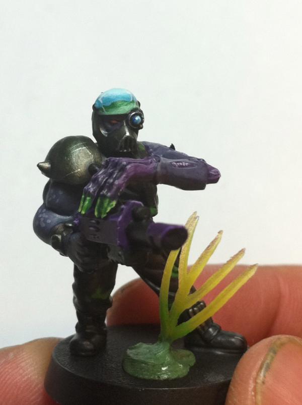
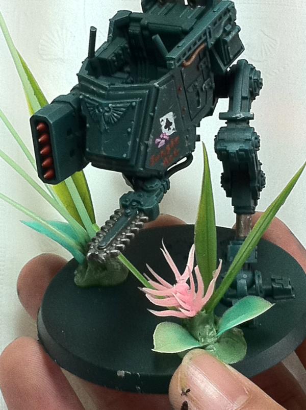
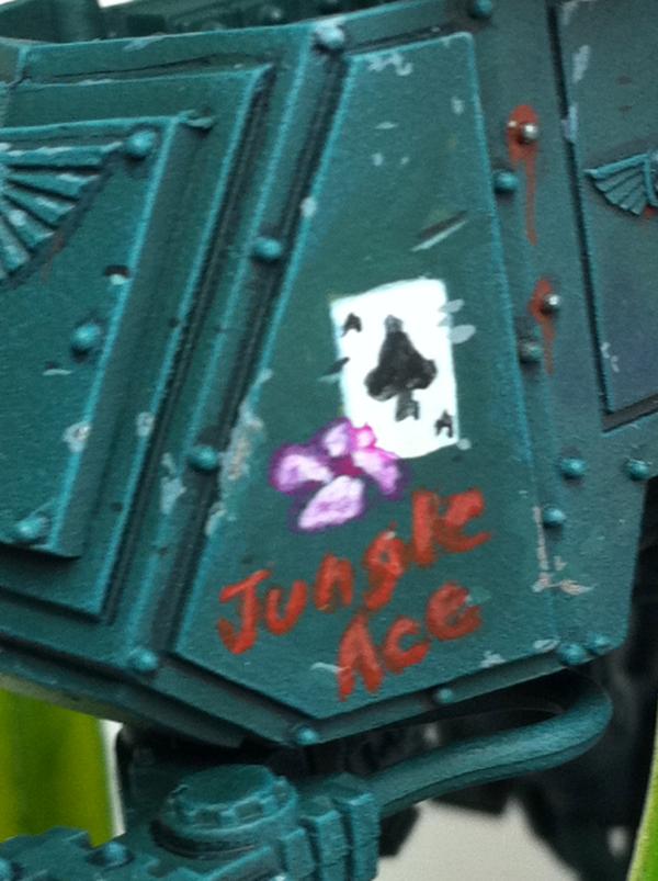
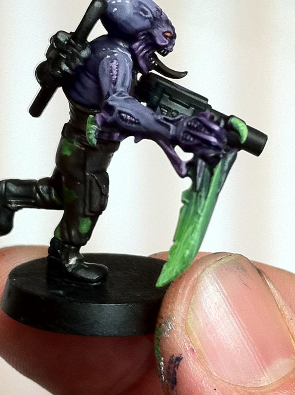
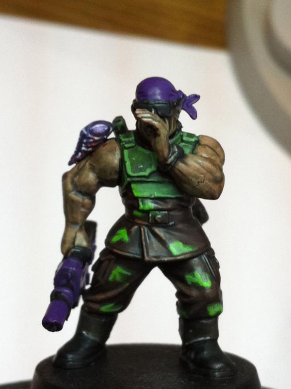
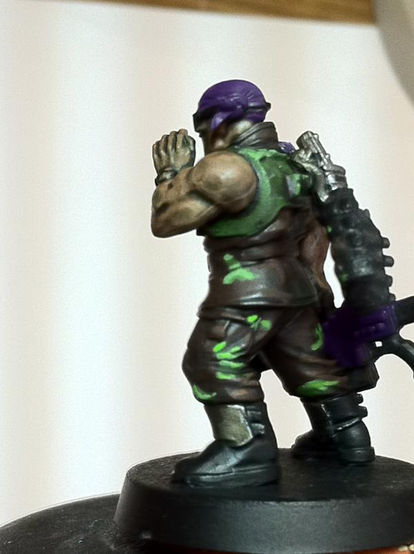
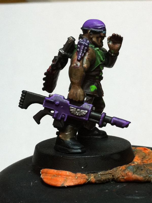
Thanks vik, im not bummed about it at all. In fact, Ive decided to let my tau idea simmer until i think of another idea that has me interested. And on that note, yay, finally a WIP update on the almost finished sentinel! I put some freehand iconagraphy ala 1940's bombers, i like it. Also, i stumbled across a new color scheme (army painter style) for possibly a whole new catachan regiment! Possible ties to genestealer cult maybe?? Its very simple to paint and ive really wanted a camo scheme to have fun with, i really like this one, maybe a few tiny tweeks here and there, but i think i really like it I dont know where i saw the purple, i know its been done, so whoever did it first, thanks It ties in with my psykers and standard too. So i might add a bit more purple to the guys...somewhere...not sure...wanna keep it very simple though so i can paint em quick like my old standard grunts...
heres the sentinel followed by the army painter style catachan grunt and then a regular grunt from my current style to compare...
The Jungle Aces icon looks great. I'm liking the paint and basing on the two guys as well. One thing on the bases. I like the use of GS to stick the planty bits, but you could sculpt some roots or a small trunkish bit to lend to the plants themselves. As it is, the pink thing looks somewhat like it's being belched up by some mud. I don't think it would read that way on the table, however. I imagine it looks great on a table, and I like the over all effect.
dsteingass wrote:It looks good, but I like your current style myself. Just my $0.02
Hehe, me too, but i cant staaaandd to paint another one like that. Plus this way, i can add veteran squads, or conscrips, or run an entire blob squad army!! I just love catachans too much, this new scheme has alot of pontential since genestealers may or may not be in the mix
and GG, thanks, thats a great idea! Unfortunately, the pink flowers troops were done within the last 2 years so its a little late, but i will do that with the next batch! I just used blobs of GS, then sand over it so it looks like mounds with plant life growing out of it, but the roots would be the extra mile! Thanks for your input always sir!
hmmm... purple...yeah see that this pot can be a thing that urges you on to use it... i have some colors i want to use but i still haven´t found a way to use them on...so the tad of purple is something i think can add some depth to your already deep^^ catachans... what i am currently not too sold is the kind of camo...there is something lacking there...maybe the main color of the pants a bit brighter and overall not so much glossy looking...dunno... maybe i am wrong completly here...
where i am totaly in the rights nevertheless is your sentinel... looks really cool and lifelike! the very minuscule weathering and covering of bumps in the armor loks very good... the jungle ace... with that small flower...very good indeed...i like that! when will we see the driver?^^ always have somthing up my sleave to complain about^^ even if all is rather not something to complain about^^ just me, ole grumpy^^
vik (and don´t let you detain you from doing tau just because we are picking on you^^)
Yeah, I guess you could always add the differently painted blob as the sacrificial flank. Just normally you don't want your opponent to be able to tell which blob you are using as the sacrificial flank. I always intended to use my Cadians as Second Platoon to my Catachans in a remnants army, but I realized that I don't like the Cadian look, so I would've always used them as the sacrificial flank and used the Catachans as the scoring flank.
sentinel looks nice so far, i do love the use of freehand insted of decals as i dont like using a decal that i could not freehand. only thing is i think the purple bandana looks a bit odd since that guardsman is mostly brown and green and then you through purple up in there. just my oppinions
Thanks for the feedback guys! Mucho appreciated! @ Vik, i must agree with you about the slight gloss finish. Its because of the washes. Sometimes if a gw wash sits for a bit i think it gets a little glossy. I need to remember to shake them better. A spray of dullcloat only helped a little bit as well...ill work on that As far as the camo design, i actually like it alot. Light green and drk brown just seems so verdant to me. So lush. And rogue wolves, you've a good eye, and i expect not everybody to love the color scheme. I think, however, that violet was the better choice for spot colors. I didnt want to use red since its standard and on the bulk of my current regiment, orange mighta been ok, but i prefer the purple, fluff wise, as it ties in well with genestealers and all that mess. Perhaps the gun could have some purple? I dont know ive gotta think about the extras that i can add here...thanks for all your invaluable c and c guys
3 things one, i better have a good eye as i can only see out of one of em (;, 2 you are absoultly right the only 2 colors that wouldnt be too bad are red and purple, and 3 i think maybie some purple here and there on some guns would be a nice accent
i dunno about the combination but what about hazard stripes on those lasguns with purpe involved? might that be an idea?
i like the idea of a penal or conscriptssquad to go under such colors... and without the gloss i think this might be a cool and unique camo version
i like it too. But where? On the gun? Where on the gun? And purple n yellow? How about purple and another purple? i want the color choices to be tight. How about purple tattoos and or face paint. Are there genestealer icons? hmmm so many questions
i´d use the claw/tentacle item you used on your standard bearer for the tats...
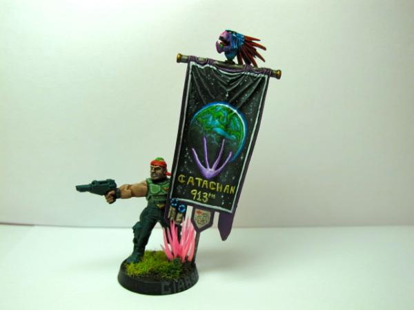
(had to repost him for sheer awsomness^^ (by the way... you had once a closeup of the banner, but it is not uploaded in your gallery....sadly)
also a purple in purple hazard stripe look to the casing of the gun would look cool too i guess...or for that matter puple and black... as you never can go far with black in my view...
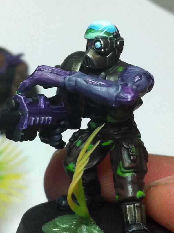
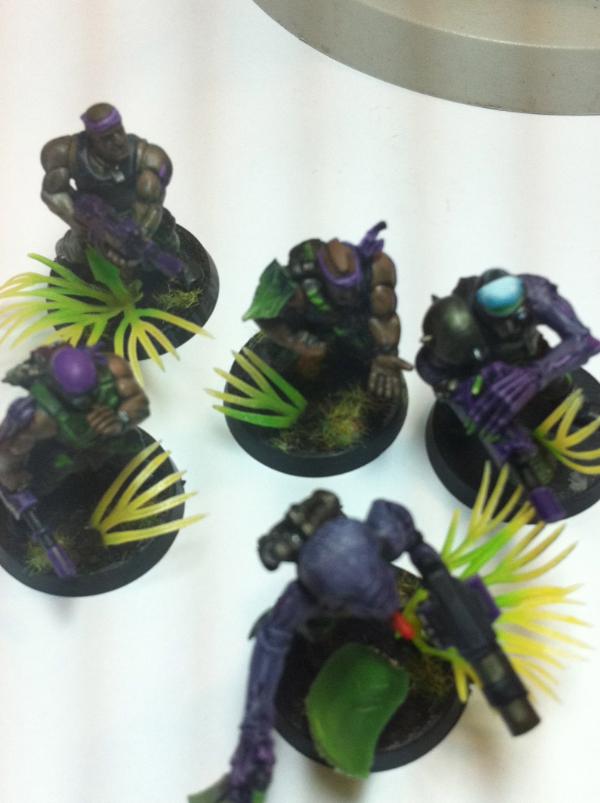
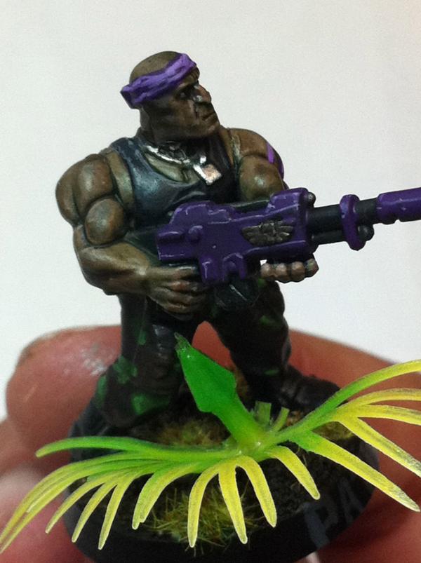
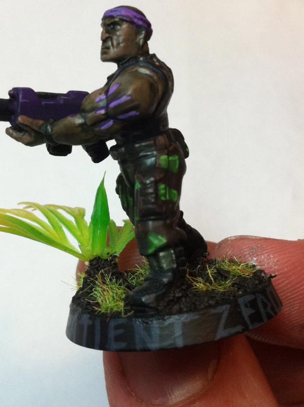
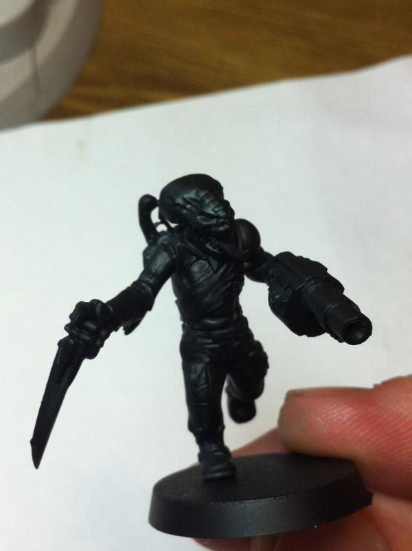
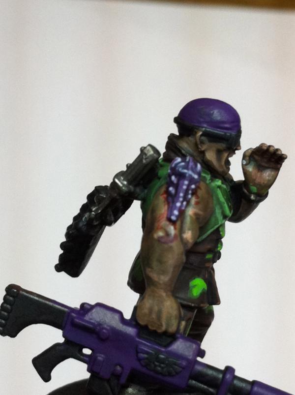
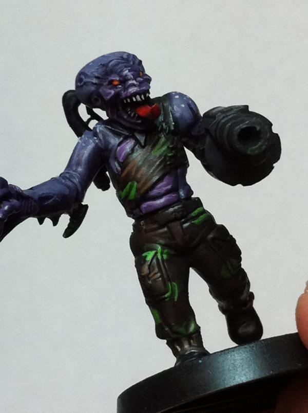
I like that idea Vik, plus it ties it in to my company standard! Heres the pretty much final version of tester number 1. Patient Zero. I tried a quick attempt at the purple gun. I dont mind it really. Maybe better than black, maybe not. Also added a bit of a warpaint tribal thing on his arm with the purple used from the banner. Not bad either. No room for danger stripes on this guy, but heavy weapons teams, probably so! Also, and more interesting, ive built 5 more genestealer cult catachans, using actually a bit of GS!! Very very minor stuff here and there, also alot of kitbashing and mixing of tau kroot parts, Necromunda, genestealers parts, cadian and catachan! Essentially my first modelling attempt ever Whatcha guys think? Basically, the more converted to genestealer the higher up in rank the trooper will be. Ill probably use the genestealer heads to denote seargents. The guns will be more picked out but playing so many games i often times switch my wargear around so im not soooo married to WYSWYG, on captains anyways...im just having fun throwing bits and weapons around with reckless abandon Maybe vet squads will have the cadian armor...i dunno, so many ideas! Gonna paint these first!! PS i know these ideas have been done before v_v
Hope you like
cool!
those conversions look lovley! i specailly like the armsswaps you did... the one with the mask and helmet with the genestealer arm above his lasgun looks very cool! the idea to use kroot bitz like the sparerips^^ is just priceless...
that guy with the grande launcher looks like a one man army! a marbo for genestealers^^
i bet in that odd mix you could as well use an ork arm too...with genestealers you could accept any mutations and deformations...
the purple guy, your pat(i)ent zero looks very good... i like the fine highlights on his gun...if you say there is no room for stripes i trust you in this^^ and i think since you have made the flesh look consderate darker i think he looks like a very good composition. now the camo idea really flies!
dsteingass wrote:I don't know what it is...It's not blue enough to be a cool color, yet it isn't red enough to be a warm color....let me look at it longer.
lol its not that intense. its liche purple base, and tentacle pink mixed in for highlights.
dsteingass wrote:Well, it's definately on the warmer side. Maybe a cooler spot color in the camo or somewhere for contrast?
ill add white to the next purple to cool it out. Personally, i think the 3 colors go very well with each other, but ill trust your eye as i always do and see what the difference is
the light purple tattoo is fine and the thing i like about the gun better than the bandana is there isnt as much highlights so its a duller purple which i think looks nice
Okay so I created a profile on Dakka 2 days ago randomly looked for any IG stuff, and I have to say bravo and I am subscrided. haha Maybe one day I'll grow a pair and post my IG army (sometime never).
Rogue Wolves wrote:when it comes to genestealer cults you have some impressive work out there *cough cough* major tom...
Yes there is definately impressive work out there. That other dakka link is amazing as well. But i think ive proven myself a proficient painter, and honestly, If i wanted to spend the time and paint a horde guard army to the standard i painted harker, i suppose i could. But then id never game:(.Plus i dont compare my stuff to other peoples work, And same for other peoples work. Everyone has their own style and strengths and weaknesses.
Aboucher, welcome, and please do share, but youll definately need a pair with vik around! he holds no punches and tells you like it is For the better!!
Made considerable progress on 4 of the 6 in only two hours of painting. On the right track posting pics soon!
bebopdrums2424 wrote:But i think ive proven myself a proficient painter
If by "proficient" you mean being peers with Golden Demon winners in painting ability, yes.
steingass, very nice, but not true Ive ALOT to learn from many of you guys. Perfect example was your ice mix And rogue, i didnt mean to say it that way, what i meant was that i like to follow my own ideas until i run into a brick wall, then ill see what other people are up to. Darn internet.
hell yeah. just looking at other painters and asking how they did something is a great learning moment. thats how i came up with my bronze scheme (check my blog in my sig or my gallery)
i did just that... high time i did that by the way^^ dunno what kept me from it for so long... sorry mate^^
and bebop thanks mate... i´ll be there to say my 2 cents and hopefully i can learn too a thing or two seeing you creating marvels with paint^^ and for my your creations should get some award...ouch... that would put me in the loosing position in our bustle at the competition... well then again i have done little to nothing on that project for the last two weeks...urgh...^^
ach nein bitte nicht herr Doom. aber mijn deutsch is nicht so sehr gut. yeah all the schools in holland have german in our classes. i hatted it because of the grammer (dyslexia isn't a friend )
he bob where are our updates? we will run amok and start posting my little pony comments!
LOL!! I love that you guys can find so much joy in my absence >_<!!! lol. Ask and you shall receive! Another update for the squad in progress. The sargeant is actually taking more time than i wanted him to. My overall need to paint every detail is overwhelming lol. Also, havent really ever painted a genestealer before so...well...practice is practice. Still, i tried to dial it back so its still somewhat army painting mode. The second guardsman is actually pretty fast. Next time i wont add so much goblin green around the bottom of his chest guard. Just the top edge. Itll look slick But i definately like the over all progress so far on this squad. I must apologize for the lack of anything exciting really since page 13 lol. >_< Unfortunately because of my drumming career, sometimes i get wrist pain from painting and i need to dial it back. Thats why not as much has been happeing and why i haven't started a real serious character model for fatty, I promise some really cool stuff on the horizon once i get my strength back.
Also in other news, i competed yesterday in a RTT tourney at my game store. I lost 2 of 3 battles against very skilled opponents, but won best painted army. Against very stiff competition. My friends flesh tearers were gorgeous, and honestly should have won. Individually my character models were better painted i think, but on the whole, his smaller elite army gave him time to do more on each individual model, and they were all extremely well painted. Musta been my aquarium plants that won it for me My prize was 25$ store credit so i bought a broodlord to be my CC for this regiment Anyways, here are more WIPs the sarge
regular guardsman #2
anyways, theres a 3rd but ill jst update him in the next wip with the qhole squad Hope you like. Also on the list is the finishing of my 3rd sentinel. Its close , just gotta do the driver
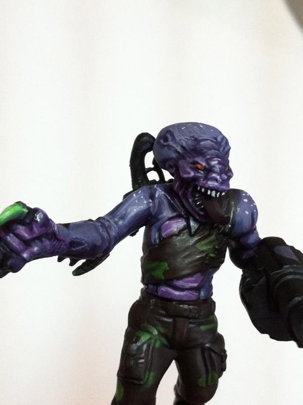
The look great. The green and purple lwork very well together. They lend themselves to a night stalker theme. The difference between the skin on the sarge and the solid color of the bandanna and gun on the trooper show the transition from human to 'nid incredibly well, I think. Very cool.
I'm looking forward to seeing the broodlord all painted up. Are you going to convert him much? Oh, and will he count as Al?
i too have marveled a the the "bit" on the shoulder...looks like some scale from a nid...hmmm...
at fisrt i thugh this was a real good photoshop thing you produced as i only saw the upper torso and head of the genestealer witth the grenade launcher..., then i saw your fingers and i knew thsi is your painting... gorgeous... loooks like done on canvas...really like it very much!
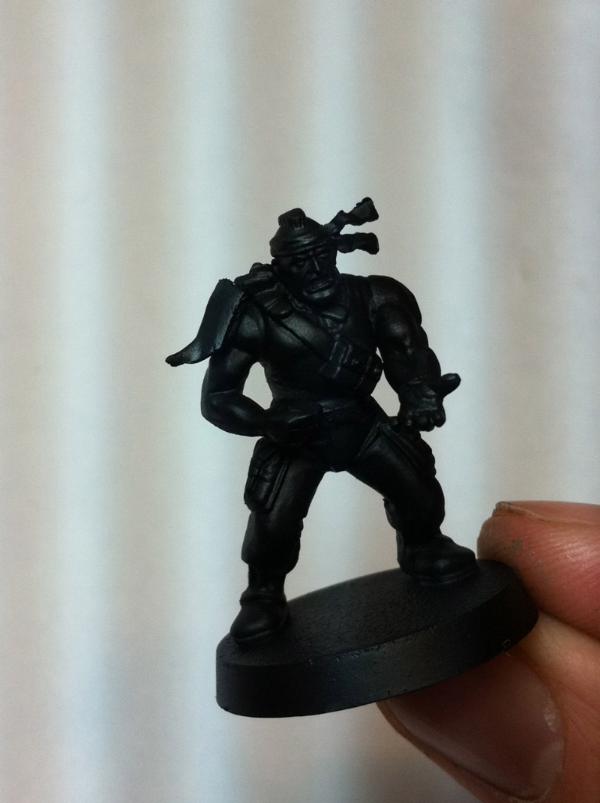
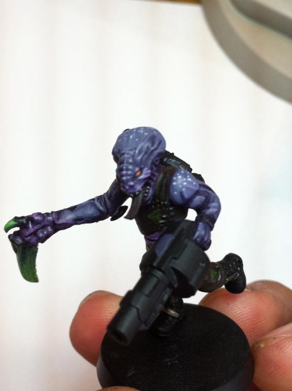
one thing the new minis made me feel akward about was: the yelling guy... the one with the spareribs on his back... those ribs are flying way to much around for my liking... i think they should hang more tighter to the back... or you could add another pack of ribs directly under his first ribcage^^ he could be the quartermaster for your gang^^
and i too think that the green on his stomach is a bitt to bright there... looks like you over did it a bit with the highlight there...*cringes* sorry someone has to point out this stuff^^
BUT! i really have to say you won me totally over with your paintscheme for your genestealers... it works and it even sells the fluff...and i like it for the pure esthetics of the scheme...
also i have to ask... that torso of the grenadelauncher guy... did you just paint on those abbs on him? very cool! and about this very conversion i have to say something else...: some peeps might have used a standard cadian body with a genestealer head... i say... this would have been dumb... a guy with a head as big as this never gets this on again...so you choice for body was way clever! sound composition all over!
LOL! Annnnnnnnnnnnd Vik breaks out the heavy artillery. OK. Clearing up the thing on the shoulder. Its a preliminary idea for vox casters. A symbiotic alien worm of some kind. Obviously, its way too big. On the genestealer sprue it looks tiny, but when put on the arm...its GIANT. LOL. so, either i should cut one in half then GS a few bits of ripped skin to look as if its dug in, or maybe just GS them entirely since they need to be so small, or perhaps let the idea go as there really isnt alot of modelling room for something like that on the models anyways. The torso is a kroot torso. And yeah, just around that left breast plates bottom edge, too much goblin green. But since these effects are made with three washes, brown, green, brown, any touch ups are almost impossible. Moving on cuz, i cant get too stuck ive got 57 more to paint. The ribs, i agree, vik. I just glued em on lol. I love that my modelling blind eyes dont even see those types of flaws. I just glue stuff >_<. Anything well modelled is by accident i assure you. Ill definately tyake more care on future models, as there will be many So anyways, im glad they are coming across well I TOLD you guys the colors would work! And GG, the broodlord is going to be fun, im thinking i may not even convert him since hes just a giant mutha ing genestealer. And that fits in the fluff of my ideas that the more in command, the more converted to alien they become. Also, im toying with the ideas of using crop circle designs for banners, vehicle markings, tattoos and icons. Ive also recently aquired a bunch of metal old magus and asatropath characaters so there are LOTS of special characters in store for this regiment. The tank camo scheme will be an opposite of the troop camo scheme. Goblin Green, with scorched brown spots.
mqybe his shoulder was the wrong psoition for this worm... but i would´t change it now...leave it as is... also i just realized that there is some wound around/ under that worm... well now it makes sense to me...
i want it on the back of the neck. But thats just so cramped back there it looks kinna stupid:( Yea the blood was my "cover up" for bad modelling technique. Bebops very own!
just an idea Bebob. why don't you let the worm stick out of his head? its more realistic as a vox caster why would a worm in your arm allow you to recive and make calls. in his head it wouuld be more logical and then the worm can be a sort of hive mind responder or a synapse responder.
Aboucher wrote:Well you know what they say fatty, there is a fine line between genius and insanity haha
you are encouraging the fatty! Which is good, dude can paint! Aboucher, just use fortress grey to highlight, or if just wanna add white to grey thats fine too.
Here are a few final wip pics for the day. Finished fatigues for the sarge, and added more deets on the grunt. When i realized i was trying to make a ray ban emblem on the side with dts i knw i had a problem. lol taken with an HD flash cuz its night now.
lol. Darn. You have a good point. Its more, just for fun, than realism i guess. I dont know how to do reflected jungle sky earth in lens'. :( Maybe i could change it to red sky and black ground?
Thanks Vik! The glasses are inspired by that orange guardsman you posted. However, thanks to Rogue Wolves good eyes, ive revamped the brown to green. Which looks so much better for jungle and makes so much more sense These three are basically done. Just finishing up the base. Apologies for so many pics now i feel like im making up for lost time. LOL Here are a few more pics of the 98% done 3 guardsman. Im basically up to 4 now! Only tons more to do! Yay! Again, these are ARMY PAINTED, not character painted. There will be minor flaws here and there. And also excuse my gross paint covered finger nails....kinnnnnaaa embarressing...
man i love your highlights...i really do.. on the grenade launcher particularly they look very cool!
seeing the last pictured guy with his empty soon to be filled by a flamer hands all i can think now is about yummy barbecue^^
also be carful with those makro pics with maximum zoom... i spoted some mouldlines even now^^ that is the main reason i haven´t started painting ma catachans... i never get the mouldlines really good done on skin...turns always kind of crappy...
Viktor von Domm wrote:man i love your highlights...i really do.. on the grenade launcher particularly they look very cool!
seeing the last pictured guy with his empty soon to be filled by a flamer hands all i can think now is about yummy barbecue^^
also be carful with those makro pics with maximum zoom... i spoted some mouldlines even now^^ that is the main reason i haven´t started painting ma catachans... i never get the mouldlines really good done on skin...turns always kind of crappy...
Yeah that 3rd guy slipped by me a little. Again im not too worried about it since im painting a blob of em. And its over the hand and forearm which will be covered mainly by the flamer But thanks for pointing it out sir vik
I don't mean to jump on your thread but I have a painting question. My Mordheim warband has black armor with gold accents and I wad wondering what would the best secondary color would be. Should I go roman purple? Should I go something else ?
Np rogue Glad i can offer my opnions on the matter. Sounds to me like youve got a sisters of battle thing goin on there. Maybe start with some googled pics as they will probably include black and gold. And honestly, between the two, almost any warm color should work. Id avoid green though.
And Steingass, geez, what a compliment man, thanks
Automatically Appended Next Post: i think its funny over the course of the last couple days you and another guy have been saying i have good eyes, and im blind in one of em!
Rogue Wolves wrote:thanks bebop i'll take a look around
Automatically Appended Next Post: i think its funny over the course of the last couple days you and another guy have been saying i have good eyes, and im blind in one of em!
i thought you were kidding. >_< sorry lol Finished the 4 but am waiting to post pics until the first 5 are all done Be patient!
will do bebop and i dont take offence i was like this my whole life, and its not so blind that its black but its legaly blind and i can barely see from it
how come? accident or defect since birth? just curious...for refference imgaine a life without the ability of smelling... that´s mine... ever smelled the aroma of your wife´s hair or the smell of your newborn child... well i wish i could...
wow man thats, odd i couldnt imagion the loss of smell how did it happen? and mine was from birth i had a lasy eye and it just got worse and worse and glasses dont do anything so now when i look at my nose it looks crooked since i can only see one side of it, and im a huge movieholic and thats the proffession i plan on entering but obviously 3d dosent work, the new all black 3d only works on the small things, the only 3d that works is the awsome ones at disney land and junk
well for my taste 3D movies could have benn not invented... was better when it was just flat... imho... but my smelling abilities where too low at birth and get more and more lower as i move on... my father and his father too had a weak sense of smell... the thing is i can taste as every average person can... and you can only smell vanilla... but if you would "make a wind pass" then i wouldn´t smell a thing....and believe me i have tried to small things like salmiac and wore and i couldn´t feel a thing... but i bet it is easier to have smnelling difficulties than seeing ones...can you drive by the way... then it would get pretty serious i think...
oh my right eye is perfect it can read real far and close, plus instead of there being a black spot in my vision its more like ---(0)---^---(0)--- normal person the (---) being pereferals and me -----^---(0)--- so im like a cyclopse with an extended pereferal (im sure i spelled that wrong) oh and yes i can drive fine
Automatically Appended Next Post: now all we need to find is someone who cant taste and a deaf person and we got a fully working person!
lol.... like that one armed and one eyed and one legged priate...er... sorry about that one eyed again... keeps creeping in the mind sort of.,..
but i though with one eye seeing you wont get the ability to measure distancies right... so you might calculate not precise enough how close something might be and how fast you might be... also in germany there is a 75% of seeing ablility needed to be able to drive... sounds like you have different standars in the U.S... hmmmm....whatever works best i guess..
Your soo cruel!!!!!! jk, that reminded me, one thing i hate (kinda) is when people are like hey since you cant see out of one of your eyes dosent that mean you have hightened senses!!! NO I DONT!!!!!!
Automatically Appended Next Post: btw sorry Bebop about going SOOO off topic, but dont worry when you come back we'll snap back into place
i think i just snaped in half... er... ouch... but to tell you something... i do have heightened sense of hearing and feeling....i really do... and i am really sharp in seeing details... but my hand eye coordination is total crap...guess i should have chosen a different hobby...darn^^ but we live and we learn, hopefully...
your making me remember the good times in german class watching monty python, aand i want to be a millionaire by the princes hahaha what a hilarious music video
my favorite is the genestealer with the grenade launcher because the highlights on the head are really nice and sharp which draws the eye to it. my only critique is that your skin tone highlights are some coverage issues. I'd add more coats of paint on the skin. I can tell you've been watering down your paints more, which is nice, but then you need to add more coats of paint so that the highlights look even and not as splotchy.
you son of a german! and father of a german! and husband of a german! plus if your going to use madchen you might as well say katse! oh btw at least human centipiede wasnt in usa! (btw dont take offense to anything i say, although i doubt you would, but just making sure)
taking offence commence...accessing data... insufficent data still for taking offence... awaiting further orders..
oh and it is katze...it is a sharrrrrrrrrrrrp "s" sound... when you spell german and make a small mistake it rads like this...germ an...sounds yucky...urgh...
well... s...ok... stands for? or did i knew that already... after all i am an old fart and can´t be blamed if i can´t remeber everything at all times... my mind is like a drawer...often stuck^^
but i thought besides that all new we germans have no middle gear... always sharp tones...the softer ones have all the frnch and italians...
so is that slash needed...liuke super-man or just a theatrical way of introducing yourself... and why the weeee...need a peee? seems you are older´n´me ...
So this is what happens when i dont post anything interesting???? Pics coming soon Ant thanks always for your advice. Of course the gatuitous self defense quote of the day. "im army painting them man"
hrmph...of course you have visiously forgotten that it is in fact my last name...von domm...so it is Viktor Misterious Germanman von domm.... and i have no hyphen.... old established but rather poor aristocrats that we are...
i always toughed the ringel-S was wrighten like this ss as there is no way you can make that funny B like s while writing. not to self stop sleeping in german class
Heres another WIP update guys. Probably another Sarge. So far thats 5 done. I went to a dr today for my wrist pain and he said my bones were fusing together from scar tissue and that he could easily fix it. I dunno there was some pain today and slightly distracting. It really hurts the inspiritation to have to deal with this. It also hurts my painting ability. Anyways, hopefully hes right, hes very highly recommended and he was very certain about it being pretty minor for me. Anyways, Heres the pics from todays efforts.
crappy group shot
...slightly frustrated today....be kind....also ill probably repaint the gun black, and ammo clip purple. Like i did the grenade launcher.
this new ones looking nice, i see that his helmet reflects green insted of brown, and i really love the spotty look on the skin, it reminds me of AVATAR


 inspires me to actually try to get my
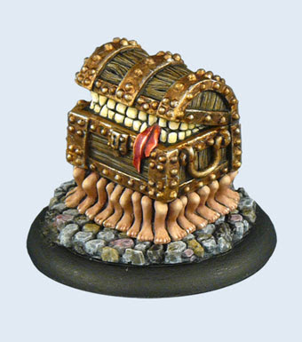


 Your soo cruel!!!!!! jk, that reminded me, one thing i hate (kinda) is when people are like hey since you cant see out of one of your eyes dosent that mean you have hightened senses!!! NO I DONT!!!!!!