Bitz_Addict wrote:
How did you get the yellow to look so smooth?
Thinned paint and a lot of patience. You can cheat with certain colours though, foundation paints when mixed with normal paints and thinned still give amazing coverage, so for instance with these I did the yellow ( darksun?) foundation as the base, then mixed that into bleached bone and some thinner for each layer, so it stayed smooth, had lovely coverage, and blended well I generally use actuall thinner like the Vallejo variety instead of water, but that's mostly just because I have it on hand and have grown used to using it.
Cool, thanks. Do you prefer Vallejo over GW paints?
That looks like it alright, the other helms look similar too. Really nice heads bar the odd eye bulge on this one, but It's not very noticeable
weetyskemian44 wrote:Thanks for plugging my blog!! Your compliment is well received, but I think you are pretty damn great yourself (nothing like a little mutual smugness). The Models are perfectly executed, beautiful to look at and you are winning!
No problem at all, your blog brightens my work days We are both winners then! Charlie Sheen style, bar the terrible breakdowns and with more tiny metal men!
Bitz_Addict wrote:
Cool, thanks. Do you prefer Vallejo over GW paints?
I much prefer them yes, but a lot of that might be down to GW's terrible pots and how quickly the paint can get congealed or the consistency go wrong if the pot isint closed right. GW metals and washes are excellent, but I would go with Vallejo for everything else. Cheaper, more paint per pot, and dropper bottles that mean paint does not dry out and you can remove a very small amount without exposing it to a lot of air.
I actually bought 50 or so basic dropper bottles online and put all my GW paint in them, including a little bead to help agitate the paint. I am happy I did it, using the paint is much easier now, especially when adding some to the airbrushes cup
niallkissick wrote:Iffy, i think you can clearly see the difference in the two models, so well done!!!
Phew, thanks a ton Niall, was going to start on more last night but the clocks rolling forward cought me out and I had to head to bed early, 11 hour shifts not including commute time leave very little time after work to get stuff done, so missing out an hour was a gamebreaker. /Shakes fist.
Automatically Appended Next Post: Super quick pic update now I'm home:
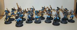
Badly lit but colourful shot of everyone done for the Eldar army so far (huuuuge pic, enjoy Coldfire )
and something a lot less interesting, my at last retidied painting desk, not picturing the storage unit of primer, tools, basing materials etc, and my well loved tiny compressor engine under the table. Spot the grot?
Feels so damn good to have that tidied finally, its been rather chaotic for the last few weeks.
medabee wrote:Organization is the key to good work environment.
Agree completely The more organised my work space is, the more relaxed and productive I am working in it, but I'm a neat freak in fairness.
inmygravenimage wrote:That's a great case for paints, where did you get it?
Also, eldar are outrageously pretty - nice one!
Thanks a ton! The case is actually the old GW paint set cased from around early 2009, I took out the paint holder tray as you actually fit in twice as many without it haha. The case is super sturdy too, I am pretty sure you could throw it into incoming traffic and the only damage would be to the cars. I'm going to get another eventually, but it will be a sturdy suitcase from a second hand store instead Nice and cheap and does the job just as well, + you can just close it and pack it away.
Yea... kinda! I can't really put my finger on what doesn't do it for me... the skull masks? I was about to say maybe they're too over-the-top, but the death-motif isn't really overdone like on Maugan Ra, persay.
Either way, I like the brown variation- it looks great.
And cheers for cleaning up the painting area- I'm impressed at the number of paints you have... I was also forced to clean my painting desk of resin/plastic/dried paint/copper wire etc... but that was more with the wife getting on me rather than a self-motivated effort.
Sorry for slow updates folks, really nasty work week this week coupled with power cuts at home, ended up getting models done in my FLGS bless them, though their low tables wrecked my back.
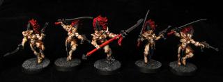
Here in complete opposite of the previous update are some super bright banshees Only took about 4 hours so really happy with them, army is approaching completion now, feels good!
Click for biggy!
Also may have decided to try out getting back into wargaming, who knows if these guys will ever get painted, but uhoh..
Congrats on the decisions to get back into the playing side!
I also just have to say, in regards to the Banshees, that, before today, I had never seen a paint job I actually liked on them!
I may have stayed up till 3am painting one of them. Tried out osl on it, looked amazing but then I went a bit too far with it and its a little overpowering now, but oh well, I learned for next time Also tried out some battle damage and weathering on the metals.
His bone, base, and bronzes are not touched yet, but I will get a pic up when he is eventually finished. Painting each of these to a pretty high standard as the force is to tiny, so they should all be pretty nice
I was convinced by a good friend and my partner who has decided to play too, I like the idea of quicker games with small armies but with just as interesting rules
It was fun.. if its not on the cards you cant do it, we kept messing up the charges .. 3 d6 non boostable. if you can get the Nyss Hunters they were fun.
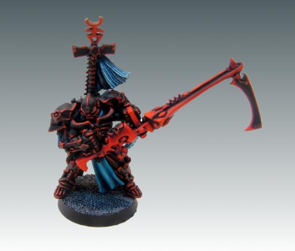
First Cryx all done I'm really not sure what quality level to call him, hes a hodgepodge of different effects and techniques I have never used before. Not happy with the basic OSL, but I learned from it and the next should be much nicer. He looks dirty and evil and thats all I was hoping for. More updates tonight!
Very nice work. Knew you'd do the Dragonfather proud! Death chickens are a bit underpowered in mk2, but I still love em.
I like the subtle osl, btw, and the damage around the carapace shell. I'd really like to see your take on cryxian runes, I imagine that'd be impressive.
My only criticism - and it's a pathetic niggle in many ways - is they're quite vanilla. Somehow, particularly given your striking eldar and Tron-marine schemes, I expected something a bit out of the box. But, beautiful work nonetheless!
TheChronoTrigger wrote:Looks real good, the weathering is nice, not over the top. Not sure i see the OSL, is it supposed to be on the vents along his spine?
Its meant to be around the green slits showing his inner bits, it was a lot more dramatic but it was too dramatic, so I dulled it down with lots of washes :( Won't be a mistake I make again though, and as long as I learn from derp moments, I don't mind having them!
Gitsplitta wrote:Nice Iffy.... very menacing. Also very dramatic which is perfect for that figure.
I think these guys would look menacing no matter the paint job, excellent models, and they fit together like a charm. Can only describe them as adult Kinder Surprise prizes, though I can imagine converting would be hard considering how they slot together.
Some_Call_Me_Tim? wrote:Yay! Death chickens! Dangit , Iffy, every time you post something new I become humiliated.
Don't be dude, your work is fantastic and Im a huge fan.
GiraffeX wrote:oh that's very nice I like the way you have done the golds and greens.
Dirty gold is a personal favourite, I'd have it on every mini if I could
inmygravenimage wrote:
My only criticism - and it's a pathetic niggle in many ways - is they're quite vanilla. Somehow, particularly given your striking eldar and Tron-marine schemes, I expected something a bit out of the box. But, beautiful work nonetheless!
Completely right! I think with these guys, the box art has nearly the perfect feel for them so I went with the same basic colours but then just splashed them on wherever. I think in hindsight I should have a bot mre bronze on there, its kind of all towards the front..
Miss Dee wrote:The thing is made from dead things and broken jacks
And also awesome. Loving them.
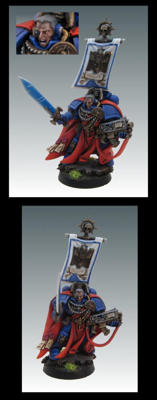
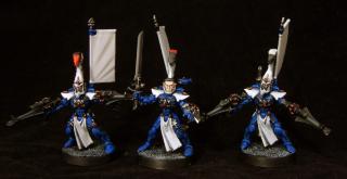
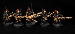
Golds and turquoise finished for the custom chapter character standard squad, have a terribly lit photo taken on top of a gerbil tank :
The leader is fantastic, that helm is blowing my mind. They look kind of awfull right now but once the blue hardlining goes on they will look lovely. Especially happy with the power glove so far, these will be done for tomorow so will get proper shots up then! This is just a sneakpeak
Wow! I haven't looked in here for ages and I'm a fool for not doing so. All your stuff is great! Love the color choices for those marines. Very bold and eye catching. But that Cryx is fantastic. The metals look nicely worn and I think the OSL is very well done. I tend to go to far, but you've made it look subtle which is the key I think. What's next?
These marines are to be finished today, then I'm back to the eldar, doing a character next I think but I am not sure which, going to be a surprise. While working on them I will also be working on some test colour grots for a certain Git, nice and busy! I have 2 full weeks off work which means Im not working again till the 23rd ( bless 4 days weeks) so there will be a hella lot of painting going on for the next while
I did an experiment last night with some cameras, we have 3 laying around the house that we found/were given/have had years etc, I usually take all my shots with my boyfriends very nice Canon powershotsx200IS, something that gives nice pics but has issues with any exposure with a lens opening time of more than 0.5 secs as it massively overexposes, so last night I tried out the little throwaway cam my dad got me years ago, a little battery run Samsung s830, and got some really clear 2 sec exposure shots.
I think I will be sticking with this little dude from now on, it only has a 3x zoom and 8 mega pixels with no possible Iso settings (wat) but its macro setting is amazingly crisp and it doesn't overexpose.
that little camera definitely wins of all the pics you've got on here so far. how is it for colour reproduction? I have a samsung and generally i'm quite happy thought it butchers reds.
Reds are something my cameras always had issues with, a black background can make a big difference but you then run the risk of oversaturating the colours so I dunno, its tricky :(
Reds so far look about right for this little one as all the reds on him have firey orange, his purity seals need to be washed, time will tell how it turns out when I am taking their proper shots
Really love the work done on the power glove fingers.
Are you ever worried about the black choice for the armor though? I always feel the pure black makes a void in the miniature, which is why I try for the darkest grey I can get away with.
I agree on the black, for my own stuff I like to use midnight blue and black as the base, or even blue ink mixed with black. I like extremly dark blues over black as they actually seem darker and you can build up lovely blue tinted highlights much better, I like painting blue highlights more than grey, so thats likely why!
These lads I just stuck with pure CB as the black, the customer sent over a model to base the paint jobs on so I didnt want to mess around with it too much.
The plan was to have these finished today but a terrible nights sleep decided to intervene, they just need their tidy up, silvers, trinkets, and bases done now, superquick shots just to show some progress:
Ill get some properly lit long exposure onces when they are done, I just never feel its worth the set up time for WIP shots. Cannot wait for the day when I just have it set up permanantly in a spare room ><
All done! Shame the larger group pics obscure detail a bit, so I took some smaller ones too. Went with a white background which I usually hate, just too much obscured with a black bg on their black armor. These were really enjoyable to paint and I am happy with the results.
I had some slight problems with the eyes on some of the helms, I will try and get a proper shine onto the right side helm eyes before they get sent out, but thats them done for now. Hopefully the client is happy too.
Lt. Coldfire wrote:Those guys are really cool. I wasn't sold on the color scheme at first, but they've really come together and are looking quite nice.
Yeah its one of those schemes that does not look good till its all done, blank bases were also killing their cool factor.
CalasTyphon216 wrote:those marines look bloody amazing!
also, if its not too much trouble, could you give a run through of how you did the gold? THanks in advance
Thanks Calas, and it's no prob, I will do a very simple tutorial when I am next doing it ( should be soon ) as pics would explain it a lot better then trying to detail it through text!
Jackal wrote:
Sure you tidy up the bases though Impossible to paint a mini without anything going on the base.
Deffo, it makes such a massive difference when the base is finally finished, like a frame around a painting.
Interesting turquoise and blue effects on those marines; it really stands out nicely with the black armor.
I really like the cryx thingie. Never cared a lot for the models, but yours comes together nicely. I will be interested to see what you do about the OSL. It's a bit tough in my experience, and I don't feel confident with it.
Wehrkind wrote:I will be interested to see what you do about the OSL. It's a bit tough in my experience, and I don't feel confident with it.
I have no confidence in it either, its new and scary. Only way to get passed the nervousness is to just keep trying it though, so I will try to get a better result on the next cryx. I need to make it more stark and yet more subtle, not sure how to go about it but hopefully I will learn something along the way!
Gitsplitta wrote:Very nice Iffy.... Love the colors and execution!
Colour choices were all down to the client, I think its a really nice scheme he has come up with and an army of them would be amazing looking Ill see if I can get him to send a shot of them with the rest of his army, it would be great. I wasent able to finish the second gobbo test skin today but thats first on the lineup for tomorow, so I will PM you with them asap, sorry for the delay Gits.
vent wrote:Awesome. The blue rims clear up all problems I had with using flat black. ^_^
They lead the eye away from it nicely I think, I am really loving the really stark schemes I am getting to paint recently. There is something really endearing about them
Some_Call_Me_Tim? wrote:Love that blue green color you have going! The blue edge highlights on the flat black really work out nicely. And, once again, your golds look superb.
Your Cryx should take on my Trollbloods someday!
Thanks Tim! Maybe if I ever get over to the states we can have a game but my god I am awful at wargames, so you have been warned
Todays minis were these 3, only 3 because they were absolute plonks. One of those flags broke off so many times, I raged. I also thought I would be soooo clever and base them white and block off the whites and hand paint on the blues, that was stupid. I should have just airbrushed them blue and painted up the whites, I painted up the whites over the primer anyway so it was just a massive waste of time despite thinking I was being economical with it.
Tabletop standard, hours and hours. I didn't count, curse those whites over white primer, it saved no time D:
Also, the guy on the right there, his arms are on backwards. Its brilliant. They looked like they were plastic glued on and his paint job was half way finished before I noticed so I let him be in case I ruined the mini. I like to think the Eldar are equal opportunities employeers when it comes to Dire Avengers, even with such crippling dissabilities as having your thumbs on the backs of your hands. What nice folk!
Ifalna wrote:
Also, the guy on the right there, his arms are on backwards. Its brilliant.
Damn, serious? That's what I get for buying used, already assembled minis Well, they look good anyways and I bet if you didn't mention that I would have never noticed
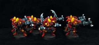
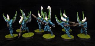
And today were some nearly completed striking scorps, I ran out of glue for the bases so just blacked them out, weapons need another sienna wash and will be finished huge image.
Thinking either a character tomorow, or the rest of the scorp unit in their other colour scheme
I usually only paint on my weekends, and for 5-8 hours a go. I am on a holiday from Work untill the 23rd this month which is why I have been productive, but I am limiting it to around 4 hours a day for the moment
The rest of the unit are going to be a oily stone grey, it's going to be really interesting.
Edit: completely forgot, this unit is finally about to be finished, all 5 mounts are finished and the knights are at the same stage as this, bit more armor tweaking then their silvers etc to be done, they are less orange than this, I derped up the shot as I'm inches away from bedtime.
I generally really dislike the aesthetic of Eldar models, (we are a dying, fragile race in soft armor; let's put on giant hats with crests and be brightly colored in battle!) but you did a really nice job on them.
The knight looks good too, assuming he is less orange and more solid looking in person
Wehrkind wrote:I generally really dislike the aesthetic of Eldar models, (we are a dying, fragile race in soft armor; let's put on giant hats with crests and be brightly colored in battle!) but you did a really nice job on them.
The knight looks good too, assuming he is less orange and more solid looking in person
Are you saying the reason they're dying so fast:
1st Space Marine: "Ooohh! Look Shiny!"
2nd Space Marine Cocks Heavy Bolter, takes aim and DAKKA, DAKKA, DAKKA!
Wehrkind wrote:I generally really dislike the aesthetic of Eldar models, (we are a dying, fragile race in soft armor; let's put on giant hats with crests and be brightly colored in battle!) but you did a really nice job on them.
The knight looks good too, assuming he is less orange and more solid looking in person
I know, they might as well have giant targets painted across their bodies. The knights are a bloodier red, and plenty solid Too solid. Spikes causing multiple puncture wounds in hands solid.
Extremely early WIP shot of the Autarch, technically to tabletop as there are only 4 layers, just being as neat as possible with him.
Only parts close to completion are the wings, I am thinking black gems with turqoise shines would look great but am not sure about the weapons or cape.. red is tempting but might feel out of place, not sure yet. Guess the cape could be turqoise to help him fit in with the rest of the army, but what then for the weapons? If anyone has ideas, hit me
Edit: Maybe turqoise for the small gems and red for the large, with a black/turqoise highlight weapon and red cape? Argh, I dont know. Need sleep. Also, this is the worst idea for armour ever. I mean really. Giant army of gem encrusted multi coloured space elves, but one not only has giant freaking wings, but a gun bigger than himself and a massive headress. He may as well have a neon "SHOOT ME FIRST, I AM IMPORTANT" sign above his head.
You can laugh at his indian princess headress all you want, or don't. He don't care.
But seriously, he's looking really good. One of my favorite eldar models too. He seems to be a lot more awesome in person than when you see pictures of him.
Hmmm... dunno Iffy. I like the helmet and the wings with their counter-changed colors. As for the rest it's a real crap shoot. I think you need to go with a red cloak. Those guns are often depicted as black or a white/bone color... both of those are rather neutral and would work well, then you could bring the turquoise into the armor proper.
Quick update as hes all done bar his base, bag, and some wash touchups which are for tomorow. Red offset him nicely, its a shame about the grainy areas (midriff, arm joints, under his sash etc ) Im not sure if it was the model itself or glue as he was primed already, but he looks ok for tabletop. Thinking the scorps tomorow too. Hopefully I have time for them all.
]
He is exceptionally difficult to photo, it has to be the amount of white, Ill try a white background and see if it helps out as the photos are a real let down.
The headdress is my one questionable reaction... other than that, I love everything about it The white is really striking, especially when considered next to the other vibrant colors of the army... it's really the only way he could show up
Very nice! He should stand out well on the battlefield.
I have always though it was funny that a race that is dying out should choose to wear the brightest armor of any faction. Might as well go out in style, I guess.
I love the way you have done the wings, the way the shadowy bits (the gaps between the wings, i think you know what i mean) goes from grey-blue, through purple to red looks stunning.
Very nice, I love how the wings came out, and while the sash gives him a slight 3rd World Dictator vibe I think it still works out nicely.
I hear you on chaos knights; between my lost and the damned and my WoC army I have drawn blood with models no less than 7 times. I actually stabbed myself less making my Dark Apostles' cursed crozius out of pins.
logg_frogg wrote: I really dig those marines from a page back too! very unique colour scheme!
All credit has to go to the owner in fairness, he gave me exact info on the tones he wanted and I think they were great choices. He has a whole army of these it seems, he said he would send me a shot of them all together which I am really looking forward to!
joshoftheforest wrote:The headdress is my one questionable reaction... other than that, I love everything about it The white is really striking, especially when considered next to the other vibrant colors of the army... it's really the only way he could show up
I think the headdress could be darkened down a bit more alright, especially in towards the gold areas, I may well touch it up a little. The white idea was Coldfires, I just tweaked the scheme to have a little red and purple as well as the blue as the army has a good mix of all 3 and it really does help tie him in, he stands out tons with the white but you can tell he is part of the same army when they are all around him and it works well
dantay_xv wrote:I love the way you have done the wings, the way the shadowy bits (the gaps between the wings, i think you know what i mean) goes from grey-blue, through purple to red looks stunning.
It was great fun and not hard to do at all, if I was spending more time on it I would have darkened where the feathers joined a little more, but this was basically prime white, wet blend washes over it, then pick out each feather carefully with multiple thin white coats. It's something I will use in the future for sure, would look great on something Tzeentchy.
Wehrkind wrote: I hear you on chaos knights; between my lost and the damned and my WoC army I have drawn blood with models no less than 7 times. I actually stabbed myself less making my Dark Apostles' cursed crozius out of pins.
It's like the only parts of the horses you can actually hold all have razor sharp death needles, then you get to the knights and think you are finally going to get a break only to realised they have the same amount, just placed in a sneakier fashion :(
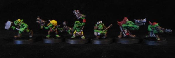
My extremely prolific time off took a dive this week as my 9 year old little brother was visiting from Dublin, and as fantastic a little kid as he is he needs a bit more entertainment then watching me unwashed in pajamas hunched over a desk covered in paint and swearing constantly, so I only got one unit done but they were a bucket of fun. 7 little grots for Gitsplitta, only 1 of which you get to see as I need to redo the eyes on the others and get a properly lit shot. I broke my rule about painting eyes first as I painted them white originally then realised they should be red only towards the end so they are slightly insane right now and need a touch up.
Here he is pointing at a gor and being indignant-
How does that gun even work? Also, considering his stature, that is the tiniest skull ever.
I love these guys, they are hilarious. Decided a Dark Angel is next as there are a couple more to do to go with the guy with the tiny man with a hat a few pages back, and they are a nice break from the norm. I'm getting a massive itch to move from working on tabletop to something higher after doing the marines to character standard, so really looking forward to starting on the higher standard Orc and Eldar character I have waiting in the wings.
I do feel that while I have learned plenty churning out tt standard mini's when it comes to colour use and getting the best I can out of minimal layers of paint, that spending longer on higher detailed models is what I need to do to get some real improvement in. I really want to get a mini painted that I feel looks better than the Korvidae I did quite a while ago, but that means spending a lot of time on one, something I can't do while painting to tabletop
One thing I am very proud to show however is the knight my 9 year old bro painted while he was over. He loves painting but worries he is not very good, all I did with this was wash and base it and help him find the colours he wanted, so I think he did very well indeed.
No new work on them yet though I am really looking forward to doing the bigger guys. Might get around to one if I need a break from commission work but what I have at the moment is so varied that its unlikely I will
The grots really are a great set. I loved converting them into chaos hobbits and painting them up; just so much character and silly fun.
Good to see you bringing another into the fold I tried with my wife, but she is just way too much of a perfectionist. A better artist than I am by a good bit, but can't just say "Good enough!" Washes were too messy for her.
Ifalna wrote:All done! Shame the larger group pics obscure detail a bit, so I took some smaller ones too. Went with a white background which I usually hate, just too much obscured with a black bg on their black armor. These were really enjoyable to paint and I am happy with the results.
These are just awesome, the colour is amazing, well done!!
I go with 1 big one (army) at a time and smaller ones to break up painting on the army and prevent me going insane.
Usually 2 at a time, Sm's are done so the grots are getting started when breaking from the Eldar, I think any more than that would stretch me too thin as my painting time is already so limited (/rage). There are a couple more eldar to arrive so I am spending a nice amount of time per unit and not rushing too hard with them, I could technically paint after work and not just on weekends but it would be about an hour a day, and that's just not enough time to get into a proper groove for me. I would end up churning out subpar work or not being able to sleep because my brain was in painty overdrive.
The Chaos stuff and Cryx are all just my own things, so there are only 2 commissions going for the moment and I won't be taking more untill my upcoming house move is sorted Less stress for all involved, I can just paint mini's for ebay untill then once these are done.
I imagine Grots on the battlefield are infuriating for the opposition to say the least, like being stuck at a birthday party for toddlers off their faces on sugar and Coca cola, except with guns ><
[quote=Ifalna
*Snip*
...I imagine Grots on the battlefield are infuriating for the opposition to say the least, like being stuck at a birthday party for toddlers off their faces on sugar and Coca cola, except with guns ><
That is exactly how the background story describes them! I still think an Easter themed Orc army would be hilarious, just imagine Grots with pink hand baskets, running around looking for more Easter eggs, whilst Ork boys wearing pink bunny ears fight each other for the ONLY giant size Snickers bar.
Some_Call_Me_Tim? wrote:
That is exactly how the background story describes them! I still think an Easter themed Orc army would be hilarious, just imagine Grots with pink hand baskets, running around looking for more Easter eggs, whilst Ork boys wearing pink bunny ears fight each other for the ONLY giant size Snickers bar.
Eep! I think i just threw up in amy mouth a little there Pure silliness! Would be fun as a diorama but I just know if someone is going to paint it I will end up seeing it played in a tournament somewhere >.<
It would be even funnier is said army was completley cheesy, with gobs of Bikerz. Nothing worse than losing to Boyz in pink bunny ears!
Been super busy, finished off the scorps unit (pics tonight), have another few grots done and the DA character is on his way to being finished!
Some quick shots, the wip Tabletop standard DA- (such a dc doom face!)
And some shots of the new grots and herder. Herder needs a teeny bit more work, grots are pretty much done. Going to get some larger pics of them all together asp
Hahah Wehrkind, I struggled with his "Shirt" for a while.
He has these really odd creases in it which imply it is cloth, wrinkles that make no sense if it was flesh, but then there are the raised lumps and what appears to be a nipple piercing (?). I think the sculptor changed their mind half way through and just went with it.
I went with the shirt as it gives an excuse for his arm joints being the end of his "sleeves" and not just lines in his flesh and it was important to me that he looked good as he is the only orc amongst many a grot and will draw the eye. I don't know how he is going to keep them all in line, there are so many of the tiny gits.
The Da dude is fantastic, not only does he have tiny skull knuckledusters, but he also has an angel on a stick. I was talking to Coldfire about it, hes sure it is some kind of iconography, but Im convinced it's way too heavy to be that alone and that he actively bludges enemies to death with his Angel club.
I would love to paint him with metal armor and a green cape, he is so incredibly like doctor doom.
Yea, I read the creases as "folds of excessive flesh" and "scar tissue" and a big definite on the nipple piercing. On the other hand mine is modded up to look a bit more Slaanshi (come play little chaos hobbits!) so I was probably biased to start
I thought I had a picture of him on here, but I have been realizing lately that I fail at pictures forever, and don't have half the photos of models up that I thought I did. I might try and get one in the following week, as I take breaks from studying for finals to photograph damned near everything.
Yeah I'm pretty sure that is flesh actually, but hey, he could be wearing an Under Armor compression shirt for all we know. I always love those pistols the grots have, and the ferocious pirahna-dog.
Ifalna wrote:The Da dude is fantastic, not only does he have tiny skull knuckledusters, but he also has an angel on a stick. I was talking to Coldfire about it, hes sure it is some kind of iconography, but Im convinced it's way too heavy to be that alone and that he actively bludges enemies to death with his Angel club.
I would love to paint him with metal armor and a green cape, he is so incredibly like doctor doom.
Asmodai is such a great model. He was my first HQ for my Dark Angels, and became my Dark Apostle when I switched them over to Fallen using the old Alpha Legion rules; which let me have a chaplain-eqiivalent in Chaos back in the day. The angel-on-a-sick is his Crozius Arcanum. Yes, he beats people to death with it, as it functions as a power weapon.
He feels fantastic, he has that weighty chunkiness of an older model, reminds me of my old chaos sorceror with the hilarious skull mask.
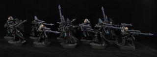
Updated shot of all the grots together (huge so click for zoom!)
And the completed muted tone striking scorps. This was requested as the same scheme as GMM used for an army they did a while back, so I kept the same colours but added the red gems and silvers to tie them in with the rest of the army while still keeping them mega dark.
Basing is down to the buyer, bit of a shame for their shots right now but the final shots of them after basing will be brilliant
The scorps are interesting, the grey is very muted and melts into the base scheme for the army, so I had to try and pull them back a bit with the gems. Going to matt varnish them entirely and then gloss up those gems to make them draw the eye, the little bit of colour apart from the crazy yellows helps them look more like completed mini's.
I think yours is a good take on them. They have colors and details, but with the exception of the bright yellows it doesn't look like they put on their bulls eyes before battle. Though I suppose Scorps have a 3+ save, so they have some leeway in being big and brightly colored.
One day I will stop being a cheapo and get some proper stuff, the real deal absorbs all light so gives a lovely backdrop, but I do need to work on my overall lighting. Not having a permamant photo area means my light varies wildly as I have to set it up each time :( Im going to try taking long exposer higher light shots in the future and then tweaking the contrast, the shots I am getting right now just don't seem to be clear enough for my liking.
Our boiler is broken at the moment and it's chilly, I had to make him a coat out of the sleeve of a furry purple dressing gown with white stars, he looks like a wizard gone wrong :(
Ifalna wrote:Our boiler is broken at the moment and it's chilly, I had to make him a coat out of the sleeve of a furry purple dressing gown with white stars, he looks like a wizard gone wrong :(
Manny is hideous, no questions asked, but leeloo is sweetness personified. She is just very very nervous with anything new, thats the same face she pulls when shes worried about anything wether a coat or a broom she has never seen before.
Ifalna wrote:Manny is hideous, no questions asked, but leeloo is sweetness personified. She is just very very nervous with anything new, thats the same face she pulls when shes worried about anything wether a coat or a broom she has never seen before.
Big pupils, one ear twised, sad face.
Reminds me of our cat, except that he happens to look like Leeloo no matter what is happening. Cats are in a claque of their own, when it comes to it. Though miniature rabbits are pretty adorable!
Well I had something nice to say about the grots, and there were some space elves too weren't there? I kinda forgot everything else when I saw the crazy wizard cats
Manny seems to be 'You press that shutter button girl and you're going to be waking up to a mauled bird in the bedroom'
Whereas Leeloo is more 'You dress me like this, then you gotta go take photos? Why?'
Awesome! I wanted a sphynx so bad, but my wife and decided that we might not be able to keep up with the skin care they require. We got little (well now HUGE) 'Rogies instead. We lucked out with a great cat (or aspiring champion, see pic at left) but I still sometimes wish he was bald. Especially this time of year.
I will be PMing you bugging you for cat details later.
weetyskemian44 wrote:They are like little deamonettes
Leeloo's massive cat boobs would agree.
Wehrkind wrote:Awesome! I wanted a sphynx so bad, but my wife and decided that we might not be able to keep up with the skin care they require.
It depends on the cat, some need a lot more maintenance than others, ours are really great. Leeloo stays clean forever and keeps her claws and face spotless herself, the only thing she needs done bar a wash once a month (she rarely needs it but we get it done so she stays used to it) is to have her ears cleaned. Manny is constantly filthy, he needs a wash within a day of getting one as he has no understanding of hygiene. He never cleans himself, hes always covered in bits of food, hes vile bless him. We still only wash him when he gets rather dirty though, like any skin the more its washed the oilier it gets quicker.
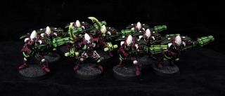
Back onto the topic of actual mini's, Asmodai is finished and project Airbrushed Harlequins has begun
Of course only now do I realise the top pic is slightly blurred, urgh. Sword was fun but time consuming because I had to redo it a few times till I got the hang, I think it looks nice for tabletop though. I will get another pic to replace the top later, maybe a full on one too as his face is obscured by his hood a lot here.
Harlies are going to be great, all using the same scheme but with varying shades, should be suitably interesting
Sorry for the long wait for an update folks, been quite busy
Huge pic inc, too many for wee pics!
So these are the Harly troop on their way to being finished. Sadly there are 3 or so still on the workbench due to coming down with a bad case of whyarethesesofragilesweetlordabove-itis, but I expect a full recovery for them.
These originally had black instead of stone, but it got too muddled with the black gradient so I went for a shade lighter instead. No 2 are the same, they either have a different blue (ice,enchanted, or midnight) or different armor patterns. Gradients were really really hard, I had to use a .3mm needle for the brush, and that required an awful lot of upkeep as it is so small the paint beads on it quickly, but I think the effect turned out nice. They all look different, but could be one giant unit.
What needs to be done to finish them:
Stone highlighted
white armor highlighted
Dark silver weapons and mithril highlight
Red gems and accessories, to tie them in with the army.
They still look really messy right now, but thats mostly due to the unpainted white primer still showing with splashes of colour. The gradients turned out lovely and smooth and add some extra oomph to them for sure.
These should be finished nice and soon as the repainting and time demanding work is already done
Way better lit shots of the last models ( cause I really disliked those pics ):
Nice scheme! it's a refreshing change to the normal schemes you see out there, and the darker scorpions are great! I would do something similar if i were to undertake those small fiddly fragile bloody eldar!
good stuff, sorry I haven't commented before now, but I've been stalking your work for ages now.... :-)
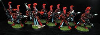
Phew, these guys kicked my bum >< I completely underestimated how long the gold on all of them would take. Warming it back up from the burnished shading took a while to say the least.
The golds and whites are finished now though, so all thats left are gems (quite quick to do) slight grey highlight, and turqoise sashes, all the timely work is finished up.
Super quick terribad lighting shot just to show progress: Not pictured- single dude sitting on my palette who missed the group shot, and the couple of poor lads under repair. So far they are looking bling tastic, the one with the absolutely giant weapon and ribcage is my favourite so far.
Starting to look like an actual unit now, should be finished very soon and I will get a proper detail shot. Next up are the airbrush effects on some of the earlier models, another DA, and some more little grotties!
So sorry for the awful delays in updates, I came down with a heavy case of Surpriseboyfriendsmothervisitfor3days over my weekend, which left no weekend to actually have. Getting them finished in hour increments after work now, only the gems to go ( phew) so they are extremely close to being finished.
This weekened is mother free, so should be ever so slightly more productive
*L* I read that as "Surprise Boyfriend Smother Visit", which also made sense, until the "mother free" bit. Then it got weird.
Those harlies look good, even if the colors and table cloth make it hard to focus on them and actually feel as though I am seeing them properly. Like a Parliment Funkadelic show.
Gitsplitta wrote:No worries Ifalna, your work is worth the wait!
Thanks Gits, but I don't think it is. I am taking way too long to get work finished recently due to my work shift situation, and I'm not happy about it. Its why I've stopped taking commissions for now, I'm not happy with how long it's taking me to get them finished and sent out and regardless of kind words, it feels like I'm letting people down by taking so long. I'm looking at 2 more months of work, maybe 3, then I can spend real time painting and not have situations arise that cause problems for the people so very kind to send me their mini's.
Wehrkind wrote:*L* I read that as "Surprise Boyfriend Smother Visit", which also made sense, until the "mother free" bit. Then it got weird.
Those harlies look good, even if the colors and table cloth make it hard to focus on them and actually feel as though I am seeing them properly. Like a Parliment Funkadelic show.
How did you do the gold that took so long?
Haha, wow my last post would have been so much more interesting if that is what I typed They were getting really hard to take in because of the bases being random smears of their colours. As soon as I blacked out the bases I was like " Whoooah ok these look so much easier on the eye". Though you are right, the 80's bedsheet is not helping.
The gold was a pain in the bum because I spent way too long playing with it, I painted on the washes instead of smoothering them, and gave them a few different colours, then rehighlighted with a couple of layers of lighter gold. It took ages but looks lovely in hand, the Dude with the very long gun shows it nicely.
So they are all done now, but there are so many it was really hard to photo them. With no tripod I can't stand back and take the shots, so these are pretty close and I am sorry for the quality. One big shot of the group, one close up to show a bit of detail. Both can be zoomed.
The background is pretty cream because trying to alter it afterwards results in their whites becoming eye blindingly illuminescent! They have really, really white parts, so trying to alter the colour cast manually just would not work ><
I am at home sick on antibiotics ( sinus infection, not fun) so I WILL have another update tomorow, I promise. I have the poor unfortunates to finish off ( the ones that were damaged on arrival and needed repairs) which are 1 swooping hawk, 1 guy on a floaty platform, and a couple of these harlys) so I will get them pretty much done tomorow, + some grots, or thats the plan at least
I know what you mean about feeling bad when commissions are late ifalna. It is a guilt making feeling.
Harlequins are looking like earth wind and fire + backing dancers (this is a good thing when it comes to harlequins)
Felt so much better today, I think the antibiotics finally kicked in, yesterday was mostly being asleep on the couch from the painkiller!
The poor unfortunates are no longer unfortunate! All repaired and based, work started on one of the harlies ( they had the most casualties of far, likely due to their very silly poses!) and the two older guys on hover platforms
And, more grots all done
Great fun to paint as always, though the guy on the right has some extremely interesting feet. I know grots aren't exactly the most perfect creatures on the evolutionary chain, but I can see why the others have guns and this one is left to manual labour. I like the one looking worryingly at his finger too, as if trying to do complex math in his head and struggling. If he is the one in charge of maintaining the mechanics, I would have a worried expression too
Of course the picture instantly highlights all the faults to me :( Spot of paint on the rights foot that needs fixing up asap and thats a grenade, not a scroll as I painted it as for some reason. Will clean those up
Those grots are looking great, Especially the WW2 themed one on the far left!
As a side not, where are these from? I know the middle-left one is standard plastic grots box, but the others not so sure (although middle-right looks like battlewagon to me?
As I recall, the outside ones are FW, the one with the wrench comes (I think) with the battlewagon kit. Can't remember where the blunderbuss grot is from.
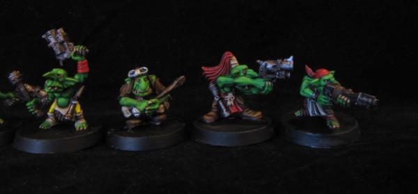
Yesterday had lots more work done, the eldar have their turqoises and whites finished and just need their bleached bone and gems done, and I got 2 more little grots.
The grots were difficult because I have no idea what they are! They are grot oilers according to their bag, and they definitely have a little creature each, but they are different to any oiler I could find on google :O I am guessing they are very old as they have that Brian Froud goblin look to them, all wrinkly and smiley. Very cute indeed. I had no idea what to do with the little creatures as I couldn't find any source material, so I did one yellow and one blue, with worried faces. I would be very worried too if an old grot was squeezing me while smirking. I will get some pics up tonight of them and the eldar, nice to see models getting done ( sigh) and I have 3 more days off to get more finished!
I had to make a stop to my local art supply store today. My trusty size 0 series 7 which I have lavished affection on since I got it has magically gone missing. My apartment is very tidy so I couldn't for the life of me work out where it could be, I turned the place upside down trying to find it. It eventually clicked that just after I last used it, I may have not put it on its pot properly, meaning it rolled off the table and was picked up by my extremely diligent Roomba.
So in a nutshell, I accidentally threw my most used brush in the garbage and didin't realise till too late. Trying to paint without it was horrible, I did not realise how dependant I had become on using it. I bought 2 more size 0's today, one spare, the other to be placed with the models on the shelves and not left on the painting desk. I don't want to go through Series 7 withdrawals again!
Those are old, metal oilers Ifalna. Should be fun to see what you've done with them. I've gotten very attached to my really good brushes... they aren't as expendable as the normal hobby grade ones so I get much more attached to them.
Shame about the brush. I've come to love my series 7 as well, though I still kind of suck at painting. Me + art = failure, usually. At least I can get straighter lines with it!
Grots are cool looking forward to seeing some more, especially the old oilers.
I still haven't taken my series 7 out of it's container, and I've had it for a couple of months now Worried I'll forget what I'm using and start dry-brushing with it Very unlike me, normally I'd be rushing to try my new 'shiny' out. Still, guess that means it'll last a good while.
Gitsplitta wrote:Those are old, metal oilers Ifalna. Should be fun to see what you've done with them. I've gotten very attached to my really good brushes... they aren't as expendable as the normal hobby grade ones so I get much more attached to them.
They are gorgeous. Very fantasy-ish with all their bags and little trousers, but super detailed. They even have tiny round fingernails and really great facial detail considering how tiny they are. Do you have any idea what their little critters are called? I guess they squeeze oil out of them, poor things. Only a few grots to go now, I will be filing down the ones that still have some lines while taking breaks from the Eldar over the weekend. My chair is awful and I can't justify getting a proper one what with likely moving so soon, so I just have to slog it out!
And aye, I got far too attached to that s7, I originally only used it for extreme detail work but as time passed it became my no 1 brush. I used it for everything and made sure to condition it when done, was convinced it would last me forever :( I will be extra careful with my new one now, lesson learned for sure. It will be on my model shelf and not left on the table. Hopefully this will last for a good few years.
weetyskemian44 wrote:I love grots and goblins - they are cute and vicious - just like my nieces
I think gobbos and grots are based on sugar hyped kiddies with weapons, there are too many similarities for it to be coincidence.
Lt. Coldfire wrote:Shame about the brush. I've come to love my series 7 as well, though I still kind of suck at painting. Me + art = failure, usually. At least I can get straighter lines with it!
I gurantee you don't suck as much as you think but aye, a good brush makes a pretty crazy difference. I had a friend over recently who is just starting to get into painting, and he is absolutely excellent considering he has 10 paint pots, a basic brush and basic tutorials so far. He was showing me the faces and saying how hard it was to detail them, he really wanted to but he just couldn't seem to get the brush to do what his hands were trying to make it do, and that was all down to the brush being sub par. Series 7's have really shown me that a brush should work for you, never against you. If you are ever struggling to paint because of a split hair, or a hook, well thats the brushes issue not your lack of skill. A perfectly pointed slightly elastic brush makes such a difference it is crazy, I tried going back to synthetics while I was without the size 0 and it drove me crazy ><
In other news, I hear a couple of Dakkites who know me from the forums came to Cork to visit my friend Conor O'Shea! Whoever you were, hope you had a good time, he's a great guy.
Automatically Appended Next Post: And heres a shot of the grots, chunk of flash on the rights foot only realised once I take photos, of course ><
Can be zoomed a bit, the blue critter is really worried bless it. These really don't look 40k, they look like amazing old school fantasy. Considering all their little leather bags and pants, I'm not sure how I could have made them fit in better. In fairness though, they look like a pair of older gents, and so they should be wrapped up nice and warm!
I originally shot this with a new white light thinking I was being awesome, but it looked terrible, the light is just too harsh. What I currently use for shots is actually a makeup mirror, with a soft daylight bulb all around it. It gives a nice light without leaving reflection glares or miscolouring mini's, but I think it can mask details sometimes, like how those satchels don't look highlighted when they very much are. When I move I am looking forward to a permanant shot area being set up, so I can have lights and my lightbox in the right place and a tripod, expecting some awesome improvements in photo quality
Gitsplitta wrote:I think they were just called "oiler squigs". Wonderful work on them Iffy. :-
Glad you like them Gits, I could not get over how hilarious their smug faces are
weetyskemian44 wrote:yup - I remember them - oiler squigs. I wonder if there is a salad dressing squig or ketchup squig? mmmmmm
Condiment squigs would be incredibly handy, if not messy ;D
Wehrkind wrote:Very nice little grots! I love the faces on the squigs, and the smug little looks on the blokes givin' them a squeeze!
Glad to hear you are feeling better, and glad to see you are back to painting!
Thanks Wehrkind, it is indeed nice to not have that horrid sinus infection, crazy how much those things floor you.
Ouze wrote:The blending on those harlies is incredible.
Its all cheating with an airbrush, for serious Definitely worth getting one.
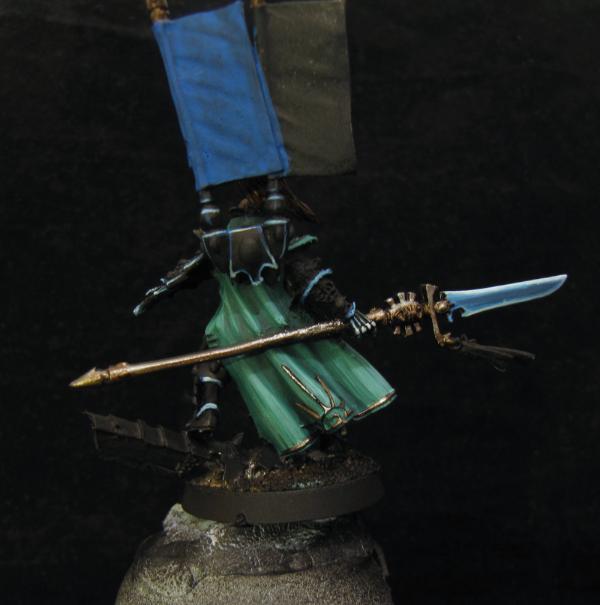
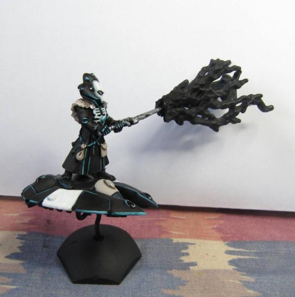
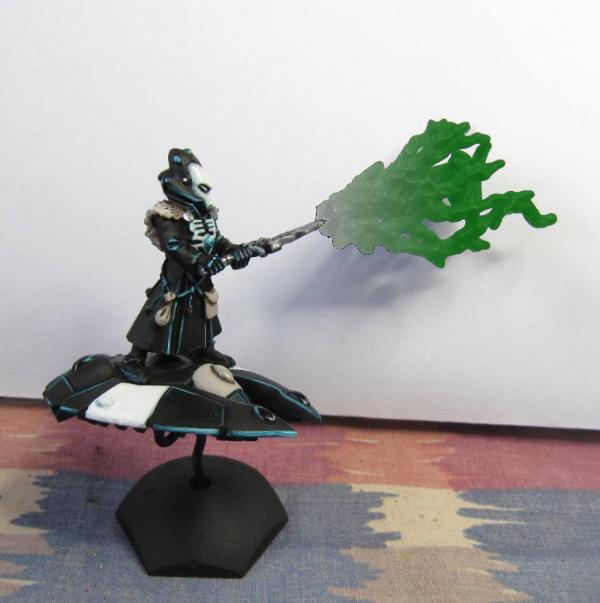
So today I finished off Eldrad, he was meant to be tabletop but I pushed him further as the model is stunning. He needed to look like a character rank model while still matching the army, so hes turqoise green, with white armor matching the exarch and the black and white guys on the platforms. Red trim + gems matches him with the units, and gold and slight glow effect ties him with the harlies and warp spiders, he looks really nice with the army behind him but also looks unique, so it went well. Might do some more work on the helmet, going to darken the slight green shading between the white panels I think.
- Click for huge
I had a very ineresting weekend that could lead to some good news in the near future, fingers crossed for it!
edit: Hmm, the little extra shading finished him I think-
Eldrad is looking really nice Iffy, I really like how you've done the sword and the green in the gaps in the helmet really help to pull it together with the white.
Glad hes being liked! The sword was an experiment based on the warp spiders glow weapons, I wanted something bright and coloured as a focus point on him as if that sword was black, or bone lets say, he would seem a lot more pastel and washed out than he does now. It turned out nice and I'm definitely going to be using it again
I'm getting frustrated with my photo shots though, they seem grainy no matter what I try. Perhaps the camera itself just is not the best for micro shots. There is tons of light so it should not be a problem, but I can never seem to get sharp zoomable details. I think I should spend a full day when I next can testing out each of the cameras one by one to see which gives the cleanest macro shots, as the ones I am taking now really don't give a good representation of the mini IRL :(
Weety, I think it's some kind of crazy mental block. When I find a model really gorgeous I tend to feel a compulsion to paint it as nice as time permits. Just such a nice feeling to see a mini come together on it's own as opposed to only getting it's full bang when it's inside a unit.
Your camera is at least as good as mine. But all that really says is that we should both get new cameras - mines like 6 years old now! I hate replacing something until it is good and proper broke though.
Wow Eldrad looks great! I don't think I have ever seen him fully painted before; usually he is "Lord Eldrad of the Douche-world Eldar" in some primer grey tourney list
I hear you on sinus infections too. I had two this year, and after 7 or so years of not getting them (used to have 4-5 a year till college due to allergies) they put me down pretty well. Sounded like I had been smoking for 79 years at 6 packs a day and then ran a few miles. Felt about like it too :(
weetyskemian44 wrote:Your camera is at least as good as mine. But all that really says is that we should both get new cameras - mines like 6 years old now! I hate replacing something until it is good and proper broke though.
Darn straight Weety, if it works, it ain't broke. This camera is an awesome little one, I just don't think very detailed close shots are its strong point. That does not make it a bad camera at all.
Wehrkind wrote:Wow Eldrad looks great! I don't think I have ever seen him fully painted before; usually he is "Lord Eldrad of the Douche-world Eldar" in some primer grey tourney list
I hear you on sinus infections too. I had two this year, and after 7 or so years of not getting them (used to have 4-5 a year till college due to allergies) they put me down pretty well. Sounded like I had been smoking for 79 years at 6 packs a day and then ran a few miles. Felt about like it too :(
Oh dude, I can't even imagine how bad it would be if allergies were involved too :( Mine is very random and doesn't seem to be triggered by anything, I just get an infection out of the blue once a year or so. Have you heard of Neti pots? They are brilliant for keeping your head nice and clear. I use one once a week when needed and despite how hilarious it looks, it feels absolutely looooovely.
I want to apologise to any readers for my massive lack of updates, things have been a bit crazy in my home life. The last month has had all our free time spent travelling back and forth from home to Galway for interviews with a new company. The awesome news I had been hoping for arrived and my partner got a really great position with them, so we have handed in our notices and are in the middle of working off our last month while also trying to find a house in Galway and then get everything moved from Cork, all of which has to have be done before early August!
This means little painting time which is leaving me feeling awful, but it will all be over within a month and I will have all day to work on painting properly while at home, and not just my weekends. So thats a massive light at the end of the tunnel! I want to take the time to publically apologise again to the people who's mini's I have, I promise I will make the delays up to you guys any way I can.
Move was done yesterday, and I am now in our new house in Galway! (with a pc balanced on a tiny kitchen desk). Living room is being finished today, then starting on unpacking and sorting out my painting room for tomorow.
Updates should be starting again as soon as my desk is sorted out! Hopefully this little pay as you go internet dongle will manage the job until our broadband is added.
I knew there was something missing in my life lately, but I couldn't quite put my finger on it... Turns out there was an Ifalna shaped hole!
Glad to hear you will be back soon! At least then I can paint vicariously through you during my own move
Feels great to sit down and paint again Still waiting on my chair to be delivered though, so my back is currently in a shape resembling an & from hunching over on a cruddy kitchen chair!
First completed mini is all done bar a tiny bit of base work, still unpacking so had to use a pretty crappy background, sorry! I have a stock of nice paper I usually use hidden in a box somewhere.
Some gobbos are WIP and should be finished by tomorow, looking forward to updating a whole lot more often! Current frustration is trying to find somewhere to set up a proper light box but over half my painting room is currently boxes and packaging waiting to be taken down to the dump, so lighting may be dodgy for the next couple of updates.
That's a great Yriel paintjob! I was going for much the same with the highlights on the leather, but I like the smoother look of yours compared to the sharper (read- crappier/dirtier) highlights I put on my Inquisitor X-men model... I'm guessing blended?
Very nice though- if it's a commission, it'll make a fine centerpiece!
Gitsplitta wrote:Looks greaty Iffy... love the blade and the work on the banners. The bright highlights on the dark armor work nicely too.
Cheers Gits! The blade is letting itself down a bit in the photo, its a bit more colourful. I think the white background is causing it to look a bit washed out :( If our PC desks arrive today I can clear out whats left in my painting room and get a spot set up for a proper photo area at last! Heres hoping.
HF Izanagi wrote:That's a great Yriel paintjob! I was going for much the same with the highlights on the leather, but I like the smoother look of yours compared to the sharper (read- crappier/dirtier) highlights I put on my Inquisitor X-men model... I'm guessing blended?
Its basically thin lines of midnight blue brought up to nearly white through layering, I dont think I could blend lines very well if they had to be that thin, though I guess it would be easy to clean up with some black afterwards
I chose a point or two on each layer of armor where I wanted the brightness to lead up to and tried to stick with that idea, like his cheek and chin on the helmet, top of knees, fingers etc. It didn't take as long as I thought but having a brush with a really good point helps to say the least!
Alfndrate wrote:Ifalna, those gems are awesome looking, any tips on getting the gems to look like that?
I use the most common gem technique I think, the concave semi circle shapes of colour leading towards the bottom, but I like to start off with at least 60% of the gem in colour and only under half of it left black. Black shine gems can look absolutely stunning but I find fuller coloured ones to be a bit quicker as they can be a little messier. Decide where you want your light source to be and work from there. Shines coming from the same angle on all the gems really helps them work together nicer. I like to water down the colours more and more the closer I get to the final shade, the tiny final orange highlights were more of a wash than anything, but it helps them look blended
inmygravenimage wrote:Very, very pretty. Also, awesome use of kitchen towel!
Haha, at least it didin't have a floral pattern!
Lt. Coldfire wrote:I love him, Iffy. Very well played.
Really awesome you moved and now get to do what you've always wanted! One day I hope to get what I've always wanted -- a winning lotto ticket.
Thrilled you like him Coldfire, hes got enough hints of Turqoise to fit in nicely with everyone else, and the red sash and gems help finish that off
monkeytroll wrote:Lovely work, I really like the colour of the cloak. Glad you're settling in and are back on dakka.
I'm very glad too! I don't like dissapearing for a while, it's unproffesional and unfair on people who have given me work. We should be here for at least a year though, so unless my house explodes it shouldn't happen again for some time
GiraffeX wrote:
The way you've done that sword is excellent I love it. The cloak is really nice as well any chance we can have a shot of the rear!
I have a WIP shot of him from the back where the cloak is finished, but nothing else haha. I will get full circle shots of him today if my delivery arrives so I can finish unpacking the painting room.
Thats basically what it looks like from the back, though the area around the spear has been finished now.
Flatpack everything decided to finally arrive yesterday hence the no show, sorry! All desks up and seats made, pcs moved and painting room now clear of the whirlwind of debris it had collected.
Haha, more like "Ikea instant apartment except why are there no drawer tracks for this €300 euro desk and how come these handles are the wrong shape to actually fit onto the second one and also wow that Alan Key actually snapped while being used"
The cats are now using the empty drawer slots as beds, so I guess it all worked out in the end? Hah. Sorry for the delay on these pics, I actually finished them sooner but I have gone through hundreds of shots that were coming out severely over saturated despite using the same camera settings as normal. Still have no idea why, but these ones finally turned out. Prepare for many Gobbos.
If any had correctly positioned hands I would so have to make them some Fimo loot
Dark angel Ezekiel is well on his way to being finished, he has a very impressive banner that is causing me a bit of angst but should be done soon Painting him has emphasized that I need to find some pipecleaners to properly clean out the airbrush. Solutions arent clearing the nozzles as well as I had hoped.
Updates Unable to get pics up as my little brother was visiting, so heres some completed mini's from the meantime.
All nice and big, click for huuuge.
Ezekiel to tabletop-
A very fun to paint tabletop Maugan Ra-
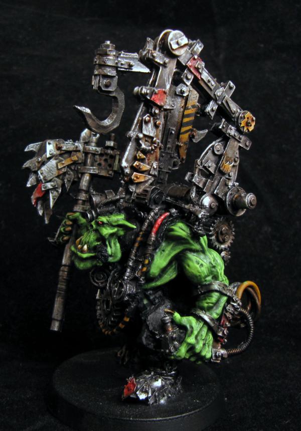
And an Orc Warboss as a speed paint practice-
I also had a really great experience with GW customer service, I opened my lillith booster only to find her entire upper arm was miscast and I had no way to sculpt a new one. I contacted them and they are being awesome and sending me out a new finecast one instead of just a metal arm. Hopefully its not miscast too, hah!
Aye I am using white primarily unless the scheme is going to be predominantly dark. It took a fair amount of getting used to but I am really starting to like working with it as a primer.
Those look great for a bunch of table top / speed painting minis Iffy, impressive!
I wonder what Maugen Ra would have looked like (and not too much more work) if you'd reversed the scheme on his shiruken cannon.. i.e. red with black edging? He looks wonderfully dark and foreboding but I just wonder if you haven't lost a bit too much of the drama by "loosing" his weapon in the scheme. Counter-changing keeps the theme while retaining the distinction of the weapon... which is very nasty.
Ifalna wrote:Aye I am using white primarily unless the scheme is going to be predominantly dark. It took a fair amount of getting used to but I am really starting to like working with it as a primer.
Never really used white much, don't like the consistency I get with a brush and too cheap/lazy to go buy a spray can! Will have to give it a go some time
I really like the speed test Orc. It's easy on the eyes and the small areas of color draw in the viewer. The rest of the model is simple, aesthetic, and suprisingly soothing.
Gitsplitta wrote:
I wonder what Maugen Ra would have looked like (and not too much more work) if you'd reversed the scheme on his shiruken cannon.. i.e. red with black edging? He looks wonderfully dark and foreboding but I just wonder if you haven't lost a bit too much of the drama by "loosing" his weapon in the scheme. Counter-changing keeps the theme while retaining the distinction of the weapon... which is very nasty.
Thats a really interesting idea actually. I don't think I would be able to get the same kind of effect going from red to black as shading the black would be really awkward, but I could build up the shading on the red instead. I'm actually going to test that out on a mini and see how it goes, it could make a really effective but fast armor scheme for Dark Eldar or whatnot. Thanks Gits!
Hatticus wrote:Never really used white much, don't like the consistency I get with a brush and too cheap/lazy to go buy a spray can! Will have to give it a go some time
You should definitely try it out! I always started from Black, even when painting extremely light or pastel models. Looking back, I was completely mad and I only did it because I was in my comfort zone using a black primer even when it was hindering me.
My HE stuff -
and
were both brought up from black, and when I look back and think how much time I could have saved using white, I facepalm :( You should try and get your hands on some cheap stuff from a hardware store, I'm pigeonholed with gamesworkshop as I live in the middle of the country and can't order online as An Post won't deliver "liquids", but I hear basic primers from hardware stores work well too and are super cheap. Painting white itself is a lot easier now that there is a pale grey foundation colour you can mix into it for lower layers Makes laying it down oh so much easier.
JB wrote:
I really like the speed test Orc. It's easy on the eyes and the small areas of color draw in the viewer. The rest of the model is simple, aesthetic, and suprisingly soothing.
He was great fun! Spending time on a mini that does not have a massive amount of detail is always interesting as you have to kind of paint on the detailing yourself, and I always find doing that pretty educational
Today will have a finished personal mini (if I can find where I stored my cork for his base) and some warp spiders either well into WIP or finished, Ill post them up before bed time. Really need to start actually posting on Dakka again instead of just posting in my own thread, it feels kind of rude of me.
GiraffeX wrote:Wow Iffy the white on Ezekiel is stunningly white, please could you share what paints/how you get to that brightness its lovely.
Not too sure on Maugan Ra's weapon being the same colour as him, it kind of gets lost in the mini.
The Orc Warboss is really cool how long did it take you?
Maugan is getting some mixed responses, I like it because it being uniform makes him look almost camouflaged, but I really do get where people are coming from saying the weapon looks a bit lost :( It's down to Coldfire, if he wants it repained it won't be a problem
The white is pretty easy but does take a while, if I ever find a way to get whites white without them taking 10 layers I will be thrilled hah! Its astronomicon grey as a base then mixed layer by layer up to white. Make sure to keep the final few layers very watery to get a smooth satin finish.
The Warboss was about 3.5 hours which is very quick for me, but I learned a fair bit with him including a new recipe to make reds really pop
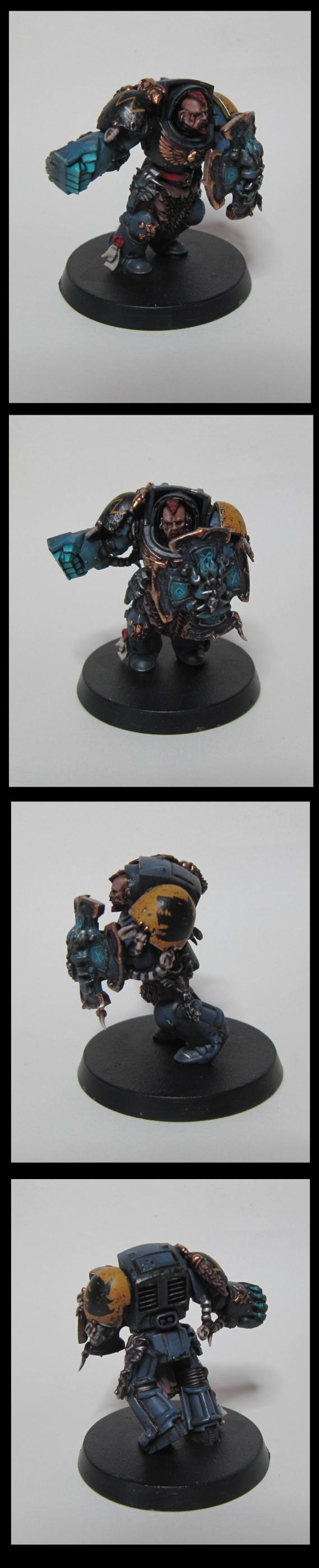
Finished up my personal piece for today, hoping he will Ebay so I can buy some nice treats this week.
The banner really, really annoyed me, mostly because its just a terrible banner thats actually quite empty and without enough texture to shade it. I was really tempted to cut it off as I personally think its a bit much on this figure but its joined at a few places and not just the backpack, so I had to leave it on ¬_¬
For such an easy to get and relatively cheap figure this is a really nice one. I love the detail on it and the face is really nicely sculpted. I don't think I painted him up as any specific chapter, he's blue but not mega ultramarine blue and I went with basic " I am an important dude" colours for him with a vibrant red and metals. I think I am addicted to blue swords. Starting to really enjoy working with GIMP too, nice results and easy enough to use considering it is free!
Somehow, I'd never visited this blog until now! Just made it through the first dozen pages, enjoying seeing the progression in methods as you try different things on the commissions
Reecius wrote:Excellent stuff in here, really like it!
Thanks a ton!
RiTides wrote:Somehow, I'd never visited this blog until now! Just made it through the first dozen pages, enjoying seeing the progression in methods as you try different things on the commissions
Hah, welcome This is my blog. There are many like it, but this one is mine.
GiraffeX wrote:Thanks for the tips on the white, After I've gone through my Khorne stuff I'm going to find something I can practice this on.
The Captain looks really nice, I'm sure he will sell.
Let me know when you get some done so I can have a look. And yes, hopefully he does!
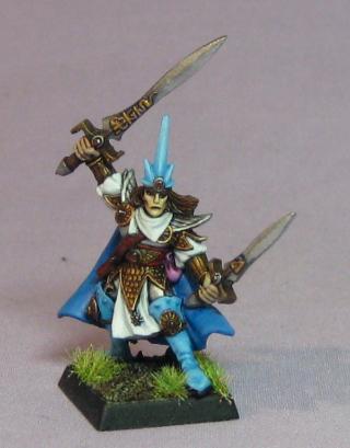
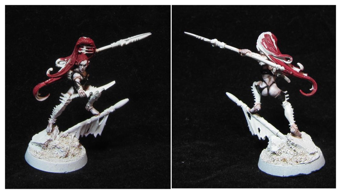
Flashman wrote:Nice WHQ Elf Ranger (happy memories) and good work as always. very impressed with your speed painted orc, it's very neatly done.
Thanks very much. I really love that model, I'm not sure where I got him but I know I had him a rather long time before actually painting him. He was the first mini I spent a fair amount of time on, I remember reading Dakka for hours beforehand going over tutorials to use.
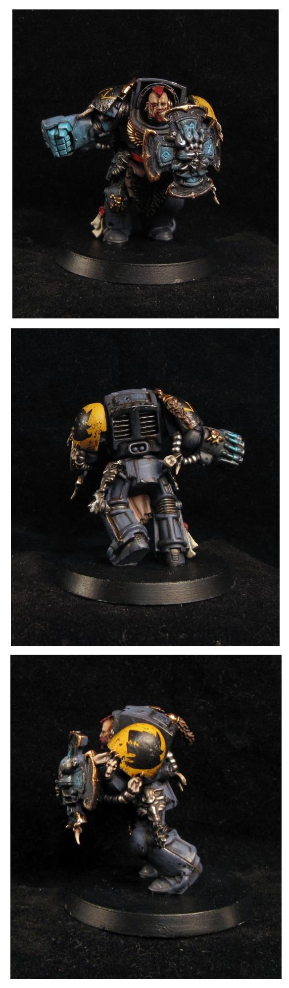
Here is the new and updated Muagan with a Coldfire seal of approval!
Click for huge
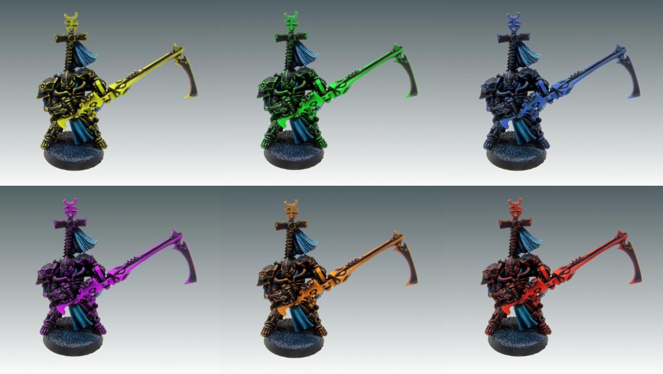
I think I am finally starting to get GOOD WITH COMPUTER and able to perform basic image tweaks, I got rid of the very irritating orange colour caste my camera insists on throwing on reds and this is a much better idea of his real colour in hand. While I had a soft spot for the full matched weapon, I admit this one is very eyecatching.
I think I was looking into it a bit too much When I was thinking reverse the colours, I was thinking Red with a Black fade highlight as the reverse of his red highlighting, and that would be a nightmare.
So I just reversed the highlight "sizes" instead, so he is mostly black with red highlights, and the gun is mostly red with black recesses. Durr D:
Cheers Bunnygurl, I ran him through some hue filters and got some really nice ideas to use in the future.
I only just realised how useful hue alterations are for coming up with interesting new ideas :O
Getting a fluorescent purple will be hard though, I use a Vallejo fluro orange/blood red mix for final highlights on red, not sure how to go about the same thing for purple. Will be fun to try it either way.
And aye Gits, it's really handy for coming up with ideas. I'm using GIMPS hue alteration for it and getting some good ideas to use in the future Should try it out, GIMPS free afterall, even if it has a very worrying name.
Haha ok Im done, back to painting May have updates tonight.
GIMP is really powerful for something that's free. Well worth a go if you need something for more than cropping photos.
Nice work on Maugan Ra. He does look much better with the red more prominent on the shuriken cannon. I can't help but feel his head is getting a bit lost in there too though. Could you increase the amount of red around the facial area and fade it to black at the back of the helmet?
haha now I want a Necron army in the green scheme. Good show, Ifalna! I agree that the reverse scheme on the red gun really pops, but I can see why you're tied to that original, darker one.
endtransmission wrote:GIMP is really powerful for something that's free. Well worth a go if you need something for more than cropping photos.
Nice work on Maugan Ra. He does look much better with the red more prominent on the shuriken cannon. I can't help but feel his head is getting a bit lost in there too though. Could you increase the amount of red around the facial area and fade it to black at the back of the helmet?
Gimp is indeed amazing, Im super happy I tried it out on the recommendation of a fellow Dakkite I think using the same scheme on the head could work out nicely alright, and I may well try it if I redo this scheme in the future, which is likely. I kind of need to leave Maugan be for now though, as he is only meant to be to tabletop
Hatticus wrote:The yellow Maugan Ra looks cool!
He does, he would be hoooorrrrible to paint though, imagine getting that bright a yellow over black? OUCH!
weetyskemian44 wrote:Nice and colourful. Gimp is so powerful that unfortunately it took up to much space on my hard drive - great program though.
Love what you do with these eldar
My old Pc could just about handle it. Magic wanding large images is a serious strain, I'm only unearthing the wonders of using it now as I bought a monster PC before I left work as I figured I really needed to get something that would not need upgrading for a few years while I still had the option to get it >< Paint.net is another decent free alternative, I don't think its as aggressive to run as GIMP is either.
monkeytroll wrote:That Maugan is lovely, really eye-catching, much more so with the re-done dakka. Err, cannon.
Like the look of the purple and blue ones too. Maybe you should paint up a Warhol Maugan set
That would be freaking amazing, imagine that Maugan Ra, TASTE THE RAINBOW. Could do the same with some Marines, it would be stellar.
Moltar wrote:haha now I want a Necron army in the green scheme. Good show, Ifalna! I agree that the reverse scheme on the red gun really pops, but I can see why you're tied to that original, darker one.
I like the darker one because it looks all meldy and interesting, but I also like the different version too I think if I was doing a unit like this for myself, I would have everything be the one scheme like the original version, but I would do something clashing, like really blue gems or yellow gems to make them a little crazier.
My Replacement Lillith just arrived from GW, it's in worse condition than the metal one I was contacting them over in the first place. She has somehow lost around 50 pounds in her transition to resin, elongated neck, skeletal face, massive straining sinews. Horrible. I mean her detailing is lovely, but she looks like a different mini and the amount of flash and holes.. ugh.
At least the arm that was miscast on the metal version is good on the finecast, so I can just use that instead
Ifalna wrote:The white is pretty easy but does take a while, if I ever find a way to get whites white without them taking 10 layers I will be thrilled hah! Its astronomicon grey as a base then mixed layer by layer up to white. Make sure to keep the final few layers very watery to get a smooth satin finish.
I've given the white a go but I couldn't get it as white as yours, do you think it needs more layers?
I came up from a black undercoat so that may be why its lost some of the brightness.
So got quite a lot done, pictures of recent progress are all on the way
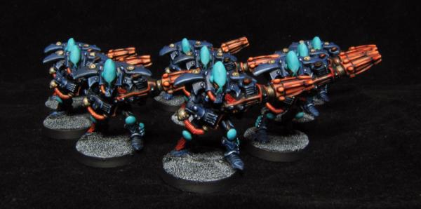
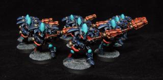
Firstly, Warp spiders.
I cannot even begin to describe the heartache these caused me. After coming up with a pretty snazzy 80's scheme with Coldfire, I was really excited about bringing it to life. Bit god, the orange. The orange.
I redid it so many times. It was coming out too yellow, too pink (?), too brown, every time I started bringing it up to a white glow point it just went wrong. Eventually settled for a vellejo model colour orange that mixed with blood red managed to get what I was looking for, but these were awkward little dudes. All turned out well in the end though, and I am satisfied that they are blinging enough for tabletop. They turned out to be my favourite of the spiders units, I think it is the duck egg helmets and little black "The Crow" eye lines.
Coldfire was bang on with the orange eyes and glow, it just turned out to be quite the lesson for me!
GiraffeX wrote: I've given the white a go but I couldn't get it as white as yours, do you think it needs more layers?
I came up from a black undercoat so that may be why its lost some of the brightness.
I had a look at that actually looks like really nice white, I think what might be causing it to look not so bright is that nearly the whole model is white. There is very little dark contrast, and I find personally that the dark contrast is what really helps makes whites pop. Most of my mini's with really bright white have black or very dark parts close to them, and that helps emphasise it to the eye. I think that actually looks really nice, and I am very impressed you brought it up from black!
I have more shots to come, I have to just go through the 40 something I took to find the good ones More later.
Coldfire will taste the rainbow. The army is a psychedelic mishmash of insane colors, but in a good way
Next up is a test Space Wolf, lovingly dubbed "Mr Impossible to Photo". I don't know if it is how dark and grimy he is, or if it is the neutral tones, but no matter what I try (60 shots and counting) I can't get an accurate representation of what he looks like in the hand. It's rather upsetting as I am really proud of this guy, and I learned a huge amount on him regarding weathering and OSL, he just gets let down in the photo's :(
Here he is at the moment, I need to get a dirty snow base on him, then I'm going to have to set up an intricate mirror array like in the fifth element to desperately try and get the perfect amount of natural light to show what he looks like in hand. He will be my photogenic holy grail.
That SW is looking ace, Iffy! For darker minis, sometimes the colors and details will show up better if you use a darker background. Not sure if you've tried that or not.
Ifalna wrote:I had a look at that actually looks like really nice white, I think what might be causing it to look not so bright is that nearly the whole model is white. There is very little dark contrast, and I find personally that the dark contrast is what really helps makes whites pop. Most of my mini's with really bright white have black or very dark parts close to them, and that helps emphasise it to the eye. I think that actually looks really nice, and I am very impressed you brought it up from black!
Thanks Iffy glad you like her, I think your right if there were more darker colours the white would stand out more.
Ifalna wrote:I have more shots to come, I have to just go through the 40 something I took to find the good ones More later.
Looking forward to seeing what else you have for us this weekend.
I always wonder whats on the back of the spiders as they have such a big plane space just asking for snazzy designs. I know they are table top quality though, do they have something extra they are hiding?
I took a lot of shots with my black velvet backdrop, but his dark areas are so dark they are pretty much dissapearing. Plan is to take some mid light long exposure shots with the black backdrop to try and get some proper crisp details while not wrecking the contrast, he is the first mini so far that has caused me this much hassle to shoot!
Good photo or not, out of all the mini's you've posted I think he may be my favorite. The amount of grime, the blood around his eye, the whole package just works perfectly to give that dark 40k feel. Awesome job!
I love them, Iffy! Taste the rainbow indeed. I'm going to be obligated to eat skittles when playing a game with these eldar.
I think the space wolf paintjob is looking really awesome, although I don't approve of space mehrines. My eye was initially drawn to his powerfist, which, if you were in battle with this guy, you'd probably want to watch out for that first thing as well.
WOW, that space wolf is amazing. I absolutely adore the skin tones, and his armor is just fantastic. Looking at the model my eye are telling me he must weigh a half ton at least. That sort of "eye feel" is really hard to achieve in models I think, but wow, that man really pulls it off.
The spiders are great and all, but goddamn, that wolf is great! Damn, I love the shield too.
I suddenly feel the urge to whip my work in progress Orboros lads across the room and just cry. :-(
GiraffeX wrote:
Looking forward to seeing what else you have for us this weekend.
I always wonder whats on the back of the spiders as they have such a big plane space just asking for snazzy designs. I know they are table top quality though, do they have something extra they are hiding?
Heehee, they have no secrets I am afraid, just plain backs with their gems done and some highlighting I do enjoy trying out freehand designs like on the wolfs shoulder, but I would be keeping it for character standard and up as it is so super time intensive!
IceAngel wrote:Good photo or not, out of all the mini's you've posted I think he may be my favorite. The amount of grime, the blood around his eye, the whole package just works perfectly to give that dark 40k feel. Awesome job!
Really happy you like him! I am going to try for a few more shots that will hopefully work out tonight and tomorrow, it's reeeeaally frustrating me!
monkeytroll wrote:Look forward to seeing even better looking pics
So do I! Hah.
Lt. Coldfire wrote:I love them, Iffy! Taste the rainbow indeed. I'm going to be obligated to eat skittles when playing a game with these eldar.
I think the space wolf paintjob is looking really awesome, although I don't approve of space mehrines. My eye was initially drawn to his powerfist, which, if you were in battle with this guy, you'd probably want to watch out for that first thing as well.
I'm so thrilled you like them dude, most do look much nicer in real life than they do in the shots, so I am really hoping you will be chuffed when they arrive.
I finished off the last few "poor unfortunates" guys who broke in transit or were not done with their full units for one reason or another, 6 in total, heres a quick shot of 3 harlies and a hawk
That is everything done now bar the special effects on the end of those weapons :O I shall unpack everyone and take a group shot tomorrow and see what the census is on what colour to do the effects. I am thinking blue to white(?) but am slightly worried that might look a bit like a giant flower!
Wehrkind wrote:WOW, that space wolf is amazing. I absolutely adore the skin tones, and his armor is just fantastic. Looking at the model my eye are telling me he must weigh a half ton at least. That sort of "eye feel" is really hard to achieve in models I think, but wow, that man really pulls it off.
Wow man, that means a lot from you. I really upped the dirt and wear factor on him, it was really fun as I never did it before so I learned oooh so much. His colour was just 3 layers airbrush, then everything else was wear and tear, so it felt really awesome to start with pristine nicely shaded grey armor and then muck it up!
Excellent. I wasn't so sure what "chuffed" meant, so I looked it up. According to dictionary.com it apparently has no real meaning as both meanings cancel themselves out:
Is that a kind of wikki dictionary? Might explain the alternate definition. My experience with other dakaknaughts from the UK is that is has been exclusively used as in the positive sense.
Gitsplitta wrote:Is that a kind of wikki dictionary? Might explain the alternate definition. My experience with other dakaknaughts from the US is that is has been exclusively used as in the positive sense.
Bah, Dictionary.com doesn't even define ironic properly. Bloody descriptive dictionaries! They are the work of false lexicographical gods!
And wow, I need to get an airbrush so badly, if only because of the excellent use you have put yours to. The weathering is just great too; I really love marines that look like they have waded through hell and brought some with them instead of the very shiny pretty ones.
Pretty pretty. Me likey eldar - specailly the death jester who is a sinister looking fellow
In cornwall a chuff is our national bird (funnily enough its extinct in cornwall). An if someone says "I can see your chuff" It means something rude; also "up your chuff", "get chuffed", "I'm going to go chuffing mental", "right in the chuff"
But personally I prefer real swear words unless my elderly parents are present
God bless the Internet for teaching us the wonders of commonplace words having different meanings elsewhere!
I spent a fair amount more time taking shots of this damn wolf and I think these give a way better idea of his actual tone/scheme. I think I am happy enough to stop photoing him now, before my hands fall off.
I also realised a missed a bit of gold on his shield trim, hnnrgh darn it. Oh well, at least that is easy to fix! (Loving the fluff stuck all over my velvet. I blame moving house and all the dust!)
Finally, I need advice from the world of Dakka. The last part of the Eldar that needs doing are the spell effects on these guys here -
So basically what is black there needs to be coloured. Now the colour itself is driving me a bit mad, I am not sure what it should be considering the variety in the army. I was thinking it going from white-blue with the airbrush, but there is a lot of blue already and I am a bit stumped.
I am going to put up mini pics of all the units so the colour's are easy to see, if anyone has any ideas of what the lightning effects should look like that would go well with all these guys, then please do post suggestions!
EDIT: And sorry for going a bit off topic, but do you know what would be a good color scheme for Dark Eldar? Can not come up with anything Also, I am sure someone on Dakka could make you a sig if you asked around. It is not that hard. Give them a size, general feel, and, SHAZAM, a sig is finished. Heck, I could do it. Have messed with PhotoShop here and there.
That space wolf is looking even better now in the new photos. I would vote for a pale lime green for magic blasts! Probably just me though. Chuffing marvelous
Just browsed through the thread and I must say, that's some really nice painting. ^^ I love the moody look and the slightly muted tones even on the bright colours. That's some wonderful shading. Bootiful!
forruner_mercy wrote:I have to say: you are a very good painter.
EDIT: And sorry for going a bit off topic, but do you know what would be a good color scheme for Dark Eldar? Can not come up with anything Also, I am sure someone on Dakka could make you a sig if you asked around. It is not that hard. Give them a size, general feel, and, SHAZAM, a sig is finished. Heck, I could do it. Have messed with PhotoShop here and there.
Thanks very much dude! Dark Eldar are really down to personal pref, I think if I was doing them for myself I would go with shiny black armor plating with acid green highlights, I really love the mix of glossy back and extreme highlighting. Then again I am painting some Wyches up atm that are dark grey for cloth with glossy black armor with red trim, and that looks pretty nice too.
Thanks for the sig offer, an awesome chap made me a really nice one, I'm just not using it at the moment as commissions are closed so there is no real point
Thom wrote:I am in love with the work you've done on the Eldar. Truly inspirational.
Thank you very much! I learned a lot with these guys, and I give massive Kudo's to Coldfire for coming up with such amazingly eye catching schemes.
Meph wrote:Just browsed through the thread and I must say, that's some really nice painting. ^^ I love the moody look and the slightly muted tones even on the bright colours. That's some wonderful shading. Bootiful!
Coming from you that really means a lot Meph. I am beyond flattered.
weetyskemian44 wrote:That space wolf is looking even better now in the new photos. I would vote for a pale lime green for magic blasts! Probably just me though. Chuffing marvelous
CHUFFTASTIC. I threw in a lime green shot below, I think it looks pretty coolbeans.
Lt. Coldfire wrote:Can GIMP assist? I was thinking purple for the spews and pows
YES IT CAN! Haha, I did two very quick tests with it using green and purple, I think you are bang on with the purple, it looks cartoony yet rather awesome.
(I have no idea what I am doing with Gimp, talk about a learning experience.)
Hmmm I'd go with the purple, looks more moody.
it might require some experimenting, but have you thought about inverting the highlights for those purple lightnings? I.e. white in the recesses and dark for the highlights. It might create a more luminous effect?
Ah GIMP, that app can make me feel handicapped easily, such a clumsy interface. Give me Photoshop any day of the week, those shortcuts I can play like pianist. ^^
Ifalna, does it have to start with white by the sword and then to the purple? Or can you switch it? Start with the purple by the blade and then fade to the white.
GiraffeX wrote:
I must say I think this is your best mini so far that I've seen, theres so much to take I don't even no where to start.
A whole squad like that would be draw dropping.
Thanks so much! As for a whole squad/unit like this, well, lets just say stranger things have happened.
Wehrkind wrote:Hmmm can't help you much I am afraid; after seeing the bit about the dust on the back drop, all I see him wielding is a giant feather duster.
Maybe green with shots of yellow through it? Or will that just look like a Swiffer?
That would look exactly like a duster. It would be pretty hilarious
Meph wrote:Hmmm I'd go with the purple, looks more moody.
it might require some experimenting, but have you thought about inverting the highlights for those purple lightnings? I.e. white in the recesses and dark for the highlights. It might create a more luminous effect?
Ah GIMP, that app can make me feel handicapped easily, such a clumsy interface. Give me Photoshop any day of the week, those shortcuts I can play like pianist. ^^
Leaving the recesses of the lightning white could have looked awesome alright, but it would take a crazy amount of time for tabletop models :( Could well be something I try in the future though.
weetyskemian44 wrote:The purple does look good
IceAngel wrote:Ifalna, does it have to start with white by the sword and then to the purple? Or can you switch it? Start with the purple by the blade and then fade to the white.
I think that could have worked really nicely too, or even going from a pale to dark version of the one colour instead of using a white. I think there is a lot of leeway when it comes to magical lightning!
So they are all finished now bar some cleanup (how did the wires even manage to get that colour?) and they look pretty impressive as a unit, especially with the couple that don't have the effects. I think I got the colour pretty close to the GIMP version in real life, they are a little colour caste in the photo.
If they get the thumbs up from Coldfire then it is time to box these babies up!
Starting on an interesting Grot for a certain Gits Don't know if I will have enough badab black around to get the metals sorted, but I hopefully will. Updates soon!
Yes, the lightning thingies are from star wars action figures actually. I attempted to make some lightning out of greenstuff, but that lies at the bottom of Iffy's trash bin, where it belongs They look great. The purple really works well IMO.
Ifalna wrote: If they get the thumbs up from Coldfire then it is time to box these babies up!
I live in Yorkshire but am not originally from here. My girlfriend uses chuffing as a substitue for the f word.
The other day my five year old son saw our neighbours cat and said "Awwww she's chuffing cute"
Oh god I had completely convinced myself I already posted these but I didn't. Goddd D:
Well, here is the first completed character standard Grot, I am really happy with his skin tones and the overall weathering for his banner/pole.
and a clear shot of the banner (grot was still WIP at this stage)
Currently working on the Ork this lad comes with and some really nice little resin wolves, some quick WIP shots of the Ork here. Only his metals are finished, there may welll be more faded painted areas added. Skin has just started
I recently stumbled upon this blog thanks to good old google, and i must say that your work has truly astounded me........so much that i joined this site, just so that i could comment. Your tabletop standard really is immaculate, and after reading the blog from the start, i can see that you really enjoy your painting. I understand that you are busy, but thought i would ask anyway (hope that's OK with you).......when would you next be available for a commission?
monkeytroll wrote:Ooh, love that little fella. Very nice skin tone, it's almost glowing, and yet doesn't stick out as really brightly coloured skin, great job
Thanks so much. I spent a lot of time on the skin, 1 because it is tier 2 standard, and 2 because I really wanted to focus on making it look like the light source was definitely coming from above. Made sense as he is so very short. Learned a lot on him that I will be using in the future
Broonba wrote:I recently stumbled upon this blog thanks to good old google, and i must say that your work has truly astounded me........so much that i joined this site, just so that i could comment.
Your tabletop standard really is immaculate, and after reading the blog from the start, i can see that you really enjoy your painting.
I understand that you are busy, but thought i would ask anyway (hope that's OK with you).......when would you next be available for a commission?
Hiya Broonba, thanks so much for the compliments. It means a lot that you actually made an account just to say hello! I'll Pm you.
PDH wrote:The grot is just fantastic. Looking forward to seeing the mek done
Well here is an update
Skins are now done awaiting the . Started on some basic detailing like teeth and nails, looking forward to working on the cigar, it will be another chance to try some new things like continuing on the small lights OSL. Really happy with the skin, best I've done so far I think, but that might be the hours and hours it took talking
Also, quick peek of my WIP being done while the Orks bits dry, hence her being random parts painted Skins done though.

 I generally use actuall thinner like the Vallejo variety instead of water, but that's mostly just because I have it on hand and have grown used to using it.
 We are both winners then! Charlie Sheen style, bar the terrible breakdowns and with more tiny metal men!
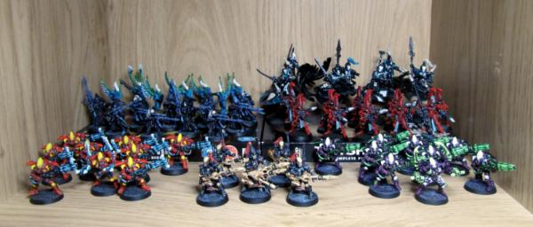
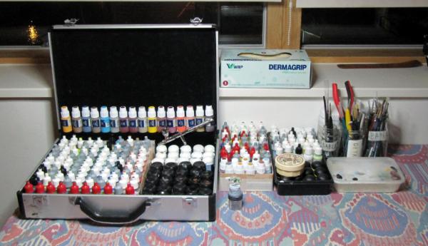


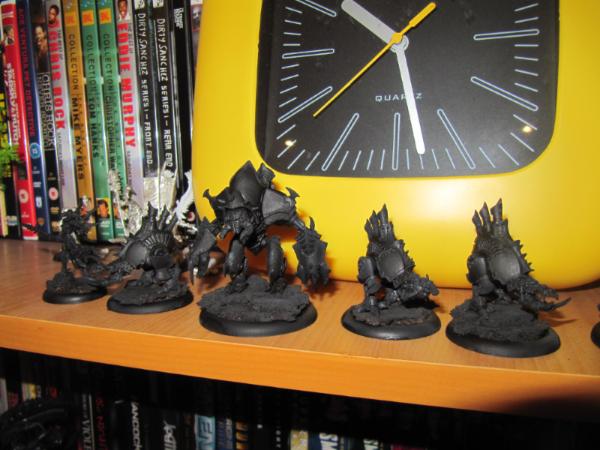
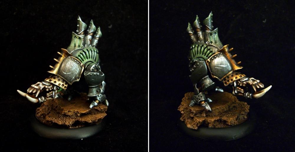
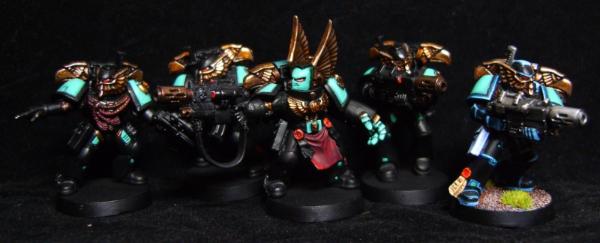
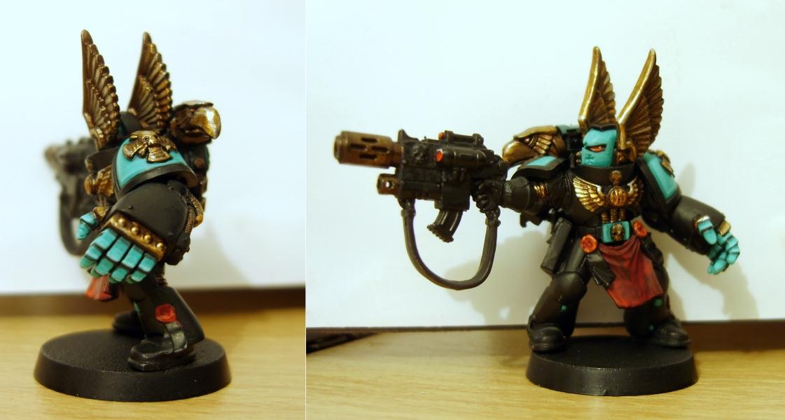
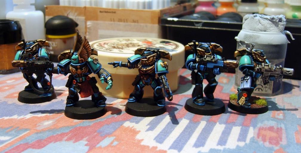
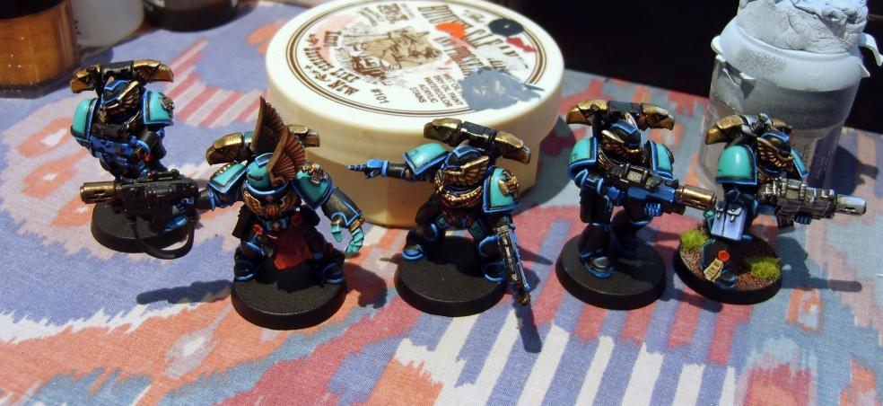

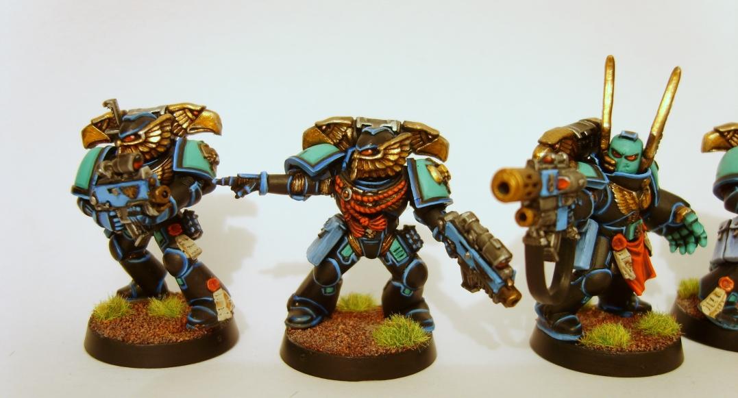
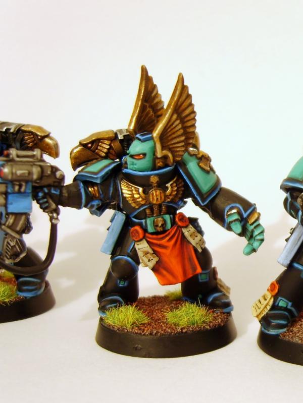
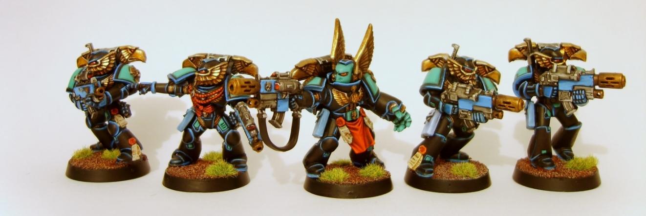
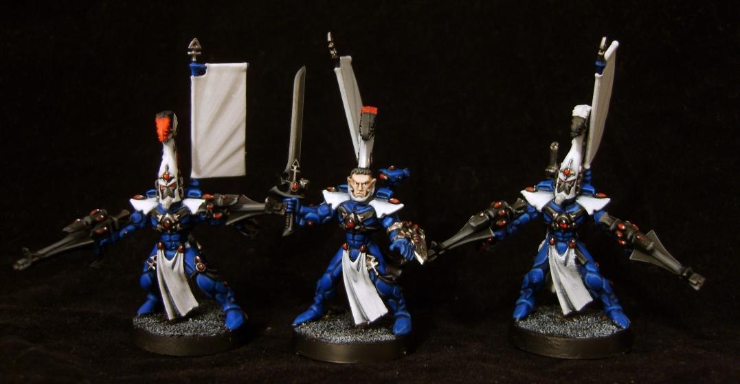
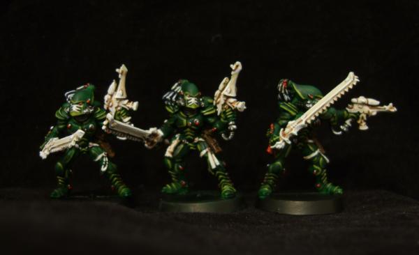
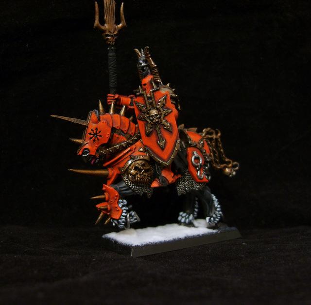

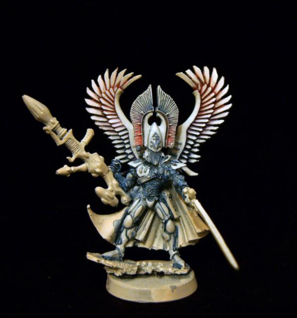
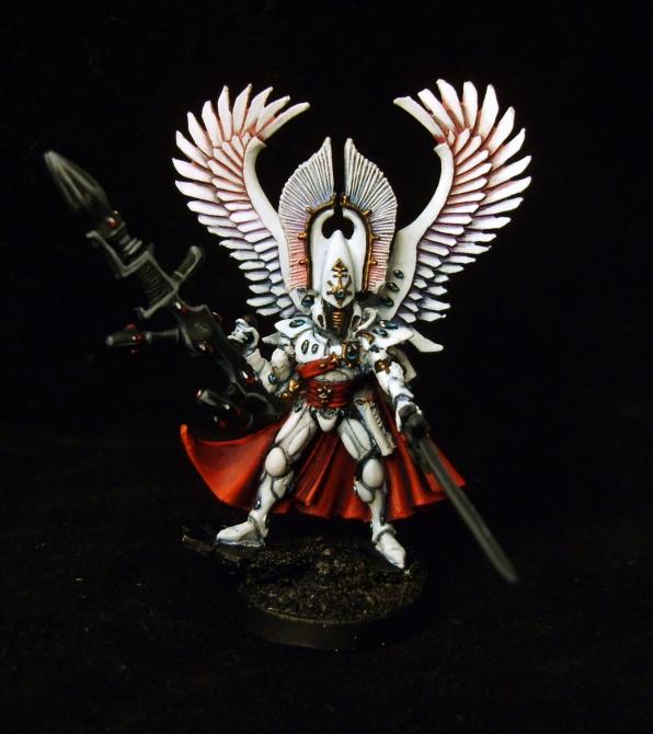
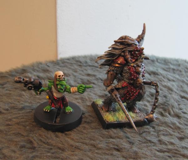


 Pure silliness! Would be fun as a diorama but I just know if someone is going to paint it I will end up seeing it played in a tournament somewhere >.<
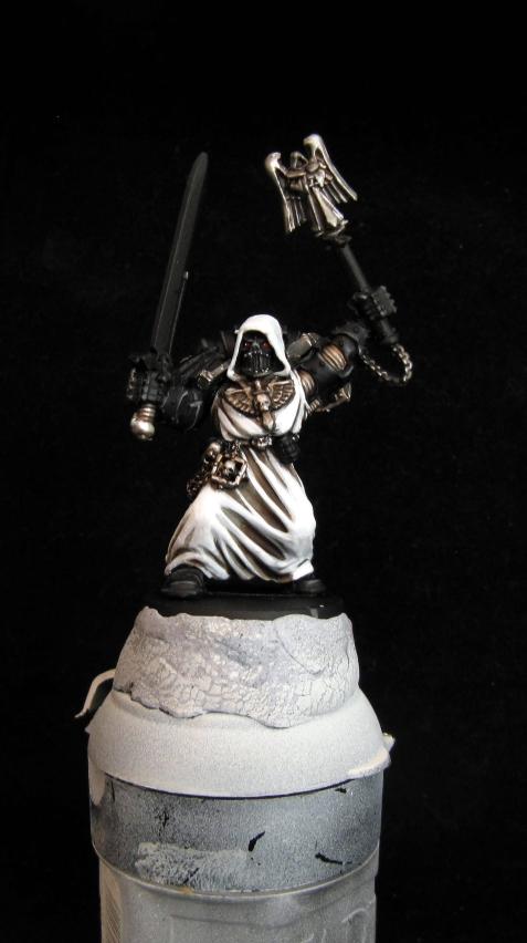
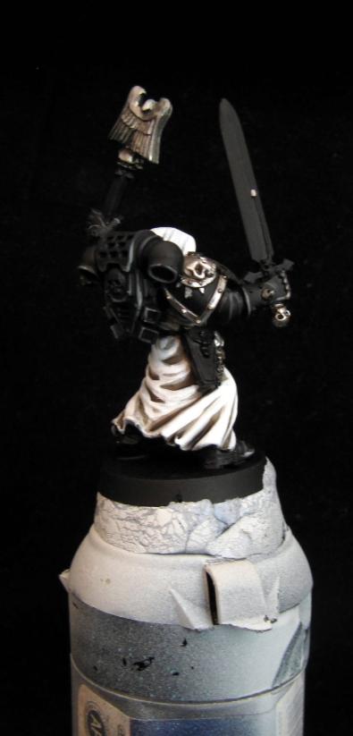
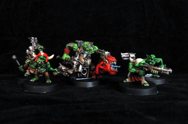
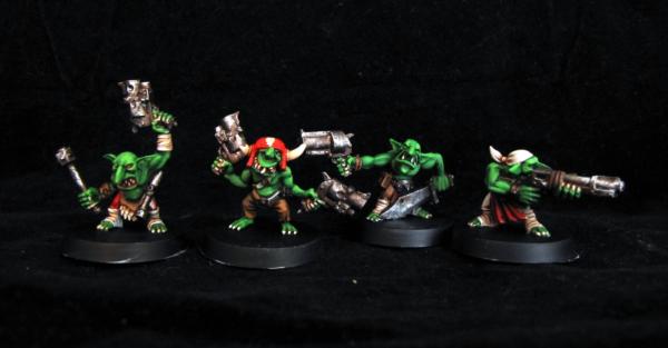
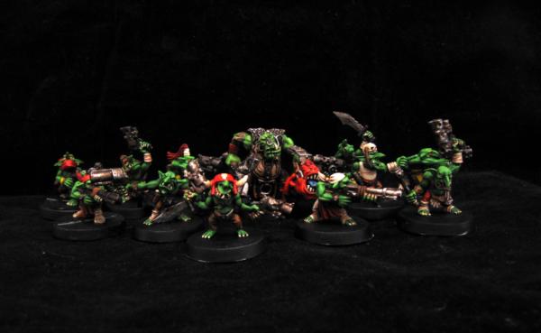
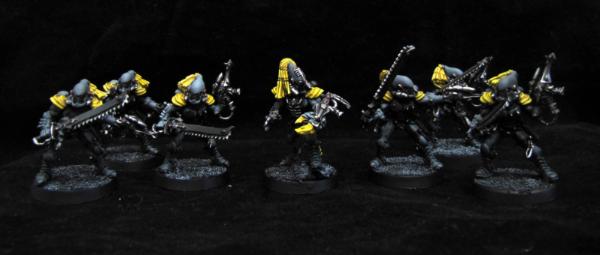


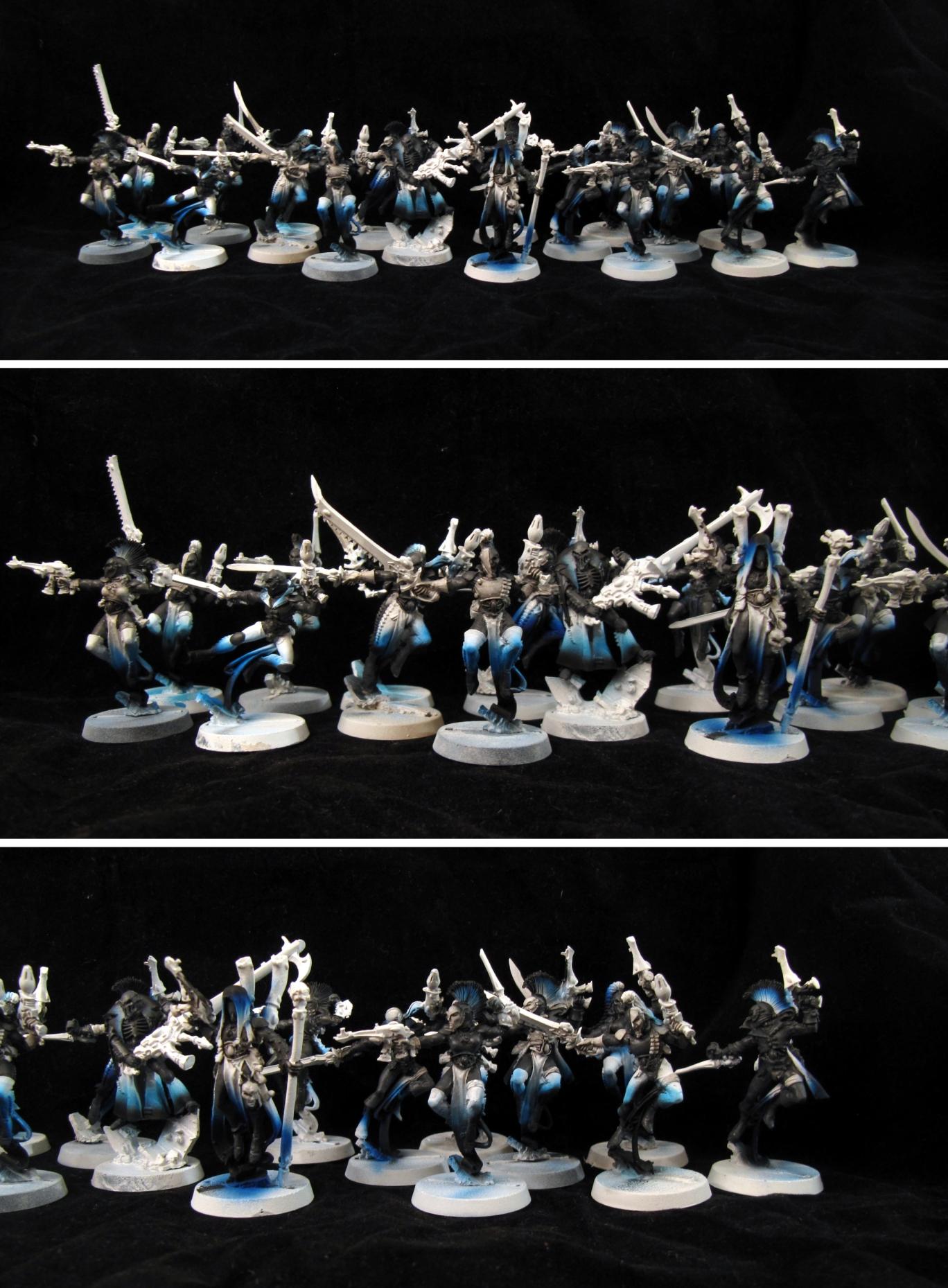
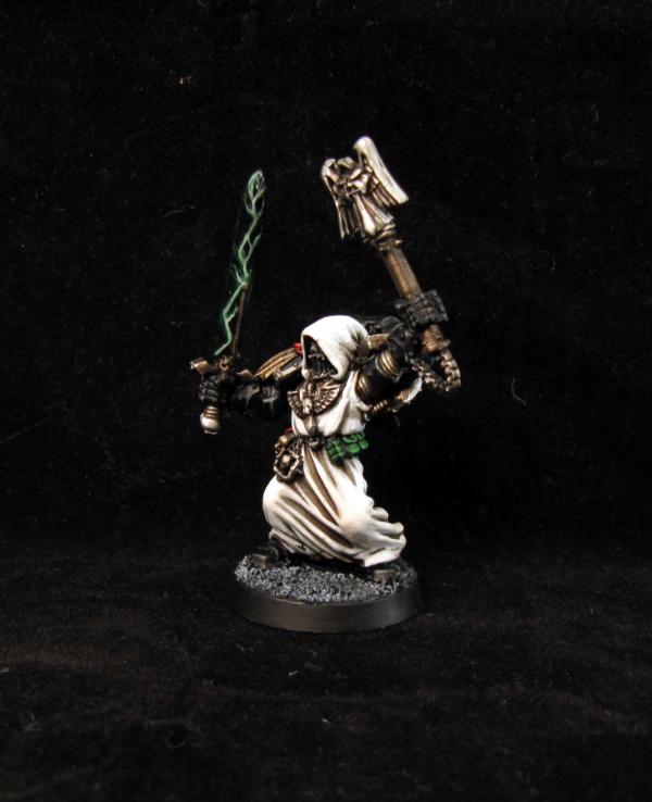
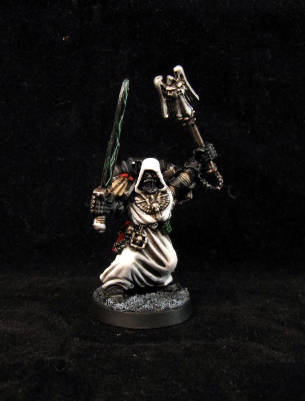
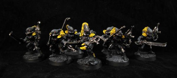
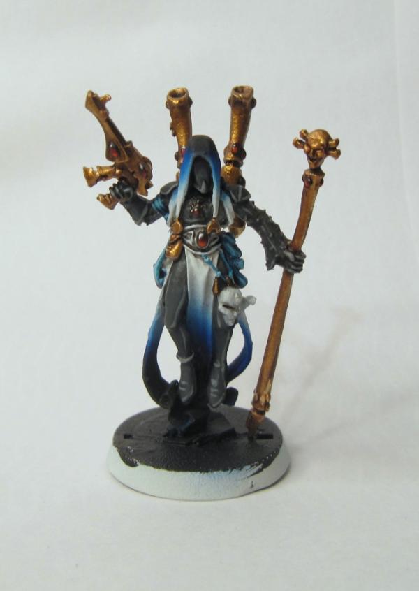


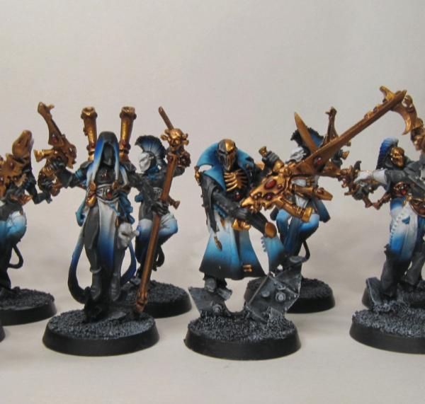
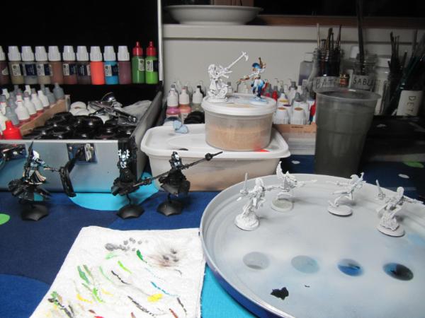
 Worried I'll forget what I'm using and start dry-brushing with it