| Poll |
 |
|
|
|
| Author |
Message |
|
|
|
|
|
Advert
|
Forum adverts like this one are shown to any user who is not logged in. Join us by filling out a tiny 3 field form and you will get your own, free, dakka user account which gives a good range of benefits to you:
- No adverts like this in the forums anymore.
- Times and dates in your local timezone.
- Full tracking of what you have read so you can skip to your first unread post, easily see what has changed since you last logged in, and easily see what is new at a glance.
- Email notifications for threads you want to watch closely.
- Being a part of the oldest wargaming community on the net.
If you are already a member then feel free to login now. |
|
 |
2010/05/07 01:29:24
Subject: Is GW cover art improving or declining?
|
|

[MOD]
Solahma
|
The new BA dex cover is by Dave Gallagher.
I'm sorry to say it, as it sounds a bit rude, but deriding John Blanche's artwork is a sure sign of poor taste. It's like saying Dan Abnett writes better books than Ian Watson.
Dave Gallagher is also a great artist and it's a shame that his cover for the new BA dex is marred by the Sanguinary Priest's strange posture. I love the way he does the Mark 5-esque helmets, for example.
|
|
This message was edited 3 times. Last update was at 2010/05/07 01:33:52
|
|
|
 |
|
2010/05/07 06:05:39
Subject: Is GW cover art improving or declining?
|
|
Ultramarine Master with Gauntlets of Macragge
|
Anyone putting down John Blanche's work ought to shut their uncultured mouths. I would love it if he was drawing codex covers again - I still wish I could get a giant print of his 2nd ed cover art so I could frame it and put it on my wall.
^^^^ and Manchu, you are one of impeccable taste. Let's be Blanche buddies.
|
Check out my Youtube channel!
 |
|
|
|
|
2010/05/07 07:13:22
Subject: Is GW cover art improving or declining?
|
|
[MOD]
Solahma
|
Brother SRM wrote: Let's be Blanche buddies.
It is already the case. Remember when this was a dex cover?  That gak could melt your face. I can hear angelic choirs of squealing metal licks just looking at this visual feast!
|
|
This message was edited 1 time. Last update was at 2010/05/07 07:15:29
|
|
|
|
|
2010/05/07 07:45:40
Subject: Is GW cover art improving or declining?
|
|
Bounding Assault Marine
|
You ever notice how much like Priss, from Blade Runner that Sister of Battle looks.
|
No good will come of this, No good at all
WAAAGH! FOR THE EMPEROR!
 Midnight Dragons: 2000pts Wins 3 Loses 1 Draws 0 Midnight Dragons: 2000pts Wins 3 Loses 1 Draws 0
 The Fox Knights: 4218pts Wins 1 Loses 2 Draws 0 The Fox Knights: 4218pts Wins 1 Loses 2 Draws 0
 King Krumpz Boyz: 2965pts Wins 1 Loses 1 Draws 1 King Krumpz Boyz: 2965pts Wins 1 Loses 1 Draws 1
 Tigrus Vespa Hive: Spawning Wins 3 Loses 5 Draws 0 Tigrus Vespa Hive: Spawning Wins 3 Loses 5 Draws 0
 500-pts 500-pts |
|
|
|
|
2010/05/07 07:56:48
Subject: Is GW cover art improving or declining?
|
|
[MOD]
Solahma
|
In a very general way, I suppose. Pris had more of a frizzy poof. But Blanche did sometimes use famous faces--see his portrait of Jaq Draco, for instance.
|
|
|
|
|
|
2010/05/07 08:12:31
Subject: Is GW cover art improving or declining?
|
|

Noble of the Alter Kindred
United Kingdom
|
The Fox Lord wrote:You ever notice how much like Priss, from Blade Runner that Sister of Battle looks.
was thinking more Kiss than Priss.
Just proves how subjective taste is.
That cover looks very dodgy
They have all stopped mid-battle to have their portraits painted...
badly, while the middle distance is a mush of shot colours.
|
|
|
|
|
|
2010/05/07 08:14:04
Subject: Is GW cover art improving or declining?
|
|
Dwarf High King with New Book of Grudges
United States
|
I voted declining because I miss the days when the game was fully tongue-in-cheek.
|
Life does not cease to be funny when people die any more than it ceases to be serious when people laugh. |
|
|
|
|
2010/05/07 08:31:53
Subject: Re:Is GW cover art improving or declining?
|
|
Dispassionate Imperial Judge
|
DECLINING!
then...

now...

or
then...
and now...

or even
then...

and now

see?
it lost all it's character after 3ed..... 
|
|
|
|
|
|
2010/05/07 08:37:08
Subject: Is GW cover art improving or declining?
|
|
Bounding Assault Marine
|
Memories, just water colored memories of the waaAAaay we WheeEEere!
|
No good will come of this, No good at all
WAAAGH! FOR THE EMPEROR!
Midnight Dragons: 2000pts Wins 3 Loses 1 Draws 0
The Fox Knights: 4218pts Wins 1 Loses 2 Draws 0
King Krumpz Boyz: 2965pts Wins 1 Loses 1 Draws 1
Tigrus Vespa Hive: Spawning Wins 3 Loses 5 Draws 0
500-pts |
|
|
|
|
2010/05/07 13:27:34
Subject: Is GW cover art improving or declining?
|
|
[MOD]
Solahma
|
Just in case you missed it . . . Chibi Bodge-Battle wrote:They have all stopped mid-battle to have their portraits painted...
see dogma wrote:I miss the days when the game was fully tongue-in-cheek.
Chibi Bodge-Battle wrote:Just proves how subjective taste is.
I was waiting for this platitude to appear. Yes, some subjects have better taste than other subjects.
|
|
This message was edited 1 time. Last update was at 2010/05/07 13:31:29
|
|
|
|
|
2010/05/07 13:28:43
Subject: Is GW cover art improving or declining?
|
|

Bonkers Buggy Driver with Rockets
|
comisarmilo wrote:i personally beleive that the covers are getting better like with the space marines one is better because there is death but the others arent as good as the new ones except tyranids it needs to be violent that who they are. tryanids are killers
So what? A piece of art featuring a CSM having his chest blown out doesn't necessarily make it good. And please, please, PLEASE, use those magic things called capitals and full stops.
|
|
|
|
|
|
2010/05/07 13:43:09
Subject: Re:Is GW cover art improving or declining?
|
|

Nasty Nob
|
The cover art is much like the codexes themselves - inconsistent. I really liked the latest Space Woof codex cover, whereas the previous one was terrible. But the latest Blood Angels cover is one of the worst in a long while - amateurish and garishly coloured (I know their armour has to be red, but there are ways of making that look convincing). Regarding ArbitorIan's comparisons, I don't agree that they've lost any character; Waaargh! Orks is a special case and there's never been anything quite like it.
It's funny how passionate people get about John Blanche's work. I think he's been hugely influential, but the actual artwork is often sketchy and the ideas are somewhat repetitive.
|
"You know that saying 'Caesar's wife is above suspicion'? Well, I put an end to all that rubbish!" - Major Denis Bloodnok, late of the 3rd Disgusting Fusiliers |
|
|
|
|
2010/05/07 13:46:49
Subject: Is GW cover art improving or declining?
|
|
Regular Dakkanaut
Bracknell, Berkshire, England
|
This is Dakka Dakka. No matter what GW do, they can never be in the right. So GW Cover Art must be clearly declining!
|
Cheese Elemental wrote:Maybe we should stop talking about fapping before a mod comes in here.
MADE WITH MYBANNERMAKER.COM
HOSTED BY IMGUR.COM
|
|
|
|
|
2010/05/07 14:53:17
Subject: Is GW cover art improving or declining?
|
|
Noble of the Alter Kindred
United Kingdom
|
Manchu
Is this less platitudinous?
Appreciate your greater knowledge of the history of gaming and 40K
you can see things in that cover that I can't relating to narrative and references to gaming. But Aesthetically it is very poor.
I can give you an objective critique of the piece if you wish, despite being a little rusty. But would rather not waste my time on such a paltry and insignificant daub.
Yes, some subjects have better taste than other subjects
oh dear  enough said
|
|
|
|
|
|
2010/05/07 16:16:44
Subject: Is GW cover art improving or declining?
|
|
[MOD]
Solahma
|
Lol, Chibi, I'm at work and only have my phone atm but promise you a paragraph or two later about why this is so. Suffice it to say, Blanche's work produced a large part of the 40k world we love while other artists have merely depicted it.
Automatically Appended Next Post:
Also, your last post belies your former point concerning taste being subjective.
|
|
This message was edited 1 time. Last update was at 2010/05/07 16:36:32
|
|
|
|
|
2010/05/07 17:01:42
Subject: Re:Is GW cover art improving or declining?
|
|

Sneaky Kommando
Alberta, Canada
|
I try not to be negative for the sake of it, but in this case yeah - I think it's getting worse. I actually think it has been bad for quite a while. PP has such gorgeous art on all their covers. I guess the current direction "fits" the gritty grimdark vibe a bit better but it's not very eye-pleasing. I'm still shocked by the tiny head guy on the BA codex.
|
|
|
|
|
|
2010/05/07 19:50:26
Subject: Is GW cover art improving or declining?
|
|
Monster-Slaying Daemonhunter
|
Manchu wrote:Is GW cover art improving or declining?
No. It's just changed from the ott exagurated comic book style to a more dark cinematic style. You may prefer one over the other, that doesn't mean it's declining if it's shifting away from your own taste. As someone already said it's subjective.
As it happens I prefer the older styles myself also. But there are many current pieces I like too.
|
|
|
|
|
|
2010/05/07 21:40:00
Subject: Is GW cover art improving or declining?
|
|
[MOD]
Solahma
|
Actually, whatwhat, my vote was for improving. I think Blanche is the man but I dont advocate a return to the Nineties.
Automatically Appended Next Post:
Alright, so a few more words as to why I think John Blanche's pictures are so great.
For starters, I'm not comparing Blanche to Rubens or Titian. This work is for a tabletop miniatures game and that's the sense in which I am saying it is good: i.e., my argument is that this work had a specific purpose for which it was extremely well suited. That specific purpose was to create a fictional universe. Some may object to this word as too strong. Certainly the writers were the ones who created what eventually became the GrimDark, right? Well, I would say that they certainly played a significant part. But Blanche (and others ike Adrian Smith, Ian Miller, and--yes--Dave Gallagher) probably played at least as significant if not a more significant part. Unlike Gondor or Cimmeria or Melniboné, the world of Warhammer 40k needed to be primarily visual rather than literary. This is for the obvious reason that, as a miniatures game, 40k exists primarily through representational objects rather than in the pages of a book or magazine. Our strong response to 40k, especially our initial response as either kids or adults, is not sparked by the story lines. It's no great shame to admit that this stuff is not even up to the standards of people that I'll call "talented hacks," e.g., Frank Herbert and George R. R. Martin. (As an aside, I mean no disrespect to what literary content 40k has. It's themes have a surprising depth even if they are rather broad and stark.) No, it's the visual world of 40k that draws us in and makes those fantastical story lines present to our imaginations. What Blanche and his collaborators gave us was the visual vocabulary, as it were, of this beloved fictional universe. And while more recent artists have strong together some very pretty sentences, they haven't invented many worthwhile new words. Put another way, any punk of deviantArt can draw or paint a Space Marine after some brilliant artist has come up with the design. The trend toward a more "realistic" style of art (and fiction--this is what Abnett is all about) is kind of unfortunate in this sense as it has contributed to the feeling that 40k is just more generic scifi rather than the stand-out it certainly was in the early 1990s. I think this is where the building criticism of the so-called GrimDark™ (where there are no Squats, for example) comes from as GW becomes increasingly "corporatized."
|
|
This message was edited 2 times. Last update was at 2010/05/08 05:53:01
|
|
|
|
|
2010/05/12 15:58:38
Subject: Is GW cover art improving or declining?
|
|
Longtime Dakkanaut
|
That pretty much sums it up for me.
Goodwin also contributed a lot to the image, he used to draw more. My favourite Avatar and general Eldar pictures are by him. IMO the designs he put down in the first Craftworld list have yet to be topped.
Blanche goes back further though. His artwork in the 3rd edition Fantasy book really gets the imagination going.
Actually, I think that's where he succeeds a lot, he triggers the imagination in a way other illustrators don't.
|
hello |
|
|
|
|
2010/05/12 19:13:07
Subject: Is GW cover art improving or declining?
|
|
Decrepit Dakkanaut
|
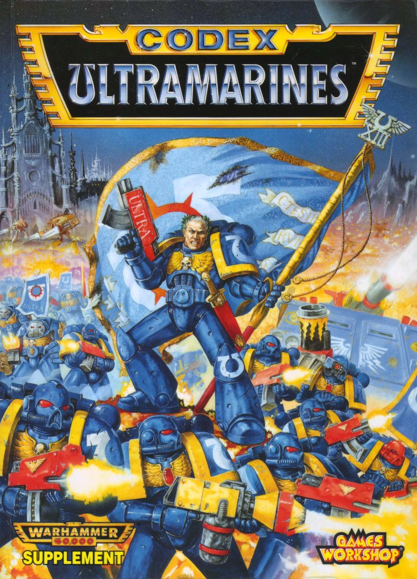
In general, the current 40k Codex covers are worse than before. The IG and BA ones are hideous, while the UM and Nid ones completely uninspired.
The Skaven one looks nice enough, and the Beastmen is a passable update of the old cover.
|
|
|
|
|
|
2010/05/12 21:42:32
Subject: Re:Is GW cover art improving or declining?
|
|
Imperial Agent Provocateur
Mississippi
|
I voted no difference because there was great and terrible art in the past and great and terrible art now. The BA codex however is just.......gag reflex-like.
|
|
|
|
|
2010/05/12 22:47:01
Subject: Is GW cover art improving or declining?
|
|
Longtime Dakkanaut
St. George, UT
|
Its very possible to respect someones artistic ability and not like their particular art work.
I personally prefer the newer darker look that the SW and Nid codex had. The BA is a throw back to the more comicbook look and I personally dislike it very much. But it doesn't mean I can't see the artistic merit of the work itself.
|
See pics of my Orks, Tau, Emperor's Children, Necrons, Space Wolves, and Dark Eldar here:
|
|
|
|
|
2010/05/21 05:41:50
Subject: Is GW cover art improving or declining?
|
|
[MOD]
Solahma
|
The new BA cover is really spoiled by the Priest's head. Cover it with your thumb and see if you like it any better.
|
|
|
|
|
|
2010/05/21 06:05:33
Subject: Is GW cover art improving or declining?
|
|
Owns Whole Set of Skullz Techpriests
Versteckt in den Schatten deines Geistes.
|
As odd as this might seem, the cover to the current 'Chaos' Codex is actually one of the few things I like about that book. I see it as a nice new take on the old 2nd Ed Chaos Codex that had Abbadon on it.
|
|
|
|
|
|
2010/05/21 10:29:10
Subject: Re:Is GW cover art improving or declining?
|
|
Foul Dwimmerlaik
|
ArbitorIan wrote:DECLINING!
...it lost all it's character after 3ed.....
I have never agreed with you as much as I do right now. You had me at "hello". 
I know this thread is purely subjective....but I cant help but feel that even though quite a bit of the older art work was amateurish in many cases (as in less refined) it had style and character.
GW's art is a direct reflection of their business nowadays. Vacant and without any heart.
|
|
|
|
|
|
2010/05/21 14:16:19
Subject: Is GW cover art improving or declining?
|
|
Blood-Raging Khorne Berserker
I don't even KNOW anymore.
|
The only good BA cover was the one with Christopher Lee on it.
|
|
|
|
|
2010/05/21 17:08:15
Subject: Is GW cover art improving or declining?
|
|
Lord Commander in a Plush Chair
|
The boring truth is that it's variable now as it was years ago. Though I think it was more characterful years ago. I see nothing wrong with the Slave to Darkness cover, or Lost and Damned if you can find it. Didn't Blanche do the original cover for Codex:Sisters of Battle, that was a lovely cover. The 2nd Edition Tyranids and Chaos books were good too. Then look at the Warhammer armies, Dogs of War is a lovely cover IMO. Colourful and full of character, just like the army. Skaven book was good too. Empire was a bit ugly.
Some of the newer covers are just grimdark for the hell of it, technically I suppose they are more precisely painted but there's more to art than that.
|
|
|
|
|
2010/05/21 17:24:42
Subject: Is GW cover art improving or declining?
|
|
Ultramarine Master with Gauntlets of Macragge
|
I really love the 4th ed Guard codex cover. It made every Guardsman look like a badass, hardened soldier, and had a sergeant who looked like Michael Biehn in Aliens:

The new one is kind of cool too, but it represents the "weirder" part of the Guard, with more command and ecclesiarchy stuff going on. I definitely prefer this older one.
|
Check out my Youtube channel!
|
|
|
|
|
2010/05/21 17:40:12
Subject: Is GW cover art improving or declining?
|
|
Servoarm Flailing Magos
|
Older guard one was better imo also.
My favourite codex cover was Eye of terror codex.
I missed the oppertunity to buy the book unfortunatly as I would be interested read it.
|
"Praise Be To The Omissiah!" 
"Three things make the Empire great: Faith, Steel and Gunpowder!"
Azarath Metrion Zinthos
Expect my posts to have a bazillion edits. I miss out letters, words, sometimes even entire sentences in my points and posts.
Come at me Heretic. |
|
|
|
|
2010/05/21 17:43:16
Subject: Is GW cover art improving or declining?
|
|
[MOD]
Solahma
|
I agree in principle with Hellfury's prognosis but wouldn't say it with quite the same prejorative tone. GW's evolving business model is having a definite effect on the art. It had become more "safe" in 4th Ed. and I think they are unsuccessfully trying to reclaim their roots.
|
|
|
|
|
|
|
|


 -- $k
-- $k  -- 9k
-- 9k  -- 6k
-- 6k  -- 4k
-- 4k  --
--