| Author |
Message |
 |
|
|
 |
|
Advert
|
Forum adverts like this one are shown to any user who is not logged in. Join us by filling out a tiny 3 field form and you will get your own, free, dakka user account which gives a good range of benefits to you:
- No adverts like this in the forums anymore.
- Times and dates in your local timezone.
- Full tracking of what you have read so you can skip to your first unread post, easily see what has changed since you last logged in, and easily see what is new at a glance.
- Email notifications for threads you want to watch closely.
- Being a part of the oldest wargaming community on the net.
If you are already a member then feel free to login now. |
|
 |
![[Post New]](/s/i/i.gif) 2017/09/19 17:33:11
Subject: 40K and its changing Aesthetic?
|
 |

Powerful Phoenix Lord
|
If you're addressing me Doc, I don't know what you're asking. I didn't say GW had to make something I like. Have they lost a potential customer for a line of models? Sure. This aesthetic they've chosen is garbage to me, but that doesn't matter - I didn't say it did.
|
|
|
 |
 |
![[Post New]](/s/i/i.gif) 2017/09/19 17:40:47
Subject: 40K and its changing Aesthetic?
|
 |

Insect-Infested Nurgle Chaos Lord
|
I think he's talking about me. I don't think the Bioshock influence is a bad thing, I just think it's out of place with Death Guard and Plague Marines, who in lore are suppose to be rotting and dead from the inside, but look more like fat tentacle mutants. But that's my preference. It also creates a dissonance between the old DG models and the new ones.
Also, on another note, I think people calling the new style "cartoony" actually means it's more stylized. Like, look at the chin on the plastic painboy; his entire expression is very stylized and his facial features sharpened beyond what would be the norm for "realistic". If you look at the old Dok Grotsnik, you'll see he has a more realistic look where things are more runder and leathery. Or just look at things with furs; they use to look like realistic bundles of hair, but now they either look like thick grooves running the length of the model or nachos.
The stylized look is a valid look and it is the way GW is heading, likely because they've basically abandoned GS sculpting and shifted over to digital sculpting (where the vast majority of people are more trained to do stylized sculpting and do not shrink realistically like GS). But it does create a dissonance with existing models. Another thing is the sculpted on smoke effects (or special effects in the case of Ynnead) whereas such things were very rare or nonexistent before.
|
Gwar! wrote:Huh, I had no idea Graham McNeillm Dav Torpe and Pete Haines posted on Dakka. Hi Graham McNeillm Dav Torpe and Pete Haines!!!!!!!!!!!!! Can I have an Autograph!
Kanluwen wrote:
Hell, I'm not that bothered by the Stormraven. Why? Because, as it stands right now, it's "limited use".When it's shoehorned in to the Codex: Space Marines, then yeah. I'll be irked.
When I'm editing alot, you know I have a gakload of homework to (not) do. |
|
|
 |
 |
![[Post New]](/s/i/i.gif) 2017/09/19 17:40:56
Subject: 40K and its changing Aesthetic?
|
 |

The Daemon Possessing Fulgrim's Body
|
I think more worrying than the change in aesthetic, which is a personal thing and varies from model to model. To me, Guilliman is a fething abomination, the Death Guard are ok, quite like the Lord Of Change etc etc. I haven't loved anything for a while, but I'm sure I will in time, if the rumoured new Beasts match the art that has been suggested depcits them I'll be very happy, I'm also a fan of the CSM Dinobots when many aren't etc.
More worrying than this, however, is what appears to be a move towards a substantial lack in modularity. Characters have become almost exclusively monopose, and this is beginning to leach its way into the other kits too. As it becomes harder and harder to build the kits with any variation, it will become harder to tailor the aesthetic more to the individual's liking, hence we'll move away from the "if you don't like it you can change it" situation we've had with a lot of kits for so long to "if you don't like it, tough" that mono builds could provoke, meaning people either buy third party, which is no good for GW, or don't buy anything, which is no fun for anybody.
|
We find comfort among those who agree with us - growth among those who don't. - Frank Howard Clark
The wise man doubts often, and changes his mind; the fool is obstinate, and doubts not; he knows all things but his own ignorance.
The correct statement of individual rights is that everyone has the right to an opinion, but crucially, that opinion can be roundly ignored and even made fun of, particularly if it is demonstrably nonsense!” Professor Brian Cox
Ask me about
Barnstaple Slayers Club |
|
|
 |
 |
![[Post New]](/s/i/i.gif) 2017/09/19 17:41:13
Subject: 40K and its changing Aesthetic?
|
 |

Courageous Space Marine Captain
|
GWs models looks now better than they ever have.
|
|
|
|
 |
 |
![[Post New]](/s/i/i.gif) 2017/09/19 17:44:05
Subject: Re:40K and its changing Aesthetic?
|
 |

Quick-fingered Warlord Moderatus
|
The DG though I think specifically had a Bioshock influence. Ignoring their similarities to the Big Daddies, a lot of the Plague Marines and Blightlord Terminators have elements that were first popularized by the original Bioshock. THe most notable one is the one Blightlord who looks like he's going all insectoid, which is one of the most notable pieces of unused art for Bioshock. In addition, the mutant tentacles, flesh bloating out of armor/fusing to armor and clothes, and makeshift fixes were all things rather unique to bioshock (still is, to a lesser extent) as generic zombies tend to still go towards the "desiccated rotting corpse" side of things rather than "hideously disfiguring mutations). This also applies to the AoS and End Times nurgle figures too (which is where the actual inspiration came from). The brass-looking piping some of the marines have going on also evokes that steampunk feel.
Like I said, all elements that have been found in 40K since the RT days. I'm not trying to say GW is 100% original because by their own admission, the game was originally an amalgam of different tropes they all found "cool". That said, I could pick out a hundred bioware designs that are so derivative that they may as well have been traced. I mean the entire Bioshcok world basically takes place in a Art Deco mansion. Hardly original design. So I'm always thrown for a bit of a loop when people come along and try to say that something GW makes (like Plague Marines) that have existed in essentially the same form since the 80's is somehow derivative of or based off of an IP that did not exist until a decade or two later. I call it the " GW singularity" because it seems to mostly happen when people discuss GW. Almost all of the "new" DG designs (even the Blightlord you mention) have been around for quite a while. Maybe not on the actual table top or as explicit unit entries, but they've been around. I'm willing to bet you can even find Poxwalkers somewhere in the background of one of the illustrations from "the Lost and the Damned" ...
TL/DR:
The GW Singularity - GW is the only company with an Art Department capable of basing it's own designs on the designs of other IP's that won't be out for another 10-15 years. 
As for this -
In addition, the mutant tentacles, flesh bloating out of armor/fusing to armor and clothes, and makeshift fixes were all things rather unique to bioshock (still is, to a lesser extent) as generic zombies tend to still go towards the "desiccated rotting corpse" side of things rather than "hideously disfiguring mutations).
This is no way at all unique to Bioshock and wasn't even unique to that game when it was new ...
|
|
This message was edited 2 times. Last update was at 2017/09/19 18:01:00
Edit: I just googled ablutions and apparently it does not including dropping a duece. I should have looked it up early sorry for any confusion. - Baldsmug
Psiensis on the "good old days":
"Kids these days...
... I invented the 6th Ed meta back in 3rd ed.
Wait, what were we talking about again? Did I ever tell you about the time I gave you five bees for a quarter? That's what you'd say in those days, "give me five bees for a quarter", is what you'd say in those days. And you'd go down to the D&D shop, with an onion in your belt, 'cause that was the style of the time. So there I was in the D&D shop..." |
|
|
 |
 |
![[Post New]](/s/i/i.gif) 2017/09/19 17:44:10
Subject: 40K and its changing Aesthetic?
|
 |

Ridin' on a Snotling Pump Wagon
|
I don't agree that Deathguard are meant to be dead. Quite the opposite - they've always been very much alive.
|
|
|
|
 |
 |
![[Post New]](/s/i/i.gif) 2017/09/19 18:18:01
Subject: 40K and its changing Aesthetic?
|
 |

Pragmatic Primus Commanding Cult Forces
|
 Togusa wrote: Togusa wrote:I've been watching the new releases for a while now, and with the start of the Gathering Storm it has become quite obvious that Games Workshops art studios is changing the aesthetic of the game. When you go to the first GS boxset, you see models that quite frankly are a mess of too many details. Then comes Roboute, with that armor, which is very AoS and cartoony. He looks like a Saturday morning cartoon villain. The primaris all look like knockoffs of the space marines from StarCraft, and the new Deathguard look like something straight out of a MOBA.
Does anyone else out there think that this trend will continue into the foreseeable future, as older models get phased out and new ones take their places? Or is this just happening to these few new armies?
Actually, I think older GW models look far more cartoony than the newer ones. Your avatar is a really good example, but also kits like the plastic Cadians. When compared with newer infantry kits such as the GS cultists, the Cadians are much more exaggerated and cartoon-like in proportions.
|
|
|
 |
 |
![[Post New]](/s/i/i.gif) 2017/09/19 18:31:41
Subject: 40K and its changing Aesthetic?
|
 |

Fully-charged Electropriest
|
 Mad Doc Grotsnik wrote: Mad Doc Grotsnik wrote:I don't agree that Deathguard are meant to be dead. Quite the opposite - they've always been very much alive.
It's very much the point of Nurgle.
|
     
“Do not ask me to approach the battle meekly, to creep through the shadows, or to quietly slip on my foes in the dark. I am Rogal Dorn, Imperial Fist, Space Marine, Emperor’s Champion. Let my enemies cower at my advance and tremble at the sight of me.”
-Rogal Dorn
|
|
|
 |
 |
![[Post New]](/s/i/i.gif) 2017/09/19 18:50:08
Subject: 40K and its changing Aesthetic?
|
 |

Monster-Slaying Daemonhunter
|
judgedoug wrote: Elbows wrote: Elbows wrote:Oh, I agree. It's probably a result of the sculptors on hire
I've seen this going around a lot recently, and it's not true. Utterly false garbage.
Warhammer Community has even had interviews with staff sculptors.
Some of the staff sculptors even post on Facebook (especially on the community-oriented facebook groups, like GBHL)
Automatically Appended Next Post:
This has been the aesthetic for Warhammer 40,000 since 1987. Nothing has really changed except the technical abilities to manufacture larger kits.
Space Marines have always been Future Space Fantasy Knight Hero Men.
Chaos Marines have always been Skeletor With A Boltgun. Abaddon is pretty much a cartoon bad guy.
Sisters wear high heels and have nipple spikes.
Orks have a cockney accent.
It's nothing new, dude. It's always been a cartoon. Nothing wrong with that. It's like Gargoyles or the Spawn cartoon. Dark and interesting but still a fething cartoon with a toy line to match.
Well, we don't, but the point stands [to the best of my knowledge, there's only one model in our line with high heels, and it's a new one.] We do have shaped breastplates and the plackart of our armor looks kind of like a corset, though.
The Sisters of Silence have small wedges, and Greyfax has some serious heels.
|
|
This message was edited 1 time. Last update was at 2017/09/19 18:51:09
Guardsmen, hear me! Cadia may lie in ruin, but her proud people do not! For each brother and sister who gave their lives to Him as martyrs, we will reap a vengeance fiftyfold! Cadia may be no more, but will never be forgotten; our foes shall tremble in fear at the name, for their doom shall come from the barrels of Cadian guns, fired by Cadian hands! Forward, for vengeance and retribution, in His name and the names of our fallen comrades! |
|
|
 |
 |
![[Post New]](/s/i/i.gif) 2017/09/19 18:58:14
Subject: 40K and its changing Aesthetic?
|
 |

Ultramarine Chaplain with Hate to Spare
|
The GW aesthetic has always been "mixed", probably quite on purpose. That way it can appeal to people with different aesthetics. The new Death Guard might be cartooney, but the basic Primaris are a step towards "realistic" from the normal space marines. The old Land Raider looks more realistic than the Repulsor, imo. It's all just mixed in together, and the studio has it's own phases, often depending on the project they're working on.
|
|
|
|
 |
 |
![[Post New]](/s/i/i.gif) 2017/09/19 18:59:32
Subject: Re:40K and its changing Aesthetic?
|
 |

Executing Exarch
|
Objectively many of the newer models are 'better' but I think the whole CAD thing has led to a lot of far too busy models
I also think some of the old models had a certain charm as they were sculpted to the limits of production, nowadays that isn't a thing and you end up with swirly gak and Yvaines stupid hat infesting the aesthetic
|
"AND YET YOU ACT AS IF THERE IS SOME IDEAL ORDER IN THE WORLD, AS IF THERE IS SOME...SOME RIGHTNESS IN THE UNIVERSE BY WHICH IT MAY BE JUDGED." |
|
|
 |
 |
![[Post New]](/s/i/i.gif) 2017/09/19 19:02:14
Subject: 40K and its changing Aesthetic?
|
 |

Dakka Veteran
|
The miniatures look the best they ever have, and even thugs I loved back in 3rd edition and have nostalgia for are showing their age. 2nd edition stuff that's still around looked long in the tooth and out of place by 4th and now looks like it comes from a completely different game, which it basically does. Looking at artwork back in 2nd and 3rd codexes it was always fairly apparent that the tech to manufacture miniatures wasn't enough for sculptors to bring an artist's vision to life.
|
|
|
 |
 |
![[Post New]](/s/i/i.gif) 2017/09/19 19:07:06
Subject: Re:40K and its changing Aesthetic?
|
 |

Quick-fingered Warlord Moderatus
|
Objectively many of the newer models are 'better' but I think the whole CAD thing has led to a lot of far too busy models
CAD really hasn't done anything to change the look of the models. It's the advances in injection molding and rapid prototyping that have allowed them to produce models that actually look exactly like the 2D concept art. They've pretty much always been able to sculpt to that level of detail. It's just that you couldn't reproduce that detail at the actual production stage.
|
Edit: I just googled ablutions and apparently it does not including dropping a duece. I should have looked it up early sorry for any confusion. - Baldsmug
Psiensis on the "good old days":
"Kids these days...
... I invented the 6th Ed meta back in 3rd ed.
Wait, what were we talking about again? Did I ever tell you about the time I gave you five bees for a quarter? That's what you'd say in those days, "give me five bees for a quarter", is what you'd say in those days. And you'd go down to the D&D shop, with an onion in your belt, 'cause that was the style of the time. So there I was in the D&D shop..." |
|
|
 |
 |
![[Post New]](/s/i/i.gif) 2017/09/19 19:10:26
Subject: 40K and its changing Aesthetic?
|
 |

Longtime Dakkanaut
|
I feel like my only complaint is that most the new art seems paint by numbers, everyday commissioned affairs. Not enough stylization and soul. I wish we had more Blanche style work, or stuff that was experimental. You can only have so many "marines standing tall and being stoic" drawn the exact same way with no action or movement until you eventually get bored.
|
|
|
 |
 |
![[Post New]](/s/i/i.gif) 2017/09/19 19:15:52
Subject: 40K and its changing Aesthetic?
|
 |

Consigned to the Grim Darkness
|
.
I just don't see how poxwalkers are so seriously obviously look like splicers; the difference is damn stark. Automatically Appended Next Post:
I'm just gonna shake my head sadly and hold my tongue here; suffice it to say, not everyone likes his "art".
|
|
This message was edited 1 time. Last update was at 2017/09/19 19:17:56
The people in the past who convinced themselves to do unspeakable things were no less human than you or I. They made their decisions; the only thing that prevents history from repeating itself is making different ones.
-- Adam Serwer
My blog |
|
|
 |
 |
![[Post New]](/s/i/i.gif) 2017/09/19 19:23:36
Subject: 40K and its changing Aesthetic?
|
 |

Grim Dark Angels Interrogator-Chaplain
Vigo. Spain.
|
I respect Blanche but his style is not the one I miss more from new Codexes. Jess Godwinn, Paul Daiton (The autor of this beautifull piece of art https://i.pinimg.com/originals/2a/cf/0f/2acf0fb60e928d869f0a87908ccf5e61.jpg ) and Karl Kopinski in the other hand? I want more of them and less of random commisioner artists.
Just look at this work of Kopinski. Art before miniatures, not art based IN the miniatures.
|
|
This message was edited 2 times. Last update was at 2017/09/19 19:24:47
 Crimson Devil wrote: Crimson Devil wrote:
Dakka does have White Knights and is also rather infamous for it's Black Knights. A new edition brings out the passionate and not all of them are good at expressing themselves in written form. There have been plenty of hysterical responses from both sides so far. So we descend into pointless bickering with neither side listening to each other. So posting here becomes more masturbation than conversation.
ERJAK wrote:Forcing a 40k player to keep playing 7th is basically a hate crime.
|
|
|
 |
 |
![[Post New]](/s/i/i.gif) 2017/09/19 19:23:53
Subject: 40K and its changing Aesthetic?
|
 |

Courageous Space Marine Captain
|
 Jaxler wrote: Jaxler wrote:I feel like my only complaint is that most the new art seems paint by numbers, everyday commissioned affairs. Not enough stylization and soul. I wish we had more Blanche style work, or stuff that was experimental. You can only have so many "marines standing tall and being stoic" drawn the exact same way with no action or movement until you eventually get bored.
That is certainly true. A lot of the new art, while technically well executed, seems to be just terribly boring and lack spirit. It is basically just pictures of the existing miniatures in art form, it really adds nothing.
|
|
|
|
 |
 |
![[Post New]](/s/i/i.gif) 2017/09/19 19:34:10
Subject: Re:40K and its changing Aesthetic?
|
 |

Fresh-Faced New User
|
I really enjoy the new aesthetic. If anything I think in general it becoming less cartoon like. Looking back at the 2nd edition static posed plastics that I started playing with in the 90s, thing have really moved on. Of course that was when video games were in their infancy, and the models and fantastic background art allowed you to project your imagination. The dark vengeance set was what got me back into the hobby - a real positive step change in aesthetics. Also the painting techniques have moved on in leaps and bounds. Far darker and more detailed. Only recent thing for me is wondering where the thousands of loyal space marines will end up now their primaris brothers have shown up...
|
|
|
 |
 |
![[Post New]](/s/i/i.gif) 2017/09/19 19:37:16
Subject: 40K and its changing Aesthetic?
|
 |

Pragmatic Primus Commanding Cult Forces
|
I agree very strongly with this. Some of the newer commissioned art is also pretty neat, but it just never lives up to the work of great concept artists like Kopinski. GW should hire people like them instead of just random guys on DeviantArt. Their books are expensive enough for it.
I also don't mind it if artworks look like exactly the miniatures (to a degree, that is what they should look like), but artists should also have some artistic freedom to deviate of the exact look of the kits. That Kopinski plague marine and renegade enforcer are perfect examples. You can clearly see that they are based off the miniature kits that FW sells, but they aren't exactly the same thing. It triggers the imagination and inspires conversion ideas.
|
Error 404: Interesting signature not found
     |
|
|
 |
 |
![[Post New]](/s/i/i.gif) 2017/09/19 19:46:52
Subject: 40K and its changing Aesthetic?
|
 |

Decrepit Dakkanaut
|
I love the new Deathguard models and I'm sure I'll be able to use bitz from the new Plague Marine box somehow, but that's it. I don't like bling period. I don't even like the Aquila on the current Marines. Burning Of Prospero was a godsend to me as someone that wants to create their own Marine army but hates bling and only wanted certain stuff from FW, not the entire Marine.
|
CaptainStabby wrote:If Tyberos falls and needs to catch himself it's because the ground needed killing.
 jy2 wrote: jy2 wrote:BTW, I can't wait to run Double-D-thirsters! Man, just thinking about it gets me Khorney.
 vipoid wrote: vipoid wrote:Indeed - what sort of bastard would want to use their codex?
 MarsNZ wrote: MarsNZ wrote:ITT: SoB players upset that they're receiving the same condescending treatment that they've doled out in every CSM thread ever.
|
|
|
 |
 |
![[Post New]](/s/i/i.gif) 2017/09/19 20:25:03
Subject: 40K and its changing Aesthetic?
|
 |

Tail-spinning Tomb Blade Pilot
|
I dont necessarily think it's the aesthetic I dont like about the new DG it's the over abundance of detail especially on typhus or mortarion that I think detracts from the model. nurglings, flies, tentacles, etc. while they all have their place smashing them all together on a model just makes it look sloppy? with no real focal point?
That being said I think the new Thousand sons and space marines look great!
|
 Necrons - 6000+ Necrons - 6000+
  Eldar/DE/Harlequins- 6000+ Eldar/DE/Harlequins- 6000+
 Genestealer Cult - 2000 Genestealer Cult - 2000
 Currently enthralled by Blanchitsu and INQ28. Currently enthralled by Blanchitsu and INQ28. |
|
|
 |
 |
![[Post New]](/s/i/i.gif) 2017/09/19 20:41:58
Subject: Re:40K and its changing Aesthetic?
|
 |

Quick-fingered Warlord Moderatus
|
I dont necessarily think it's the aesthetic I dont like about the new DG it's the over abundance of detail especially on typhus or mortarion that I think detracts from the model. nurglings, flies, tentacles, etc. while they all have their place smashing them all together on a model just makes it look sloppy? with no real focal point?
That being said I think the new Thousand sons and space marines look great!
Couldn't agree more about the 1K sons! IMO they look great! I'm with you on the new Typhus too. To me, his pose looks like he's just hitting the "high note" in a high-school musical. Jazz hands and all. I also don't like the nurgling on his stomach area. IMO, the previous model was a closer match to the source material, but I don't think either model does the illustrations/background any real justice.
|
Edit: I just googled ablutions and apparently it does not including dropping a duece. I should have looked it up early sorry for any confusion. - Baldsmug
Psiensis on the "good old days":
"Kids these days...
... I invented the 6th Ed meta back in 3rd ed.
Wait, what were we talking about again? Did I ever tell you about the time I gave you five bees for a quarter? That's what you'd say in those days, "give me five bees for a quarter", is what you'd say in those days. And you'd go down to the D&D shop, with an onion in your belt, 'cause that was the style of the time. So there I was in the D&D shop..." |
|
|
 |
 |
![[Post New]](/s/i/i.gif) 2017/09/19 20:44:18
Subject: 40K and its changing Aesthetic?
|
 |

Powerful Ushbati
|
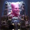 JohnnyHell wrote: JohnnyHell wrote:They all look pretty 40K to me. If you don't like the style that's your prerogative, but they ooze the same ooziness that Death guard have for 25+ years!


...the latest guys are really just a remake of these. The old ones are hardly any less busy.
But taste is subjective and you're not wrong to dislike them, just wrong to say they cannot be liked.
Also the Primaris look nothing like the StarCRaft marines...


Similarities? All 'space power armour dudes' have them. The same as? Nope.
They've elongated the rifle to look more like that of the SC marine. They've given the power armor a slimmer look, with longer legs and a more appropriate torso. It looks a lot like a cheap copy to me in terms of SC, which is ironic. To me at least.
|
|
|
 |
 |
![[Post New]](/s/i/i.gif) 2017/09/19 20:51:58
Subject: Re:40K and its changing Aesthetic?
|
 |

Quick-fingered Warlord Moderatus
|
They've elongated the rifle to look more like that of the SC marine. They've given the power armor a slimmer look, with longer legs and a more appropriate torso. It looks a lot like a cheap copy to me in terms of SC, which is ironic. To me at least.
That's a pretty large stretch IMO. The base Primaris models (particularly when seen in person) really do look like scaled up versions of the original marines. So if anything, what you're saying is that the Primaris look like the "iconic" Starcraft marines which, themselves bear a striking resemblance to Space Marines that existed for nearly two decades before that game came out .... and that's if you're REALLY trying to stretch things.
Now, if you want to say that the Inceptor Primaris models look similar to that SC design, well then you might have a case, but again, it's much more likely that the SC marines were originally based on GW marines so it's still kind of a moot point. It's pretty common knowledge that the Zerg were inspired in part by elements of the 'Nids so it wouldn't surprise me if other parts of the game were also inspired by 40K.
|
Edit: I just googled ablutions and apparently it does not including dropping a duece. I should have looked it up early sorry for any confusion. - Baldsmug
Psiensis on the "good old days":
"Kids these days...
... I invented the 6th Ed meta back in 3rd ed.
Wait, what were we talking about again? Did I ever tell you about the time I gave you five bees for a quarter? That's what you'd say in those days, "give me five bees for a quarter", is what you'd say in those days. And you'd go down to the D&D shop, with an onion in your belt, 'cause that was the style of the time. So there I was in the D&D shop..." |
|
|
 |
 |
![[Post New]](/s/i/i.gif) 2017/09/19 20:57:31
Subject: 40K and its changing Aesthetic?
|
 |

Wicked Warp Spider
|
 supreme overlord wrote: supreme overlord wrote:I dont necessarily think it's the aesthetic I dont like about the new DG it's the over abundance of detail especially on typhus or mortarion that I think detracts from the model. nurglings, flies, tentacles, etc. while they all have their place smashing them all together on a model just makes it look sloppy? with no real focal point? That being said I think the new Thousand sons and space marines look great!
They think that just because they CAN add a given detail now, they automatically SHOULD. I had recently a chance to work with sculpts of the new Death Guard, models that I criticized heavily when I have seen them the first time. The new plague marines are actually fine models in their essence, and clearly a work of passion: I don't think that the usual sloppiness of the design team is present into the sculptor team - at least not in the same, severe extent. To demonstrate this, think about the fact that each one is a reference to a given plague marine of a past edition (you can see in them stuff from 2nd, 3rd, 4th, and even FW - the same FW that has the best balance, generally speaking, between detail and restraint). Furthermore, they have inserted appropriate references to pop culture like Cronenberg's The Fly for the termies and Carpenter's The Thing for an easy to build champion. That's nice to see. I think it shows they cared. The problem is that the enthusiasm in the design was not restrained. One bell or tentacle here and there are fantastic, but to show off the SUPERB QUALITY of their sculpt, GW kept adding details so you have marines that have more tentacles than an hentai and the bell character (I will not remember the copyright friendly names, I call it the "Campanaro*") ends up with less bells that one of the guys of the basic Plague Marines team. Is cool to have exausts on the armor, but 1 or 2 short are enough, 3 long ones put the model off-balance, visually speaking. This is incredibly naive and unprofessional. I sat down with a cutter trimming when possible and I found in ebay Blightkings weapons to convert some of them (the effect I want to obtain is more "Rusty Ancient Warriors" than "the Thing: Space Marine Edition") like the easy to build Plague Launcher guy, that now has a small axe on his right hand that holds lazily. Overall I am happy for the results but I am not sure I will buy as many models as planned, especially if the rules are like the ones of the Deathshroud. Also the Plague Brethren make me really, really mad at GW. I am having a blast painting my Plagues (I am using on top of 50 shades of green, 3 technicals, in moderation) but I am painting the models one at time or in small groups because you cannot repeat many things automatically, each one is subtly different and requires attention. This is not bad per se, but building up the team I forced myself to tone down the painting of many details or the final squad would look too different in shape AND colour, ruining the overall sense of coherency that a 40k infantry squad should have (yes, even a chaos one). In other words, each plague looks like a mini-character that is easy to the eyes when observed alone, but does not fit necessarily with the rest of the squad. *Italian for church bell-ringer
|
|
This message was edited 12 times. Last update was at 2017/09/19 21:15:44
Generic characters disappearing? Elite units of your army losing options and customizations? No longer finding that motivation to convert?
Your army could suffer Post-Chapterhouse Stress Disorder (PCSD)! If you think that your army is suffering one or more of the aforementioned symptoms, call us at 789-666-1982 for a quick diagnosis! |
|
|
 |
 |
![[Post New]](/s/i/i.gif) 2017/09/19 21:42:42
Subject: 40K and its changing Aesthetic?
|
 |

Longtime Dakkanaut
|
 Melissia wrote: Melissia wrote:.
I just don't see how poxwalkers are so seriously obviously look like splicers; the difference is damn stark.
Automatically Appended Next Post:
I'm just gonna shake my head sadly and hold my tongue here; suffice it to say, not everyone likes his "art".
His art may be messy and red but it's still got more soul than 90% of anything made for AOS. Nothing about the new 40k art direction or anything new for AOS screams interest, novelty or style. It's got no stylization, we've seen it before and it's boring.
At least when you see a Blanche painting it's 'interesting'.
|
|
This message was edited 1 time. Last update was at 2017/09/19 21:45:36
|
|
|
 |
 |
![[Post New]](/s/i/i.gif) 2017/09/19 22:06:28
Subject: 40K and its changing Aesthetic?
|
 |

Decrepit Dakkanaut
|
 Jaxler wrote: Jaxler wrote: Melissia wrote: Melissia wrote:.
I just don't see how poxwalkers are so seriously obviously look like splicers; the difference is damn stark.
Automatically Appended Next Post:
I'm just gonna shake my head sadly and hold my tongue here; suffice it to say, not everyone likes his "art".
His art may be messy and red but it's still got more soul than 90% of anything made for AOS. Nothing about the new 40k art direction or anything new for AOS screams interest, novelty or style. It's got no stylization, we've seen it before and it's boring.
At least when you see a Blanche painting it's 'interesting'.
How are you measuring soul?
|
CaptainStabby wrote:If Tyberos falls and needs to catch himself it's because the ground needed killing.
 jy2 wrote: jy2 wrote:BTW, I can't wait to run Double-D-thirsters! Man, just thinking about it gets me Khorney.
 vipoid wrote: vipoid wrote:Indeed - what sort of bastard would want to use their codex?
 MarsNZ wrote: MarsNZ wrote:ITT: SoB players upset that they're receiving the same condescending treatment that they've doled out in every CSM thread ever.
|
|
|
 |
 |
![[Post New]](/s/i/i.gif) 2017/09/19 22:15:58
Subject: 40K and its changing Aesthetic?
|
 |

Wicked Warp Spider
|
Slayer-Fan123 wrote: Jaxler wrote: Jaxler wrote: Melissia wrote: Melissia wrote:. I just don't see how poxwalkers are so seriously obviously look like splicers; the difference is damn stark. Automatically Appended Next Post: I'm just gonna shake my head sadly and hold my tongue here; suffice it to say, not everyone likes his "art".
His art may be messy and red but it's still got more soul than 90% of anything made for AOS. Nothing about the new 40k art direction or anything new for AOS screams interest, novelty or style. It's got no stylization, we've seen it before and it's boring. At least when you see a Blanche painting it's 'interesting'.
How are you measuring soul?
When what is shown in the picture is not a repurposed faithful representation of an existing model, it's a good start.
|
|
This message was edited 1 time. Last update was at 2017/09/19 22:20:29
Generic characters disappearing? Elite units of your army losing options and customizations? No longer finding that motivation to convert?
Your army could suffer Post-Chapterhouse Stress Disorder (PCSD)! If you think that your army is suffering one or more of the aforementioned symptoms, call us at 789-666-1982 for a quick diagnosis! |
|
|
 |
 |
![[Post New]](/s/i/i.gif) 2017/09/19 22:22:04
Subject: 40K and its changing Aesthetic?
|
 |

Decrepit Dakkanaut
|
 Kaiyanwang wrote: Kaiyanwang wrote:Slayer-Fan123 wrote: Jaxler wrote: Jaxler wrote: Melissia wrote: Melissia wrote:.
I just don't see how poxwalkers are so seriously obviously look like splicers; the difference is damn stark.
Automatically Appended Next Post:
I'm just gonna shake my head sadly and hold my tongue here; suffice it to say, not everyone likes his "art".
His art may be messy and red but it's still got more soul than 90% of anything made for AOS. Nothing about the new 40k art direction or anything new for AOS screams interest, novelty or style. It's got no stylization, we've seen it before and it's boring.
At least when you see a Blanche painting it's 'interesting'.
How are you measuring soul?
When what is shown in the picture is not a repurposed faithful representation of an existing model, it's a good start.
And why is that?
|
CaptainStabby wrote:If Tyberos falls and needs to catch himself it's because the ground needed killing.
 jy2 wrote: jy2 wrote:BTW, I can't wait to run Double-D-thirsters! Man, just thinking about it gets me Khorney.
 vipoid wrote: vipoid wrote:Indeed - what sort of bastard would want to use their codex?
 MarsNZ wrote: MarsNZ wrote:ITT: SoB players upset that they're receiving the same condescending treatment that they've doled out in every CSM thread ever.
|
|
|
 |
 |
![[Post New]](/s/i/i.gif) 2017/09/19 22:23:40
Subject: 40K and its changing Aesthetic?
|
 |

Disciplined Sea Guard
|
Correct me if I'm wrong but Star Craft was originally based on 40k. Terrans were Space Marines, zerg were Tyranids, and protoss were Eldar but GW wouldn't have it and it was changed.
On topic however imo Primaris marines are what I always wanted my marines to be. I pretty much retired my old marines putting them behind glass and ordered and painted up a new army as all primaris. I love the new and old aesthetic ( I like the look of DG as enemies, but I only play Imperium so I'd never buy them).
|
"The world's best swordsman doesn't fear the second best; he fears the worst swordsman, because he can't predict what the idiot will do."-Admiral Honor Harrington (David Weber's take on Twain's original quote) |
|
|
 |
 |
|
|