Forum adverts like this one are shown to any user who is not logged in. Join us by filling out a tiny 3 field form and you will get your own, free, dakka user account which gives a good range of benefits to you:
No adverts like this in the forums anymore.
Times and dates in your local timezone.
Full tracking of what you have read so you can skip to your first unread post, easily see what has changed since you last logged in, and easily see what is new at a glance.
Email notifications for threads you want to watch closely.
Being a part of the oldest wargaming community on the net.
If you are already a member then feel free to login now.
2019/04/06 16:18:33
Subject: "Together at last..." - New Warhammer logo
ProtoClone wrote: It is a simple, striking, logo that conveys who they are. Sort of reminds me of the sports leagues general use logos to represent the field as a whole.
How does it convey who they are? They don't make hammers or sunbeams. (If eagles had a wing like that, they'd definitely be extinct)
The biggest thing that it conveys is that the major lines of the logo lead up to the <TM> in the upper right. Top line, the line of the 'hammer' and the outside frame form a nice big arrow to ----> TM
Seems to me that WARHAMMER in big letters on boxes and books sold more than any amount of little doodles (which makes the blurb in the article about friends and family buying gifts weird- things were already branded sufficiently).
It conveys who they are by the representation of the logo. They boiled down their name into an image that best reflects both fantasy and scifi. They can still use the name warhammer, but eventually they won't have to. It will be like the swoosh of wargaming, if they stick with it.
But I get the feeling you are just complaining just to have something to complain about, so I won't continue just to explain further.
This message was edited 1 time. Last update was at 2019/04/06 18:41:56
I'm back!
2019/04/06 19:54:15
Subject: "Together at last..." - New Warhammer logo
JohnnyHell wrote: If you don’t understand logos or branding, Voss, the there’s not a lot of point in posting, especially with random hatred. Branding encompasses more than a logo or a colour scheme... it’s everything down to language used and tone of voice. The video is as important as the image in saying “this is who we are now. We take this very seriously but don’t mind a laugh at ourselves too.”
Don't mistake confusion at wastes of time for hatred.
So break it down for me. Who are they now? How are they meaningfully different than 'who they were' last month or last decade? What does the logo or video tell you anything about that?
And why in the world does any of it matter to anyone who want to buy a box of plastic models?
This new logo is just part of their ongoing rolling rebrand, as others have said.
What ongoing rebrand? This is the company that made space marines 30 years ago, and still makes space marines. And other models, but whatever.
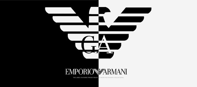
It combines iconic visual elements of both their main product brands into one simple overarching company logo.
Yes. It says Warhammer at the bottom. The image is superfluous.
Is the logo going to cause a measurable uptick or downtick in the sales of Warhammer 40,000: Space Marine boxes? I have doubts.
Of course it wasn’t designed to “point to the TM”, “show faction bias” or to somehow claim they sell actual hammers or eagles. Boots don’t sell boots, Shell don’t sell shells and MacDonalds don’t sell Golden Arches.
Right. But the golden arches have been associated with McD's for literally decades, it's a visual shorthand designed for people passing by on the highway. It's a recognizable symbol associated with a specific company, advertising its presence. This is a randomly stylized hammer with a trademark. It speaks to nobody and symbolizes nothing, and thus needs text on the logo itself to even explain what it is.
That isn't even vaguely iconic or useful for sales. If it is replaced by a different symbol next month or next year it won't matter in any way. If McDonalds or Shell replaces theirs, it will cause confusion and lost sales, as people won't know to stop at their businesses.
the golden arches are only reckongizable after so long, when it first started they were just another logo.
Opinions are not facts please don't confuse the two
2019/04/07 02:20:37
Subject: "Together at last..." - New Warhammer logo
JohnnyHell wrote: If you don’t understand logos or branding, Voss, the there’s not a lot of point in posting, especially with random hatred. Branding encompasses more than a logo or a colour scheme... it’s everything down to language used and tone of voice. The video is as important as the image in saying “this is who we are now. We take this very seriously but don’t mind a laugh at ourselves too.”
Don't mistake confusion at wastes of time for hatred.
So break it down for me. Who are they now? How are they meaningfully different than 'who they were' last month or last decade? What does the logo or video tell you anything about that?
And why in the world does any of it matter to anyone who want to buy a box of plastic models?
This new logo is just part of their ongoing rolling rebrand, as others have said.
What ongoing rebrand? This is the company that made space marines 30 years ago, and still makes space marines. And other models, but whatever.
It combines iconic visual elements of both their main product brands into one simple overarching company logo.
Yes. It says Warhammer at the bottom. The image is superfluous.
Is the logo going to cause a measurable uptick or downtick in the sales of Warhammer 40,000: Space Marine boxes? I have doubts.
Of course it wasn’t designed to “point to the TM”, “show faction bias” or to somehow claim they sell actual hammers or eagles. Boots don’t sell boots, Shell don’t sell shells and MacDonalds don’t sell Golden Arches.
Right. But the golden arches have been associated with McD's for literally decades, it's a visual shorthand designed for people passing by on the highway. It's a recognizable symbol associated with a specific company, advertising its presence. This is a randomly stylized hammer with a trademark. It speaks to nobody and symbolizes nothing, and thus needs text on the logo itself to even explain what it is.
That isn't even vaguely iconic or useful for sales. If it is replaced by a different symbol next month or next year it won't matter in any way. If McDonalds or Shell replaces theirs, it will cause confusion and lost sales, as people won't know to stop at their businesses.
the golden arches are only reckongizable after so long, when it first started they were just another logo.
The fact this had to be said is kinda shocking.
CaptainStabby wrote: If Tyberos falls and needs to catch himself it's because the ground needed killing.
jy2 wrote: BTW, I can't wait to run Double-D-thirsters! Man, just thinking about it gets me Khorney.
vipoid wrote: Indeed - what sort of bastard would want to use their codex?
MarsNZ wrote: ITT: SoB players upset that they're receiving the same condescending treatment that they've doled out in every CSM thread ever.
2019/04/07 06:20:01
Subject: Re:"Together at last..." - New Warhammer logo
also every company occasionally rebrands, it's more then JUST a logo.corperate slogans and jingles for example are also part of the branding process, and mcdonalds has over time changed those (they went, just for example from "Do you belive in magic" to "have you had your break today" to "I'm loving it") every company does this on occasion.
Opinions are not facts please don't confuse the two
2019/04/07 09:12:10
Subject: "Together at last..." - New Warhammer logo
Geifer wrote: The aquila has after all been a very identifiable symbol used by GW for a very long time.
The Aquilla looks like a fascist symbol (fitting because the Imperium isn't exactly high in civil liberties but not something everyone would be comfortable carrying branded merch around, for instance)
"Our fantasy settings are grim and dark, but that is not a reflection of who we are or how we feel the real world should be. [...] We will continue to diversify the cast of characters we portray [...] so everyone can find representation and heroes they can relate to. [...] If [you don't feel the same way], you will not be missed"
https://twitter.com/WarComTeam/status/1268665798467432449/photo/1
2019/04/07 09:45:56
Subject: "Together at last..." - New Warhammer logo
It conveys who they are by the representation of the logo. They boiled down their name into an image that best reflects both fantasy and scifi. They can still use the name warhammer, but eventually they won't have to. It will be like the swoosh of wargaming, if they stick with it.
But I get the feeling you are just complaining just to have something to complain about, so I won't continue just to explain further.
The reality is that it doesn't matter what any of us think here, because we are already aware of the brand anyway. The point of rebranding is to either change or widen your audience and it's success will be dependent on whether this achieves that aim. Now there is an arguments that Games Workshop might have worked in the 70's to 90's but now, likely to an outsider, generates thoughts of computer games. It has only been relatively recently since things were branded to "Warhammer" but this doesn't really tell you anything either and also implies a fantasy theme (as in a physical warhammer).
Ergo perhaps the rebranding by incorporating more 40K elements could suggest a future direction in that GW wants to bring the sci-fi side of things more into perspective on the assumption that this is generating the most income and incorporates a greater prioritisation on this side of the business going forward.
"Because while the truncheon may be used in lieu of conversation, words will always retain their power. Words offer the means to meaning, and for those who will listen, the enunciation of truth. And the truth is, there is something terribly wrong with this country, isn't there? Cruelty and injustice, intolerance and oppression. And where once you had the freedom to object, to think and speak as you saw fit, you now have censors and systems of surveillance coercing your conformity and soliciting your submission. How did this happen? Who's to blame? Well certainly there are those more responsible than others, and they will be held accountable, but again truth be told, if you're looking for the guilty, you need only look into a mirror. " - V
I've just supported the Permanent European Union Citizenship initiative. Please do the same and spread the word!
"It's not a problem if you don't look up." - Dakka's approach to politics
2019/04/07 10:22:10
Subject: "Together at last..." - New Warhammer logo
Geifer wrote: The aquila has after all been a very identifiable symbol used by GW for a very long time.
The Aquilla looks like a fascist symbol (fitting because the Imperium isn't exactly high in civil liberties but not something everyone would be comfortable carrying branded merch around, for instance)
Stylised eagles being arguably the most recognisable fascist symbol after the swastika hasn't really hindered it's popularity thus far.
Spoiler:
Hell, just the eagle without clutching the actual fasces of "fascism" is probably stretching it a bit far as condemning symbolism goes, as you'd get all kinds of weird stuff into that category otherwise: Harley Davidson, the American Eagle, millions of sport team logos, etc..
2019/04/07 13:33:48
Subject: "Together at last..." - New Warhammer logo
JohnnyHell wrote: If you don’t understand logos or branding, Voss, the there’s not a lot of point in posting, especially with random hatred. Branding encompasses more than a logo or a colour scheme... it’s everything down to language used and tone of voice. The video is as important as the image in saying “this is who we are now. We take this very seriously but don’t mind a laugh at ourselves too.”
Don't mistake confusion at wastes of time for hatred.
So break it down for me. Who are they now? How are they meaningfully different than 'who they were' last month or last decade? What does the logo or video tell you anything about that?
And why in the world does any of it matter to anyone who want to buy a box of plastic models?
This new logo is just part of their ongoing rolling rebrand, as others have said.
What ongoing rebrand? This is the company that made space marines 30 years ago, and still makes space marines. And other models, but whatever.
It combines iconic visual elements of both their main product brands into one simple overarching company logo.
Yes. It says Warhammer at the bottom. The image is superfluous.
Is the logo going to cause a measurable uptick or downtick in the sales of Warhammer 40,000: Space Marine boxes? I have doubts.
Of course it wasn’t designed to “point to the TM”, “show faction bias” or to somehow claim they sell actual hammers or eagles. Boots don’t sell boots, Shell don’t sell shells and MacDonalds don’t sell Golden Arches.
Right. But the golden arches have been associated with McD's for literally decades, it's a visual shorthand designed for people passing by on the highway. It's a recognizable symbol associated with a specific company, advertising its presence. This is a randomly stylized hammer with a trademark. It speaks to nobody and symbolizes nothing, and thus needs text on the logo itself to even explain what it is.
That isn't even vaguely iconic or useful for sales. If it is replaced by a different symbol next month or next year it won't matter in any way. If McDonalds or Shell replaces theirs, it will cause confusion and lost sales, as people won't know to stop at their businesses.
the golden arches are only reckongizable after so long, when it first started they were just another logo.
But one that served a useful purpose. People driving by on a highway saw a symbol that they could quickly associate with a service, so they could start looking for an exit without taking their eyes off the road.
This is... a hammer on top of the word Warhammer that will... replace the word 'Warhammer' on boxes? Maybe? Or just be alongside another instance of the word 'Warhammer?'
You still need to look further at the box to determine if its the unit you want, so... the functionality is still a mystery.
Will it be big and hide more of the box/cover art on products? (Which would be a shame)
Or will it be small and on the back the way the Citadel logo was? (Which would magnify its uselessness)
Or will it actually deepen confusion? The fonts and styles of the Warhammer and Warhammer40K have been intentionally different to be (daemons aside) clear which product line a box is for. Is a combined logo going to cause confusion among the 'friends and family' that they seem convinced buy models for people? "Well, Jimmy says we bought the wrong guys in armor, time to go back to the shop."
See how this doesn't compare well to McDonalds? It just raises questions, with no indication of how it will help. Or any indication that it will shift units or somehow magically separate warhammer products from competitors' products
This message was edited 1 time. Last update was at 2019/04/07 13:37:02
Efficiency is the highest virtue.
2019/04/07 13:42:48
Subject: "Together at last..." - New Warhammer logo
I think people are forgetting that GW has started spreading their licensing around to a number of product types, including clothes, housewares, and toys. This new unifying emblem not only ties their own products together, but is something that can be easily and relatively unobtrusively added to another company's packaging design more easily than slapping the Warhammer name on everything.
You know you're really doing something when you can make strangers hate you over the Internet. - Mauleed
Just remember folks. Panic. Panic all the time. It's the only way to survive, other than just being mindful, of course-but geez, that's so friggin' boring. - Aegis Grimm
Hallowed is the All Pie The Before Times: A Place That Celebrates The World That Was
2019/04/07 18:05:02
Subject: "Together at last..." - New Warhammer logo
It might be different, depending where you are, but in central Europe I felt awkward walking around with a citadel product that had the imperial aquila on it.
2019/04/07 18:05:22
Subject: "Together at last..." - New Warhammer logo
Only if you have no understanding of history and don't understand the word 'context'.
Hey, I'm sorry for being a realist. Beside, as I mentioned, in universe it's the symbol of some political entity that, while not being fascists, is very very uninterested in human rights or the will of the people, so the resemblance is very likely intended ¯\_(ツ)_/¯.
People misinterpreting the symbols would be wrong. Yeah, sure, that's the meaning of misinterpreting, else it would just be interpreting. It's still a good call to take a logo that will NOT be misinterpreted.
This message was edited 1 time. Last update was at 2019/04/07 18:06:51
"Our fantasy settings are grim and dark, but that is not a reflection of who we are or how we feel the real world should be. [...] We will continue to diversify the cast of characters we portray [...] so everyone can find representation and heroes they can relate to. [...] If [you don't feel the same way], you will not be missed"
https://twitter.com/WarComTeam/status/1268665798467432449/photo/1
2019/04/07 18:09:59
Subject: "Together at last..." - New Warhammer logo
Whirlwind wrote: Now there is an arguments that Games Workshop might have worked in the 70's to 90's but now, likely to an outsider, generates thoughts of computer games. It has only been relatively recently since things were branded to "Warhammer" but this doesn't really tell you anything either and also implies a fantasy theme (as in a physical warhammer).
Ergo perhaps the rebranding by incorporating more 40K elements could suggest a future direction in that GW wants to bring the sci-fi side of things more into perspective on the assumption that this is generating the most income and incorporates a greater prioritisation on this side of the business going forward.
Also, "Warhammer" is more product-agnostic. "Games Workshop" as a brand is a little silly when for plenty of people their connection with it has nothing to do with games. Whether that be through the fiction or even simply collecting things (miniatures, toys, mugs, whatever).
the golden arches are only reckongizable after so long, when it first started they were just another logo.
But one that served a useful purpose. People driving by on a highway saw a symbol that they could quickly associate with a service, so they could start looking for an exit without taking their eyes off the road.
So, no different to what's happening here.
2019/04/07 19:39:48
Subject: "Together at last..." - New Warhammer logo
It could also be a callback to projects and ranges from over the years, showing off the legacy of the brand, seeing as it also shows off the classic Warhammer Legacy hammer and the cover of Rogue Trader.
Fatum Iustum Stultorum
Fiat justitia ruat caelum
2019/04/07 21:19:30
Subject: "Together at last..." - New Warhammer logo
Whirlwind wrote: Now there is an arguments that Games Workshop might have worked in the 70's to 90's but now, likely to an outsider, generates thoughts of computer games. It has only been relatively recently since things were branded to "Warhammer" but this doesn't really tell you anything either and also implies a fantasy theme (as in a physical warhammer).
Ergo perhaps the rebranding by incorporating more 40K elements could suggest a future direction in that GW wants to bring the sci-fi side of things more into perspective on the assumption that this is generating the most income and incorporates a greater prioritisation on this side of the business going forward.
Also, "Warhammer" is more product-agnostic. "Games Workshop" as a brand is a little silly when for plenty of people their connection with it has nothing to do with games. Whether that be through the fiction or even simply collecting things (miniatures, toys, mugs, whatever).
the golden arches are only reckongizable after so long, when it first started they were just another logo.
But one that served a useful purpose. People driving by on a highway saw a symbol that they could quickly associate with a service, so they could start looking for an exit without taking their eyes off the road.
So, no different to what's happening here.
Unless and until someone actually comes up with a useful purpose for this, very different, in fact.
And that means more than just insisting that there magically is one, while declining to explain.
Efficiency is the highest virtue.
2019/04/07 21:28:19
Subject: "Together at last..." - New Warhammer logo
Not to sound obtuse but what prior logo(s) is the new one replacing? Just the warhammer one or also the games workshop one? Or neither and this will instead be yet another logo on a product like for example another HH boardgame have the new warhammer logo from above in addition to games workshop, citadel, warhammer 40000, horus heresy, and maybe black library logos? What about the warhammer part of the AOS logo?
This message was edited 3 times. Last update was at 2019/04/08 03:11:37
2019/04/08 02:35:29
Subject: "Together at last..." - New Warhammer logo
To tie multiple different products together and show customers they’re interrelated. I’m sure there are people out there that didn’t believe FW and GW were the same company or had the same mission statement.
To show customers the company is moving in a new direction. AoS rebranded from WHFB to show customers they had cut ties with the old world and were going in a new direction with new rules, new story arcs, and new miniatures.
I could keep going but I hope you get the point from these two examples and until I see more information I don’t really know their current purpose.
This message was edited 2 times. Last update was at 2019/04/08 02:41:24
2019/04/08 03:46:55
Subject: Re:"Together at last..." - New Warhammer logo


 [1,750] Chaos Knights |
  [1,250] Thousand Sons |
  [1,000] Grey Knights | 40K editions: RT, 8, 9, 10 |


