| Author |
Message |
 |
|
|
|
|
Advert
|
Forum adverts like this one are shown to any user who is not logged in. Join us by filling out a tiny 3 field form and you will get your own, free, dakka user account which gives a good range of benefits to you:
- No adverts like this in the forums anymore.
- Times and dates in your local timezone.
- Full tracking of what you have read so you can skip to your first unread post, easily see what has changed since you last logged in, and easily see what is new at a glance.
- Email notifications for threads you want to watch closely.
- Being a part of the oldest wargaming community on the net.
If you are already a member then feel free to login now. |
|
 |
2011/06/14 07:59:04
Subject: New to the hobby - how do I choose a color scheme?
|
|

Fresh-Faced New User
|
Hi everyone!
I recently started the GW hobby, and I've been struggling to come up with a color scheme that actually looks good. I bought the How To Paint Citadel Miniatures book, but it wasn't of much help (no examples of bad scheme: "don't do this"). Some of the questions I have:
What colors go well together?
What is a spot color? How is that different from all the colors used for the details?
What is the maximum amount of colors I should use in a scheme? Minimum?
Do schemes that work good for single models work as well for all models in a unit? And for all units in an army?
Thanks in advance for any pointers!
|
|
|
 |
|
2011/06/14 08:08:23
Subject: New to the hobby - how do I choose a color scheme?
|
|

Utilizing Careful Highlighting
Finland... the country next to Sweden? No! That's Norway! Finland is to the east! No! That's Russia!
|
1. This is all about your opinion. For example, I like light blues, dark metals, bright reds etc. But someone else might like dark
Blues and light greens.
If you want I can give you a few colour schemes if you tell me what army you are using.
2. A spot colour is... Actually I have no idea... It might be what I call a shock colour. A shock colour is a very bright or diffirent colour in your pattern, like if you are making a dark colour scheme, and make a very pale skin, or bright gems, or lenses etc.
3. Your maximum colour amount shouldn't exceed 10 million (get my point?) and a good minimum is 3-5 colours (not including the basecoat)
4. Your last question is a bit unclear, but unless you have a good explanation, then your models should have the same colour variants with maybe some twists, like heavy weapon teams with diffirent shoulder pads, or sergeants with a varied armour scheme. If you want to make your guys look diffirent from each other, skin colour is alqays a good option.
|
Sweet Jesus, Nurgle and Slaanesh in the same box!?
No, just Nurgle and Slaanesh, Jesus will be sold seperately in a blister.

|
|
|
|
|
2011/06/14 08:19:44
Subject: New to the hobby - how do I choose a color scheme?
|
|

[MOD]
Anti-piracy Officer
Somewhere in south-central England.
|
Here is a basic introduction to colour theory.
http://www.colormatters.com/colortheory.html
People normally choose two or three main colours for an army, and continue the colour theme throughout the entire army. If your army is composed of fairly uniform troops such as IG or Tau, you stick the the same basic scheme for the whole army If your army is composed of highly individual models such as Orks or Chaos Space Marines, you can mix things up more.
The basic colours could be analogous (close to each other) or complementary (opposite each other). Either can work well.
I don't know what a spot colour is. People normally choose one or two contrasting colours which are used for special details such as unit markings.
When picking a scheme you should think about the difficulty of painting it. There's no point choosing a wonderful scheme which is so complicated that it takes ages to finish a unit.
Have a look in the Gallery for visual inspiration.
|
|
|
|
|
|
2011/06/14 08:45:39
Subject: New to the hobby - how do I choose a color scheme?
|
|

Dispassionate Imperial Judge
|
Have a look at wikipedia and search for 'colour theory' and 'complimentary colours'.
A colour scheme can be as simple or as complicated as you like. Most of the schemes you find in GW publications tend to use one or two 'base' colours, with a third 'contrasting' colour.
It's the difference between the base colours and the contrasting one that makes the model pop - this can be added to by putting in a bright or very contrasy third 'spot' colour - on all the gems, say, or all the eyes.
The advantage of having a 'base palette' of two or three colours is that you can reverse or isolate bits of it for special squads.
For example, Dark Angels are Dark Green (base colour) with Bone as a contrasting colour. You might choose to use bright red as a spot colour on the weapons, to give them more 'pop' (rather than painting the weapons black). When you want to do Deathwing Terminators, you can paint the whole model bone, and it still looks like part of the same army, because you've already used that bone elsewhere on the regular models.
Same idea for Blood Angels Death Company or Sanguinary Guard. They use the secondary colours as main colours, which allows you to paint something quite different and it still looks like part of the same army.
Also, bear in mind that when i say 'one colour', this may actually be the product of two or three coats of paint. So, your 'base' red colour might actually consist of spraying a model white, then red, then washing with Baal Red, then highlighting with Blood Red.
|
|
|
|
|
|
2011/06/14 09:07:40
Subject: New to the hobby - how do I choose a color scheme?
|
|

Land Raider Pilot on Cruise Control
|
@ OP, I think if you give us an idea of what kind of army you want, Dakka might have some suggestions. 
|
 ~1200 ~1200
DT:90-S+G++M---B--I+Pw40k10+D+A+/mWD372R+T(D)DM+ |
|
|
|
|
2011/06/14 09:13:39
Subject: New to the hobby - how do I choose a color scheme?
|
|
Fresh-Faced New User
|
@Sam, Grey Knights with gold armor, deep purple (=complementary to yellow) weapons and cloth.
|
|
|
|
|
2011/06/14 09:22:31
Subject: Re:New to the hobby - how do I choose a color scheme?
|
|
Khorne Rhino Driver with Destroyer
|
This is fun
http://www.bolterandchainsword.com/csmp.php
even if you're not doing CSM or SM you can get a gist of what a pallette will look like.
http://www.freewebs.com/grimdarkness/painterprogram.htm
|
|
This message was edited 1 time. Last update was at 2011/06/14 09:35:44
All praise the Omnissiah! |
|
|
|
|
2011/06/14 09:50:36
Subject: New to the hobby - how do I choose a color scheme?
|
|
Krazed Killa Kan
|
What colors go well together?
That is typically up to you, but take a good long look at colour theory for knowledge on complementary colours and contrasting colours as others have suggested,
What is a spot color? How is that different from all the colors used for the details?
I'm a big fan of using spot colours (and is probably one of only mini painting concepts I truly understand), a spot colour is essentially a strong colour that contrasts with the rest of the model in order to draw attention to certain areas, preferably we want to create a 'triangle' of spot colours to create a frame for the whole model, so that attention is drawn to all parts equally.
For instance, if we had an AoBR Ork Warboss that is painted (as tradition entails) predominantly in black and green (black clothes and armour, green skin), we could use a bright red (as it contrasts well with the duller black and green) as a spot colour. The tricky bit is knowing where to place the spot colour, on the warboss for example, we could paint the Power Klaw and gun bright red (two create two points of the triangle) and then another point bright red, now we could paint the bosspole bright red (which would draw attention to the upper half of the model) or the loin-cloth/gut-plate bright red (to draw attention to the lower half of the model). If we wanted a more subtle spot colour triangle, we could paint the shoulder pads and loin-cloth/gut-plate bright red, and this would keep attention focused on the center of the model. However, if we painted the shoulder-pads and bosspole bright red, we would create a triangle that draws attention to the head of the model (which you may want, if you have an extensively converted head you want to show off, or not want, if your ability to paint faces is very poor).
Then again it doesn't have to be a stark, bright colour, nor one with a large contrast gradient (as in the above example), you may be AMAZING at painting ork skin, and want to use this as your spot colour, so by painting the miniature in more muted tones, and paying extra attention to the skin areas (on the warboss, these are the arms and head) we create a spot-colour triangle using the skin tones, that keeps focus on the mini as a whole (look at the picture here this is a really good example of using skin tones as a spot colour).
Again, choice of colour and location is up to you, but practice makes perfect!
What is the maximum amount of colors I should use in a scheme? Minimum?
Your average tourney/store event requires 3 colours minimum, so that should be your minimum. As a maximum, use however many you want, but remember, the more colours you use the more in danger you are of making a scheme look 'busy'
Do schemes that work good for single models work as well for all models in a unit? And for all units in an army?
Varies greatly from scheme to scheme, ideally you want a scheme that unifies all the models in your army. If you really want that unified look, I would suggest that you pick a scheme that works on the most common unit in your force (e.g. ork boyz) to get the unified look, and then elaborate on that scheme for your vehicles and HQs etc. Also linking to the question on # of colours, remember that the more complex your scheme, the harder it is to paint those basic foot troops!
My biggest advice would be to get yourself the cheapest set of minis you can ( e.g. the push-fit space marines that come in boxes of three) and go nuts on those! paint, repaint, try out techniques, test out schemes, rinse and repeat until you are happy. And don't be too self-critical, to begin with, your painting WILL look like crap (it always does, for everyone!) but remember these are not failures but lessons learned, you know next time to thin the paint a little more, be more gentle with the drybrushing, apply more washes etc etc.
The paint scheme you described sounds quite nice, looking forward to seeing some pics! and good luck 
|
DR:80S---G+MB---I+Pw40k08#+D+A+/fWD???R+T(M)DM+
My P&M Log: http://www.dakkadakka.com/dakkaforum/posts/list/433120.page
 Atma01 wrote: Atma01 wrote:
And that is why you hear people yelling FOR THE EMPEROR rather than FOR LOGICAL AND QUANTIFIABLE BASED DECISIONS FOR THE BETTERMENT OF THE MAJORITY!
Phototoxin wrote:Kids go in , they waste tonnes of money on marnus calgar and his landraider, the slaneshi-like GW revel at this lust and short term profit margin pleasure. Meanwhile father time and cunning lord tzeentch whisper 'our games are better AND cheaper' and then players leave for mantic and warmahordes.
daveNYC wrote:The Craftworld guys, who are such stick-in-the-muds that they manage to make the Ultramarines look like an Ibiza nightclub that spiked its Red Bull with LSD.
|
|
|
|
|
2011/06/14 11:20:55
Subject: New to the hobby - how do I choose a color scheme?
|
|
Regular Dakkanaut
Nottingham
|
Don't choose yellow!
|
|
|
|
|
2011/06/14 11:30:48
Subject: Re:New to the hobby - how do I choose a color scheme?
|
|

Guardsman with Flashlight
Alice Springs
|
easest way: Pick a climate you like, tropical, arid, arctic, ect... then look at the colours from that area and paint those.
|
|
|
|
|
2011/06/14 20:04:28
Subject: Re:New to the hobby - how do I choose a color scheme?
|
|
Fresh-Faced New User
|
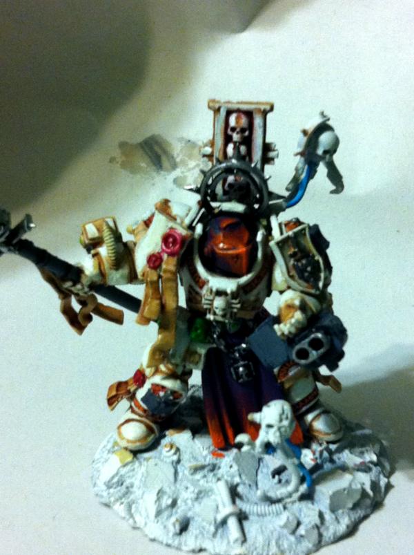
Here's my shot at it. No spot color. Something looks off.
I've found that some patterns look great up close, but look busy / lack contrast when seen from a bit further. And conversely some armies look great and unified from the tabletop, but when up close... Not so much. Perhaps it's just me though.

Since this is a test model, I welcome any suggestions / tips before I go on with the others. Thanks!
|
|
|
|
|
2011/06/14 20:07:13
Subject: New to the hobby - how do I choose a color scheme?
|
|
Ollanius Pius - Savior of the Emperor
Gathering the Informations.
|
The paints overall look good, and it's clear you've got a relatively good grasp of the colors you want.
However (and this is a big however from someone who also likes to do very uncomplicated color schemes) you really should have the weapon casings done in a different color.
Something like a dark brown or black for the gun casing and the haft of the spear would make the rest of it really 'pop'.
|
|
|
|
|
2011/06/14 20:49:13
Subject: Re:New to the hobby - how do I choose a color scheme?
|
|
Shrieking Traitor Sentinel Pilot
|
I find a web based color scheme picker to be a real help.
http://colorschemedesigner.com/#
Easy to play with and can help you get a feel for how some hexcodes mix. You can then port them over to your favorite online figure painter to see how they go.
|
|
|
|
|
2011/06/14 21:05:27
Subject: Re:New to the hobby - how do I choose a color scheme?
|
|
Lurking Gaunt
|
I have a friend who changed the colours scheme of his Tau about 4 times, all he'd painted was 1 mini! I guess there's no such thing as a bad colour scheme though... its entirely objective. My army is a pretty bizarre combination of colours... I wasnt really sure about them at first but then when there were more and more standing next to them they actually looked ok. Although I did have someone lean over my models at Warhammer World in Nottingham and say 'Mmmmmm, thats INTERESTING'. Admittedly I would have loved him to have told me how awsome they were... I mean... 'Interresting'? Thats a nice way of saying 'crap' right?
On the other hand, I made a girl angry at her boyfriend... 'why dont MY Tyranids look like that!?!' I dont know if she was happy with my quality or choice of colours. If you want to ask an artist about colour theary thats up to you... but I used to like picking all sorts of mad colour combinations in the army painter on Dawn of War. Also depends on what your collecting I guess. Look somewhere for insparation or something? When I was a kid, a guy working in a gamesworkshop told me that he changed the colour scheme of his tyrands based on an icecream he was looking at. : )
|
I am also a contributor to this blog where I upload a lot of my other projects under the name Pandorasbitzbox
http://www.krakendoomcool.wordpress.com
You can also follow us on twitter @krakendoomcool
Or me @Pandorasbitzbox |
|
|
|
|
2011/06/14 21:17:34
Subject: New to the hobby - how do I choose a color scheme?
|
|
Regular Dakkanaut
|
Here is what I see: you've got a good range of color in the gold and purple, but they're all the same brightness. Nothing in the color scheme provides contrast.
Try this: pick either the gold or the purple to be your darker color. If the gold, hit all of the gold parts with a wash of Devlan Mud. If the purple will be your darker color, hit all of the purple parts with a wash of Badab Black, then wash Devlan Mud over the silver accents (the words and such).
I suggest darkening the gold, as it will cause the eye to be drawn to the silver accents, and the purple on the weapon and banner, while pushing the rest of the model into the background a bit.
|
|
This message was edited 1 time. Last update was at 2011/06/14 21:18:52
|
|
|
|
|
2011/06/14 22:42:47
Subject: New to the hobby - how do I choose a color scheme?
|
|
Fresh-Faced New User
|
@themocaw: that's great advice. Will do and post an update picture. Automatically Appended Next Post: Kanluwen wrote:The paints overall look good, and it's clear you've got a relatively good grasp of the colors you want.
However (and this is a big however from someone who also likes to do very uncomplicated color schemes) you really should have the weapon casings done in a different color.
Something like a dark brown or black for the gun casing and the haft of the spear would make the rest of it really 'pop'.
I'm not sure I follow. The theory here is to darken the casing to make the armor stand out?
|
|
This message was edited 1 time. Last update was at 2011/06/14 22:47:41
|
|
|
|
|
2011/06/14 23:11:49
Subject: New to the hobby - how do I choose a color scheme?
|
|
Ollanius Pius - Savior of the Emperor
Gathering the Informations.
|
Seanor wrote:@themocaw: that's great advice. Will do and post an update picture.
Kanluwen wrote:The paints overall look good, and it's clear you've got a relatively good grasp of the colors you want.
However (and this is a big however from someone who also likes to do very uncomplicated color schemes) you really should have the weapon casings done in a different color.
Something like a dark brown or black for the gun casing and the haft of the spear would make the rest of it really 'pop'.
I'm not sure I follow. The theory here is to darken the casing to make the armor stand out?
Basically:
You want the weapons to not really blend together with the cloth bits you have. It's not simply to make the armor 'stand out'--but to make the entire model as a whole look a bit different.
|
|
|
|
|
2011/06/15 00:51:55
Subject: New to the hobby - how do I choose a color scheme?
|
|
Fresh-Faced New User
|
This is way too complex for me. Now I'm stuck in decision-land.
The impetus for the choice of color was reproducing an Imperial Rome feel to the army, with Tyrian purple and gold. But perhaps steel + highlights of the above would be better.
What would you guys recommend to get this feel?
|
|
This message was edited 1 time. Last update was at 2011/06/15 00:52:13
|
|
|
|
|
2011/06/15 00:56:22
Subject: New to the hobby - how do I choose a color scheme?
|
|
Ollanius Pius - Savior of the Emperor
Gathering the Informations.
|
Seanor wrote:This is way too complex for me. Now I'm stuck in decision-land.
The impetus for the choice of color was reproducing an Imperial Rome feel to the army, with Tyrian purple and gold. But perhaps steel + highlights of the above would be better.
What would you guys recommend to get this feel?
No, you really did get an Imperial Rome feel to it. That's exactly what I thought when I first saw it.
But really, the only think off about it is the gun casing and the haft of the spear. They just look...'wrong' when you look at them with that particular coloration.
You could give them a dark brown or a light grey and really retain the feel.
|
|
|
|
|
2011/06/15 01:01:57
Subject: Re:New to the hobby - how do I choose a color scheme?
|
|

Longtime Dakkanaut
|
jgemrich wrote:I find a web based color scheme picker to be a real help.
http://colorschemedesigner.com/#
Easy to play with and can help you get a feel for how some hexcodes mix. You can then port them over to your favorite online figure painter to see how they go.
This right here should be bookmarked and checked often for anyone getting into painting.
It is a fantastic tool and one that really is great fun to play around with If you are looking for a simple scheme, you can't go wrong with a primary colour and a direct offset of it, purple and yellow for instance, but when looking for something a bit more interesting like a nice triad, this wheel is a life saver
|
|
|
|
|
|
2011/06/15 12:45:51
Subject: New to the hobby - how do I choose a color scheme?
|
|
Dispassionate Imperial Judge
|
It looks great - the gold and the purple are both good colours. The purple works very well as a contrast to the gold.
I agree with what a few people have said - that there is no 'dark' colour to the model, and a dark colour could be included to give the model more contrast.
Don't get me wrong - the purple REALLY pops, but I agree that if you painted the haft of the spear a dark colour, and maybe gave the gold a darkening wash, you'd get a more pleasing, contrasty model.
If you don't like losing that much purple, then maybe a purple 'energy' edge to the spear blade?
|
|
|
|
|
|
2011/06/15 13:07:37
Subject: New to the hobby - how do I choose a color scheme?
|
|
Dakka Veteran
|
I thought about Imperial Rome (although maybe I've been playing Rome: Total War too much ), anyway, I really like the Idea of the Purple-based Energy blade. Your model looks really good, although, I would encourage you to water down your paints a little, the gold on the hip plate just looks a little thick. You have a great scheme and that is amazing for a first model. Keep it up!
|
Okay, I've been on a bit of a hiatus 2011-14
Currently working on my Riot Guard.
DA:90-S+++G+M++++B+++I+Pw40k99+D++A+++/cWD142R++T(M)DM+ |
|
|
|
|
2011/06/15 17:46:16
Subject: New to the hobby - how do I choose a color scheme?
|
|
Regular Dakkanaut
|
Okay, let's try this. Now that I've heard more, I come away from this with two basic ideas.
1. You're new at this, but your basics are pretty good.
2. You're looking for advice on color schemes, not techniques.
Purple is a very sharp, very vivid color, and a small amount goes a huge long way. I agree with Kan that you're using a bit too much of it.
Try this: paint the staff shaft in a dark metallic grey (Boltgun Metal would work well). Leave the purple on the top portions of the staff (the two cylinder thingies) and on the very bottom. As for the gun casing, I honestly think it could go either way.
Then hit all the gold parts with a Gryphonne Sepia wash (I'm suggesting Gryphonne Sepia over Devlan Mud in this case because it's more reddish and will go well with the purple). Leave the loincloth unwashed.
See how that works for you.
|
|
|
|
|
2011/06/15 21:31:17
Subject: New to the hobby - how do I choose a color scheme?
|
|
Tail-spinning Tomb Blade Pilot
|
I'd go with black for the spear
|
In the words of the late, great Colonel Sanders: "I'm too drunk to taste this chicken." |
|
|
|
|
2011/06/15 22:03:49
Subject: New to the hobby - how do I choose a color scheme?
|
|

Longtime Dakkanaut
|
Yellow IS actually okay to do, just bear in mind it's finnecky, and you need to apply a solid basecoat underneath it, and of a color that works with yellow. I made a bad decision, and now I dont know if its worth-while for me to switch so far through my scheme...
|
15 successful trades as a buyer;
16 successful trades as a seller;
To glimpse the future, you must look to the past and understand it. Names may change, but human behavior repeats itself. Prophetic insight is nothing more than profound hindsight.
It doesn't matter how bloody far the apple falls from the tree. If the apple fell off of a Granny Smith, that apple is going to grow into a Granny bloody Smith. The only difference is whether that apple grows in the shade of the tree it fell from. |
|
|
|
|
2011/06/16 01:25:34
Subject: Re:New to the hobby - how do I choose a color scheme?
|
|
Slippery Scout Biker
|
I've said it before based on advice from my spouse who overall thinks this hobby is ridiculous and has no interest in it whatsoever, but is willing to put up with it, that taking something from nature that looks cool and mimicking it will almost always work. I really should take a pic of my grey knights grand master, but I took inspiration from an orchid my spouse bought and painted the armour white (dirty white) and did the helmet and tabard in deep purple blended towards orange. It sounds INSANE, but I couldn't be happier with the results.
Even if you can't find anything like that which works for you, my suggestion is badger your significant other for advice, if you have one, or a sister or friend if you don't. Women in general have a better grasp of what colours work better together (especially given that colour blindness is far more common in men, statistically), how they should be layered, etc. I've run rough ideas past my spouse and with only a few spot suggestions she's managed to turn bland and disinteresting colour schemes into ones I'm proud to have painted.
In conclusion: find something in nature, emulate it, and make it fit what you FEEL looks right for your chapter/scheme/whatever. It's not just for tyranids anymore.
*EDIT* Here's a photo. Obviously still PIP.
|
|
This message was edited 1 time. Last update was at 2011/06/16 01:39:20
|
|
|
|
|
2011/06/16 03:10:20
Subject: New to the hobby - how do I choose a color scheme?
|
|
Storm Trooper with Maglight
|
Find something you like and ignore all comments about it being anything other then great.
|
 3200 points 3200 points  > 5400 points > 5400 points
 2500 points 2500 points |
|
|
|
|
2011/06/16 03:41:11
Subject: Re:New to the hobby - how do I choose a color scheme?
|
|
Longtime Dakkanaut
|
=shadow chaplainI took inspiration from an orchid
problem: there are potentially more unique species of orchid than there are different types of flora.... Now.. i AM stretching it a bit, but orchids... whooooowEEEEEE let me tell you, my mother stopped/lost count at 150 orchids.... and she had about 100 left after she threw/gave almost quite literally *half* of them away, and no two that were left were alike...
|
|
This message was edited 1 time. Last update was at 2011/06/16 03:41:29
15 successful trades as a buyer;
16 successful trades as a seller;
To glimpse the future, you must look to the past and understand it. Names may change, but human behavior repeats itself. Prophetic insight is nothing more than profound hindsight.
It doesn't matter how bloody far the apple falls from the tree. If the apple fell off of a Granny Smith, that apple is going to grow into a Granny bloody Smith. The only difference is whether that apple grows in the shade of the tree it fell from. |
|
|
|
|
2011/06/16 04:47:52
Subject: New to the hobby - how do I choose a color scheme?
|
|
Fresh-Faced New User
|
themocaw wrote:Okay, let's try this. Now that I've heard more, I come away from this with two basic ideas.
1. You're new at this, but your basics are pretty good.
2. You're looking for advice on color schemes, not techniques.
Purple is a very sharp, very vivid color, and a small amount goes a huge long way. I agree with Kan that you're using a bit too much of it.
Try this: paint the staff shaft in a dark metallic grey (Boltgun Metal would work well). Leave the purple on the top portions of the staff (the two cylinder thingies) and on the very bottom. As for the gun casing, I honestly think it could go either way.
Then hit all the gold parts with a Gryphonne Sepia wash (I'm suggesting Gryphonne Sepia over Devlan Mud in this case because it's more reddish and will go well with the purple). Leave the loincloth unwashed.
See how that works for you.
Exactly what I needed. I don't have time before the weekend, but I'll follow your advice and see how it turns out.
|
|
|
|
|
|
|
