| Author |
Message |
 |
|
|
|
|
Advert
|
Forum adverts like this one are shown to any user who is not logged in. Join us by filling out a tiny 3 field form and you will get your own, free, dakka user account which gives a good range of benefits to you:
- No adverts like this in the forums anymore.
- Times and dates in your local timezone.
- Full tracking of what you have read so you can skip to your first unread post, easily see what has changed since you last logged in, and easily see what is new at a glance.
- Email notifications for threads you want to watch closely.
- Being a part of the oldest wargaming community on the net.
If you are already a member then feel free to login now. |
|
 |
2011/10/09 14:22:10
Subject: Marine test scheme
|
|

Fresh-Faced New User
|
Hello everyone!
This is a test-brother for my Space Marine army, no name yet. Sort of similar to the Carcharodons, but I will try to make some distinctions between the chapters. I like the simplicity of the gray scheme, and I like the idea to really focus on weathering the marines and make the squad markings stick out.
So, on to the pictures then. He is almost done, some minor things left to do, orange lenses, teeth and some more weathering, black scratches I think. The picture got a little messed up, lost some contrast and became grainy. I don't really know why, but as I am unfamiliar with both dakkadakka's photouploder and GIMP, time will correct that, I'm sure.
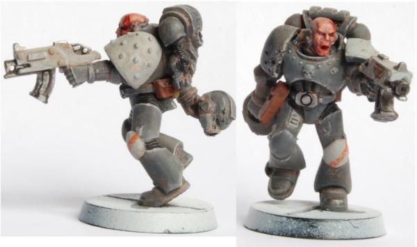
Comments an critique are very welcomed!
Slobo
|
|
|
|
 |
|
2011/10/09 14:30:12
Subject: Marine test scheme
|
|

Angry Blood Angel Assault marine
Kettering, Northants, England, UK
|
Looks good.
Might want to add a bit more of the orange though.
I find all grey armies look washed out when massed together.
|
|
|
|
|
|
2011/10/09 15:00:30
Subject: Marine test scheme
|
|

Splattered With Acrylic Paint
|
That's a nice modelling job. Alot of people prefer the dark, dirty worn look. Not me, but I can appreciate the time it takes to pull off this style.
Looking at this, and I'm aware you're not done, and the image is twice actual size, but I'd just add some darker lines in the cracks and folds of the armour to make the shape of everything stand out - especially that helmet. Maybe distinguish the little skull on the chestplate a tad more...maybe make the orange stripe a tad bolder...the white on the gun and shoulder is a little chalky.
Also I've never liked the studded shoulder-pad as it gets in the way of the chapter symbol which is usually allocated to that shoulder.
You mentioned contrast...it is key...especially to an earth tone/non colourfull scheme. Something has to make it stand out. Depth and highlights and bold symbols, otherwise from across the table it'll just look like another dirty/worn space marine army.
Yeah I like to nitpick. I look forward to seeing the figure complete.
|
|
|
|
|
|
2011/10/09 15:54:01
Subject: Marine test scheme
|
|
Fighter Pilot
|
While it's a good start and a very good feel for the army, I feel that as mentioned above, there needs to be a contrast. It all looks very bland, but a very well done bland. If you're going for orange, maybe make it a bit more noticable.
|

"Whatever happens, you will not be missed."
Guard Tank Company: 3k
PHR for DZC: 4k |
|
|
|
|
2011/10/09 18:34:59
Subject: Re:Marine test scheme
|
|
Fresh-Faced New User
|
Wow! Thanks for the quick replies guys, I really appreciate it.
CrazyMez, I somewhat agree with the “washed out” effect being a concern. I plan on create a contrast between the regular marines and sargents, as members of the first company, veterans, terminators and so on, will have more white and gold added as a sign of seniority and to make them “pop” on the battlefield. Thanks for your reply.
PeteGodwin, You are on to something regarding the deepness of the gray, the primary color is important to get right, especially if I'm going to use it a lot. Will give this a thought the next painting session. A lot of the richness of the color is gone due to me being noob at GIMP, but I will take note of that as well. Regarding a chapter symbol, I haven't gotten that far yet, but something simple, like a sword or a fist would fit well I think. Thanks for the extensive c&c, I really appreciate it, and it certainly works as an motivator!
Field_Mouse, Thanks for the reply, and your are right, I need to give the colors more overall contrast.
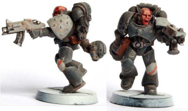
I did a re-uplode of the pic, much more accurate contrast I think, thou it feels a bit like cheating...
So, on to a painting session then. Taking all of the replies in mind and working on my GIMP skills, I will update my progress soon!
Slobo
|
|
|
|
|
|
2011/10/09 20:11:09
Subject: Marine test scheme
|
|

Death-Dealing Devastator
|
Nice scheme, definitely like the gray! Also nice touch letting him hold the helmet.
The majority of sm armies are brightly painted, so it's nice to see something that makes a bit more sense from a tactical point of view. Though still, space marines really don't give a damn, paint them purple and they're fearless as ever. xD
I would love to see more if you continue with this scheme 
|
|
|
|
|
|
2011/10/12 10:56:31
Subject: Re:Marine test scheme
|
|
Fresh-Faced New User
|
Thanks again for all the feedback!
Amphsix , Cheers, here is some more!
I have finally got some more painted, none of them is finished thou 
Got an idea for the bases, as you can see in the pics, I think it will turn out nicely and add some well needed contrast to the models. Some yellow alien planet, with urban ruins and yellow foliage. Still not set on all the markings, so if you have suggestions for a fitting chapter symbol, please let me know.
The “mostly” finished marines
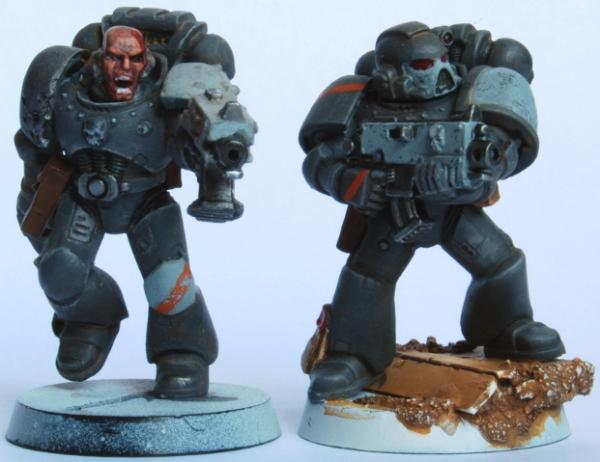
Two wips, one Sargent and a Brother
Also, I'm starting a log with this army, so if you liked this, you probably going to like the log to.
Link to log http://www.dakkadakka.com/dakkaforum/posts/list/403447.page
Thanks for checking my stuff out!
Sobo
|
|
|
|
|
|
2011/10/12 13:35:49
Subject: Marine test scheme
|
|
Hacking Shang Jí
|
Nice work so far. How are you planning to base?
|
Need more  's in my life! 's in my life!  |
|
|
|
|
2011/10/12 13:41:10
Subject: Marine test scheme
|
|
Death-Dealing Devastator
|
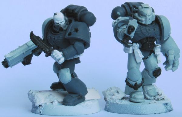
Nice progress! The grey in the recent pictures seem a little bit more blue-grey than the previous red-grey... but I assume that's just the photograph?
The sergeant's face might need a little bit more work. Teeth are very hard to do because white stands out so much on a dark scheme and quickly makes it look a bit strange.. you can counteract this by highlighting the skin around the lips, nose and eyebrows a bit more.
I also wonder, are the orange details only going to be visible as stripes? Maybe you could paint other details such as the skulls orange too.. unless you think that is a bit weird haha. In that case, some other colour maybe? Or are you keeping them grey?
|
|
|
|
|
|
2011/10/12 13:41:11
Subject: Marine test scheme
|
|
Perfect Shot Black Templar Predator Pilot
|
Looks nice man, I like it. The grey makes them pretty grimdark and almost what you would see outside of camo for marines.
|
|
|
|
|
|
2011/10/12 16:16:59
Subject: Marine test scheme
|
|

Fresh-Faced New User
|
I'm not a fan of using only grey tones.
You models need more contrast to stand out.
Maybe try out a orange field with a white stripe as markings?
I don't like the effect of the almost white bolter, that just doesn't make sense to me.
In general you could add metalic colors for the skulls and other details on the armour to create more contrast and diversity.
|
|
|
|
|
|
|
 Space Marines (Blood Angels) 1500pts
 Chaos Space Marines 800pts


 2350pt W/D/L: 4/2/3--
 600pt 2/0/1 --
 280pt
280pt
