| Author |
Message |
 |
|
|
|
|
Advert
|
Forum adverts like this one are shown to any user who is not logged in. Join us by filling out a tiny 3 field form and you will get your own, free, dakka user account which gives a good range of benefits to you:
- No adverts like this in the forums anymore.
- Times and dates in your local timezone.
- Full tracking of what you have read so you can skip to your first unread post, easily see what has changed since you last logged in, and easily see what is new at a glance.
- Email notifications for threads you want to watch closely.
- Being a part of the oldest wargaming community on the net.
If you are already a member then feel free to login now. |
|
 |
2012/02/26 06:51:35
Subject: Working toward achieving Master Class level painting - updated May 1st, 2012
|
|

Most Glorious Grey Seer
|
This past January first, I made a big New Year's Resolution to get stuff painted. One of the sub-resolutions is my Skaven army which is currently in progress (link in sig). Another is attending the Master Class painting classes held at the GW Battle Bunker in Seattle. I consider my painting skills to be very medeocre with an impressively slow speed to boot. I really want to improve in both areas. The classes are my chance to improve my skill at the very least.
First, we started off with Capain Sicarius because he was the first figure in the GW Master Class book that was sold last year. Lots of layering is involved in this scheme as well as some not insignificant freehand. I suck at layering and need a LOT more practice to improve. I also cannot do gems to save my life. Holy cow, my gem painting blows. Still, my ability to clean up my own errors impressed even some of the really good painters that were watching my progress, so that's good at least. One issue I had was with the back banner. I'm a little older than the average hobbyist so my eyesight is starting to go a little wonky when I squint at the model and try to paint around delicate details when everything is a dark blue. Normally I don't need glasses but I may have to get a pair so I can see easier when I'm doing minute detail work. Bleh. In the short term, I got a cheapo magnifyer that helped out a bit. It doesn't solve the underlying problem by any means but it was enough to get me by.
So, It took about six weeks worth of Friday evenings (and one all day run on Saturday) to get this thing completed because I'm really slow, but it is finally finished. Man, what a load off my shoulders. 

The SBB manager will be putting snaps of this guy on the Seattle Bunker's facebook page soon, but you guys get to see it first because I'm such a fan of Dakka.
Next week we start on Skulltaker. I guess I'll finally be able to learn how to do skulls properly. 
|
|
This message was edited 3 times. Last update was at 2012/05/02 06:32:06
|
|
|
 |
|
2012/02/26 07:13:49
Subject: First attempt at Master Class level painting
|
|

Lone Wolf Sentinel Pilot
|
I love the red on the cape. The white looks a little blotchy, next time used layers of thinned paint. Other than that, I think it looks great 
|
|
|
|
|
2012/02/26 08:18:33
Subject: First attempt at Master Class level painting
|
|
Most Glorious Grey Seer
|
That's something I've noticed. I have trouble with some of the reds being blotchy, too. I really don't understand what's going on with them. I'm going to test out some Golden brand retarder and see if that helps out at all. I'm not going to revisit it because this is just a learning project, but there were times that the white on the banner back was looking like I used that liquid paper correction fluid stuff instead of paint. What you see is around the fourth or fifth attempt. I finally decided to put the brush down and call it "Good enough for government work."
If I had to do it over again, I'd go with a lighter blue on the armor, too. Regal Blue is better suited for Crimson Fists.
|
|
This message was edited 2 times. Last update was at 2012/02/26 08:21:14
|
|
|
|
|
2012/02/26 14:28:10
Subject: Re:First attempt at Master Class level painting
|
|

Regular Dakkanaut
|
He looks really good, the cape is great. The only thing that jumps out at me is that the eyes look a little flat, although that may just be the picture. I haven't worked out how to get really smooth whites yet either - if you figure it out let me know!
|
|
|
|
|
2012/02/26 21:56:26
Subject: First attempt at Master Class level painting
|
|
Most Glorious Grey Seer
|
The eyes are a little flat. I built up the colors similar to the way the cloak was done. Instead, I should have built them up as white and then hit them with blood red. If I were better at doing gemstones, I would have done the eyes like that, too, so they'd pop a little more.
|
|
|
|
|
|
2012/02/26 22:05:53
Subject: First attempt at Master Class level painting
|
|
Anti-Armour Yaogat
|
The cloak looks good , the eyes seem to let it down a bit but other wise a great looking model.
|
Red corsairs -2000 points 
Empire army -2000 points 
Cygnar-15pts
======Begin Dakka Geek Code======
DR:90-S---GMB+I+Pwhfb09++D++A++/h WD362R+T(M)DM+
======End Dakka Geek Code======
psn-blackclaw12-add me and mention that you're from dakka.
|
|
|
|
|
2012/03/06 12:55:30
Subject: First attempt at Master Class level painting
|
|

Wicked Canoptek Wraith
|
Very nice first masterclass piece. Only thing I can complain at is the base, it could use more shading/highlighting. But I'm not a fan of bases myself so perhaps I should shut up
|
|
|
|
|
|
2012/03/06 14:22:46
Subject: First attempt at Master Class level painting
|
|

Thunderhawk Pilot Dropping From Orbit
|
Nice attempt, lovin the Red of the cape
|
|
|
|
|
|
2012/03/07 05:09:57
Subject: First attempt at Master Class level painting
|
|
Primered White
|
In addition to the cape, the skulls look perfect too!
|
For The Greater Good & Menoth |
|
|
|
|
2012/05/02 06:35:16
Subject: Working toward achieving Master Class level painting - updated May 1st, 2012
|
|
Most Glorious Grey Seer
|
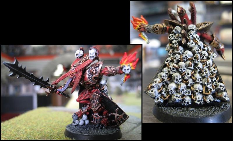
Okay, this is a little late but here is the work I did on Skulltaker from the same Masterclass book. The only thing I'm really disappointed in is how... neon the fire looks. The red and orange seem to blend into each other in this image and contrast a bit too much from the yellow. The skulls are a lot whiter than I originally intended but the damned paint was coming out so chalky that I finally gave up trying to get a smooth blend. Still, there are signs of improvement in this model and I'm working on the Ork Warboss at the moment which shows even greater progress toward my being a better painter. As always, C&C welcome.
|
|
|
|
|
|
2012/05/02 07:20:11
Subject: Working toward achieving Master Class level painting - updated May 1st, 2012
|
|
Ultramarine Land Raider Pilot on Cruise Control
|
Love the Skulltaker - a definate improvement on your marine (which was still nice BTW  ) The only things I would say is to have a more defined 'border' on the metal piping holding his skull-cape together. The metal seems to blur into the white of the skulls (although this may be just the photo). Undercoat all the piping black or dark brown and then don't paint to the edge for better definition. As for the fire it needs more 'extremes' to make it more realistic. It needs to be virtually white at the centre and go to a very dark red (like the old scab red or even a scab red/scorched brown mix - whatever the equivalent is with new names or the paint brand you're using) with some black soot lightly stippled on the extreme tips of the flames. Looking forward to seeing your next work 
|
|
This message was edited 1 time. Last update was at 2012/05/02 07:20:58
While you sleep, they'll be waiting...
Have you thought about the Axis of Evil pension scheme? |
|
|
|
|
2012/05/02 08:19:51
Subject: Working toward achieving Master Class level painting - updated May 1st, 2012
|
|
Warning From Magnus? Not Listening!
|
Is that NMM on the khorne symbols on the inside of the cape? If so, wow!
|
Notice: If you notice this notice you will notice that this notice is not worth noticing
|
|
|
|
|
2012/05/02 09:46:23
Subject: Working toward achieving Master Class level painting - updated May 1st, 2012
|
|

Esteemed Veteran Space Marine
|
Norn King wrote:Is that NMM on the khorne symbols on the inside of the cape? If so, wow!
thats what i was thinking!!!
about sicarius, is that freehanding on the inside of his cloak??? how did you do that??? thats something ive always been struggling with!!
as for the skulltaker, imo his horns could do with a bit more shading, but thats personal preference perhaps
|
|
|
|
|
|
2012/05/02 09:53:20
Subject: Working toward achieving Master Class level painting - updated May 1st, 2012
|
|
Ragin' Ork Dreadnought
|
Cool idea working through the models in the 'Eavy Metal Masterclass book! Looking forward to see your progression and improvement.
|
|
|
|
|
|
2012/05/02 13:43:55
Subject: Working toward achieving Master Class level painting - updated May 1st, 2012
|
|
Most Glorious Grey Seer
|
DijnsK wrote:Norn King wrote:Is that NMM on the khorne symbols on the inside of the cape? If so, wow!
thats what i was thinking!!!
about sicarius, is that freehanding on the inside of his cloak??? how did you do that??? thats something ive always been struggling with!!
as for the skulltaker, imo his horns could do with a bit more shading, but thats personal preference perhaps
The khorn symbols are, indeed nmm. Everything thus far pretty closely follows the stuff in the book. The exceptions are the skulls and flame. I don't like the blackish skulls they did and every campfire I've ever seen has yellow as lowest flame to the logs. The one in the book looks like a burning chunk of the stay-puff marshmellow guy from Ghostbusters.
The design in Sicarius' cloak is freehand. I'm the worst of our little group at doing that thus the simplistic design compared to the book. I'm hoping that as my brush control improves, so will my freehanding.
|
|
This message was edited 1 time. Last update was at 2012/05/02 13:44:55
|
|
|
|
|
2012/05/02 19:22:47
Subject: Working toward achieving Master Class level painting - updated May 1st, 2012
|
|
Esteemed Veteran Space Marine
|
can you explain how to paint that pattern on the inside of sicarius'cloak?
|
|
|
|
|
|
2012/05/03 15:11:22
Subject: Working toward achieving Master Class level painting - updated May 1st, 2012
|
|
Most Glorious Grey Seer
|
Brand new brush with sharp pointy tip, a careful hand, and repeatedly going back and correcting your mistakes. All of the mistakes. Including the new ones you make correcting the old ones. I remember there was a lot of profanity involved in the process, too. Also I recall a distinct desire to hurl the mini across the room one time.
Seriously though, I'm really not that good at freehand so you'll probably want to ask someone who is for advice. :(
|
|
|
|
|
|
2012/05/04 02:49:41
Subject: Working toward achieving Master Class level painting - updated May 1st, 2012
|
|
Jealous that Horus is Warmaster
|
It's beautiful
|
|
|
|
|
|
2012/05/04 03:56:45
Subject: Re:Working toward achieving Master Class level painting - updated May 1st, 2012
|
|
Hellish Haemonculus
|
Both these figs look excellent. 'Working towards Master Class,' my fanny: compared to most painters, you're already there.
|
|
|
|
|
|
2012/05/04 07:29:05
Subject: Working toward achieving Master Class level painting - updated May 1st, 2012
|
|
Utilizing Careful Highlighting
|
Good work. For me I like more light, ie sicarius' chest and knee pad. Also his eye lenses. But overall a good job you should be proud of.
|
Aurora SMs in 5th Ed (18 wins, 3 draws, 13 losses)
1st in Lords of Terra Open (Sydney) 2012
Aurora SMs in 6th Ed (3 wins, 0 draws, 5 losses))
|
|
|
|
|
|
|


 Imperial Knights: The Avengers Initiative
 Da Dark Angelz
 Arakasi vs Infinity


