| Author |
Message |
 |
|
|
|
|
Advert
|
Forum adverts like this one are shown to any user who is not logged in. Join us by filling out a tiny 3 field form and you will get your own, free, dakka user account which gives a good range of benefits to you:
- No adverts like this in the forums anymore.
- Times and dates in your local timezone.
- Full tracking of what you have read so you can skip to your first unread post, easily see what has changed since you last logged in, and easily see what is new at a glance.
- Email notifications for threads you want to watch closely.
- Being a part of the oldest wargaming community on the net.
If you are already a member then feel free to login now. |
|
 |
2013/10/10 05:39:06
Subject: Best and Worst Book Covers
|
|

Rough Rider with Boomstick
Guelph Ontario
|
As the title says. Black Library has a reputation for really crappy book covers, with the occasional one that is decent. But mostly just BAD. There's only so many times that you can show a scowling Space Marine wandering across a barren landscape.
As for the good, well, I can think of two at the moment.
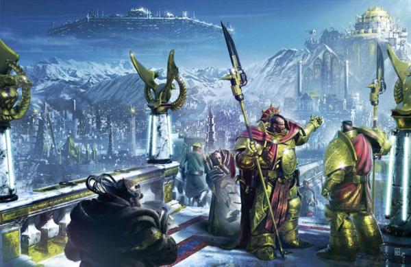
Titanicus really manages to nail the scope and scale of a full on Titan battle with its front cover.
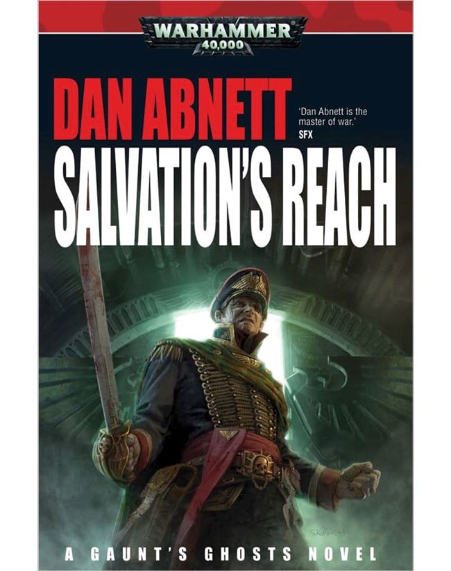
Meanwhile, I really enjoy the cover for Salvation's Reach because it's rather simplistic. Not overly generic like so many of the Spess Mahreens book covers, and not overly flashy either. Just a nice rendition of our favorite Colonel-Commissar.
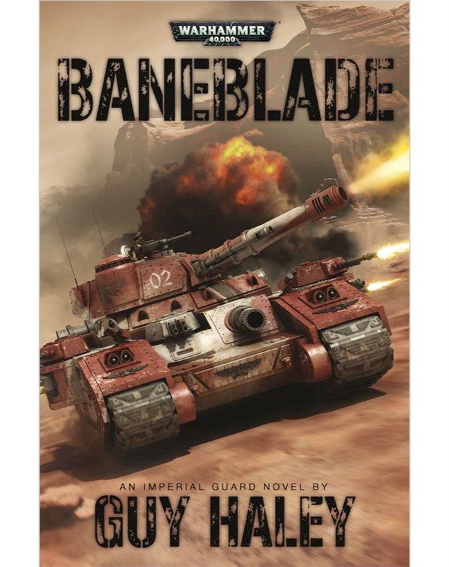
As for worst? Well, that might be tricky, because there is a lot of bad stuff to wade through. But in the end, I just had to stick with the cover of Baneblade. It's just awful.
It's literally just a photoshop of a Baneblade model plastered on the cover.
|
Think of something clever to say. |
|
|
 |
|
2013/10/10 16:44:18
Subject: Best and Worst Book Covers
|
|

Hurr! Ogryn Bone 'Ead!
|
How is baneblade a bad cover? I have seen WAY worse. It made me want to start IG!
|
|
This message was edited 2 times. Last update was at 2013/10/10 17:03:41
|
|
|
|
|
2013/10/10 16:59:01
Subject: Re:Best and Worst Book Covers
|
|
Growlin' Guntrukk Driver with Killacannon
octarius.Lets krump da bugs!
|
Wat.Beehhnblades cover is awesome.It delivers what it promises.
|
Kote!
Kandosii sa ka'rte, vode an.
Coruscanta a'den mhi, vode an.
Bal kote,Darasuum kote,
Jorso'ran kando a tome.
Sa kyr'am nau tracyn kad vode an.
Bal...
Motir ca'tra nau tracinya.
Gra'tua cuun hett su dralshy'a.
Aruetyc talyc runi'la trattok'a.
Sa kyr'am nau tracyn kad, vode an! |
|
|
|
|
2013/10/10 17:25:01
Subject: Best and Worst Book Covers
|
|

Lone Wolf Sentinel Pilot
|
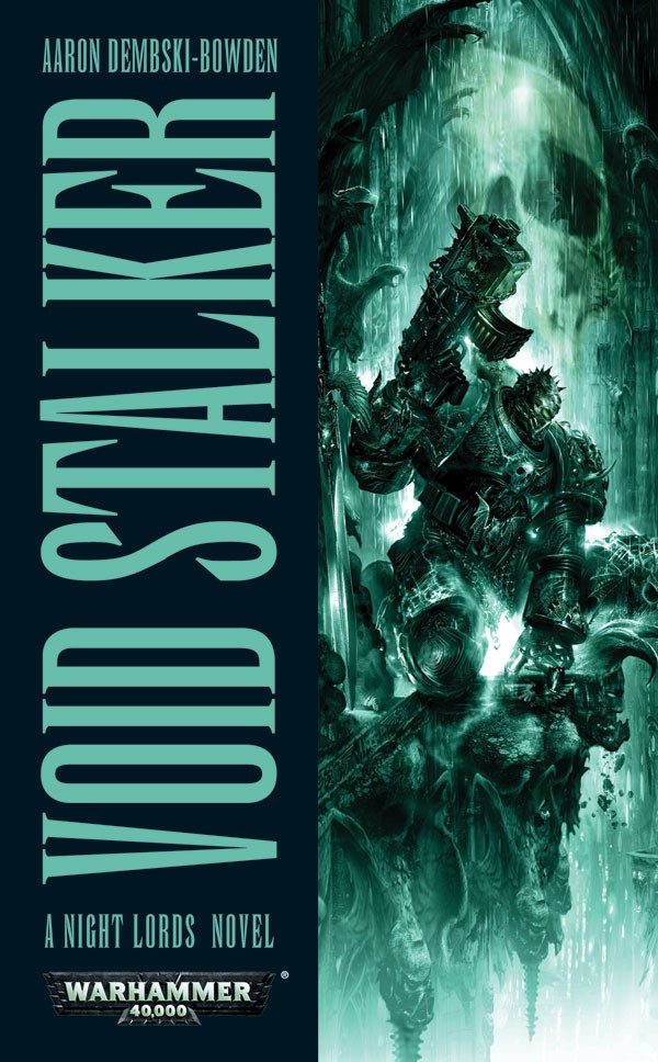
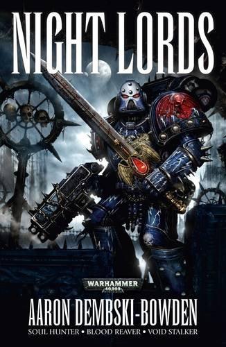
Most of FW's internal art is just photoshopped models and they usually come out looking awesome. I don't think Baneblade is any different. Now if you want a really terrible cover, the Night Lords Omnibus cover is quite the disaster.
|
|
|
|
|
2013/10/10 17:25:38
Subject: Best and Worst Book Covers
|
|

Mighty Vampire Count
|
Love Titanicus cover - except I don't recall the Salamanders or any other Marines taking part?
I cant see anything wrong with Baneblade - in fact I think I like it the most of those three 
|
I AM A MARINE PLAYER
"Unimaginably ancient xenos artefact somewhere on the planet, hive fleet poised above our heads, hidden 'stealer broods making an early start....and now a bloody Chaos cult crawling out of the woodwork just in case we were bored. Welcome to my world, Ciaphas."
Inquisitor Amberley Vail, Ordo Xenos 
"I will admit that some Primachs like Russ or Horus could have a chance against an unarmed 12 year old novice but, a full Battle Sister??!! One to one? In close combat? Perhaps three Primarchs fighting together... but just one Primarch?" da001
www.dakkadakka.com/dakkaforum/posts/list/528517.page
A Bloody Road - my Warhammer Fantasy Fiction |
|
|
|
|
2013/10/10 17:43:33
Subject: Best and Worst Book Covers
|
|
Rough Rider with Boomstick
Guelph Ontario
|
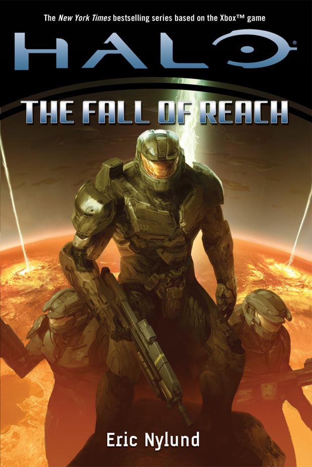
Really? To me it looks worse than the first edition covers of the Halo novels.
The reprint is much better.
When your cover looks like a video game screenshot, it strikes me as amateur.
|
Think of something clever to say. |
|
|
|
|
2013/10/10 18:22:53
Subject: Best and Worst Book Covers
|
|
Lone Wolf Sentinel Pilot
|
When the Halo books first came out, no one was going to read them that hadn't played the games. You're better off making the cover look as close to the game as possible because it's the game's graphics that people would've been familiar with when they were browsing through a store.
|
|
|
|
|
2013/10/11 05:04:59
Subject: Re:Best and Worst Book Covers
|
|
Stormin' Stompa
|
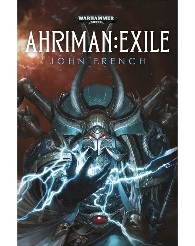
I don't know about the worst, but the new ahriman book is pretty cool looking.
|
Ask yourself: have you rated a gallery image today? |
|
|
|
|
2013/10/13 00:50:36
Subject: Best and Worst Book Covers
|
|
Fresh-Faced New User
|
So... you rag on covers that portray a scowling man in a barren backdrop...
and one of your choices for best covers is a scowling man in a barren backdrop.
Okay.
In terms of BL covers, I like the stylized ones of the Ravenor omnibus and Pariah. I also think each cover of the Night Lords series was lovely, although the omnibus one... not so much.
I really, really like the French covers of the Eisenhorn books.
|
|
|
|
|
2013/10/13 01:58:03
Subject: Best and Worst Book Covers
|
|
[DCM]
Coastal Bliss in the Shadow of Sizewell
Suffolk, where the Aliens roam.
|
Seems more of a Dakka Discussions thread, mainly as the title is pretty neutral and the fact Halo pics have already found there way in here opens it up to any and all Wargaming based novel art. Plus Black Library does more than just 40K anyways.
|
"That's not an Ork, its a girl.." - Last words of High General Daran Ul'tharem, battle of Ursha VII.
Two White Horses (Ipswich Town and Denver Broncos Supporter)
|
|
|
|
|
2013/10/13 03:22:22
Subject: Best and Worst Book Covers
|
|
Dakka Veteran
|
I like Angel of Fire:
It's drawn from the soldiers' point of view, you really feel the sense of awe that the IG were feeling.
Nemesis is awful:
It looks like some crappy terminator thing. Not in line with the 40k aesthetic at all.
|
The plural of codex is codexes.
|
|
|
|
|
2013/10/13 03:34:10
Subject: Best and Worst Book Covers
|
|

Owns Whole Set of Skullz Techpriests
Versteckt in den Schatten deines Geistes.
|
xruslanx wrote:It looks like some crappy terminator thing. Not in line with the 40k aesthetic at all.
Uhh... what?
|
|
|
|
|
|
2013/10/13 03:35:14
Subject: Best and Worst Book Covers
|
|
Ultramarine Master with Gauntlets of Macragge
|
I'm actually not a huge fan of the Horus Heresy covers in general, or at least the earlier ones. That CGI artwork doesn't do it for me like painted art does. While some of the newer stuff looks good, the first few look like screengrabs from an early PS2 era cutscene:

I do, however, really like the Ciaphas Cain covers. I like them not because they're great artwork (some are pretty good, some are meh) but because they work so well in-universe. The man's a propaganda icon in the Imperium, and the covers of the novels are illustrated as such:

There is no point where he ever double fists bolt pistols with his biceps rippling in the wind. You can tell the artist was told to do something absolutely ridiculous, as befits propaganda in the 41st millennium.
|
Check out my Youtube channel!
 |
|
|
|
|
2013/10/13 04:07:00
Subject: Best and Worst Book Covers
|
|
Hacking Proxy Mk.1
|
 Mr Morden wrote: Mr Morden wrote:Love Titanicus cover - except I don't recall the Salamanders or any other Marines taking part?
I'm pretty sure that was a much older piece of artwork from Epic (or maybe before) that they simply slapped on Titanicus because titans.
Still, I agree it's a very nice cover.
|
 Fafnir wrote: Fafnir wrote:Oh, I certainly vote with my dollar, but the problem is that that is not enough. The problem with the 'vote with your dollar' response is that it doesn't take into account why we're not buying the product. I want to enjoy 40k enough to buy back in. It was my introduction to traditional games, and there was a time when I enjoyed it very much. I want to buy 40k, but Gamesworkshop is doing their very best to push me away, and simply not buying their product won't tell them that.
|
|
|
|
|
2013/10/13 09:07:39
Subject: Re:Best and Worst Book Covers
|
|
Brigadier General
The new Sick Man of Europe
|
I think the Baneblade cover is cool.
|
DC:90+S+G++MB++I--Pww211+D++A++/fWD390R++T(F)DM+
|
|
|
|
|
2013/10/13 09:23:14
Subject: Best and Worst Book Covers
|
|

Terrifying Doombull
|
Wut? Salvations Reach has a nice cover me thinks, and as for the pictures posted by OP...well the less I say is better me thinks. All in all I think the BL book covers are good
|
|
|
|
|
2013/10/13 09:40:14
Subject: Re:Best and Worst Book Covers
|
|
Morphing Obliterator
|
The recent HH novels have had some truly great.
When I first saw these I just fell in love with them, something about them just made me want the books.
Now if you want a really terrible cover, the Night Lords Omnibus cover is quite the disaster.
After reading this I went and looked up the cover and words cant describe how I felt, it's truly awful why couldn't have done a new cover inline with the 3 individual books.
I'm assuming it's the same artist who did the covers for the BA Omni-buses.
|
|
|
|
|
|
2013/10/13 09:56:41
Subject: Re:Best and Worst Book Covers
|
|
Warning From Magnus? Not Listening!
UK
|
Surprised this gem hasn't come up yet as the worst - "The giant commissar and his regiment of tiny midget soldiers"

|
Dead account, no takesy-backsies |
|
|
|
|
2013/10/13 10:17:58
Subject: Re:Best and Worst Book Covers
|
|
Shas'ui with Bonding Knife
|
Somewhat off topic... what the hell is with GW Novels and picking some of the utterly worst and fugliest fonts for their novel covers ?
I'm not an aesthetic designer by any means, but it's like they are physically incapable of pairing a font, font size, and font weight to compliment the artwork on the cover.
Also - kearning. They needs to learn it. Though admittedly GW's kearning is better than some other games. PP's kearning could make baby jesus weep, despite being sound visual print designers otherwise.
|
|
This message was edited 2 times. Last update was at 2013/10/13 12:19:11
 daedalus wrote: daedalus wrote:
I mean, it's Dakka. I thought snide arguments from emotion were what we did here.
|
|
|
|
|
2013/10/13 10:46:55
Subject: Re:Best and Worst Book Covers
|
|
Joined the Military for Authentic Experience
On an Express Elevator to Hell!!
|
Nice idea for a thread!
Really liked the original 'Deathwing' cover (spoilered, as I could only find this one, massive image of it!)
The gritty mood of ADB's Night Lords trilogy is perfectly captured with these cover, this is probably my favourite.
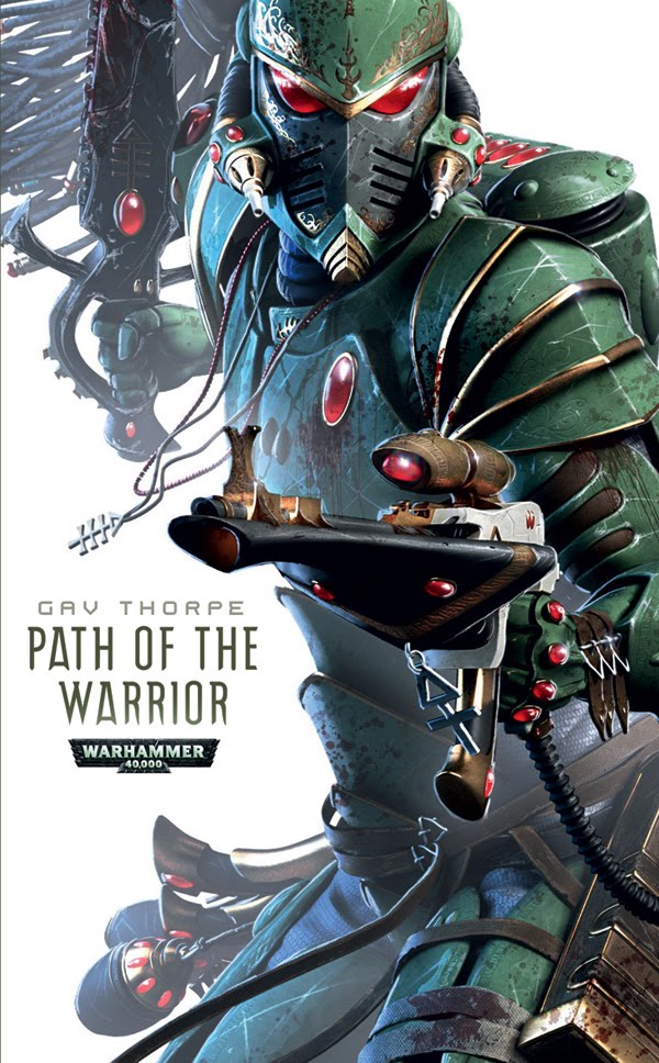
And the neat and colourful contrast of Gav Thorpe's Eldar books, tremendously striking (haven't read them yet though.. afraid to see what he has done with the Eldar background, do they grow from carrots now or something? )
As for worst, this one wins because it's bad on so many levels - the look on the White Scar's face, the lack of focus, the ork motioning 'please stop sir!', the sword that is just begging to be photoshopped into a sexual device

To be honest, biggest criticism I could make at the moment is just the complete lack of imagination or anything off-centre with the new Heresy books, to the point where most of them are instantly forgetable - "Marine + action scene" is fine, and I can understand the need for parity amongst a series, but this is the problem with just having one artist doing everything
|
|
This message was edited 1 time. Last update was at 2013/10/13 10:48:06
|
|
|
|
|
2013/10/13 11:10:36
Subject: Best and Worst Book Covers
|
|
Is 'Eavy Metal Calling?
|
On the whole, I like most of the more recent BL covers. Here are a few that really stand out: Battle of the Fang 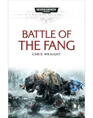 Know No Fear: 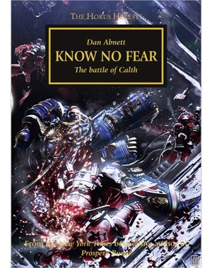 Hammer and Bolter Volume 2: 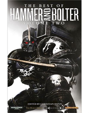 And for fantasy. I've always thought the civer for The Sundering Trilogy was pretty cool: 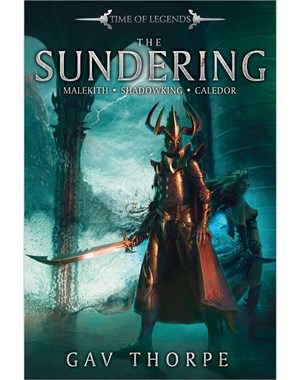 Not sure on a worst, I can't think of any really terrible ones I've seen.
|
|
This message was edited 2 times. Last update was at 2013/10/13 11:11:02
|
|
|
|
|
2013/10/13 14:17:42
Subject: Re:Best and Worst Book Covers
|
|
Dakka Veteran
|
I've always liked the Gortrek and Felix covers and as mentioned before the over the top propaganda of the Ciaphas Cain novels.
This one looks like a clown:

|
|
|
|
|
2013/10/13 15:08:27
Subject: Best and Worst Book Covers
|
|
Dakka Veteran
|
Well I don't consider that to be in keeping with the 40k aesthetic either.
|
The plural of codex is codexes.
|
|
|
|
|
2013/10/13 15:32:19
Subject: Re:Best and Worst Book Covers
|
|
Soul Token
West Yorkshire, England
|
 Pacific wrote: Pacific wrote:
As for worst, this one wins because it's bad on so many levels - the look on the White Scar's face, the lack of focus, the ork motioning 'please stop sir!', the sword that is just begging to be photoshopped into a sexual device
You know when you go on a rollercoaster, and they take a picture of you screaming at some point on the ride, then give it to you as a souvenier at the end?
|
"The 75mm gun is firing. The 37mm gun is firing, but is traversed round the wrong way. The Browning is jammed. I am saying "Driver, advance." and the driver, who can't hear me, is reversing. And as I look over the top of the turret and see twelve enemy tanks fifty yards away, someone hands me a cheese sandwich." |
|
|
|
|
2013/10/13 16:31:16
Subject: Re:Best and Worst Book Covers
|
|
Member of the Ethereal Council
|
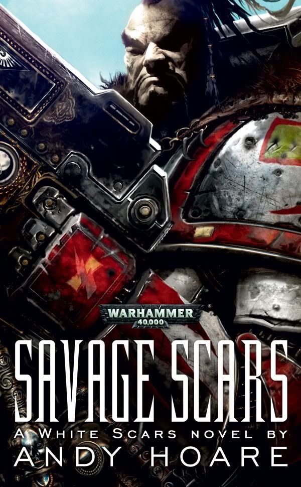
Savage Scars If my favorite TBH, He just looks like something you would only see in nightmares
|
|
|
|
|
|
2013/10/13 16:36:50
Subject: Best and Worst Book Covers
|
|
Fixture of Dakka
|
I don't like most of the Horus Heresy series covers; the proprtions of the Marines looks off to me, I don't like the "texture" of the CG artwork and half the time you can't see what's going on. That one above is a prime example.
I'm not a fan of simply re-using a piece of artwork from an old rulebook; the Titanicus cover is one example, while the first edition cover of Space Marine is another. That novel's about three new Imperial Fist recruits, so the cover features ... Dark Angels?
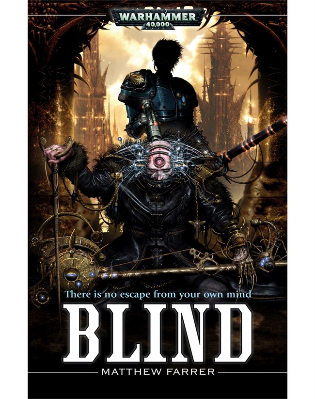
I am a bit of a fan of Clint Langley, and I really like the cover of Blind:
Oh, and the cover from either edition of Jack Yeovil's Comeback Tour is great  :
1991:

2007:

|
|
|
|
|
2013/10/13 16:46:20
Subject: Re:Best and Worst Book Covers
|
|

Xeno-Hating Inquisitorial Excruciator
|
|
|
|
|
|
|
2013/10/13 18:18:54
Subject: Re:Best and Worst Book Covers
|
|
Raging Ravener
|
Fear to tread has to be one of my favorites 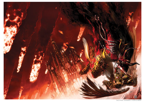 Angel exterminatus as well just oozes amazment, everything about it is just brilliant, the way perturabo is shown mid swing, the way fulgrim is stanind in the background smirking as his plan comes to fruition, the corruption starting to take ahold of the emperors children in the front firing his bolter and the wraithlords all poised however what I do not like about the horus hersy covers is how they show only a fraction of the image, when it's all able to be seen it's a beautiful image, on the front cover of the books however it looks less than impressive
|
|
This message was edited 3 times. Last update was at 2013/10/13 18:33:11
Slaanesh: "Hey guys we're back! We brought presents. And yes, they ARE sexually suggestive"
Tzeentch: "So did we miss anything while we were away"
Khorne and Nurgle trade a shifty glance
Tzeentch: "Hey! Whos been touching my stuff! Where did my Old World go?!"
Khorne and Nurgle wander off whistling. |
|
|
|
|
|
|


 5000pts
  6000pts
  3000pts