| Author |
Message |
 |
|
|
|
|
Advert
|
Forum adverts like this one are shown to any user who is not logged in. Join us by filling out a tiny 3 field form and you will get your own, free, dakka user account which gives a good range of benefits to you:
- No adverts like this in the forums anymore.
- Times and dates in your local timezone.
- Full tracking of what you have read so you can skip to your first unread post, easily see what has changed since you last logged in, and easily see what is new at a glance.
- Email notifications for threads you want to watch closely.
- Being a part of the oldest wargaming community on the net.
If you are already a member then feel free to login now. |
|
 |
2018/01/26 14:18:41
Subject: Trying to make my marines "pop" a little more.
|
|

Utilizing Careful Highlighting
|
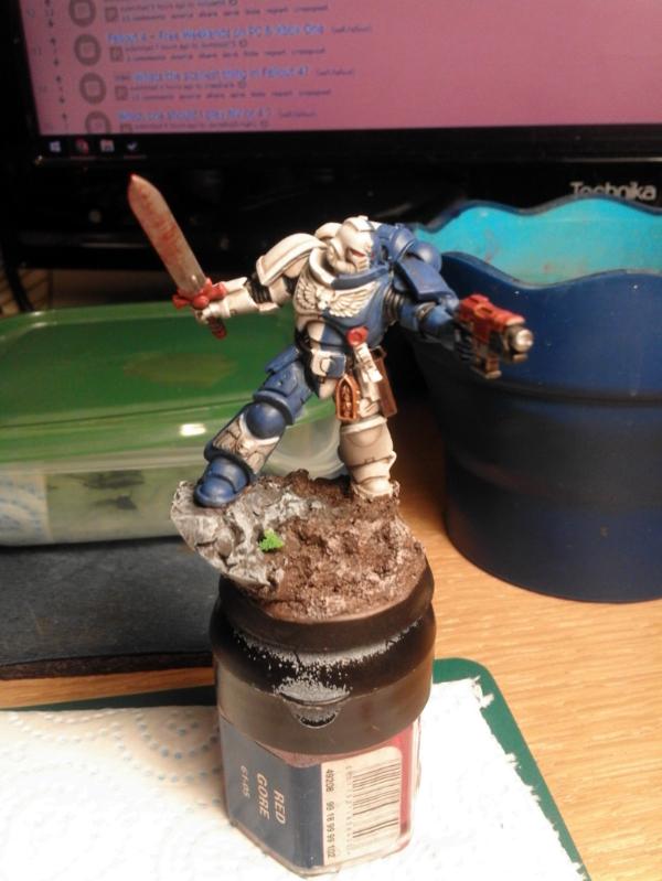
Just finished up a Lieutenant for my Primaris Marines, but I feel like its a little underwhelming, does anybody have any tips for making it more striking? Maybe pop a little more. At the moment i feel like no one part really catches your eye.
|
|
|
 |
|
2018/01/26 14:21:46
Subject: Trying to make my marines "pop" a little more.
|
|

Boosting Ultramarine Biker
|
Red helmet... Or some red stripes on the helmet? Or giving the sword a more distinctive, vibrating look?
Besides that it's a very nice looking mini... Wouldn't change too much.
|
My Element Games referal code: SVE5335 |
|
|
|
|
2018/01/26 14:28:26
Subject: Trying to make my marines "pop" a little more.
|
|
Utilizing Careful Highlighting
|
I might try the red stripe down the helmet, just like GW have done on theirs.
Thanks for the input, and the compliment!
|
|
|
|
|
2018/01/26 15:13:35
Subject: Re:Trying to make my marines "pop" a little more.
|
|

Longtime Dakkanaut
|
Or maybe just the skull? The helmet has the forehead skull but right now it's almost invisible.
|
"Fear is freedom! Subjugation is liberation! Contradiction is truth! These are the truths of this world! Surrender to these truths, you pigs in human clothing!" - Satsuki Kiryuin, Kill la Kill |
|
|
|
|
2018/01/26 15:22:12
Subject: Trying to make my marines "pop" a little more.
|
|
Utilizing Careful Highlighting
|
I might try making the aquilla and skulls a bit of a darker grey, Looking at it, it might have ended up a little lighter than I had hoped.
|
|
|
|
|
2018/01/26 15:26:16
Subject: Trying to make my marines "pop" a little more.
|
|

Liche Priest Hierophant
|
I think SM patterns like that, squared, is much better served by having pure colours. SM are based on knight heraldry after all.I think your blue is very dirty. If I where to guess you used a veyr light wash of earthshade on the blue parts. I would paint the blue on again (saving the recises as washed). Perhaps even in a lighter colour.
The pure white is like a sign of pride. Think about people including an all white outfit, like white leather. It is a prestine costume cept clean. The white part of rennesance clothing like the stockings and ruffels stand in a contrast to the other rich colours an is a status symbol because the colours are so prestine. Or the pure colour use of the white stripes albums and music videoes. All of these things works because the colours are so pure.
I think a more pure blue (less dark and white in the blue more of the coloured pigment) will make it pop more.
Look at this SM from a google search. Pops a lot more.
http://www.internet.is/sigzo/smcol.jpg
|
|
|
|
|
|
2018/01/26 15:33:31
Subject: Trying to make my marines "pop" a little more.
|
|

Grizzled Space Wolves Great Wolf
|
 EagleArk wrote: EagleArk wrote:I might try making the aquilla and skulls a bit of a darker grey, Looking at it, it might have ended up a little lighter than I had hoped.
That's what I was thinking.
I think overall it looks fine and just needs something to add a bit more contrast. At first I thought maybe some decals in a contrasting colour, but the chest and knee aquilla being a different colour may do the trick as well.
You could also make the red on the model a bit more vibrant. Use a darker shade for the shade and the same midtone for the red and it'll pop a bit more.
|
|
|
|
|
2018/01/26 15:44:59
Subject: Trying to make my marines "pop" a little more.
|
|
Utilizing Careful Highlighting
|
 Niiai wrote: Niiai wrote:I think SM patterns like that, squared, is much better served by having pure colours. SM are based on knight heraldry after all.I think your blue is very dirty. If I where to guess you used a veyr light wash of earthshade on the blue parts. I would paint the blue on again (saving the recises as washed). Perhaps even in a lighter colour.
The pure white is like a sign of pride. Think about people including an all white outfit, like white leather. It is a prestine costume cept clean. The white part of rennesance clothing like the stockings and ruffels stand in a contrast to the other rich colours an is a status symbol because the colours are so prestine. Or the pure colour use of the white stripes albums and music videoes. All of these things works because the colours are so pure.
I think a more pure blue (less dark and white in the blue more of the coloured pigment) will make it pop more.
Look at this SM from a google search. Pops a lot more.
http://www.internet.is/sigzo/smcol.jpg
I followed this guide https://www.youtube.com/watch?v=2FqVJMBL-eY to create the blue. I guess i could layer a lighter colour ontop of the blue to bring it up a little more, and brighten it.
AllSeeingSkink wrote: EagleArk wrote:I might try making the aquilla and skulls a bit of a darker grey, Looking at it, it might have ended up a little lighter than I had hoped.
That's what I was thinking.
I think overall it looks fine and just needs something to add a bit more contrast. At first I thought maybe some decals in a contrasting colour, but the chest and knee aquilla being a different colour may do the trick as well.
You could also make the red on the model a bit more vibrant. Use a darker shade for the shade and the same midtone for the red and it'll pop a bit more.
Decals and transfers could work, although I'm not sure what you mean when you talk about midtone on the red, could you expand on that?
|
|
|
|
|
2018/01/26 16:08:52
Subject: Re:Trying to make my marines "pop" a little more.
|
|
Courageous Grand Master
-
|
It's a well painted mini, and there's nothing wrong with the blue and white scheme.
But as others have said, you need to lighten the blue a bit.
Also, the purity scrolls look too white, and set against the white armour, don't really stand out. I would make them more like old parchment i.e. a bit more yellow or brownish looking. Something like Tallarn sand in the recesses or a similar yellow/brown colour.
Speaking of yellow, the chest eagle is to white as well, and should be yellow/gold, to make it stand out.
Personally, I would also tone down the blood? rust? on the blade, but each to their own.
Hope that helps.
|
"Our crops will wither, our children will die piteous
deaths and the sun will be swept from the sky. But is it true?" - Tom Kirby, CEO, Games Workshop Ltd |
|
|
|
|
2018/01/26 16:42:17
Subject: Re:Trying to make my marines "pop" a little more.
|
|
Liche Priest Hierophant
|
I think you will find the white is more filled with black making more contrast on the GW example.
The blue is only shaded in the recesses (not dirtying it, or at least as much as you) and the blue has been highlighted.
|
|
This message was edited 2 times. Last update was at 2018/01/26 16:42:42
|
|
|
|
|
2018/01/26 17:38:18
Subject: Re:Trying to make my marines "pop" a little more.
|
|

Buttons Should Be Brass, Not Gold!
|
Niiai wrote:I think you will find the white is more filled with black making more contrast on the GW example.
The blue is only shaded in the recesses (not dirtying it, or at least as much as you) and the blue has been highlighted.
Protip: In order to get the right contrast, you need to go up the same number of shades for highlights equal to the number of shades you go down for your shadow. I didn't know this for the longest time and would just shade with black and highlight with a highlight tone one or two shades up from the midtone. It never ends up looking right. If you shade with black, you will need to go up to off-white. If you don't want to go this high, don't shade with black... try a dark color tone, ideally opposite from your color on the color wheel.
Example: Guy on the left: I used dark purple/grey to shade the white helmet. Green armor uses dark red / green mix for the shadow. Yellow / white off white for the top highlight. Guy on the right (Circa early 2000's): GW Snot green with GW Scorpion Green edges. Having dark tones next to a highlight where the light catches the model increases POP.
Example 2: This space marine was shaded/highlighted with almost black / almost white over the green, back when I didn't have a handle on how color balance worked. Pure black/white desaturates your midtone.

Hope this helps!
|
|
|
|
|
2018/01/26 17:58:21
Subject: Trying to make my marines "pop" a little more.
|
|
Liche Priest Hierophant
|
Yeah, I made some grey with mixing kabalaite green and the pink colours. And then I shaded that grey into kabalite green, and I made some flesh with the pink colour. Worked nicely.
|
|
This message was edited 1 time. Last update was at 2018/01/26 18:00:25
|
|
|
|
|
2018/01/26 18:08:24
Subject: Re:Trying to make my marines "pop" a little more.
|
|
Utilizing Careful Highlighting
|
Niiai wrote:I think you will find the white is more filled with black making more contrast on the GW example.
The blue is only shaded in the recesses (not dirtying it, or at least as much as you) and the blue has been highlighted.
I think the muddyness is a mixture of bad photograph and a not entirely even basecoat, I really did try to just keep the wash in the recesses. I may of done the highlighting too faint as well. Automatically Appended Next Post:  keezus wrote: keezus wrote: Niiai wrote:I think you will find the white is more filled with black making more contrast on the GW example.
The blue is only shaded in the recesses (not dirtying it, or at least as much as you) and the blue has been highlighted.
Protip: In order to get the right contrast, you need to go up the same number of shades for highlights equal to the number of shades you go down for your shadow. I didn't know this for the longest time and would just shade with black and highlight with a highlight tone one or two shades up from the midtone. It never ends up looking right. If you shade with black, you will need to go up to off-white. If you don't want to go this high, don't shade with black... try a dark color tone, ideally opposite from your color on the color wheel.
Example: Guy on the left: I used dark purple/grey to shade the white helmet. Green armor uses dark red / green mix for the shadow. Yellow / white off white for the top highlight. Guy on the right (Circa early 2000's): GW Snot green with GW Scorpion Green edges. Having dark tones next to a highlight where the light catches the model increases POP.
Example 2: This space marine was shaded/highlighted with almost black / almost white over the green, back when I didn't have a handle on how color balance worked. Pure black/white desaturates your midtone.
Hope this helps!
So rather than a brown wash, a dark yellow sort of wash on the blue?
|
|
This message was edited 1 time. Last update was at 2018/01/26 18:10:46
|
|
|
|
|
2018/01/26 18:32:27
Subject: Trying to make my marines "pop" a little more.
|
|
Buttons Should Be Brass, Not Gold!
|
Orange is opposite blue on the color wheel, so I think brown should work. In particular, I think Rhinox Hide may be a good fit due to the red tones in it. If you think the transition between colors is too crazy, add your midtone color to it until you feel comfortable with the effect and then highlight up using the same off-white to midtone ratio you used for the shadow. I do not think that yellow has the properties to shade a dark color. Granted... I've never tried it... so I can't say for sure it won't work.
There is also nothing wrong with shading with black and edging with an ice blue either!
Understanding that highlight and shadow tones need to be equal degrees of difference from the midtone is really important... especially when it comes to light colors. As the degree of highlight is not that different from the midtone, the shadows have to be equally light...
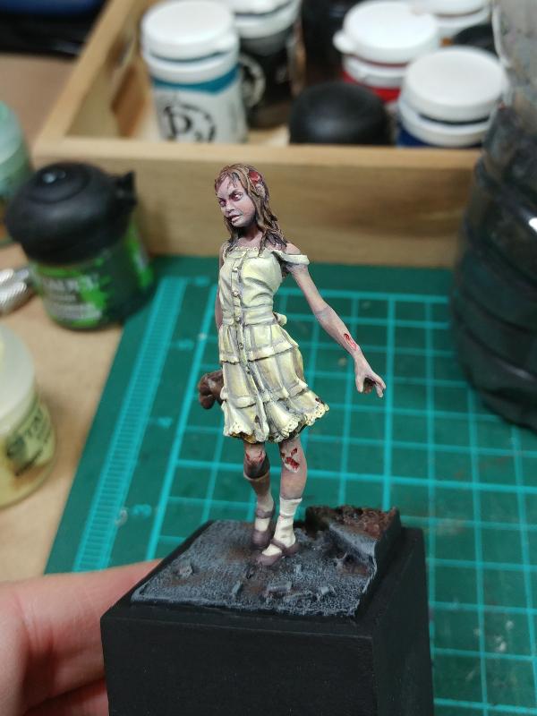
This zombie was a great learning experience. The shadows on the yellow dress are actually a very light purple/white mix - kind of a faded lilac. However, as yellow and purple are opposite on the color wheel, combined with the yellow, you get a surprisingly strong contrast despite the fact that tonally, the colors are very close together! The final effect is very dependent on color selection AND strength of shade and shadow.
I didn't grasp this until I flung myself off my comfort zone and started trying all sorts of crazy color combinations.
|
|
This message was edited 1 time. Last update was at 2018/01/26 18:33:43
|
|
|
|
|
2018/01/26 19:21:59
Subject: Trying to make my marines "pop" a little more.
|
|
Utilizing Careful Highlighting
|
keezus wrote:Orange is opposite blue on the color wheel, so I think brown should work. In particular, I think Rhinox Hide may be a good fit due to the red tones in it. If you think the transition between colors is too crazy, add your midtone color to it until you feel comfortable with the effect and then highlight up using the same off-white to midtone ratio you used for the shadow. I do not think that yellow has the properties to shade a dark color. Granted... I've never tried it... so I can't say for sure it won't work.
There is also nothing wrong with shading with black and edging with an ice blue either!
Understanding that highlight and shadow tones need to be equal degrees of difference from the midtone is really important... especially when it comes to light colors. As the degree of highlight is not that different from the midtone, the shadows have to be equally light...
This zombie was a great learning experience. The shadows on the yellow dress are actually a very light purple/white mix - kind of a faded lilac. However, as yellow and purple are opposite on the color wheel, combined with the yellow, you get a surprisingly strong contrast despite the fact that tonally, the colors are very close together! The final effect is very dependent on color selection AND strength of shade and shadow.
I didn't grasp this until I flung myself off my comfort zone and started trying all sorts of crazy color combinations.
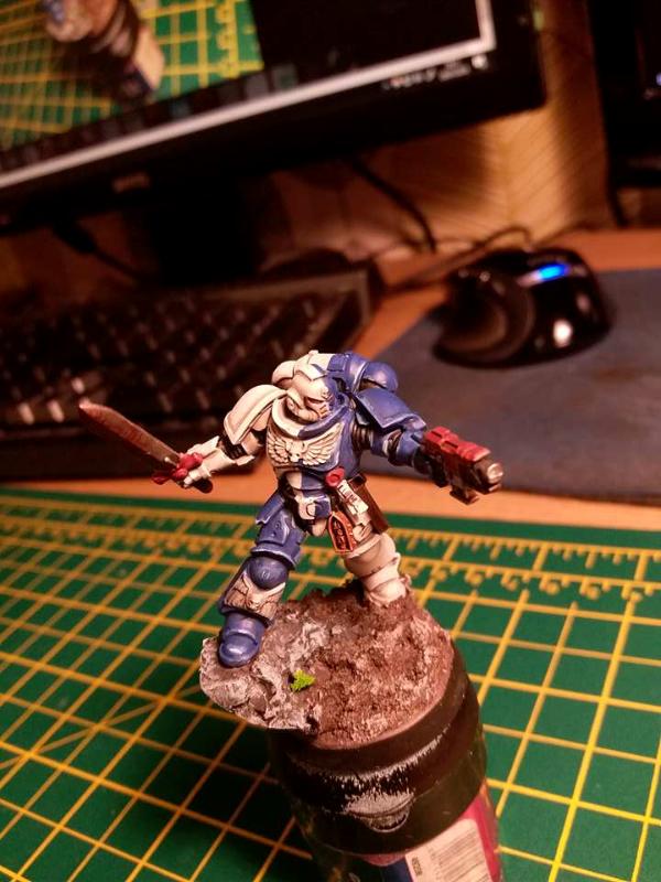
I took your advice and highlighted the blue up quite a bit lighter than i usually would, do you reckon it worked?
|
|
|
|
|
2018/01/26 19:37:47
Subject: Trying to make my marines "pop" a little more.
|
|
Fresh-Faced New User
United Kingdom
|
That has much more pop now, those sharp edge highlights have taken it to the next level
|
|
|
|
|
|
2018/01/26 19:41:10
Subject: Trying to make my marines "pop" a little more.
|
|
Buttons Should Be Brass, Not Gold!
|
I think so. Definitely the collar, the knee and thigh plate seem to jump out a bit more.
On the hip, keep in mind that the highlight should be where the light hits the object. I think there would be some small highlights at the top corners of the hip plate where they stick out beyond the belt. the bottom wouldn't normally have a strong highlight like that. If you want the hip plate to pop out more, you can make a mix of the highlight to the mid tone and bring it up a bit while simultaneously darkening the area below the hip plate to create that contrast.
|
|
|
|
|
2018/01/26 20:03:12
Subject: Trying to make my marines "pop" a little more.
|
|
Utilizing Careful Highlighting
|
keezus wrote:I think so. Definitely the collar, the knee and thigh plate seem to jump out a bit more.
On the hip, keep in mind that the highlight should be where the light hits the object. I think there would be some small highlights at the top corners of the hip plate where they stick out beyond the belt. the bottom wouldn't normally have a strong highlight like that. If you want the hip plate to pop out more, you can make a mix of the highlight to the mid tone and bring it up a bit while simultaneously darkening the area below the hip plate to create that contrast.
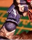
Something like this?
|
|
This message was edited 1 time. Last update was at 2018/01/26 20:03:26
|
|
|
|
|
2018/01/26 22:02:07
Subject: Trying to make my marines "pop" a little more.
|
|
Buttons Should Be Brass, Not Gold!
|
Hi. I think there should be a highlight in the upper part of the hip and not on the bottom. You can help differentiate the plates where I drew some black (or dark blue) onto the model any spots where the upper plates overhang a lower plate without adding a stark highlight at the bottom of a plate where light wouldn't normally hit.
|
|
|
|
|
2018/01/26 22:24:19
Subject: Trying to make my marines "pop" a little more.
|
|
Utilizing Careful Highlighting
|
How would you darken the bottom of the plates, just a highlight with a darker colour?
|
|
|
|
|
2018/01/26 22:50:39
Subject: Re:Trying to make my marines "pop" a little more.
|
|
Fresh-Faced New User
|
Use neon. Neon make every thing cool. Or camo.
|
|
|
|
|
2018/01/27 01:08:29
Subject: Trying to make my marines "pop" a little more.
|
|
Liche Priest Hierophant
|
Never cammo a SM except maiby mantis.
The model looks better now. I also learned some new things in this thread. An remembered something old I forgott. Thanls ye all.
|
|
|
|
|
|
2018/01/27 01:40:58
Subject: Re:Trying to make my marines "pop" a little more.
|
|
Grizzled Space Wolves Great Wolf
|
keezus wrote:Protip: In order to get the right contrast, you need to go up the same number of shades for highlights equal to the number of shades you go down for your shadow.
I actually kind of like the look of shaded but not highlighted models, it does depend on the specific model though and I think it works better with satin finished models rather than purely flat finished models, but maybe I'm just weird 
|
|
This message was edited 1 time. Last update was at 2018/01/27 01:42:19
|
|
|
|
|
2018/01/27 05:17:02
Subject: Trying to make my marines "pop" a little more.
|
|
Norn Queen
|
I think the white could uss a little agrax earthshade along all the edge crevices. Just a little brown to give everything a bit more definition.
|
|
This message was edited 1 time. Last update was at 2018/01/27 05:17:40
These are my opinions. This is how I feel. Others may feel differently. This needs to be stated for some reason.
|
|
|
|
|
2018/01/27 06:21:48
Subject: Trying to make my marines "pop" a little more.
|
|
Dangerous Skeleton Champion
|
You could try mixing a bit of Teclis Blue into the base blue paint you have and pick out only the sharpest edges. I will have to say though, the picture you posted compared to a more recent one few posts back definitely shows more pop !
|
 Udo wrote: Udo wrote:Get it painted up though. It's a scientific fact that unpainted models die quicker than painted one's.
|
|
|
|
|
2018/01/27 19:07:54
Subject: Trying to make my marines "pop" a little more.
|
|
Loyal Necron Lychguard
|
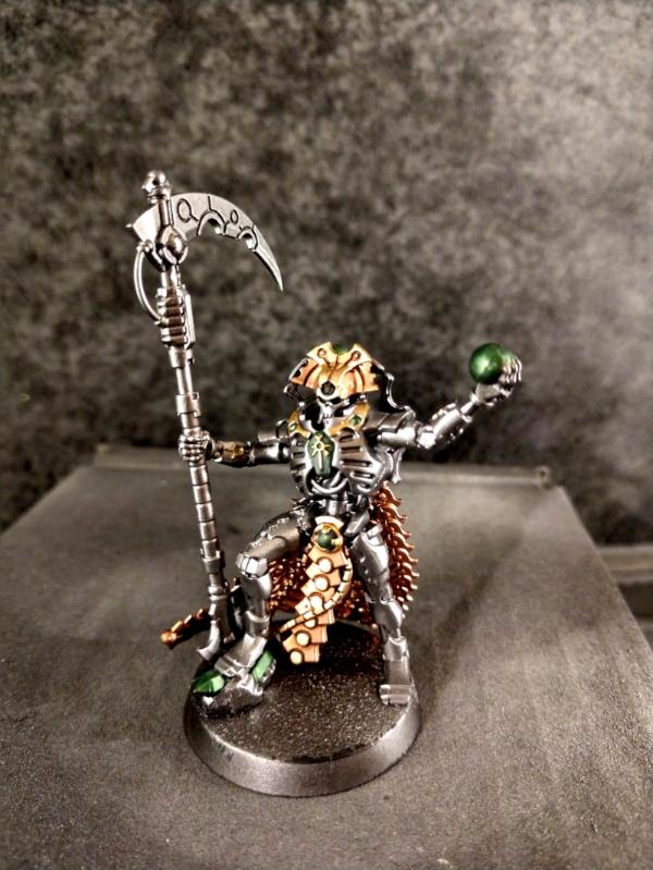
The other thing that I would suggest is some better metallics. Your current metallic areas are pretty flat as far as the sheen is concerned, I'm guessing from a wash. I'd go back over the edges with the original color to get some shine back into them. Also consider using some nicer metallic paints like Vallejo's Metallic Air or Liquid Gold series. Both can be brushed on, but do take some extra care (especially the Liquid Gold as it cannot touch water at all until it is completely dried). Examples of both are on my Necron Overlord that I'm in the middle of painting:
|
 11,100 pts, 11,100 pts,  7,000 pts 7,000 pts
++ Heed my words for I am the Herald and we are the footsteps of doom. Interlopers, do we name you. Defilers of our
sacred earth. We have awoken to your primative species and will not tolerate your presence. Ours is the way of logic,
of cold hard reason: your irrationality, your human disease has no place in the necrontyr. Flesh is weak.
Surrender to the machine incarnate. Surrender and die. ++
Tuagh wrote: If you won't use a wrench, it isn't the bolt's fault that your hammer is useless.
|
|
|
|
|
2018/01/28 04:44:40
Subject: Trying to make my marines "pop" a little more.
|
|
Pyromaniac Hellhound Pilot
|
I'd use the alternate color to outline the shoulder pad borders - white on the blue, blue on the white.
Interesting advice on "shade with the opposite". I've only done much shade work in 15mm, where the schemes I used / the scale kinda gets away with a broad sepia type washing.
I suppose brown or sepia washes still work with vehicles because "dirty"?
Also, what does one use for various grey-shades?
|
|
This message was edited 1 time. Last update was at 2018/01/28 05:14:54
|
|
|
|
|
2018/01/30 16:24:54
Subject: Trying to make my marines "pop" a little more.
|
|
Buttons Should Be Brass, Not Gold!
|
My Infinity Nomads are grey. I tried a few experiments. Black / white is the most straightforward, but it seems that as grey is neutral, any dark tone mixed into the grey mid-tone up to an off-white would work in theory. Here are a few examples of things I have tried.
1. The darkest shadows on the moderators are black and the highest highlights are a light blue (off-white). The white shoulders is a light blue, off white and goes to white.

2. I used dark purple to shade the grey on Zoe.
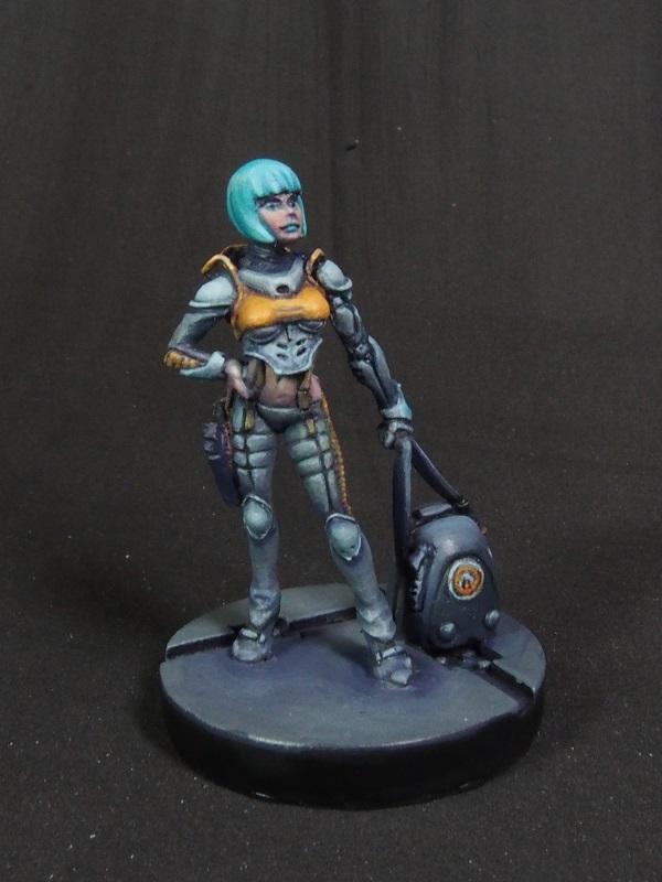
3. I used 50% dark purple + 50% dark green to shade the grey on the Taskmaster. I learned a lot when working on this guy about how light/dark adjacency can really accentuate details. The amount of detail also made me not want to paint another Infinity model for a while.
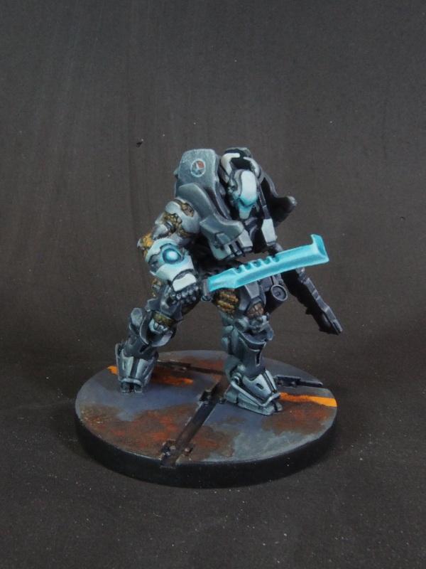
4. I used dark blue on Barbaretta

|
|
|
|
|
2018/01/30 19:08:26
Subject: Trying to make my marines "pop" a little more.
|
|
Nurgle Chosen Marine on a Palanquin
|
Now some orange highlights on the reds and drill the gun barrel.
T
|
|
|
|
|
2018/01/31 04:34:00
Subject: Trying to make my marines "pop" a little more.
|
|
Monstrously Massive Big Mutant
An unknown location in the Warp
|
Looking really nice! For the primaris chap I would recommend the mentioned red stripe on the helmet as well as highlighting both the blue and red parts once or twice to make it pop more. Another tip would be some foliage on the base, like a dead, dry bush for example, to help the base pop as well!
I hope this helps.
|
|
|
|
|
|
|
|