| Author |
Message |
 |
|
|
|
|
Advert
|
Forum adverts like this one are shown to any user who is not logged in. Join us by filling out a tiny 3 field form and you will get your own, free, dakka user account which gives a good range of benefits to you:
- No adverts like this in the forums anymore.
- Times and dates in your local timezone.
- Full tracking of what you have read so you can skip to your first unread post, easily see what has changed since you last logged in, and easily see what is new at a glance.
- Email notifications for threads you want to watch closely.
- Being a part of the oldest wargaming community on the net.
If you are already a member then feel free to login now. |
|
 |
2013/07/20 21:06:30
Subject: Re:Totally Storag - It's alive! (12/07)
|
|

Rogue Grot Kannon Gunna
|
@ Vik
QFT mate... I'd prey to such totem 
A rather unique update it is...
While I'm working on that SM head, I'd like to know your opinion on a very sensitive topic...
Some of you guys may already heard that me and Ish are going to combine our efforts and establish a humble miniature studio somewhere in upcoming autumn. But such things do not happen overnight so we're already making some preparations and sorting out complications.
One of such issues is the combined nature of our work so when it comes to posting WIPs and, more importantly, results it gets really rediculous as we cross post similar stuff all the time =) Thus we figured that the time has come to replace 2 separate plogs with one studio plog. We spent the last few days trying to find a suitable name and something to visually represent it and today I brought you the results of that brainstorm.
I ask you state which logo you like (if any) and why. Some of them are similar in all but one word so please put the corresponding letter with the number. and help us choose 
A little bit of my usual obvious blah-blah
MYWAY is the reference to what really drives us and what made us start the hobby - the desire to change things, to make them the way we see them.
The curved line that is present on all the variants represents our not-so-straightforward approach to making things with the tendency to go back on various stages and redo until we are satisfied.
"Miniatures" VS "Figures" - while miniatures sounds right and that's what we do it's a plain word with no deeper context, figures also gives a sense of thought, mathematical, logical approach and impact (as far as we understand English anyway  )

extra one lasttimer

Waiting fir your CC guys!
Cheers!
|
|
This message was edited 1 time. Last update was at 2013/07/20 21:22:51
 "No pain - no gain!" "No pain - no gain!"
--------------------------------------------------------

--------------------------------------------------------

|
|
|
 |
|
2013/07/20 22:28:50
Subject: Re:Totally Storag - An important question (21/07)
|
|

Is 'Eavy Metal Calling?
|
I don't know if my opinion matters much, but I'd definitely would go with my way miniatures, sounds better than my way figures. None of the symbols really shouted out coolness to me though...sorry. Maybe it's the change in the fonts if you kept them all the same font and same size.
Maybe since m and w are reflective images of each other you could stack them for a catchy look.
My
Way
Miniatures
To get the widths better you could do
My
Way
Minis
You could put your drawing on the side of the words.
Just a suggestion.
|
LOL, Theo your mind is an amazing place, never change.-camkierhi 9/19/13
I cant believe theo is right.. damn. -comradepanda 9/26/13
None of the strange ideas we had about you involved your sexual orientation..........-Monkeytroll 12/10/13
I'd put you on ignore for that comment, if I could...Alpharius 2/11/14 |
|
|
|
|
2013/07/21 06:18:41
Subject: Re:Totally Storag - An important question (21/07)
|
|
Rogue Grot Kannon Gunna
|
Thank you Theophony, every opinion counts for the bigger picture.
The two fonts are there 'coz we view MYWAY as the actual name and miniatures as the specification. Such things are often done in different fonts to visually separate. When I get home I'll try to make something with the structure you suggested and that way it'll be one font for sure.
|
"No pain - no gain!"
--------------------------------------------------------
--------------------------------------------------------
|
|
|
|
|
2013/07/21 07:59:11
Subject: Re:Totally Storag - An important question (21/07)
|
|

Kinebrach-Knobbling Xeno Interrogator
|
I'd have top say 3 with "miniatures". The logo is simple and effective and, while I like the tought behind "figures", miniatures sound better.
Any chance I'll be able to buy some Synapse bits in the future from this store?
|
|
|
|
|
|
2013/07/21 09:23:17
Subject: Re:Totally Storag - An important question (21/07)
|
|
Rogue Grot Kannon Gunna
|
Thanks Igandris, Synapse will sure be in the starting line
|
"No pain - no gain!"
--------------------------------------------------------
--------------------------------------------------------
|
|
|
|
|
2013/07/21 12:31:39
Subject: Totally Storag - An important question (21/07)
|
|

Shroomin Brain Boy
|
hmm.... good to hear you will make yourself be a decent couple  ...
no honestly the pair of you work most excellently together... so i think it was a natural development... even if the water outside is rather cold 
as for the name... yeah i think theo is right... miniatures before figures...as figures also stands for numbers...that then would sound a bit weird and out of context...
and for the colors... hmmm... currently i favor the last logo you attached... but this still doesn´t cut it for me...
i am all for the my way or the high way thing... but somhow it should be simpler and more flashy...the current designs all look rather homedepot/hardware store to me and not associated with minature making...
but for actual really helpful suggestions... i have currently nothing up my sleave...
but i cross both fingers for you both to get this working!!!
|
|
|
|
|
|
2013/07/21 12:43:44
Subject: Totally Storag - An important question (21/07)
|
|
Dipping With Wood Stain
|
|
|
|
|
|
|
2013/07/21 12:47:35
Subject: Totally Storag - An important question (21/07)
|
|
Shroomin Brain Boy
|
LOL... i see i am understood here^^
|
|
|
|
|
|
2013/07/21 13:12:45
Subject: Re:Totally Storag - An important question (21/07)
|
|
Rogue Grot Kannon Gunna
|
Yeah Vik, go on, keep joking, I know you're just jealous 
I also think that it lacks some modelling flavor, and look more like a movie production company. But the only thing I came up with was that inch ruler... so i'd welcome any idea. (Rivets aside )
I'll keep working...
|
"No pain - no gain!"
--------------------------------------------------------
--------------------------------------------------------
|
|
|
|
|
2013/07/21 17:20:39
Subject: Re:Totally Storag - An important question (21/07)
|
|

Da Head Honcho Boss Grot
|
LOL dont worry guys why do you think Vik is in a league
No serious I like the idea of the sign post and the colour scheme has that model makers feel, maybe making the arrow look more like a road ( road lines down the middle ) might help a little and miniatures not figures.
Thats all I have at the moment, o no wait add bullet holes to the sign 
|
|
|
|
|
2013/07/21 18:38:19
Subject: Totally Storag - An important question (21/07)
|
|
Shroomin Brain Boy
|
I think you should include a silhouette of one of your favourite self made models...
I think that would give you the best hint what you are about to mass produce...
|
|
|
|
|
|
2013/07/21 18:39:28
Subject: Totally Storag - An important question (21/07)
|
|
Da Head Honcho Boss Grot
|
 Viktor von Domm wrote: Viktor von Domm wrote:I think you should include a silhouette of one of your favourite self made models...
I think that would give you the best hint what you are about to mass produce...
That is a good call at the bottom of the sign post, see Vik does come up with good ideas
|
|
|
|
|
2013/07/21 18:40:39
Subject: Totally Storag - An important question (21/07)
|
|
Shroomin Brain Boy
|
a blind hen and all that, yeah?...
|
|
|
|
|
|
2013/07/21 20:57:24
Subject: Re:Totally Storag - An important question (21/07)
|
|
Rogue Grot Kannon Gunna
|
Sorry guys, but Vik's idea, as nice as it may seem, is a no-go 
First - we'll never be able to pick just one model for such purpose
Second - minis are tiny and complex things with lots of detail and stuff thus any decent mini ripped of all that will become a shapeless hole in the logo background. A much better graphical artist than me or Ish could possibly create a stylized image of one but definitely not I know off =(
But I spent some more time and tried to make something with Theophony's ideas... Here it is

I made some subtle changes to the last variant and I personally like it somehow, it has a weird retro movie poster feel to it...
But the numbers 4 and 8 are really my favourites atm, especially 4. Modern and lite imo.
|
|
This message was edited 1 time. Last update was at 2013/07/21 21:32:32
"No pain - no gain!"
--------------------------------------------------------
--------------------------------------------------------
|
|
|
|
|
2013/07/21 23:43:09
Subject: Totally Storag - An important question (21/07)
|
|
Shroomin Brain Boy
|
LOL...the way it figures... that´s a good one!!!
and the logos have a strong star wars feel to them...
i would vote now for either 6 or 8... but since you probably will need to print something like bills eventually i think 8 is the smartest way... looks sombre in black and white and will save you money due to the monochrome issue...so no colored prints needed...
i think it is save to say... loose the triangle... that is currently the weak part of the other logos...
|
|
|
|
|
|
2013/07/22 07:46:20
Subject: Re:Totally Storag - An important question (21/07)
|
|
Rogue Grot Kannon Gunna
|
If you only knew what it took me no to use the "long ago" font
So the creative process goes on but I promised you updates and updates you shall have!
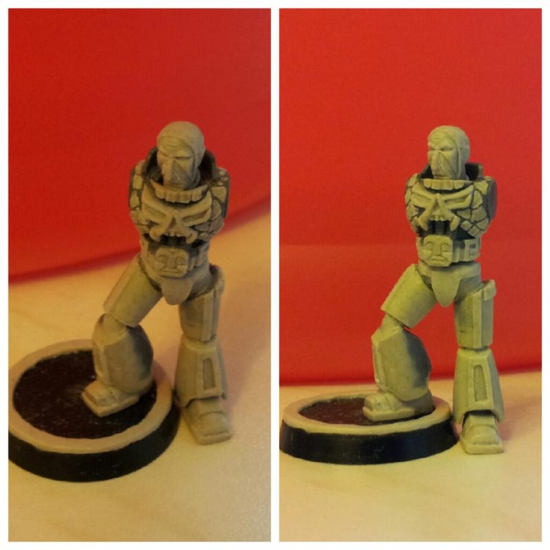
You waited long enough... But remember, it's just a teaser, the head is at work and legs are ony basic shapes... You've been warned
Cya!
|
"No pain - no gain!"
--------------------------------------------------------
--------------------------------------------------------
|
|
|
|
|
2013/07/22 07:52:30
Subject: Re:Totally Storag - An important question (21/07)
|
|
Da Head Honcho Boss Grot
|
A proper update at last and the marine returns as it is early work I will say the legs are coming on nicely and have the Aztec geometry.
Face has the feel of the drawing just a little angled at the moment, but I know this is still WIP so I know it will receive some more Storag magic.
Great work and glad its back, also I still like the yellow sign post myself but hey ho
|
|
|
|
|
2013/07/22 11:30:27
Subject: Totally Storag - An important question (21/07)
|
|
Shroomin Brain Boy
|
no need for warning... or was it that we have tissues by the ready to stop the drooling?
the legs i really like...those detail lines look very cool... the belt buckel looks a bit strange in comparrision of all the other rather grim dark looking stuff... it smiles at me...???
chest is stunning... and i marvel about what you add to the face... atm it looks like that fella is jaw- less...
and well... now that lucas is owned by disney... i bet they would even invade russia to get a law issue on you if you use that font
|
|
|
|
|
|
2013/07/22 13:20:42
Subject: Re:Totally Storag - An important question (21/07)
|
|
Rogue Grot Kannon Gunna
|
I think some comments are in order:
The head. I'm trying to make it as close to my sketch as possible (Vik, it's somewhere up the thread) and its almost done. The jaw it's there and believe me it's massive but the gorget is deep and covers most of it. Plus the head is facing down a bit as he's going to look down on his hand.
The belt. That is not a belt in modern understanding as power armor has no real pants to support this is more of an armour part that guards the abdominal region and suppots the waist (in this case it actually forms the waist as GW stock SMs have none). But I made it in such a way that it can be used with default legs as wider version of their regular belts.
And the smiling sun god is a weird shadow play
The chest. As you can see I reworked the "scales" to look more like reptile skin then rivets and with the new waist region it craved for the utter proportion overhaul. That is way it took me so much time to make the legs.
The legs. This piece alone is 26mm high. I think it speaks for the new proportions. I had to completely rework the whole design, putting realistic skeleton behind that armour bulk.
The head again. To match the new scale I had to make it a lil bit larger. It's 7mm high while SM stock heads are around 6mm.
Hope it clears some point.
|
|
This message was edited 1 time. Last update was at 2013/07/22 13:21:45
"No pain - no gain!"
--------------------------------------------------------
--------------------------------------------------------
|
|
|
|
|
2013/07/22 13:33:17
Subject: Totally Storag - An important question (21/07)
|
|
Mastering Non-Metallic Metal
|
Really impressive sculpting Storag. You've got a lot of character into that face.
|
     Mastodon: @DrH@dice.camp Mastodon: @DrH@dice.camp
The army-                  ~2295 points (built). ~2295 points (built).
 
* -=]_,=-eague Spruemeister General. * A (sprue) Hut tutorial *
Dsteingass - Dr. H..You are a role model for Internet Morality! // inmygravenimage - Dr H is a model to us all
Theophony - Sprue for the spruemeister, plastic for his plastic throne! // Shasolenzabi - Toilets, more complex than folks take time to think about! |
|
|
|
|
2013/07/22 16:42:01
Subject: Re:Totally Storag - An important question (21/07)
|
|
Rogue Grot Kannon Gunna
|
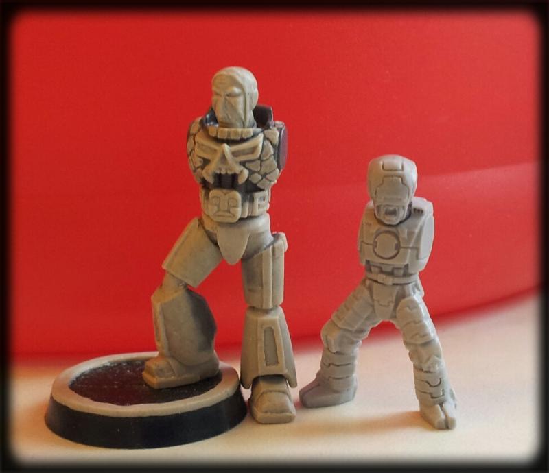
Thanks H, my first work on human head, and second at all. Lots off small work to do on it yet.
And I made an extra scale image for you guys to feel the size. As you can see the Synapse agent represent the average 40k human (32mm which is around 1,90m in 1/64 scale) if that character would stand straight he would rich right to SM's chin with his top. That makes this particular SM around 2,30m and that is exactly the hight of an aged SM hero... Please note that I'm not trying to make what is often called a "True Scale Marine". Quite the contrary actually, I want to keep that GW toyish style that appealed to me since I was a kid, but in a properly logical way, that people can understand why Marines are so special and why they can fight alone against dozens by just looking at them among adversaries. The way it figures, you know...
|
"No pain - no gain!"
--------------------------------------------------------
--------------------------------------------------------
|
|
|
|
|
2013/07/22 16:53:03
Subject: Totally Storag - the return of the Aztec! (22/07)
|
|
Dipping With Wood Stain
|
And here we can observe the main difference between an ordinary human and the seasoned Space Marine - when the first one is crying terrified about his hands beeing chopped off, the SM stays perfectly calm with just a little concern for his arms missing:
" - Oh Emperor's mercy, my arms! Such a pain!... We're gonna die! We ALL gonna die!!!..
- Keep it calm, boy - tis' but a scratch! Which is not the excuse to abort the mission."
|
|
This message was edited 2 times. Last update was at 2013/07/22 17:04:46
|
|
|
|
|
2013/07/22 20:11:11
Subject: Totally Storag - the return of the Aztec! (22/07)
|
|
Shroomin Brain Boy
|
The way it figures, you know...
what a cool line to end now all future posts of yours ... think about CD and CI and all that...
and well i didn´t realize that your marine is that big...!... and yeah... i even knew why the sun idol had to look that way from former comments of yours...
i am now eager looking forward to your new or rather finished head... i now remeber big chin again too...
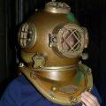
and ish.... that reminds me now a bit of this:
|
|
|
|
|
|
2013/07/22 21:50:06
Subject: Re:Totally Storag - the return of the Aztec! (22/07)
|
|
Da Head Honcho Boss Grot
|
LOL made me chuckle any way, I did not realise the size difference of the SM you could technically use it as true scale marine though 
The smiling sun god is only smiling in one of the pictures if you look closely  strange it follows you around the room.
Have you started on the arms for the marine then ? Cool to see the Synapse return  this guy is so cool
|
|
|
|
|
2013/07/22 22:00:01
Subject: Totally Storag - the return of the Aztec! (22/07)
|
|
Shroomin Brain Boy
|
is it just me or does the synapse fella has something ferral going on?
|
|
|
|
|
|
2013/07/22 22:03:18
Subject: Totally Storag - the return of the Aztec! (22/07)
|
|
Da Head Honcho Boss Grot
|
In what way 
|
|
|
|
|
2013/07/22 22:06:28
Subject: Totally Storag - the return of the Aztec! (22/07)
|
|
Shroomin Brain Boy
|
the mouth... it looks as if he is about to take a bite^^...
|
|
|
|
|
|
2013/07/22 22:12:50
Subject: Totally Storag - the return of the Aztec! (22/07)
|
|
Da Head Honcho Boss Grot
|
Yes I guess I can sort of see what you mean, I thought maybe some one had just kicked him in the nackers, after all he had no arms to protect himself 
|
|
|
|
|
2013/07/22 22:20:01
Subject: Totally Storag - the return of the Aztec! (22/07)
|
|
Shroomin Brain Boy
|
ouch....ouch....man... no fair to tell me such stuff
or he could be in the middle of uttering the word...f...k...
|
|
|
|
|
|
2013/07/22 22:23:18
Subject: Re:Totally Storag - the return of the Aztec! (22/07)
|
|
Da Head Honcho Boss Grot
|
Yes I can see that to
|
|
|
|
|
|
|