Hey bro! Thought I had an account here already, but it disappeared for some reason.
You sure are being pandered with compliments! No wonder you like it here

Which must be very motivating, so that's good

But surely you must be aching for some constructive criticism as well right? Right? I love seeing you improve on your work and "Mek stoff noice an' pwitty". Because you're trying lots of new things here.
First things first, the well deserved compliments:
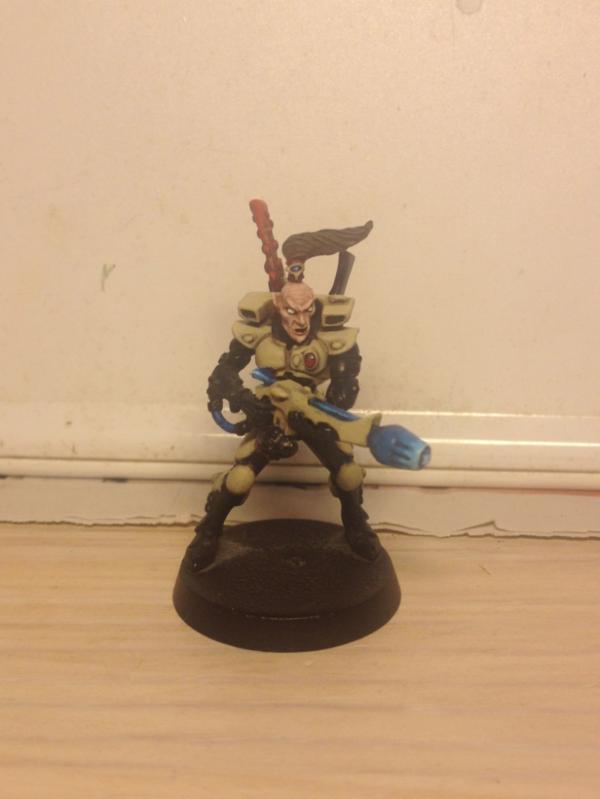
I agree on the specular reflections on the canisters. They are spot on, I actually believed you had gloss coated it at first glance!
Your blends are looking better and better, it's a shame though you're not using them everywhere (the skin could really do with some softening up, like at the triceps of the flamer, though some light drybrush might work as well there)
The camo is getting pretty refined, nice thin stripes in there, bet you're doing it faster as well.
Though the models aren't always that forgiving and you'd really have to work around it to get great results, the eyes are pretty amazing, especially the right eye on that flamer looks spot on. And is that a specular reflection in the eye or am I imagining things?
The 5 o' clock shadow works pretty well too.
Clear canisters are fairly tricky so it's a pretty daring attempt there, even though it's kind of silly to have completely clear large canisters for dangerous fluids, that'd be orky thinkin'.

You almost got it right as well! The liquid is shaded in the right direction and it's darker at the meniscus like its supposed to be (though perhaps too dark, but that's not a problem for the 'effect')
Already told you but it needs to be said again, the tattoo is pretty damn good. Nice and symmetrical and everything. I don't think you should highlight it. It'll become less clear and it might end up looking less neat and possibly less like a tattoo. Looking at it again, I do think it might need to be blended into the skin a little more though to look a little less like a fresh tattoo bordering on bodypaint. Just 1 wash of the top skin colour should suffice I think. And I love the pouty lip on that guy (also nice shadow suggesting the zygomatic).
A point about the shoulder muscles. I think the main problem isn't so much the straight dark line going around the shoulder, separating the deltoid. It's more that the pectoralis is flowing over the shoulder and there's no separation for the trapezoid there, accentuating the fact that there's a line going around his shoulder. Use your anatomical knowledge! Also, that picture is pretty good reference on where there should be dark lines and where not.
Wild idea, you might be willing to try, painting a shadow implying the 'dent' where the acromion lies, on top of the shoulder and thinning or removing the shadow there. Might be nice to experiment on. I've got an ork with a bare chest as well, though I believe I did fix the gap.
The last flamer slightly has the headband merging with the skin, some darklining would make it look a little neater. (a dark red would work, watered down).
The top part of the flamer canisters is too blue (giving it an odd contrast with the liquid as well), mind you, it's clear, so it's not reflecting the clear blue sky (only slightly, this can be visible around the specular highlights) so it should be showing what is behind it. I could give you a quick paintover with some explanations of how you could paint a clear canister like that.
And finally, there's a little red spot on the back of the left deltoid of the last flamer.

Peace out, keep stompin'!


 ~2500p
 ~1750p
  (
( (
(