| Author |
Message |
 |
|
|
|
|
Advert
|
Forum adverts like this one are shown to any user who is not logged in. Join us by filling out a tiny 3 field form and you will get your own, free, dakka user account which gives a good range of benefits to you:
- No adverts like this in the forums anymore.
- Times and dates in your local timezone.
- Full tracking of what you have read so you can skip to your first unread post, easily see what has changed since you last logged in, and easily see what is new at a glance.
- Email notifications for threads you want to watch closely.
- Being a part of the oldest wargaming community on the net.
If you are already a member then feel free to login now. |
|
 |
2013/04/18 13:49:27
Subject: GW's "professional" painter's standards dropping?
|
|

Grim Dark Angels Interrogator-Chaplain
|
Again- they're trying to illustrate the "anybody can do it" thing. If you set the bar too high then people will be less inclined to paint.
Automatically Appended Next Post:
Plus there's plenty of videos on YouTube etc anyway if people wanna try a little more..
|
|
This message was edited 1 time. Last update was at 2013/04/18 13:56:20
|
|
|
 |
|
2013/04/18 14:12:10
Subject: Re:GW's "professional" painter's standards dropping?
|
|

Utilizing Careful Highlighting
|
But it's a promotional product. It's like expecting McDonald's to put how their burgers really look like in their ads. I mean that'll be closer to the truth but it'll be less enticing. Or art schools showing mediocre artworks on their brochures.
Promotional photos are there to help you sell the product by showing it in the best possible light. Just like why you dress up for a job interview: you are selling yourself and you're trying to look as best as possible. A mediocre paintjob does not do this on their product. It damages the company's reputation ("Aren't they professional enough to hire good painters to show their product? If small garage companies can hire really good painters, why can't they?") and it does not sell the product well. If you have no experience with painting, would you honestly buy a product with shoddily painted box art over a professionally painted one?
Also, setting the bar too low could lead to people being less inclined to further develop their skills.
|
|
|
|
|
|
2013/04/18 15:41:13
Subject: GW's "professional" painter's standards dropping?
|
|
Grim Dark Angels Interrogator-Chaplain
|
But they're not really shoddy are they? If any painting is to be criticized it's ForgeWorld. Have you seen the paintjobs they've been doing? ie the World Eater rampager squad. Dreadful.
|
|
|
|
|
|
2013/04/18 15:49:31
Subject: Re:GW's "professional" painter's standards dropping?
|
|
Utilizing Careful Highlighting
|
It's tabletop quality. Just like how McDonald's burgers in real life look alright and not outright disgusting. You don't show mediocre work (especially if you're charging premium price) to show your model off and expect people to not notice. Imagine premium brands like Prada or Ferrari showing their products with not enough lighting or in low resolution: sure it looks alright and it shows the product but it does them a disservice of not showing the best, and it hurts the brand image ("finest miniatures in the world!" But we can only hire tabletop quality painters, sorry about that. Even if we charge a lot for our minis. Yeah, we can't afford great painters.).
It's still not in the best light you can show the product.
|
|
|
|
|
|
2013/04/18 17:02:09
Subject: GW's "professional" painter's standards dropping?
|
|
Lurking Gaunt
|
 angelofvengeance wrote: angelofvengeance wrote:But they're not really shoddy are they? If any painting is to be criticized it's ForgeWorld. Have you seen the paintjobs they've been doing? ie the World Eater rampager squad. Dreadful.
afaik they don't even paint half their stuff themselves, they let enthusiastic fans from conventions do it for them. I don't think they're bad pj's particularly, but they definitely don't photograph well.
|
|
|
|
|
2013/04/18 21:38:38
Subject: GW's "professional" painter's standards dropping?
|
|

Douglas Bader
|
angelofvengeance wrote:But they're not really shoddy are they? If any painting is to be criticized it's ForgeWorld. Have you seen the paintjobs they've been doing? ie the World Eater rampager squad. Dreadful.
One mediocre* paint job isn't a trend. Yeah, someone probably rushed it out to meet a deadline, but they're still doing amazing work on things like the Fellblade or character dioramas. The overall standard for their painting is still "awesome goal to aim for", not "let's show what the average 10 year old would paint".
*Yes, mediocre. The rampager squad certainly isn't going to be winning any painting awards but it's still way above the awful "just throw some paint on it" Tau models or that shameful upgrade pack.
|
There is no such thing as a hobby without politics. "Leave politics at the door" is itself a political statement, an endorsement of the status quo and an attempt to silence dissenting voices. |
|
|
|
|
2013/04/19 08:25:16
Subject: GW's "professional" painter's standards dropping?
|
|
Lesser Daemon of Chaos
|
Wow, I mean if you think thats bad. you should see my paintjobs.......
|
"I prayed to that corpse for a millenia with no response, what makes you think he'll answer you?"
 2000 Loki Snaketongue and the Serpents of Malice 2000 Loki Snaketongue and the Serpents of Malice |
|
|
|
|
2013/04/19 08:30:12
Subject: GW's "professional" painter's standards dropping?
|
|

Longtime Dakkanaut
|
 wowsmash wrote: wowsmash wrote:I don't think we're contesting beginners painting guide system. We're protesting using it in the box art, rulebook and codex's. save the simple painted pics for the how to paint books/DVDs and keep the eavy metal team stuff on everything else.
But are those weaker paintjobs used in those places? I have DA and Tau codices and paintjobs there are as good as ever. Only "hobby" level model there is the other Farsight and he's shown so far that you don't really notice shortcomings in the paintjob. Examples cited here are mostly from White Dwarf.
|
Mr Vetock, give back my Multi-tracker! |
|
|
|
|
2013/04/19 11:47:40
Subject: GW's "professional" painter's standards dropping?
|
|
Longtime Dakkanaut
|
I believe those pic come of their website. I dislike it when they talk out of both sides of their mouth. You can't say they are the highest quality mini company in the world to justify your prices and then turn around and just slap some paint on it that I as a beginner can do better. You don't through down table top standard paint jobs to represent your product.
|
|
|
|
|
2013/04/19 18:30:41
Subject: Re:GW's "professional" painter's standards dropping?
|
|

Longtime Dakkanaut
|
 heartserenade wrote: heartserenade wrote:But it's a promotional product. It's like expecting McDonald's to put how their burgers really look like in their ads. I mean that'll be closer to the truth but it'll be less enticing. Or art schools showing mediocre artworks on their brochures.
Promotional photos are there to help you sell the product by showing it in the best possible light. Just like why you dress up for a job interview: you are selling yourself and you're trying to look as best as possible. A mediocre paintjob does not do this on their product. It damages the company's reputation ("Aren't they professional enough to hire good painters to show their product? If small garage companies can hire really good painters, why can't they?") and it does not sell the product well. If you have no experience with painting, would you honestly buy a product with shoddily painted box art over a professionally painted one?
Also, setting the bar too low could lead to people being less inclined to further develop their skills.
Considering GW's goal is to sell toys to children. Even the "bad" paintjobs are going to be omg amazing unattainable to some 12 yearold whos never used a paintbrush in his life.
promotional photos make people feel cheated actually IMO. You see the nice pictures but then when you order it, some snot nosed 16 yearold who could care less throws your half cooked crap burger together and serves it to you. or serves you stuff that's been sitting in the warming tray for 6 hours. yum.
|
|
|
|
|
2013/04/20 00:24:13
Subject: Re:GW's "professional" painter's standards dropping?
|
|
Utilizing Careful Highlighting
|
kb305 wrote: heartserenade wrote:But it's a promotional product. It's like expecting McDonald's to put how their burgers really look like in their ads. I mean that'll be closer to the truth but it'll be less enticing. Or art schools showing mediocre artworks on their brochures.
Promotional photos are there to help you sell the product by showing it in the best possible light. Just like why you dress up for a job interview: you are selling yourself and you're trying to look as best as possible. A mediocre paintjob does not do this on their product. It damages the company's reputation ("Aren't they professional enough to hire good painters to show their product? If small garage companies can hire really good painters, why can't they?") and it does not sell the product well. If you have no experience with painting, would you honestly buy a product with shoddily painted box art over a professionally painted one?
Also, setting the bar too low could lead to people being less inclined to further develop their skills.
Considering GW's goal is to sell toys to children. Even the "bad" paintjobs are going to be omg amazing unattainable to some 12 yearold whos never used a paintbrush in his life.
promotional photos make people feel cheated actually IMO. You see the nice pictures but then when you order it, some snot nosed 16 yearold who could care less throws your half cooked crap burger together and serves it to you. or serves you stuff that's been sitting in the warming tray for 6 hours. yum.
Have you ever seen product shots of good toy companies that are mediocre? They almost always show their product in the best light. Even GW's rival companies, those that sell their figures for less, show better paintjobs than that Tau warrior. So if your rivals, supposedly of "less quality" (small companies, they also charge less), can afford good painters, what does that say about you? Are you just incompetent, or are you in need of money and you can't hire a painter? It WILL color the perception of its customers with the company.
It makes you feel cheated, yes. But they're doing it for a reason: if they put out "real" photos of their products, sales will drop.
|
|
|
|
|
|
2013/04/20 05:51:44
Subject: GW's "professional" painter's standards dropping?
|
|
Regular Dakkanaut
|
I'm with Heartserenade on this one, when you buy a model you adjust your expectations based upon your skill with a paintbrush. When i buy something i know that my effort will not look like a GD winner (i consider myself a competent painter, no more) but i look to the GW official paintjob to inspire me and show how good it CAN look.
Some of the paintjobs features in WD recently have not shown the product in its best light and actually put me OFF buying certain figures.
|
WWW.conclaveofhar.com - Now with our first Podcast!
Also check out our Facebook Group!
|
|
|
|
|
2013/04/20 06:04:56
Subject: Re:GW's "professional" painter's standards dropping?
|
|
Grizzled Space Wolves Great Wolf
|
heartserenade wrote:But it's a promotional product. It's like expecting McDonald's to put how their burgers really look like in their ads. I mean that'll be closer to the truth but it'll be less enticing. Or art schools showing mediocre artworks on their brochures. Promotional photos are there to help you sell the product by showing it in the best possible light. Just like why you dress up for a job interview: you are selling yourself and you're trying to look as best as possible. A mediocre paintjob does not do this on their product. It damages the company's reputation ("Aren't they professional enough to hire good painters to show their product? If small garage companies can hire really good painters, why can't they?") and it does not sell the product well. If you have no experience with painting, would you honestly buy a product with shoddily painted box art over a professionally painted one? Also, setting the bar too low could lead to people being less inclined to further develop their skills.
I do feel it's less of a case of telling the professional painters to "paint worse" for promotional material, I feel it's more of a "paint mroe cartoonish". Along with the bobble head scale models and skulls on damned near everything, I feel like they're aiming for a more cartoonish look in the paintjob, even in cases where the sculpt isn't THAT cartoonish (many models the painter has clearly gone out of their way to make muscles look square with edge highlighting when in reality the model has smooth muscles with no edges and no square shape). One of my personal obstacles to painting "Eavy Metal" quality, even back when they were painting at a higher standard, I don't know what bloody paints they are using. It's often clearly a mix of something and not straight from the pot, but that's my struggle even more than technique. Some of my best models are a result of the old master class tutorials on LOTR (which they've now removed from their site) because it made me realise how much mixing you need to do to achieve the looks that the GW pros have.
|
|
This message was edited 2 times. Last update was at 2013/04/20 06:07:23
|
|
|
|
|
2013/04/20 06:19:48
Subject: GW's "professional" painter's standards dropping?
|
|
Most Glorious Grey Seer
|
Do they still have the old 'Eavy Metal guys on the payroll?
|
|
|
|
|
|
2013/04/20 11:44:14
Subject: GW's "professional" painter's standards dropping?
|
|
Thunderhawk Pilot Dropping From Orbit
|
High quality paintjobs is what drives me to buy a new model so I can paint it. A shoddy paint job makes me go to a different website or different company all together. Forge World mostly* does not have their stuff painted. This is why forge World is not so much of an eye sore to me, but when they post a pic trying to sell a mini and it is bad...I don't buy it.
|
Click the images to see my armies!
 |
|
|
|
|
2013/04/20 14:02:05
Subject: Re:GW's "professional" painter's standards dropping?
|
|
Utilizing Careful Highlighting
|
AllSeeingSkink wrote: heartserenade wrote:But it's a promotional product. It's like expecting McDonald's to put how their burgers really look like in their ads. I mean that'll be closer to the truth but it'll be less enticing. Or art schools showing mediocre artworks on their brochures.
Promotional photos are there to help you sell the product by showing it in the best possible light. Just like why you dress up for a job interview: you are selling yourself and you're trying to look as best as possible. A mediocre paintjob does not do this on their product. It damages the company's reputation ("Aren't they professional enough to hire good painters to show their product? If small garage companies can hire really good painters, why can't they?") and it does not sell the product well. If you have no experience with painting, would you honestly buy a product with shoddily painted box art over a professionally painted one?
Also, setting the bar too low could lead to people being less inclined to further develop their skills.
I do feel it's less of a case of telling the professional painters to "paint worse" for promotional material, I feel it's more of a "paint mroe cartoonish". Along with the bobble head scale models and skulls on damned near everything, I feel like they're aiming for a more cartoonish look in the paintjob, even in cases where the sculpt isn't THAT cartoonish (many models the painter has clearly gone out of their way to make muscles look square with edge highlighting when in reality the model has smooth muscles with no edges and no square shape).
One of my personal obstacles to painting "Eavy Metal" quality, even back when they were painting at a higher standard, I don't know what bloody paints they are using. It's often clearly a mix of something and not straight from the pot, but that's my struggle even more than technique. Some of my best models are a result of the old master class tutorials on LOTR (which they've now removed from their site) because it made me realise how much mixing you need to do to achieve the looks that the GW pros have.
While I do acknowledge that the 'Eavy Metal style has its merits, it's also not my cup of tea. Their technique does make the model pop out more on the table, although for me I am more of a fan of carefully blended and much more realistic paintjobs rather than high contrast ones.
Infinity's Angel Giraldez is one of my favorite painters. I mean, just look at his work. That's how you paint something in high quality.
|
|
|
|
|
|
2013/04/20 15:43:45
Subject: GW's "professional" painter's standards dropping?
|
|
Ian Pickstock
Nottingham
|
When I was a kid, I remember getting a "wow" factor from seeing miniatures in White Dwarf, which I definitely don't now. They just look boring.
Yet I still get the "wow" factor from Golden Demon stuff, which I've seen plenty of in person at Warhammer World.
I suspect it's more likely a conscious choice to either a)keep it simple (though the combination with bland colour schemes means the end result is often pretty crappy) or b)reduce cost by reducing the time spent painting on the time, and therefore reduce the quality.
|
Naaa na na na-na-na-naaa.
Na-na-na-naaaaa.
Hey Jude. |
|
|
|
|
2013/04/20 15:49:52
Subject: GW's "professional" painter's standards dropping?
|
|
Ancient Ultramarine Venerable Dreadnought
|
 BryllCream wrote: BryllCream wrote:When I was a kid, I remember getting a "wow" factor from seeing miniatures in White Dwarf, which I definitely don't now. They just look boring.
Yet I still get the "wow" factor from Golden Demon stuff, which I've seen plenty of in person at Warhammer World.
I suspect it's more likely a conscious choice to either a)keep it simple (though the combination with bland colour schemes means the end result is often pretty crappy) or b)reduce cost by reducing the time spent painting on the time, and therefore reduce the quality.
Yeah its obvious they did it on purpose, their new line of paints and all of the minis seem to be geared towards really good paint jobs that are achievable by the majority, as opposed to the total fething awesome paint jobs by Eavy Metal that 99% of us wouldn't be able to get anywhere near!
|
We are arming Syrian rebels who support ISIS, who is fighting Iran, who is fighting Iraq who we also support against ISIS, while fighting Kurds who we support while they are fighting Syrian rebels. |
|
|
|
|
2013/04/20 21:22:56
Subject: Re:GW's "professional" painter's standards dropping?
|
|
Secretive Dark Angels Veteran
|
And as for the GW Deathwing scheme that really stood out to me, this is it:

The bone color is just generally completely flat with only a tiny bit of highlighting and shading on it. This is quite different from older versions of the Deathwing they used to do that had a much wider palette of shading.
Ugh, I'd kill to be able to paint bone to that sort of smoothness and subtlety. Bone is the hardest thing in the world to paint, especially with the crap GW gives you.
|
|
|
|
|
|
2013/04/21 02:13:04
Subject: Re:GW's "professional" painter's standards dropping?
|
|

Hacking Proxy Mk.1
|
Asmodai Asmodean wrote:
And as for the GW Deathwing scheme that really stood out to me, this is it:
-snip-
The bone color is just generally completely flat with only a tiny bit of highlighting and shading on it. This is quite different from older versions of the Deathwing they used to do that had a much wider palette of shading.
Ugh, I'd kill to be able to paint bone to that sort of smoothness and subtlety. Bone is the hardest thing in the world to paint, especially with the crap GW gives you.
I dunno, it's smooth and all but it looks too yellow to be bone for me. It's one of the paintjobs that made me stop and think 'ok sure, full points for staying inside the lines but nothing about it excites me and makes me want to paint that myself'.
|
 Fafnir wrote: Fafnir wrote:Oh, I certainly vote with my dollar, but the problem is that that is not enough. The problem with the 'vote with your dollar' response is that it doesn't take into account why we're not buying the product. I want to enjoy 40k enough to buy back in. It was my introduction to traditional games, and there was a time when I enjoyed it very much. I want to buy 40k, but Gamesworkshop is doing their very best to push me away, and simply not buying their product won't tell them that.
|
|
|
|
|
2013/04/21 02:20:48
Subject: GW's "professional" painter's standards dropping?
|
|
Space Marine Scout with Sniper Rifle
Seattle, WA
|
It is smooth, given a couple days I think I could get close to the bone since I've figured out how to properly push paint around.
The Deathwing paintjob certainly doesn't scream 'awesome'. It may be the half-assed zenithal highlight which only seems to have a shadow and mid-tone, while a highlight was left to the edging.
Actually, I think that's exactly it. He tried zenithal lighting on the armor but forgot to do the 'light' tone. That is why it looks so flat.
|
|
This message was edited 1 time. Last update was at 2013/04/21 02:22:42
|
|
|
|
|
2013/04/21 09:38:20
Subject: GW's "professional" painter's standards dropping?
|
|
Longtime Dakkanaut
|
 Civik wrote: Civik wrote:It is smooth, given a couple days I think I could get close to the bone since I've figured out how to properly push paint around.
The Deathwing paintjob certainly doesn't scream 'awesome'. It may be the half-assed zenithal highlight which only seems to have a shadow and mid-tone, while a highlight was left to the edging.
Actually, I think that's exactly it. He tried zenithal lighting on the armor but forgot to do the 'light' tone. That is why it looks so flat.
That deathwing knight has a couple problems. First is the use of yellow wash/glazes to shade bone. Just looking at the photo i think yellow was a poor choice. Browns and blacks look alot better. devlan, ogryn, sepia and badab will produce some awesome looking bone shading.
Second is the metallics fall short compared to the rest of the model. They need more washes and more variation in color and brightness.
It's still a nice model though. No one gets it perfect every time.
While I do acknowledge that the 'Eavy Metal style has its merits, it's also not my cup of tea. Their technique does make the model pop out more on the table, although for me I am more of a fan of carefully blended and much more realistic paintjobs rather than high contrast ones.
Infinity's Angel Giraldez is one of my favorite painters. I mean, just look at his work. That's how you paint something in high quality.
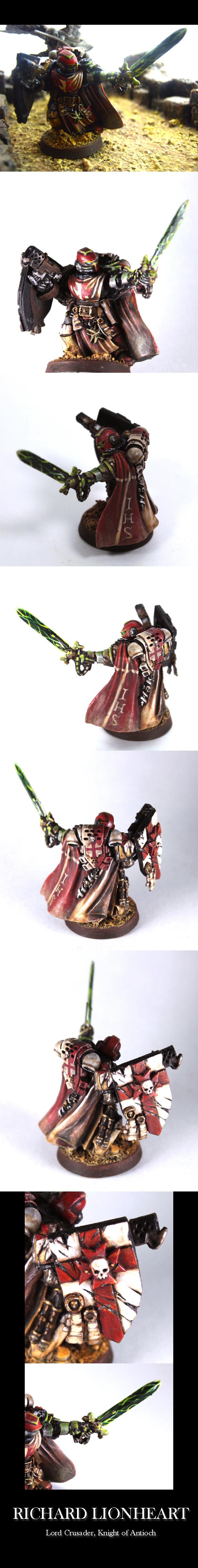
That's pretty funny considering the model in your sig is blood red with neon green edge highlighting.
|
|
This message was edited 1 time. Last update was at 2013/04/21 09:39:45
|
|
|
|
|
2013/04/21 09:47:35
Subject: GW's "professional" painter's standards dropping?
|
|
Ian Pickstock
Nottingham
|
I too think the Deathwing looks "meh". Anyone got any fan/golden demon deathwing for comparison? Preferably that doesn't involve a million stages.
|
Naaa na na na-na-na-naaa.
Na-na-na-naaaaa.
Hey Jude. |
|
|
|
|
2013/04/21 09:48:53
Subject: Re:GW's "professional" painter's standards dropping?
|
|
Norn Queen
|
heartserenade wrote:But it's a promotional product. It's like expecting McDonald's to put how their burgers really look like in their ads. I mean that'll be closer to the truth but it'll be less enticing. Or art schools showing mediocre artworks on their brochures.
There's a difference though. Showing painted models is an enticement to buy some and paint them yourself, McDonalds are enticing you to buy something and *shudder* eat it, not make your own.
Good looking models are good, but acheivable standards while still looking good are better. Nothing it more demoralizing than getting your first box, sitting down ina the store and painting your first model, only to look at all the stuff around you and see how terrible it is. Some people get spurred on by that to practice and get better, some get demoralized to the point of not painting at all.
|
|
|
|
|
2013/04/21 10:27:48
Subject: GW's "professional" painter's standards dropping?
|
|
Utilizing Careful Highlighting
|
kb305 wrote:
That's pretty funny considering the model in your sig is blood red with neon green edge highlighting.
I don't see what's funny about that. Being a fan of something does not mean I do it all the time. if you're a fan of Death Metal, do you limit yourself in singing only Death Metal?
Besides, that's OSL from the green sword. Putting high contrast is only fitting. Have you seen the rest of the model, though? It may not be the best painted model ever, nor the most carefully blended one, but it certainly does not fit the 'Eavy Metal style of high contrast on everything painting.
Loki wrote:Some people get spurred on by that to practice and get better, some get demoralized to the point of not painting at all.
This is true, and you can't please everybody. But using the best possible work you can possibly present looks way more professional (think about how the other companies present their product), so pleasing the former is better than the latter.
|
|
This message was edited 1 time. Last update was at 2013/04/21 10:28:26
|
|
|
|
|
2013/04/21 11:12:43
Subject: GW's "professional" painter's standards dropping?
|
|
Norn Queen
|
I dunno. I find that the people who are demoralised into not painting at all far outweigh those that paint well.
People that paint well don't really care what Eavy Metal does. They go and find better inspiration on CMON and the like, because no matter how well Eavy Metal paint, they're still painting to the studio schemes. Even when Eavy Metal painted well, techniques like freehand weren't common.
Simpler, but still good looking, official models with a simple base/shade/layer/highlight approach helps get the masses out of their apathy, while the good painters will still ignore it.
I'd far prefer to see a bunch of tabletop standard armies when I see people playign at the store than a bunch of grey armies with the odd model they tried to do a good job on.
|
|
This message was edited 1 time. Last update was at 2013/04/21 11:13:29
|
|
|
|
|
2013/04/21 11:36:01
Subject: Re:GW's "professional" painter's standards dropping?
|
|
Utilizing Careful Highlighting
|
What you said has some merit. Still, maybe it's the fact that i used to work for advertising that presenting mediocre promotional product for me is very off-putting. It just looks very unprofessional.
|
|
|
|
|
|
2013/04/21 11:42:28
Subject: GW's "professional" painter's standards dropping?
|
|
Norn Queen
|
I think you're opinion might also be a bit skewed because, well, you're a pretty amazing painter.
To me, Eavy Metal still presents an end product I couldn't hope to match. However, with its simpler style, it at least motivates me to get my stuff done, because they're advertising with techniques I can do, if somewhat rough around the edges.
Contrasted to Infinitys stuff by Angel, I look at his stuff, look at my stuff, and basically consider giving up right there. That's why I rarely venture to their official site other than to see new releases.
|
|
This message was edited 2 times. Last update was at 2013/04/21 11:43:22
|
|
|
|
|
2013/04/21 12:36:25
Subject: GW's "professional" painter's standards dropping?
|
|
Boom! Leman Russ Commander
|
My big problem is the new paints.
I'm still using old techniques, like multi-layering white to get that nice, unified white colour, and all the GW staff are saying OH U SHUD JUST USE DA WHITE U CAN DO IT IN 2 COATS WATCH.
And I'm stuck thinking "But that looks terrible"
Another example is the newer golds. I'm used to layering scorched brown beneath shining gold. It's what I do. it looks nice and that's what I want. That's a problem for some reason.
|
|
|
|
|
|
2013/04/21 16:39:07
Subject: GW's "professional" painter's standards dropping?
|
|
Space Marine Scout with Sniper Rifle
Seattle, WA
|
kb305 wrote:
That deathwing knight has a couple problems. First is the use of yellow wash/glazes to shade bone. Just looking at the photo i think yellow was a poor choice. Browns and blacks look alot better. devlan, ogryn, sepia and badab will produce some awesome looking bone shading.
Second is the metallics fall short compared to the rest of the model. They need more washes and more variation in color and brightness.
It's still a nice model though. No one gets it perfect every time.
Oh, the metallics barely even look highlighted and the wiring on the shield bled onto the shield surface... it is admittedly terribly done for what should be a professional paint job. I thought that the robes had a yellow glaze, but the bone didn't seem as evident that a glaze was used. It looked pretty close to bone to my eye, but I'm still a relative noob when it comes to painting techniques.
I still believe the model could have had a much less flat appearance if the bone had another blend layer to an 'upper surface' color before the line highlight, but he may also have not wanted to fix any screw-ups if the green decorative line got messed up... But that theory doesn't fly because it goes over the dark color portion.
|
|
|
|
|
|
|


 Legion: Dark Angels


 Mechanicus
 Ravenwing
 Deathwing