| Author |
Message |
 |
|
|
|
|
Advert
|
Forum adverts like this one are shown to any user who is not logged in. Join us by filling out a tiny 3 field form and you will get your own, free, dakka user account which gives a good range of benefits to you:
- No adverts like this in the forums anymore.
- Times and dates in your local timezone.
- Full tracking of what you have read so you can skip to your first unread post, easily see what has changed since you last logged in, and easily see what is new at a glance.
- Email notifications for threads you want to watch closely.
- Being a part of the oldest wargaming community on the net.
If you are already a member then feel free to login now. |
|
 |
2013/05/31 01:43:43
Subject: Opinion - color for my Ultramarines
|
|

PanOceaniac Hacking Specialist Sergeant
|
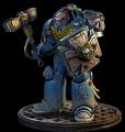
As the title states, I am seeing opinions on what color I should use for my Ultramarines. Here are the colors used on each:
Left: Altdorf Guard Blue - washed with nuln oil and then guilliman blue glaze
Middle: enchanted blue with quickshade dark tone dip
Right: ultramarine blue dipped with quickshade dark tone
Note: I did not add all the little details on the left as I was curious on the armor color only.
|
# of Unpainted/Unassembled > # of Painted models.  |
|
|
 |
|
2013/05/31 01:50:55
Subject: Opinion - color for my Ultramarines
|
|

Longtime Dakkanaut
|
Middle hands down, all though this could be a bias, as the mini looks more finished than the others.
|
|
|
|
|
|
2013/05/31 01:53:20
Subject: Re:Opinion - color for my Ultramarines
|
|
Flailing Flagellant
|
Middle. Definitely.
|
|
|
|
|
2013/05/31 01:58:19
Subject: Re:Opinion - color for my Ultramarines
|
|
Basecoated Black
|
Based on this photo, I'd have to say I like the middle the most. However, the flash is centered on that model and shows off all its detail while making the other two look worse because they aren't getting enough light. Based simply on the color of the armor plates, you could also go with the far right. It doesn't look too bad. It is just hard to tell when you are giving us three different models, each with a different level of detail.
|
|
|
|
|
2013/05/31 02:00:42
Subject: Opinion - color for my Ultramarines
|
|
PanOceaniac Hacking Specialist Sergeant
|
Eldercaveman wrote:Middle hands down, all though this could be a bias, as the mini looks more finished than the others.
I know it is hard not to be biased when you compare a complete v. WIP model. :-)
Both the middle and right are done from a paint perspective. The enchanted blue did come out better than I expected, considering I used a dip for shading.
|
# of Unpainted/Unassembled > # of Painted models. |
|
|
|
|
2013/05/31 02:08:14
Subject: Opinion - color for my Ultramarines
|
|

Xeno-Hating Inquisitorial Excruciator
|
I agree, the middle figure looks richer in colour
|
|
|
|
|
|
2013/05/31 02:08:34
Subject: Re:Opinion - color for my Ultramarines
|
|
PanOceaniac Hacking Specialist Sergeant
|
 Icarusthepilot wrote: Icarusthepilot wrote:Based on this photo, I'd have to say I like the middle the most. However, the flash is centered on that model and shows off all its detail while making the other two look worse because they aren't getting enough light. Based simply on the color of the armor plates, you could also go with the far right. It doesn't look too bad. It is just hard to tell when you are giving us three different models, each with a different level of detail.
Good point. Here is a featured shot on each.
|
|
This message was edited 2 times. Last update was at 2013/05/31 02:10:06
|
|
|
|
|
2013/05/31 06:23:40
Subject: Opinion - color for my Ultramarines
|
|

Steadfast Grey Hunter
|
I would say the far right, he doesn't look like the run of the mill ultra marines. The colour is a little more matt and books sightly more menacing in my eyes.
|
|
|
|
|
2013/05/31 08:30:48
Subject: Opinion - color for my Ultramarines
|
|

Sinewy Scourge
|
MIddle, no comparison.
|
|
|
|
|
|
2013/05/31 14:20:20
Subject: Opinion - color for my Ultramarines
|
|
Regular Dakkanaut
|
One more for the one in the middle.
|
|
|
|
|
2013/05/31 14:24:43
Subject: Opinion - color for my Ultramarines
|
|

Thunderhawk Pilot Dropping From Orbit
|
I'd say the one on the left, if completed, would look the best. Its not that the other colors dont work, I just think is a bit distinguishing from the other UM army's.
But like I said, it need completion to be a 100%
|
|
|
|
|
|
2013/05/31 14:40:38
Subject: Opinion - color for my Ultramarines
|
|
The Marine Standing Behind Marneus Calgar
|
Middle or left. I like a richer, deeper tone for my Ultras.
|
|
|
|
|
|
2013/05/31 14:54:25
Subject: Opinion - color for my Ultramarines
|
|
Fixture of Dakka
|
Middle for sure.
|
|
|
|
|
|
2013/05/31 15:02:34
Subject: Opinion - color for my Ultramarines
|
|
Stubborn Hammerer
|
Yeah I agree with just about everyone here, middle definitely. Though I can also see the right one if it had some more highlights.
|
|
|
|
|
2013/05/31 15:04:44
Subject: Opinion - color for my Ultramarines
|
|
Been Around the Block
|
Yes, the middle is a much better balance of tone and shade. Good work so far matey!
|
|
|
|
|
|
2013/05/31 22:28:58
Subject: Opinion - color for my Ultramarines
|
|
PanOceaniac Hacking Specialist Sergeant
|
Since a few folks said that the left marine needs a little work, I will add some more detail and post an updated pic tonight or tomorrow.
Thanks to all those who have commented so far. I really appreciate it. :-)
|
# of Unpainted/Unassembled > # of Painted models. |
|
|
|
|
2013/06/01 13:26:11
Subject: Re:Opinion - color for my Ultramarines
|
|
PanOceaniac Hacking Specialist Sergeant
|
A pic of a little more detail added to the left marine.
|
# of Unpainted/Unassembled > # of Painted models. |
|
|
|
|
2013/06/01 14:07:59
Subject: Opinion - color for my Ultramarines
|
|

Judgemental Grey Knight Justicar
|
well the wash seems a little rushed, so its thick and thin >.<
but yeah, I prefer the middle one because its a nice vibrant blue, the right one looks a little dull
|
I have half a mind to kill you, and the other half agrees |
|
|
|
|
2013/06/01 14:23:05
Subject: Opinion - color for my Ultramarines
|
|
PanOceaniac Hacking Specialist Sergeant
|
 BewareOfTom wrote: BewareOfTom wrote:well the wash seems a little rushed, so its thick and thin >.<
but yeah, I prefer the middle one because its a nice vibrant blue, the right one looks a little dull
Yeah, I am not sure I have the best technique when it comes to washes. Does it really look that bad?
|
|
This message was edited 1 time. Last update was at 2013/06/01 14:39:05
# of Unpainted/Unassembled > # of Painted models. |
|
|
|
|
2013/06/02 00:51:11
Subject: Re:Opinion - color for my Ultramarines
|
|
PanOceaniac Hacking Specialist Sergeant
|
For further comparison, here is one of my other marines that I painted using Mordian Blue. Not sure if that changes any votes. Lol
|
# of Unpainted/Unassembled > # of Painted models. |
|
|
|
|
2013/06/02 01:25:16
Subject: Opinion - color for my Ultramarines
|
|
Regular Dakkanaut
|
Try using abit of black and white,with lots of swords and,,,er,,,,,,,
The middle figure looks the best ,the mix of light and darker shades looks better,the other two seem to be more muted/the contrast does not show well even when re photographed.
|
"Ave, Imperator, morituri te salutant"
 Black Templar-24,000+ Black Templar-24,000+
Imperial Guard
 Gaunts Ghost -2,000 Gaunts Ghost -2,000
Victoria's Own 33rd of Foot-2,000
 Sisters of battle-2,500 Sisters of battle-2,500
 Loyal Chaos Marines-2,000 Loyal Chaos Marines-2,000
 Legio I Italica-8.000 Legio I Italica-8.000
Bretonnians 3,000plus |
|
|
|
|
2013/06/02 04:55:34
Subject: Opinion - color for my Ultramarines
|
|
Perfect Shot Ultramarine Predator Pilot
|
The middle on seems to be more your style because it is definately the nicest... but i think if you took a little more time the left could work! dark wash adds depth.
|
|
This message was edited 1 time. Last update was at 2013/06/02 04:55:52
|
|
|
|
|
2013/06/02 20:10:47
Subject: Opinion - color for my Ultramarines
|
|
PanOceaniac Hacking Specialist Sergeant
|
 Largeblastmarker wrote: Largeblastmarker wrote:The middle on seems to be more your style because it is definately the nicest... but i think if you took a little more time the left could work! dark wash adds depth.
It is the color I am leaning the most towards at this point. I like a rich blue color, but also like hiw GW tends to paint them a little darker. I am trying two other color schemes and will post pics soon.
|
# of Unpainted/Unassembled > # of Painted models. |
|
|
|
|
2013/06/08 21:02:47
Subject: Re:Opinion - color for my Ultramarines
|
|
PanOceaniac Hacking Specialist Sergeant
|
Sneak peak at the latest color scheme I am attempting.
|
# of Unpainted/Unassembled > # of Painted models. |
|
|
|
|
2013/06/08 21:58:33
Subject: Re:Opinion - color for my Ultramarines
|
|
Ferocious Blood Claw
|
Hi for my Ultramarines I used Caledor blue as base and layer, drakenhof nightshade for shade then Calgar and Lothern blue for high lights
|
|
|
|
|
2013/06/09 03:21:08
Subject: Opinion - color for my Ultramarines
|
|
PanOceaniac Hacking Specialist Sergeant
|
Those are really impressive! The Emperor would be proud! :-)
|
# of Unpainted/Unassembled > # of Painted models. |
|
|
|
|
2013/06/09 07:26:05
Subject: Opinion - color for my Ultramarines
|
|
Morphing Obliterator
|
my vote's for the middle guy. much more vibrant, better contrast, etc. I'm curious to see your latest color scheme, though.
|
|
|
|
|
|
2013/06/09 12:07:00
Subject: Re:Opinion - color for my Ultramarines
|
|
PanOceaniac Hacking Specialist Sergeant
|
Update with a little more work completed.
|
|
This message was edited 2 times. Last update was at 2013/06/09 12:08:24
# of Unpainted/Unassembled > # of Painted models. |
|
|
|
|
2013/06/10 03:08:59
Subject: Re:Opinion - color for my Ultramarines
|
|
PanOceaniac Hacking Specialist Sergeant
|
So I am mulling over options to deal with the shading of the recesses. Someone suggested using Regal or Mordian Blue to fill them with a small detail brush. I thought about giving the armor plates a wash with guilliman blue glaze to help pull them out. I really don't want to darken the armor color too much that it loses the Ultramarine feel. Thoughts?
|
# of Unpainted/Unassembled > # of Painted models. |
|
|
|
|
2013/06/10 13:59:21
Subject: Opinion - color for my Ultramarines
|
|
Morphing Obliterator
|
you can still use a wash on the recesses without applying it across the entire surface of the armor. just use the brush to apply wash specifically to the recesses instead of all over. personally, I'd go with something darker than a blue wash, but give it a go and see what you think. easy enough to throw another layer of wash over it 
|
|
|
|
|
|
|
|


 Ultramarines, 3rd Co. and friends, 16k+
  4k
4k  Competition Index
 being recalculated~4.5k
 750
750  875 My p&m blog where there are space marines
  Night Lords P&M Blog:
  Salamanders P&M Blog: