| Author |
Message |
 |
|
|
|
|
Advert
|
Forum adverts like this one are shown to any user who is not logged in. Join us by filling out a tiny 3 field form and you will get your own, free, dakka user account which gives a good range of benefits to you:
- No adverts like this in the forums anymore.
- Times and dates in your local timezone.
- Full tracking of what you have read so you can skip to your first unread post, easily see what has changed since you last logged in, and easily see what is new at a glance.
- Email notifications for threads you want to watch closely.
- Being a part of the oldest wargaming community on the net.
If you are already a member then feel free to login now. |
|
 |
2016/09/06 21:00:30
Subject: DakkaDakka Society of Fine Painters
|
|

Decrepit Dakkanaut
|
Just so you don't feel like I'm picking on you graven... I've been dogging my absolute favorite YouTube battle report guy to do the same thing. You both are already really good... but you both also have so much untapped potential... want to do what I can to encourage you to tap into it!
|
|
This message was edited 1 time. Last update was at 2016/09/06 21:01:01
|
|
|
 |
|
2016/09/06 22:04:57
Subject: DakkaDakka Society of Fine Painters
|
|

Mastering Non-Metallic Metal
|
tatt2014 wrote:Dr. H your right will do. I have been fallowing your mini city looks fantastic I love the clouds and the shore work is beautiful
Thanks Tatt'. 
Your painting looks good, so show more of that in here, and I'm sure if you start a p&m blog, we'll all pop in to see more of that sculpting too. 
Cam': The heat effect is pretty good. I will only tell you to make use of research to make sure you get it "right". I don't know off the top of my head what brass looks like when heated...
Ooo, well there's a thing:

I'd say job's a good'un.
Thanks BB.
Further to what you said to Cam' about the colours:
Looking at the plants in particular. Starting with differing colours is not necessarily a bad thing, maybe adding some painting steps to bring them closer together in colour...
I'm assuming that's how those bushes come from the pack, maybe experiment with painting them as if they needed painting. Paint them both the same, but make use of the different base colours to give them a natural variety.
This may "remove" the harsh difference in colour that BB is talking about.
TP' and Graven'; Everyone has something to learn and something they can teach others.
If you find a technique that helps in your painting, don't assume that everyone else already knows about it. Share it and someone may learn something new.
|
     Mastodon: @DrH@warhammer.social Mastodon: @DrH@warhammer.social
The army-                   ~2295 points (built). ~2295 points (built).
 
* -=]_,=-eague Spruemeister General. * A (sprue) Hut tutorial *
Dsteingass - Dr. H..You are a role model for Internet Morality!  // inmygravenimage - Dr H is a model to us all // inmygravenimage - Dr H is a model to us all
Theophony - Sprue for the spruemeister, plastic for his plastic throne! // Shasolenzabi - Toilets, more complex than folks take time to think about! |
|
|
|
|
2016/09/07 00:38:24
Subject: DakkaDakka Society of Fine Painters
|
|
Fresh-Faced New User
|
Bebop My Apologies to our society. I was asked to post some Wips. I was Hopping to get some feed back on the paint work and maybe start a Q&A conversation about the work in progress. Again My bad Guys, nothing but love, Tatt
|
|
|
|
|
|
2016/09/07 09:00:06
Subject: DakkaDakka Society of Fine Painters
|
|
Decrepit Dakkanaut
|
|
Theophony"... and there's strippers in terminator armor and lovecraftian shenanigans afoot."
Solar_Lion: "Man this sums up your blog nicely."
Anpu-adom: "being Geek is about Love. Some love broadly. Some love deeply. And then there are people like Graven. |
|
|
|
|
2016/09/07 14:31:31
Subject: Re:DakkaDakka Society of Fine Painters
|
|
Decrepit Dakkanaut
|
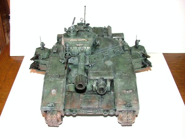
I've been wanting to contribute to this thread in some way, but I'm not half the painter that most of you are so finding something useful to say or show has been difficult. I think however, I might have found something that might be useful. I'm pretty passionate about basing. I've been asked about it several times over the years & recently wrote up a little thing for my AdMech blog. It's not really a tutorial... more like musings and theory interspersed with some supporting pics. I thought it might be of interest to the readers of this thread. ----------------------------------------------------------------------------------------- So, as to the basing... I'll give you a bit of my theory using some old models, then include a pic of my most recent effort & you can make your own decisions. Generally, I'm a big fan of basing... not just the basics (grit)... but multi-layered, multi-texture basing. Some people believe that complicated bases distract from the figure. I respect that opinion but personally disagree with it. A good base can make a mediocre figure look good, or make a good figure look great. With a few, simple techniques you can really ramp-up the visual impact of your work (no matter what caliber your paint job is)... that's time well spent in my book. Here's are a couple of good example of my "standard" basing style. Brown grit of several sizes, washed with sepia which gives me some variation in color. Grey rocks (these are cork, but I've used other substances), mainly to provide some contrast to the ground, with some scattered bits of grass and/or foliage of various colors. These provide a more realistic setting for the figure and more importantly, give me a chance to either add more color variation to the piece, or reinforce minor colors already in the piece. 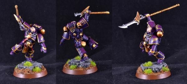 In the case of the EC centurion, the green grass really sets the purple off, for the headless horseman below... the base conveys a very fall feel... appropriate for a Halloween army, as well as echoing the colors in the cloak. 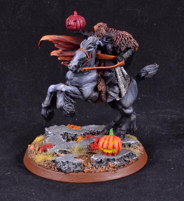 The AdMech army provided an interesting challenge. I wanted to base to be somewhat Mars-like. Now of course, Mars in 40k probably doesn't have any exposed soil anymore... the entire surface being covered by a thick layer of Mechanicus construction... plasteel and concrete. Still, I wanted to origins of the army to be reflected in the bases. So, some kind of red soil. GW makes a very interesting Mars soil technical paint... but it wasn't really the direction I wanted to go. I adjusted my grit mix to be much finer than usual so it more closely approximated sand (actually most of it IS sand from a local beach), then experimented with a variety of washing techniques to try and get the look I wanted. Problem is that the resulting red base, with a red figure on top of it just became a largely indistinguishable red mass. Making matters worse, I'd opted for red rocks, figuring that in many places the color of the soil tends to reflect the color of the rocks in the area... being the result of erosion of those rocks and the same chemical processes that led to the color of said exposed rocks (iron, etc). So, I needed to break up the red on the base. I dawned on me that it would be a very nice touch to use living plants (i.e. healthy green ones) to do so, and in much higher percentage than I normally would. Green and red go beautifully together, and the contrast of natural organisms vs. the mechanicum's metallic nature would be a neat thing as well. Here's what I came up with... 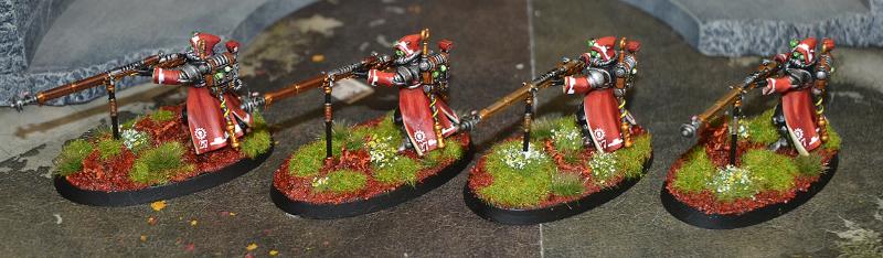 Lot's of green, tall grass, even flowers. I loved the effect this had on the bases. However... I still wasn't quite happy with it. The ground was just too screamingly red... While it did compliment the figure, it also competed with it. Add to this the fact that my rocks, painted to match the ground did so a little too well and completely disappeared into the base. So... not bad... but not what I was going for. Also, I couldn't remember my wash formula which was very frustrating as it was rather complicated. This brings us to our current experiment. I like the basing grit I'd concocted, so I didn't change that. I had to change the rocks... but wanted them to stand out from the ground. Turns out that where I live, we have a native quartzite that is pink in hue, locally called "pink lady". My driveway is filled with it so I went out and scooped up a couple of handfuls, washed them and decided to try them for the rocks instead. I won't paint them, just leave them their natural color. As far as washing the basing... I came up with a simple scheme that I think works better than the last and is certainly more repeatable. I'll show you the pic first, then talk about it afterwards. 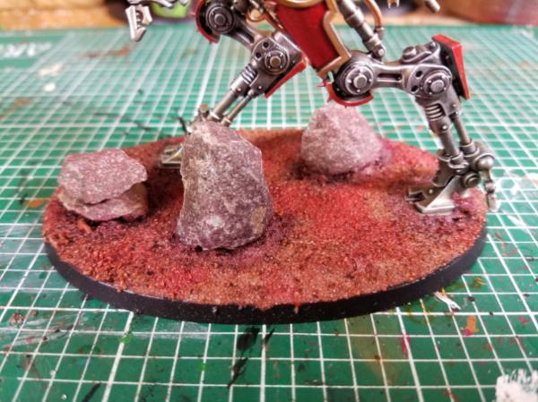 So here you can see the new rocks. Different from the basing color but clearly within the same theme. My new approach to washing the bases is to do the shadows (say, around anything touching the ground and the deepest parts under machines) in carbourg (?) crimson, then quickly wash the whole base in flesh wash... kind of a slightly reddish brown. Lastly, while the flesh wash is still wet... I hit random areas with the red glaze. So rather than the whole base being screaming red... it now has multiple shades, some rather muted, playing across the surface. Once I added ample greenery, flowers, etc. to the base, the final effect is rather eye-catching and compliments the figures nicely. I also got my hands on some Woodland Scenics bits of wood, typically you'd see this in model railroading. I *really* like the element it brings to the bases. 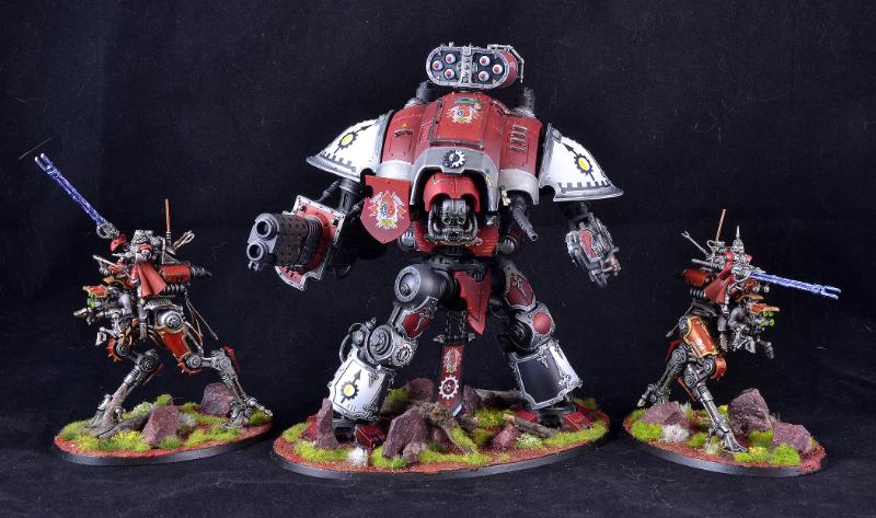
|
|
This message was edited 1 time. Last update was at 2016/09/07 14:32:06
|
|
|
|
|
2016/09/07 15:14:19
Subject: DakkaDakka Society of Fine Painters
|
|

Ancient Space Wolves Venerable Dreadnought
I... actually don't know. Help?
|
Any tips for painting red capes? I have 2 that I both want to be incredibly fancy.
|
|
|
|
|
|
2016/09/07 15:39:11
Subject: DakkaDakka Society of Fine Painters
|
|
Decrepit Dakkanaut
|
Capes are interesting because they're one of those things that you can shade up through pastels (white) and have it look amazingly good. I'll leave that for a better painter to answer through.
|
|
|
|
|
|
2016/09/07 21:59:12
Subject: DakkaDakka Society of Fine Painters
|
|
Gargantuan Great Squiggoth
|
Capes are easy, take a 2" brush, dark colour bottom to top, dry brush with same brush with lighter colour left to right, done. Whats the problem......oh wait, maybe thats where I am going wrong!
|
|
|
|
|
|
2016/09/07 22:21:47
Subject: Re:DakkaDakka Society of Fine Painters
|
|
Mastering Non-Metallic Metal
|
You can do cloaks with dry-brushing. You just have to be really gentle and build up the highlights gradually, catching less and less of the peaks of the folds.
I go for wet blending though. Many many layers. The trick is to get the blend as smooth as possible. Layering (as opposed to blending) doesn't tend to work as well for the smooth curves of a cloak.
But the more layers you use for layering, the closer you are getting to blending. Work on that and then it's just a small step to wet blending.
Contrast is pretty important for cloaks. They are actually more difficult when the cloak is less creased as you can't use large contrasts to show the shape, and layering becomes more obvious.
I often don't push my contrast as far as I should to really pop but I did for this chap and I'm pretty pleased with how he turned out:
If you look closely enough you may actually see the layers on him (he was painted back in 2013).
|
Mastodon: @DrH@warhammer.social
The army- ~2295 points (built).
* -=]_,=-eague Spruemeister General. * A (sprue) Hut tutorial *
Dsteingass - Dr. H..You are a role model for Internet Morality! // inmygravenimage - Dr H is a model to us all
Theophony - Sprue for the spruemeister, plastic for his plastic throne! // Shasolenzabi - Toilets, more complex than folks take time to think about! |
|
|
|
|
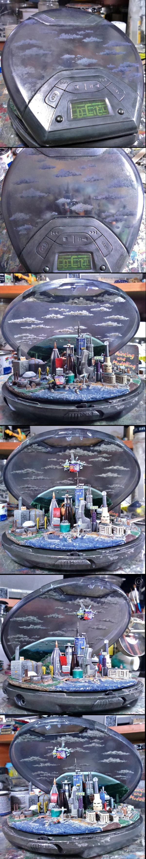
2016/09/07 23:44:09
Subject: DakkaDakka Society of Fine Painters
|
|
Thermo-Optical Tuareg
|
This is awesome! Looks like there's some Macross inspiration going on here as this looks a lot like a City Class colony ship.
|
|
|
|
|
|
2016/09/10 21:55:02
Subject: DakkaDakka Society of Fine Painters
|
|
Mastering Non-Metallic Metal
|
Thanks Barzam. Not directly inspired by Macross, but I do like things like that and cyberpunk type things.
I just went for a "futuristic" city and let the various items I picked out dictate the shape.
|
Mastodon: @DrH@warhammer.social
The army- ~2295 points (built).
* -=]_,=-eague Spruemeister General. * A (sprue) Hut tutorial *
Dsteingass - Dr. H..You are a role model for Internet Morality! // inmygravenimage - Dr H is a model to us all
Theophony - Sprue for the spruemeister, plastic for his plastic throne! // Shasolenzabi - Toilets, more complex than folks take time to think about! |
|
|
|
|
2016/09/11 10:05:44
Subject: Re:DakkaDakka Society of Fine Painters
|
|

Chaplain with Hate to Spare
|
O.k, not really a big quandary but since the new Deathwatch codex has been released i've been wanting to make and paint a few to have some fun with now, I 'can' paint black, in a fashion but it's so different from my regular style I'd like to see what others do to paint black and then have a few test models made up to practice on
I was thinking of trying these out (when I say 'zenithal' I just mean from above with a spray can)
* prime black, edge highlight with grey up to a light grey
* prime black, edge highlight with grey up to a light grey wash with nuln oil or blue then grey highlight
* prime black, chip edges with boltgun and wash chips with agrax/sepia then re chip with silver
* prime black, zenithal highlight with white then wash with nuln oil multiple times while adding light grey highlights until it blends (how I currently do it)
* prime black, zenithal highlight with silver then wash with nuln oil and finish with silver edging
So thoughts to try?
|
Flesh Eaters 4,500 points

" I will constantly have those in my head telling me how lazy and ugly and whorish I am. You sir, are a true friend " - KingCracker
"Nah, I'm just way too lazy to stand up so I keep sitting and paint" - Sigur
"I think the NMM technique with metals is just MNMM. Same sound I make while eating a good pizza" - Whalemusic360 |
|
|
|
|
2016/09/11 10:45:09
Subject: Re:DakkaDakka Society of Fine Painters
|
|
Gargantuan Great Squiggoth
|
I am really not joking here, try prime white and shade it back to black. That's how I did these cloaks recently. Put a bit of blue to it myself.
Though I am sure you will do it much better. That was literally 2-3 washes over a white primer.
|
|
This message was edited 1 time. Last update was at 2016/09/11 10:46:05
|
|
|
|
|
2016/09/11 20:04:59
Subject: Re:DakkaDakka Society of Fine Painters
|
|
The Hammer of Witches
|
Cam this is how I do black - mainly because I have white primer cheaply available, but also because it works fairly well. At first it wasn't working well on large flat areas like armour plates but then I tried adding thicker black paint to my black wash and carefully wet blending it.
This is all very useful stuff - for example I used the heat technique recently -
|
|
|
|
|
|
2016/09/11 20:44:51
Subject: Re:DakkaDakka Society of Fine Painters
|
|
Is 'Eavy Metal Calling?
|
 nerdfest09 wrote: nerdfest09 wrote:
* prime black, zenithal highlight with silver then wash with nuln oil and finish with silver edging
So thoughts to try?
That's pretty much my method, the only difference is that I apply splotches of brown/green/purple/blue before the Nuln, to add some depth and colour to the black (my early Iron Hands were just silver then black, adding in the colour stage on the later ones definitely makes a difference). I'd suggest drybrusing the silver rather than spraying or painting solid, though, it's just as quick as there's little need to be neat at that stage and gives a much more natural and less artificial finish.
|
|
|
|
|
|
2016/09/17 22:28:31
Subject: Re:DakkaDakka Society of Fine Painters
|
|
Lord Commander in a Plush Chair
California + Philidelphia
|
Here's some of my current favorites...
|
 [ [
"Don't worry, Vik! You have all of your internet friends to keep you company! And, as everyone knows, internet friends are at least one step above imaginary friends "-Rawson
"Does an Ork shiiiit green?" "...Rogue! -you rock!" "Damn you too Rogue!""[TTFN]... That means tittyfething right?""Yep, that's me, a two-dollar whore"-Dsteingass
"... but if we all fail together we can make it look like we´ve won actually.." "...to all killers out there...: my face will hit your fist so hard it´s gonna bleed...your fist that is...""lol....OMG... you are a serial""he knows no pain...nor fear^^ he is a riveteer""yep... some of the dakka chaps here sure made the joints of my jaw quite loose...""er... emailsex... now that at least sounds like the perfect safer sex... but i like mine a bit more...wet""do you know what they call a quarter pounder of a buckte full of rivets in france?" "No...what?" "Rivitz royal"-Viktor von Domm
" I expected to hear gak like that from RW, not you Vik... for shame Sir, for shame"-AnUnearthlyChilde
"We are Vik's private collection of muses for the monkey on his back.....""you, guys are worse than my children......"-mxwllmdr
"Singling one out as odd in a =][_= thread is like going into an asylum, pointing at someone at random and saying "that person's insane""-Shrike |
|
|
|
|
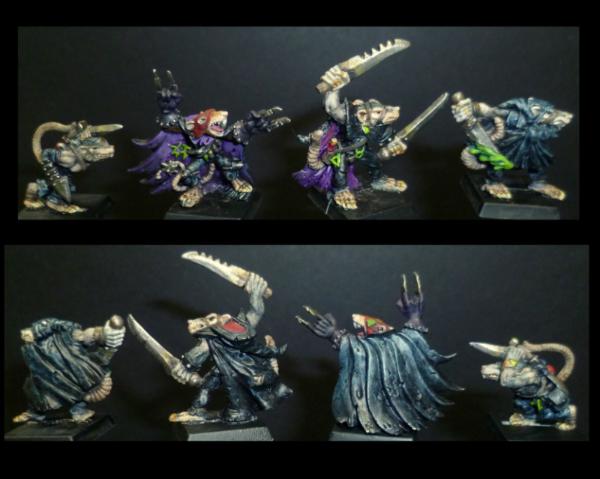
2016/09/18 10:16:03
Subject: Re:DakkaDakka Society of Fine Painters
|
|
Gargantuan Great Squiggoth
|
Going to try the metallic undercoat business, your work Para is outstanding and love the results you are getting.
@Rogue Wolves, nice work, scary, but really brilliant paintwork.
OK peeps had a go at NMM lets see what the best of the best think.....
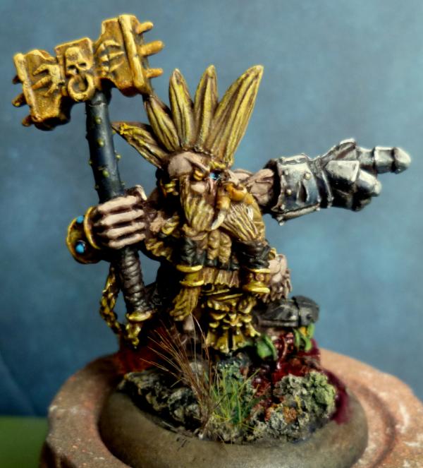
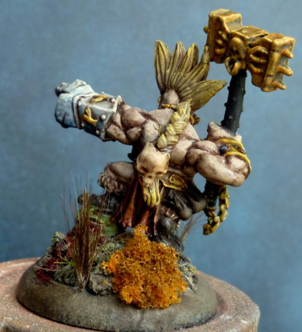
It's my first real go, tried little bits here and there before, never really pulled it off, whats your thoughts..
|
|
|
|
|
|
2016/09/18 10:25:58
Subject: DakkaDakka Society of Fine Painters
|
|
Is 'Eavy Metal Calling?
|
Looks great for a first attempt, way better than mine! The gauntlet in particular is superb. A few pointers though:
- The first thing I noticed that does detract from the overall look a little is how close in colour the hair/beard are to the gold NMM, the actual gold areas get a little lost. If those were to be, say, a grey-white or a slayer-esque orange the whole thing would pop a bit more.
- The gold could maybe use one more highlight just on the edges that would really catch the light, and likewise maybe a bit more shadow in the recesses. I'm not one for ultra-shiny NMM, but the odd extreme highlight or shade can definitely help nail the metallic look.
- Looks like you used a blue wash of some kind on the gauntlet, I'd do the same on the hammer with very, very thin purple. Think I mentioned this before in the thread, but purple over gold really does help the contrast and tone.
All in all, though, a very solid first attempt! Looking forward to your take on working from actual metallics as well
|
|
|
|
|
|
2016/09/18 20:37:46
Subject: DakkaDakka Society of Fine Painters
|
|
The Hammer of Witches
|
What you need there is a really really solid white-yellow highlight just at the top of that hammer, is what I'd do. Make it pop as they say. Paradigm already sad that but I wrote this before I read...
|
|
This message was edited 1 time. Last update was at 2016/09/18 20:39:01
|
|
|
|
|
2016/09/19 20:41:32
Subject: Re:DakkaDakka Society of Fine Painters
|
|
Mastering Non-Metallic Metal
|
nerdfest09 wrote:... I'd like to see what others do to paint black ...
I've... not actually painted much black recently.
Looking back over past models that have black on them I appear to start from black and then dry-brush dark and then medium grey over it, with a final edge highlight of lighter grey.
Best example of this is what I used in your "Sin City" competition.
Judging from the votes she has received in the gallery, it's not the best method:
I'll have to try out a black model some time soon as see if I can find a better method.
Welcome RW. Nice selection of things there. Good work.
Cam': I've already commented over in your thread.
I have a series of photos in progress showing every layer of my painting technique. So that'll be incoming soon.
In the meanwhile, I was commenting in the last LoER contest round and came out with something that'll be a good topic to cover in this thread:
It's all well and good knowing the techniques and reading all the tutorials of how the experts perform those perfectly...
...But what do you do when it goes wrong?
I think that a large part of painting to a high level is knowing ways to "save" a project when something hasn't worked out.
Yes, you can strip the model and start again, but what if it's only part of that model that's wrong and you don't want to remove/damage the 100's of hours of work you've put in to the rest of the model?
It can be as simple as a moist brush to erase a slip, or a complicated methodology to cover or disguise a dodgy paint effect.
I think it'll be very useful for all involved if we share out methods for saving those "little" errors that might cause someone to throw a model back in the box.
Let's hear them.
|
Mastodon: @DrH@warhammer.social
The army- ~2295 points (built).
* -=]_,=-eague Spruemeister General. * A (sprue) Hut tutorial *
Dsteingass - Dr. H..You are a role model for Internet Morality! // inmygravenimage - Dr H is a model to us all
Theophony - Sprue for the spruemeister, plastic for his plastic throne! // Shasolenzabi - Toilets, more complex than folks take time to think about! |
|
|
|
|
2016/09/19 21:54:47
Subject: DakkaDakka Society of Fine Painters
|
|
Never Forget Isstvan!
|
The ' series ' will be good to review. often we can gain alot from the step by step.
|
|
|
|
|
|
2016/09/19 23:38:46
Subject: Re:DakkaDakka Society of Fine Painters
|
|
Fixture of Dakka
|
RE: Painting it Black
When I do black, the main thing I do is avoid using black paint as much as possible. The reason is that it is hard to get darker than black, and it tends to look sort of dead.
I usually start with a middle grey primer, and then mix a dark grey + some reasonable color I want the reflecting light to be. That is, most materials don't really reflect black or grey (no color) but rather a really dark version of a color. So my wife's hair is not black but a really dark brown, while crow feathers often seem sort of bluish.
Once you have your dark base color, you can add the contrasting color to it to darken it while keeping the intensity. So instead of looking flat and dead from adding black it looks rich but still darker.
After that, just use less of the dark grey and contrast color as you get lighter, and Bob's your uncle.
You can get a similar effect going with a dark grey wash over a mid grey coat, then highlighting with white + desired color, then washing with desired colors. This can be less work depending on the model.
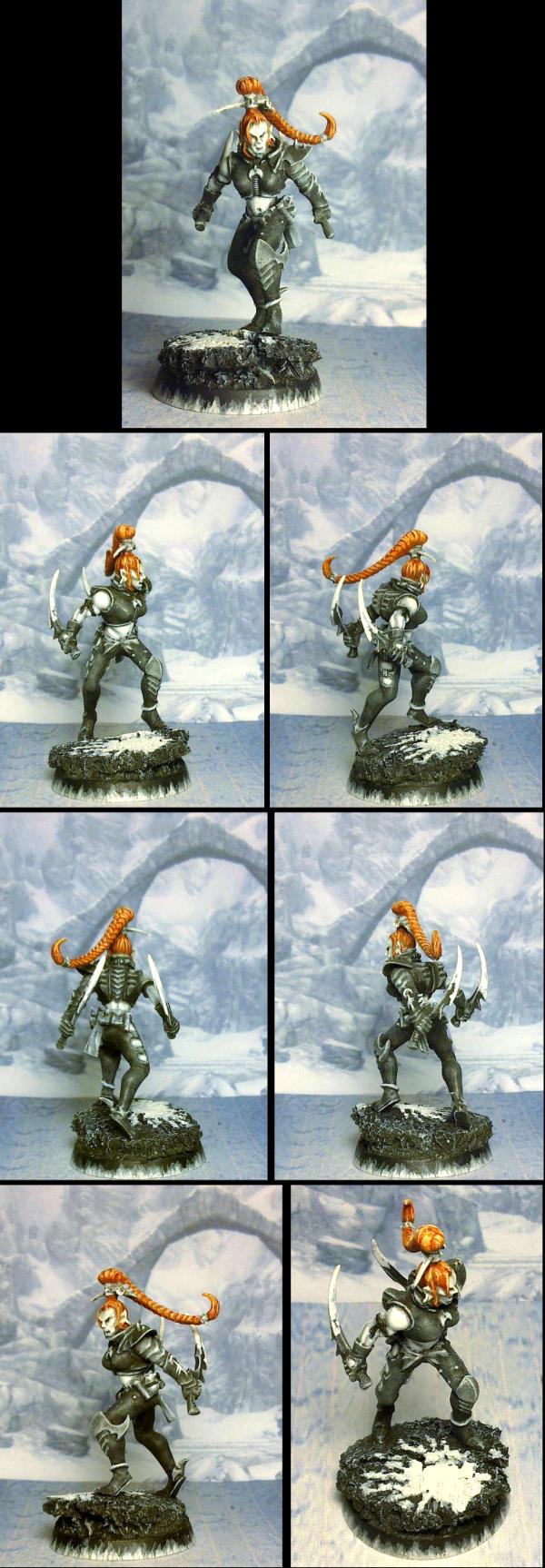
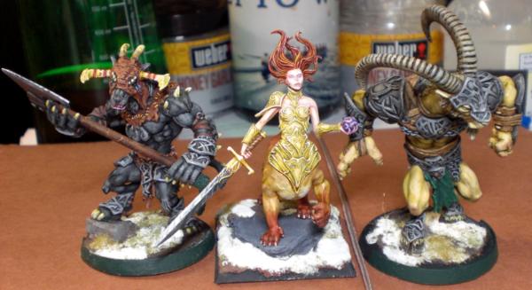
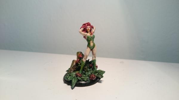
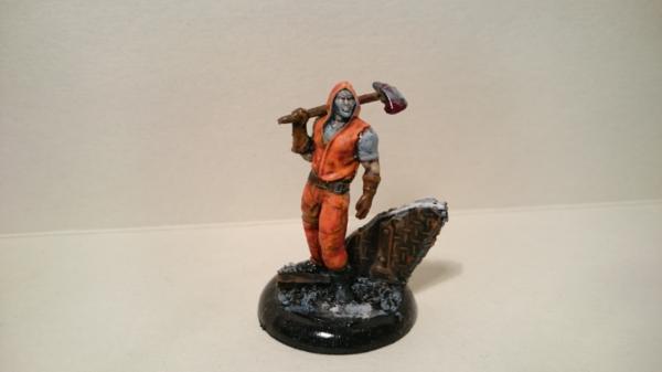
Lanyssa's cloak here on the left uses mostly the wash method, while the (really hard to see) boots of the guy shooting her in the temple use more of the first method to get a black with brown tones. On Lanyssa I also added some purple wash as a partial contrast to the blue, giving it a slightly darker look (and somewhat iridescent, which doesn't show in the picture).
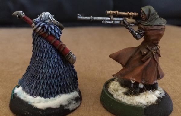
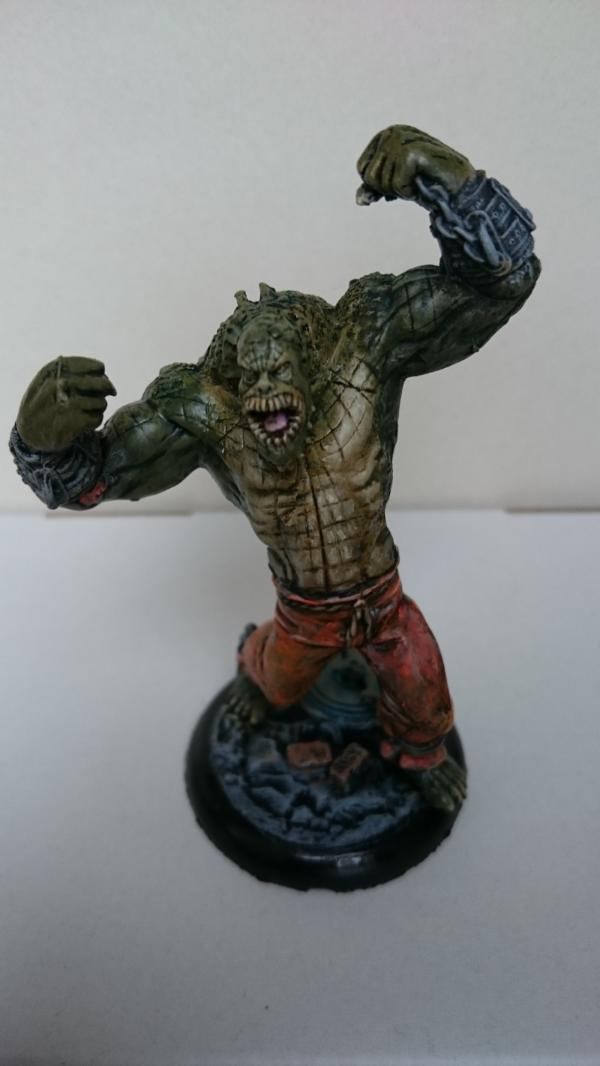
Ghettorix here on the left is sort of an example of how NOT to do this. I didn't use enough color on his fur, and it sort of blends into his cast iron armor plates, for a disappointing effect. Live and learn.
Wow.... looking back through my gallery for examples of this, I really haven't painted anything black other than armor bits in a long, long time. That's kind of shocking.
|
|
|
|
|
|
2016/09/21 13:26:05
Subject: Re:DakkaDakka Society of Fine Painters
|
|
Mastering Non-Metallic Metal
|
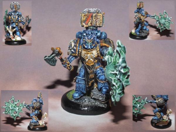
Here we go, every layer of paint from primer to tidy armour (no additional details) for an Imperial Fist marine.
Notice that it looks horrible and patchy for almost half the process, and rough and messy until almost the end where it's tidied.
This is just how I work, and why I do details at the end.
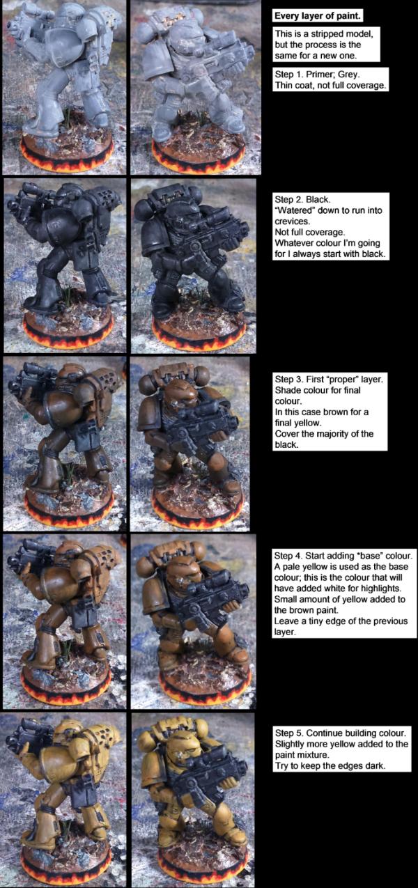
While the majority of the black gets covered anyway and I have to go back and "tidy" the edges and crevices, I like to start from black to get a good dark basecoat (the brown in this case) that I can build up to the highlights and leave the shading that forms naturally from this process.
Any areas that are too hard to reach after this point get left black/dark and are considered shadows.
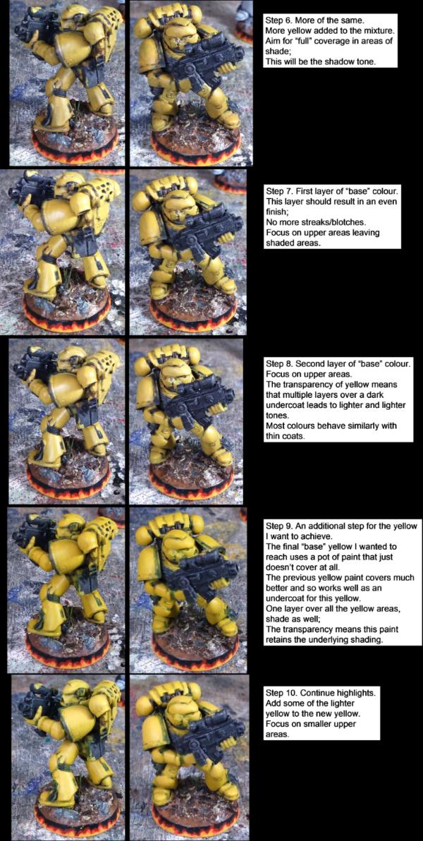
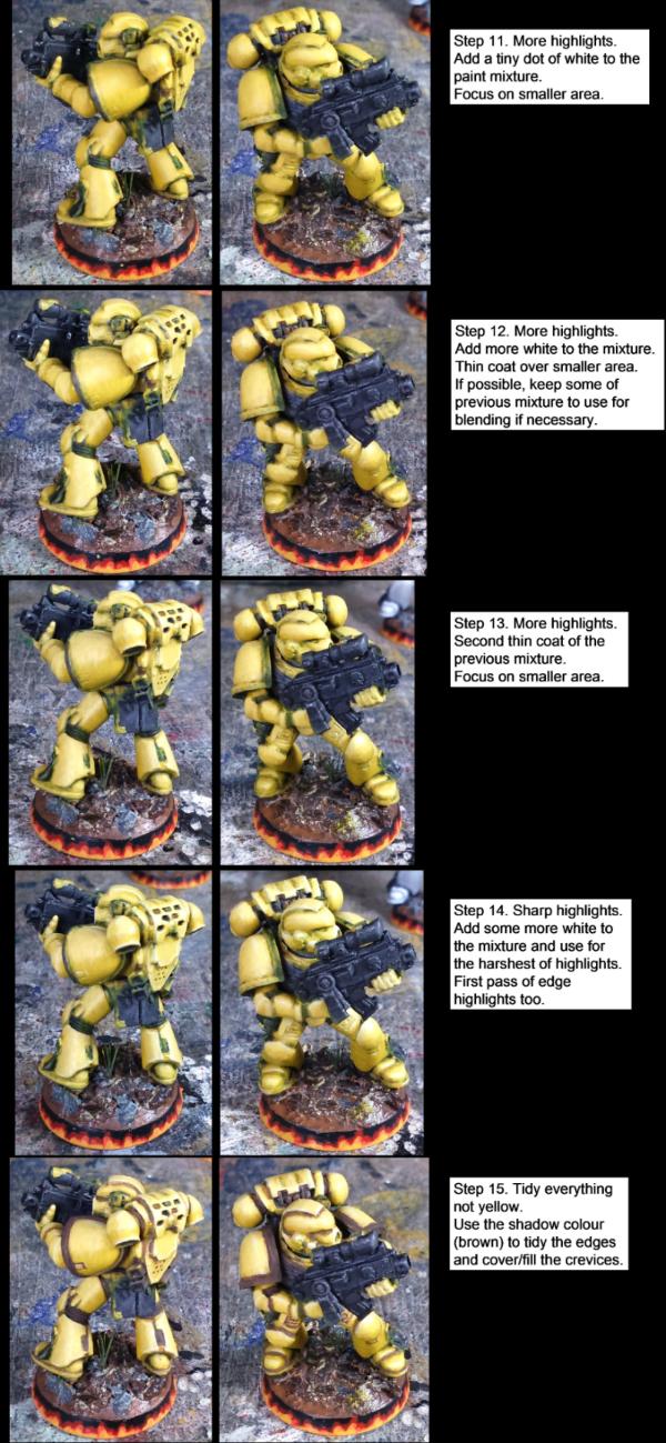
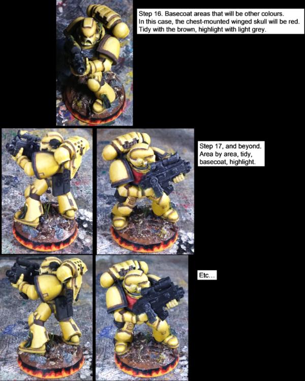
That's a lot of layers on some areas... But very few layers over fine details that have shading around them; one advantage I can think of for starting from dark.
The thin coats mean that, even at 12 - 15 coats of paint, it doesn't leave that "thick paint" look and distort the shape/lines of the model.
Hope that proves informative.
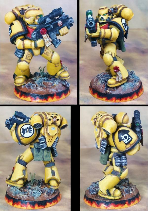
Oh, and once all the details are done:
|
|
This message was edited 1 time. Last update was at 2016/09/21 13:27:06
Mastodon: @DrH@warhammer.social
The army- ~2295 points (built).
* -=]_,=-eague Spruemeister General. * A (sprue) Hut tutorial *
Dsteingass - Dr. H..You are a role model for Internet Morality! // inmygravenimage - Dr H is a model to us all
Theophony - Sprue for the spruemeister, plastic for his plastic throne! // Shasolenzabi - Toilets, more complex than folks take time to think about! |
|
|
|
|
2016/09/21 17:40:14
Subject: DakkaDakka Society of Fine Painters
|
|
Never Forget Isstvan!
|
Awesome tutorial strps..
My weakness is faces. I know a lot of you are masters at it. Can you post your recipe?
|
|
|
|
|
|
2016/09/22 03:03:07
Subject: Re:DakkaDakka Society of Fine Painters
|
|
Chaplain with Hate to Spare
|
Faces eh, I love painting them, and mostly I feel I get them right but I still have a long way to go with them still. I can give you the basic run down until I can get a good tute done (i've done about 3 so far but i'm not happy with the pics etc)
base with Tallarn flesh, wash with ogryn flesh, then add a little grey and bleached bone and go over the face again, add more bleached bone and water down more then paint the highest areas, add more bleached bone and highlight the highest points, add red to the mix for the bottom lip and water down to add a blush to the cheeks/nose/ears wherever you want. if you get too bright then wash sparingly with ogryn flesh again. 
|
Flesh Eaters 4,500 points
" I will constantly have those in my head telling me how lazy and ugly and whorish I am. You sir, are a true friend " - KingCracker
"Nah, I'm just way too lazy to stand up so I keep sitting and paint" - Sigur
"I think the NMM technique with metals is just MNMM. Same sound I make while eating a good pizza" - Whalemusic360 |
|
|
|
|
2016/09/22 04:57:11
Subject: DakkaDakka Society of Fine Painters
|
|
Fixture of Dakka
|
The exact recipe differs a little whether I am doing female or male skin, but usually something like this:
Step 1 is a tan/brown sort of tone, either Tallarn or now that I airbrush first layers, a mix of Vallejo Cavalry Brown (a very red brown) and Pale Flesh or Ivory. That gives a somewhat pinkish tan base; a more masculine base would have a drop of English Uniform (sort of a brownish olive drab thing) in there. I honestly don't know why the pink color matters, but it really seems to.
Step 2 is the Step 1 mix with more Pale Flesh or Ivory mixed in. (Usually still airbrush, but brushed on is ok too.)
Step 3a : If I want it darker, apply a wash of Ogryn Flesh or Devlan Mud.
3b: If I want lighter skin, another pass of the mix, but almost all Pale Flesh or Ivory, then apply the wash.
Step 4: With thinner than normal paint, do some highlights with the Pale Flesh. (Ivory is sometimes too pale here, but depends on the look you are going for.) Repeat until you get it light enough, which is for me usually a bit lighter than the rest of the skin.
For details, I generally use Ivory for whites of the eyes, just touching them up after the wash. Sometimes I add a tiny bit of black wash to really draw out the eye detail.
Lips are usually a tad more Cavalry Brown mixed with Ivory for a subtle pink on the bottom lip, depending on how lippy you want it. Often the wash covers that fairly well for male models.
Then I usually get crazy with tattoos or woad paint, but that's just me
A little while ago... or like 7 years ago... wow... I did a short little write up of some practice I did to get better at skin tones before starting an army project. It is NSFW as it mostly uses a lot of succubus models I had lying around because, hey, lots of skin. Nothing really fancy, but between that and my sort of normal blog here there is a lot of face/skin work you might find handy.
|
|
|
|
|
|
2016/09/22 13:09:34
Subject: DakkaDakka Society of Fine Painters
|
|
Never Forget Isstvan!
|
Thanks.. That helps.. I can see by how you apply your layers it's as much technique as it is color. This is where I may be going astray.
Nerd.. looking forward to your tutorial. That would be super helpful.
Wer..wow for 7 years old that was pretty good. I actually like the 2nd to last picture. Perhaps I'm drawn to the much lighter creamy skin look for my demonic women!
Time to experiment.
|
|
This message was edited 1 time. Last update was at 2016/11/07 03:23:11
|
|
|
|
|
2016/09/24 02:58:57
Subject: DakkaDakka Society of Fine Painters
|
|
Fixture of Dakka
|
oooh some pale sky blue or purple is good for that! Now that you mention it, that makes me want to paint up some more Wrath of Kings stuff...
|
|
|
|
|
|
2016/09/24 03:26:47
Subject: DakkaDakka Society of Fine Painters
|
|
Decrepit Dakkanaut
|
I should belong to the Mediocre could be better, but gets distracted easily painters society 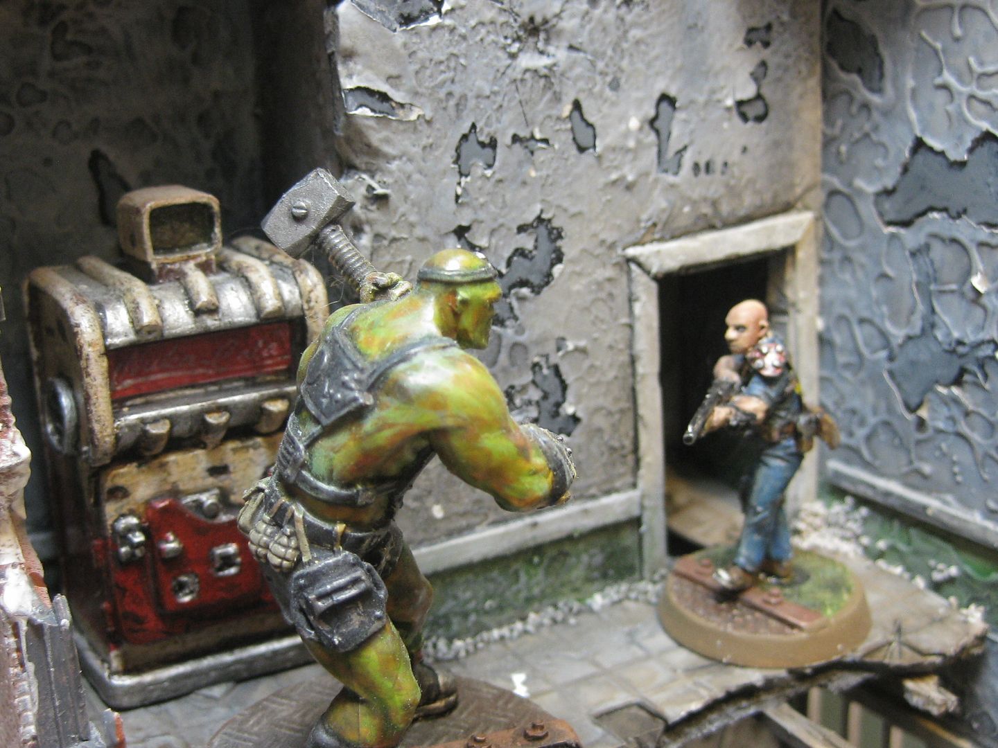
|
"dave you are the definition of old school..." -Viktor Von Domm    My P&M Blog : My P&M Blog :
It's great how just adding a little iconography, and rivets of course, can make something look distinctly 40K-adamsouza
"Ah yes, the sound of riveting.....Swear word after swear word and the clinking of thrown tools" "Nope. It sucks do it again..."- mxwllmdr
"It puts together more terrain, or else it gets the hose again...-dangledorf2.0
"This is the Imperium, there is no peace, there are only rivets" -Vitruvian XVII
"I think rivets are the perfect solution to almost every problem"- Rawson
More buildings for the Building God! -Shasolenzabi
|
|
|
|
|
2016/09/24 12:09:06
Subject: DakkaDakka Society of Fine Painters
|
|
Chaplain with Hate to Spare
|
Just a little heads up (no pun intended) but the October WD has a new tutorial for painting detailed faces! :-) I'm guessing this will really help those that have been asking lately, I used a WD faces tutorial to learn and I now love painting them so this should be great and could re invigorate my own face painting with new tricks! :-)
|
Flesh Eaters 4,500 points
" I will constantly have those in my head telling me how lazy and ugly and whorish I am. You sir, are a true friend " - KingCracker
"Nah, I'm just way too lazy to stand up so I keep sitting and paint" - Sigur
"I think the NMM technique with metals is just MNMM. Same sound I make while eating a good pizza" - Whalemusic360 |
|
|
|
|
|
|
 ~2800 points